Tag: kotobukiya

Rei Ayanami – Seaside ver

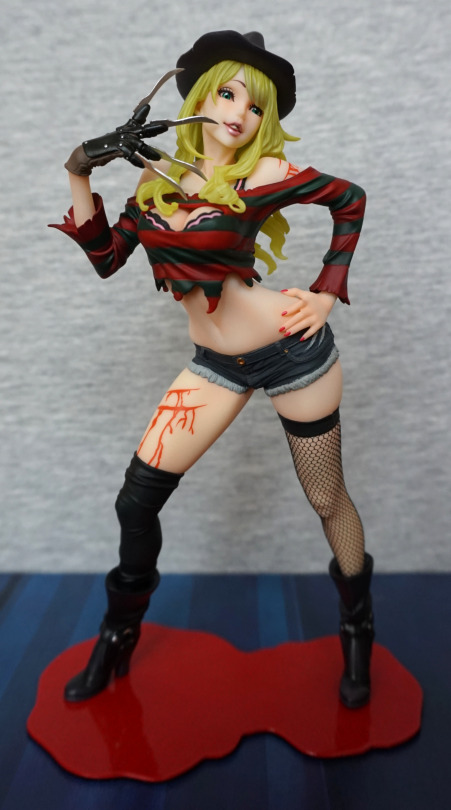
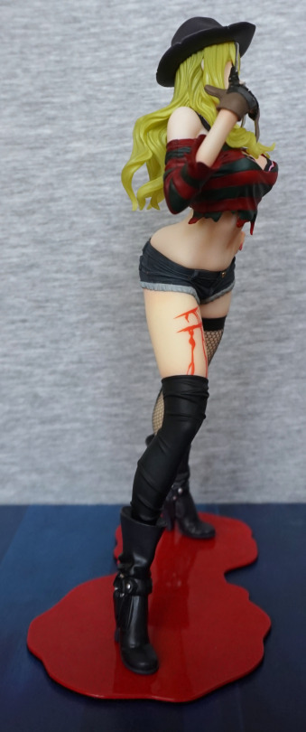
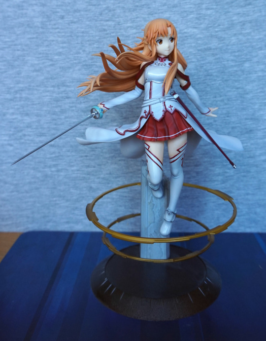
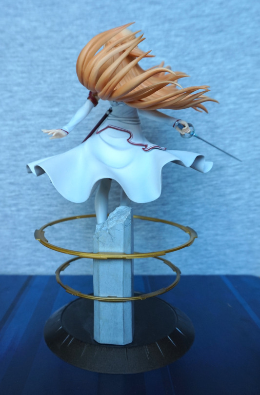
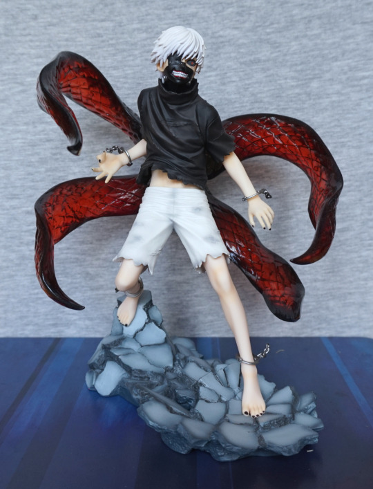
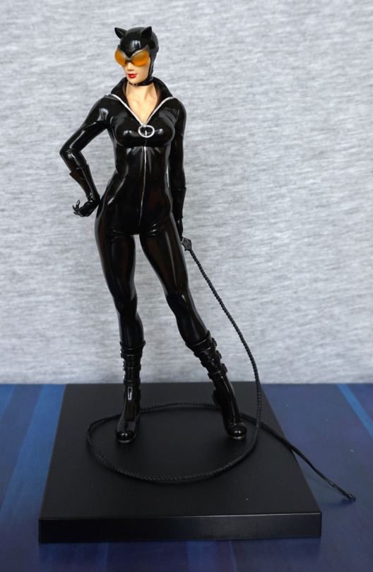
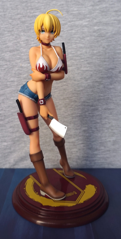
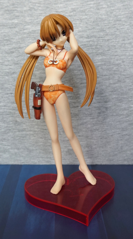
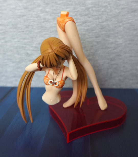
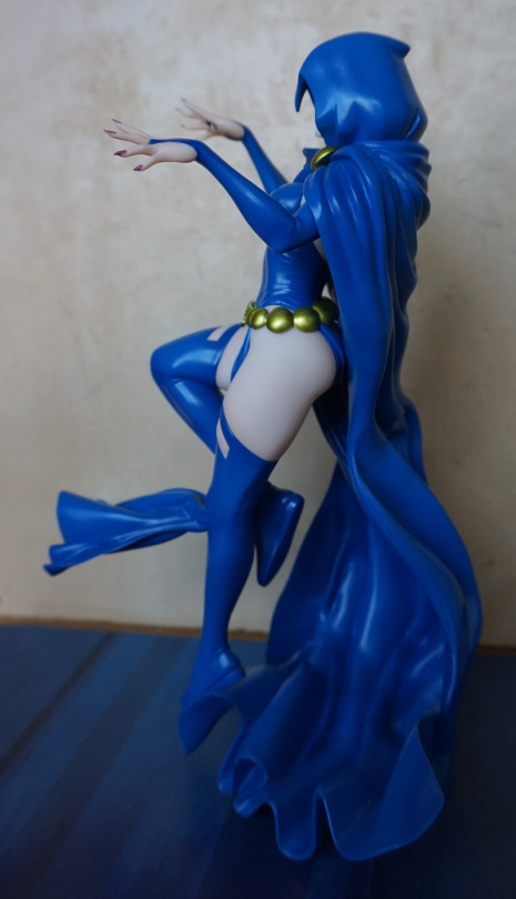
This figure I bought secondhand from another user on MFC.

image

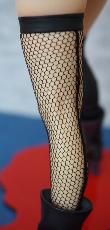
She has a small chip on her leg, that was there when I bought her. She’s a very tall figure and quite heavy, as she’s cold cast. 
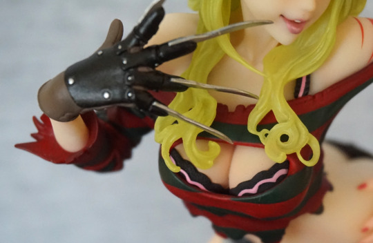
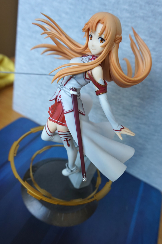
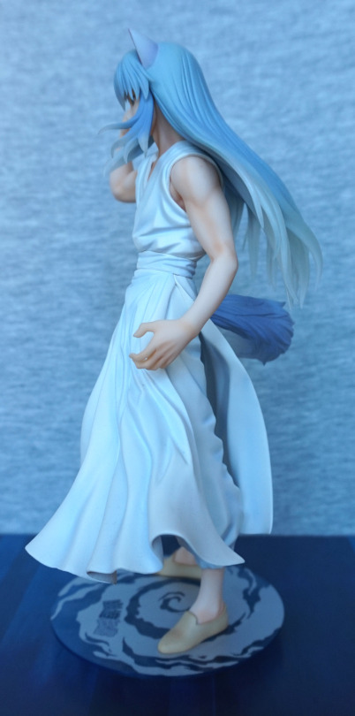
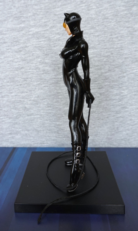
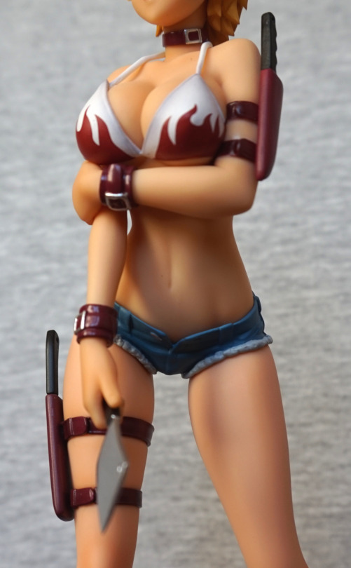
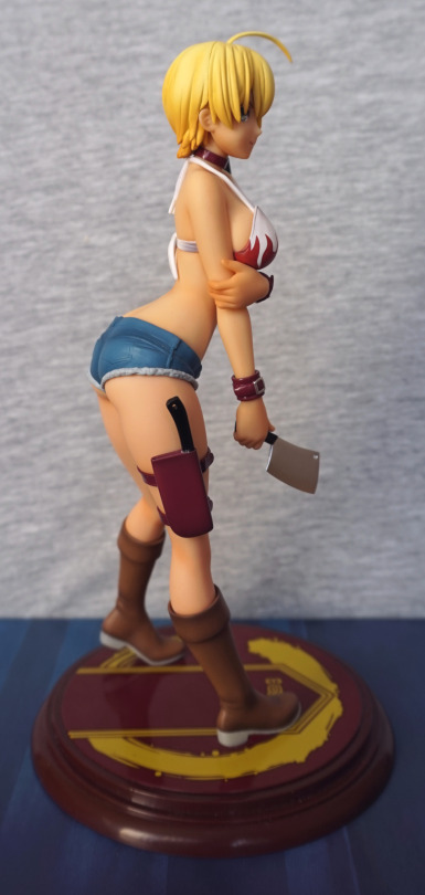
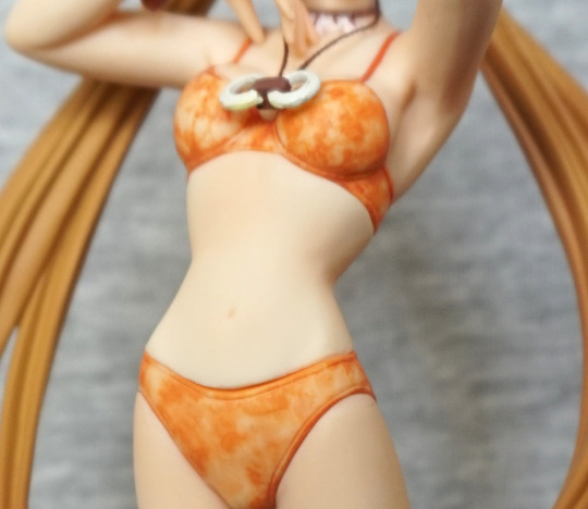
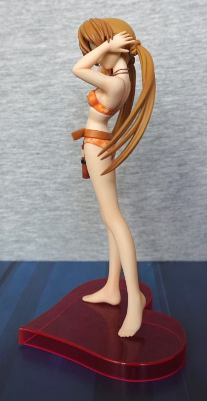
Left view:

image

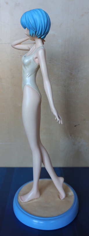
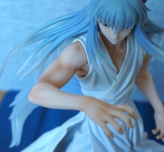
Some detail to be seen here, in her armpit and wrinkle on her swimsuit. 
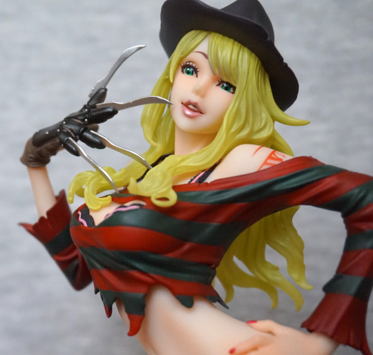
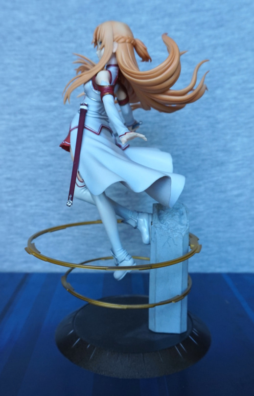
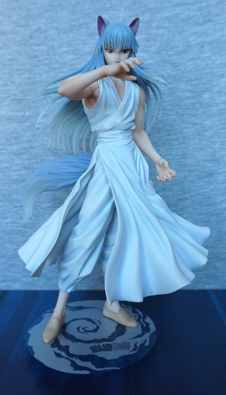
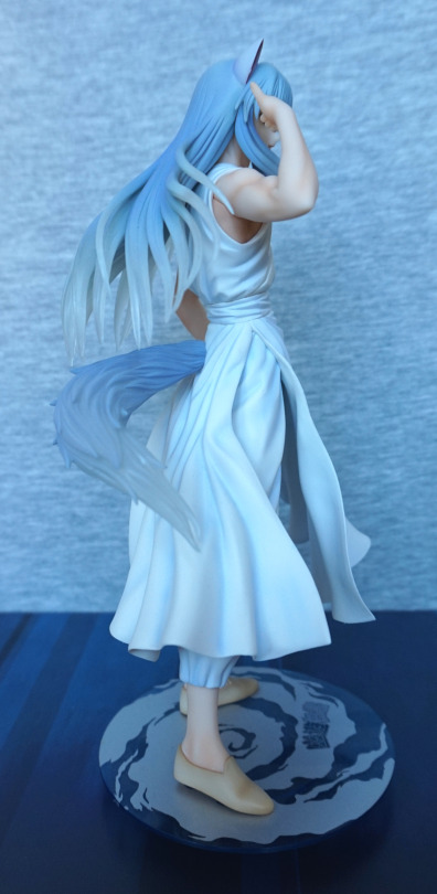
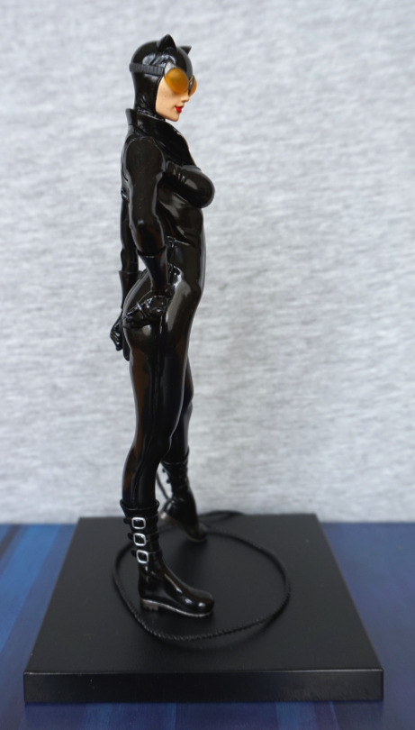
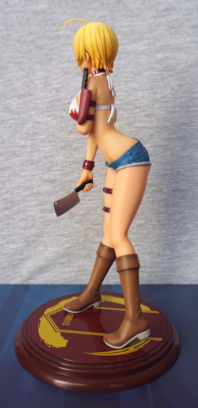
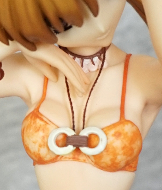
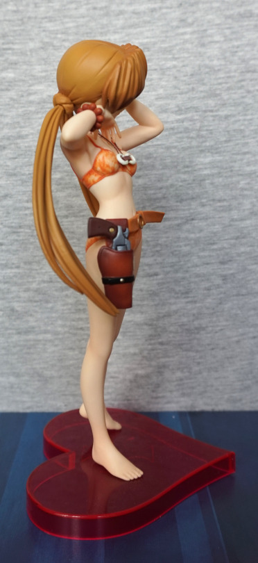
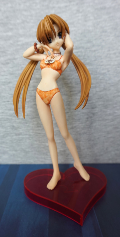
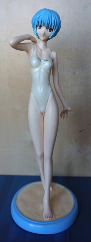
Right view:

image

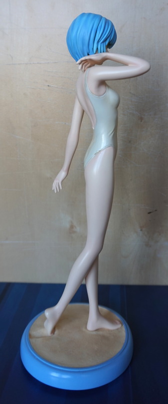
Little bit of a mark here too, at the bottom of her swimsuit. Doesn’t really affect looking at the front of the figure, and that side of her is obscured from where I chose to place her, so I forgot it was there, until I got her out for these photos. 
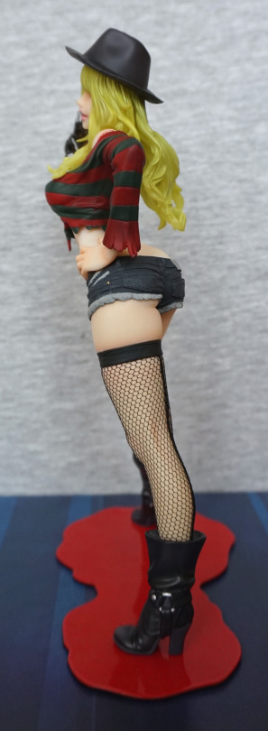
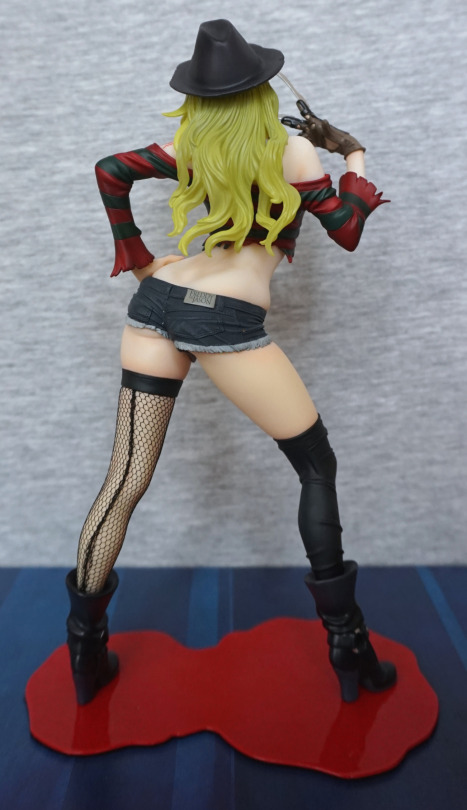
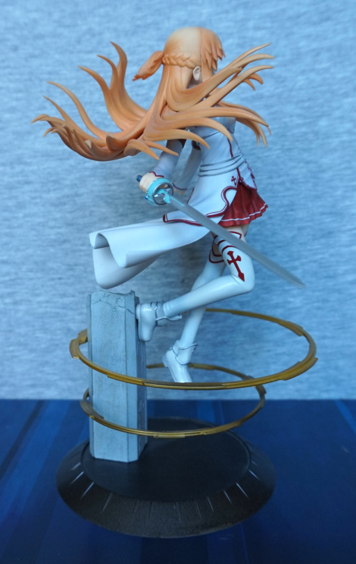
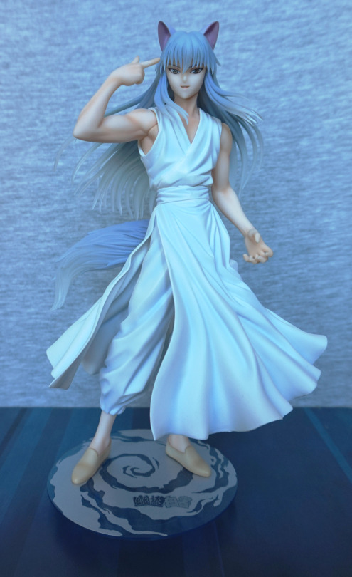
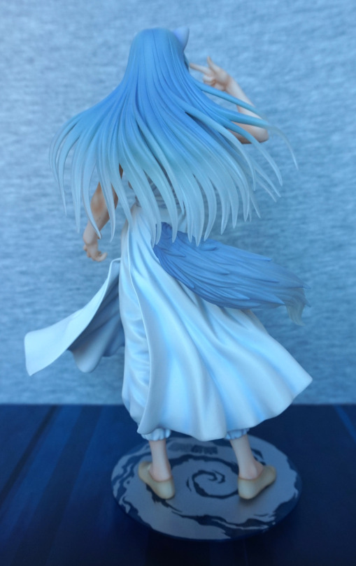
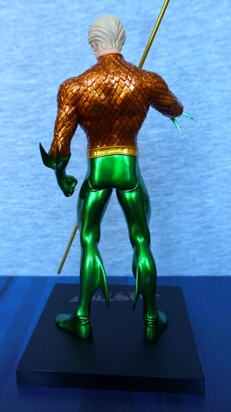
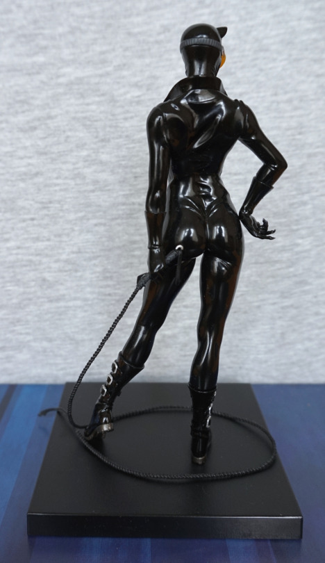
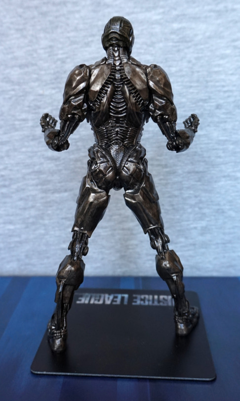
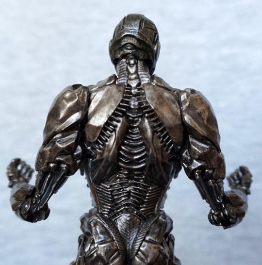
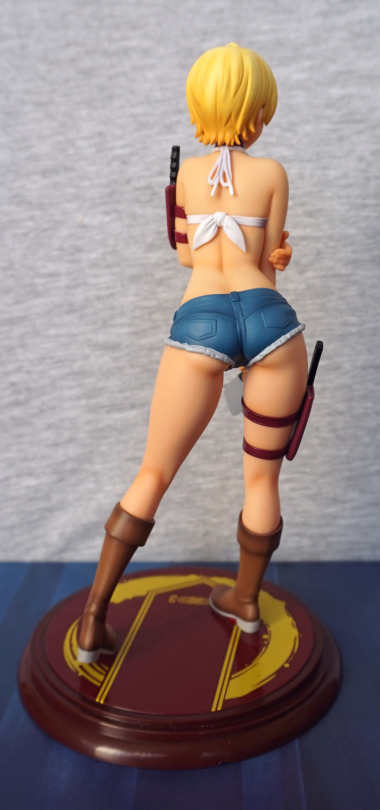
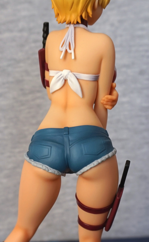
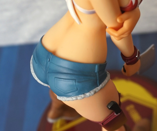
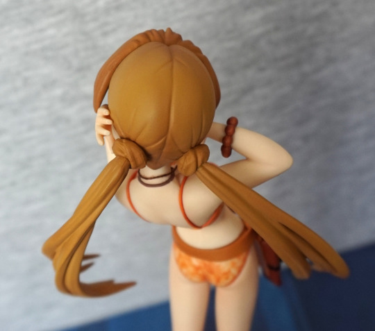
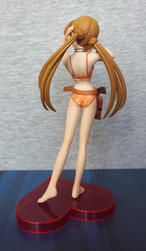
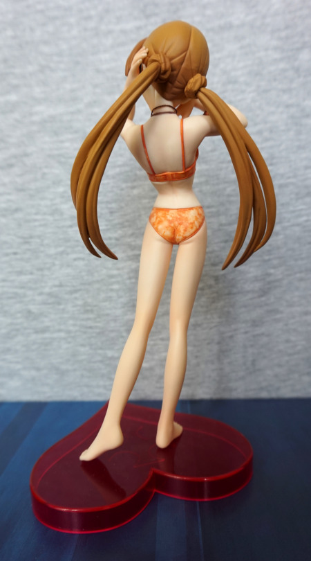
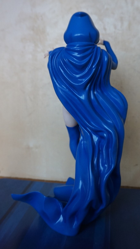
Back:

image

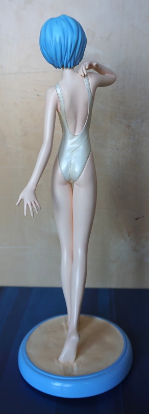
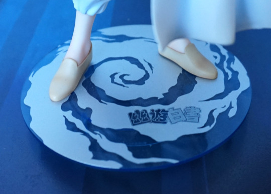
Some detail to be seen here, but nothing that stands out to me. The dent in the sand on the base is a nice touch. Being a heavier material, it does cast some of its own shadows, but there’s no shading in the paint. This leaves her looking rather plain compared to other figures, especially as her skin tone is paler than the concept art for this figure. 

She’s rather a mediocre part of my collection. I don’t regret buying her, but she doesn’t particularly stand out, either. 

Freddy Krueger – A Nightmare on Elm Street – Bishoujo v2

Now for another horror-themed figure – Fredd Krueger, but perhaps not as you’ve seen him before!

This figure is part of Kotobukiya’s Bishoujo line, which has a few gender-swapped characters, this being one of them.

So here he, uh, she is:

A very sultry-looking Freddy. I love the face and the pose from the front. With the second edition, they slimmed down the base and reshaped it a bit, to make it fit with the figure more. The base does the job, but I don’t have many feelings towards it.

Face:

I love the way the lip gloss has been done, and the hair is an interesting effect, but feels a tad green which I find a little off-putting. The glove has been sculpted and painted well. Her top is fairly decent, but doesn’t have a proper ripped effect going on with the edging, which is a minor downside to the figure.

This close-up also shows the issue I have with her body shape – her back looks rather broken at certain angles… especially this one! She’s fine from the front, but some of the side angles aren’t very flattering.

Chest:

Her cleavage has been done well, and I like the cute bra under the top.


Left:

With her arm covering her back, she doesn’t look so broken. Love the dimple in the hat, and the strands in her hair. Her boots are also nicely sculpted, and I think they pulled the ring detail off well.

Stocking close-up:

Her stocking looks especially good on this figure, and they’ve even included the stocking seam at the back, which I thought was a nice touch.

Right:

The blood effect isn’t terribly realistic, and could’ve done with a bit more shading to it. The flat red makes it look kinda bad imo. The shape of the paint works, but there’s no depth to the wound. I think a little bit of an edge would have helped.

Back:

Again, lookin’ kinda bent. However, her back is otherwise sculpted well, and the shorts are really well done. Here the “off” hair shade shows up the most I think, and could’ve done with being a tad more yellow in my opinion. He doesn’t have any hair, so it would’ve been nice to give it a more complimentary shade now he has some.

Shorts close-up:

Love the logo on the back of the shorts! The detailing on these is nice, and the frayed jeans effect I think works here. The stitching has been detailed, which really adds to the realistic look.

Overall, I’m happy with this figure, and glad to have finally got around to getting it. I think the hair could’ve been done in a better colour, which is my main gripe. Seeing as I don’t move my figures around too much, I can display her at a favourable angle, so not too bothered about the oddly shaped back. I think it’d bother me more if it wasn’t for the hair though.

Asuna – Aincrad ver – Sword Art Online

As I don’t have many figures of Asuna, I decided I wanted a scale of her, and this one cropped up on MFC for a decent price. 

Front:

image

I was attracted to this figure by the pose and the golden rings. For this one, I think the promo version looks a fair bit more attractive than the final product, but it’s still a decent figure. I like her outfit and the rings, but they’re not as shiny as the promo version would suggest. The base is also a flatter colour – would’ve been nice to have more shading on this. 

For me, the weakest part of the figure is the hair:

image

It has been nicely sculpted, but the paint makes it feel a bit plasticky. I feel it could’ve done with some darker shades. The rest of the details on this figure though, have been painted decently well, and the lines are nice and clean.

Left:

image

Here we can see her launching herself from the pillar – I do like this pose. They’ve included the braiding in here hair, so that’s nice. The clothes are sculpted well, and include creases.

Right:

image

Here is her sword – this detaches at the hilt. She holds it well, and looks good. Her hilt is also a part that has to be attached. I think this picture also partly captures the plastic finish to her hair. The shading looks nice, and I love the way it’s flowing out in different directions… but that finish… 

Back:

image

Her cloak looks good from the back, and the pillar has paint details from the back. The texture on the broken part of pillar looks good too. 

Overall, I think this figure is decent, and worth what I paid for it. I think the RRP is a bit much for it, what with the hair and the other smaller downgrades from the promo version. She seems fairly available in the aftermarket, and you can probably get her for a decent price.

Yoko Kurama – Yu Yu Hakusho

This figure I’m not familiar with the source material, but I couldn’t turn down a wolf dude, so I preordered him. 

And thus he arrived at my house:

From the photos on MFC it wasn’t clear if the translucent parts were tinted blue or purple – I’d say they’re a bluey grey. Not entirely sure my photos are also clear in this regard – camera felt like nudging the white balance into the blueish range. 

I love the motion in his clothing, and his face is sculpted well. His skin has been given a decent amount of shading, which helps his muscles stand out. I like the effect of the translucent hair, but not sure it works as well as the promo art. 

Face close-up:

I like the ears and his expression. Here we can see the seam where the arm can be exchanged – I like the fact they’ve included an exchangeable part by default (unlike Kaneki Ken…) and the seam isn’t too visible when displaying the figure. 

Close-up of the alternate arm:

I like this arm too, but for the photoshoot, it can get in the way of his face. His tendons are sculpted well on this arm, and the hand looks good.

Front with the alt arm:

As shown by this photo, viewing angle is important if you choose to use this arm part. However, it does make for a better generic pose than him pointing at his head. 

Left:

This arm is also painted well, and has a good amount of detail sculpted on his hand. Clothes also work well, and I like the way his hair flows over his shoulder.

Right:

Here we get a first look at the tail – and it shows why I’m on the fence about translucent hair. It’s a nice effect in isolation, but doesn’t really give the impression of being hair. I’ll just admire the shading on his shoes and feet. 

Back:

The sculpt lines in the hair are well done – it does convey the different hair textures well. Also having the sculpted strands is nice, and adds detail to the figure. 

Base:

The base has a ring underneath, to make him appear as if he’s slightly floating on this wind disc. A relatively simple base for Kotobukiya, but still looks good. The silver print and the transparent blue plastic work well and complement the figure. 

Overall, I’m happy with this figure – there is more paint detail on this one than there usually is for Kotobukiya figures, and well, he’s a wolf dude :P. I’d prefer if the hair was the more purplish colour in the promo photos, but suspect that would be less canon. Looking at images of him, his hair colour does vary somewhat, but probably tends more to grey than purple. Would recommend this figure, if you like his design. There aren’t too many figures of this guy, and the other “main” one has some unfortunate arm seams. 

Kaneki Ken – Awakened Ver – Tokyo Ghoul

This figure I was considering chasing down in the aftermarket, as I liked the design, but then found Kotobukiya was doing a repainted re-release. So I PO’d that instead. 

So here he is:

image

I love this figure, and the base works well with him. The paintwork is really nice, and the upgraded kagune were definitely worth waiting for – I love the transparent plastic they’ve used, and think it looks much better than the pictures of the original that I’ve seen. 

He also has some nice paint details, with the shading on the shorts and his nails being painted. 

Face:

image

One mini-controversy with this figure is they didn’t re-release the bonus head – you can use it if you have it, but you’ll be relying on sourcing the old release. I’m not too bothered about it myself. The head itself is painted well, and looks good in isolation. 

Close-up of part of the kagune:

image

Shiny, glossy :). We can also see some paint shading on his hand here too. 

Left:

image

Lotsa kagune. I like the way his feet are posed, and standing on the rock. 

Right:

image

His pose, what you can see of it, looks good from this angle too. The broken handcuffs are painted well, and have a sense of motion to them. 

Back:

image

The back of his shirt is sculpted well, and you can also see the band for his mask back here. The kagune comes out nicely from his back, pushing his shirt out of the way. 

Overall, I’m really happy with this figure, and definitely think this is one of Kotobukiya’s nicer figures. Worth the price I paid imo, though he will now have gone up in the aftermarket. Would recommend it, and not surprised it’s gone up in the aftermarket. 

Aquaman – Justice League

This figure I was on the fence about buying, and decided to go for it, before I lost the opportunity to get it at a reasonable price. 

So here he is:

Whilst I’m not much of an Aquaman fan, I like the shininess and the colours of this figure. The copper-green colour scheme is very eye-catching, especially with the metallic effect paint. The belt has also been sculpted well, and complements the figure. 

One thing that’s a pain is his trident:

It looks nice, but he doesn’t hold it too well – it’ll easily slip through his hand, which makes it awkward if you’re moving him off the shelf… To remedy this, I’ve used a balled-up Glu Dot on his hand to hold the trident in place. I have him displayed slightly above eye-level, so the Glu Dot isn’t visible, but I don’t think it’s even that noticeable in the above shot. 

Face:

I like his face – not sure what it’s supposed to look like, but I think it has been done well in terms of general sculpt and paint. The hair has a nice sculpt to it too. We can also admire the edging on his collar here too. 

Base:

The base is the standard Artfx+ affair, with the Justice League logo, rendered nicely in silver. The base is magnetic, as these figures have magnets in their feet to hold them to the base. For him, the magnets aren’t strong enough to pick up the base, but it does help him stand up for sure. 

Left:

I love the curved parts on his suit, and the glossiness of the green. Almost think his gloves could’ve done with some kind of edging to make them less plain though. They feel like they end prematurely somehow. His sideburn is well done on this side though. 

Right:

The join on his leg is pretty noticeable from the side. Probably the largest flaw with the figure, outside of his slippery weapon and the fact it’s Aquaman. Still liking the fins on his outfit. 

Back:

Bit of a square arse… Not sure what’s going on with that. Especially with the creases moulded underneath on his legs, it seems to emphases the odd shape  :(. I think the rest of the back of his legs looks OK, though the shiny patterns do make it look a bit like he’s got rubber-legs. For his back, I think it’s better ignore most of him from the waist down, but the suit top texture looks good, and his hair looks decent enough. 

Overall, not a bad figure, but not worth RRP. I’ve usually seen him for sale around the £35 mark, which is a fair price. I think with the lack of extra colour and shading that other characters get, maybe he should have been given a lower price point out of the gate. 

Hresvelgr & Ram – Frame Arms Girls & Re:Zero

Another couple of gashapon today. 

First up, Hresvelgr:

image

Here we have one of the Frame Arms Girls creeping out of their box. This series is ordinarily model kits by Kotobukiya, so this is what these are based on. The boxes for model kits often look like this – a plain cardboard bottom, with the artwork printed on the lid. 

Front:

image

Aww, cute face. The reason I went for one of these gacha was because they looked so cute in their boxes.

Sides:

image
image

Paint’s a bit messy, but does the job. 

image

Top of the box isn’t a replica of the model kit boxes, but does a good job of replicating the feel. 

Ram from Re:Zero:

image

At the time I went to Japan, there was a lot of Re:Zero merch about the place, but I haven’t seen the show. I decided the gashapon looked pretty, so decided to go for one. And I got Ram. Personally, I prefer Rem, due to the blue hair. Overall, the paint on this gashapon is OK, but a bit blobby on her hair. 

Other photos:

image
image
image

I think this gacha has been sculpted decently well, and would make for a nice charm. 

Catwoman – New 52 – ARTFX+

This figure was pretty much an instabuy when I saw it… after some price-checking.

So here she is, out of the box:

They’ve nailed the shiny outfit she wears, though the zipper doesn’t feel super-detailed. I like her pose, as it conveys her confidence and strength. Her collar also looks nice, and her lipstick is painted well. The base is the standard Kotobukiya magnetic stand that they use for their Western property figures.

Left:

Here we can see she is endowed, but not overly so. There are a couple of creases in her outfit, and her buckles on her boots are painted well. Here we get a look at her whip – this is mostly a cord, which looks OK at a distance, but would prefer if it was something with a poseable wire.

Right:

Her small ears on her hood work well. Buckles on this side are also well painted and sculpted – I like the way they’re not perfectly even. Here we can also see her spiked gloves, which look good.

Back:

Here we see a bunch of creasing in the back of her outfit – I do like the fact they have sculpted it like this, instead of totally flat, like most Catwoman figures. The band for her goggles looks a little odd though – just doesn’t feel like it’s any particular material.

She also has switchable goggles, here is a close-up of the ones used in the above figures:

These goggles are pretty decent. Please ignoe the dust on her chest… Here we can see the lack of sculpt detail in the zipper, above the zipper itself. Would’ve been nicer if the teeth of the zipper were more defined.

Without glasses:

Her eyes are painted well, though her eyes do look a little bloodshot, as it seems the eyelid edge paint went a bit walkies into the whites of her eyes. If you look just above her eyes, on the sides of her hood, you can see the indentations that the glasses attach to. Looking at the zipper pull in this shot, it does appear to be a bit distorted.

Alternative glasses:

After trying these pair of glasses on her, I think these are the ones I will display her with. I like the way they are see-through, so you can see her eyes. The orange colour is nice too.

Overall, this figure is fairly decent, but does have a couple of flaws. I could recommend it at a good price, but not worth an inflated aftermarket price. Personally, I quite like this figure, and am happy to add another Catwoman to my collection.

Cyborg – Justice League (2017) – Kotobukiya

This figure I found was for sale at one of Mandarake stores I planned to visit, so put it on my “to buy list”.

And then bought it:

Whilst the film was a pile of poop (watched it on the plane), I quite like the design of Cyborg. Not convinced it rivals his comic book look, but I like it on its own merits. What I like about it: the red accents, the wires near his chin, and a couple of other details on his upper half. What I don’t like: The midriff feels overly fussy, his legs feel too “robot”. 

Face:

His face is nicely sculpted and painted, and I think Kotobukiya did a good job of this. The metal part fits well. His hair, however, looks rather on the painted-on side, which spoils it a bit. I really like his upper chest with the angular parts, red glow and wires. Love the show-of-strength pose. 

Stand:

The base is magnetic, so he sticks well to it. I like the logo, but the base being thing looks like more like a cheap coaster than a base for a figure. Wish they went for the thicker style the other western Kotobukiya figures came on. 

Left:

The pose doesn’t feel overdone from this angle, which I  like. The sculptwork is really nice and looks good from this angle.

Right:

The expression fits the pose from this side, but the hair being a bit shiny looks odd. ‘tis my main niggle with this figure. The shading on the metal parts is really nice and give it a lifelike feel. 

Back:

I really like the design of the back, and think it works better than the front… but that’s more DC’s fault. The fin effect is a lot less fussy than the randomness on the front, and the metal places help accent it. The shielding on the spine looks really good to me:

Here we can also see the number of paint effects going on, on the metal parts of the figure. I think they did a really good job with that. 

Overall, I think if you like this figure mostly relies on if you like DC’s design. Apart from the hair, I think Kotobukiya did a good job of recreating Cyborg in figure form, and am glad to have him, even though the film is poop. 

DC, stop making crap movies kkthx!

Mito Ikumi – Food Wars – Kotobukiya

This figure I tried to buy off the seller once before, but he changed his mind about selling. Then a couple of months later I saw him selling it again – kind of surprised he didn’t message me, seeing as I was willing to buy before, but ah well, messaged him and bought it.

After spending a week at a drop-off point before bring collected, she finally got to me:

And I’m definitely glad to have her in my collection. She comes pre-attached to the base, so all you need to do is give her her meat cleaver and she’s all assembled. She also demonstrates two of the things I tend to like about Kotobukiya figures – the bases are never plain, and the ‘clean’ art style and colouring that can make these figures stand out.

Close-up of her face:

She has a good smile to her, and nicely shaded hair. Her outfit is painted cleany, and looks true to the character. Her body is nicely sculpted with her collarbones and her boobs which don’t feel too overly large. The silver buckles on her straps contrast nicely and are painted well.

Close-up of her stomach:

She has a crease above her belly, and her pelvic area is sculpted, which helps her body look realistic. I also like the way her shorts are unbuttoned, but not revealing anything. The shorts have a decent amount of detail, and are a pleasing shade of blue, that compliments the figure.

Left:

Her pose is leaning forward slightly, which I think works well. It gives off a sexy vibe, without overdoing it. Her body looks trim, but not muscly, which fits the character for me.

Her boots are nicely shaded, and look like a comic version of leather, which fits the style of this figure.

Right:

Here we can see where she is holding her right arm with her left. The fingers are posed very naturally, which I like. Here we can see her larger holstered cleaver – I like these details, but these knives aren’t ‘real’, so you can’t take them out. Kinda wish you could, and decide which knife/cleaver she is holding, but it’s not a biggie.

Back:

Her back has a good amount of detail to it, with the back of her top and her shorts having pockets.

Let’s have a closer look at her upper back:

A bit of flashing or spare paint is present in the upper knot of her top. Not a dealbreaker, but a bit sloppy. The lower knot is a lot neater imo. I like the way her spine has been shaded on the back too.

Backside:

Showin’ a little crack, I like the way they’ve clearly made the shorts as a separate piece. So many figures don’t have the clothes as separate pieces, so I really like it when a manufacturer does something like this. It makes a big difference to a figure imo. She might not be big in the backside department, but I think they’ve done a good job with it. The shors are really nice, with the pockets and the blue shading. There is some slightly “off” paint where the short trim is – believe this is supposed to be frayed jeans, and the shorts are cutoffs, but the effect doesn’t quite work for me. It’s a hard thing to get right, but it’s not something I’d expect to be excellent on a Koto figure. Does look a bit more like a wool trim though – think they’d need more dark blue lines in it for it to work better.

Overall, I really like this figure and glad to have it. Food Wars doesn’t have a lot of figures, so it’s nice to have a decent one in my budget. I did look at buying the Alter one, but I didn’t want to spend twice the money on a Mito Ikumi figure. If money was no object, the Alter one is likely to be a decent bit better and more realistic in its appearance, but I think this one is a solid substitute if you don’t want to spend so much.

Sakuya – Sister Princess

Another “bargain” purchase from the same retailer as Barnaby. This one I tried to find pics of online… but came up blank. So decided to go for it anyway. 

So let’s see what she looks like:

image

Her swimsuit is a nice marbled orange colour. From the prototype pics I couldn’t work out if it would have a shiny effect – turns out not, and I think it works fine as-is. The fabric necklace was a nice surprise – I like mixed media touches like this. What is disappointing about this figure for me, however is her hair – it dangles very significantly over her face, and you don’t really see much of her face. In the prototypes they’ve lit her in an unnatural way so there isn’t as much shadow. Displaying this figure, you’re likely to get a decent amount of shadow over her eyes. What compounds this lighting issue is the dark colouring of her eyes – when strongly lit from one angle, this causes her face to look overly plain as it overemphasises the light areas. You can also get the same effect from viewing her from above, where you can’t see anything but face. 

Let’s have a close-up of her face before we move on from it:

It’s not a bad face when viewed close. Just something doesn’t quite work between face and hair. She’s quite cute when viewed from below. 

A closer look at the necklace:

… and the chest. There’s some lifting going on with that swimsuit, despite what those bra straps are saying :P. It does give her body more definition, so I think the curvy boobs are needed. OK, back to the necklace… she has one painted onto her – here the paint does look messy on it, but this really isn’t visible when looking at the figure normally. Here we can see the binding is painted on, and the string simply inserts into this part. Had me fooled until I looked at this photo, lol. And I’m thinking the marbled paint on her outfit is the best feature of this figure. 

In terms of painting, this figure does lack in the body shading department:

This isn’t just my photo-editing whiting things out – as far as I can tell, there isn’t any paint shading on her body, or what’s there is incredibly subtle. She does have some sculptwork that’s gone missing in the editing of this photo, but it is pretty subtle. Imo her stomach could’ve done with a small amount of shading to bring out the curves in her body. 

Base:

A fairly simple base, but I love the heart shape. Contrast got upped a bit too much here, and it’s more of a “red red”. I think the colour complements the figure. 

Left:

Here we see the sculpting carrying the figure. Her pigtails are mostly the same colour, barring the tips. She has nails sculpted, but I think they’re the same colour as her skin. Her toes are definitely not painted in a different colour. 

Some more of her hair:

There is some shading up here, but it’s pretty subtle. Could’ve done with some darker paint all the way down her crown. 

Right:

The gun and gun holster are painted nicely! We have some shading here! And I’m pretty sure she’s knotted her hair to get it into pigtails. Not sure how she managed that, can’t imagine it’s too practical!

Back:

Some distinct join going on under her top. Looks a bit too, erm, linear to be the top pressing into her imo. Backside is sculpted well though. Again, no shading in the paint on her back or legs. 

Time for a break:

Bwah! This is how she comes apart, so you can put her holster on her .

With mine I think I need to have the holster on her:

Due to her leaning back pose, the upper half of her leans back a slight amount, giving a bit of a gap. Fortunately I prefer her with the gun. 

Back, without the gun:

Here the joint is OK. Not sure how prevalent this issue is, as I only have one, and well… there’s a lack of pics of her on the internet. But I’d be prepared to mod her joint to get her upper half to sit fully upright. 

Overall, I wouldn’t recommend spending a lot on this figure. I paid £18, and I think I got my money’s worth. She’s a bit above a prize figure – she doesn’t have the shiny plastic that plagues prize figures and the paint that is there is well-applied without flaws, but equally well she has a lot of areas where the paintwork could’ve done with more detail. Also she’s a short figure, as she’s a fairly short character – she measures just under 18cm without the stand. If you like her simple, clean look, then maybe consider her, but I don’t think I could give a strong recommendation for her. Maybe if you have to have all the Sakuya figures?

Wasp – Kotobukiya Bishoujo

The day before I went to FACTS, I went to a handful of comic book shops and Japanese merch shops in Belgium.

First purchase was Wasp from Super Dragon Toys, as she was on sale. Had seen her clearance in the UK, but didn’t get her as I wasn’t sure if I liked her. Seeing her in person made me decide I wanted her. So here she is:

image

I love the happy expression, and the shiny wings. The gold has also beeen superbly done – gold can often look poor on figures, but here, it’s a good hue and shiny. 

Close-up of her face:

image

Love the shiny lipstick and moulded mouth. She’s also got some shading painted into her eyes, which is a nice touch. Her hair is sort of simple, but nicely sculpted. Here we can also see a couple of creases moulded into the neck part of her suit, giving it a lifelike appearance.

Close-up of the base:

image

A nice, creative base. No solid-coloured disc here. The splash looks good, with the blue fading out towards the droplets. Also some ripples on the disc part of the base, so it isn’t just flat. The colour complements the figure imo.

Right:

image

Here we see the bulk of her outfit – I love the gold piece running down the middle, and the gold on her palms. The suit itself also has a few well-placed creases, to show it is indeed a bodysuit. 

Left:

image

Here we can see where the wings peg into her back, and the paints nicely match up. And her shapely backside – she has a pear shape goin’ on here. 

Close-up of the gold on her shoes:

image

I don’t think she has much grip on the floor, but the finish is nice and gold colour attractive. 

Back:

image

This shot shows off some of the iridescence of the wings. I love that they’ve managed to make the wings iridescent – it shines quite well, and looks great in the sunlight. 

Her hair looks good from the back too. 

Close-up of the wings:

image

This is definitely one of the features that attracted me to buying this figure. More figures need iridescent parts! And well-done gold parts! 

Overall, I really like this figure, and kind of wish I bought it sooner XD. Might’ve got it for a bit cheaper, but hey, I have her now!

Figure Spotlight – Kotobukiya Raven

This was a figure that I had to have, once I saw it. Not sure what time elapsed between the wanting and the actual buying – think I did have to wait for funds – but this is a figure I really like. 

image

And here she is, casting a spell at you :D. The paintwork is really nice on this, and the sculpting has nice, bold lines without being overly fussy. Also move the smile on her face. 

Here’s a shot showing how she stands:

image

The cape is also her stand – this was one of the things that drew me to this figure – the fact she doesn’t need a plastic disc to stand. And she stands up sturdily too. 

Here’s the cape from the back:

image

Imo the cape looks nice from every angle, and doesn’t look ‘tortured’ into being the stand. I can see people not liking her shiny, blue look, but I love the colour, so it doesn’t detract for me.