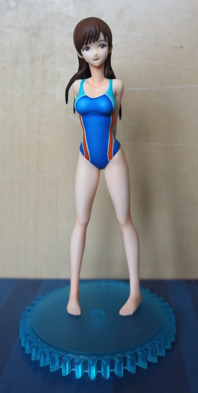
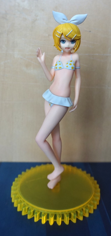
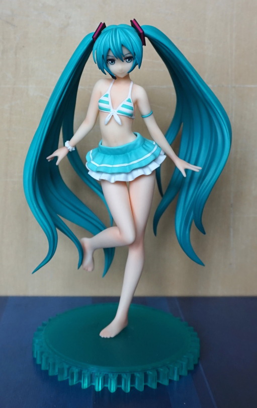
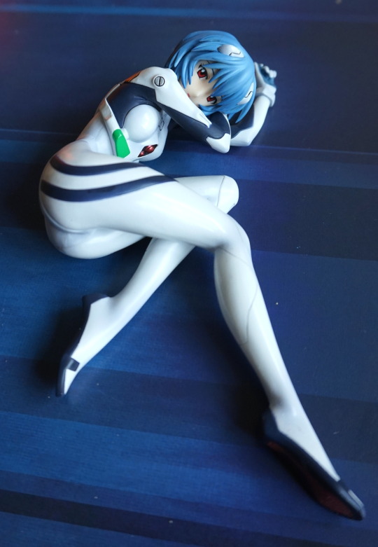
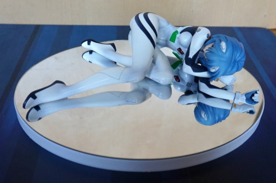
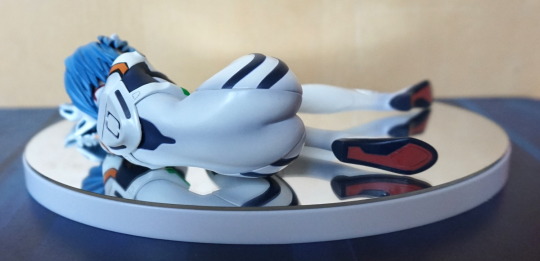
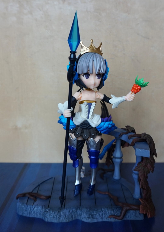
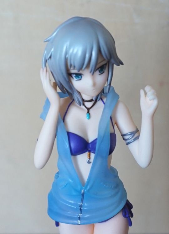
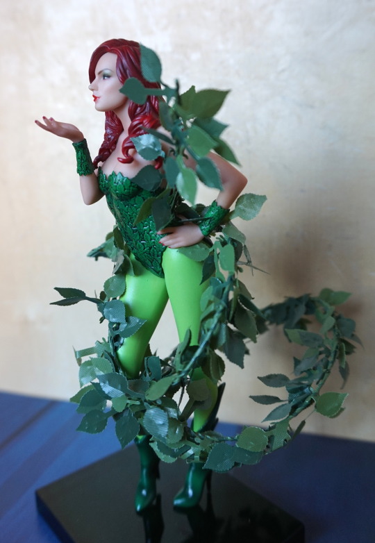
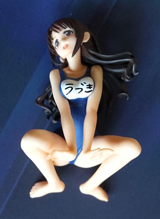
This is the last of the three Idolm@aster figures that were released together in the S-Style series. I planned to get this one anyway, as her pose was rather different from the rest of the S-Style figures.
So here she is:
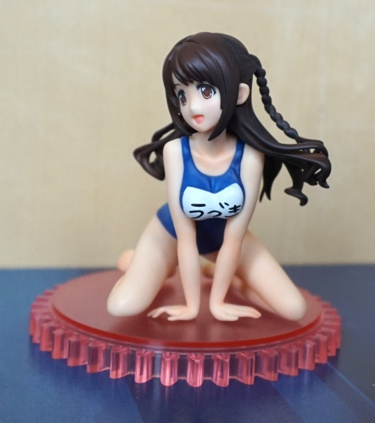
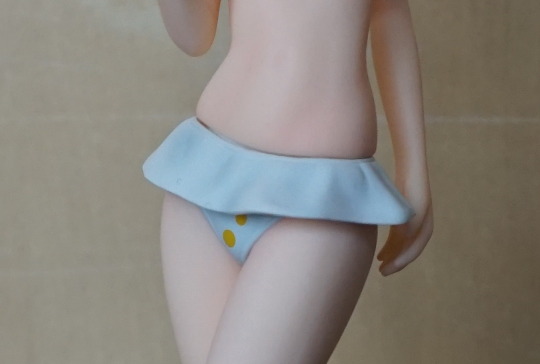
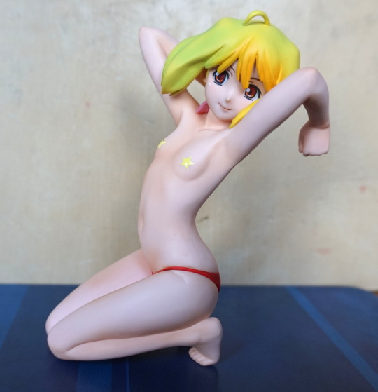
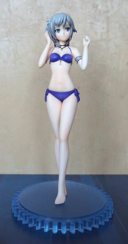
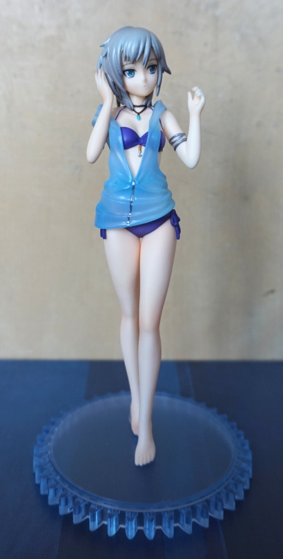
I love her smiling face, and the blue of her swimsuit is a very nice colour. Kinda wish the base matched her swimsuit more, or they matched the stands for the Idom@ster figures. Due to her pose, she’s very tiny though.
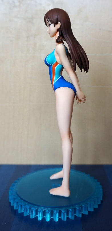
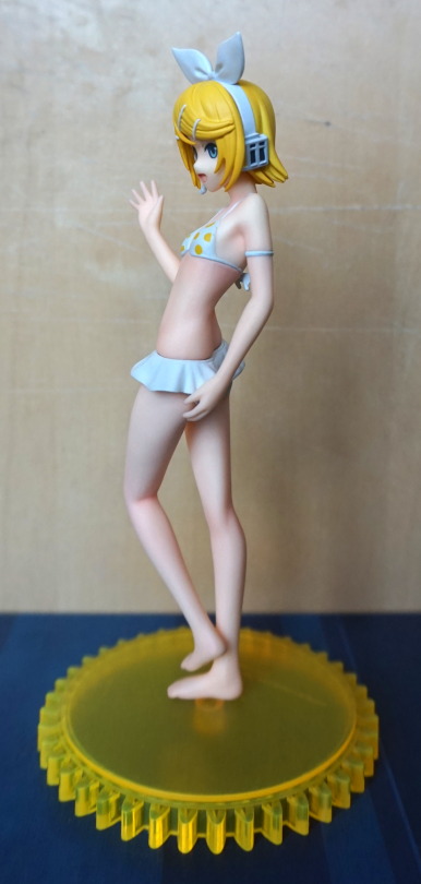
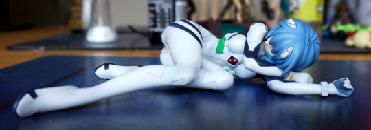
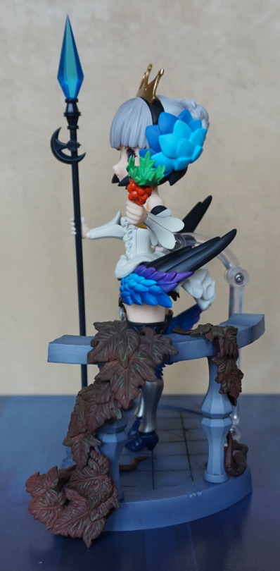
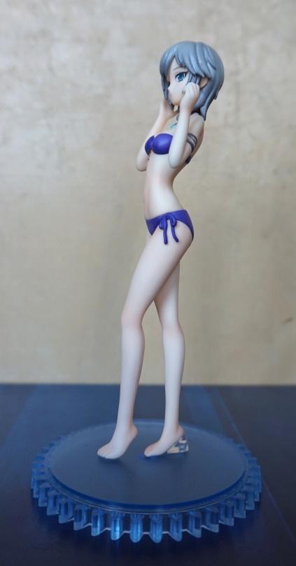
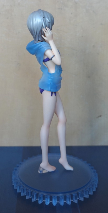
Left side:
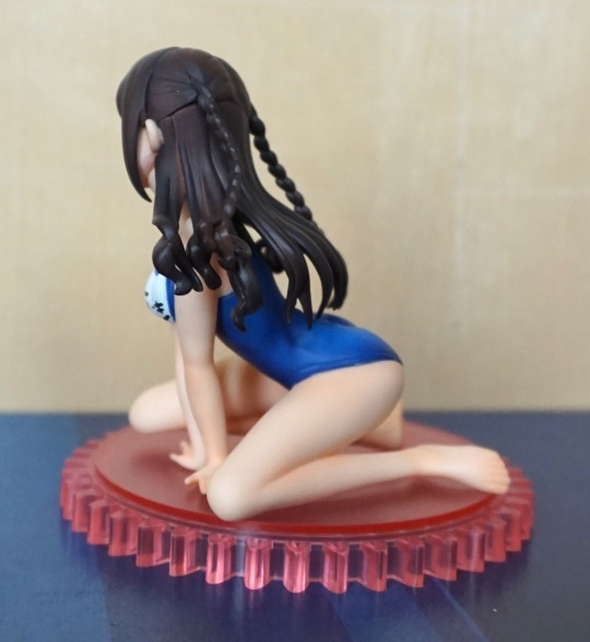
Her hair is nice and detailed, but evidence of seams, which is a bit of a shame.
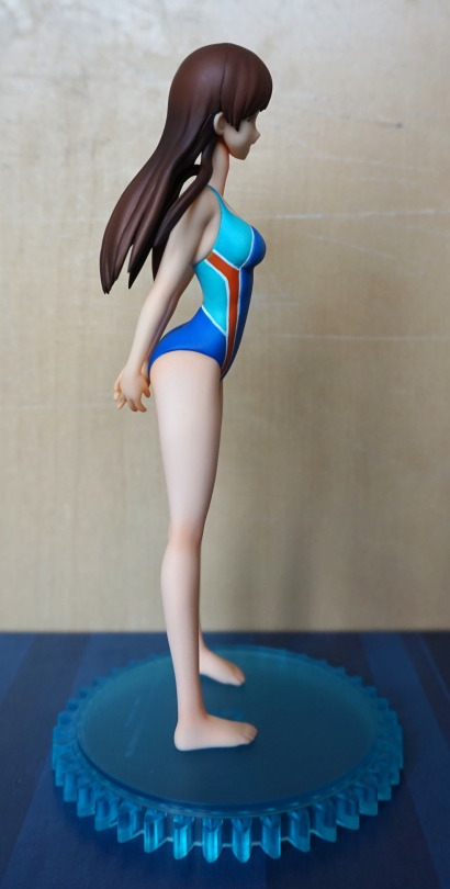
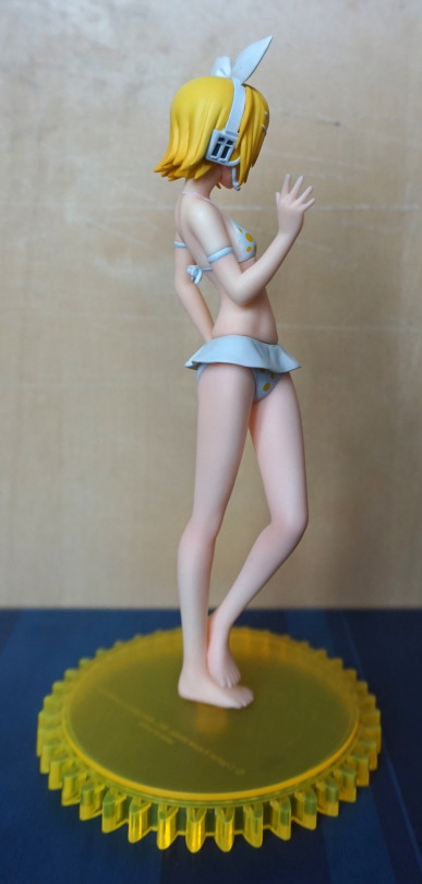
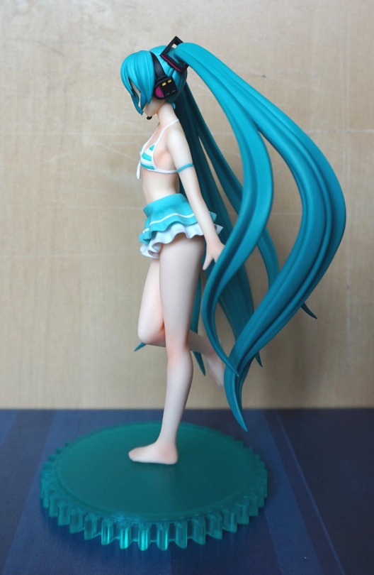
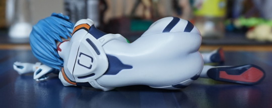
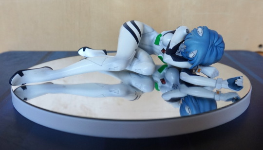
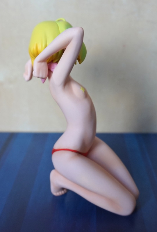
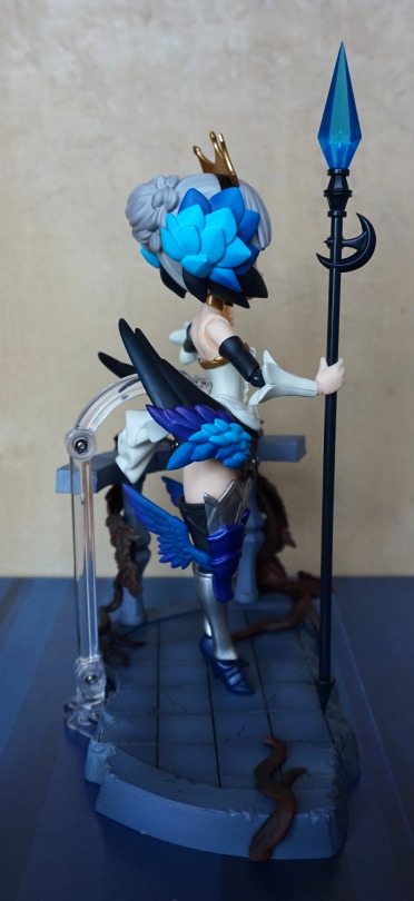
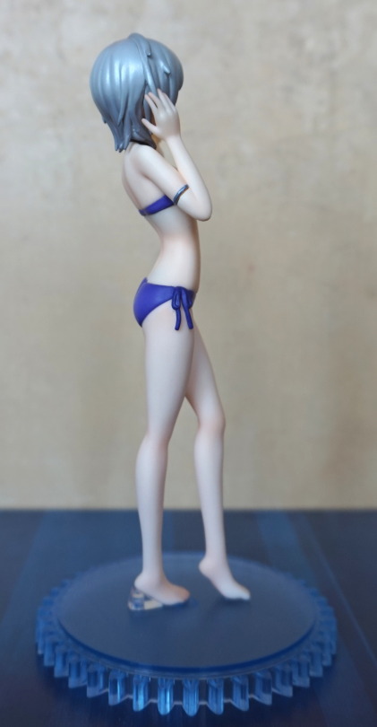
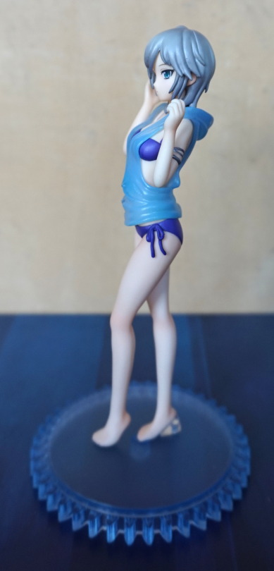
Right side:
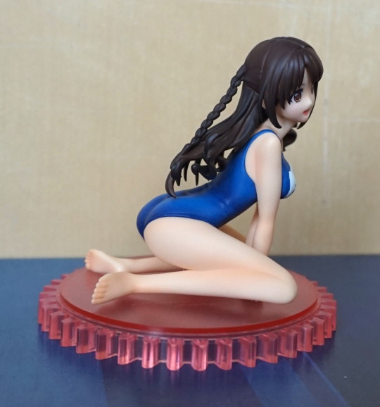
This side looks much nicer, and showcases her hair better. Some nice shading on the swimsuit, plus some wrinkle lines on the suit.
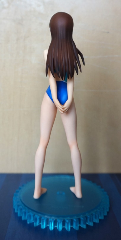
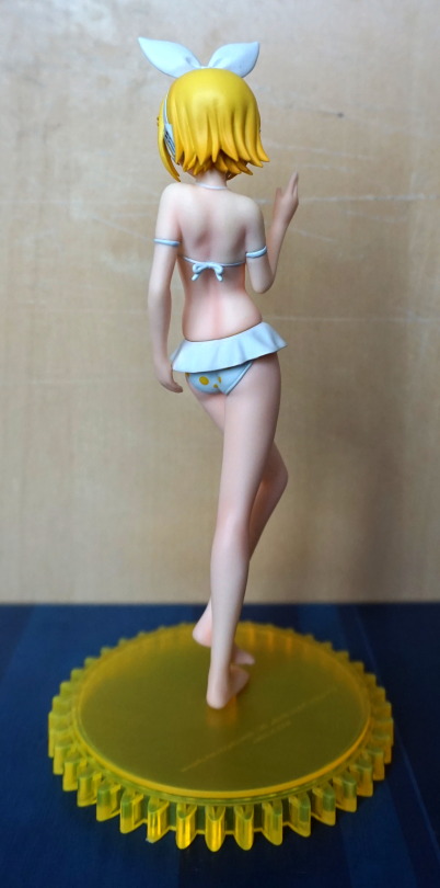
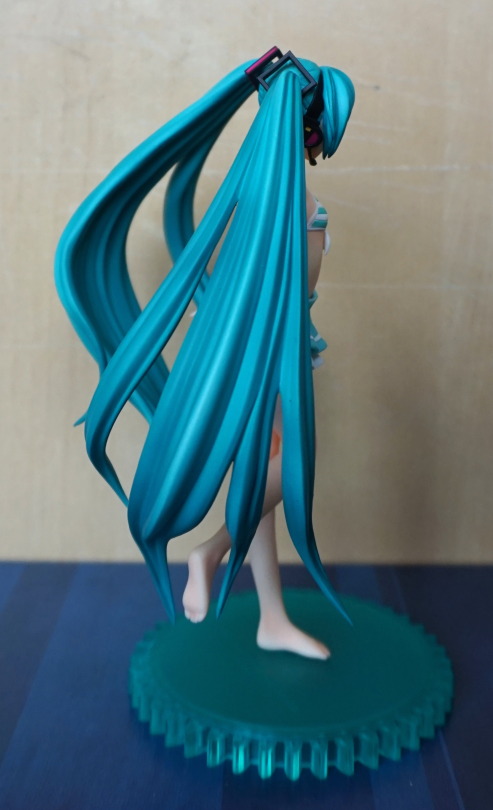
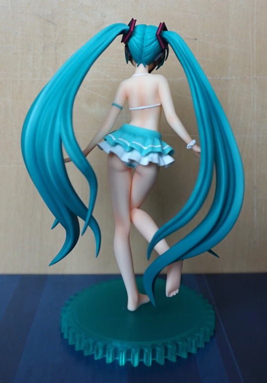
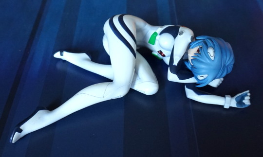
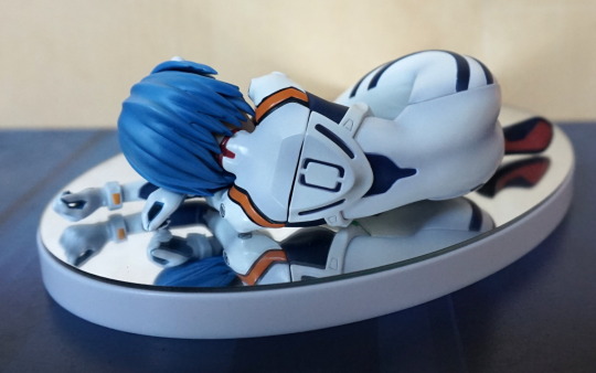
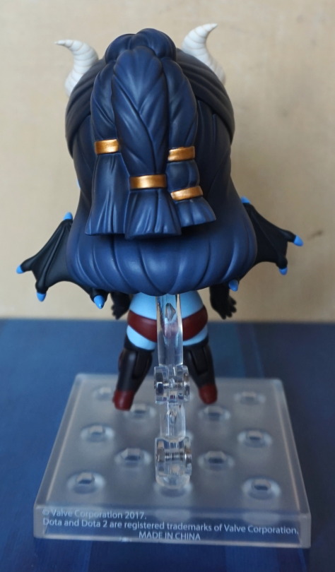
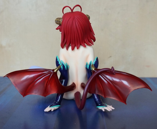
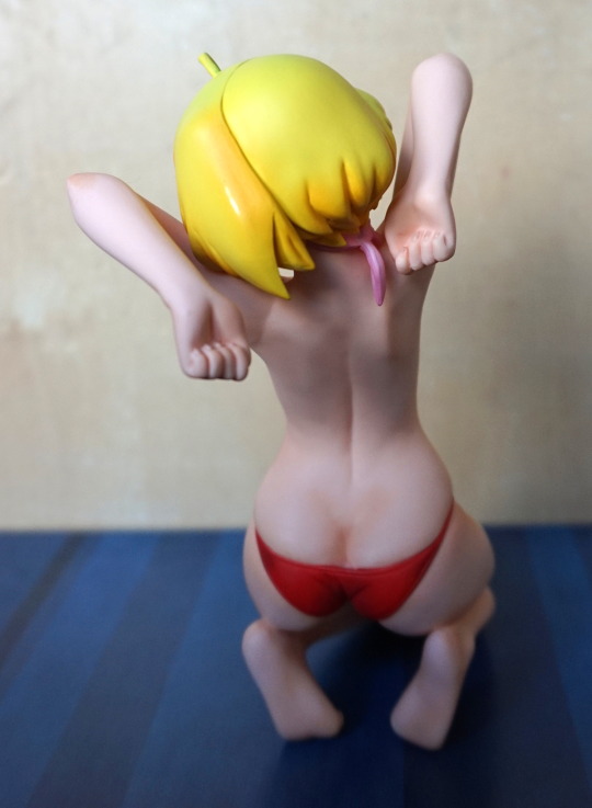
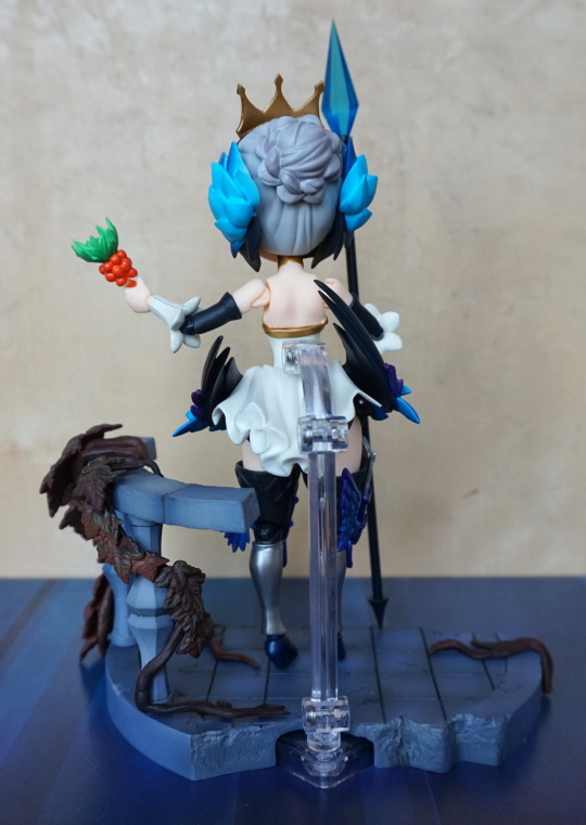
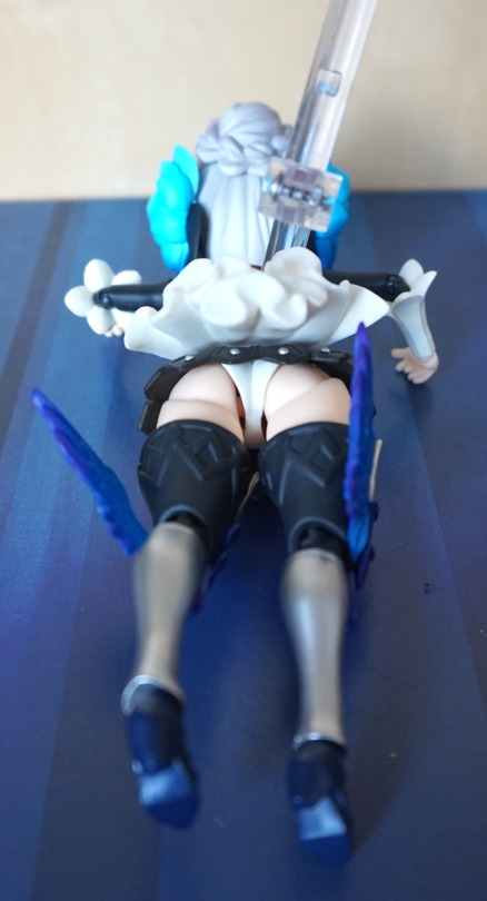
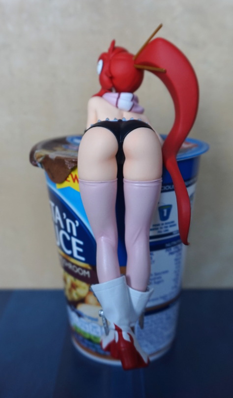
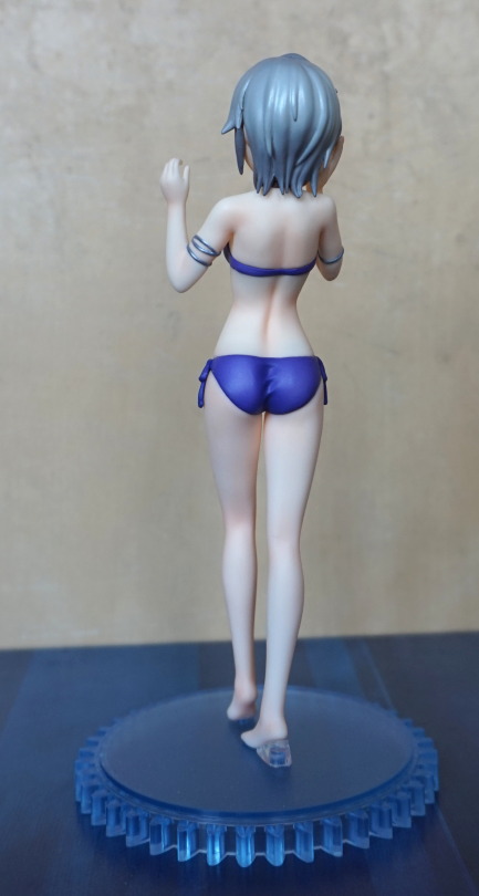
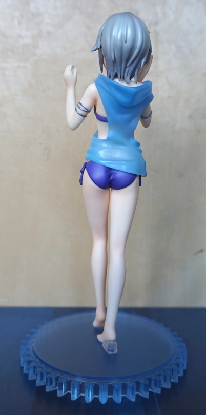
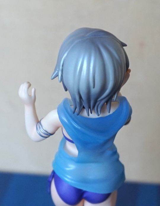
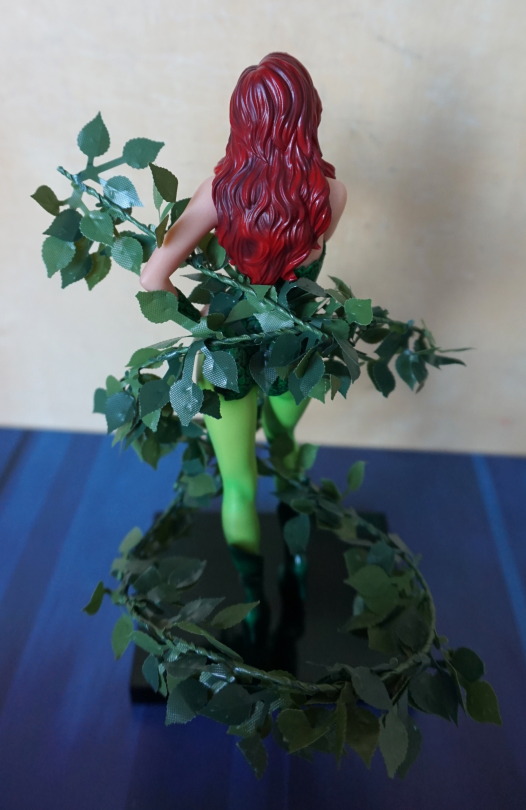
Back:
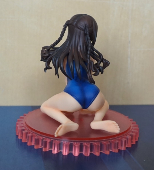
Her hair in detail! Probably a little on the shiny side, but her backside has been sculpted well.
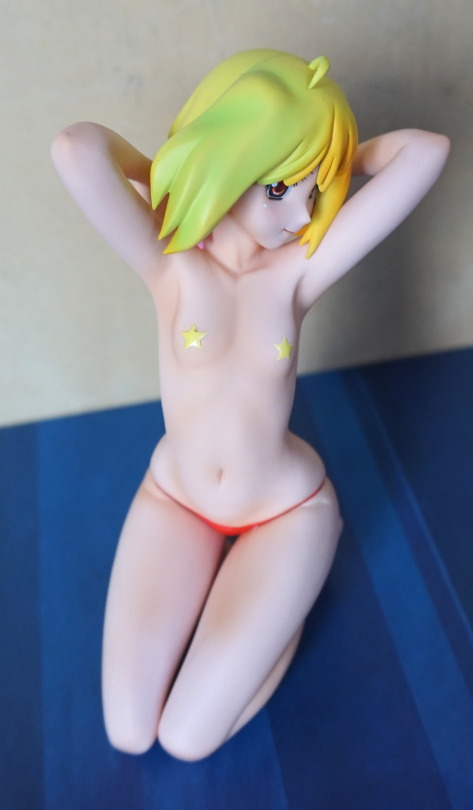
Top:
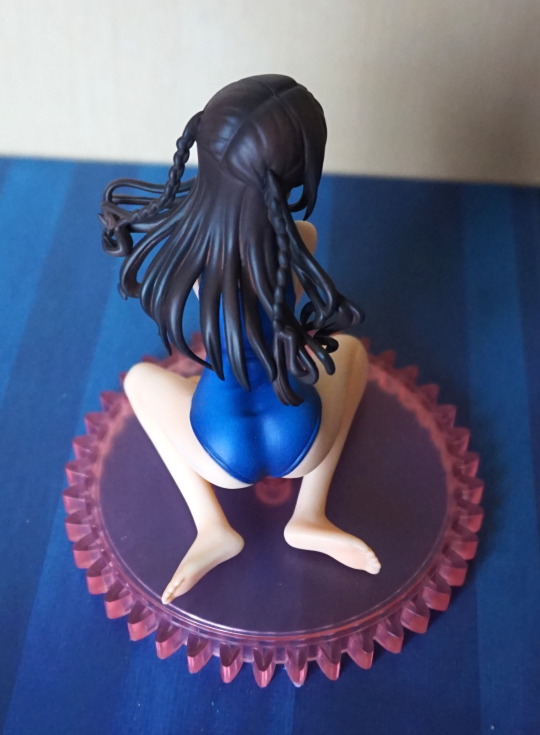
This shows the main issue of the hair: the sudden change between the hair on the top of her head, to the hair lower down. Her back looks nice though.
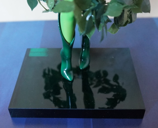
Underneath shot:
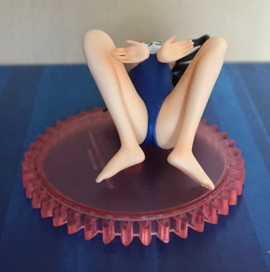
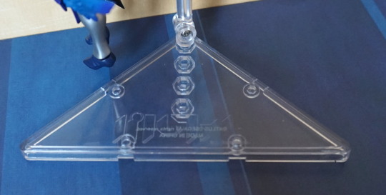
She doesn’t have any pegs to hold her to the base, so you can sit her wherever :).
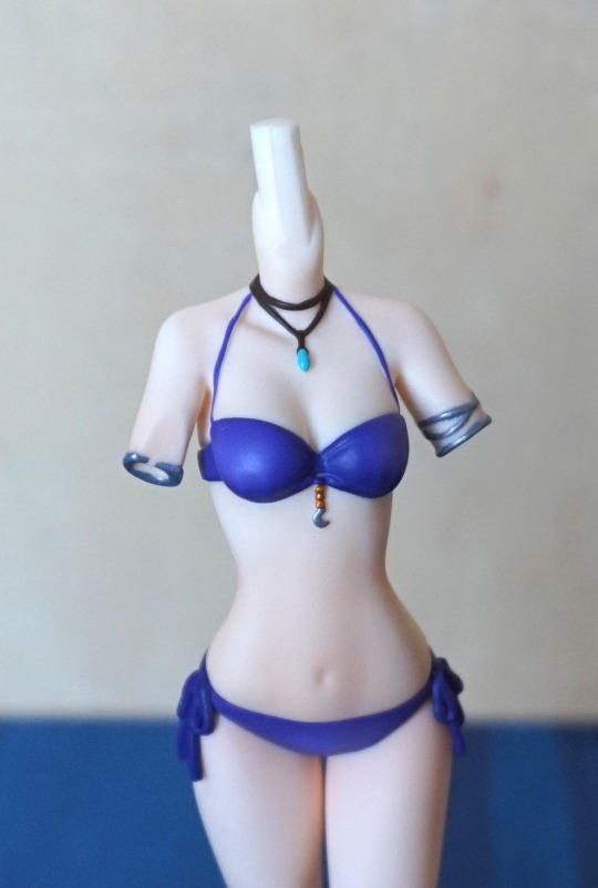
Chest writing:
The writing on her to translates to Uzuki (her name).
Overall, I like this figure, though she does feel very small, due to her pose. She’s painted nicely, but imo, it would’ve been nicer if they made her slightly bigger, though she is a scale.