Month: May 2018

Kuroyukihime & Arita Haruyuki – Banpresto

I saw these appear on an Urban Mine auction some time ago, but I believe that they went for more than I wanted to pay for them.

Then I was just browsing Mandarake randomly – and found they were in the store! And for the grand sum of ¥100! I quickly put a Mandarake order together for these two, and they arrived some time later. 

So here they are:

image

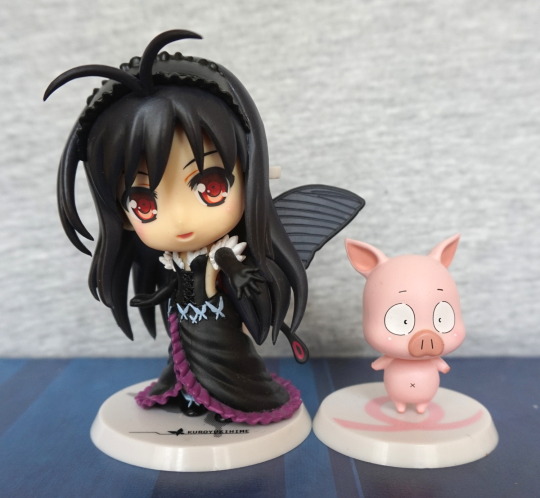
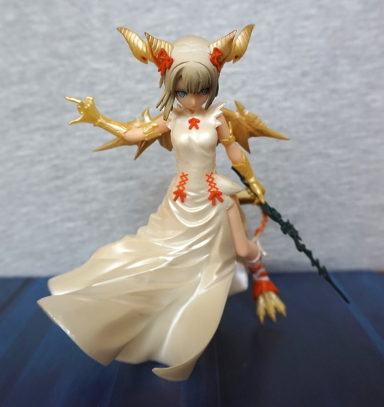
Yay! A cute pair of prize figures. Arita’s avatar form isn’t much to look at, but it has been nicely painted. Kuroyukihime in avatar form though… is nicely detailed and well-painted. Definitely worthy of a B-Prize. Kuroyukihime’s base has her name on, and does have some of a design, but it’s mostly covered up by her dress. I like the way Arita’s base has a curly pink tail on it, and he sits in the middle, but it would’ve been nice to have his name on the base, to match Kuroyukihime’s. 
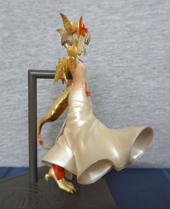
Left:

image

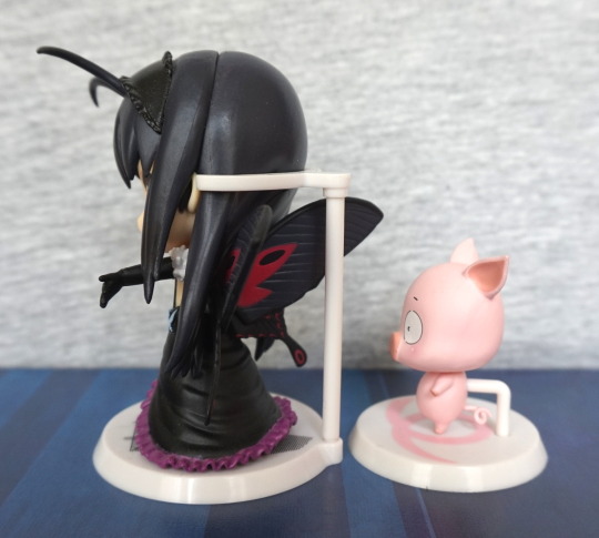
Here we can see Kuroyukihime’s wings, which have been well reproduced in chibi-form. She has two pegs on her feet and this head stand, so she is stable. The dress is a nice texture, but her hair is on the shiny side. We can also see Arita’s cute, curly tail. 
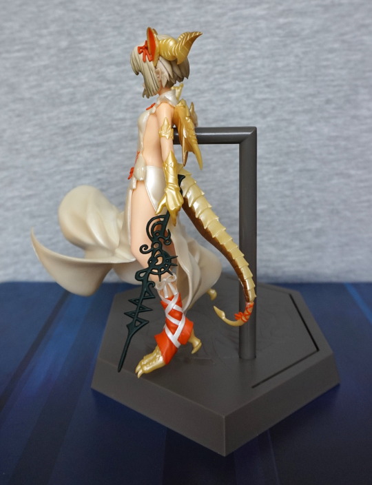
Right:

Nice amount of strands in her hair on this side, helping it not look flat, though the top of the hair is standard for this kind of chibi figure. 
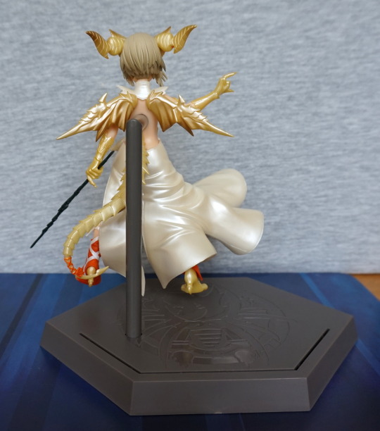
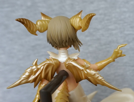
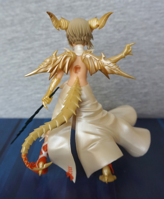
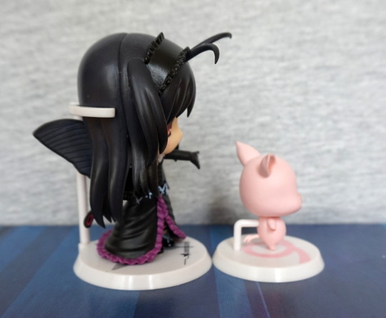
Back:

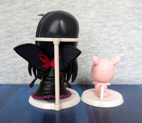
Here we can see more of the wings, which have been very nicely done. The paint and detailing is good. The dress also looks really nice, with the purple trim and the folded fabric. Not much to see with Arita, not that anything is really expected. His ears are shaped nicely though. 

Super-pleased with this set. I don’t usually go for these small chibi figures, but I really like this pair. Her hair does suffer from prize-figure shininess, but the rest of her is really well done. Glad I picked these up, especially for the cheap price! 

And just before I finish this blog, a quick addition:

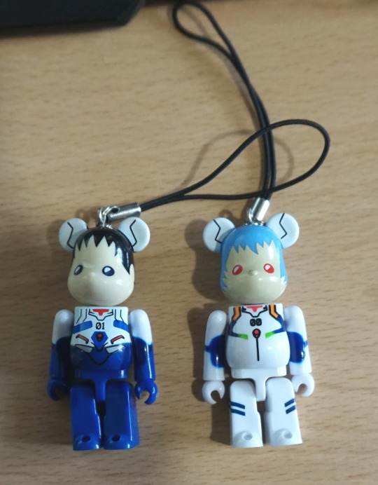
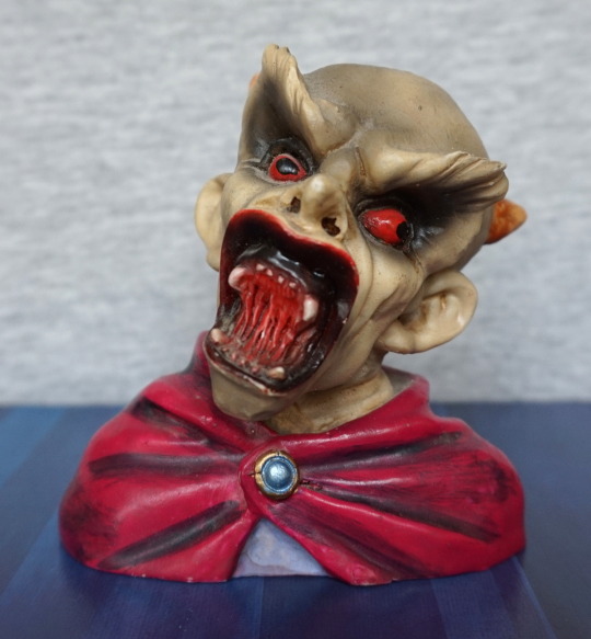
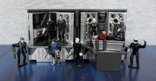
I also bought these with this Mandarake order, but they’re not really worthy of their own blog post XD. Been on the fence about ordering them for some time, but decided to go for it. They’re a nice addition to one of my keychain rails. I think they look better than I was expecting, but I don’t think they’ll be a “favourite thing”. Still happy to get Evangelion loot though :D. 

Paréo Paradiso – Tomb Raider III: Adventures of Lara Croft

This figure I bought shortly after the other one, at FACTS. It is entitle “Paréo Paradiso” which would imply she’s wearing a wraparound dress. I remember seeing the pose she’s based on (was it in one of the cinematics? Or just some out-of-game artwork?) and in that, it definitely looked more like a towel. So not sure if the original model was wrong or this one is “wrong” :P. 

Here she is, in her towel/dress:

As with the other one, there’s some noticeable paint flaws going on. Mine’s got a bit of stray paint on her foot, and a bit of blobbiness in one of her hair strands. With the fabric wrapping around her, it definitely looks more like a dress fabric than a towel, due to the way the creases are moulded. 

Left:

Her face looks OK, not sure she’s entirely pleased to see us looking at her in just a thin piece of fabric… The moulding looks really good from this angle imo, and probably is a better display angle than front on, where you can’t see her face too well. 

Right:

Mostly looks OK from this angle, but the dress is too flat against her right leg, which leaves it looking painted on. Could’ve done with a line of shading or to actually mould it, like it is on the left leg. 

Back:

Admire her shapley backside :P. It would’ve been nice if they added some detail to the dress, as it does look a bit like she’s been papier-mâché’d. With this one, there is a couple of rubbing marks on the back. Not entirely surprising, as she’s probably been kicking around for awhile. The forked hair looks a little odd – may’ve been better to either not fork it, or have the bits “lean” the same way. 

I paid €5 for her, so a cheap figure. Was glad I could find another one of this “set”. 

Lara Croft – Angel of Darkness – Strahov Complex

I bought this figure in a collectables shop, along with the zombie head. This figure originates from France, but I can’t find out a lot of information about this series of figures. 

So in lieu of information, here is a pic:

It’s quite a solid figure, paint job is on the sloppier side, but good enough at a distance. Love the camo on her shorts, and her face came out well imo. The sculpt is decent, but not overly detailed. 

Left side:

The black paint appears like it didn’t want to go where it was intended to go :P. Having the hair as strands is nice. Not sure what’s going on with that back shoe – looks like they wanted to have her feet more level, and tried to use the floor colour to make her soles an even shape. Yeah… didn’t quite work, and looks like she’s wearing one platform shoe… d’oh. 

The text across the bottom is “L’Ange des Ténèbres, Strahov Complex”, which is the name of the game in French, followed by the level she’s in. 

Right side:

Copyright to Core Design, showing these are official figures. And some serious platform shoe going on. The black paint is neater on this side, but mine has a couple of marks. Fortunately this is on the back, so it doesn’t show when displayed. Hair is a little sloppily painted on this side. 

Back:

The back looks fine, some nice details in the sculpt. Most noticeable paint flaw here for me is the strap on her left thigh, followed by the shoe top. 

Overall, this is nice for a cheaper collectable. I paid £8, and that would probably be the max I’d recommend spending on her. If you want a small statue of Lara, I think these are pretty decent, but there will be paint flaws. 

Illusionless Time Dragonbound, Myr

After receiving the previous Myr, I decided I need more Myr. So… more Myr!

The simpleness of the dress with the small details make this a striking figre. She’s supposed to be motioning to her backdrop… but this was in her box at the time of taking pictures. I love her expression and the orange ribbons on her dress. And one feature prize figures frequently don’t have: shading in her hair! 

Close-up of her face:

Some lovely, small details in her bows and lipstick. I like her blue eyes too. Hair lacks the definition a scale would usually have, but the shading makes it look the part. The horns also have eye-catching shapes, as well as being shiny. 

Here she is, more angled on the stand:

I think she is designed to be displayed at roughly this angle. but not so good for photographs to show her details. The lower half of her dress flows well over the empty part of the stand, and definitely looks like it was designed to be seen at this angle. I like the way there are cuts in the side of the dress, so you can see some of her, and her lithe body. It is a pretty outfit. The range of finishes on this figure work really well too. 

Let’s take a closer look at that staff:

Tiny scratch on mine. Mostly looks the part, but close up, you can see how flat it is – not sure it’s really like this in the artwork, so I suspect they flattened it for the sake of quality – making it rounded would be prone to more flaws, as well as being more difficult to manufacture. From a distance, it looks fine. 

Left side:

Here we can see her revealed skin. Some amount of detail has gone into sculpting her hand. Her tail looks good, and the lines painted well on the ribbon that’s on there. Love the amount of detail that’s gone into the ribbon and cloth “boot” she’s wearing on this side.Also you can see her ear poking out from her hair, which is a nice detail.

Right side:

Here, she’s less revealed. You can see the seams in the dress,the upper one is pretty neatly done, the lower one about average. I think she’s saying “that camera? I’m gonna destroy it if you keep pointing it at me…”. Uh, please don’t, I’m nearly through with this review, I swear!

Back:

The ripples on the dress are continued around to the back. Her wings are nicely detailed on the back, and catch the light well. Here you can see where her hair is darker towards the bottom – nice that they continued the shading all the way around. 

Let’s get a closer look at those horns and wings:

Some paint shading in the horns, which is a nice touch. And those wings are looking small but amazing. 

So… what if we don’t want a great big massive stand in her back?

Erm, er well…. Not too attractive! But we can get a better look at her tail like this. I find it interesting they’ve joined the tail far higher up than most creatures have a tail. We can also admire the neat painting they’ve done  on her tail ribbon. It’s kind of a shame they went for a back stand, as she looks really good from this angle too – would’ve been nicer to have a stand that maybe went under her dress or a clear claw stand. Foot pegs may’ve worked, but even if they were clear, she probably wouldn’t look like she was floating, which is the look they were going for. Ah well, can’t have everything.

Also she doesn’t work too well without a stand from the front:

You can lean her so she stands, but she’s looking down. You could get away with doing this, if you displayed her on a high-up shelf, but really she’s designed to be displayed with the stand. 

Really pleased with this figure – Eikoh has done a really good job with it. Would recommend it if you like what you see. 

Zombie Bust

Now for a figure I can’t tell you much about! There is a maker’s name on the back, but sadly I can’t quite read what it says, so can’t search/verify who made this XD. I bought him from a collectables shop in Southampton, and I don’t think the owner knew anything about him either (and he didn’t really like the fellah :P):

He has a few little dints, but nothing too severe, which is good for this kind of collectable. Too often these kind of things have quite large paint gouges secondhand. 

Whilst I’ve called him a zombie in the title, I’m not sure he really is. Almost a gargoyle/demon look about him. He’s a fearsome fellow anyway! Not so keen on the super-lazy eye, but I love those eyebrow ridges and that screaming mouth. Paint on his cloak seems a bit on the rushed side, but the skin paint is very nicely shaded. 

Left:

Here you can get a good look at one of the horns atop his head. They have a decently chitinous look to them irl. I don’t think this photo does them justice. Here you can see some scratching on his eye ridge. Some lovely moulding details in the side of his face, with the way it wrinkles. 

Right side:

I like the way the skin has been done so it’s taught on his head, and looser on the face. Gives that demon/undead vibe. You can see where an attempt has been made to blend the darker parts of his cloak into the lighter parts, but could’ve done with some more blending, so there was less brush strokes in it. Maybe a wash would have been better in the lighter areas? 

Back:

Some nice attention-to-detail in the mould. Here you can see he’s been stamped © 1998 and some kind of name/logo next to it. Not sure if this is a small-run item or mass-manufactured. I love the shading on the back of his head – gives a good amount of definition to him. 

On display, the flaws in the cloak are less obvious at a distance, but it would’ve been nice if a bit more effort was put into blending the darker paint, or it was more of a wash instead. He’s still a cool-looking figure, who currently resides on my desk :). 

Daenerys Targaryen – Eaglemoss

Two collectables that don’t have much to do with each other, but are both going to be quick entries I think… 

First up, this small Daenerys Targaryen:

Unfortunately she was broken across the feet when she came – you can see the lines across her boots where I’ve reglued her. As to why I didn’t return her: I won her for 99p + postage, so it wasn’t worth the hassle of returning it. It’s not very well painted, and is probably about the level I hope to achieve with a garage kit :P. Thinking of repainting her boots as practice, and cover up the break lines. The die-cast material she’s made out of isn’t very strong, so not sure if she was already broken (image for the auction was poor), or it happened in her journey to me. 

Sometimes Eaglemoss does an OK paint job. Sometimes they… do this. I guess the GoT line is one of the ones that’s going to/has binned hard. 

Here she is from the right:

Admire the… thing she is holding and blue paint in her hair. Base is also a bit naffed. Her This is probably the best angle for the moulding on Daenerys goes. The gold part is supposed to be one item, with a tassel coming off the end, but the tassel isn’t aligned to the base of the item. The tassel moulding looks OK irl. 

Left:

Apologies for the out-of-focus shot. Her face paint is actually pretty good close up, but the quality of her hair really mars it. It looks like they overpainted blue on the hair that’s on her shoulders, and it’s way too fat to look right. And that hand paint is damn awful, as well as a total lack of definition for her fingers on this hand. Part of the hair is the same colour as her cloak – the side of the hair that’s facing us, plus a bit on her back is the same way. I don’t think cloaks come up to meet your hair… 

Back:

Paint overruns everywhere. If you look at the hair dangling down her back, you can see the blue side on the left that I mentioned in the last paragraph. The bottom tip of her coat is also missing dark blue paint. 

This could’ve been a good figure, if more care was paid to the painting. This feels like a figure that shouldn’t have passed QA – there’s some nice bits like the clasps painted in silver in her hair, and the bead on the tassel of the… thing. The face weirdly was done well, considering the rest of it. The blue detailing on her front though, comes off very much like “cheap blind bag figure”, which is a shame. 

I don’t think I’ll pick up any of these GoT figures unless I can see them in person, and can verify the paint job isn’t turd. The LotR figures were marred with the same issues, so it wouldn’t surprise me if this line is similarly affected. 

Tiger – Tiger & Bunny – Figure-Rise 6

And what would Bunny be without Tiger?

This one, the stickers were easier than Bunny’s I felt. Especially as the ridged ones sit in the ridges. Main downside of the stickers on this one is the leg stickers are prone to peeling on the pointy bits. The bits that go over his shins are two pieces, which is why they peel back from the edge, when clipped. Second annoying thing is his hips don’t like to be straight, and he seems to like to stand with a slight wonk at all times. Like Bunny, I find he looks impressive, and articulates well. 

Left:

Love the armour on his lower arms, and the angular armour on his lower leg. And a wonderfully pointy face. 

Right:

The lines add a lot of detail to his legs, but with them being several stickers, it was a bit of a laborious process sticking them all on. Worth it though! Not so worth it: Those white arm stickers. I don’t find they lie particularly well on the moulded plastic. 

Back:

Love the lines on the backs of his legs. The back shoe stickers were a pain though, as they’re a rounded blob that you have to sort of try and smooth them onto. There are some cuts in the sticker to aid with this, but not sure how much they helped. He also has a hidden peg hole, underneath a piece on his spine. I like the way this part blends well into his back, but it does have a protrusion, so it’s easy to remove with just a fingernail. 

Overall, these figures were mostly fun to build. Did make some mistakes along the way, but these weren’t too hard to rectify. Am pleased with the end result, and was worth it. If you want to kill an evening and end up with a nice-looking action figure, these kits may be for you. 

Let’s say goodbye Tiger:

Thanks for reading!

Barnaby Brooks Jr – Tiger & Bunny – Figure-Rise 6

After making the Black Lotus and Silver Crow model kits, I decided I needed more. After hunting around for something from an anime I was familiar with, I came across Tiger & Bunny. There were two versions – I chose the “Style 2″, as these ones looked nicer than the original counterparts. Doing the research for this blog, I think I made the right choice, but these ones were the far more involved to build, owing to the number of stickers they have. 

So, let’s see what the end result looks like:

I think he was worth the effort, and came out really well. The articulation is good too, and you can do a range of poses:

Here he is, running into battle. Or stopping Tiger from doing something stupid. The stickers, once on, work really well and give the figure a decent amount of detail. I love the blue shiny stickers. The downside of doing Barnaby’s stickers was that most of them sit on top of the ridges, meaning they’re hard to get in place. This is due to most of these areas having a coloured border. 

Left side:

Love the clear areas on the armour. His head has a good shape, and his head “fins” look neat. Also love the way the side of the legs turned out, where the colours work well together. 

Right side:

Not too much different from the left. Looks good 🙂

Back:

Love the wings/jets on his back. The detail of the red plastic behind the clear plastic works really well imo. Here you can see where some of the sticker son the back of his thighs didn’t quite sit right on the ridges. Annoying. And one of his butt stickers has since walked off :/. Not sure where that one went, sadly. 

The base of his spine comes out, to reveal a peg hole. I have some bases on order, so I can put Tiger & Bunny in action poses, when I display them. 

Overall, I’m definitely pleased with this figure, despite having to be careful not to nudge the stickers, and the amount of rude words that went into putting them on XD. If you’d like a more involved model kit, I would recommend this. 

Borg Cube – Playmates

What do we have here?

Hm, looks cube-y. 

Yep, those look like some Borg cube patterns… 

Hm, this side doesn’t seem very Borg-y…

Let’s see what’s in here:

Lots of Borg out to play! The Picard and blue Borg came with the set, the others are a Borg Assimilation Team I bought many moons ago. Have been wanting this mini play set for some time, but finally decided to commit to getting one. Ended up getting this shipped over from America, along with 2 other sets which I may sell. 

Top-down view:

The inner parts pull out, and the bed folds down. You can partially extend the arm on the bio-bed, so it’s sticking up. Yeah, Playmates called the bed that. 

Glad I bought this – it’s nice having the Borg to have a home :). It’s nothing hugely fancy, but it does provide a good backdrop & stand to my assimilation team. There’s enough here to give the “feel” of a Borg cube, but I think it’s only good as a diorama, rather than a toy – there’s only so much room to pose the small figures… and it’s small. Very much more a backdrop than anything else. This playset doesn’t have the playability of a Polly Pocket, but it’s nicely executed for what it is. 

Blue Beetle – DC Icons

Here we have a bit of a random buy – Blue Beetle:

image

Am a sucker for winged things and blue. Found him in a discount pile, priced at £5 for the mildly damaged box. What was even better, when I brought him to the checkout, I found out the store was doing a half-price on all damaged & discounted goods…. can’t argue with £2.50!

Here he is with his wings pointed upwards:

image

The wings freely rotate, so can be positioned freely, on the axis given. However, they are not hinged so you can’t ‘flap’ the wings backward, but not sure this is entirely necessary for a beetle.

Close-up of his wings (the pegs do shove further in to mostly hide the unpainted section):

image

They are attached to a beetle, who clings onto his back. I think this is a pretty neat design,as someone unfamiliar with the character. It also gives him some cool ‘spikes’ either side of his head, by virtue of its antennae.

Back shot:

image

I love the shininess of the wings, and the details upon them. The dark blue areas are also metallic paint, which shines nicely. I’d say he isn’t a super-detailed figure, but what’s there is well done. The contrasting textures on his suit are nice, and the grooved lines neat. 

Side shot:

For some reason, I only took a pic of his right side in this configuration, but this will do for demoing what he’s like. The joints are nicely done and largely blend well. I love the way the beetle’s legs hang onto him, and you can see the beetle’s antennae, which make cool ‘spikes’ over his shoulders. The white areas on his legs help break up the large amount of blueness. 

One thing that annoys me slightly is that his forearm seems a little big for his upper arm, and seems to show at any angle. I suppose I could pretend it’s a gauntlet, but it doesn’t look distinct enough for that. 

However, if you don’t like his forearms, he can be ‘armed’: 

He comes with two blasters that you can equip on his forearms, hence the forearm split. These guns are pretty neat, but do look a bit like “lump of plastic” from certain angles imo. There really isn’t much paint detail on these – mostly what you can see here. 

Here he is from the left:

The gun on his left arm has a decent amount of detail and some other paint details. It’s also sculpted to fit properly around his arm, making it the clear candidate for the left arm. 

From the right:

The moulding is nice on the right gun, but it just seems too… solid? Would’ve been nice to see some kind of painting/shading on it. Same with bits of the right gun – maybe the banding on the barrels could’ve been painted a darker blue or something. But hey, I bought him for £2.50 so I’m not that fussed! I’ll likely display him with the left gun and with his right hand. 

Overall, I’m pleased with this figure, definitely think he’s worth the price I paid! Not sure I would’ve paid full price for him personally, but he seems to be a solid figure in the DC Icons range. 

Figure Spotlight – Naked Jehuty

This figure was a birthday present from my husband, though it took the form of pointing him at the direction of the auction and having him buy it. Iirc it was on eBay as Buy-It-Now. When my birthday rolled around, this fella came out:

image

Originally I didn’t think he came with a stand, but I had a spare Play Arts Kai one, from a figure that could stand up fine on its own (a rarity with PAK!). Later, I got a second Revoltech figure, and found the stand taped to the back of the plastic. I then went up into the loft to retrieve the box, and indeed Jehuty did have a stand! Though I never switched to it, as the Revoltech stands aren’t very good, and this figure especially would pull it over. 

Here’s his back, with the shiny gold plating:

image

Here’s his side, showing his arm and face:

image

And a shot of his other side, showing the cable coming from him, and some of the detail on the back of his leg:

image

I love the colour scheme on this figure, and I have a thing for this kind of mecha. I did watch ZOE, Dolores, I but this dude doesn’t feature in it. I did enjoy it somewhat, but it isn’t a firm favourite. 

Still love this figure, maybe one day I’ll go hunt a playthrough of the game, so I can watch and learn more about the characters.