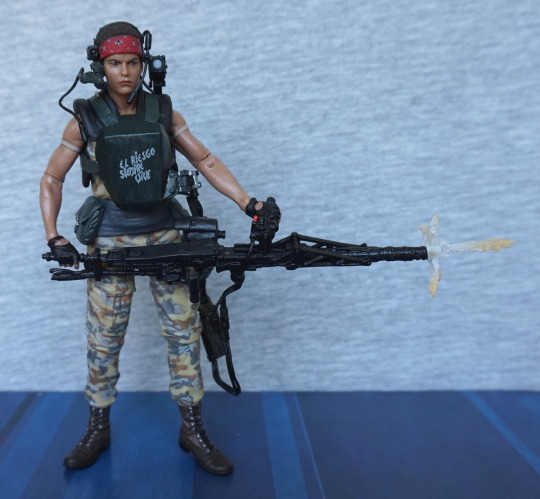
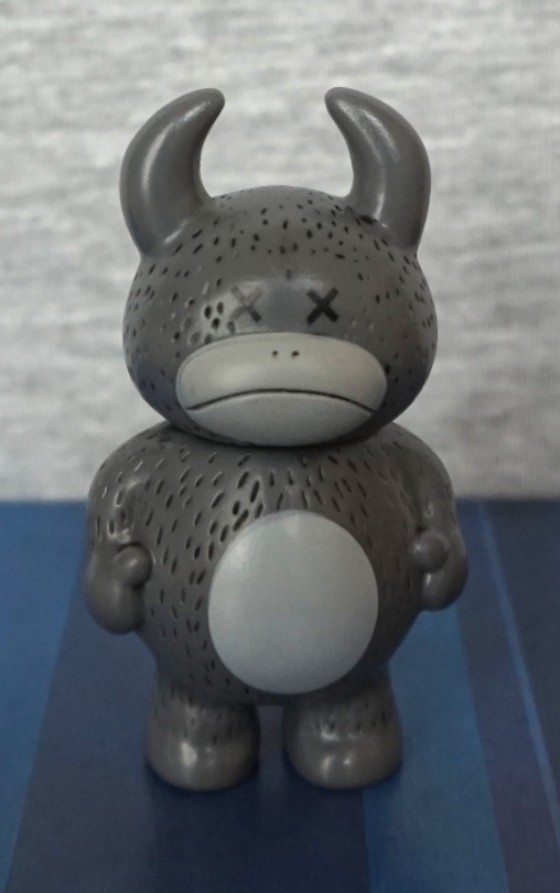
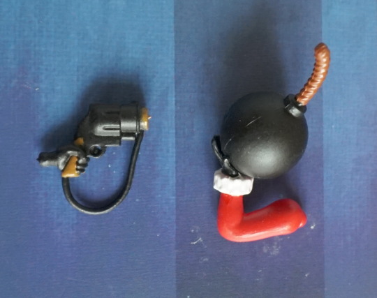
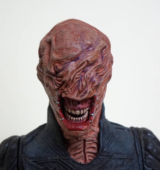
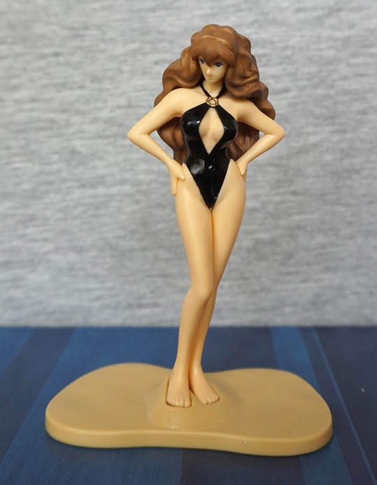
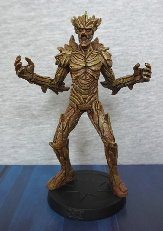
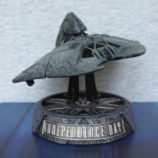
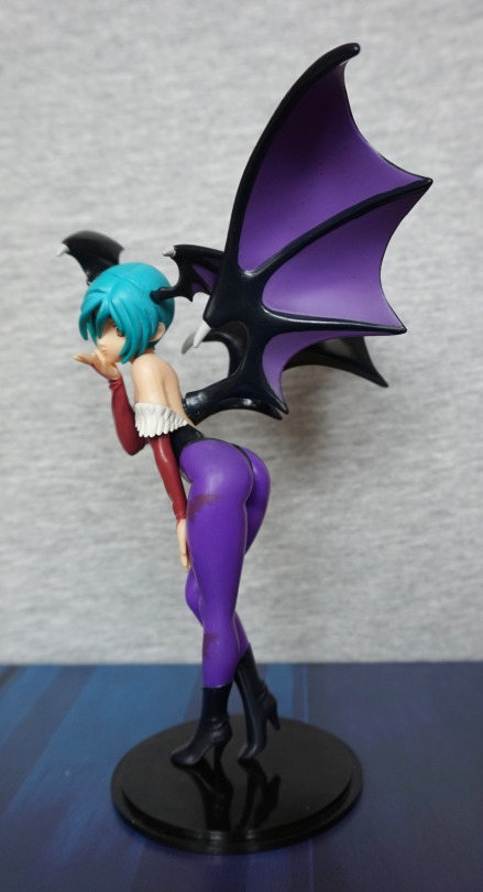
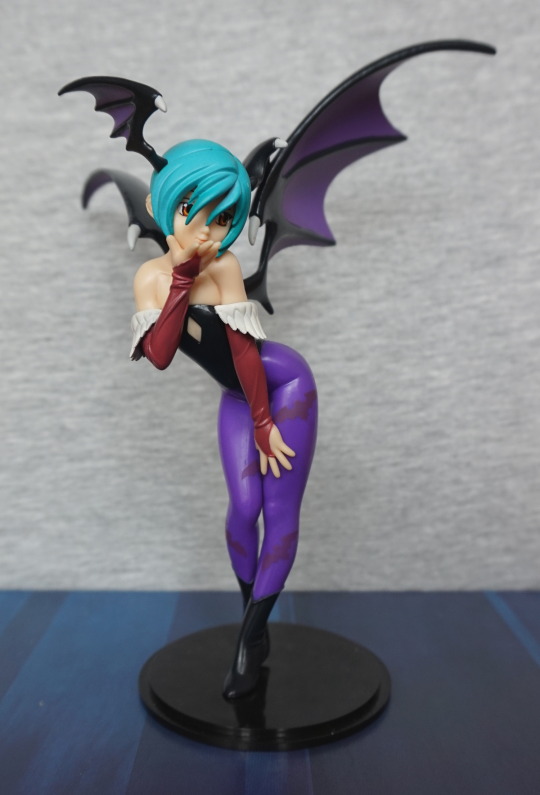
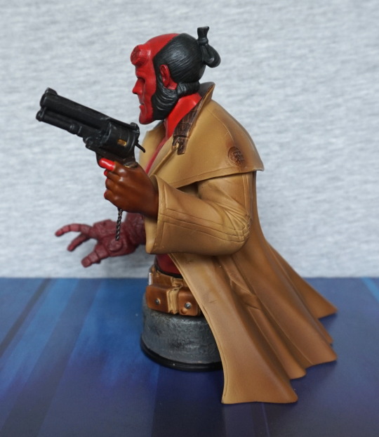
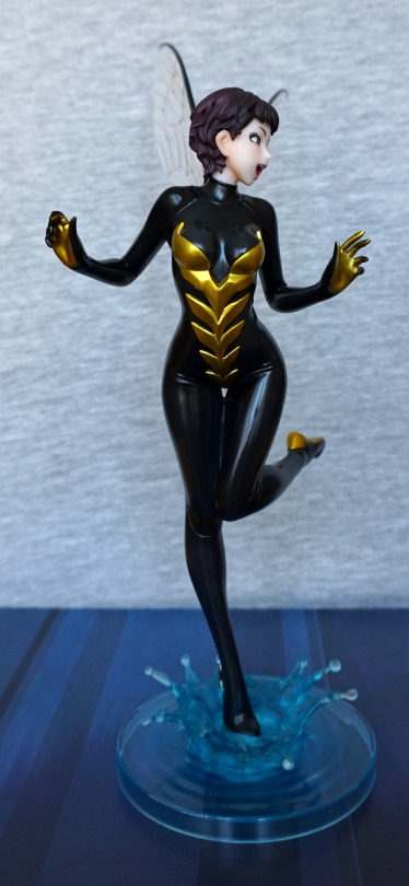
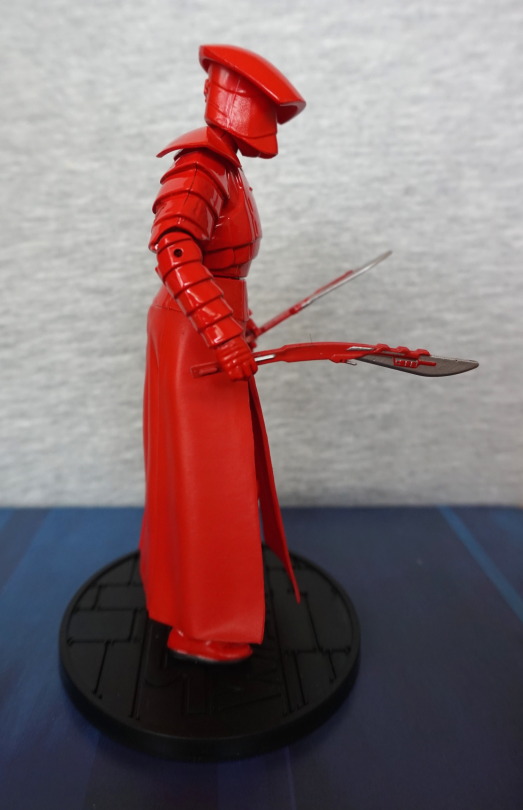
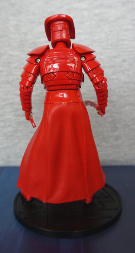
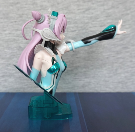
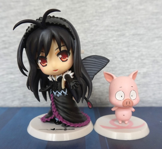
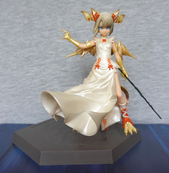
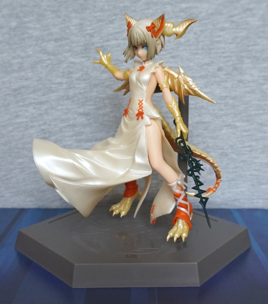
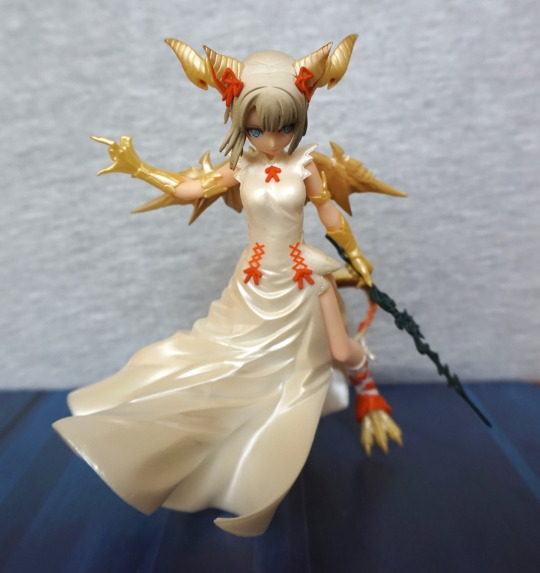
GAME had reduced the price on the Cute But Deadly Series II figures, so I picked up two of the boxes. One of them was a repeat (Tyrande), but the other one was Pharah:
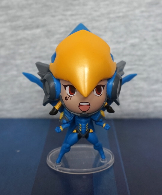
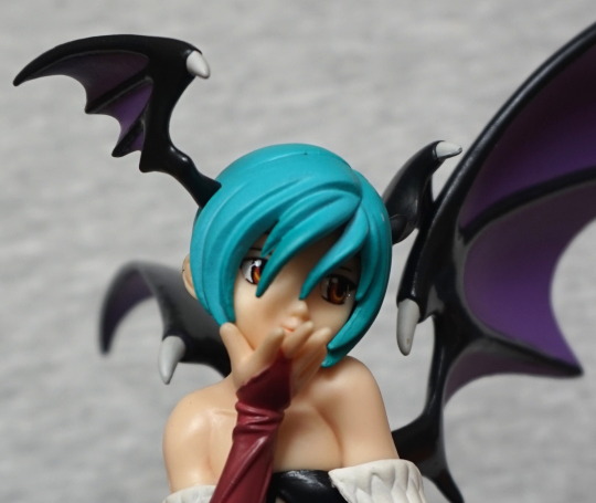
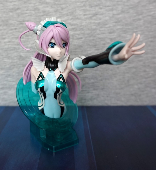
I don’t play Overwatch, but this little figure is too amazing to give up. I love the bold, striking colours and that screaming expression. Which came off like shock, in an ad-hoc picture of a lewd figure I sent to a Discord channel I’m in. Oops, haha.
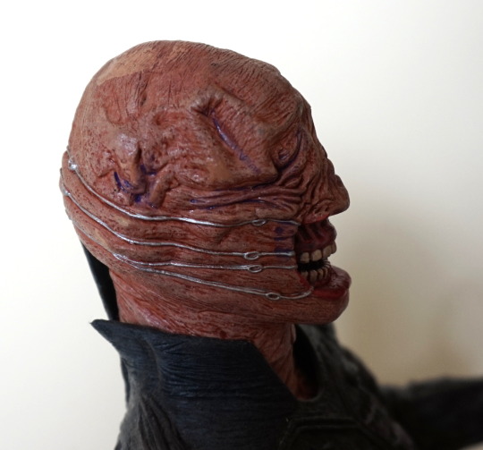
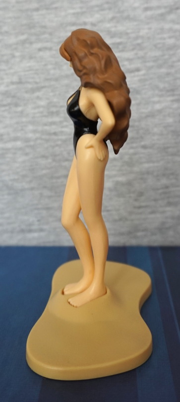
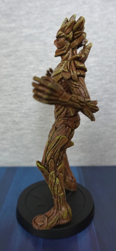
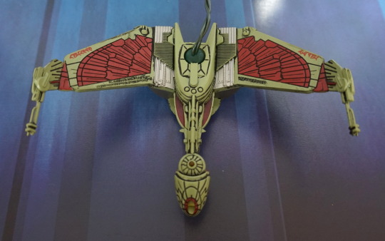
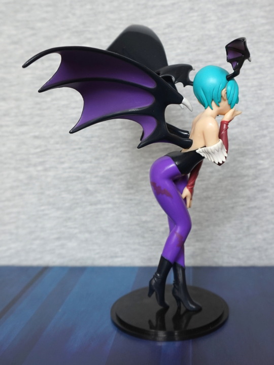
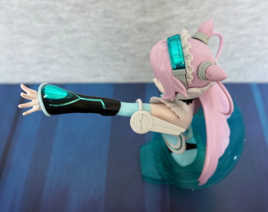
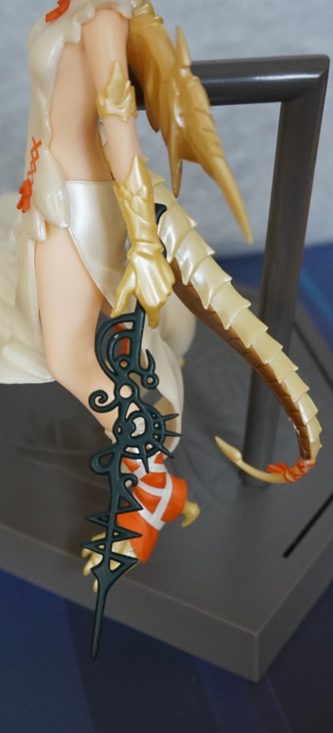
Left:
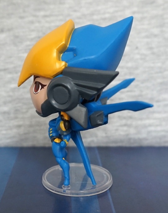
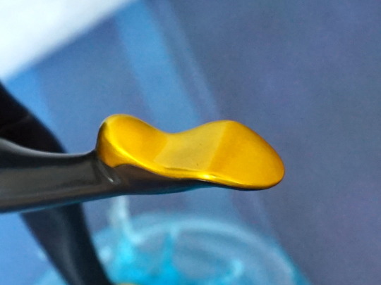
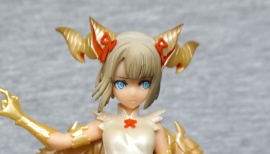
Some stray yellow paint at the top, but other than that, painted well. Surprisingly the smaller details are neater than the big ones.
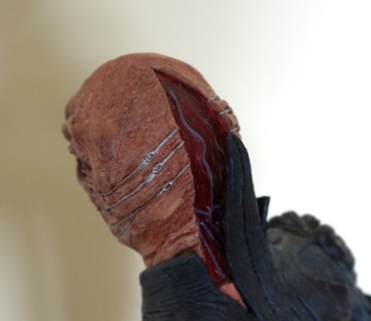
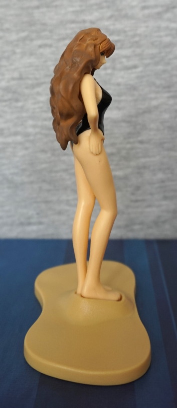
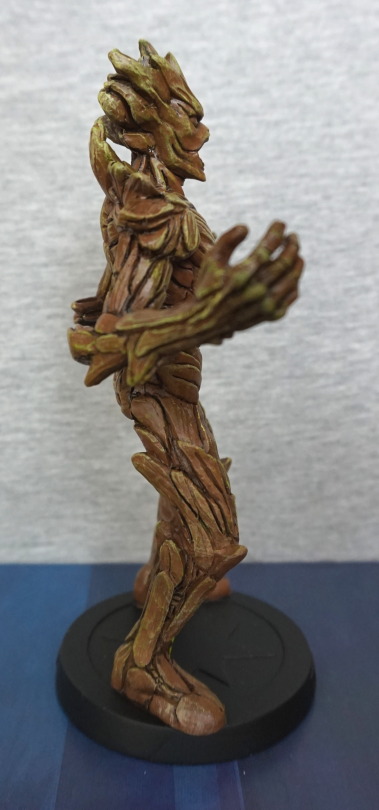
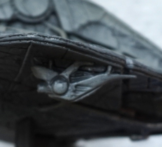
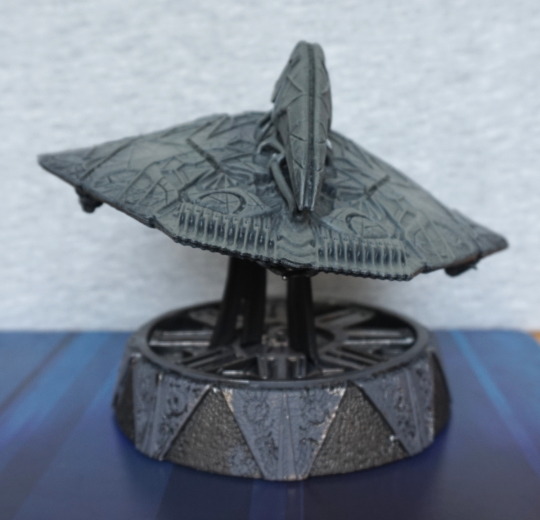
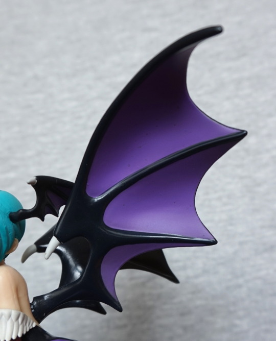
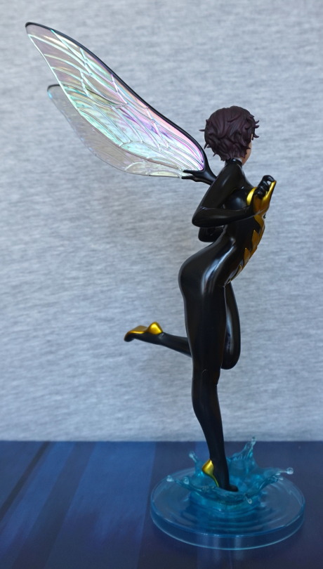
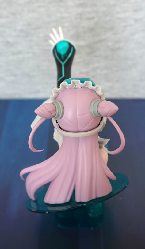
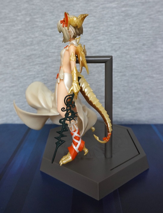
Right:
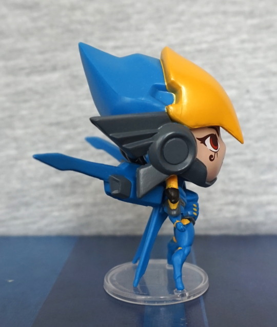
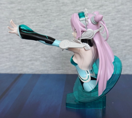
Similar story here. This side is pretty much a mirror-image of the other one. This one pegs into the stand, but also propped up by the downward-pointing fins.
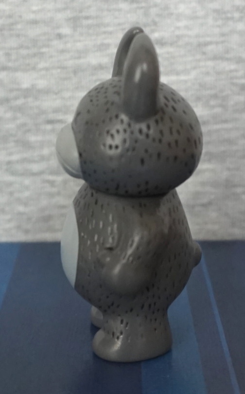
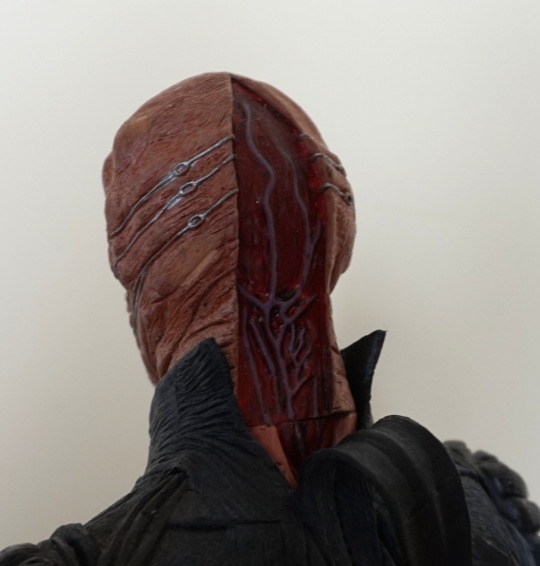
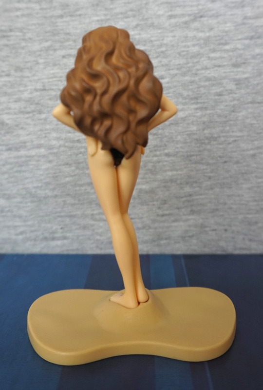
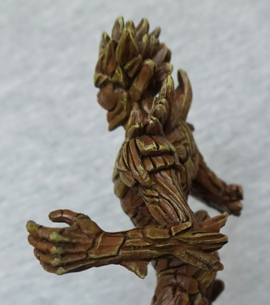
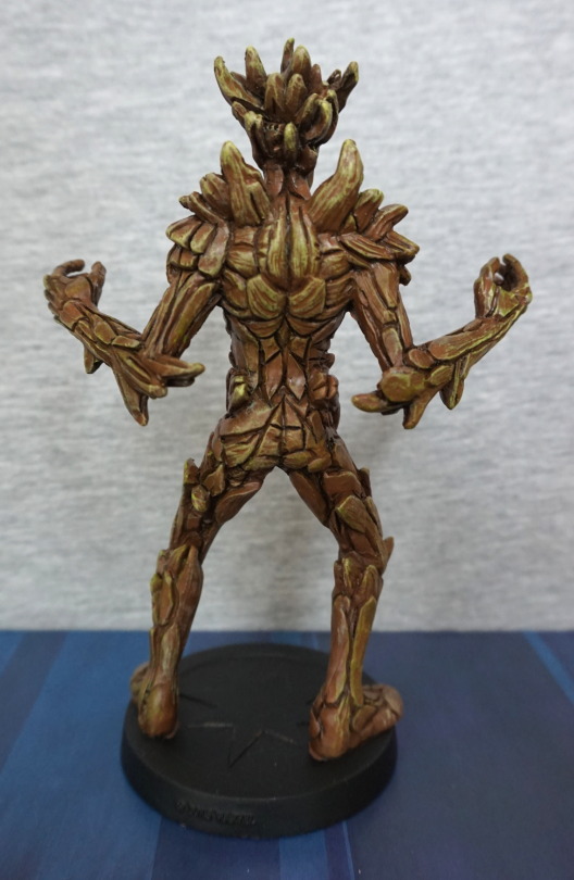
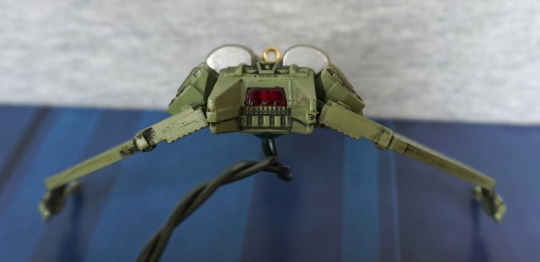
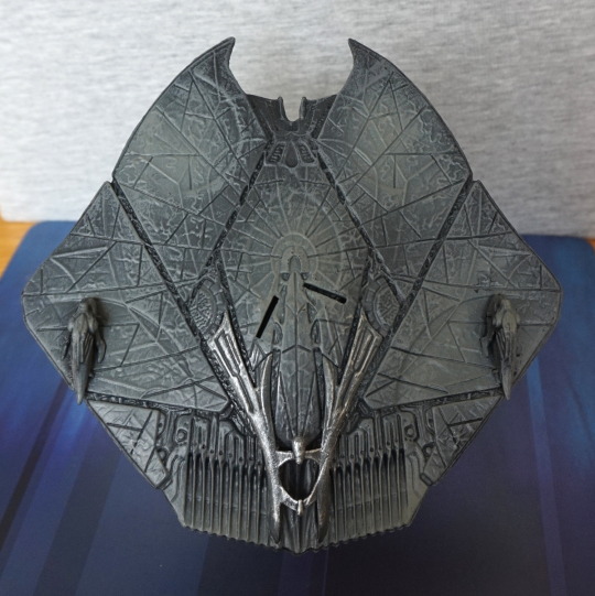
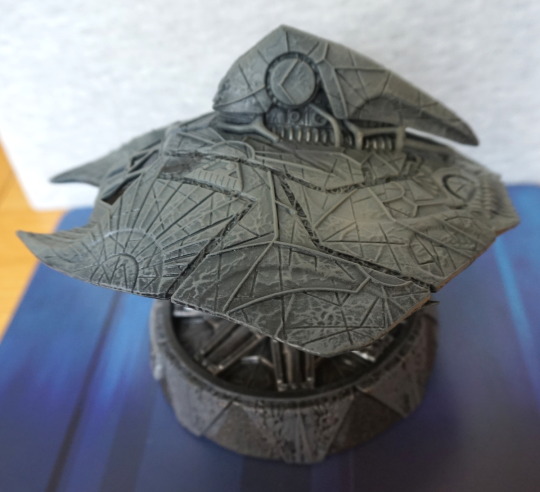
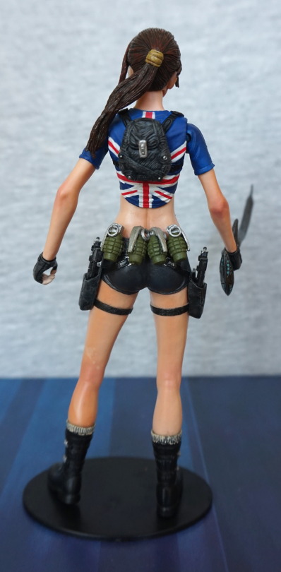
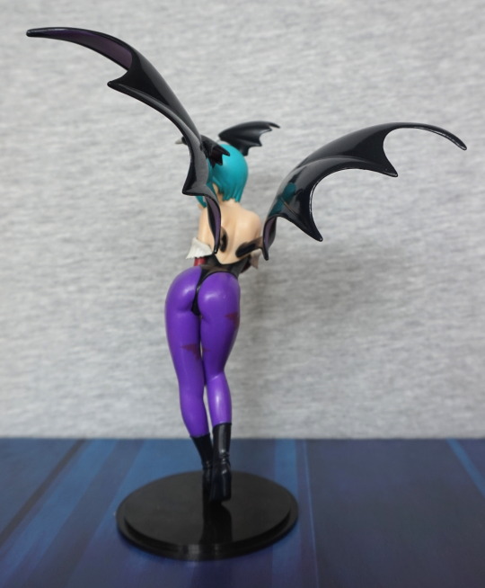
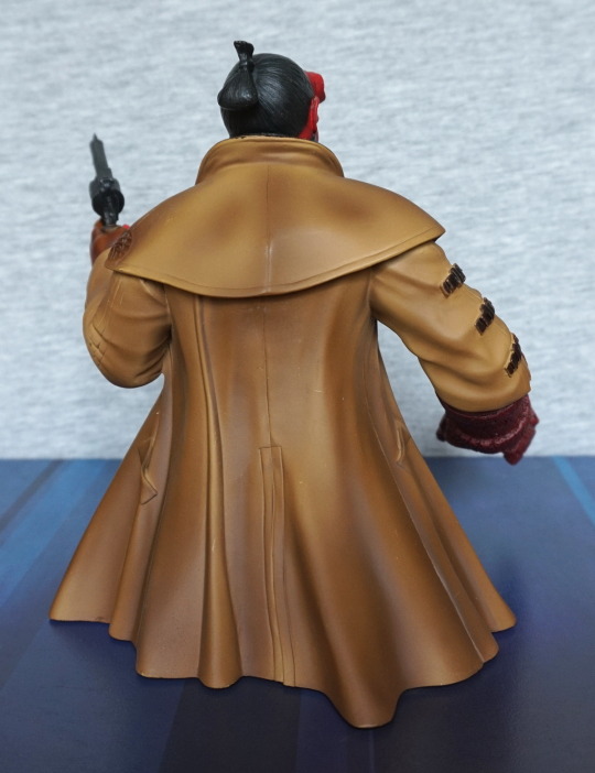
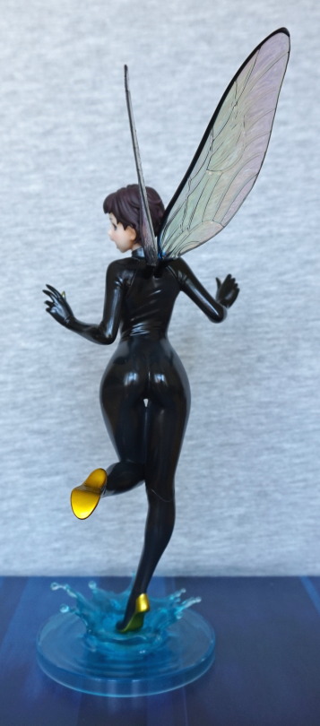
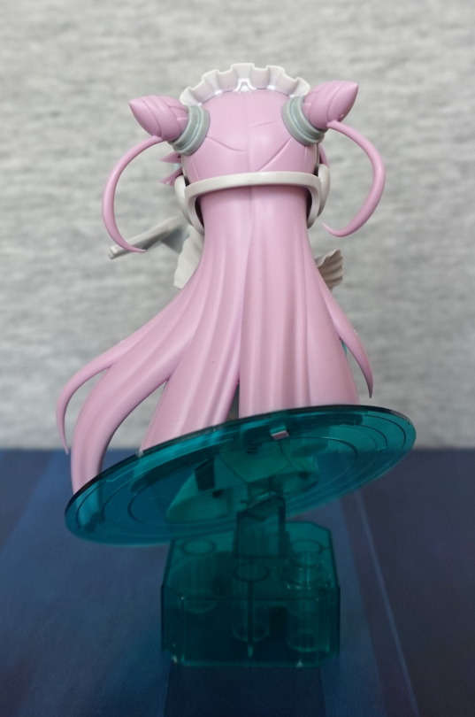
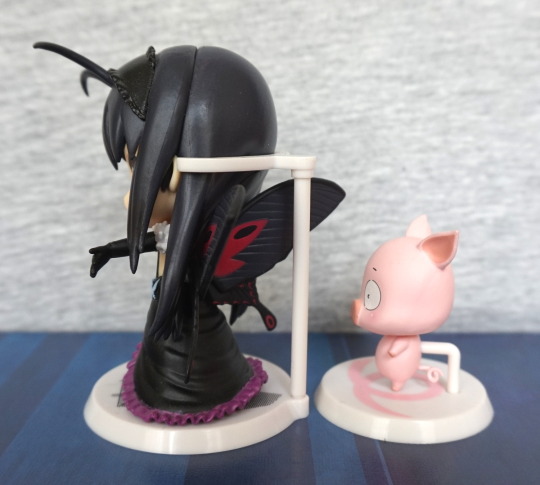
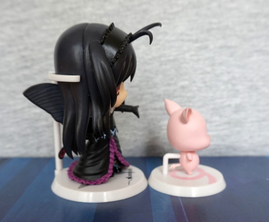
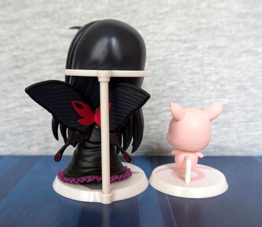
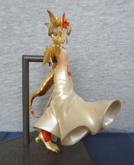
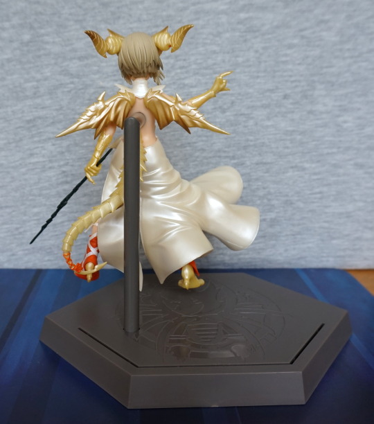
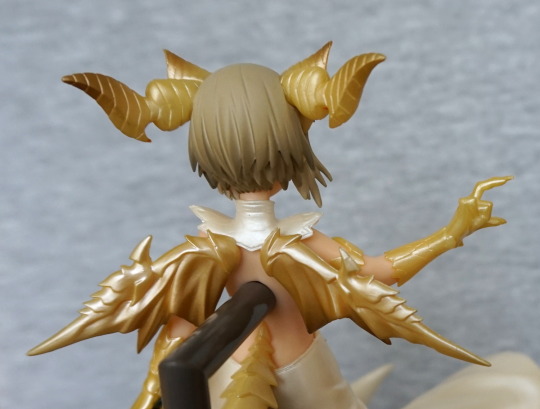
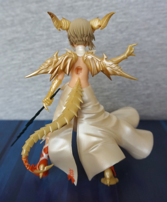
Back:
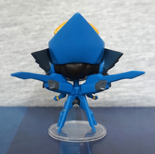
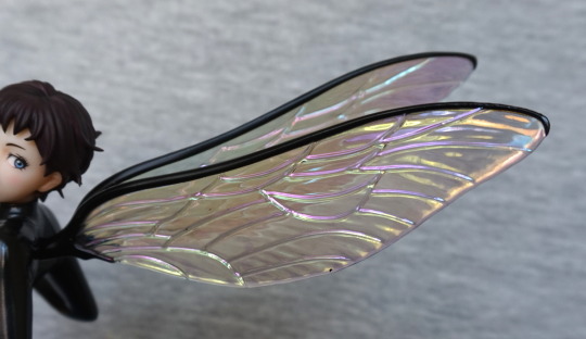
Plain-looking for the back of her head, but the fins jutting out of her back prevent her looking totally plain. Love this part of the character’s design.
Overall, I really like this character, even though I don’t have any familiarity with her. The paintwork is largely good, and the expression interesting, and would likely work well in photoshoots. I still think these are a bit on the pricey side in the UK, but the quality does justify a higher price tag than a lot of other blind boxes imo.