Month: August 2018

Yozora Mikazuki – Haganai NEXT

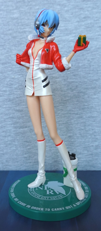
Here’s a figure I bought on my first day in Japan:

image

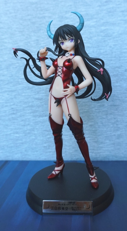
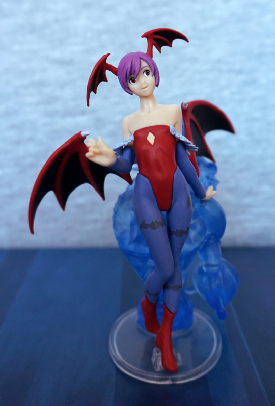
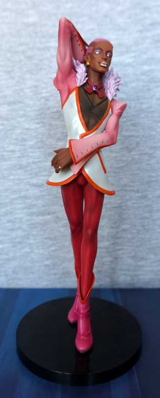
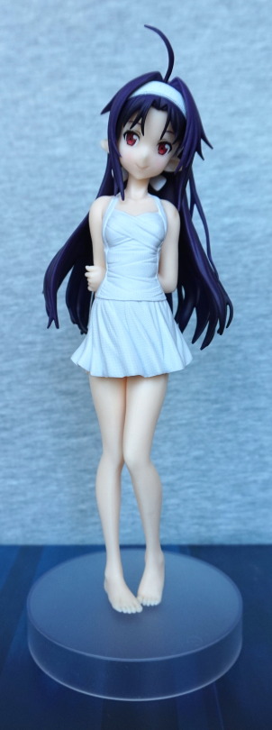
This figure is by the most-likely-defunct Griffon Enterprise. The thing that attracted me to this figure was her outfit – I love the shiny, red colour and the spikiness :). I also like her horns and the leg warmers(?). I like the detail that went into the legwear – the creases are nice and detailed, and the shading is well done. 
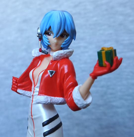
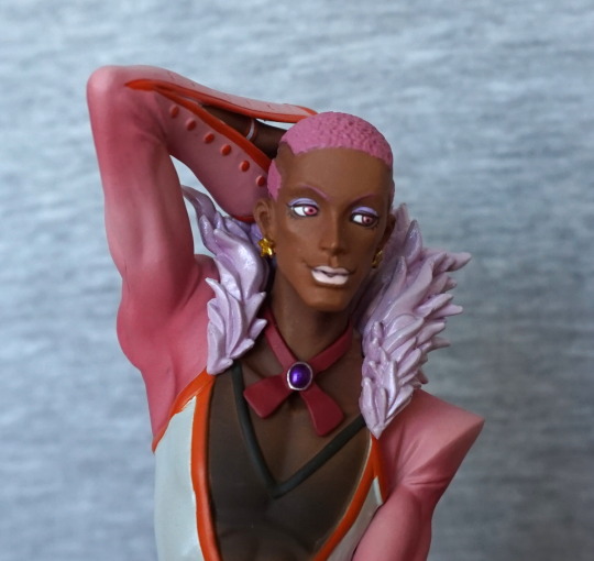
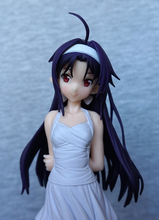
Face:

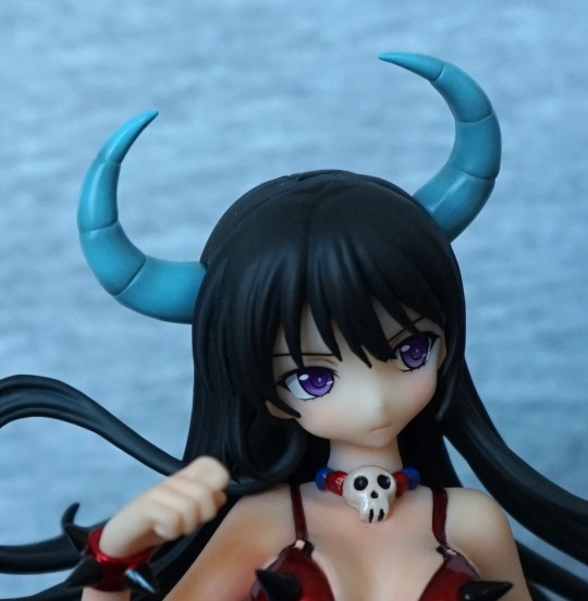
She has quite a cute face. Love the eyes, rest of the face doesn’t feel too detailed. Her necklace is nicely done though, and looks cute, if morbid. Her horns are a pleasing shade of blue, and are well shaded. 
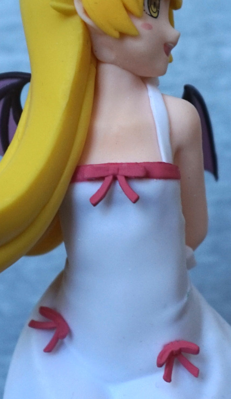
Midriff:

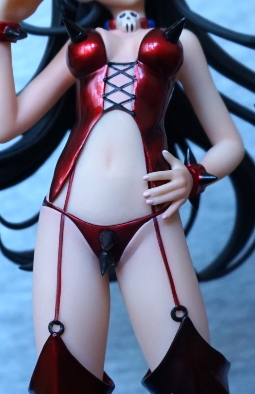
This angle emphasises where the top doesn’t quite meet her boob properly, on the left-hand side of this photo. I don’t find it too noticeable on the shelf, but if you look up close, it’s pretty obvious under certain lighting conditions. The red is spiffy though. The black lines feel a bit shakily painted up close. I like the fact they’ve painted her fingernails. 

One thing that did stand out to me further away was the way the strap doesn’t quite line up between the different areas of her skin. Again, the problem is worse on her right side. I feel the joins on this figure could’ve been done much better, because it is a bit shoddy in places. On her legs, the thin lines are painted well. 
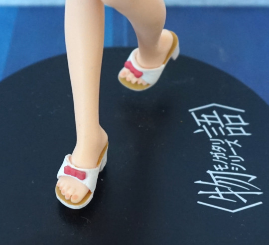
Feet :

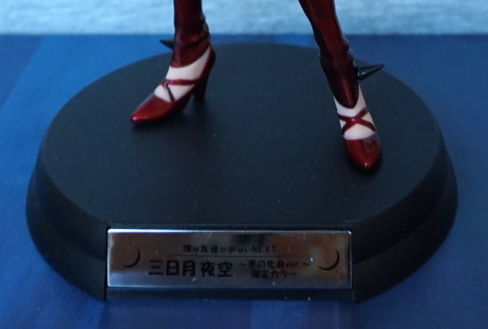
I like her shoes, and more spikes down here too :). Whilst I can’t read the plaque, I think they’ve stuffed too much information here, and it doesn’t look aesthetically pleasing. I think it would’ve been better to stick to two bits of info and not the pile here. Her name and the series would’ve been enough imo, though the moons are nice. 
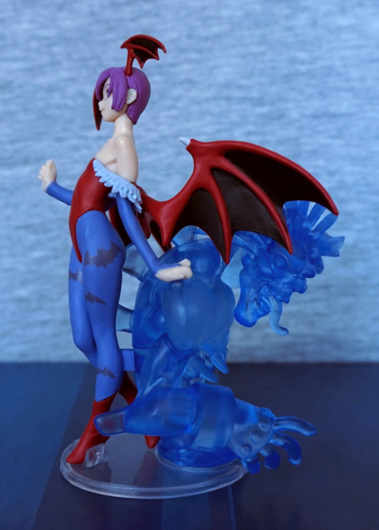
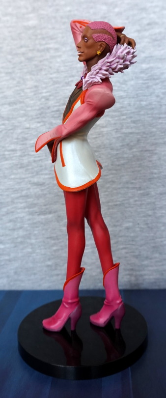
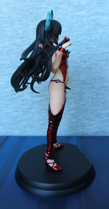
Left:

Her hair looks nice, and those shiny clothes are still looking good. I like the way the top of her legwear creases, and the bottom. 
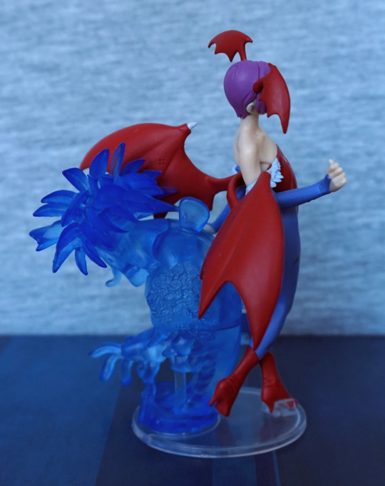
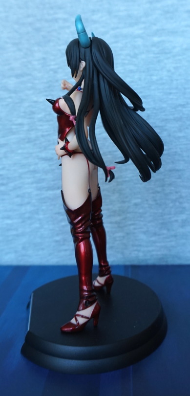
Right:

This side is pretty much a repeat of the other side, but here you can see the side of her knickers. They look OK from a distance like this, but up close it does look a bit of a mess :(. Hair and ribbon looks good though.
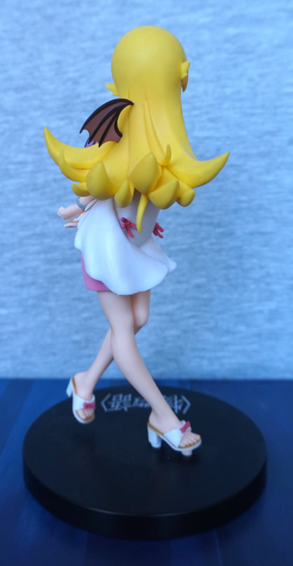
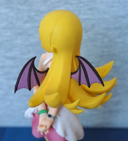
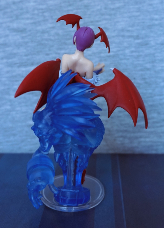
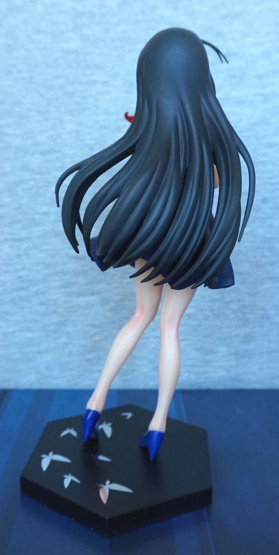
Back:

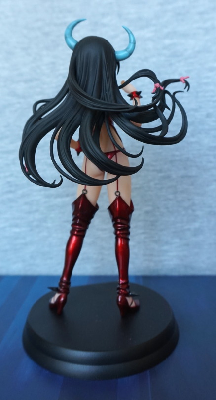
Her hair has a good amount of motion, and has been sculpted with a decent amount of detail. Here we can see a couple of ribbons in her hair – this detail is nice. 

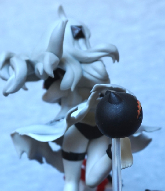
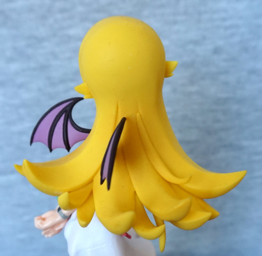
She also comes with this hairpiece:

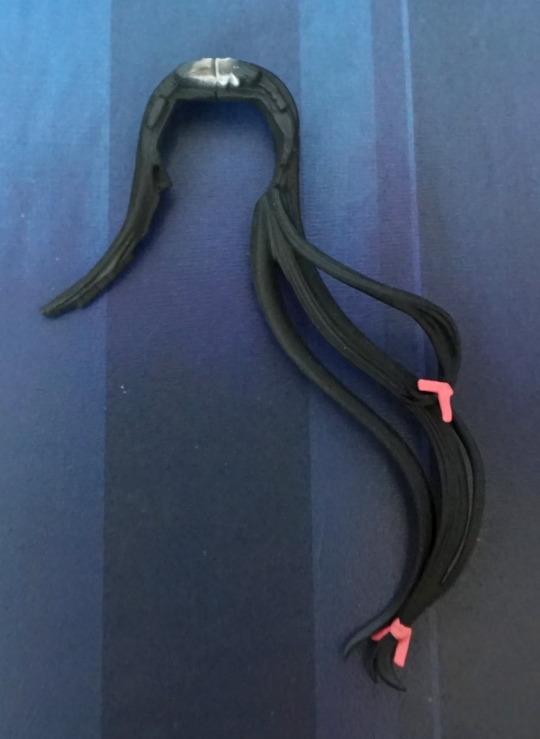
This hairpiece is the same as the part with the horns in, only without the horns… what’s the point of this? Pfft. Though if you prefer her without horns, hey, it’s an option. Not a very compelling one for me, alas. Personally I’d be happier to have less seams in her hair, but I guess some people would like this piece. 

Overall, she’s an OK figure, but I wouldn’t pay a lot for her. I paid £42 for her, and tbh, that feels like the most I’d probably pay for it. She was sold for a bit more than that at release, so not surprised she’s gone down somewhat in the aftermarket. Now I own this one, I don’t feel like buying the more common black variant – I think owning just this one is enough. If you’re OK with some flaws in your figure, you may like this one if you can get it for a reasonable price, otherwise I wouldn’t recommend it. She is shiny though.

Zanin – Devilman

Here we have Zanin from Devilman. I did end up getting the fully silver limited edition earlier in the holiday, but I prefer coloured versions, so picked this one up with little hesitation when I saw him:

I love the Devilman designs – they have a good range of colours and detailed designs. I love the shiny blue colour he has, and his wolf-insect head.

Let’s look closer at that head:

OK, I didn’t get the focus quite right…. His chest eyes have coppery irises, and blood vessel details, which make them look good without looking plain. His eyes on his main head are painted nicely too, but there is less to them, lol. The paintwork is nice, with a black wash that fits well.

Side of his head:

Ah, better photo. Here we can see they limited the black wash/painting to is hair, which works really well. His tentacles are nicely sculpted. We can also see his lower eyes also include what almost looks like an eyebrow.

Left:

Despite being articulated, there’s a limit amount of ways you can pose him without falling over. This dude doesn’t have a base. His body is an eye-catching shape, but this has the downside he won’t be cheap to get shipped boxed, as the box is huge, which is why I didn’t buy him prior to going on holiday, and planned to pick him up whilst I was there. Still diggin’ the shiny blue paint.

Right:

The hair texture on his legs is similar to his mane, and looks good. His head doesn’t have the best transtion to his neck. Still lovin’ him though.

Back:

… more eyes! He can see us from here too! The contrasting but complimentary colours look really good. I think they picked well here. Also the veins on his back are sculpted well, and painted in a shade of purple I like. There’s some shading on the green part of his back, to emphasise the ridges, which I think works well.

Overall, I’m really happy with this figure, and was glad I could pick him up. I’d recommend these Fewture figures to fans of Devilman. There is a mildly dated feel about them, but they’re still really good eye-catching figures. Just don’t expect to be able to pose them all that much. And prepare for some of them to be hefty on the postage, when they don’t fit in SAL small packet!

Christmas Rei Ayanami – Evangelion – Sega

So… it’s summer. So let’s review a Christmas figure.

Of Rei, naturally:

This is a really nice figure imo – her hair is nicely detailed, she has a good expression, and for the most part, she’s well painted. I like the way she’s posed, holding her jacket because it gives us a good view of her plugsuit-inspired dress. The figure also features a couple of different finishes, so her dress and boots are pearlescent, her coat is shiny and the other elements are more matte.

Face:

A fair amount of detail went into her face, which is a bit rare for prize figures. The fluffy parts suffer for being plastic, but I don’t find them too bad on this figure, and not as distracting as other figures I’ve blogged about. I love the red shininess of her jacket, and the badge on it is painted well. Some of the red does escape onto the edging, though. Also she’s one of the few Rei figures where the hair doesn’t go flat, and I really like this about this figure.

Left:

She sports a headband, which is a nice addition to help hide the seams, but being flat to her head it does look a little odd. She has quite a slender pose, which fits Rei. I like the red band at the top of her shoes.

Right:

Here we can see the fact her hair is moulded fully at the back, which is a rarity. The creases in her jacket give a sense of realism. We can see a bit of a seamline in her dress, but it doesn’t stand out much. Her legs aren’t shaded, but not much shows, so I don’t find that fact too significant. We can also see the headset she’s wearing, not sure why. Maybe she’s posing during a music video or some stage show…?

Back:

A bit of a miss with the red paint on her jacket, d’oh. Her bum sticks out slightly, which works well. I like the way the logo is printed on her jacket – I think silver paint was a nice choice, and the print is nice and crisp. The present paint looks OK from the back, but is a little dodgy on the front – some of the yellow paint wasn’t applied thickly enough.

Present boot:

Rockets… what’s possibly clips… yep, this appears to be presents from NERV! The bow is painted nicely, but there is a bit of a miss on the green paint on the ribbon, but it isn’t too bad.

Back:

Looks OK, nothing too special to say about the back. The toes on the boot feel a bit short though – feel like they could’ve lengthened them so it would feel more proportionate.

Base:

“December 24th 2004, we came in order to carry out a special duty to you tonight”. Mmm, special duty… Is Shinji getting the prize gift? I think the presents in the boot will keep Asuka happy for a bit.

Overall, I really like this figure. It’s definitely one of the nicer prize figures I have. Also being a Christmas figure she was really cheap – they don’t tend to keep their value as a lot of people don’t feel like displaying them outside of the Christmas period and end up selling them. But me being me, appreciates a good figure all year round :P. Yes, even the Christmas ones. If you need more Christmas and Rei in your life, I’d recommend this figure.

Seiki Hokuhou – Kantai Collection

This figure was a bit of a random buy for me. I was considering the scale, but the price for it turned out to be quite hefty, so I set my heart on getting one or two of the KanColle prize figures, as I don’t play KanColle, but I like some of the character designs.

So here is Seiki Hokuhou:

I liked this one as she looks quite cute, and I like all of the extras around her. With the present and the items she’s holding, it feels like it’s her birthday :).

Close-up of her face:

She has a bit of a worried expression, some food and a li’l plane. Nothing here is super-detailed, but what’s there looks good. I think he eye print could do with a little bit more vibrancy – it feels a little on the faded side. The Japanese sweet has a couple of flaws, but nothing seriously bothersome for me. Her hair has been done in a plainer style, but it’s one that works with this figure.

“Fiery chain chomp” companion:

These guys are cute, but quite basically printed. Here you can see the dots in the printing process, and I’m not using the macro lens here. From a distance they look OK, but close up, you can see this detail.

Present:

This present has been nicely done, and has a lovely anchor detail that has been sculpted well. Love the themeing here. The ribbon looks good and is flowing in the imaginary airflow around her. Dress side:

Here they’ve even thought to detail her underwear underneath her dress, which even has a little bow painted on. The dress shading itself is subtle, but effective. This is a figure that couldn’t be left plain without looking super-dull.

Left:

Here we see the bottom layer of the sweet is trying to run away. Pretty sure that’s not intentional. The edging on the cloth it sits on could’ve done with some work – the white edging would’ve been nicer if it had been fully painted red imo. The present is looking very spiffy though – it is shaded well, and he red band is crisp on this side. The dress also looks good, and a decent amount of sculpting went into the rips in her dress.

Right:

The back of her hair has a fair amount of life, and looks good. The poles the accessories are sitting on aren’t exactly hiding, so you have to wilfully ignore them.

Back:

Here we can see a greater amount of shading on her dress, which is what partly makes this figure. We can also see her feet and legs are well-posed and give her a good sense of motion. The anklets and bracelets she wears are also nice details.

Pantsu:

Yep, she has a pair of black panties. For those that care. I like the fact they’ve detailed them in. Here we can also see that her toes are sculpted well.

Overall, I think this is a decent prize figure. It’s one of the ones that is well-shaded, which is a win in my book. If I were to make one change, it’d be make the face print a bit more vibrant. And then align the sweet properly, though this probably isn’t incorrect on other instances of this figure. I’d recommend this figure to anyone who is interested in owning her. I think she’s reasonably available at a good price.

Oshino Shinobu – Monogatari – Ver.2

I was pretty sure I’d end up with at least one Oshino figure by the end of my Japan holiday. My only surprise is that I managed to keep it to one. Whilst I’m not familiar with

Monogatari

, I do rather like Shinobu’s design, and this one was on my “to buy” list due to the wings.

So here she is:

She’s definitely a cute figure, but… as we go on to see… her quality is somewhat lacking. Her hair and expression are nice, and the wings… cute li’l devil wings. I know some people have passed on this figure due to the fact they aren’t character-appropriate, but for me I’m a sucker for wings and therefore don’t care. Barring her skirt, she is pretty much plain, flat colours. If you look near her bracelet, you’ll see a bit of a seam too.

Left:

Here we see the obvious seam in her hair, and a bit of a weird sticky-out bit behind her ear. It looks OK from the front though, If you look near her ankle, there is a bit of a flaw in the finish. On her skirt, you’ll also see a bit of a grubby mark – there were a few of these on the figure. If it wasn’t for these marks, the skirt would look good. She’s also posed nicely, which is what attracted me to this figure. So at least there’s that.

Right:

… I think she’s broken her neck! Yeah.. this angle ain’ pretty! Her shoes are nice, but here you can see where I had issues getting her into the base – she didn’t slot in nicely. The bows feel a bit “plonked on” and aren’t exactly the pinnacle of sculpting. For me, this lacklustre effort emphasises the overall plainness of her dress. But that neck… she doesn’t look odd from the front, but the side angle makes me think “The Exorcist”. I feel they could have made this figure with her not quite as side-on so she didn’t look like she has broken her neck.

Dress close up:

The top edging is a bit dodgy, and the strap is a bit uneven in the sculpt. I’m starting to wonder if those bows are erasers…

Feet:

The feet themselves are nicely done, and the bows here look OK. However the white paint on the shoes themselves is awful and is a blobby, bootleggy-style mess. One of her shoes there is a gap between the sole and the upper, but apparently I didn’t get a good photo of that. 

Back:

Her hair is definitely a big block of yellow… something. Has an old prize figure feel. Not too much to say about it.

Hair from the top:

I like the shapes in it, that’s about it. Doesn’t much look like hair. Could’ve really done with some shading.

Wings:

They’re pretty nice, paint a little shaky though. More notable on the right wing. These weren’t too hard to put in place, but did need heat to go. Her wrist accoutrements are nice, but I’m seeing some stray paint near her watch….

Overall, I wouldn’t recommend this figure. It’s not awful, but it isn’t great either. You could certainly do worse… like a bootleg. This figure was readily available at around 1k yen. I wouldn’t recommend paying more than that tbh, if you like it despite its flaws. Or y’know. Just don’t bother. 

Lilith Aensland – Vampire

Just a small figure for today, but a trading figure I was excited to see:

Lilith from Vampire/Darkstalkers. I love the cute look on her face, and the strong, vibrant colours used for this figure. Her hair has come out nicely, along with all her wings. For a small trading figure, it has been painted well, and looks the part.

Left:

I like her jaunty pose. The wing paint is mostly where it should be,with only a little bit out of place. The bats on her leggings are nicely defined. Here we can see Lord Raptor’s face – it is nicely detailed, so you can see him well. The tongue is also a separate part – it came detached in the bag I bought it in, and it took me a bit to work out where it went XD. The figure likely came in a gachapon, so it is supposed to disassemble, but likely originally had assembly instructions. Fortunately these things aren’t too hard to construct.

Right:

Whilst Lord Raptor is one colour, they’ve done a good job with the texturing, so he looks good. It’s so easy for translucent figure and figure parts to look bad and cheesy, but here I think it works well. The backs of her wings don’t have too much to them, but that’s more the design of Lilth than the figure itself. It has the one notable detail she has – the creases on her wings.

Back:

Here we see Lord Raptor’s impressive mane :). And Lilith’s back, which has some definition to it. The paint and sculpt is impressive on this tiny figure, especially so for a trading figure.

I’m glad I was able to pick this one up, and would recommend it to anyone who likes it.. if you can get hold of it.

Nathan Seymour – Tiger & Bunny – Banpresto

This figure I was considering buying prior to Japan, and came across whilst I was there, so decided to buy him. For Nathan, there are only two prepainted non-trading figures, and the other one was an exclusive, so if you’re a fan of this dude (not in costume) it’s slim pickings.

So let’s take a look what we got:

All in all, a pretty decent figure. Phew. Some paint flaws on the orange parts of his top, but the rest of it seems decent. His makeup has been replicated well, and he has shading throughout his outfit, which is definitely a bonus for a prize figure.

Face:

He has nice sculpt detail in his face, along with the makeup that matches with the show. I also like the ribbon around his neck, which is painted well, and I especially like the purple of the gem attached to it.

Left:

His hair and ruff look really good imo, and look pretty much like they’re supposed to. His earring is crisp and defined, which is good for such a small part. The clothes flow nicely, along with the shading present. We can see one seam down his coat, but it has been fairly well hidden.

Right:

Here we can see he has painted fingernails, which is good, and the different finishes. His coat is shiny, whilst the rest of him isn’t.

Back:

Here we can see his right hand has a ring on, and also has painted nails. The edge of his cuff could’ve done with a tad more orange paint though. His ruff is nicely shared though, and I like the hole in the back of his top – it adds a good amount of detail. His leggings and boots are nicely shaded, to complete the figure.

For a prize figure, this one is really good, so I am really happy with him. I’m glad they did a decent job on him as there is rather a lack of figures for the side characters of Tiger & Bunny, especially out of costume. He is one of my favourite side characters, despite being a bit too stereotypical in places. If you like this dude, I’d recommend this figure. It should also be pretty cheap to obtain, as these Tiger & Bunny figures don’t seem overly popular.

Mari Illustrious Makinami – Evangelion – Wave – Plugsuit ver.

There were many Maris to choose from, and I decided to go with this one:

I went with this one, as Wave figures tend to be better than prize figures and not too expensive. Also they’re not too big, which is a bonus when to use haven’t got infinite room. Out of the box, I am really pleased with this one – she is well-painted and sculpted, and the finish is really nice. She has a pretty basic stand, but I’m not too bothered by that.

I like the shininess of her plugsuit, and her expression fits her seriousness. The glasses are also well done.

Left:

Looking closely at the lines on her legs, they’re not perfect, but do the job. There is also a bit of a ridge where her legs connect to her body, where you can see the blue parts have been made to compensate for this. The side of her head looks good, though I think I’d prefer if her hair learned on her body, rather than stick out like it does. She doesn’t have much movement in her pose, so it makes it look a little odd to me.

Right:

Not too much different from the other side. Her headband paint is a bit better on this side, and her hair looks less odd, as it doesn’t look like it is floating of its own accord. The different coloured parts of the suit are well defined.

Back:

A little sneaky gold bit! Funny what I notice when writing these blogs. Her hands look good and are well posed. Ridges where her legs join her body could’ve done with some tidying up. Her backpack looks good, and her hair makes more sense from this angle. Her hair is a soft rubbery plastic, so not too much chance of breaking it. There is some sculpting on the upper part of her hair, stopping it from being totally plain, which is nice.

Overall, I think this is a decent Mari figure, and a cut above a prize figure. However, the joins could have done with some work to make them less severe. If you can pick this one up at a reasonable price, and happy with a smaller figure, I’d recommend it.

Yuuki – Code Register – Banpresto EXQ

This figure I had a couple of goes at trying to win at a claw machine, and realised it probably wasn’t gonna happen, so ended up looking for it throughout my holiday. Ended up finding her cheapish without box:

Aww, cute figure. These Banpresto figures are certainly a good thing in the prize figure world. I love Yuuki’s hair colour. The sculpting is good. but similar to the other EXQ ones I have, the skin lacks shading. The dress has an embossed pattern on, which I’m on the fence about. It does add detail, but does look a bit like she’s bandaged. Paint on the hair band looks like it goes a bit far on mine. 

Face:

Here we can see where the hairband is either ridged or the paint goes too far. Decision up to he reader. She does have some blush on her face, which is a nice touch. I love her cute expression. On mine, if you look closely, the chest doesn’t quite marry up with the dress, but it doesn’t really show when on a shelf.

Left:

Her hair curls around her nicely, and we can see where she sits on the stand. Her stand holds her well. The sculpt of her ears is clean, and looks good.

Right:

Here we can see there is shading in the hair, and a couple of seams. The seams are pretty decently hidden. 

Back:

Here we can see where the hair goes from light to dark, to light again. The backs of her legs are sculpted nicely too. 

Overall, I’m glad I got this figure, but don’t think it’s worth more than I paid. Some of these new EXQ figures are really worth their aftermarket price, but this one I’m on the fence about. I’m glad to have her, but with the outfit and the hairband, I’m more on the fence about her than the other EXQ figures. 

Cyborg – Justice League (2017) – Kotobukiya

This figure I found was for sale at one of Mandarake stores I planned to visit, so put it on my “to buy list”.

And then bought it:

Whilst the film was a pile of poop (watched it on the plane), I quite like the design of Cyborg. Not convinced it rivals his comic book look, but I like it on its own merits. What I like about it: the red accents, the wires near his chin, and a couple of other details on his upper half. What I don’t like: The midriff feels overly fussy, his legs feel too “robot”. 

Face:

His face is nicely sculpted and painted, and I think Kotobukiya did a good job of this. The metal part fits well. His hair, however, looks rather on the painted-on side, which spoils it a bit. I really like his upper chest with the angular parts, red glow and wires. Love the show-of-strength pose. 

Stand:

The base is magnetic, so he sticks well to it. I like the logo, but the base being thing looks like more like a cheap coaster than a base for a figure. Wish they went for the thicker style the other western Kotobukiya figures came on. 

Left:

The pose doesn’t feel overdone from this angle, which I  like. The sculptwork is really nice and looks good from this angle.

Right:

The expression fits the pose from this side, but the hair being a bit shiny looks odd. ‘tis my main niggle with this figure. The shading on the metal parts is really nice and give it a lifelike feel. 

Back:

I really like the design of the back, and think it works better than the front… but that’s more DC’s fault. The fin effect is a lot less fussy than the randomness on the front, and the metal places help accent it. The shielding on the spine looks really good to me:

Here we can also see the number of paint effects going on, on the metal parts of the figure. I think they did a really good job with that. 

Overall, I think if you like this figure mostly relies on if you like DC’s design. Apart from the hair, I think Kotobukiya did a good job of recreating Cyborg in figure form, and am glad to have him, even though the film is poop. 

DC, stop making crap movies kkthx!

Kuroyukihime – Accel World – Incognito Avatar Ver

Whilst there aren’t so many Black Lotus figures, there’s plenty of Kuroyukihime… so here’s one more!

This figure was nicer out of the box than I was expecting. The mask is painted well, the dress has some shading, and her face looks really nice. Also the base isn’t boring and plain.

Face:

The eyes are nicely detailed, and don’t feel as overly heavy in the linework as the ones on the FuRyu one I looked at recently. I love the butterfly attaching her collar to her dress, and the rose is a nice addition. 

Mask:

The colours complement each other well, and are within the lines. Is a really nice piece. 

Base:

These butterflies are silver and are decently reflective. It goes well with the dressed-up party theme. Her shoes do look a bit on the “painted on” side. but aren’t too bad imo.

Left:

Her hair isn’t shaded, but I don’t think it detracts that much from the figure. Having the dress shaded though does make a good bit of difference to the look of the figure and I’m glad they did it. Here you can see the shading they have on the back of her legs – from the side it looks OK, but from the back it looks kind of like she has sunburn. 

Right:

She has a nice armband on this side – butterfly-themed ofc :). I like the way her hands are posed as it gives a sense of motion to her.  Most of the hair is stranded, which makes it look good. 

Back:

Here you can see the sunburn on the back of her legs. Her legs are nicely shaped though, and her hair is sculpted nicely. 

Overall, I really like this figure. I may get the recoloured variant at some point in the future. Super-glad I picked this one up.