Month: May 2018

EVA-13 – Revoltech

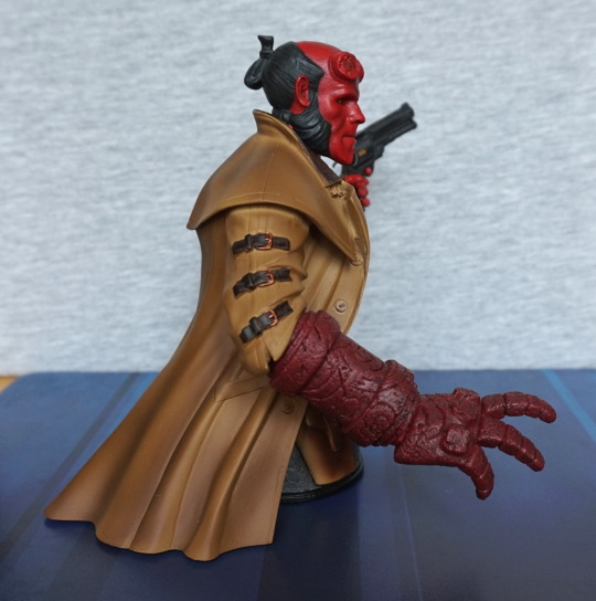
Initially I missed the re-release of this figure, but then randomly found it in stock again on AmiAmi. Wasting no time, I ordered it – stuff like this doesn’t tend to stay in stock for long with AmiAmi if it comes back into the store. 

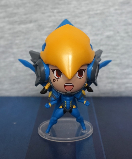
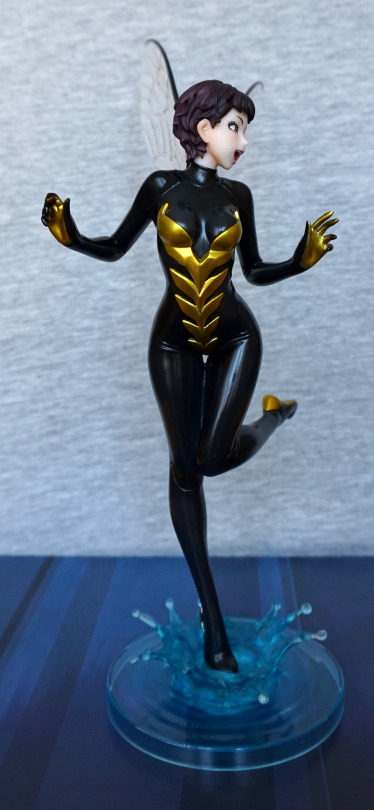
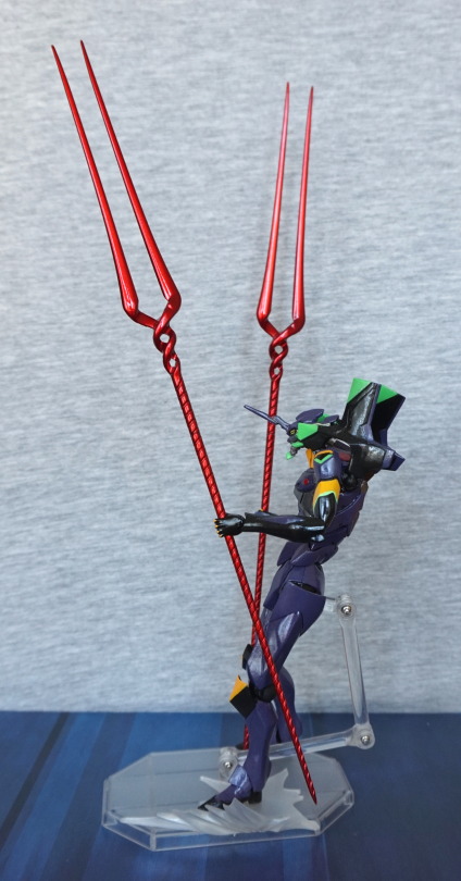
Here he is in his “default” configuration:

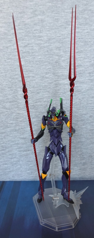
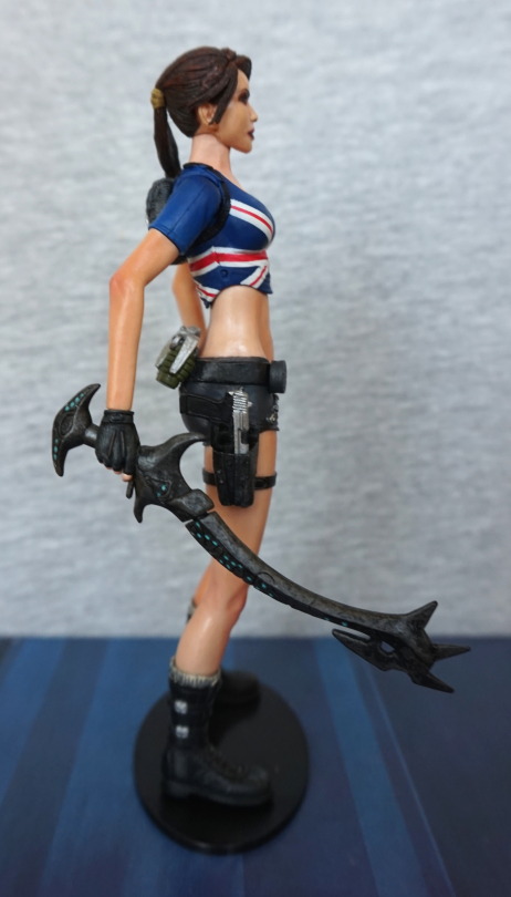
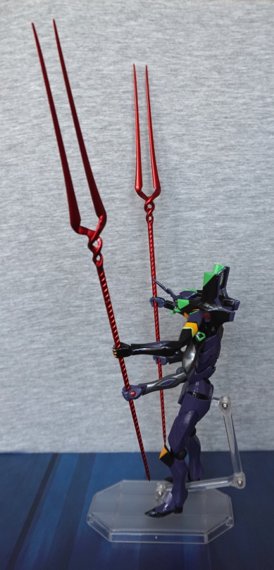
Decided to equip him with both the lances, so most of the shots will feature these. Other options available, and will be shown later in this review. 

I love the shiny purple paint, and the yellow & green that complements it. He also articulates well imo, and his midriff segments bend pleasingly. I prefer a more stoic pose though. 

Left:

Here he is… having a bit of a nap apparently. The paint is nice and striking, but a wee bit uneven in spots. Not really noticeable from the distance I’m taking photos at. 

Right:

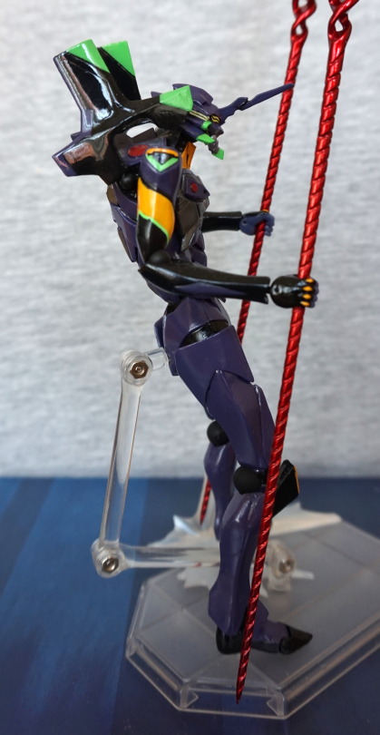
Closer look. Here you can see a bit of a paint flaw, in the black paint on his upper arm, where it spills into the green stripe near his elbow. And a bit of an uneven line going into the canary yellow. Whilst the paint job is mildly iffy in places, the articulation seems plentiful, and feels good. 

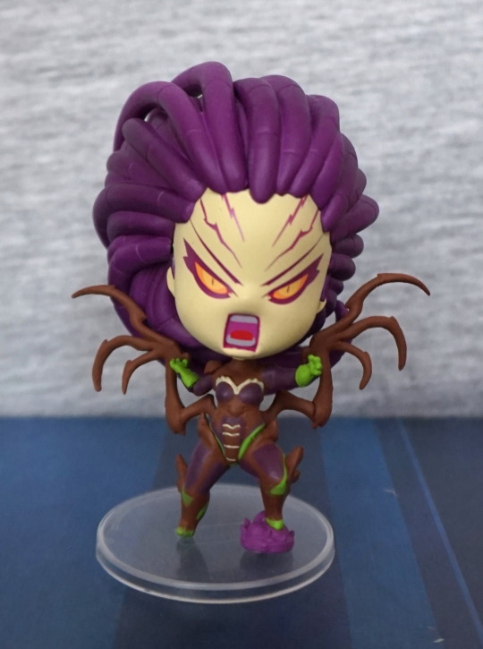
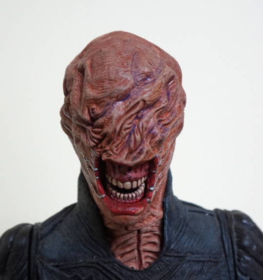
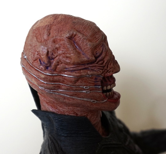
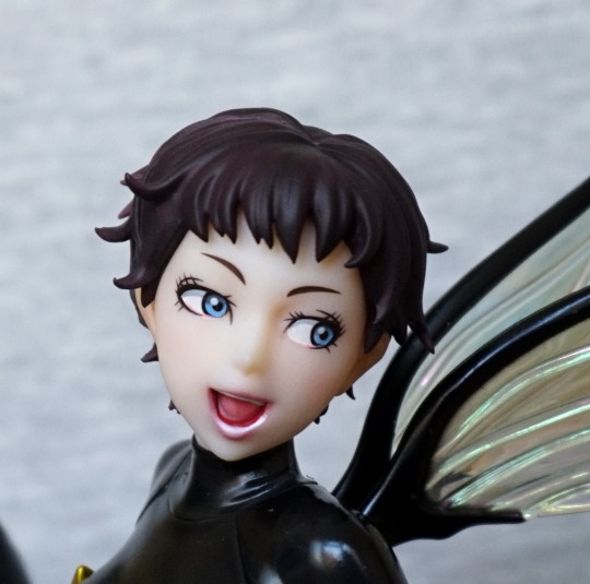
Close-up of the head:

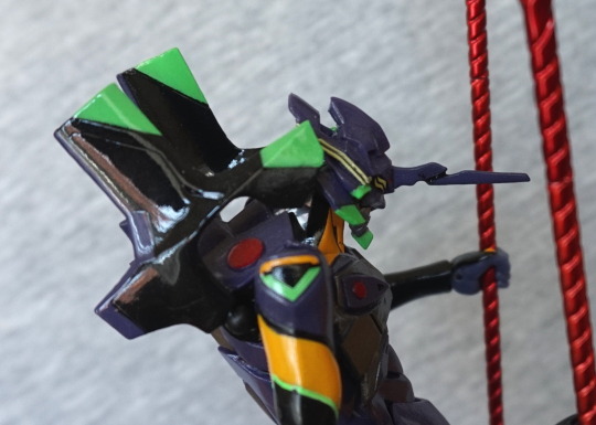
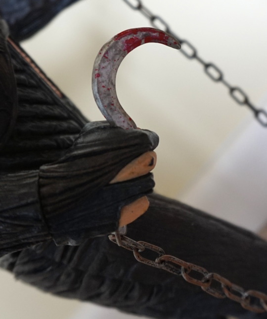
Paint job  is OK; like all the little details in the mould. And ofc, you’ve got that wonderful impaling spike on his head :D. 
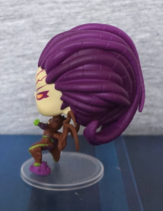
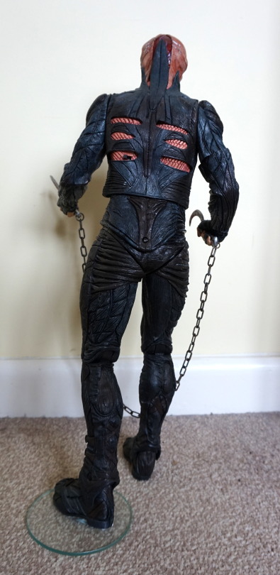
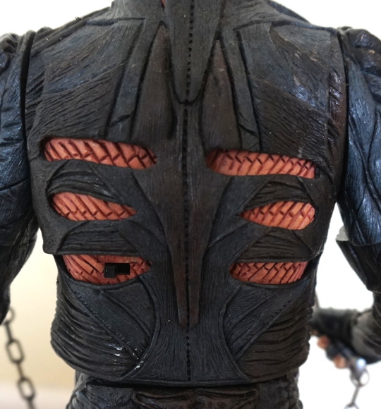
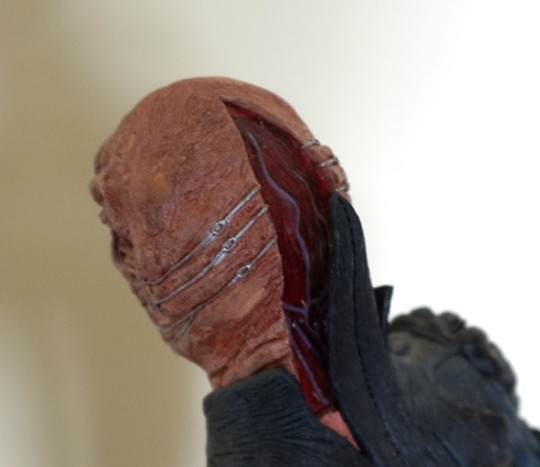
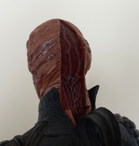
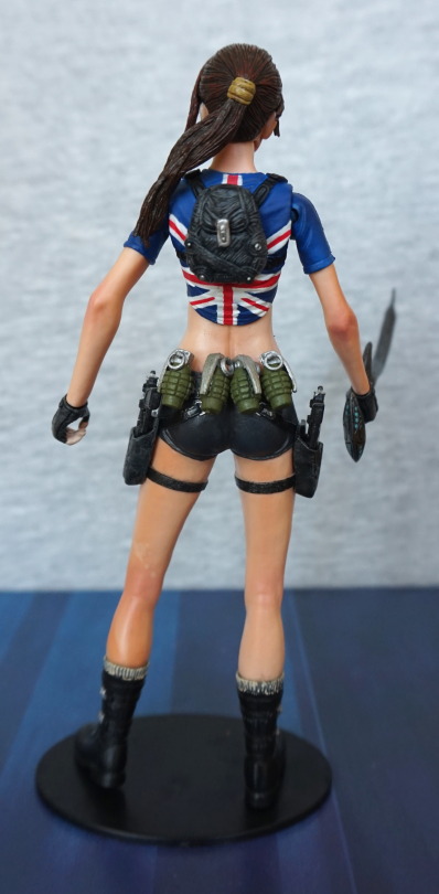
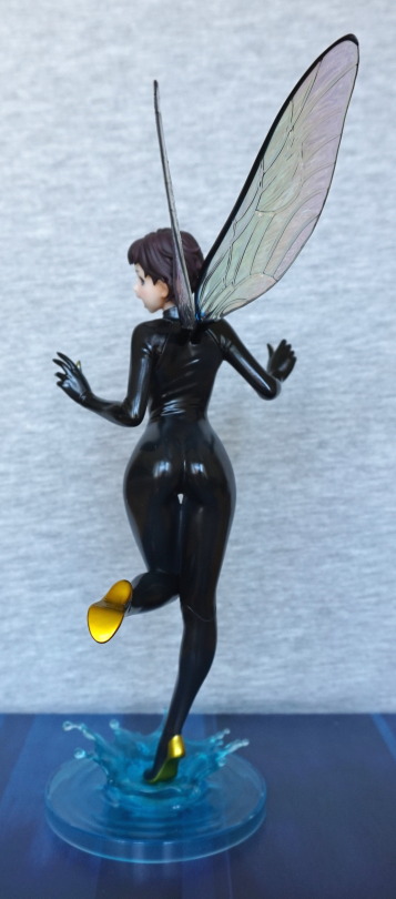
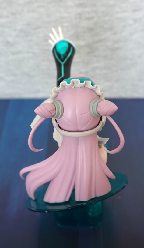
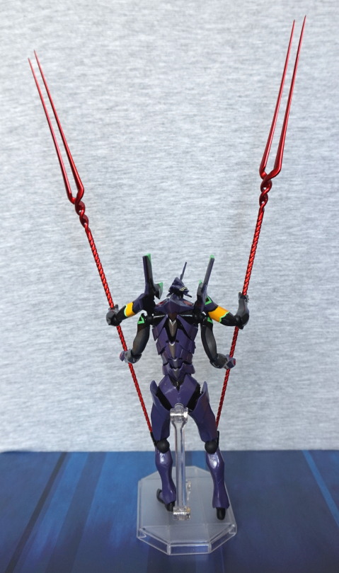
Back:

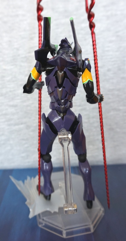
Some nice painting and moulding on his back – love the silver bits running down the middle. 

Here are the other spare parts, not shown in the rest of this review:

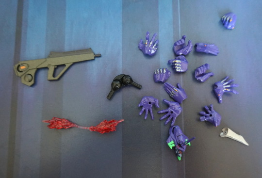
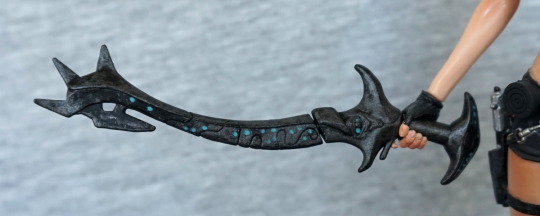
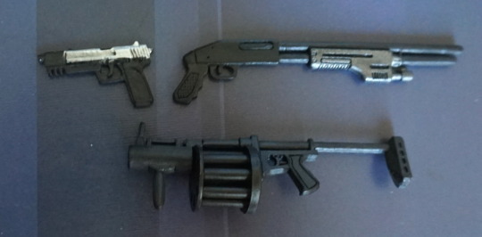
Plenty of hands to choose from, if you don’t want him wielding the spears of destiny. Also has the gun, if you wish to go for a less epic weapon. 

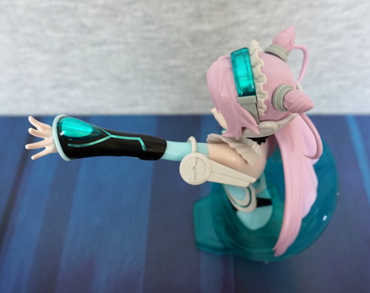
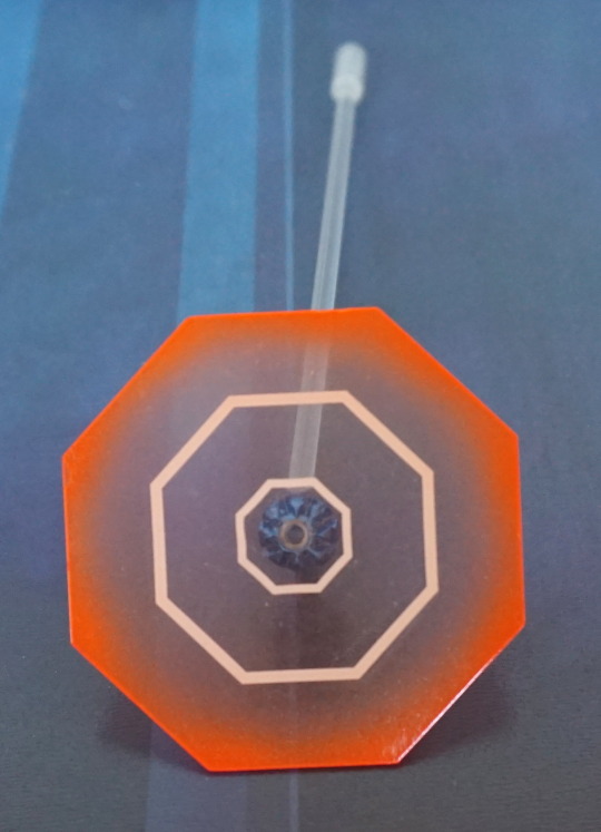
Also in accessories is the AT field:

That sits on an arm…:

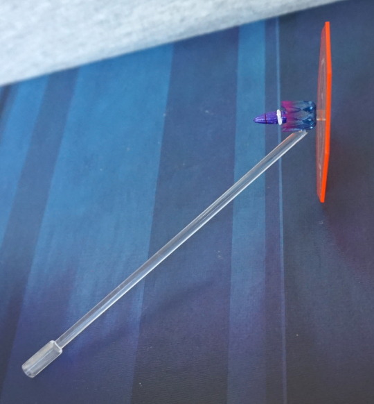
…which can be attached to the stand. Then you need to balance EVA-13 up on his own, which he will do. Though I’d prefer to have a separate stand, tbh. 

And after taking this pic, I realised I was some parts short. So I went to dig up the other bag of spare parts, and assemble him in the configuration I really wanted him in:

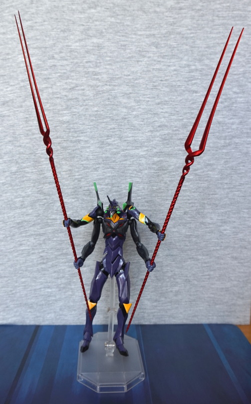
Yeah, much better! This form consists of a new upper torso and two more arms. The uppermost purple V in his chest is rubbery, and sits above the joint that attaches into the grey part of his torso. With the extra arms, the spears are far more stable, so now I can have him hold them aloft, and not worry about them swinging out of place, like with two arms. 

Some more views:

Looking good :).

Close-up of the arms:

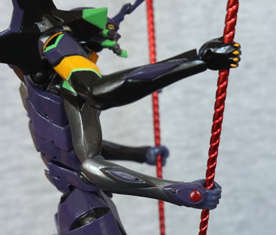
Love the shiny silver, and the cuff that both the lower arms have. Does make assembling on his lower hands a little on the awkward side. 

Overall, I really like this dude. He’s probably not as good as a Figma, but he comes at a lower price point, and far more accessories. Really happy to have him, and will be getting more of the Evangelion Evolution re-releases. I won’t be getting all of them – just a select few. 

Dva – Native

This figure is a futanari figure, so this is definitely a NSFW blog.

So let’s start with a SFW pic:

image

She has a very cute face, that has been well-painted. Love the shading underneath her fringe, and the slight smile. 

Here’s the “company is coming around” configuration:

image

The pasties covering her nipples are made out of metal, and she has magnets in her boobs. This makes them stay put, yet be easy to take off and put on. I like this! This figure benefits from strong lighting – her skin is quite plain, as far as paint jobs go, but in the light, it adds a fair amount of natural shadow, as seein in the pic. I love the shiny purple of her ribbons, and the methods used to hide the figure’s seamlines. 

Dva’s base:

This thing is big. Takes up most of a shelf of a detolf cabinet… The texture’s nice, and the butt divot does help keep her in place, but there’s no shading in the paint. Fortunately Dva mostly covers it, so it isn’t too much of an eyesore. And she certainly is a distraction, lol. 

Close-up of her with the pasties:

The paint appears to be thickly applied, and is a good, solid layer. Also shiny, which makes them nice, if you’d like to display her with them. 

Here she is without her pasties:

Yep, those look like a pair of nipples on a couple o’ melons. They’re big, but somehow don’t look ridiculous like some anime figures can do. 

Close-up on the flower in her hair:

Nice, vibrant colours, that contrast well with her hair. 

Let’s look at her different downstairs options, before looking at the rest of her in detail.

First up, if you want to keep her 100% woman:

Just the string, with some well-sculpted inner female parts. Not sure if she has a labia majora? 

If you want her to be futanari but not have everything on show:

You get this option, where she has a bright blue condom. The condom has a moulded ridge at the bottom, so it doesn’t appear painted on, which I thought was a nice touch. 

And for the full futanari effect:

One member please! It does have a particularly dark tip to it, which is a bit odd, but I honestly don’t mind it. Is a bit of an odd choice, but hey. Does ensure it contrasts strongly with her body and doesn’t blend in with it, from a front-on view. 

With this part, there is a labia minora visible underneath:

S’cuse the blurry shot. Was trying to hold her and focus the camera at the same time… maybe I should’ve taken the part off first. But I think this shot gets across what’s there, though it really isn’t visible when she’s on display. 

Close-up of her left leg:

I love the purple bows – the shiny purple is a lovely colour. The bottom part of her leg detaches, so you can slip the golden ring onto her ankle. The golden rings are packed separately in the box, so no need to worry about paint transfer. 

Right leg:

One nicely sculpted leg. Not much to say about this one. Some suggestions of shading in the paint, but not a lot. 

Midsection:

Yeah, this shot for your work PC wallpaper :P. The strings are nicely moulded, and slightly dig into her flesh. Hate it when they overdo it with the tightness, but I think this is a nice balance. The gold rings are also painted well, without stray paint. 

Left:

Here we can see she is arching her back slightly. Nothing too strenuous. The ribbon on her leg hangs down nicely. 

Close-up of her side:

The black strings are neatly painted. 

Right:

Here we can see where she’s resting her hand behind her, and the subtle shading in her hair. 

Close-up of her arm:

The band is nicely placed on her arm, and here is the other bangle you can place on her, if you’d like. Her lower arm detaches, so you can slip this on easily. Some people have complained her hand doesn’t lean on the base, but for mine, it does to some extent, and looks fine from the front. 

Close-up of the bangle:

Shiny 🙂 Here you can see where her hand does touch a bit to one side, but not so much in the middle. 

Back:

Yeah, bit of a seam visible here, but I love the gradient in her hair. And a nice shot of the penis :P. 

Lastly, here’s a shot of one of the penises not attached:

This peg simply plugs into the front of her, and the pieces stay there snugly. The penises are easy to remove, but the female parts are a bit of a pain to get out. Was able to do it with a fingernail from the bottom point. Once you’ve loosened them a bit, they’re easy to pull out. With the snug fit though, it does make the thong/genitalia parts look seamless though, which is good. 


This was an expensive figure, and an even more expensive one to get in the aftermarket. Glad I decided to be decisive about my preorder (had to do it through a third party too as Native won’t ship to my country :/), so I was able to get her at a more reasonable price. I think it would’ve been nice to have a bit more shading on her skin, but in the right light, she looks amazing. If you like a chick with a dick ;). though the options to display her without are both viable. 

Cute But Deadly – Kerrigan

Now back to series 1 of the Cute But Deadlies! Finally caved and bought this one on eBay, after missing out on her a few times in the past:

Glad to finally have her, though she cost a bit more than I initially planned to spend on her. But Kerrigan is worth it, even if I don’t play Starcraft :P. Love her angry, screaming face. And she’s a character that can make purple, brown and green work. The wings on her back can be moved up and down. 

Left:

She’s been to the stylist, and has plenty of purple, wormlike hair. 

Right:

I love the way the wings come out of her back, also the small detail on the back of her right leg. 

Back:

Lots of purple tentacles. What’s not to love?!

Glad I finally caved and got her. Always wanted something Kerrigan. Maybe one day I’ll get a scale of her or something. 

Cute But Deadly – Rainbow Goblin

After buying the two boxes from GAME, I walked into a collectable store and found this for a fiver:

One of the ones I really wanted, for less than the box price! Woo! I have the “normal” goblin, but I really wanted to have the rainbow one to go with him. I took a risk in buying him, as I hadn’t opened up the other boxes yet, but if I ended up with two, I could very likely get my money back on this one via selling it. But I didn’t get a dupe of this one, so happy days!

Left side:

Another figure with bright and vibrant colours :). Love the smiley cloud on his bag. And that cheeky grin he’s sporting. 

Right:

Aww, a little heart. Love the purple they’ve painted his outfit with. Love the little swords poking out of his loot bag. 

Front:

He has a good headbutting head. And I love his pale blue colour. 

Back:

Here we can have a closer look at his loot. See a little bit of stray grey paint, but nothing particularly noticeable. 

Overall, I really like this figure, and was super-glad to be able to get him 😀

Cute But Deadly – Pharah

GAME had reduced the price on the Cute But Deadly Series II figures, so I picked up two of the boxes. One of them was a repeat (Tyrande), but the other one was Pharah:

I don’t play Overwatch, but this little figure is too amazing to give up. I love the bold, striking colours and that screaming expression. Which came off like shock, in an ad-hoc picture of a lewd figure I sent to a Discord channel I’m in. Oops, haha. 

Left:

Some stray yellow paint at the top, but other than that, painted well. Surprisingly the smaller details are neater than the big ones.

Right:

Similar story here. This side is pretty much a mirror-image of the other one. This one pegs into the stand, but also propped up by the downward-pointing fins. 

Back:

Plain-looking for the back of her head, but the fins jutting out of her back prevent her looking totally plain. Love this part of the character’s design. 

Overall, I really like this character, even though I don’t have any familiarity with her. The paintwork is largely good, and the expression interesting, and would likely work well in photoshoots. I still think these are a bit on the pricey side in the UK, but the quality does justify a higher price tag than a lot of other blind boxes imo. 

Vasquez – Aliens – NECA

The day after FACTS, we decided to wander around the town we were staying in. Found a couple of comic book shops, but only made one purchase. Things were largely overpriced, and arguably this one was, but she’s hard to get a hold of now, and she has a bootleg version, if eBay auctions from China are anything to go by. Reallly should have bought her when I had the opportunity to, but nope. Decided to pay the premium, as this one had officially been imported (via heo), so I could guarantee it was not a fake. 

So here she is:

And wow, I’m not actually salty about overpaying. This is one of the figures I reckon NECA knocked it out of the park with. The sculpt and the paint both work for me, though the lack of assembly instructions was frustrating. Please stop this NECA, with your more complicated figures. 

Close-up of her face:

It has an almost lifelike quality to it, which impressed me. The bandanna print is crisp. We can also see some wear and tear on her armour, and the writing is nearly done. The cross on her neck has been neatly done too, which was a nice surprise. 

Close-up on the smartgun:

This thing is cool but it was interesting working out how to assemble the piece that hangs off. The muzzle flare can be removed, if you have trouble fitting it all in a display. The detail in the mould is good. 

Left:

Some nice detailing in the fabric of her trousers, and a pocket. Here you can see the assorted equipment she has. The shoulder camera was a pain to get in – she has a rubbery strap with a hole in, which didn’t quite align with the hole in the back. Some heat helped me move the strap hole into alignment with the back hole though, and I got the pest in. 

Also love the paint detail in her shoes. 

Close-up of her arm:

The ties around her arm have been done well. The articulation in her arm is decently hidden for an action figure. 

Right:

The satchel is well-detailed with folds and stretch marks. Again, nice detail on the trousers and the boots. 

Back:

Here you can see the problematic strap that runs from her left side, up to the middle of her back. However, once the piece was in, it really completes her look. 

Close-up of her camera:

I’m seeing a little bit of stray plastic looking at this photo I could cut off… Lots of little details in the moulding of this piece – grip handles, texture on the side of the camera box, and the bits and pieces of the camera itself. 

And to round this blog out, an action shot:

Yeah, this figure looks really good and isn’t too hard to stand up. Had some issues at the beginning, but she behaved for most of this photo shoot, which was a boon. 

I’d recommend this figure. Yep. If you like her, and you can get hold of her, I’d say get this figure 😀

Blind Box Pack

The stall that sold me the Harley Quinn XXRay figure also had a blind bag on display, and I was, for whatever reason, determined to buy some kind of blind bag at FACTS. I looked around his stall, and he seemed to have a decent selection of blind box stuff, so I decided to go for it and buy the bag:

image

So… let’s see what we got. The figures were brand new and sealed, but I didn’t take pics of the items whilst they were still boxed. 

First up was this “Vamou” figure:

image

Decently made, lookin’ pretty dead. Would’ve preferred to get a purple one. The box was a choice of this dude in various colours. Not too interesting, but well-made. 

Side:

image

Back:

image

He’s decent enough, and has ended up on a shelf of other small collectables.

Next up was a Be@rbrick. Was kind of excited to get this, as I wanted to see what these are like. Inside I got one entitled “Animal”:

image

An interesting texture, and the articulation was better than I thought it would be – the arms are on ball joints, so you can move them into many positions, unlike a minifig. The legs also bend outwards slightly. He can rotate at the hips, head and wrists, which is good. Not the best pattern, not the worst. He also came with a card, which I didn’t take a pic of, as it’s already in a drawer. 

Side:

image

Back:

image

Close-up of the text:

image

Interesting addition on the back. I guess it makes the copyright text less boring! 

Lastly, Shah Mat chess pieces:

image

Each set comes with 4 tiles that clip together (each tile is a separate piece) and a pawn. My bind box figure was the king, who is the rare one, uh, yay! If I could find a buyer, it would likely be worth something, but I don’t think people are clamouring for a chess set that you have to get through pricey blind boxes… They do make pretty display pieces though! 

Back:

image

And they are cute. 

Overall, I felt I broke even on this. Buying the boxes would’ve likely cost me more, but would I have bought them….? I’d say definitely “no” for the Vamou, and a likely “no” for the Shah Mat dunnies. Though none of them are headed to the the “box of trading figures”, so I got things that I like. Maybe not the wisest use of €15, but it was a fun one. Out of blind bags, I could’ve done much worse, so glad how it turned out. 

And here concludes my loot at FACTS! Money well spent I say!

Harley Quinn – XXRay

The stall had a bunch of XXRay figures for €15, including this deluxe edition. Price is about average for the normal editions, but couldn’t resist this deluxe edition, especially as it was Harley Quinn. 

Here she is, out of the box:

I’m a sucker for novelty figures, and have been looking at these XXRay figures, but usually they’re either too expensive, or not a character I want. 

Her internals have been well-sculpted and painted. It’s nice having one of these figures, but I feel having a lot of them would be kind of “meh”, as they seem to largely do humanoid characters, so the internals don’t vary much. On the externals, there’s a couple of bits of stray paint (you can see one above her left bobble). 

For accessories, she comes with the hammer as pictured above, plus these pieces:

Unfortunately taking her apart is not easy, so I haven’t actually tried these pieces out, but it’s good they included other weapons for her to hold. I’d likely pick the hammer for her anyway, as it’s the most iconic item of the three. Bomb has a noticeable seam though, which isn’t so good. 

Left:

Here we see her, as if she was whole. Paintwork is mostly OK, with a little escaping here and there. 

Right:

Bony! I like the way they’ve done the cutaway. Her cutaway foot seems too flat though. Would’ve been good if these bones were raised like the ribs. 

Back:

Imo the back looks good. No real complaints back here. 

I think these XXRay figures are a neat idea, but I don’t think I’d collect a lot of them as it’s much of the same. Having a couple makes for a good novelty, having a collection would just water down their impact for me. All in all, I’m happy with this one and maybe I’ll pick up a Joker if I come across one going cheap or one or two others. If you like what you see, I would recommend them, but not paying a lot for them, as they aren’t that big. 

Chatterer 18″ – Hellraiser – NECA

Now for my largest purchase of FACTS! In price, as well as size… 

Though I couldn’t use the usual backdrop:

image

… so I apologise if the photos are a bit meh today. 

Here he is displayed on a shelf, showing how big he is:

image

Yeah, this dude towers over everything! 

So let’s get a closer look at him:

image

His top is leather, whilst the rest of him is hard plastic. The leather overlay on the top is a really nice touch. I got this figure cheap, as it does have a few flaws – there’s a paint scratch on his lip, and most of his leg joints were glued by a previous owner, as well as being glued to the glass disc. I don’t mind him being attached to the disc – it certainly helps him stand, but the joints being seized is kinda annoying. 

Left:

Detailing is nice on the arm, and a bit of a lack on the leg tbh. The halves don’t quite meet up in texture at the top. 

Right:

Here we can see better the arms have plenty of creases running round them, and various fake leather pieces making them up. Here the leg issue is better demonstrated – where crease lines don’t run from the back half of his leg to the front. The white dots are glue residue – I may attempt to remove these at some point, but this is from the haphazard efforts to force him into a stable position. 

Close-up of one of his hooks:

The blood effects are nice, and the chain is plastic, with fake rust. Looks good though. The top half of the hooks slide into his hand, an the bottom of the hook is attached to the chain, and clips into the other half. These fit easily and nicely in his hands, so no issues there. His arms have full mobility, but due to the way the arms have been designed with particular orientations in mind, this limits poseability, if you want things to line up. 

Back:

Back looks nice, and the leg hinges aren’t too visible. The screw on his backside is where the batteries live (he has an action feature!) and the switch is there to turn him on and off. 

Close-up of his back:

Here we see the switch, which says Off-On above it, and the leather overlaid on his flayed back. Kinda wish more of the figure was covered in material (it’s a rubbery plastic made to resemble leather). 

Close-up of his face:

Lovely amount of detail in the face, with the sculpt and the paint. Here you can quite clearly see the paint chip on his lip. I feel a lot of the detail in this figure is in his face. 

Side of head:

The metal wires have been well-painted, and moulded so they’re digging into his skin. 

Back of his head:

His head is slightly rotated – if you have his head straight, the removed flesh parts line up properly. Love the veins shown in his head. I think they did a good job back here. 

So action feature… what would chatterer’s action feature be? Well, he has a motion-activated chat:

Initially, it didn’t work when I put the batteries in, and it turned out that one of the battery terminals were corroded. Currently they’re replaced with a piece of foil, as it was the one bridging the two batteries. Probably won’t bother replacing the foil, but was really glad to find he still chatters, even if the motor is a bit noisy lol. 

Compiler – Story Image Figure – Yamato

I’m a sucker for StoryImageFigures if I see them cheaply enough. And this was the case with this one, at €5. 

So here she is:

I love the swimsuit she is wearing, and wish I could look good wearing one like that, but alas, it’d look odd on me. Not to mention that ring is probably metal and I have a nickel allergy… As an older figure, there’s a noticeable lack of dfetail in her face and hair. Some of the StoryImageFigures haven’t aged too well due to this, but on this one it isn’t enough to put me off it. The contrasting textures of her body and her swimsuit is nice.

Left:

She’s got a good pose, with one hand on her hip. Hair has some shading, They have gone for a poofy hair look, but it didn’t quite work in the mould I think. Just something about it seems to say “low detail”. 

Right:

This angle looks OK. Hair shading a bit suspect towards the top. Is a hair seam, but I don’t find it distracting. 

Back:

You can see where they’ve aimed to shade her hair, with the darkest parts on the ridges. Which I think worked. Just maybe needed to persist to the top. 

The stand is simplistic, but OK. Helps her stand up just fine, but the texture isn’t anything to write home about. She didn’t quite want to stand up originally – I think some bending has occurred in the box, but once I got her to settle, she’s been fine. 

A good addition to my collection, and was easy to place on a shelf, with a couple of other StoryImageFigures. Nice to get the odd small thing, now that I have a sizeable collection XD. 

Angry Groot – Eaglemoss

This figure originally came with “Marvel Fact Files – Cosmic Special Edition #5″. 

I, however, just bought the figure without the magazine:

Was drawn to this figure, due to its unusual look. Most Groot figures have him more tree-trunk-like, and this was more like spiky, angry tree. I love the shouting expression and his hairstyle. 

Left:

The paint job isn’t hugely complex, but it works. Most of the niceness of this figure is in the sculpt. 

Close-up of his arm:

Love the poking out parts of bark, and his hands look good, with the green emphasising his knuckles. 

Right:

Looks fine from this angle too. Some asymmetry going on, which is nice. 

Back:

I like the “flow” of the bark on his back. The shapes tessellate well and look good. Also a fan of that spiky hair 😀

I like this figure. The pose and facial expression convey a lot of emotion, and you can’t help but imagining him roaring. A welcome addition to my collection. 

Klingon Birds of Prey – Star Trek – Eaglemoss & Hallmark

Bought these two Klingon Birds of Prey from the same seller. Well, when you like a thing… you buy two of it :P. 

First up, the Eaglemoss figure:

Evidence Eaglemoss can make decent stuff  when they want to. Not quite sure what’s going on with the Klingon logo on the wing – seems to have more colours than it should? Maybe a Star Wars buff can comment.. However, the paint job gives a good weathered look to the ship, and the model is detailed. This model shows how little splashes of colour can really bring out a colour, with the gold accents on the end of the wing & gun, the gold accents on what I assume are auxiliary thrusters on the top and the red for the windscreens. 

Front:

Birds of Prey have quite a thin profile from the front, so not a lot to see here. Menacing though. 

Left:

Same details as the right, so I’ll pass a few comments about the stand – it stands fine, as long as you leave it alone. However, it is a bit easy to knock it out if moving/handling it. If you want to move these ships around, I’d suggest taking them off the stand first prior to moving. Don’t want to ding any weapons off!

Back:

Here we see the red of the main engine. I do like this stand’s general design – it does allow you to see all the angles, without getting in the way. No complaints about this angle. 

Top:

Here we get a much better look at the details – this Star Trek series has some impressive entries, which is why they hold their value on reselling sites. Star Trek is a bit of a weird one for licencing – they have a bunch of Playmates merch, which is largely meh, then they have really good things like this. 

Bottom:

Glad to see they didn’t skimp on the mould detail here, but… shouldn’t the undersides of the wings be red? Seems to be a different design underneath, than the one I’m familiar with. Pleased to see they did detail it, but not sure it’s entirely accurate, but I like it anyway. 

Overall, I’m really happy with this model. I do really like some of the “enemy” ship designs in Star Trek. 

The second Bird of Prey I picked up was a Hallmark Keepsake:

No stand for this one, as it’s a Christmas tree decoration, so here it is, with its butt parked on the floor. As expected for an ornament, it is less detailed than the Eaglemoss one, but still looks good imo. Here they’ve painted what looks like a heat sink in silver, which makes me realise the other one had this part in green. Hm, looks better in silver. Nice detail in having some Klingon writing on the wing. No idea what it says though. 

Top:

Here’s the wire that is designed to plug into a light string, but may get modified to work off USB, as the manual suggests it should work just fine on 5V. The “1994″ on the back above the thruster is because this ornament was manufactured in 1994. Interesting detail there, lol. No thread on the eye, but I’ve got plenty around here to supply my own. Top of it looks good at a distance. 

Front:

Yep, still small profile, though this one’s chunkier construction makes it stand out more. The yellow light at the front will light up when powered. 

Back:

Here’s a red light, which represents the thruster. I believe this one is meant to flicker when powered, but as I’m yet to test it, I haven’t seen it, only read about it in the information leaflet.  This isn’t a particularly attractive angle for the ship.

Bottom:

Red wings! Yeah, this is how I remember them! Despite the lack of shading, the paintjob on the bottom of this one outdoes the Eaglemoss one. Shame we’ve got some copyright info slightly spoiling it. This is probably one of the neater angles of this ship. 

All in all, this is a nice ship considering it’s an ornament. If you’re looking for an epically detailed display piece, this probably isn’t the ship for you, but if you like a Bird of Prey that lights up, this is an option. I’ll try to post an update if I get the lights working, but they’re yet to be tested. If I get it working, I may choose a display shelf that I’ll have powered items on, and have 5V available for LEDs. 

Alien Attacker – Independence Day

So now for the FACTS loot! First up is this spaceship that came with a collector’s edition of Independence Day. It came with the box, but not the Blu-Ray, though with the Blu-Ray it’dve been a lot more costly… and I don’t care about Independence Day that much. Just wanted the cool spaceship :P. 

Here it is – it has a nice plaque stand. so you know where it is from. It sits on two plastic supports, and is relatively sturdy. 

Closer look at the stand:

Here we see the base pattern, nicely shaded, and the plastic supports that peg into the ship. 

The underside of the ship:

Here we can see the two slits that the stand pegs into. Most of the paintwork is a black wash, but it isn’t evenly applied, so there’s lighter and darker areas, which gives the ship more detail. Some silver paint on the back, which provides a bit of a contrast. We can also see the guns that dangle down from the bottom.

Here’s a closer look at one of the guns:

They don’t give an overly detailed vibe, but they do the job. 

Left top:

The detailing is good, but the paint job just leaves it looking a little on the plain side. I love all the etched patterns and the fin on the top. 

Top front:

Windscreens are there, but no detail really. Would’ve been nice if they were in reflective paint, or there was suggestions of detail inside the ship – looking at some pics of the movie, there were lights inside. Also there seems to be a lack of wash or paintwork on the parts either side of the windscreen. I think it’s this and the lack of variety in depths of the etching that leaves it looking plainer than it should. It’s fine for a cheap figure, but I wouldn’t pay a massive premium for it. Also with most of it being the plastic’s colour, it does leave it looking like a plastic model. 

Top-down:

The patterns are what “make” this ship, along with its unusual shape. A credit to the original designers. 

Back:

Yep, that’s a ship’s arse. Line of the fin is good. Looking closely, there’s some stray grey paint on the base… 

If you like this ship design, I’d recommend it if you can get it cheaply. It’s definitely not the worst collectable that came with a movie or game (Max Payne 3 statue anyone?) , but I don’t think it would be winning any awards either. I think it’d make a great base for a custom paint job, but alas, I’m not the one to do that. Well, not at the moment anyway. I’m mildly a sucker for ships, and I liked the look of this one, so decided to get it. I don’t regret it, but do think the paintwork could’ve been better on the ship itself. 

Lara Croft – Union Jack variant – NECA

Last but not least from Forbidden Zone, Lara Croft in a Union Jack shirt:

Upon getting her out of the box, she has a platiciser issue, and her skin is quite sticky. Haven’t washed her yet. Had to buy her because… union jack. 

Close-up of her top:

Her hair they’ve tried to shade but not sure it worked. The texture seems a bit rough on her hair. Her makeup I think is a bit too on the severe side. Far off, the painting on her top looks OK, but close-up, it doesn’t really hold up. The neckline is particularly a mess, but there is some mess in the middle of the flag. The 

The shininess on her face is due to the plasticiser, and some of the uneven colour may be due to it too. If the makeup parts were done in a less severe colour, I think her face would look much nicer, and I wouldn’t have complaints about it. 

Close-up of her shorts:

Most of the painting is pretty neat. Some weathering effects, which is a nice touch. And a nice-looking belly button :). The guns can come out of the holsters – they start off in the blister, or she can hold the pistols. 

Empty holster:

They’re rubbery and hold the pistols quite well. They need a bit of a shove to get in there fully. 

Left:

She looks good from the side. Some weird orange line on her leg – not investigated if this is plasticiser effect, or if it’s painted on there. Unsure if deliberate or not, could be mud… Here I’ve taken the shotgun out of her hand, but here’s why you kind of need a weapon equipped:

Yeah. You can face the back of her hand forward, and that doesn’t look as odd, but the hands are moulded for holding her weapons, so you can’t do too much with them if she hasn’t got a weapon in her hand. Would’ve been nice to have some fists/flat hands so she didn’t look odd when not holding a gun or the sword. 

Right side:

Looking a bit sunburnt on this side, lol. I love this interesting-looking artefact weapon. I should probably really know what it is… 

Close-up of the weapon:

Love the blue dots on it, and the intricate design. 

Back:

Some mottling, which might be the fault of the plasticiser. But it does look like she’s been out adventuring to me :)> Plenty of grenades back here to fend off the beasties. Love her backpack – this has been well sculpted and painted. Hair still looks a little rat-tail though. 

Close-up of the grenades:

… and her backside. Not too much of a backside view, due to the accoutrements on her belt. The grenades look good, and painted neatly. 

And the last of her arsenal:

Pistols look OK, shotgun is painted OK, but the backend I think looks like it has been through a steamroller – I guess to make it thin enough for her to hold. Also not sure it’s actually faithful to any of the games? Grenade launcher looks… eh. That one is going into storage. She can’t hold it well either. And another point about holding her weapons – she seems to like to practice trigger safety, and it seems hard/impossible to get her trigger finger into the trigger guards on her weapons. Kinda like the weapons were a bit of an afterthought. Pistols look good in her holsters, even if they look mediocre out of them. And she has that sword to wield, which is the favoured option for me. 

Overall, I love the look of this figure and did a good job for the most part, just a shame about some of the more major paint flaws. Also she has very little articulation in her arms, which severely limits posing. However, I’m forgiving of this – with older figures, the elbow joints tend to suck massively and show far too much, so this is the better option. Would’ve been nice to have some replaceable hands, and dispense with the kinda crappy looking guns. 

Lilith – Darkstalkers – Capcom Girls Collection

This figure was also an instabuy for me – and even better, this one was on sale! After leaving the shop, at first I though there was damage to the wings, but it turns out I was mixing up the lugs with her claws. Was super-pleased to find out that there’s nothing wrong with her, and she was just reduced for quick sale. 

Here she is, blowing a kiss:

image

Pic towards her face:

I like the sassy pose she has – it suits her character. Her outfit isn’t overly detailed, but it does the job. The bats on her leggings are nicely done, but I would’ve liked to see a bit more contrast so they stand out more. They do blend too well into her leggings.

Close-up of her face:

A cute, if simple, face. Hair strand moulding is nice, and the creases on her sleeve. 

Opposite side:

Here we can see she is well-posed, with one leg bent in a suggesive pose. We can also see where i didn’t quite get the pegs all the way in. Didn’t want to end up breaking them, so ended up leaving them as-is for now. Back of her head is largely flat, which doesn’t make it very hairlike. Other part that doesn’t look so good imo is the white edging on her sleeves – the finish and colour leaves it looking plasticy, instead of more like fabric. 

Back:

One well-sculpted butt :). Her spine and back are detailed in the sculpt, which is nice. 

Close-up of the wing:

No shading, but I think they still look good and striking. Due to their shape, natural light adds some natural shading :). I like the way they’re posed so they frame her. The tops of her wings aren’t detailed, but I don’t see too much of them. 

Overall, I like this figure. It is a simpler figure aimed at a lower price point. If you can pick her up for a good price, I’d recommend her. 

Angel Of Death – Hellboy 2 – Mezco

Second loot…. more Hellboy! This time the Angel of Death:

This figure is huge with her wings! Really love the wings for this figure. You can move them up and down, and hinge them back and forth a bit. I love her skin texture, suitably gross, with the hard, bonelike head. She looks the part imo, but picking her up, she feels a bit like a… lump. 

Close-up of her upper half:

Here we can see the nice details in the sculpt and the shading, which has largely been subtly done, and really adds to the figure. I wasn’t leaving the comic book shop without this one 😛 Other than the wings, you can move her arms, as shown here. The joints just rotate, but this is fine for this figure, imo. 

Left side:

Some shading is present in her cloak, and here you can see the hinges in the wings. She has some good detailing in her arms – you can see the spirals etched into her arms, as well as the scaly layering. 

Right side:

Pretty much the same story here. Some grasping hands, which fit with the character. 

Back:

The wings are fully sculpted on the back, as well as shaded, which looks really good. Kinda wish I could display her where you can see all angles, but she needs to go in my large cabinet to fit anywhere XD. And here you can see her not fitting into my “set”. I don’t have the space for too many large figures, so I don’t think I’ll be rushing out for another piece of wood yet… Though I will be reviewing a super-large figure soon™, which may require a new “set”…

I really like this figure, and super-glad I got her. 

Hellboy Mini-Bust – Gentle Giant

This is the first of the purchases I made at the comic book shop that ended up eating half of my budget… Forbidden Zone in Brussels. So the next four blogs will be the purchases I made there :). 

First up is Hellboy:

image

Love the paint on this dude. One small mark on his right shoulder, but otherwise is in excellent condition. Love the strong red of his chest, complemented by the shading. But I agree with one review I read for him… he does have a lack of nipples. He could do with more in the nipple region :P. 

Close-up of his face:

image

Hair/sideburn paint is a bit sloppy in places. And you can see the mark on his jacket in the corner of this photo. When looking at this picture, I do notice they’ve missed out some copper paint on the fasteners(?) on his jacket. The shading on his face seems kind of unfocused, but it works OK from a distance. I do like his eyes, 

Left:

image

Here we have his gun hand. We can see a good amount of shading on his jacket too. The gun looks good and weighty, and looks the part imo. You can see the tendons in this hand, which makes it a good sculpt in my book.

Close-up of the gun:

image

Texture looks good on the gun, and seems to have the right details to my untrained eye. 

Right side:

image

Love the straps going down the arm of his jacket. The stone texture on his arm is really good, pleased with how that came out.

Closer look at the arm:

image

Looking good 🙂 

Back:

image

His jacket has some lovely shading in it – love the fact they didn’t go for a super-plain look, and does give the feeling it’s a more “lived in” jacket. Some minor marking here too, but it just kind of adds to the jacket :P. 

Overall, I really like this bust. Think it was worth the money I paid for it :). 

Wasp – Kotobukiya Bishoujo

The day before I went to FACTS, I went to a handful of comic book shops and Japanese merch shops in Belgium.

First purchase was Wasp from Super Dragon Toys, as she was on sale. Had seen her clearance in the UK, but didn’t get her as I wasn’t sure if I liked her. Seeing her in person made me decide I wanted her. So here she is:

image

I love the happy expression, and the shiny wings. The gold has also beeen superbly done – gold can often look poor on figures, but here, it’s a good hue and shiny. 

Close-up of her face:

image

Love the shiny lipstick and moulded mouth. She’s also got some shading painted into her eyes, which is a nice touch. Her hair is sort of simple, but nicely sculpted. Here we can also see a couple of creases moulded into the neck part of her suit, giving it a lifelike appearance.

Close-up of the base:

image

A nice, creative base. No solid-coloured disc here. The splash looks good, with the blue fading out towards the droplets. Also some ripples on the disc part of the base, so it isn’t just flat. The colour complements the figure imo.

Right:

image

Here we see the bulk of her outfit – I love the gold piece running down the middle, and the gold on her palms. The suit itself also has a few well-placed creases, to show it is indeed a bodysuit. 

Left:

image

Here we can see where the wings peg into her back, and the paints nicely match up. And her shapely backside – she has a pear shape goin’ on here. 

Close-up of the gold on her shoes:

image

I don’t think she has much grip on the floor, but the finish is nice and gold colour attractive. 

Back:

image

This shot shows off some of the iridescence of the wings. I love that they’ve managed to make the wings iridescent – it shines quite well, and looks great in the sunlight. 

Her hair looks good from the back too. 

Close-up of the wings:

image

This is definitely one of the features that attracted me to buying this figure. More figures need iridescent parts! And well-done gold parts! 

Overall, I really like this figure, and kind of wish I bought it sooner XD. Might’ve got it for a bit cheaper, but hey, I have her now!

Elite Praetorian Guard – Star Wars: The Last Jedi

Here’s a bit of a random pickup – a die-cast Elite Praetorian Guard. I haven’t seen The Last Jedi (can’t claim to be much of a Star Wars fan), but I love the design of this character, who looks like this:

The majority of the figure is a solid metal, and his skirt is rubbery, allowing to flex as you move him around. Weapons are also plastic. The particular thing that drew me to this version of the Praetorian Guard was the shininess of the paint, which I think works well with the red. As much as I’m not a fan of the films, I have to give them props for designing some interesting-looking characters. 

The base:

The base has this nice etched pattern. Shame it’s only passable as a base – it only has one peg, so getting him to balance can be tricky, as he’s quite top-heavy, so realistically, you’re not going to do action poses with him. If you want him in a more action pose, you may have to invest in a sturdy claw stand. 

Left side:

Here we can see a pinhole that’s the articulation for his arm, and one of the rubber bands I’ve left on for the weapon in his left hand. With the weapons, I took the one off the right-hand side, then had issues getting the weapon to stay in his hand. They are plastic-y, but not by much, so you could possibly get a better grip out of it. However, doing some research during writing this blog, I’ve found you can make the two swords into one weapon… but he’ll be holding it one-handed. Does stay in his hand better as the one weapon. 

On removing the pictured rubber band, I think it had started to go. I wasn’t planning on leaving it on long term, as they do eventually perish and then are an awful mess to remove sometimes. 

Right side:

So let’s get to those arm seams – yeah, they’re pretty visible. Probably less so on this side. I don’t think it’s too bad placement the seams, but they do remain visible. Here you can see the notch in the weapon, which attaches to a corresponding hole on the other weapon. Having the choice to attach them together is neat… however there’s a lack of articulation, so you can’t really do a two-handed grip, like the weapon should really be held. He has a lack of “flapping” motion in his arms – the joints basically articulate on one axis. 

Back:

They covered up four screws… but not the two on his arms?! I guess it was to avoid fouling of the joint, but damn. Seems an odd choice to do nothing, and not even paint the screws red. Some nice detailing in the mould of his upper body though – some bit son the back of his head, and the lines on the back. 

Honestly I think this figure would have been better as a statically posed figure, with maybe some swappable arms to change his stance to hold the weapon. The articulation gives you some options, but you’re fighting gravity to find stances that work. I think this is the kind of guy you’re going to pose once, then leave him, lest you knock him over and scratch him. The die-cast and the paint gives him a good finish, and makes him into a weighty collectable, but I think the articulation didn’t add as much as it should to a figure, and kind of loses out on that. A claw stand may’ve been nice, or maybe some stand that holds onto his leg, or wedges up between his legs, so you could have him more “action stance” and not have to fight gravity so much. 

I don’t mind him for what he is – I didn’t pay full price, and honestly, I think I can see why other people didn’t either… Once displayed, he looks fine, but there has been compromises in this figure that don’t quite work. 

Liko – Active Raid – Figure-Rise Bust

I saw a video of this model kit, and decided I would like it, to continue on with my interest in all things model kit. I’m not familiar with the series, but loved the colour scheme, and thought she was cute. So here she is:

Not the easiest thing to take a picture of, due to her outstretched arm. And those dot stickers on her collar were in the right place when I built it *goes to fix it*. 

With this kit, the things that attracted me to it was the face, the base and the colour scheme. I love the way they have done injection moulding for her eyes – they’re actually constructed from plastic, rather than being stickers, which gives them a fantastic finish. And no need to worry about getting them crooked! My main issue with the kit was getting the flesh-coloured parts of her body to sit well together – here you can see the bit at the front is still a bit gappy. Other problem was the stickers – some of them didn’t quite seem big enough – main pain-in-the-backside are the ones above her chest – those V-shaped stickers seemed too small for the space they fit in. 

Left:

Here you can see some of the details on her sleeves, which are nice. Here you can see one of her body seams – they’re just kind of butt-ugly. She looks fine from the front, but the seams kinda make other angles a bit “eh”. Her hair flows nicely though,and I like the frill she has on her headband. Maybe I could go for a partial disassemble and sand down those bits of the sprue, but not sure it’s entirely worth it. 

Right side:

Another weird seam here. I do like the way she “projects” out of the base. Another interesting thing about this base is you can attach it to a Bandai stand, along with the mecha that goes with her. Probably won’t get the mecha though. 

Back:

Here we can see her flowing hair, which I think looks good. 

Top back:

A closer look at those unusually-shaped hair buns, which give some personality to the figure. You can also rotate them, to get her micro-pigtails at whatever angle is preferable to you. 

Bottom of the back of the base:

Here we can see how she is hollow and attaches to the stand. Getting the disc into the correct orientation was… fun. There wasn’t much guidance of how it was supposed to go, but some trial and error later, I got it. She attaches firmly to the stand, so not concerned about her dropping off or anything. The way her hair connects to the stand means her head does not articulate though. 

Above:

I love her sleeve. All of the translucent green pieces have silver stickers underneath, which help the green bits “pop”, which adds to the figure. Her arm at the white armband is a bit easy to knock apart though. Did knock her arm off mid-assembly, oops. 

Overall, I like this model kit. It wasn’t too hard to assemble, but I don’t think I would’ve paid a lot for it. If you find this cheap, and like the end result, I could recommend it, but kind of has limited display angles, due to the way the seams are, unless you really want to get some model putty and paint out.