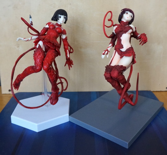
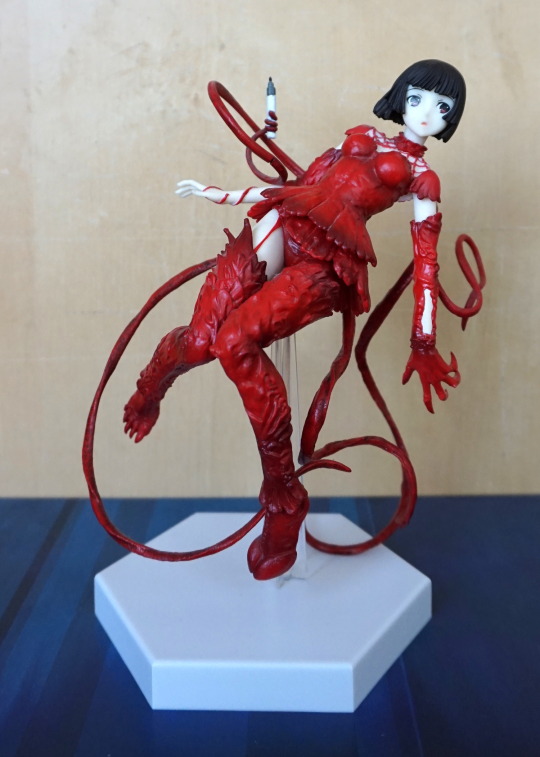
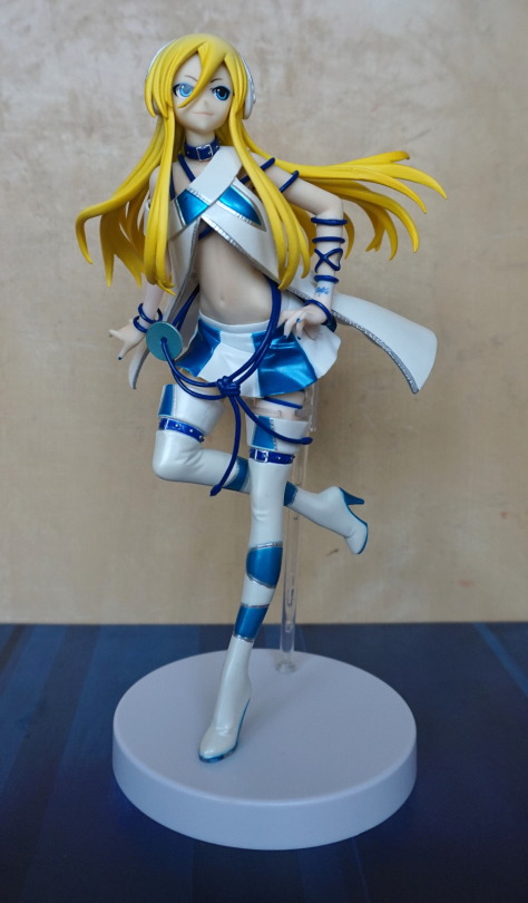
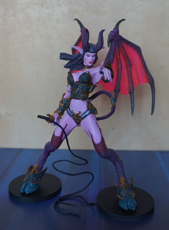
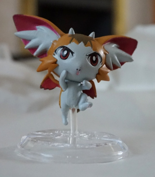
Sirene is a character from Devilman. She’s a harpy with electric powers. This figure was on my Mandarake wishlist for some time, and my recent Urban Mine digging gave me the excuse to order it.
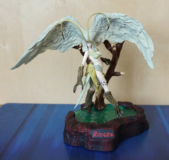
She’s designed to go with two other Devilman figures, but still looks great on her own. Am impressed with the detail in this figure.
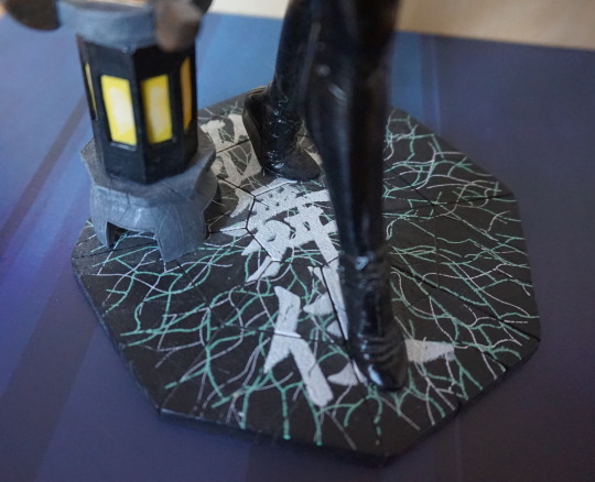
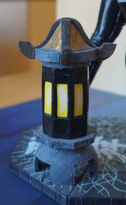
Here’s a close-up of the base:
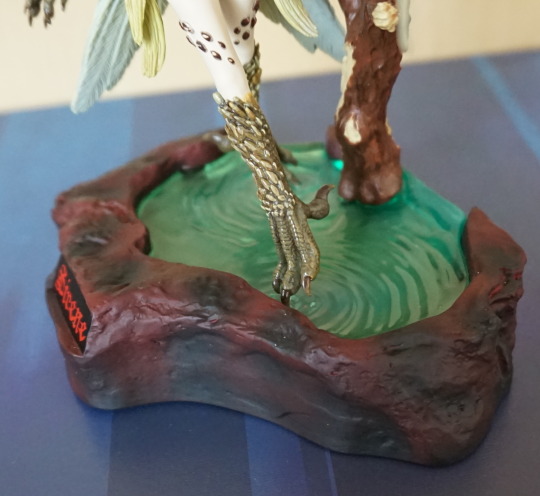
Her wings rest atop the branch, and her feet have some tiny little holes that her toes rest into. She’s a lot less easy to knock over than she first appears, which is nice.
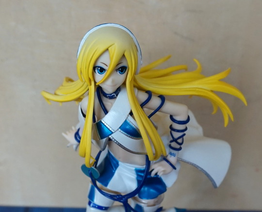
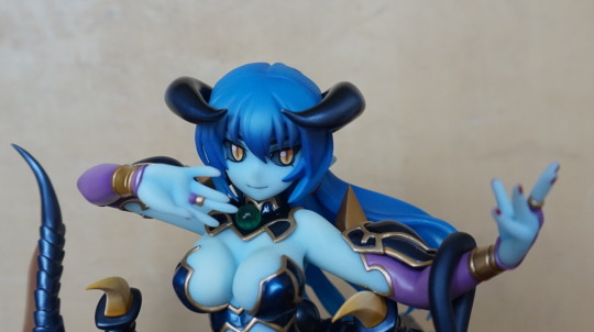
Close-up of her face:
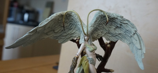
She’s got very big head wings here.
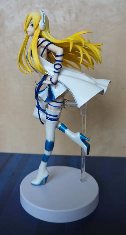
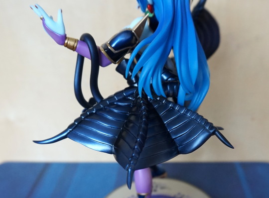
She also has butt-wings:
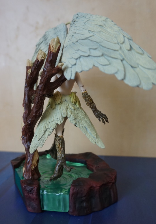
Never know when you might need to fan something away! Also there is a bit of a waterfall on this side, and the back is just “cut” water, rather than a waterfall.
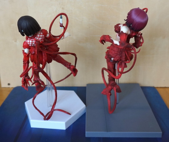
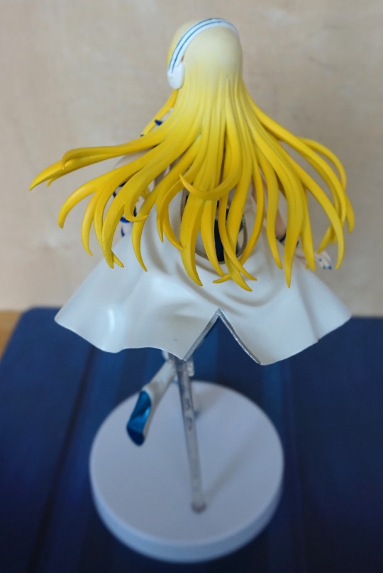
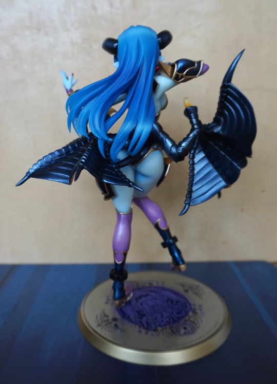
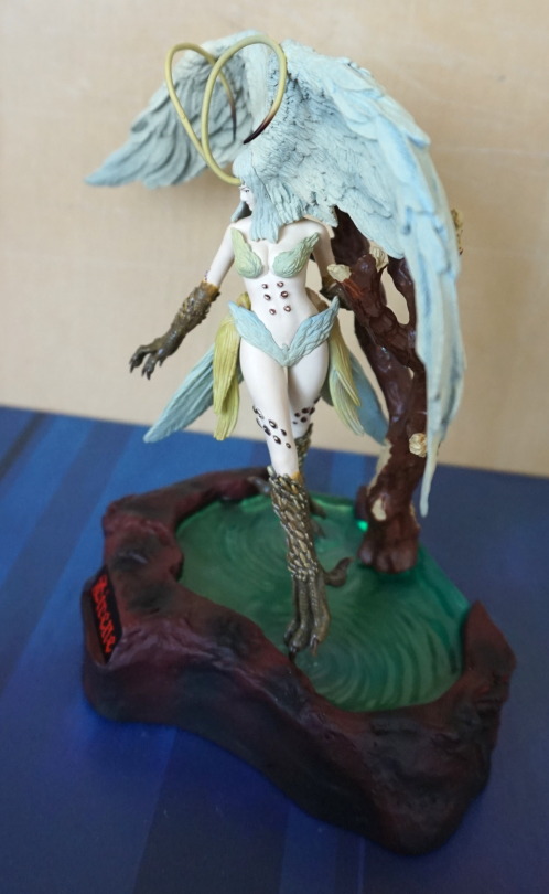
Back view of the figure:
This shows how the back really is the back, but the branch has been done nicely. Her head wings are also highly detailed on the back, which is nice. This would be a good figure for a mirror cabinet.
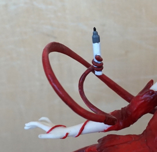
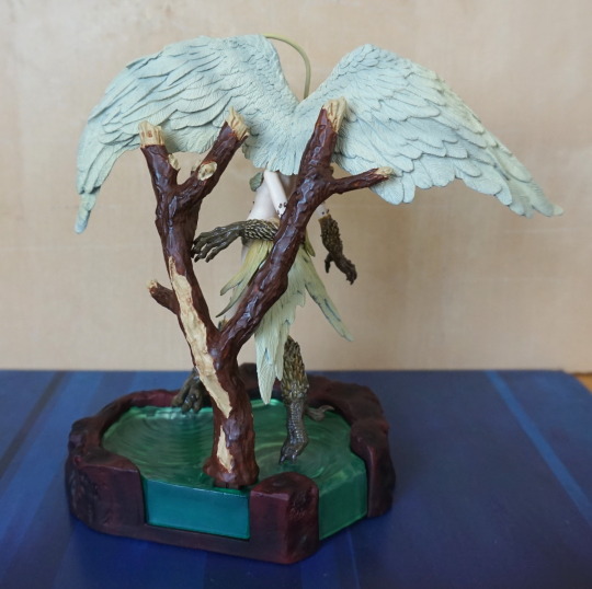
View showing the spike details:
Glad I bought this figure – it exceeded expectations, and am now considering obtaining the rest have ordered Devliman.