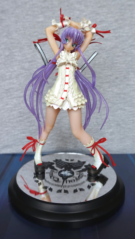
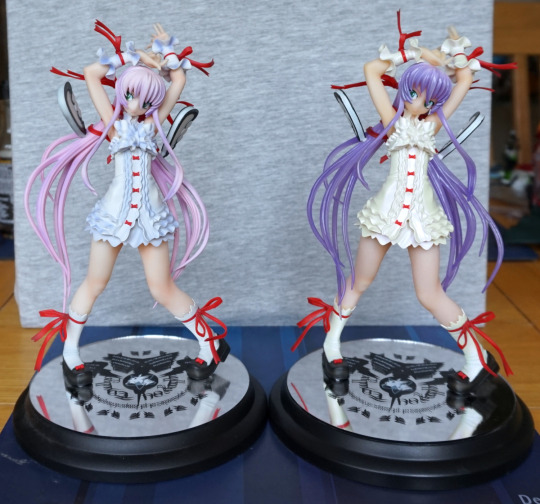
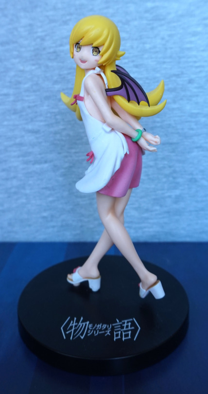
After getting the blue/grey pair, I decided to eventually pick up the golden pair.
This blog will be about the Golden Diva version:
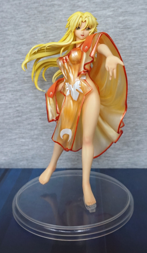
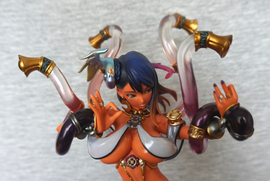
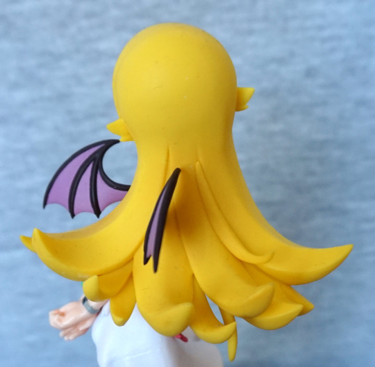
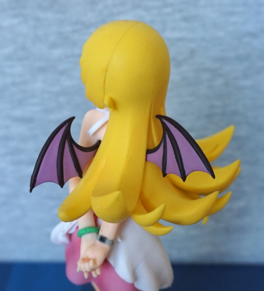
I didn’t quite get her robe back on quite right when taking these pics… The blonde/gold versions are certainly more colourful. The outfit is pretty, and her hair flows well.
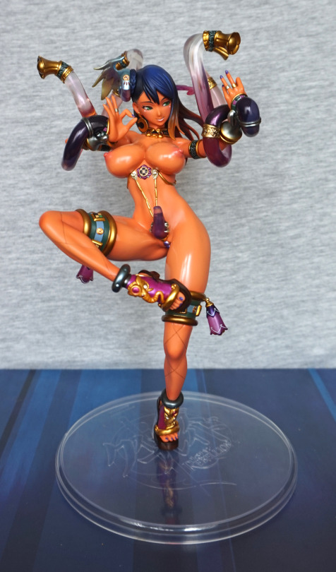
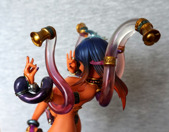
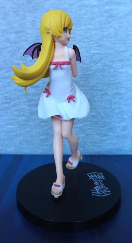
Right:
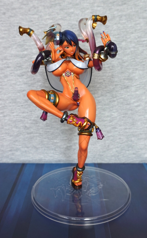
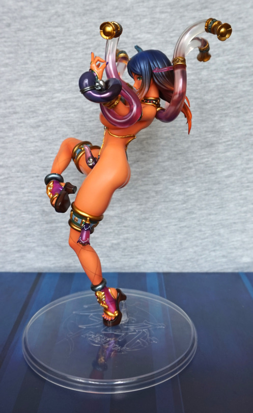
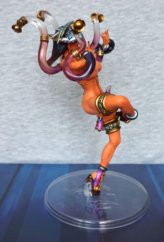
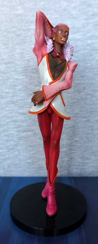
I like the pose of this figure, which is why I ended up getting a second one of her XD.
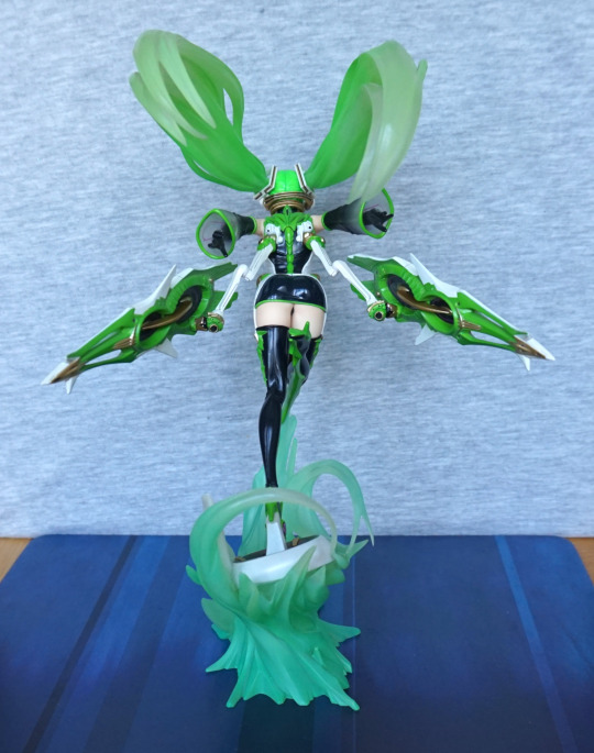
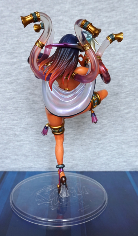
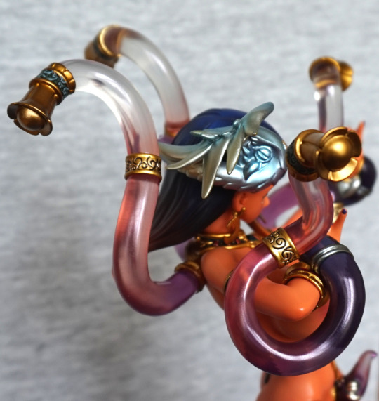
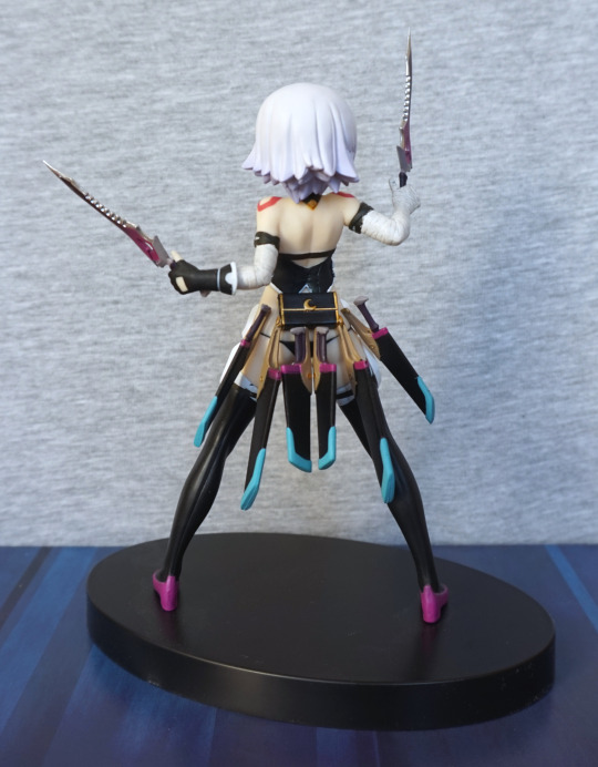
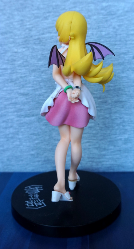
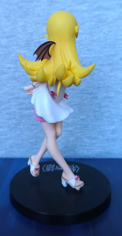
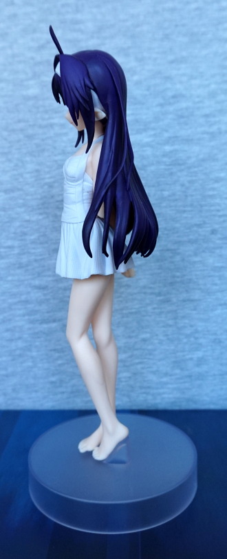
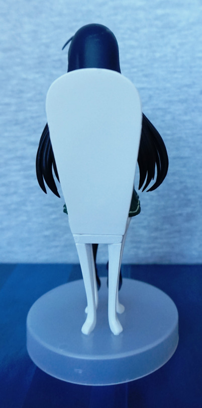
Back:
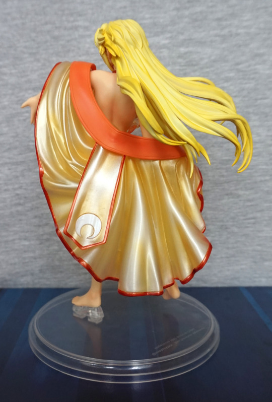
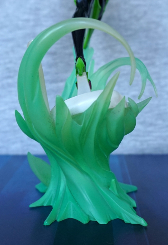
The robe does a good job of covering up the parts you may not want to see, if you prefer clothed figures, but leaves it so you can see her back, which has been sculpted well.
Now for the NSFW pictures.
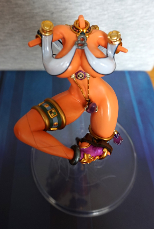
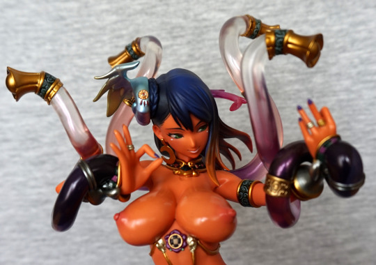
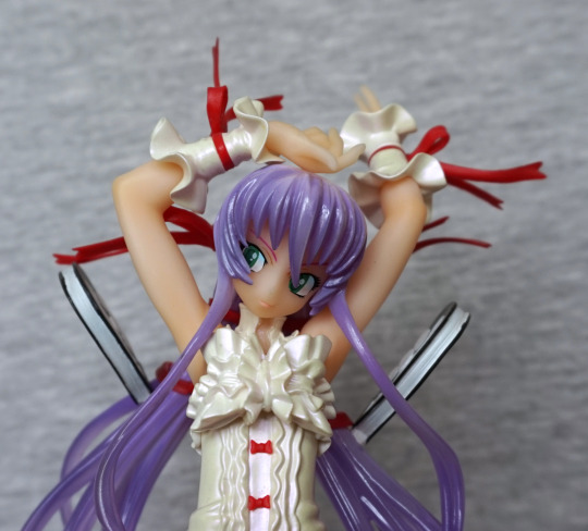
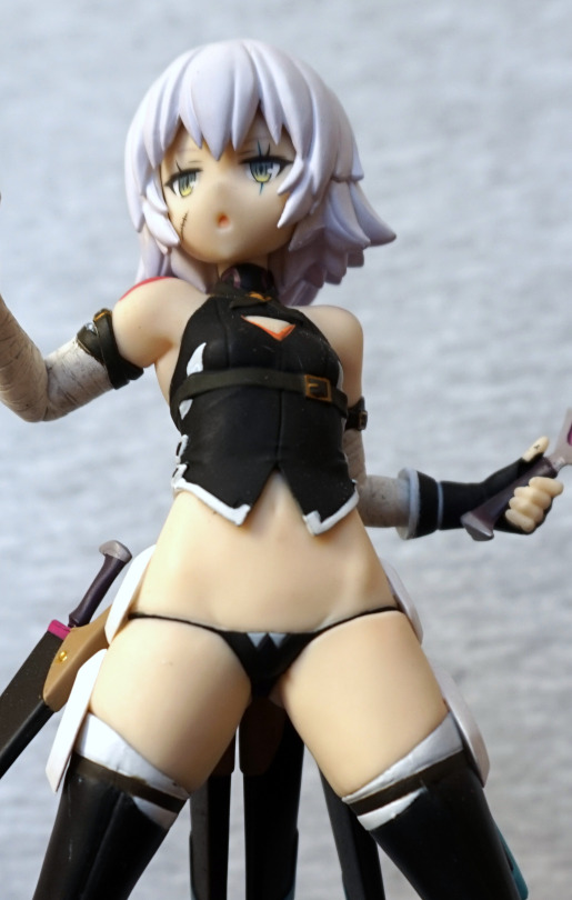
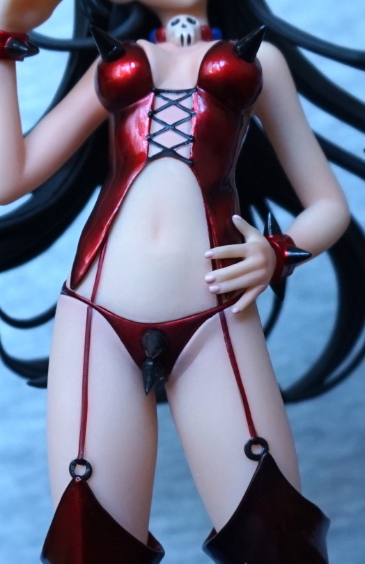
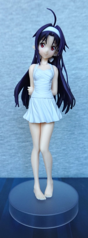
Front:
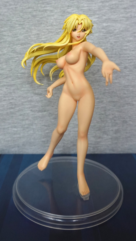
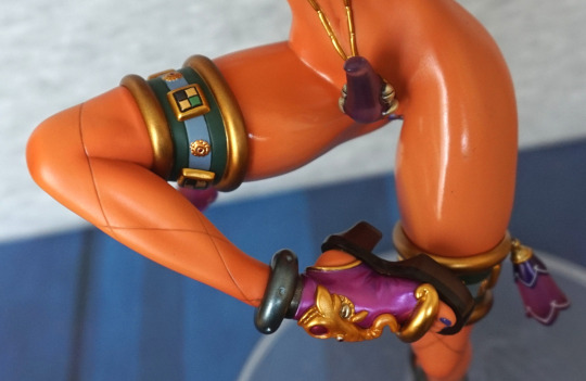
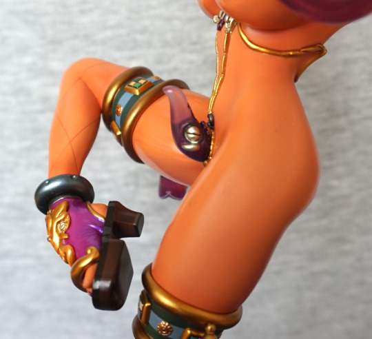
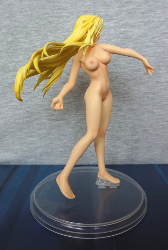
The painting on her body is really good and looks natural. The other nice thing about these figures is the bodies are one piece of PVC, so there are no seams. The head is a separate part, so there is a connection there, but not visible normally, with it being under her chin/hair.
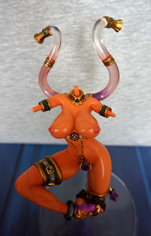
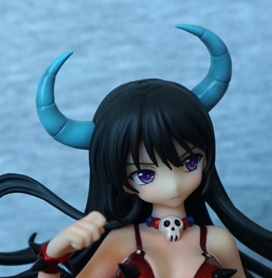
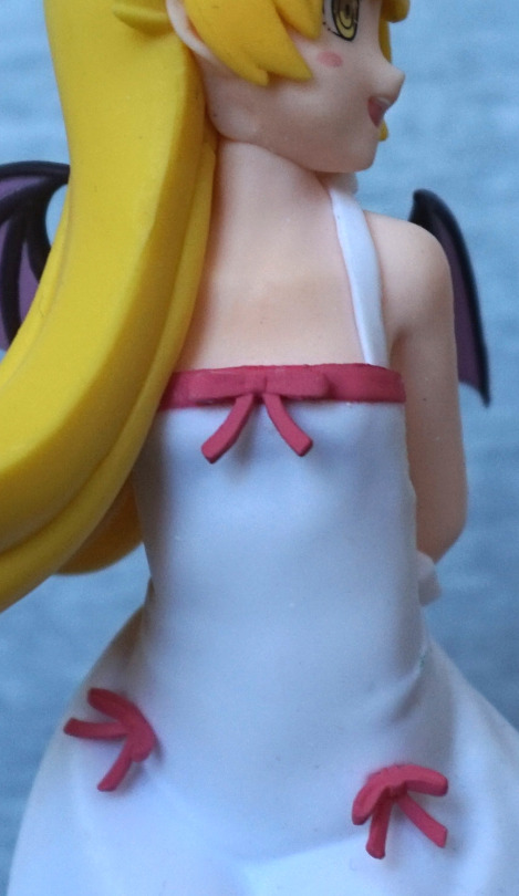
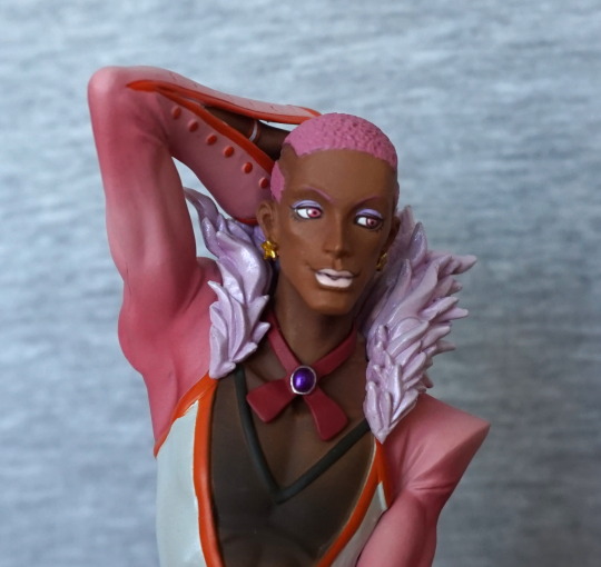
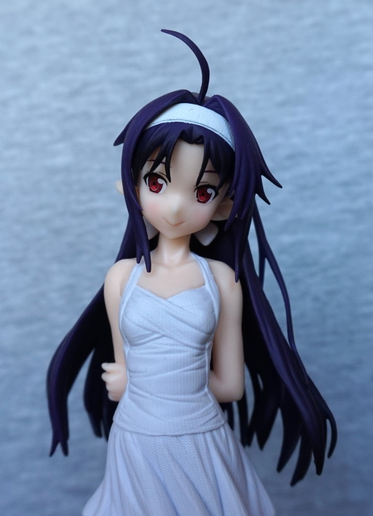
Face/chest close-up:
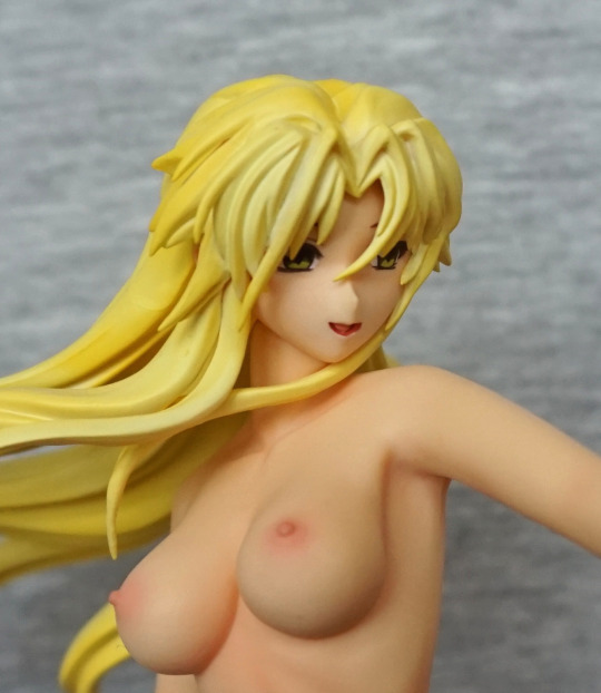
Her face has been painted well, but her nose is a bit pointy. Her chest is painted well, and looks realistic. I like the fact her chest isn’t comical sized.
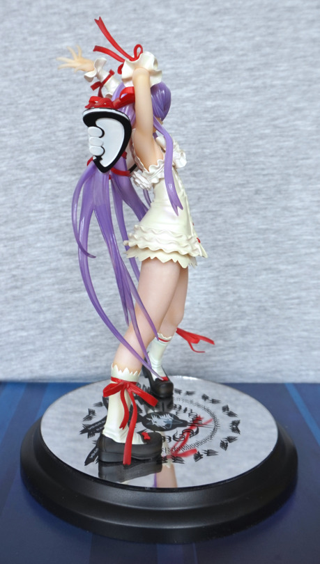
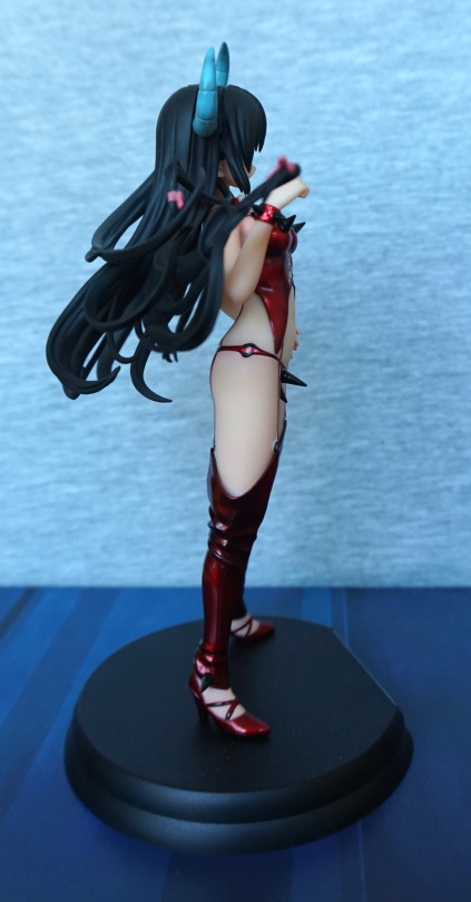
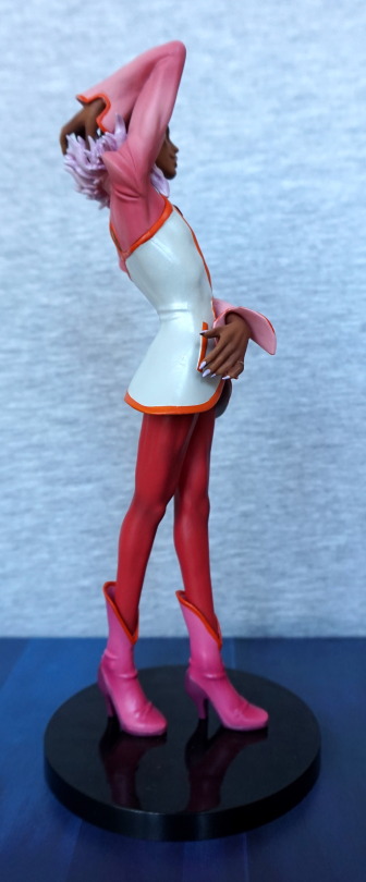
Left:
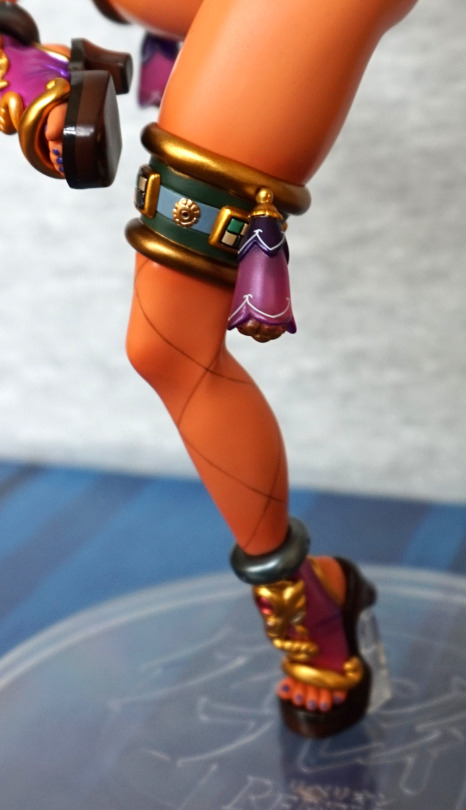
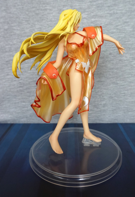
Her body is sculpted well, and the curves look good. The hair also has some nice highlights to it.
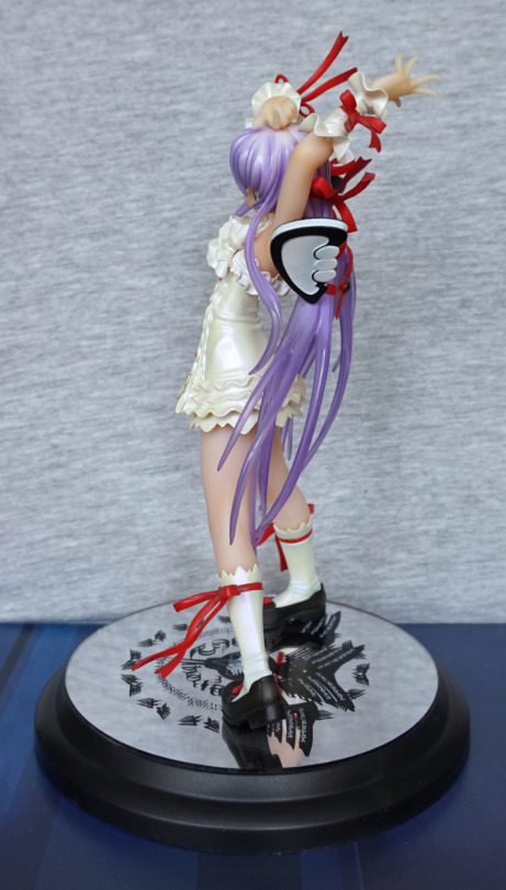
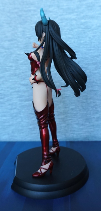
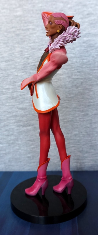
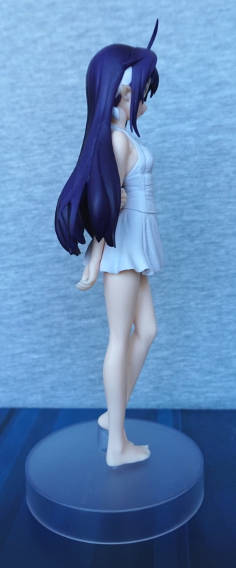
Right:
Her chest is probably most visible from this angle. I like the way the light works on this figure. I’m thinking her outstretched arm may have sagged a bit over time, and I may fix this at some point. I know from the next Izuruha figure I’ll be blogging about that these figures do bend a bit over time.
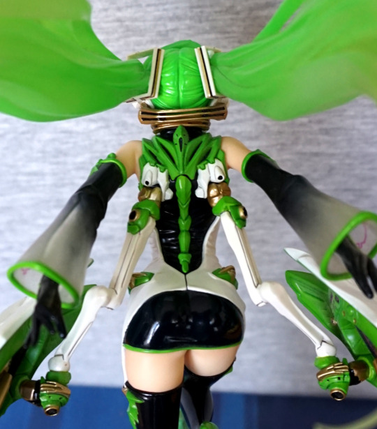
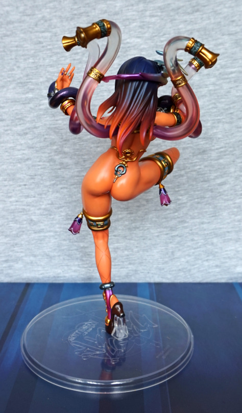
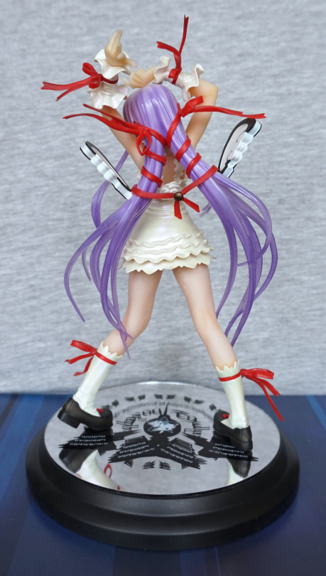
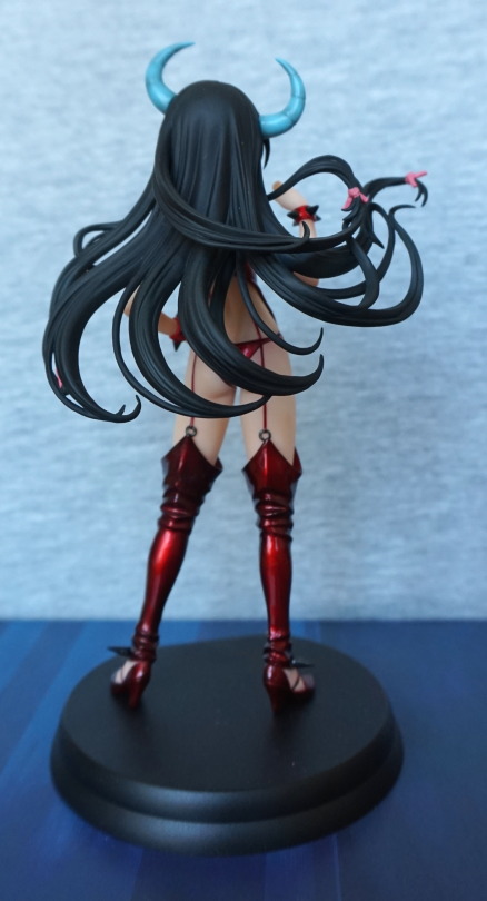
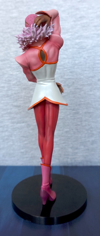
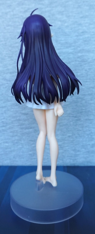
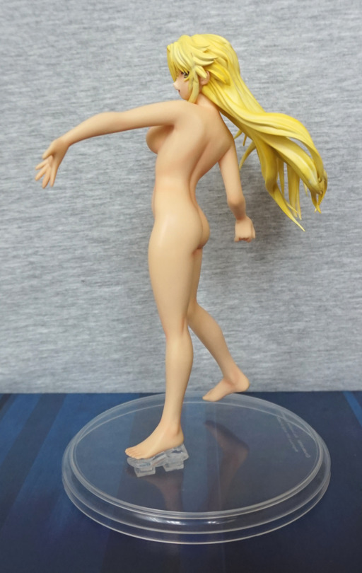
Back:
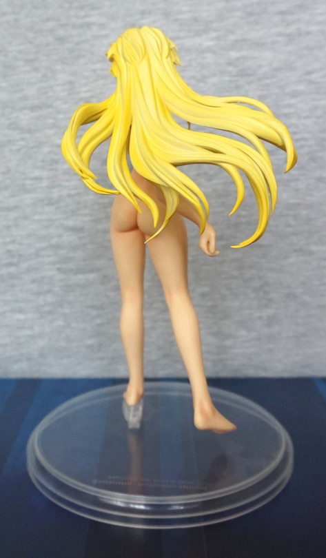
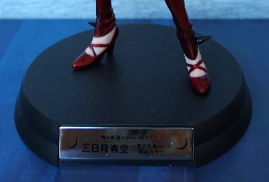
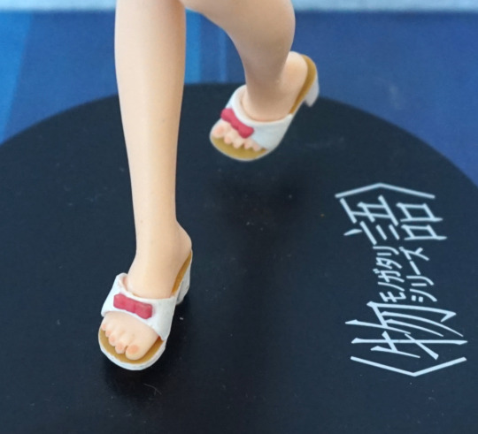
The hair looks nice from the back, and so does her backside. We can see that her ankles have been sculpted well too.
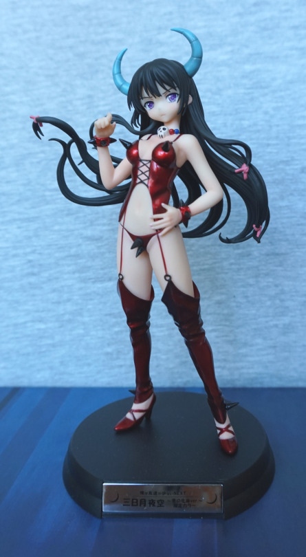
Overall, I really like these Izuruha figures, and this one isn’t an exception. If you like the figure (and not too bothered about source material – doesn’t seem like it’s something that’s particularly accessible outside of Japanese language things),I would recommend it.