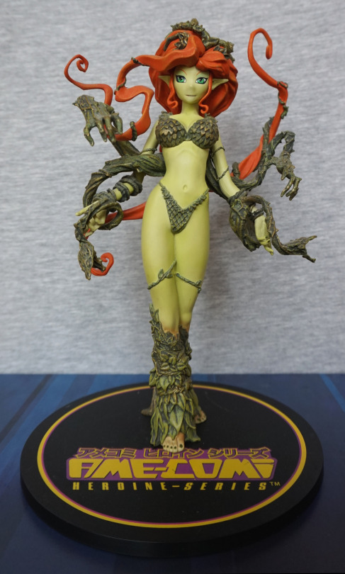
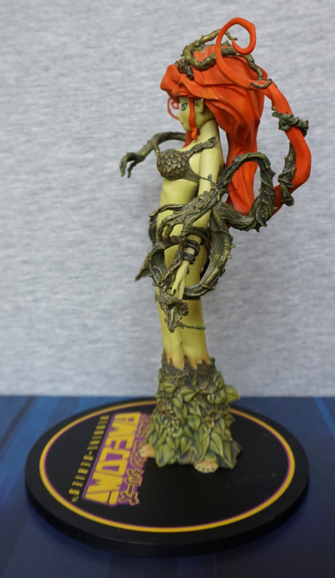
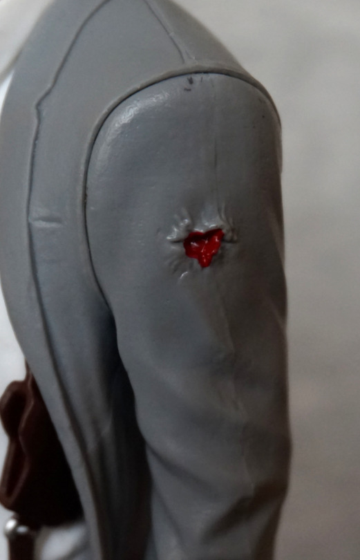
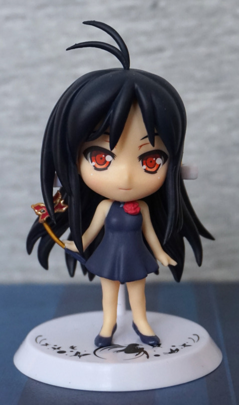
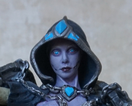
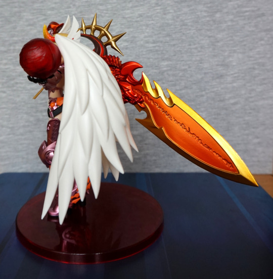
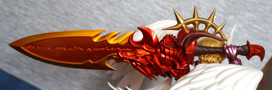
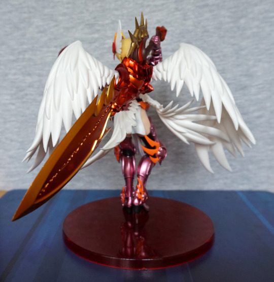
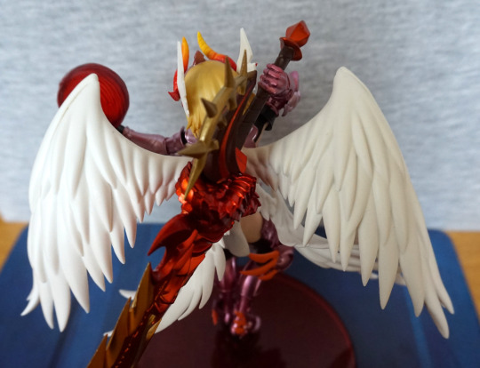
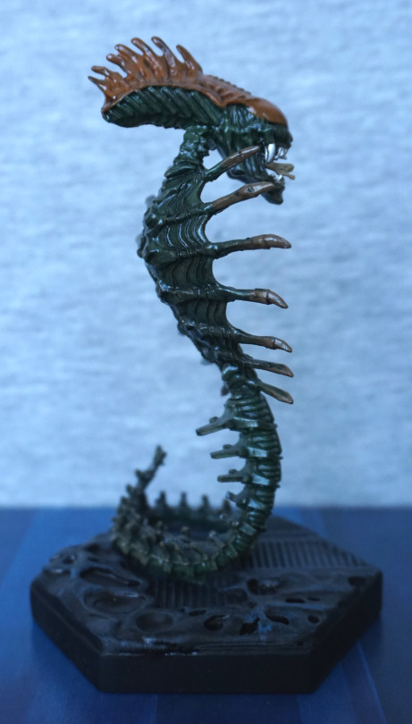
This figure is the first one that was not on the original poll, but I suspect it would have garnered a reasonable number of votes, so here she is.
And talking about voting… I now have a website where you can register your interest in what figures I feature in the Official vs Bootleg series. The website is https://ovbvote.tharglet.me.uk. You can vote for figures in my collection that are marked as having a counterfeit version on MFC and that I haven’t already planned to blog or blogged about.
If you have any questions/comments about the site, feel free to comment down below or send a PM on MFC.
And now for the main feature!
The bootleg didn’t come with a box, so no box comparison for this one. So let’s get straight onto the figure!
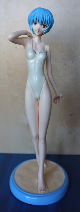
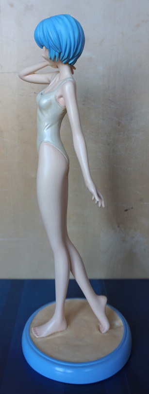
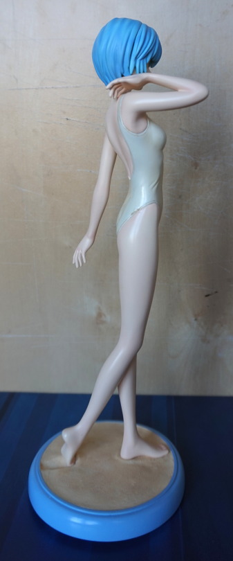
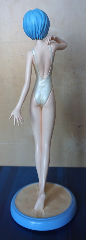
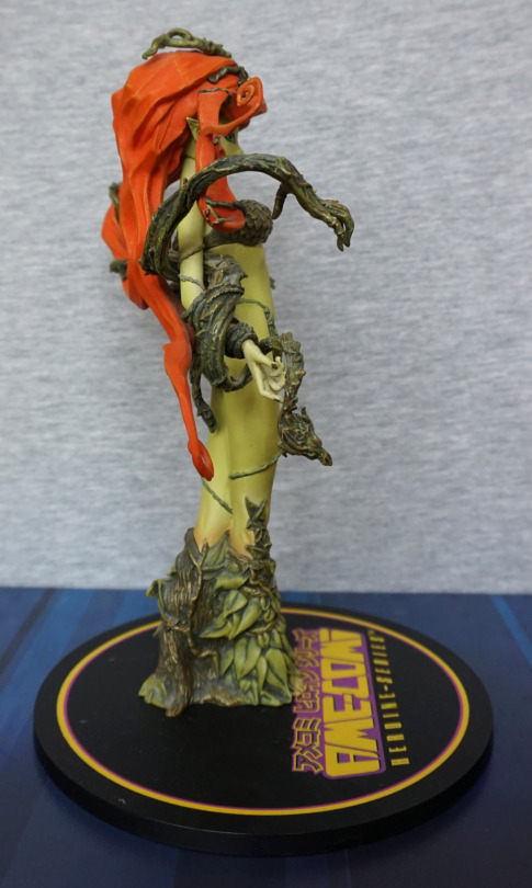
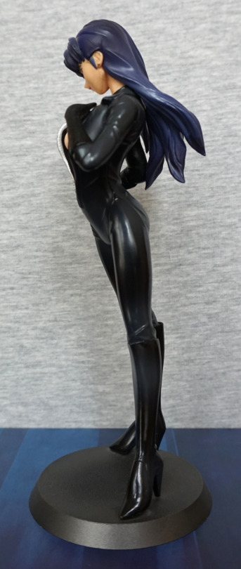
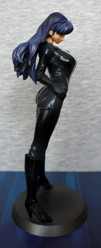
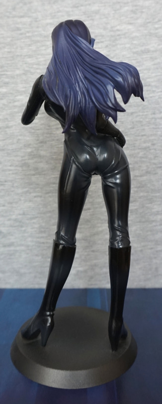
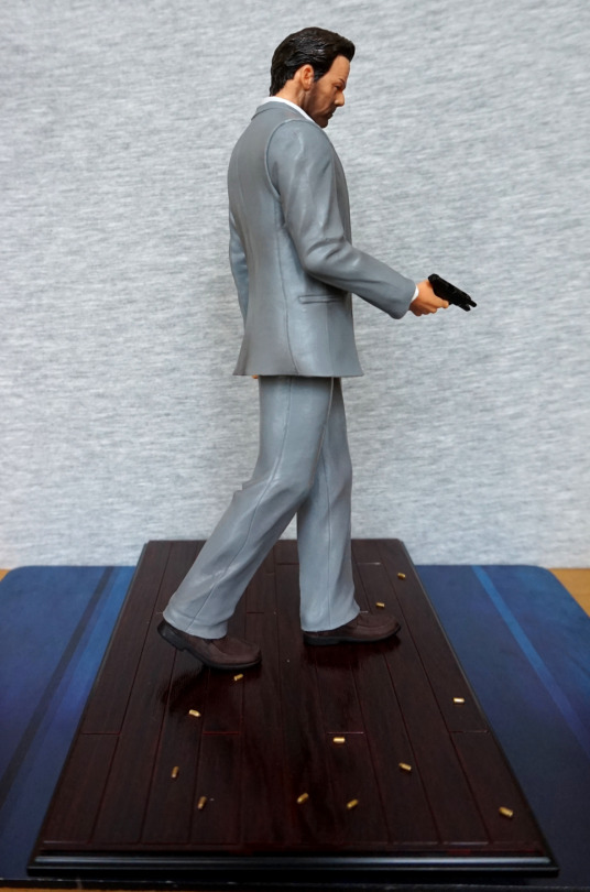
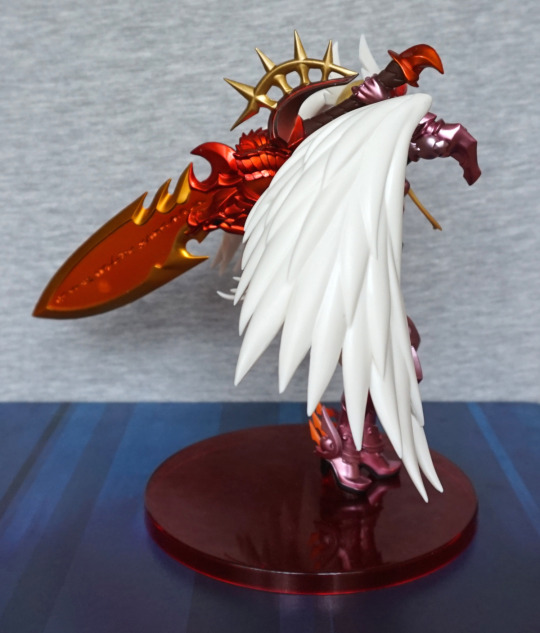
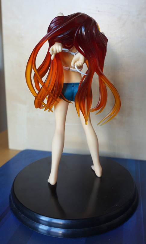
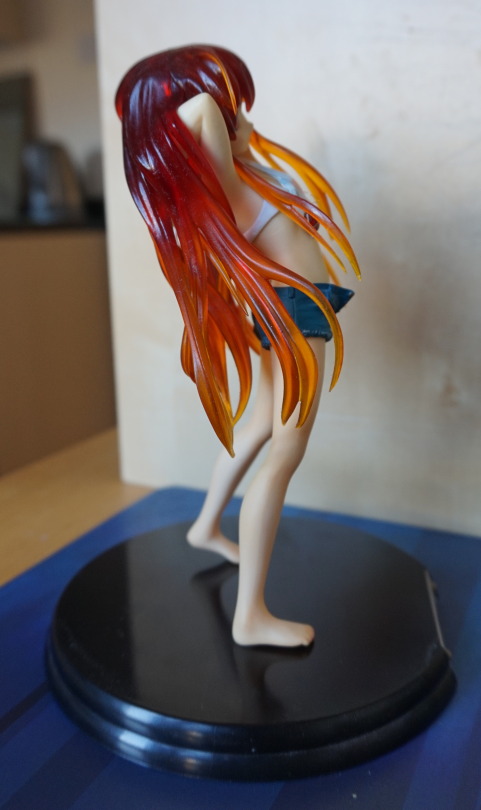
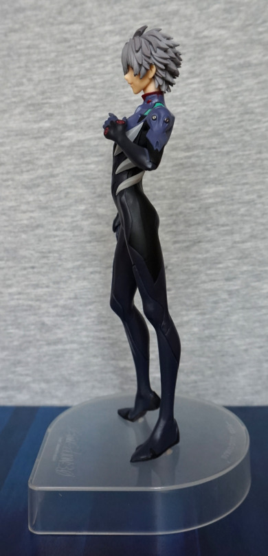
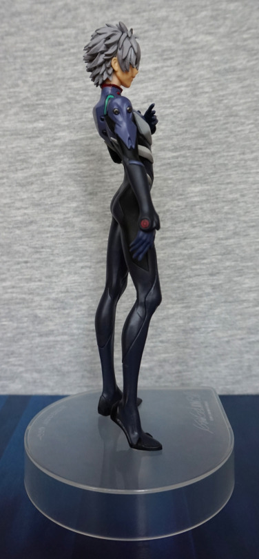
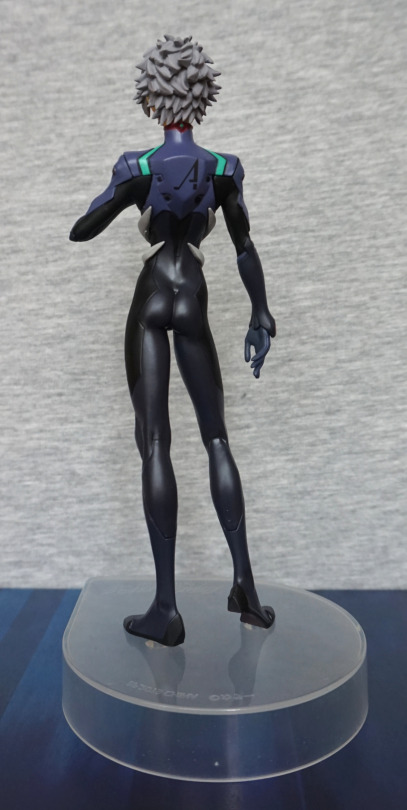
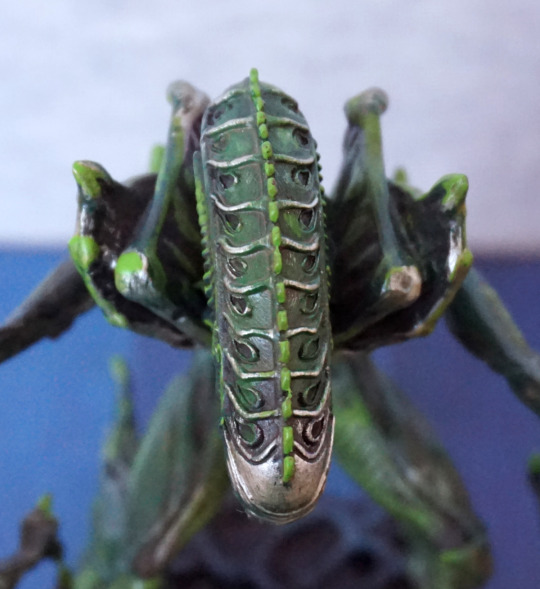
Spin-around


Firstly, no your eyes do not deceive you – the bootleg is indeed a couple of cm shorter than the official. The bootleg figure has been scaled smaller than the original. Guess this saves on the plastic! The other immediately noticeable thing is the way bootleg Harley “holds” her mallet – floating roughly in front of her arm. That’s some holding ability! One thing to note about the bootleg is getting the hammer in was not easy and is very much prone to falling out. The original has some of the falling-out problem, but not as bad as the bootleg.
Due to some of the parts being mangled during the production of the bootleg cast, this one was another one that was hard to line up certain shots for. The two notable parts in this regard are the hammer-holding arm and the cape.
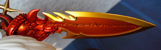
Hammer

Here we can clearly see the scale difference – the bootleg hammer is noticeably smaller than the official one when they’re side by side. The colours are also markedly different – the bootleg looks like a painted wood colour to me, instead of an actual wood colour.
Top of the hammers:

The bandings are a fair bit worse on the bootleg, being uneven and losing the sharp definition of the bumps. We’ve also gained a mould line around one of the bandings. The middle of the hammer has also seen some “damage”, and isn’t cylindrical like it should be.
The bootleg has also been painted post-assembly, leaving lots of paint slop of both paints.
Hammer handles:

The red paint on the official is paint transfer from the figure, and was not originally on there. My bad.
The bootleg’s handle has lost much of the finer texturing detail on the leather wrap, leaving it looking a lot less like leather. The original also features a shiny finish on the end-cap and a matte finish on the leather wrapping, whereas the bootleg has a semi-glossy finish throughout.
Pegs:

And this is why the bootleg was so hard to assemble… the peg is so much bigger than the original, and doesn’t have a proper shape. The hole on the figure isn’t much different, so it took some heat and shoving to actually get the darned thing in. The official, on the other hand, slips in easily, and it’s just a case of getting the angle right for assembly and to balance the hammer correctly on her shoulder.
The bootleg hammer also has some scratchy defects:

What? Is this a rusty hammer?
Overall, the bootleg hammer is fairly clearly the inferior product in my opinion. Couldn’t be used as a replacement for the original due to the scale and the defective peg. Whilst the peg could potentially be fixed, the scale cannot.
Figure close-ups
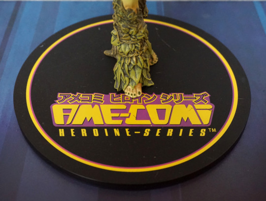
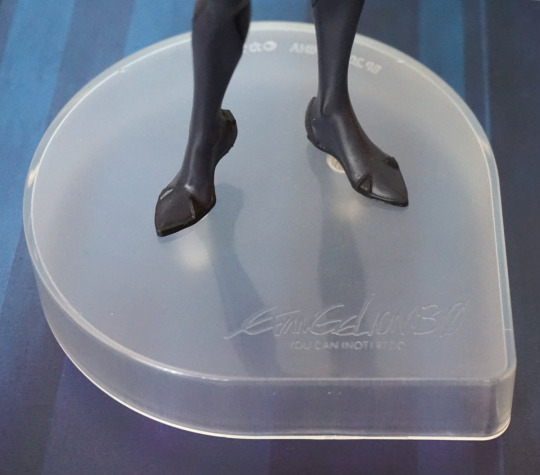
Before we get onto the figure proper, let’s have a quick look at the bottom of the base:

The original has the copyright information, and most notably, a screw. The original comes as one piece with the figure screwed to the base whilst the bootleg actually pegs onto the base. If you see her displayed loose turning her over to see if there’s a screw on the base is probably the fastest way of seeing if she’s bootleg. If there’s no screw, she’s not Kotobukiya.
We can also see here that the original base has a much better finish quality, whilst the bootleg has a bunch of defect lines and mould marks.
OK, back to the top. Here’s their faces:

The first thing that strikes me is the much less pleasing tones of her hair colours. Kotobukiya’s chosen a blue and red that pop and complement well. The bootleggers have gone with whatever paint they could find. The bootleggers have also seemed to have put a glossier finish on the blue part of her fringe which makes it look quite odd indeed.
I think bootleg Harley did her makeup when drunk – much too heavy on the eyeshadow and wtf is up with that lipstick?! My official seems to have her right eye stamped incorrectly, but I’ll take that over the poor colour definition on the bootleg. And to complete her facial features, the bootleg seems like she’s been rubbing her nose in the dirt, and the tip of her nose is a greenish colour. Not too pleasant to look at up close.
Lastly, we have her ruff – the official is decent, with one bit of moulding left that I can see, but the bootleg is an unfinished mess. All of the edges are rough, and it’s not something I can really ignore.
Top of her head:

The official isn’t flawless here – we have a tiny amount of paint bleed between the halves, and the way her part-in doesn’t line up between the parts may annoy some.
Now onto the bootleg… here, we are really not lining up, and have a large unpainted gap between the halves of her hair. The red hairband has become more of a bead and doesn’t really match her hair. Not sure why we’ve gone shiny just for this bit. The hair across the top of her hair has lost some of the finer details, so doesn’t look as nicely bunched as the original.

Here we can see where her bodice didn’t fit correctly to the chest on the bootleg, leaving an odd ridge that follows the edge of the bodice. Interestingly, the ring on her cape is more rounded on the bootleg to the official. And if you’re keeping a good eye on her cleavage, then you may have noticed the speck of dirt embedded into the bootleg’s left boob.
Now to “admire” the bodice closer:

Yeesh. This is really where the bootleg falls down, if the face didn’t do it for yah.
The official could be neater – where the red and blue paint joint doesn’t look as neat as it could, but the laces are nicely detailed and look like actual laces.
And the bootleg? An attempt was made. Blue and red paint have been quickly slopped on, without much regard for coverage. The eyelets have been completely ignored and painted over. And the lacing? All the fine moulding details have gone, and the top ones have suffered badly during moulding and don’t look like they’re pulled tight. And to finish the whole thing off, there’s semigloss sloshed over the lot of it to further make the lacing look incorrect.
Let’s take a look at her arms. First the more statically-posed one:

Here we can get a good feel for how different the skin tones are for these figures – the official is much more of a pinkish-white tone, whilst the bootleg is a much more peachy-based skin colour.
Under her armpit, we can see a very distinct seam line on the bootleg, as well as part of the bodice banding being missing.
For the arms themselves, they are pretty similar, but the diamond paint is a bit messier on the bootleg. With the blue-red we can see the official has a much stronger contrasting colour scheme whilst the bootleg is more muted.
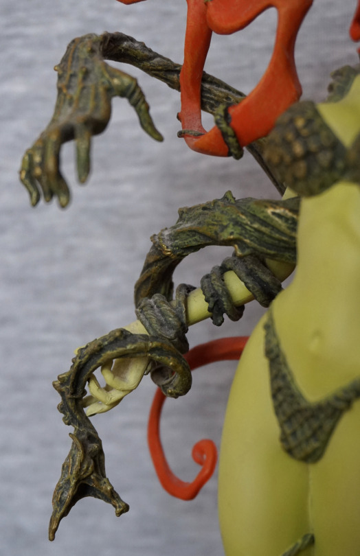
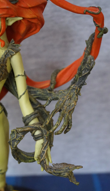
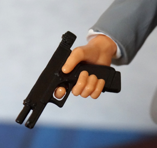
Hammer-holding arm:

This was the photo I was editing that made me notice the arm on my official Harley has come slightly loose – it does push down so her arm doesn’t look so misshapen. So I’m going to ignore that ¬¬.
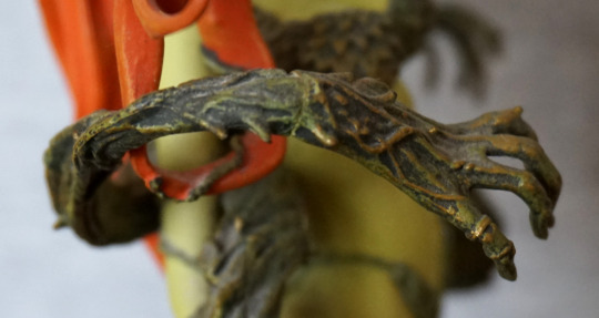
Here we can see why the peg is such a pain on the bootleg. For the official, we have a perfectly-shaped square hole that matches with the hammer peg. (You may also notice the peg hole is painted, which is why there is a paint transfer on the official’s peg). On the bootleg we have… a roughly-hewn mess. I think they tried to add a keyed slot looking at the hammer peg, but instead we got whateverthefuckthatis. With the official arm guard, we have some subtle red shading, but on the bootleg it is simply a flat colour.
Holding of the hammer:

With the official, we can see she is leaning on the hammer so that it balances on her shoulder. The pose looks natural and carefree, matching Harley’s “doesn’t give a fuck” nature.
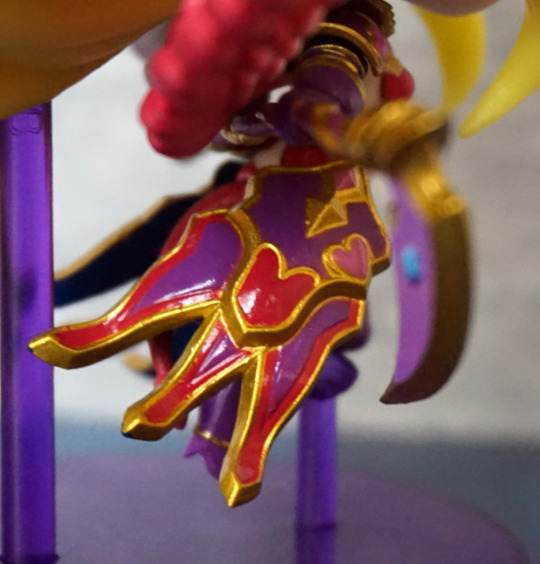
Now to the bootleg. She seems to have attached a spike to the hammer and rammed it through her wrist. Ouch! The self-injuries don’t end here – on her hand we have some holes and scrapes in the form of moulding issues. Her fingernails also lack the sharp points they’re supposed to have. Not sure what’s going on with the thumbnail paint on either of them, but the rest of the fingernails are painted nicer on the original. However, this detail is very small, so you wouldn’t really notice unless you look up close.
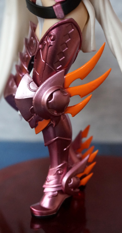
Belt and stomach:

Bootleg Harley’s belt looks like it has been through the wars – the poorly-painted buckle leaves the black paint poking through, and the bullets look like they’re rusting copper oxide. The belt doesn’t seem to have been scaled down as much as the rest of the figure, which leaves it sitting higher up on her hips. It kind of looks like they attempted to re-add the detail on her buckle and ended up with a misshapen mess on the front of it. The bootleg bullets look much more of a brassy colour than their official counterparts.
The bootleg Harley’s stomach has less shading, but we seem to have some bonus warehouse dirt baked in. Yay? I really like the shading on the original as it helps give the figure more definition, so this is lost on the bootleg.
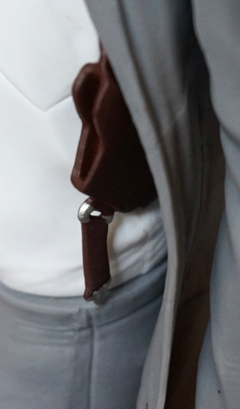
Holster:

Here we can see how the belt sits differently on the bootleg – on the original the holster sits below her shorts, on the bootleg it has ended up sitting at the end of the shorts line, due to the belt riding up.
The gun’s grip on the bootleg has lost some definition, but it isn’t particularly noticeable. The more matte finish is, though.
The holster on the original looks like its outer layer is made from plastic/pleather. The bootleg… I’m not sure what this looks like.
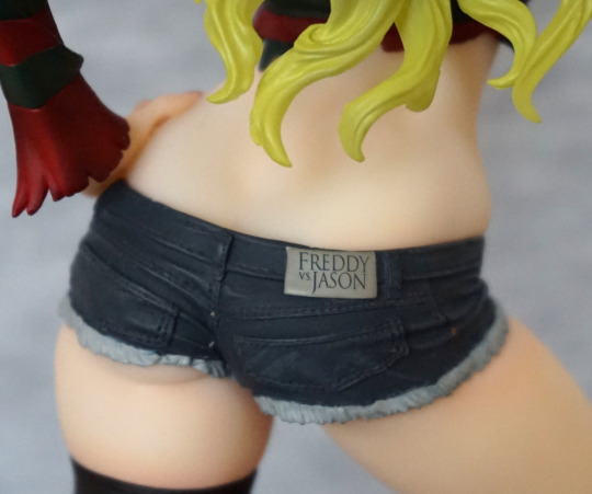
With the shorts, we can see how the official is glossy but the bootleg is not. Also we have a bonus seam line on the bootleg. Another bootleg that’s been to the Chinese knockoff clothing store.
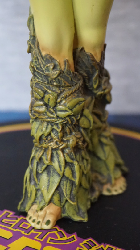
Feet & base:

Massive overspray here on the bootleg – her left shoe didn’t know where to stop. We’ve also got some grey scratches on the base and not entirely sure why. With the bases, we actually have more contrast on the bootleg than the official, which is a switch compared to the figure itself.
Cape:

Here we can see the different colour and finish of the capes – the original is brighter and has a more matte finish. The bootleg cape curves in different amounts in certain places, which makes it look more different than it truly is in my opinion.
Bum:

With the cape, holsters and her arm, there isn’t much backside action going on here. Here we can see the massive difference in the finish on the shorts though – on the official you can see plenty of shine, and the bootleg is super-dull. We can also see some mould defects on the back of the bootleg’s right leg – the small wormy lines. The nail polish is passable though – it didn’t quite get to the ends of her fingernails, but at least it isn’t blobbled out over everywhere.
Conclusion
This bootleg isn’t really going incognito with the poorly-done hammer peg and pose alterations. May fool a non-seasoned collector at a distance, but a close-ish inspection will reveal the poor quality. Was also interesting to find out she was scaled down – I’ve seen this with action figures but less so with bootleg scales. If you were hoping to pick this one up to use for spare parts, I’d give it a miss as it won’t work with the scaled-down pieces.