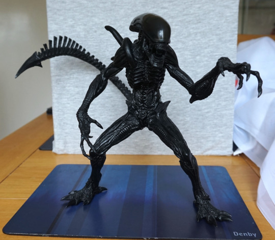
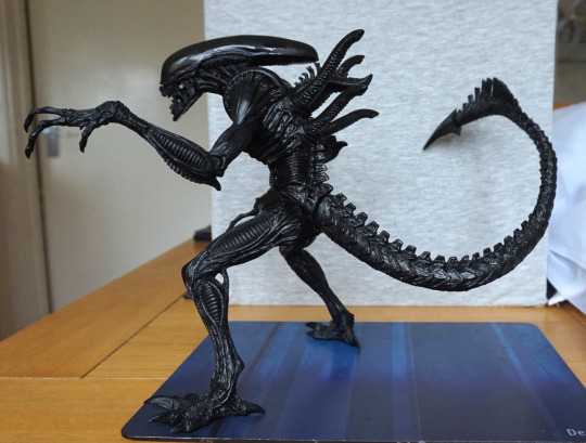
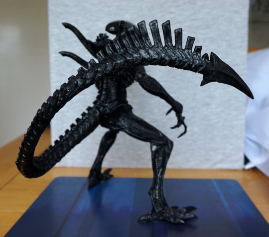
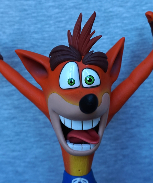
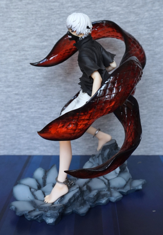
With the bull alien came the gorilla alien:
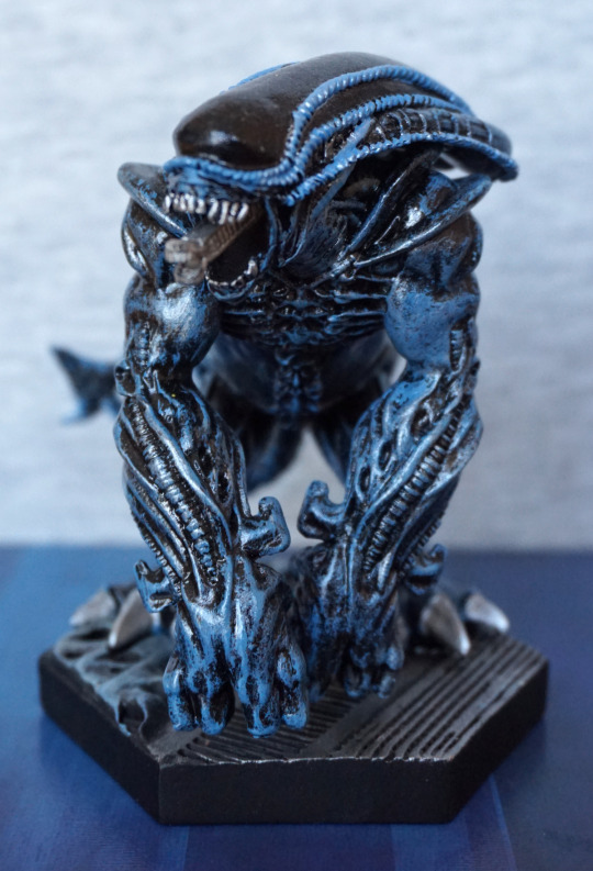
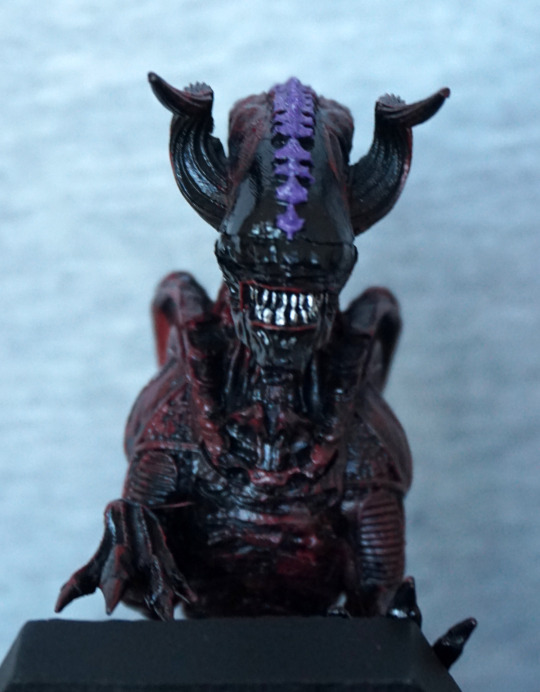
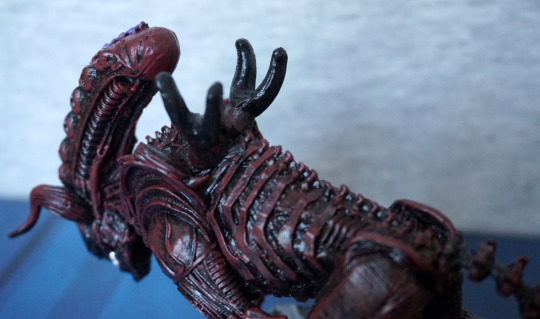
This is one burly dude of an alien! I do love the “growling” pose, and we also get to see his inner mouth due to it. The blue dry brushing effect does help to accentuate parts of the figure, and I think this mostly works.
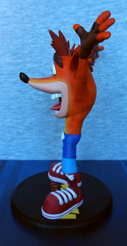
Left:
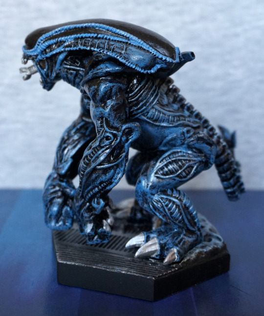
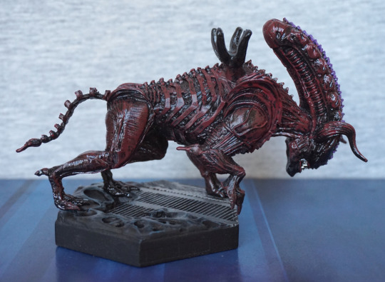
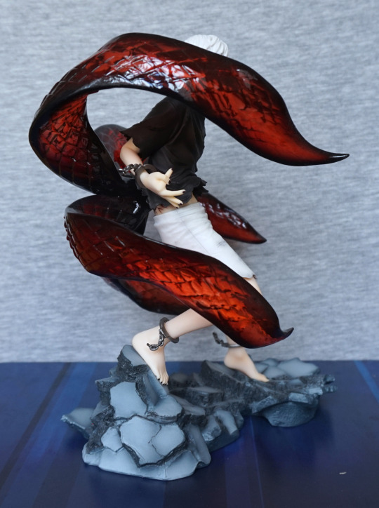
That’s some big claws he has there on his legs! Love the colour scheme. What I love less is some of the line painting at the top of his head is a bit messy. The sculpting is nice, with plenty of details to look at.
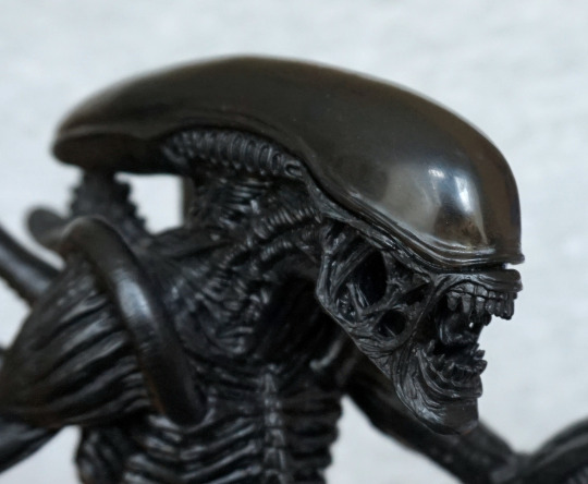
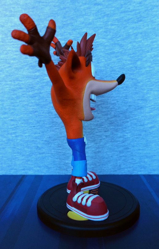
Right:
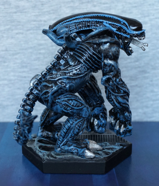
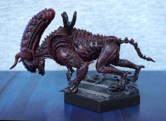
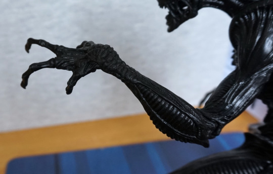
Here the lines are neater, but one pesky bit at the front of his head there. We have a lot fo the same details as the left side, and I do like how he’s posed. He also seems he’s got his hands curled, ready to pound the floor.
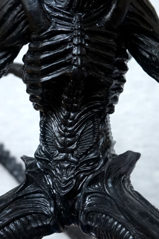
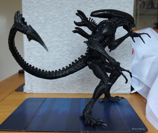
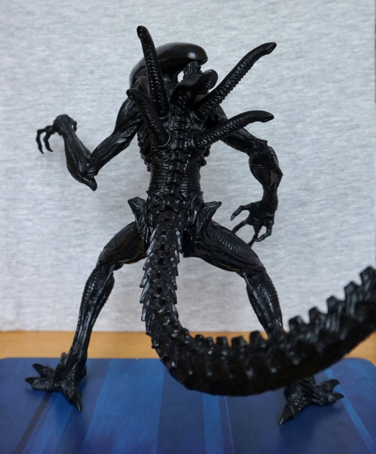
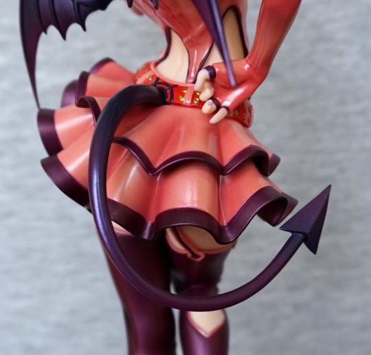
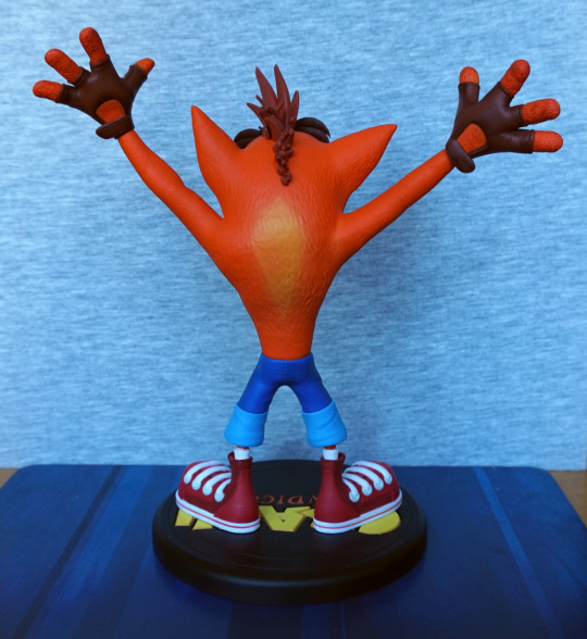
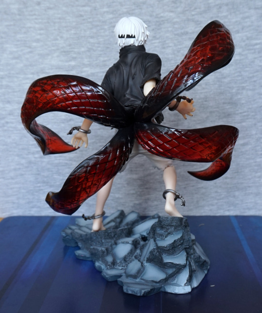
Back:
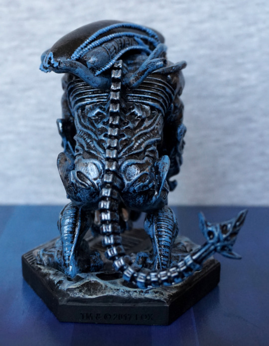
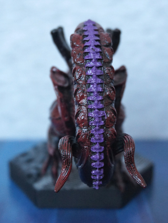
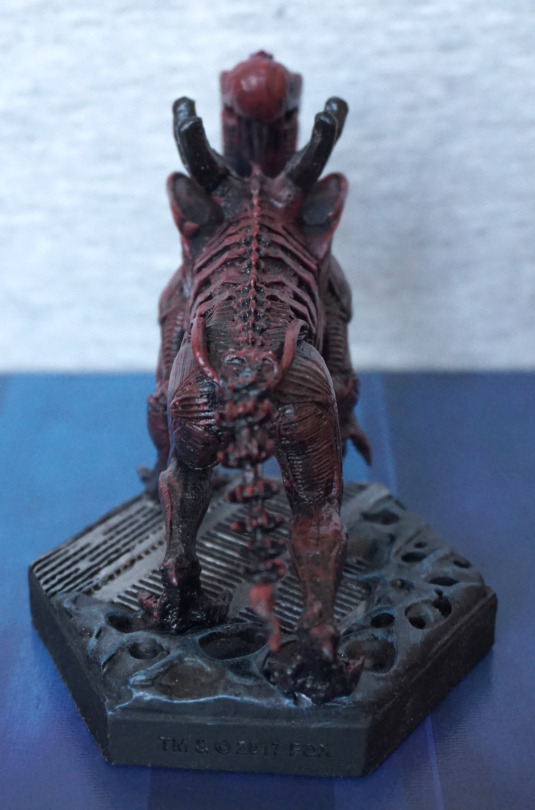
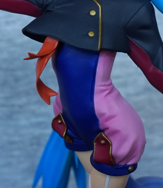
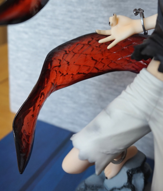
Big butt! I think his body looks a bit awkward from this angle, and maybe needed a little more shape to it to make it less square. However, it is detailed nicely, and I do like the design of his tail, which has an interestingly sculpted end part that I like.
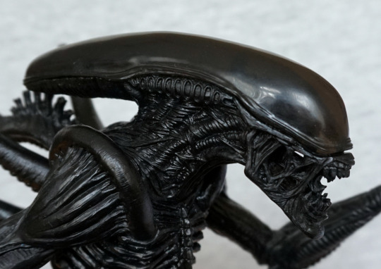
Top:
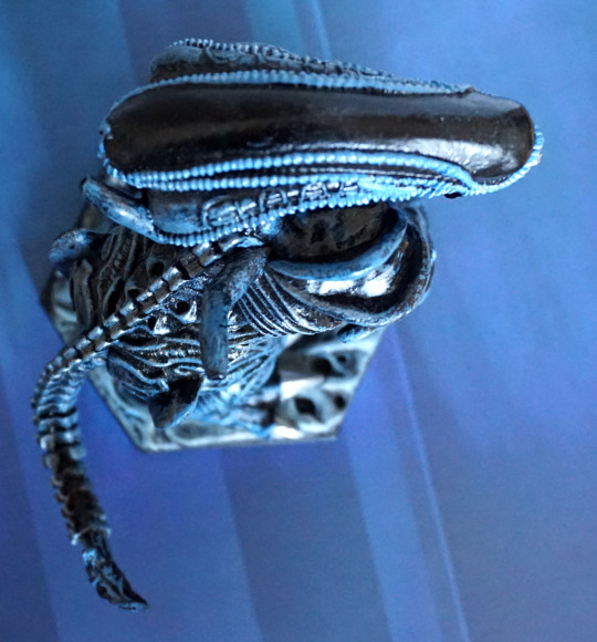
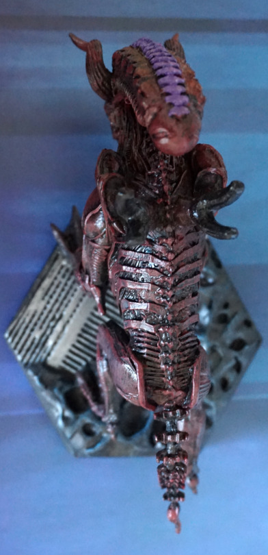
He has a nice, shiny head, a little bit marred by stray paint. I like the way they’ve gone for a different finish here, and the effect it gives it.
Overall, I’m a fan of this one. The colours are nice, and the posing is good. Feel they’ve done a good job of capturing the gorilla alien’s appearance.