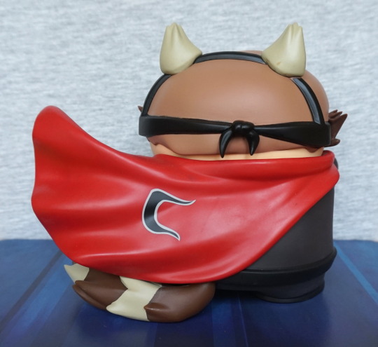
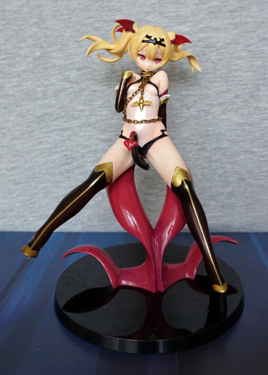
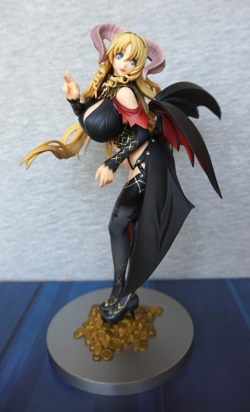
Decided to complete my set of Myrs by buying the Flamebound version. So here she is:
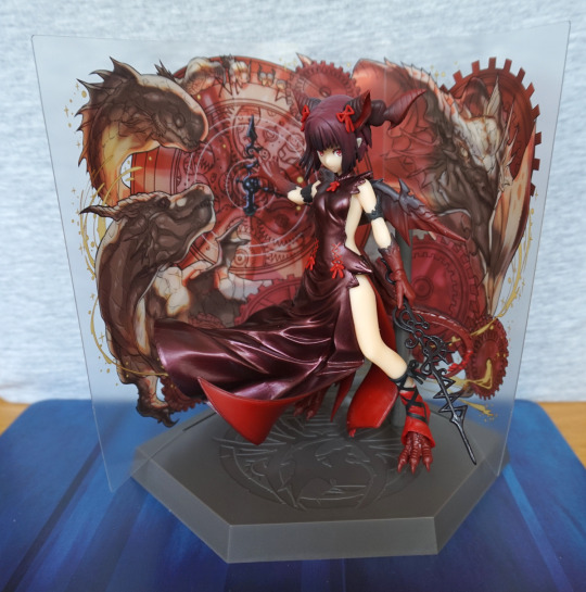
This time I remembered to take a pic with her backdrop :P. So now you can see how she is pointing at the clock in the background.
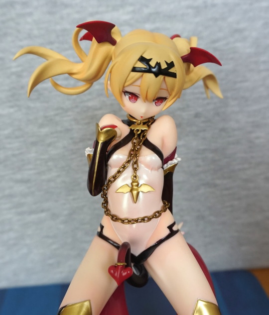
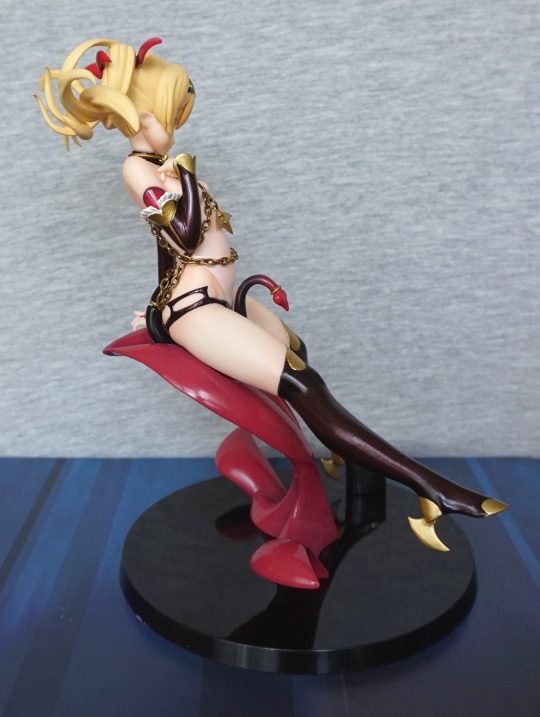
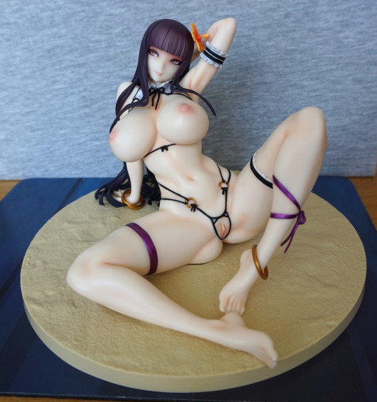
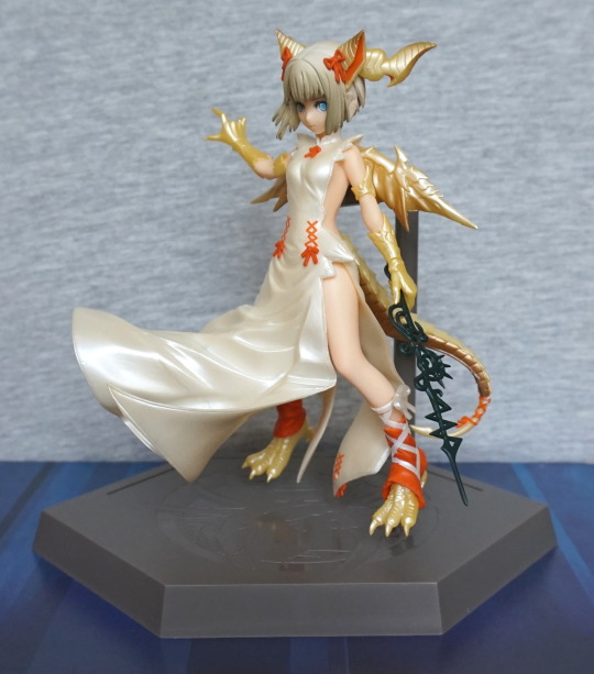
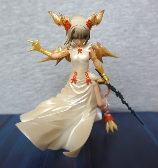
Here she is without the backdrop:
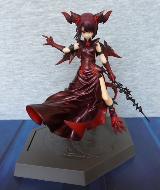
I love the shiny burgundy colour of her dress, the shading in her hair and horns.
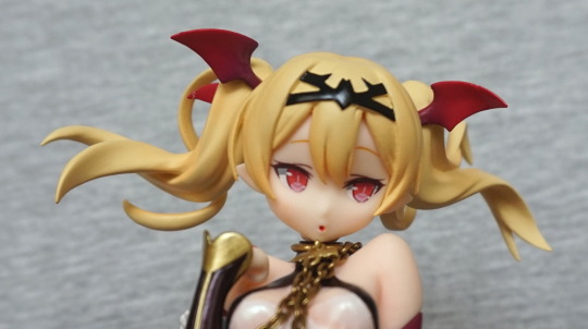
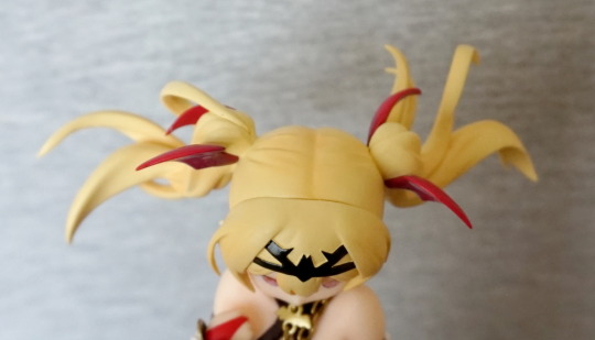
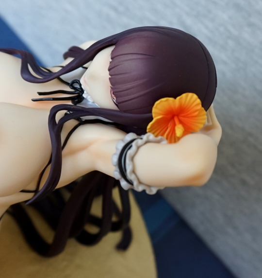
Close-up of her face:
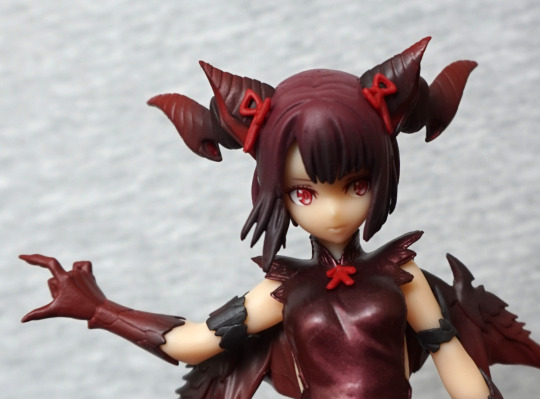
Her face is nice, and I love the red eyes. I do wish the bows had more contrast to the rest of her – they kind of blend in too much for me.
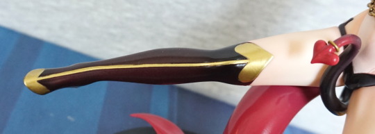
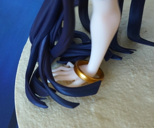
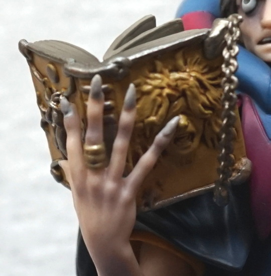
Arm close-up:
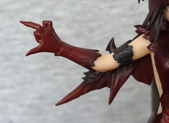
The sculptwork is nice in her hand/arm, and a bit of subtle shading on where her arm transitions to skin.
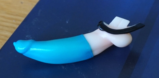
Staff close-up:
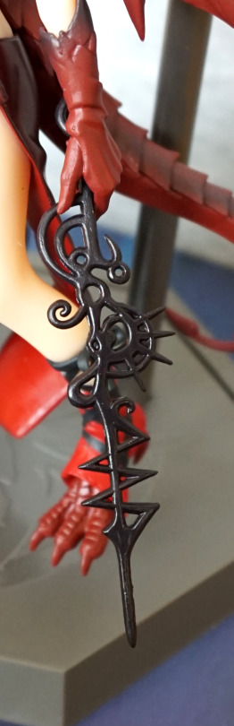
Same design as the other one, but this time the staff was in her hand out of the box, instead of wrapped up separately.
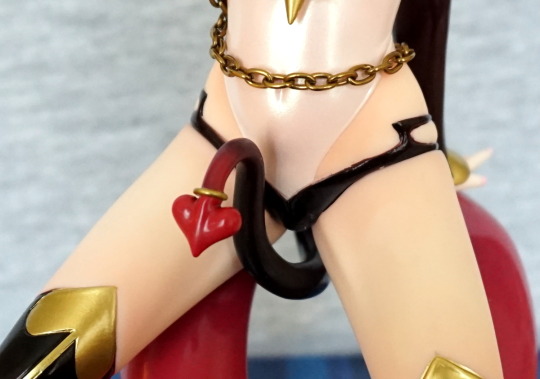
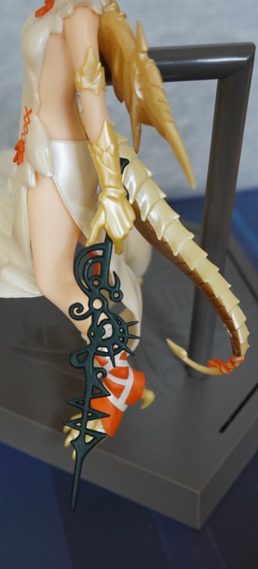
Tail side close-up:
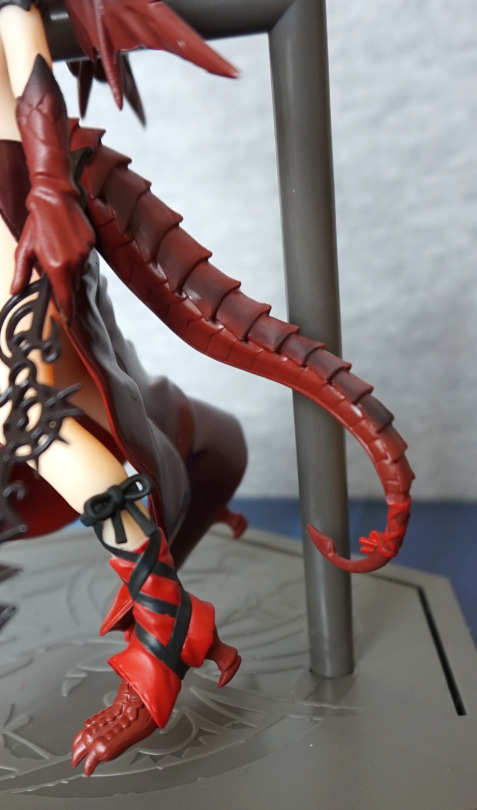
Tail looking nice, but here you can see where the black paint is a bit off on the “boot” ribbon.
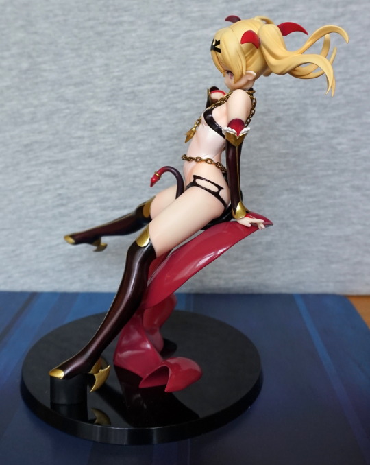
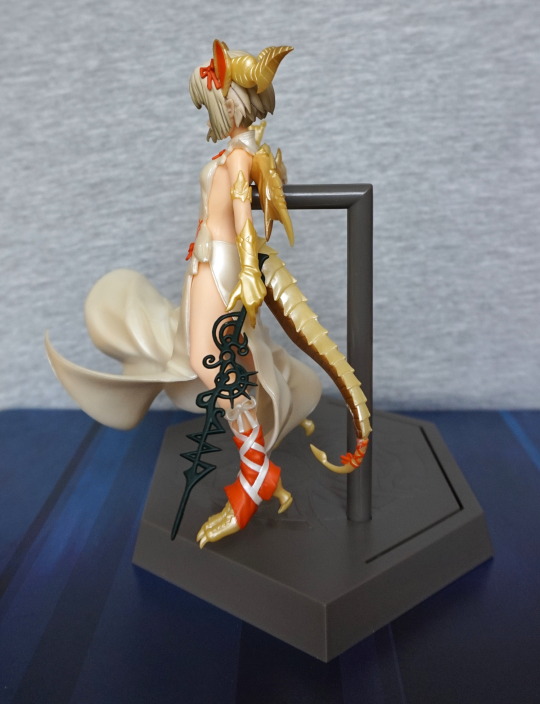
Left:
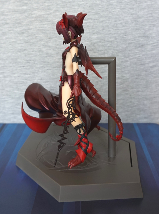
She looks very nice from this angle. Love the way the dress flows, and the detail on her upper arm. The straps around her “boots” is tied nicely. Her tail is nice, and you can see a small ribbon she has at the end of her tail.
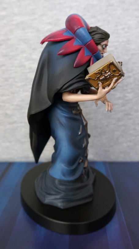
Right:
Looks OK on this side, but the seam in her dress is pretty obvious. Not a big fan of that.
Close-up of her dress:
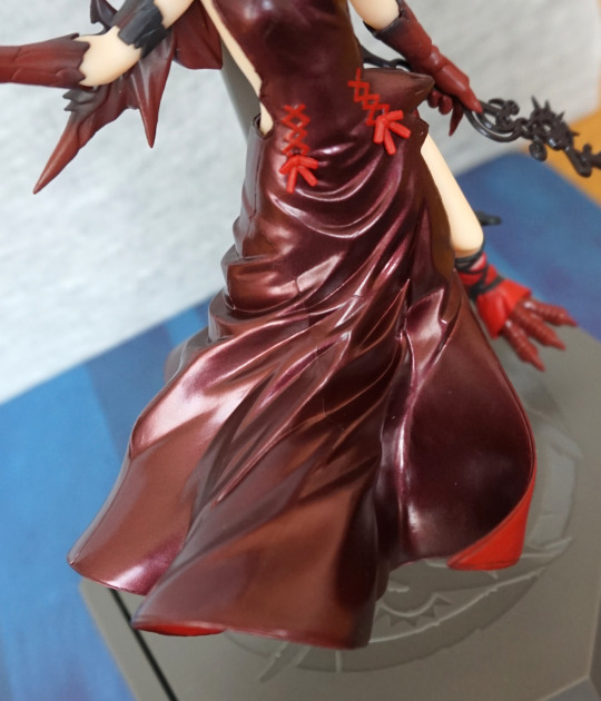
Yeah, that seam… isn’t great. Because it runs across the ripples of her dress, and her dress being a plain and shiny colour makes it stand out.
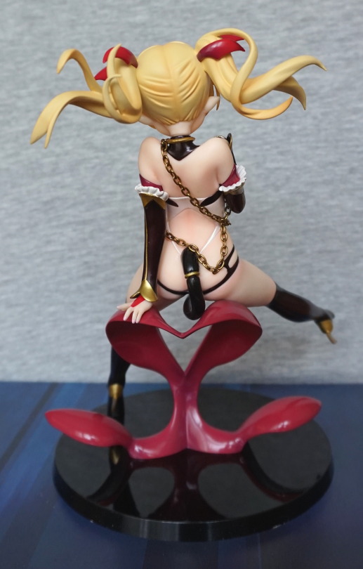
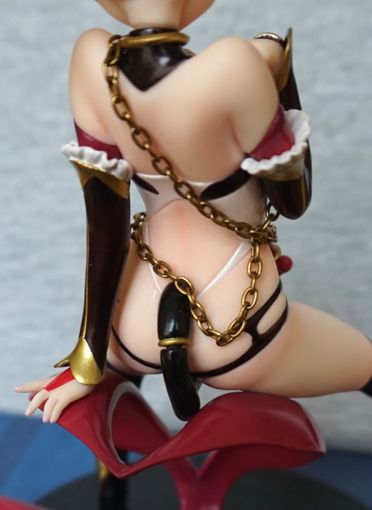
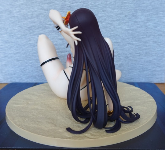
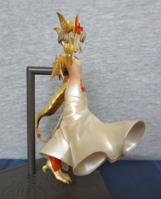
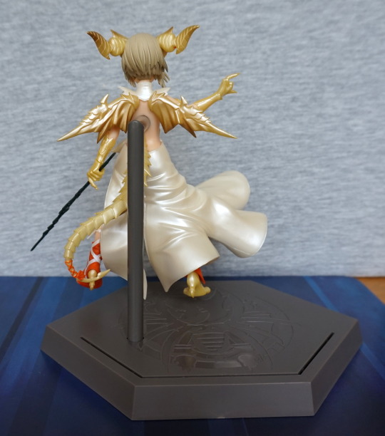
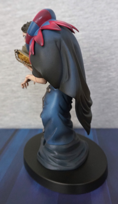
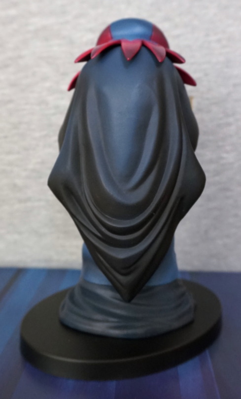
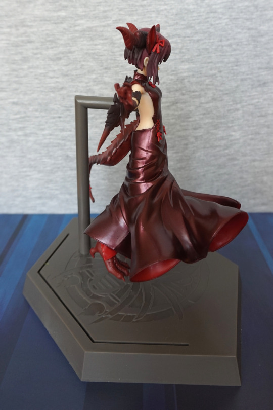
Back:
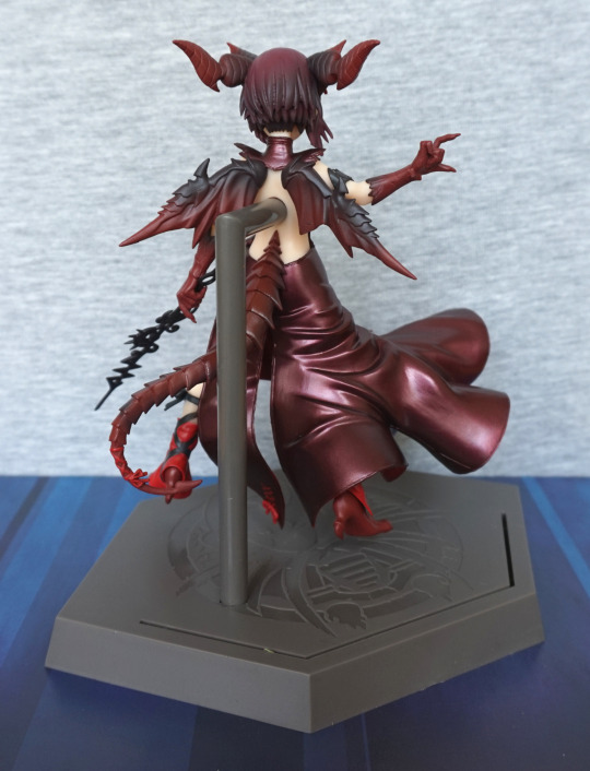
Has the same downside as the other, with the huge base hole in her back. Kinda wish they provided a plug for this or made it smaller, but this is a prize figure. Does mean she doesn’t wobble about much, with such a large pole though. Her skin and the red colours contrast well imo.
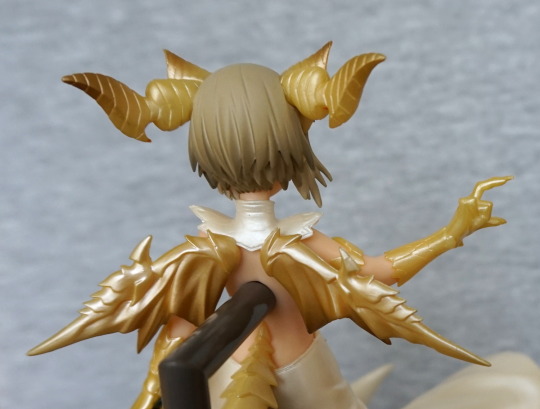
Close-up of the back of her head:
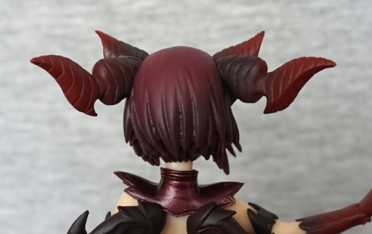
Ah, hmmm… some blobby paint back here in her hair. Bit of a shame. Her collar is nice though, along with her horns.
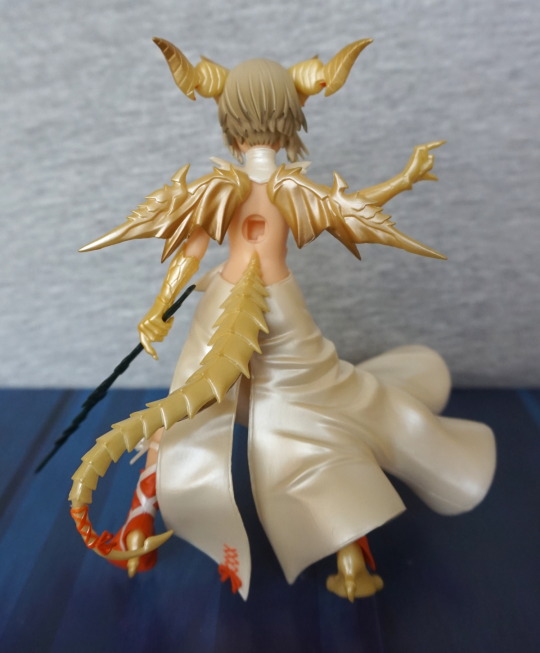
Close-up of the tail from the back:
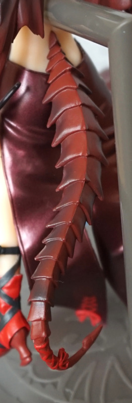
Some lovely shading and sculpting here. I do rather like her tail.
Overall, I like this figure, but isn’t my favourite of the three. It is a repaint of the Illusionless version, which does partially detract from it. I do love the shiny burgundy, but the rest of her outfit doesn’t really contrast or compliment this well for me. Also the blobby hair. I don’t think this is a bad figure, just less attractive than the other two for me. Unless you want both colours of this one, I’d recommend picking whichever colour scheme appeals and go with that one.