Tag: western figures

Alien – Real Action Heroes

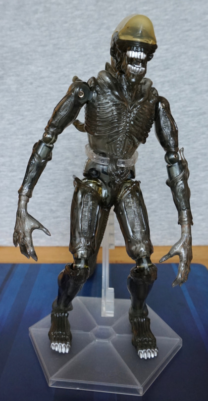
This was another random discovery on Mandarake. The description and picture didn’t match, but decided to go for it anyway and see which of the Real Action Heroes Alien figures this was…. and it turned out to be neither of the ones I was guessing it was. This one is #41. 

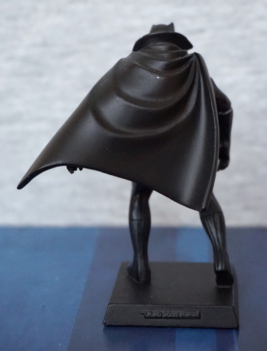
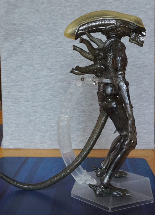
Here he is, on a Play Arts Kai stand:

image

S’cuse the derpy pose XD. Some of the threads on the joints had become loose, so I added some PTFE tape, so this is slightly visible due to his transparent nature. If it ever bothers me, I’ll replace the PTFE tape with clear nail polish, but PTFE tape is what I had to hand. 

Overall, he’s one cool-looking dude, but it is a rubbery plastic outer, so it had got very sticky with age – ended up giving him two baths to get rid of the sticky residue. 

‘Face’:

image

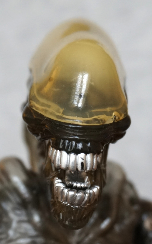
Scratches on his teeth were prior damage. Could get some silver paint/marker to fix this. His mouth has been sculpted well, and he has his inner mouth, as any Alien should. 

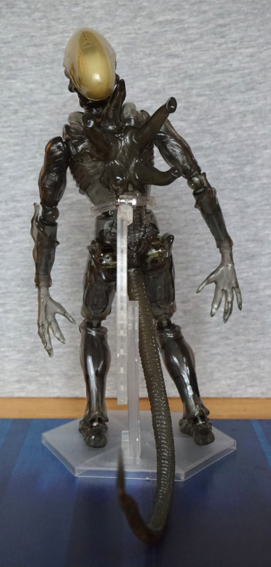
Crotch (because apparently I deemed this as a shot worth taking):

image

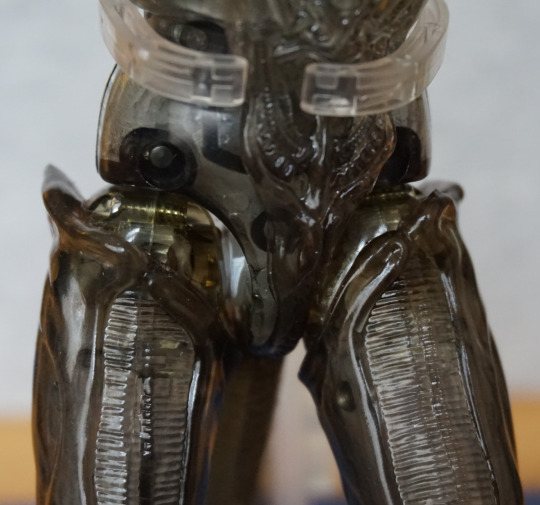
Here we can see some of the mechanisms, and the way his rubber suit is almost like a swimsuit. 

Feet:

image

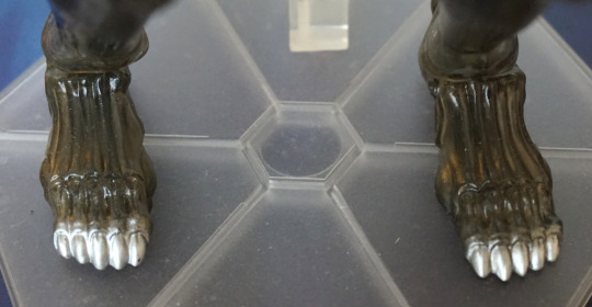
Here we have some shiny silver toes. Paint and sculpt is nice. 

Left:

image

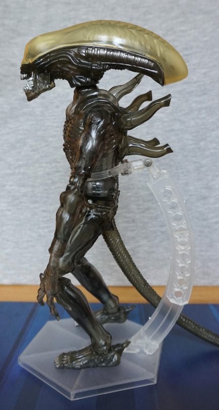
Love the sculpt on the side of his head, and he’s a decently poseable figure. Even with his joints tightened, he doesn’t stand too well on his own, so I’d recommend getting a stand, if you get any of these Alien figures. 
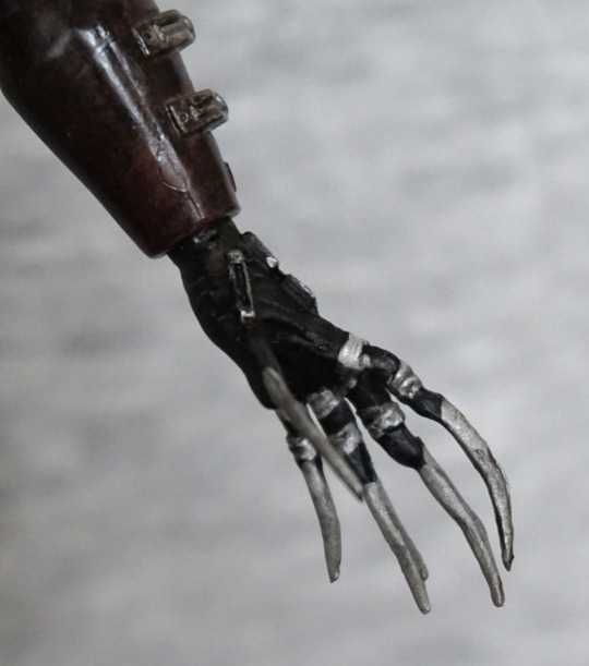
Hand:

image

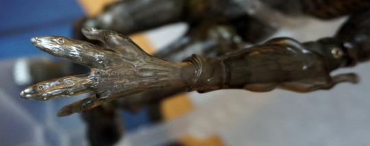
These hands are just the rubbery plastic, plus some silver painting on his fingernails. 

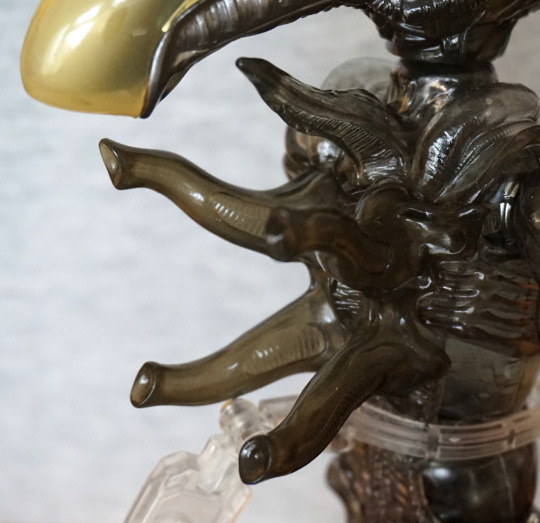
He does have a second pair of hands:

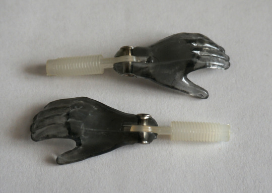
These are hard plastic, with a singular wrist joint. I prefer the spiky ones.
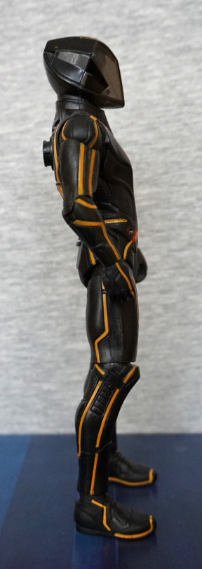
Right:

Looking symmetrical to the left side. 

Back ‘pipes’ side:

Details look nice and crisp. 
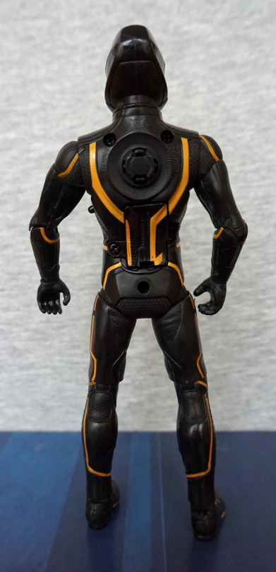
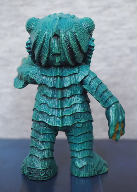
Back:

Not too much to see back here, but we can now get a good look at his tail. 

Tail joint:

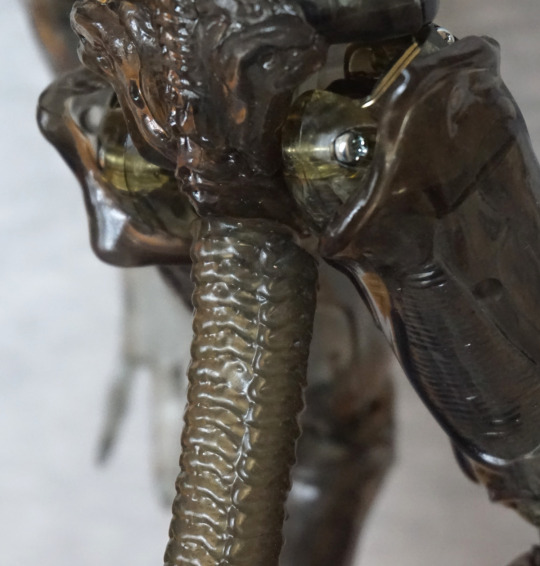
This is the part I dislike most about this figure – the tail goes onto a rubberised “spike” so it can fall off easily and isn’t poseable. Wish they had a hinged joint here, so you could move his tail to the side at lest. 

Tail in all its glory:

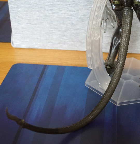
This thing is long and does pose issues when placing him on a shelf. The rubberised nub does allow it to bend to the side a bit, but can be knocked off in the process. 

Tail tip:

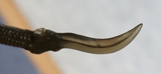
Nice bit of sculpting to end his tail. 

Head dome:

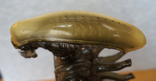
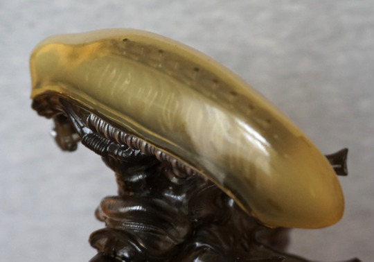
The details in here are sculpted nicely, and the transparent dome works well. You do get some dots on the dome, from the spikes pressing against it. This is also probably some of the plasticiser that’s leaked out over time too. 

Overall, I really like this figure, especially for the price I paid. He hasn’t aged too well, but the faults are mostly minor and fixable. For anyone interested, for getting off the plasticiser (sticky stuff) I used either hand soap or washing-up liquid, or possibly both. And some good ol’ fashioned elbow grease. Due to his head already having some potentially liquid dots in there already, I was careful not to dunk his head in the water, just in case it leaked (which would be a pain to fix). 

Poison Ivy – Ame-Comi – DC

This was one of the Ame-Comi figures I was after, and it eventually turned up on eBay. 

Front:

image

I love the pose of this figure and the colour scheme. To me, she looks more like a relative of Poison Ivy, than Poison Ivy herself, but I like her in her own right. 

I like the amount of detailing that has gone into her vines and leafy clothing. 

Vine hands:

The texture work is nice here, and I love the grasping vine hands

Feet:

The leaves are well-sculpted here, and the shading in the paint adds a lot ot the leaves. She’s also got her toenails painted neatly.

Base:

Ignoring the marks, the base logo is nicely placed, so she isn’t covering it in any significant way. Does take up a lot of room though. 

Left:

The vines curl around her hair, which I think is a nice touch. The figure has a nice amount of depth to her. 

Vine close-up:

The detailing is really nice on these, and there aren’t too many joins. Here we can see one, to the left of the photo. 

Right:

Some thicker vines on this side, and some transitioning of the leaves on her legs. 

Arm vine:

Nice blend of colours on the vine itself, and I don’t think I want to get in its way. 

Back:

Here we can see how the vines like to play with her hair,. We’ve also got plenty of leaf detail back here, so the back isn’t plain. The hair is sculpted nicely, and has a good amount of detail throughout. 

Glad I was able to get this figure, and am happy with it. Maybe at some point I’ll try to get the mark off her base. 

Alex Mercer – Prototype

This little Mercer was a promotional item, so was a nice random find at a not-very-good con. This was the only figure I bought at the con, as there weren’t many stalls there (wasn’t much of anything tbh…) and most of them were local artists. They had an “artist’s alley”, but the entire con was pretty much artist’s alley… Nothing wrong with having a lot of artists, but it would’ve been nicer if there was more variation there. 

Anyways… enough drivel about a con of a con in the UK… 

Here he is:

Cute-sized Alex Mercer, d’aww. The detailing is nice, and the paintwork is nice and neat. I like the way the three layers of his clothing have been sculpted, and his virus arm. 

Claw arm:

I love the texture on this, and the glossier finish, which makes it have a more organic appearance. 

Left:

Here we have his normal hand, I like the way they’ve posed his fingers, so it looks like he’s about to spring into action. The seam in his jeans has also been well-sculpted, along with the stressed-jeans paintwork. 

Right:

Clothing looks good on this side too, love the creasing detail in his hood. 

Back:

The pattern on the back of his jacket is nice and crisp. The dirty shirt effect feels a little overdone here, but isn’t really a big part. Some red paint has crept onto his collar here, so the paint at the back did get a little sloppy.

Double the Alex, double the fun!:

This guy is actually a smaller version of a larger figure that NECA produced. I bought the larger one years ago, but was never able to get the small one for a decent price, due to its more limited nature. Both have the same sculpt and articulation, so this Mercer is one that’s been shrunk in the wash :P. 

Max Payne

And now for the slightly infamous Max Payne figure that came with the collector’s edition! 

So this was the figure that was promised:

And this is what we got:

A weird grey-coloured suit with no texturing, and a white shirt that doesn’t look like it’s been anywhere near coffee and cigarettes… is this Max Payne? 

And that face:

Oh, so that’s where the coffee went. Those eyebrows also amuse me. Hair sculpt is actually rather decent – I think all the sculpting efforts went into the face and then bllerrgh. 

But hey, at least we got this base:

Easily the nicest part of the figure – the wood came out well, and the scattered bullets look nice. 

Left:

Some parts of the sculpt are actually quite nice – head’s pretty detailed, fabric creasing works well. Some nice detail in his hand too. 

Close-up of the bullet wound:

It could have been good. Instead they stuffed some angry red paint on itand called it a day. We can see a figure seam here, but it has actually been sanded down better than I’d expect for a figure with this paint quality. 

Holster:

Looks the part. Brown paint has slopped onto the ring somewhat, but overall, doesn’t look bad. 

Right:

Again, sculpt is decent. His shoes look good but is suit… did he buy this from the pleather store or something? Or is that giving pleather a bad name?

Gun:

A little webbing can be seen up close, but looks fine tbh. Gun is decent enough. Not sure why there isn’t a matte finish on his hand. OK, I know why – shiny finish is cheaper. 

Back:

Aww, lookit – they did actually attempt some shading somewhere! Either that, or the figure rolled around the warehouse… I almost suspect that, with the paint job the rest of the figure got… 

So why did I buy this dude when I knew he was shit? 1, he was cheap and it’s Max Payne. 2, Some point in the future I aim to use this figure as painting practice – I can’t exactly make that suit look any worse! The sculpt-work is there on this figure, hidden by a shoddy, cheap paint job. Me painting him isn’t going to happen in the short-term, but when I’ve learned a couple of techniques, I plan to give it a go. And probably add a claw stand to the base (or some other mod) so that he doesn’t experience “bullet time” leans. If you do an image search for this figure, you’ll likely find ones where he’s leaning far over – apparently they didn’t use a particularly strong plastic or put rods in his legs to prevent this issue -.-

Hela – Rock Candy – Thor: Ragnarok

This Rock Candy figure I bought elsewhere, but on the same day as the Harley Quinn one… I think if I saw it at a later date I wouldn’t have bought it, due to the quality of the other one. So let’s see what this one is like.

Front:

Here she is, proclaiming her unboxed glory. At a first glance I really like her outfit and her helm, but her face does feel a bit derp. Feels like her eyes and mouth don’t quite match up somehow.

Face close-up:

From this angle the effect is much less. Nose feels slightly too big though. And the paint across her nose went on the wonk. Still prefer that to Harley’s nose scrape though. Overall, I like the sculpt of her helm, and think this works well. The parts of her face work well individually, but not entirely sold on the overall look. 

Outfit:

The big thing that attracts me to Hela figures – her outfit. The paint colours are nice and striking here, and seem to match up with the colours of other figures of her. However, the paint is hilariously off in places – especially the upper right part of her suit. These paint issues weren’t restricted to this one in the shop, and this was the one I chose for being least distracting with errors. As the centre of the suit attracted my eye, I was looking for the least amount of error in this part.

Here we can see the rubberised bits used to cover her arm joints… but they tend to have a mind of their own and not sit properly on her shoulders. May need to heat treat these so they sit in the right location more naturally. 

Left:

Hm, apparently she stole one of my hairs. Gerroff that! Helm looks good from the side, and the paint is nice on her arms. They’ve painted her fingernails, but it is a bit blobby. 

Right:

Looks OK from this side, but her shoulder does look odd… and I think the paint is a bit more pallid on her shoulders. Bit of a nasty seam there too. 

Back:

I like the shininess of the cape, and the colour is lovely. The fabric wrinkles look good, so I’m pleased with this. Just wish more of this was visible from the front. The way it joins onto her back isn’t as lovely, but it does the job. 

Not particularly pictured is the fact she’s a bobblehead – in the above pic you can see some of the gap around her head that allows her to “bobble”. Not sure I’m keen on this feature, but it doesn’t really take anything away… so that’s there if you like to bobble your bobbleheads. 

Overall, I’m more pleased with this figure than the Harely one, but it still isn’t particularly high quality. I did get this one cheaper though, but not sure I could recommend it. 

Harley Quinn – Rock Candy

This was a random buy, as I came across her at a reasonable price. Was considering getting one or two of the Rock Candy figures as I like the proportions. As Harley Quinn is one of the characters I collect figures for, she was one of the natural choices.

So here she is:

image

With my copy, there is a slight mark on her nose – annoyingly I didn’t notice this until I unboxed her, otherwise I would’ve probably not bough her. I like the rest of her face though, the front of her collar is done well… and the hammer is nice, apart from the slight bend it has to it. However, the less good things are the fact the quadrants of her top aren’t aligned properly, leaving some overlap on the black and there’s a noticeable seam on the collar to her left side. Can also see a bit of paint mess on her hat pom-poms.

Left:

The colours are nice, the sculpt isn’t too bad (collar feels a bit thick though), but there are small paint errors dotted around – most noticeable is just above her hand. 

Right:

Right looks better than the left and doesn’t have much in the way of noticeable issues. Do wish they put a rod in the hammer handle so it didn’t bend so freely. It does make assembly easier (and the figure cheaper…) but at a cost. 

Hammer & leg close-up:

One thing I can say for the hammer is the sculpt job is nice, and the paint used for the bands works well… if you ignore the paint slop. The diamonds are printed well on her leg, which is nice. 

Back:

Square overlap doesn’t seem as bad on the back and the paint looks mostly neat. Cuffs have a bit of slop, but this is pretty common. 

The big paint slop though…

Who the heck QC’d this… or more to the point, didn’t? Pretty nasty paint flaw here, and this is why I don’t buy Funko stuff often. Wouldn’t recommend buying their figures online, unless you’re not fussed over paint mess… as this is not too uncommon. 

Overall, I like the design, but the execution leaves something to be desired. A handful of paint errors and an ugly amount of flashing on her collar doesn’t make for a very premium figure. Honestly wouldn’t recommend these at full price. 

Figure Spotlight: McFarlane Viper King

This is one of the figures I bough early on in my collecting. Being McFarlane, it’s still a quality figure in my collection:

image

This figure looks cool… but has a habit of falling over. He doesn’t come with any stand holes either, so I’ve developed various ways of standing the bugger up over the years. Though after this photo session, I did manage to get him to stand up on his own!

Close-up of his face: 

image

Very much an angry fellah :P. The arms move up and down, and his neck moves, which gives some poseability. 

Viper King from the back:

image

The Blu-Tack mark is from the original owner – obviously the technique they used to keep him upright. I favoured stands and string, rather than tack. 

Here’s a close-up of his back:

image

Some interesting details back here, I like the tail part on his head. 

The black, red and silver colour scheme works well, and there’s a decent amount of detail in the sculpt. Just a shame they didn’t provide him with a stand so you could pose his snaketacles fully, thus making him prone to faceplanting. This issue can be resolved by sticking him down, or coming up with your own form of stand, but it’d be nice if he was provided with one. 

Freddy Krueger – A Nightmare on Elm Street – Bishoujo v2

Now for another horror-themed figure – Fredd Krueger, but perhaps not as you’ve seen him before!

This figure is part of Kotobukiya’s Bishoujo line, which has a few gender-swapped characters, this being one of them.

So here he, uh, she is:

A very sultry-looking Freddy. I love the face and the pose from the front. With the second edition, they slimmed down the base and reshaped it a bit, to make it fit with the figure more. The base does the job, but I don’t have many feelings towards it.

Face:

I love the way the lip gloss has been done, and the hair is an interesting effect, but feels a tad green which I find a little off-putting. The glove has been sculpted and painted well. Her top is fairly decent, but doesn’t have a proper ripped effect going on with the edging, which is a minor downside to the figure.

This close-up also shows the issue I have with her body shape – her back looks rather broken at certain angles… especially this one! She’s fine from the front, but some of the side angles aren’t very flattering.

Chest:

Her cleavage has been done well, and I like the cute bra under the top.


Left:

With her arm covering her back, she doesn’t look so broken. Love the dimple in the hat, and the strands in her hair. Her boots are also nicely sculpted, and I think they pulled the ring detail off well.

Stocking close-up:

Her stocking looks especially good on this figure, and they’ve even included the stocking seam at the back, which I thought was a nice touch.

Right:

The blood effect isn’t terribly realistic, and could’ve done with a bit more shading to it. The flat red makes it look kinda bad imo. The shape of the paint works, but there’s no depth to the wound. I think a little bit of an edge would have helped.

Back:

Again, lookin’ kinda bent. However, her back is otherwise sculpted well, and the shorts are really well done. Here the “off” hair shade shows up the most I think, and could’ve done with being a tad more yellow in my opinion. He doesn’t have any hair, so it would’ve been nice to give it a more complimentary shade now he has some.

Shorts close-up:

Love the logo on the back of the shorts! The detailing on these is nice, and the frayed jeans effect I think works here. The stitching has been detailed, which really adds to the realistic look.

Overall, I’m happy with this figure, and glad to have finally got around to getting it. I think the hair could’ve been done in a better colour, which is my main gripe. Seeing as I don’t move my figures around too much, I can display her at a favourable angle, so not too bothered about the oddly shaped back. I think it’d bother me more if it wasn’t for the hair though.

Dominia – Unreal Tournament

This figure is part of a short-lived series of Unreal Tournament figures. I found out randomly that they existed a few years back on eBay, when someone was selling them in the UK. Unfortunately I missed out, when the auctions ended and I forgot…

Several years later I remembered they existed, and decided to buy Domina:

image

Here she is, in all her gory glory. The “blood” paint on her leg isn’t the best, but the rest of her looks really good imo. Her articulation does leave something to be desired, and I did have to fix a bend in her leg/foot that had occurred due to time, which meant she couldn’t stand upright initially/

Her grasping hand does have a gun to hold:

image

But with the bother of sorting out her foot, I didn’t get around to warming her hand to get this into it. Gun itself looks nice – a decent amount of detail here, and they’ve done a brushed metal effect, so it avoids the issue of looking plain. 

Face:

image

They’ve done her mask nicely… and included the eye in her mouth. The skin also raises up around her head spikes, which is a nice touch in the sculpt-work. The brushed metal effect on her shoulderpads works well too. 

Left:

image

Love all the little details that have gone into her hand/glove. Spiky shoes looking very ‘metal’ too. 

Hand close-up:

Love the claws, and the paint is neat. Sculpt does look a bit dodgy close-up but fine at a viewing distance. The texture in the paint on the cuff looks good. 

Leg close-up:

image

The scar part looks suitably gory and disgusting, but the bruising/blood-marks don’t look quite the right colour. Little too purplish. 

Right:

Instead of a scarred leg, we have a bandaged one on this side. The asymmetry has been done well, and both sides look suitably detailed. 

Hip:

Here she has a syringe made of a flexible plastic, so that it doesn’t snap. Slight downside to that is it likes to be a little bit bent. Doesn’t look particularly realistic, but enough for a figure of this type. 

Back:

Can’t help but think how cold her backside must be in matches… Does look like she forgot to put her pants on, prior heading to the tournament! Paint shading is nice, but a little off-coloured imo. The back of her clothes are nicely detailed, and they didn’t skimp on the sculpt back here.

Top of her head:

And to finish her off, we have some more cutaway flesh. I like the way they’ve detailed the cuts, and the red wash works well. 

Overall, I think this figure does a very good job of being Domina, the main issue is probably that her skin colour is less pallid than her in-game appearance, but this doesn’t bother me too much. Her articulation doesn’t bring too much to the table – her arms are good for posing, but with the stands she has, posing her legs is mostly done to get her to balance, so you’d need an action stand to get poses out of her. Overall, I think she’s a good figure, though does look a bit dated in some respects… which is fair, as she is an older figure. Wish they did more of the UT crew, but alas, they only ever did four. Would’ve loved to own a Lilith figure, if it was an option. 

Sam Flynn – Tron

Found this dude at the same fair as Clu, but in a different fodder box.

Front:

image

This one has a fairly equal level of paint and sculpt. Which is to say… not amazing. 

Lit up:

image

Face effect looks cool on this one too, and the LEDs work. Overall works well to distract from the figure 😛

Face close-up:

The faces look surprisingly realistic. Kind of wish some other figures went with this effect, but don’t think it’d be massively popular. 

Left:

Sam’s helmet profile is less cool to me than Clu’s but does look good in general. Skin tone on his hands feels off though. 

Right:

Not too much different from the left. No paint detail on his lower calf on this side though. 

Back:

Again, a half-assed paint job when it came to the battery cover and a hole in his arse. Disc on this one was also lost to time, so I don’t have that to show. So he’ll have to forever grasp at air, instead of his disc. 

Overall, I can’t recommend these Tron figures, unless you have some sort of nostalgia or soft spot for them. I kind’ve always wanted them, but ended up missing out when they clearanced, so kinda happy to get them since for not a lot of money. For me, I think the figure’s gimmick actually works (though I probably won’t trigger it often), but the rest of the figure leaves a lot to be desired.

Clu – Tron

This figure isn’t in the best condition, as I bought it from a box of “fodder” – loose figures that come as-is. Not uncommon to see fodder boxes at cons and car boot sales (UK equivalent of yard sales). 

So here he is:

Paintwork is passable, sculpt is OK. I can see why these got clearanced back in the day. 

However, that bump on his side does make this figure more interesting. 

First press:

The lights turn on, which does look pretty neat.

Second press:

He lights up and says a line. Imo, it’s a pretty neat effect, especially for an older toy. Was also surprised the batteries weren’t flat either. 

Left:

Love the profile on the helmet. Most of the orange paint on this side is neat. Not sure if the paint missing on the side is wear and tear or if it was just a poor paint job. 

Right:

Paint feels more of a mess on this side, leading me to be less sure if the other side was damage, rather than a manufacturing defect. Still suspect it was damage though.

Back:

This clip is supposed to have a disc, but being fodder, the ring has probably been long lost to time. The paint hasn’t been matched up well on the battery compartment, which gives a cheap feel to the figure. Feel as if they just kind of gave up with the back. 

So my conclusion is a cheapy figure with a neat gimmick. Looks OK at a distance, but the paintwork seems to have been lacking, even taking wear and tear into account. 

Vir Cotto – Babylon 5

Ended up seeing this guy at the Toy Fair, and as I liked the other two I have of this series, I decided to add Vir to my collection too.

Vir:

Here he is, in his shiny ceremonial outfit glory! Love the bright fabrics they’ve used on this figure, and the stitching seems neat. These figures do end up a bit uncanny valley, but it doesn’t really bother me. 

Face:

I like the detail in the face, with the makeup paint and the shading. Hair does look thick plastic though, and the eyebrows don’t really fit with the rest of his more realistic face – probably could have done with a different finish here, and possibly a bit of shading. 

Left:

Clothes look good from the side, hands could’ve done with a less shiny finish, but the sculpt is nicely detailed, and does look pretty realistic. 

Right:

Mmm, shiny and flamboyant. Fits Vir well. 

Back:

Full-on bright shininess. If you like things gaudy, this coat should do it for you. 

Overall, I’m pleased with this figure. The detailing is nice, and it is a difference change of pace to the usual action figures. If you don’t mind your figures more doll-like, and a fan of Babylon 5, then these figures might be up your alley. 

Voth City Ship

Bit of a random buy this one… but here is a city ship from the Star Trek universe:

I like its slender design and rounded shape. 

Side:

Here it is in profile… I do rather like the overall shape, and the detailing upon it

Back:

Here we have what should be the engine, but does kinda look like more windows.

Top:

Here we can see all the details sculpted into it – there’s a reasonable amount of detail here, to give the impression of something bigger. Also some mottling, which also adds to this impression. 

Bottom:

We have a similar set of details and a very flat base. This thing is… weirdly flat. Could’ve done with a bit more shape. 

One issue that isn’t pictured is that it’ll fall off its base at the slightest provocation.  If it’s on a shelf it should be fine, but touch it even ever so slightly and it is likely to take off and make a visit to the floor. Wish the stand designs had some kind of clips to actually hold the ships. Out of the ones I personally own, this one seems the worst for pinging off the stand.

Overall, I’m fond of its looks, but it isn’t overly exciting. Can’t give a strong recommendation of it, but I don’t think there’s anything particularly wrong with it either.

Winzar’s Pack Patrol – Lego Chima

This is the second of the two polybags I bought at the toy fair.

Front:

Here he is, looking very growly. The minifigure looks nice, and I like that he can hold the handlebars. 

Bone:

I like this small detail that they’ve included. Fitting with the wolf theme. 

Side:

I like the tilted design of this snowmobile. The skis and blades also add interesting details to the vehicle. 

Back:

He’s even got some lights on the back of his snowmobile! The back isn’t too interesting, but looks fine.

I think the overall design of this one is better than Frax’ flyer. Overall, I’m pleased with this one and can recommend it.

Frax’ Phoenix Flyer – Lego Chima

This was one of two Lego Chima polybag sets I bought at a toy fair:

Here he is, in his shiny orange glory. The flyer is a bit of an interesting shape, but does the job. 

Front:

Here we see Frax, who looks good imo. We’ve also got a little detail on his front with the flat stud. Instead of lights his flyer seems to have… crystals. Those wings aren’t looking very aerodynamic…

Side:

Here we can see how his wings are attached – a little bulky and odd due to the constraints of Lego. The forward-pointing lights look kinda cool though. The controls look kind of strange, due to the small amount of space available. 

Right:

Not too much to see here. Very flat on the back, Wing do look a little odd from being clipped on the back instead of truly being part of him. 

Overall, this isn’t a bad little kit, but could possibly do with a few more pieces to bulk out the shape.

Adam Jensen – Deus Ex

This figure originally came with Loot Gaming, but I bought this at a Toy Fair (the reason a bunch of Western figures are coming out now :P). 

Front:

He’s a pretty nifty chibi figure, done in a solid block colour style. They’ve used some good paint for his glasses, that make them match the ones he wears in-game. They’ve included the indentation in his head, which shows attention to detail. I also think his clothes have been rendered well, and is reminiscent of one of his outfits from the game. 

Left:

His hair has been done in an interesting way. Not sure if I like the look from the side or not. But it does help give his head some detail so it isn’t a plain ball. On this side we have one of his arm blades – for those not familiar, they are dull-ended as depicted here. Here we can also see his artificial arm details here too. 

Right:

Here we have a silenced pistol. The paint detail on his hand is nice and neat. We have a weird seam going around his head here though. 

Back:

Painting and sculpting is nice back here. I also like his gold base, which complements the figure well, and fits in with the Deus Ex colour scheme, for the games he is featured in. 

Overall, I think this is a nice figure and would recommend it, if you can find it reasonably priced. 

Gilbert – The Monsters!

Gilbert is part of a mini-series of Bad Taste Bears, but based upon movie monsters. The series was simply titled “The Monsters!”. 

Gilbert himself is a cross between a bear and Gill-Man from Creature from the Black Lagoon. So let’s take a look at him:

I love the bright blue-green colour they went with, and the mustard colour compliments the blue-green well. The texture on his scales has been sculpted well, and helps the bear-gillman cross work. 

Left:

They’ve added several finned bits, which helps add to the aquatic theme. Gotta have something to counteract the shagginess! 

Arm close-up:

I love the webbed hands, and think these have been sculpted and painted ell. The light green accents have been done well, and the yellow paint is within the finned parts, though there’s a tiny stray bit on one finger if you look closely.

Right:

Love the tiny little claws he has. Sculpt on the back of his hand is very effective. The shiny finish complements the aquatic themeing of the figure.

Back:

His back has the usual number and BTB icons on his back. Ignoring those, I really like his back – it completes the figure well, and we have the nice spine bits goin’ on. Again, there’s nicely-placed light accents.

Glad I was able to get him, and he was cheap too. Would recommend this figure if it appeals. Getting hold of him in the aftermarket might be hit and miss, but he seems fairly available at time of writing. 

Seven of Nine – Borg’d – Star Trek

This is a figure I’ve kind of been wanting for some time. Because Borg. 

Presenting Borgified Seven of Nine:

She has a very retro vibe – not just in terms of the action figure style, but the design of her borgification. However, with this retro style, I love the way it introduces more colour to her design than the mostly-black modern designs. 

In some places the moulding feels a bit chunky and flat, but in other places, there’s a decent amount of detail. Interestingly, her top seems to be part-fabric – the black part has creasing like she’s wearing a PVC top. I like the metal part on her left knee, though it could do with some paint accents to add to it. 

I like her face, and feel it has a likeness to Seven of Nine in the show.

Left:

Here we have some visible seams on the top of her shoulder and a bit on her arm. I love the detail on her arm, and feel it fits the Borg theme well. Her lower leg also has a lot of nice detailing. The paint here is decently done.

Right:

Here she has a very apparent seam on her side. Not much of a surprise for these figures. The detailing is nice on this side, but some of the stuff on her leg feels a little flat and odd. 

Back:

We have a good amount of detailing back here too. The painting is messy on her upper back, and we have some weird patches of colour which don’t seem to match up withe the sculpt – the wires would look better if they were a consistent colour, then with other bits filled in. Here it looks like the factory worker went with whatever they felt like to colour this in. We’ve also got some stray silver paint in a couple of places, most notably on her right shoulder. 

Ignoring the upper back, I like the rest of it. 

She also comes with these accessories:

I like the alcove piece, but there’s no method provided to mount this. Would’ve been nice to be given a clear stand to mount it behind her, but… I’ll have to dig around in my accessory box to find something to use. The data pad thing has an interesting sculpt to it, but it is just plain silver, so doesn’t look very exciting. Not sure if she would hold it too well either, but not tried.

Overall, I’m pleased with this figure, and glad I was able to get it. She has got some flaws, but nothing too major in my eyes, for the figure type she is. Glad to have another item to add to my Borg collection.

Starfire – DC

Another Eaglemoss figure… but this time for a DC character:

Just about recognisable as Starfire :P. This is based on her New-52 outfit and is part of the Chess Collection. Some of her body sculpting is nice, such as her chest, others are more suspect, like her upper legs and lumpy arms. 

The chosen colours for the paintwork work well, but the actual paint job is… lacking. Her face and upper clothes seem to be fine, as is most of her sues, but the other parts are roughly painted, leaving her skin looking lumpy. Top of her left boot also missed the mark. 

Left:

The upper parts of her hair look OK, but where it should blend to yellow and white there is just a sudden transition into this part, which makes look like she accidentally dipped her hair in bleach. Not a good look… 

The bands on her armguards are overly lumpy – the should be raised, but this is too raised for the bit that goes over her arm. With her boots, I think she’s supposed to be standing on her toes, but with her standing so high up like this, her feet either look misshapen or like she should have some heels descending from the back of her shoes. I think it would look better, if her feet were less straight up (i.e. if she lowered her heel more to the ground). 

Right:

Looks to be some attempt at highlights in her hair, but they don’t work too well. Her arm looks a bit lumpy this side, and apparently she’s developed some webbed fingers… Didn’t realise Starfire was turning aquatic! Her feet look less odd from this side, but still, I think she’s a bit too much on her tippy toes. 

Back:

Back paint definitely has some slops in it. Hair highlights seem to work a bit better from the back to me… Here we get to see the absolute lack of blending they’ve done between the yellow and orange paint. Not sure why they didn’t even try, seeing as the yellow and white are blended. 

Overall, this isn’t a great figure. Would only recommend to someone collecting the set or people who just want Starfire stuff (like me). Stafire has had a rough time with collectables imo, so decided to pick this up as it was Starfire and cheap enough despite its flaws. Thankfully, since buying this, Kotobukiya is re-releasing her Bishoujo figure so I’ve got that to look forward to! Yay! 

Black Panther – Marvel

Today’s blog features Black Panther, made by Eaglemoss.

Front:

This is his comic book appearance, rather than his film appearance – Eaglemoss has done figures of both, but this is the older one. 

Here he is, looking very stealthy in his cape. There isn’t much in terms of colour, but the gold accents and eyes have been painted nicely. The sculpt is good too, and I do like his pose. 

On mine, the left arm has been misassembled – I may break this at some point and reglue (probably not particularly needed to repin). Not sure how I didn’t notice this when I was photographing it…

Left:

I like the way he he bent over slightly. Here we can see the gold accents do go around his back, under his cape. Nice to see this attention to detail.

Right:

Here we can get a bit of a better look at his eye – they’ve used 2 paint colours here, which does elevate their appearance. His bag o’ tricks is a nice touch. 

Again, please ignore the “elbow”. At first, I think it looked like a design element, but on closer inspection, it’s a mistake. The joint here wasn’t pushed all the way in, so left with this mess… ah, QC. Or not. 

Back:

I like the cape design, with the large flowing wrinkles. Tiny paint scratch on the back, but this could’ve been a previous owner. 

Overall, a decent figure, or will be once I repair him I guess. If you get one that’s properly assembled at a reasonable price, I’d recommend him.