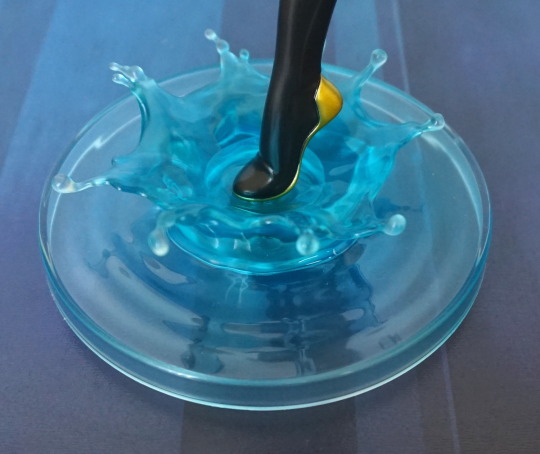
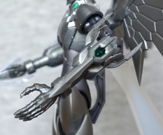
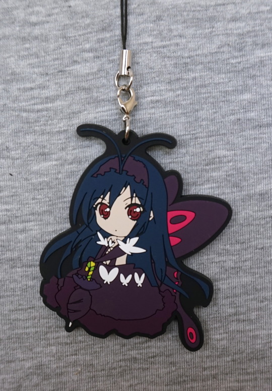
This figure was also an instabuy for me – and even better, this one was on sale! After leaving the shop, at first I though there was damage to the wings, but it turns out I was mixing up the lugs with her claws. Was super-pleased to find out that there’s nothing wrong with her, and she was just reduced for quick sale.
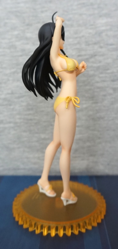
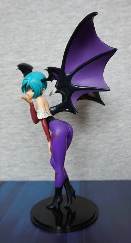
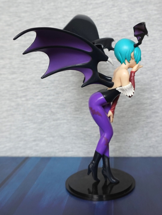
Here she is, blowing a kiss:
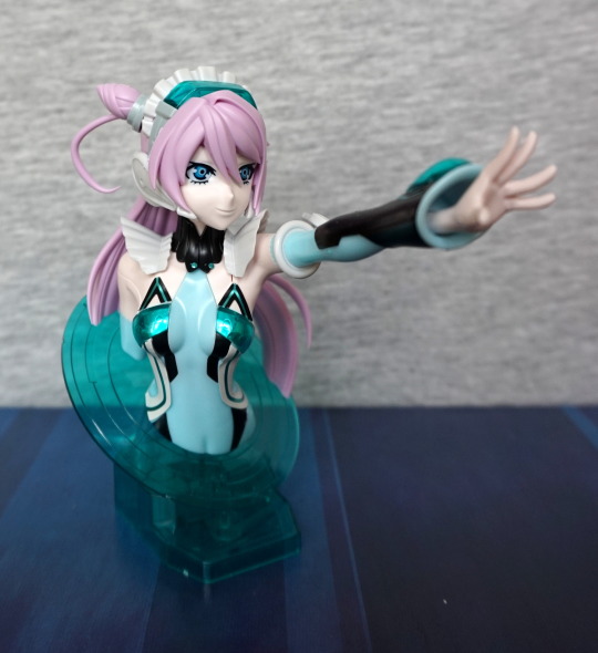
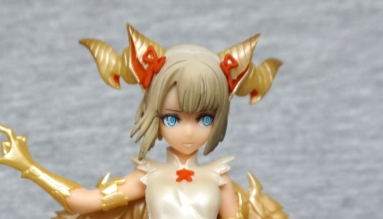
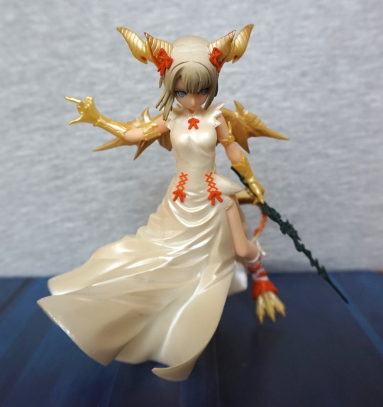
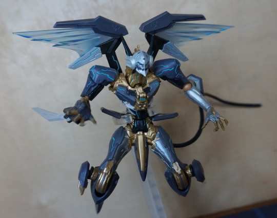
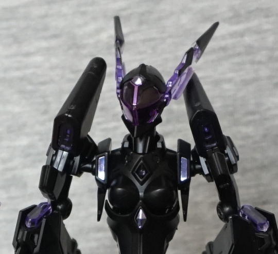
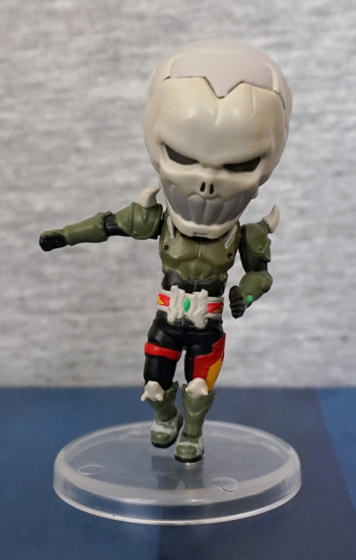
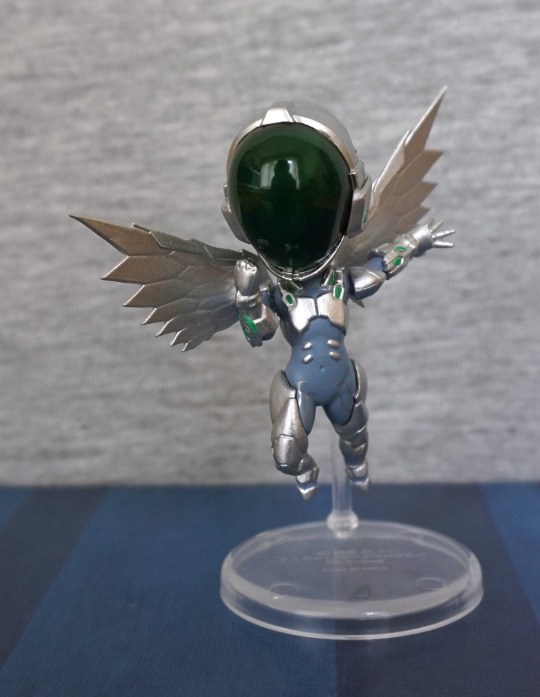
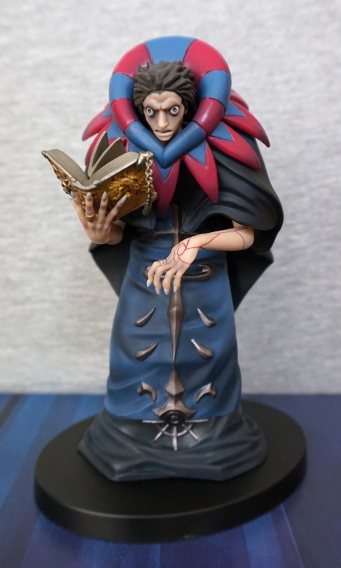
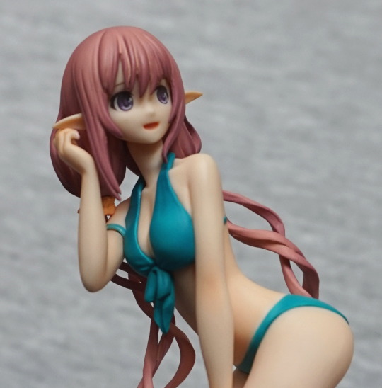
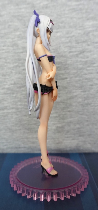
Pic towards her face:
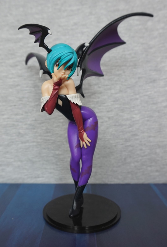
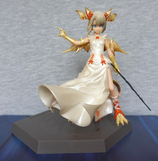
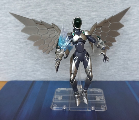
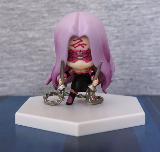
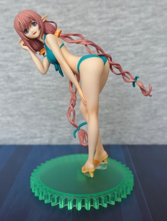
I like the sassy pose she has – it suits her character. Her outfit isn’t overly detailed, but it does the job. The bats on her leggings are nicely done, but I would’ve liked to see a bit more contrast so they stand out more. They do blend too well into her leggings.
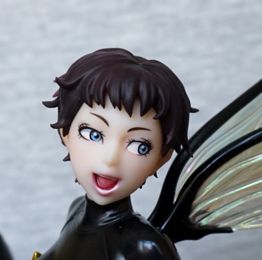
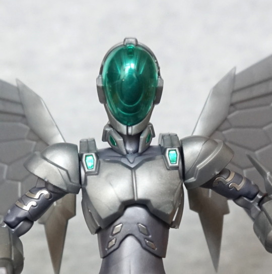
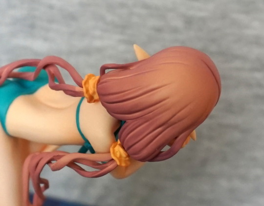
Close-up of her face:
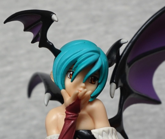
A cute, if simple, face. Hair strand moulding is nice, and the creases on her sleeve.
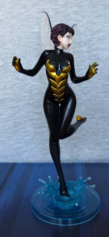
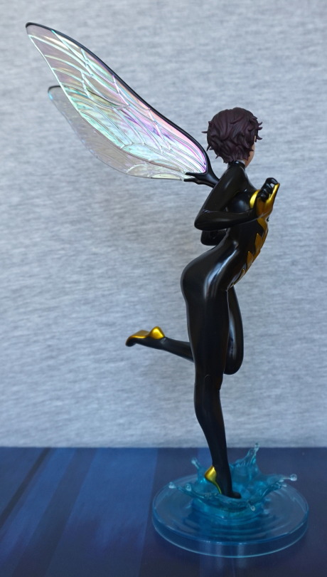
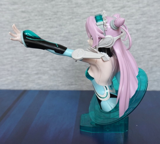
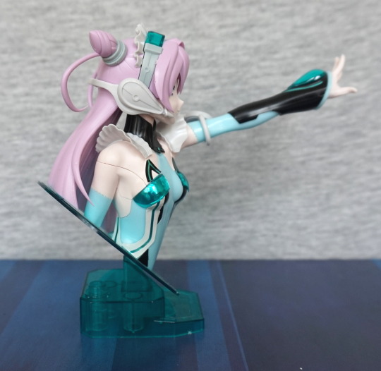
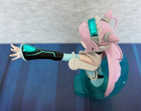
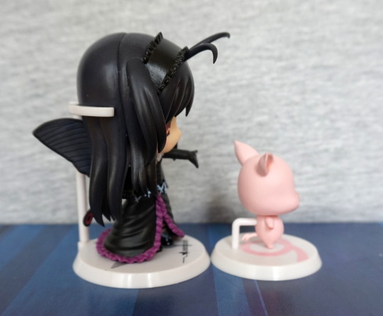
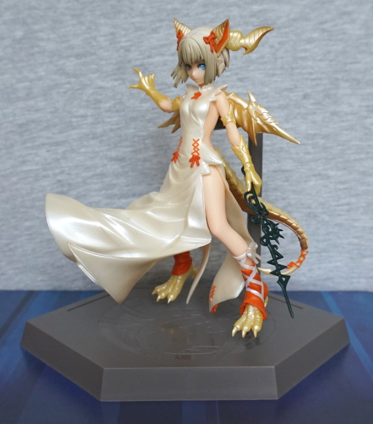
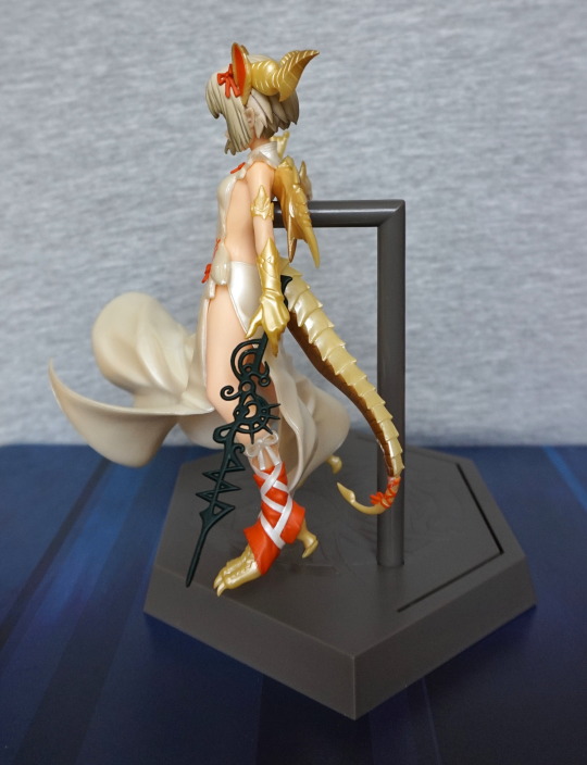
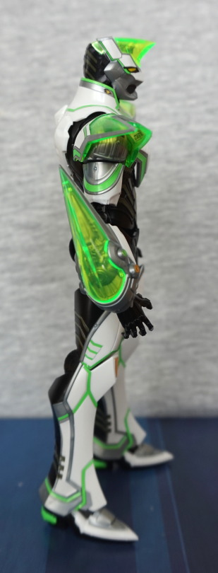
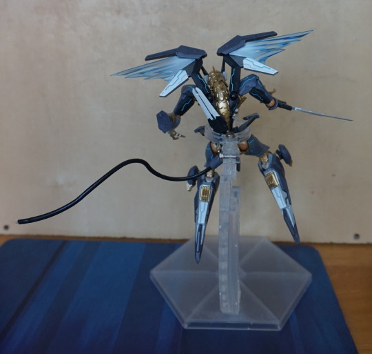
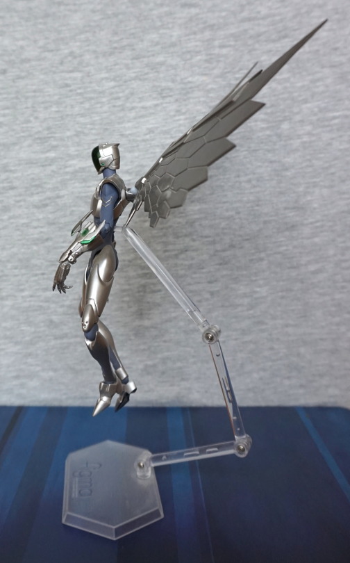
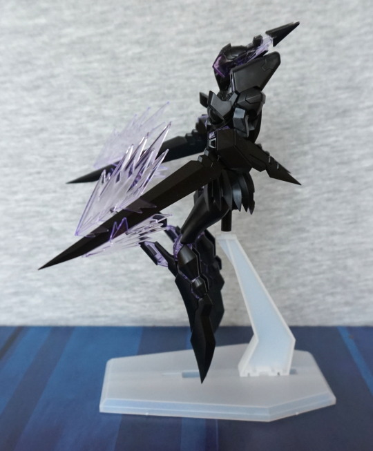
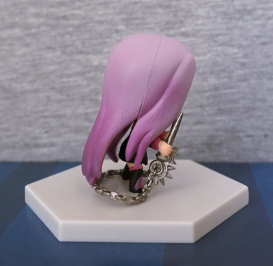
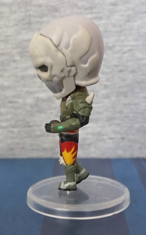
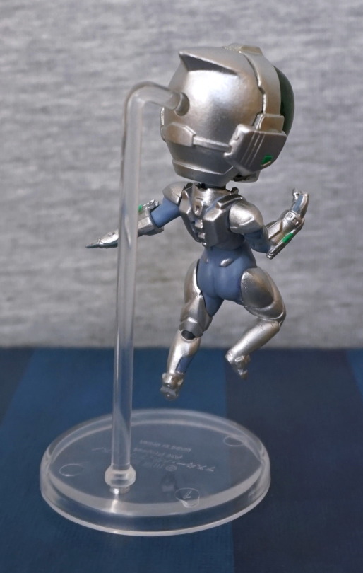
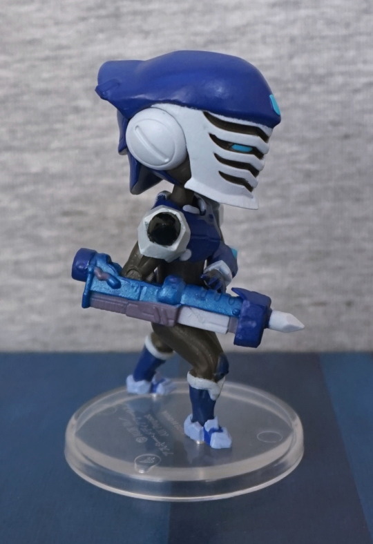
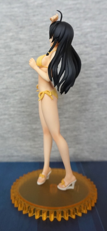
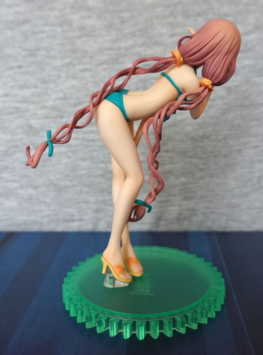
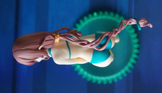
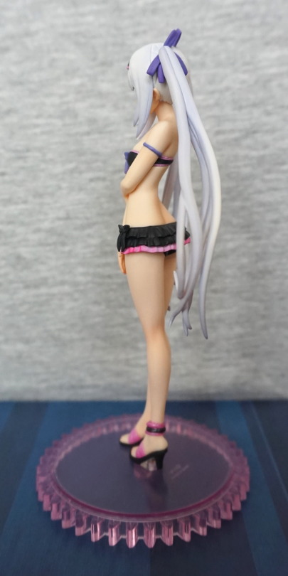
Opposite side:
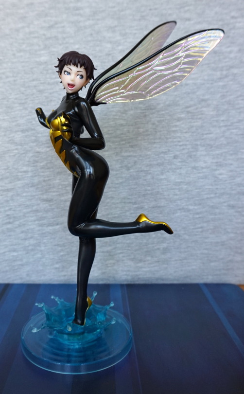
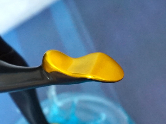
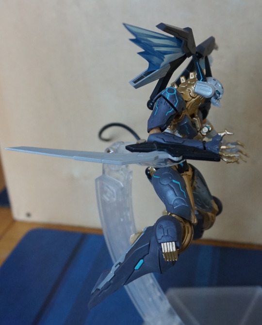
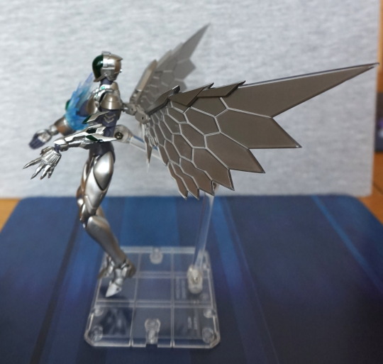
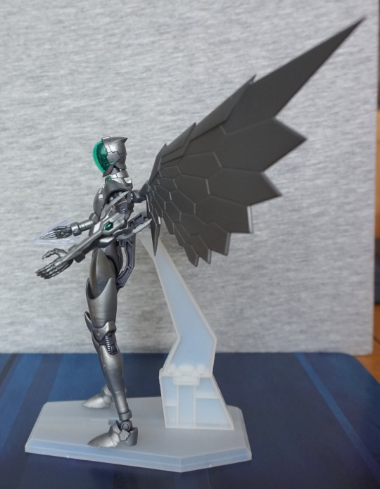
Here we can see she is well-posed, with one leg bent in a suggesive pose. We can also see where i didn’t quite get the pegs all the way in. Didn’t want to end up breaking them, so ended up leaving them as-is for now. Back of her head is largely flat, which doesn’t make it very hairlike. Other part that doesn’t look so good imo is the white edging on her sleeves – the finish and colour leaves it looking plasticy, instead of more like fabric.
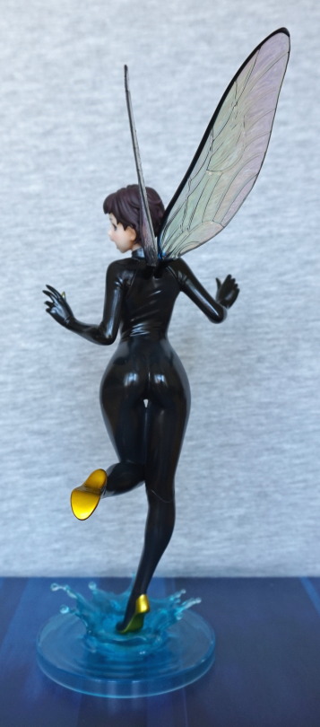
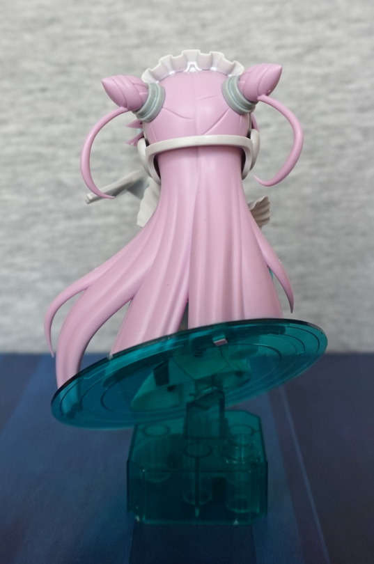
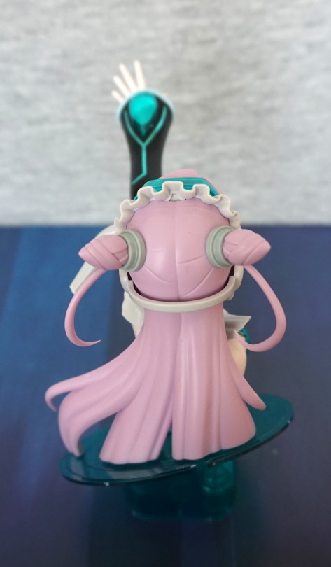
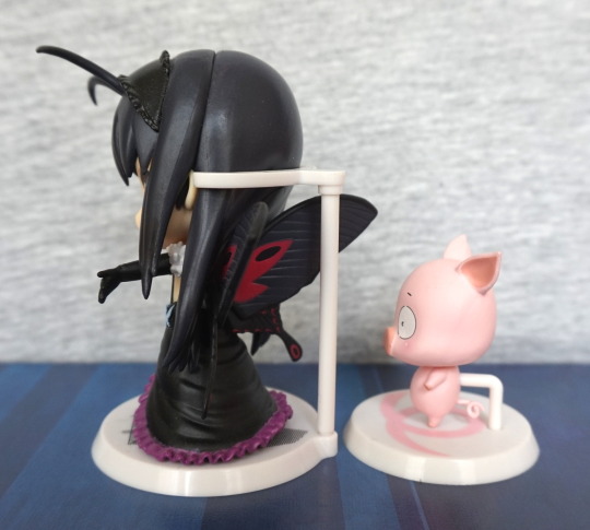
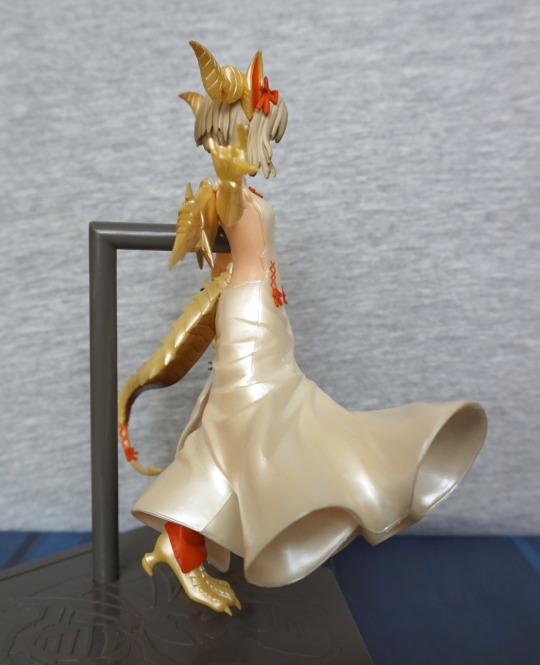
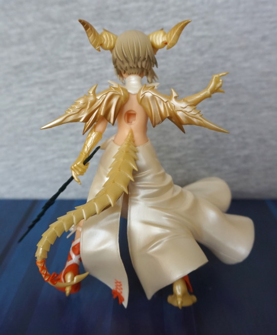
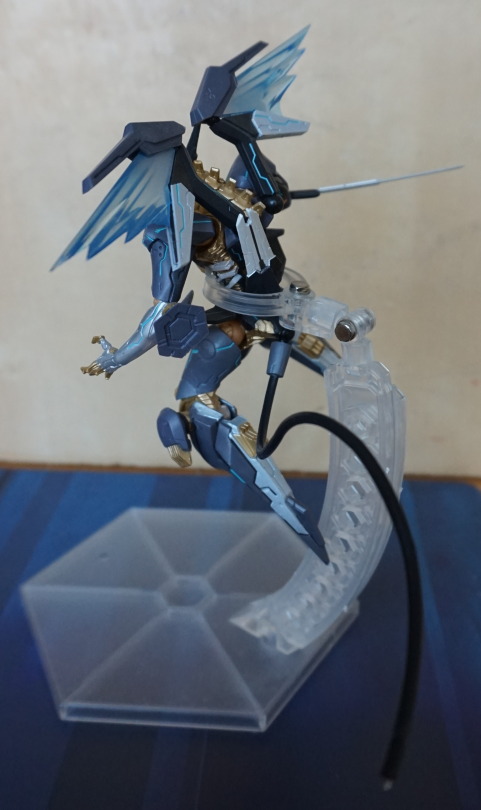
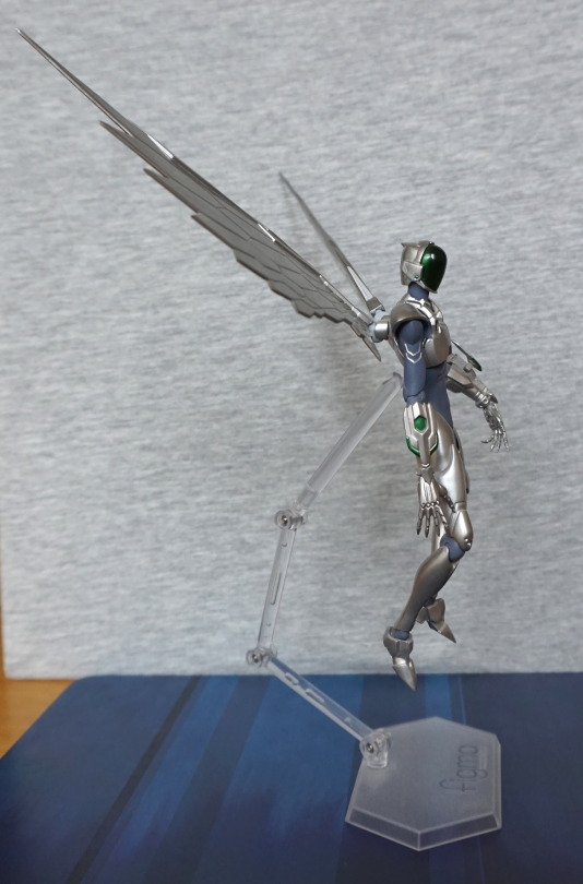
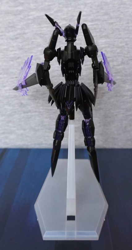
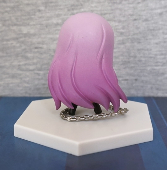
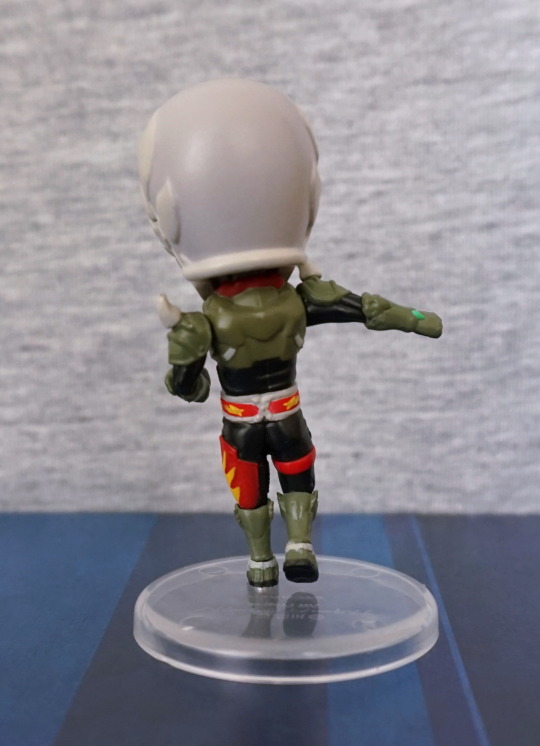
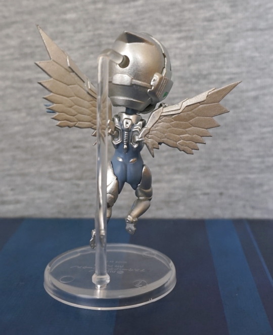
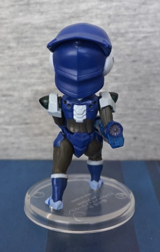
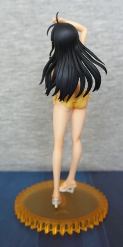
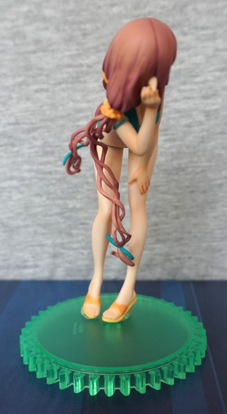
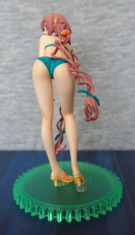
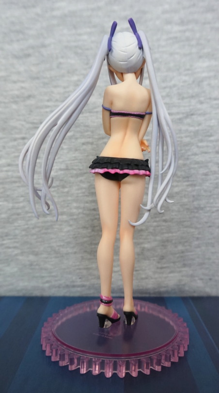
Back:
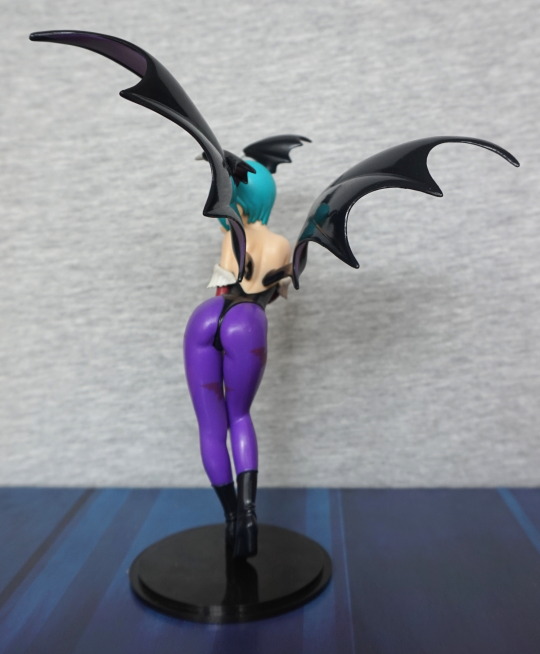
One well-sculpted butt :). Her spine and back are detailed in the sculpt, which is nice.
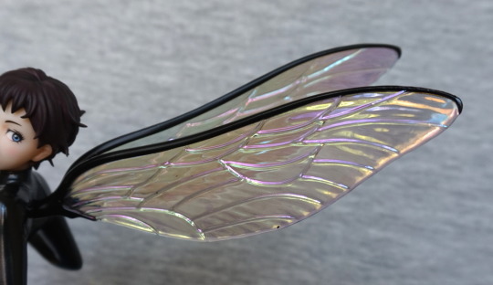
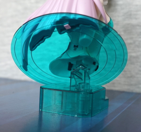
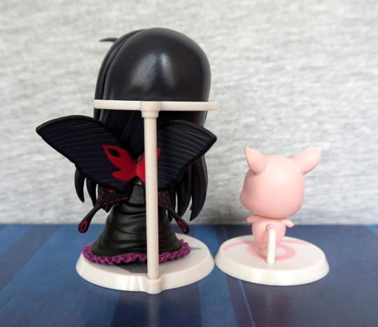
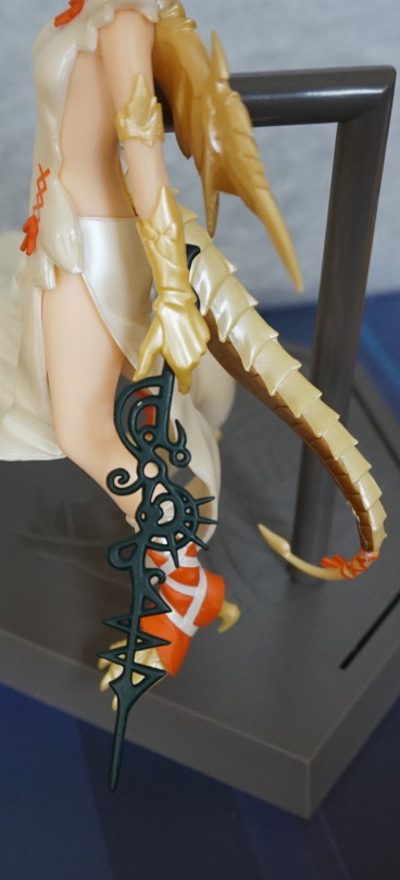
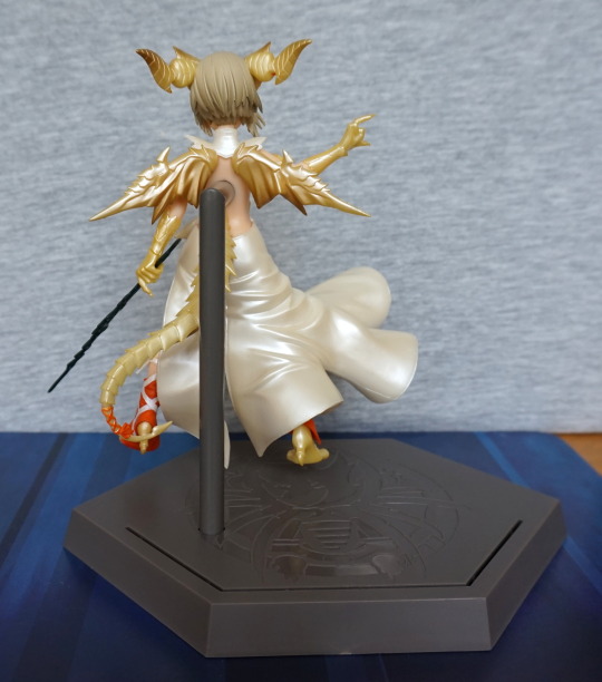
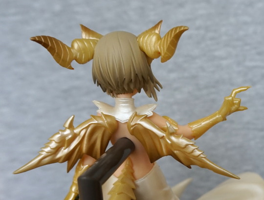
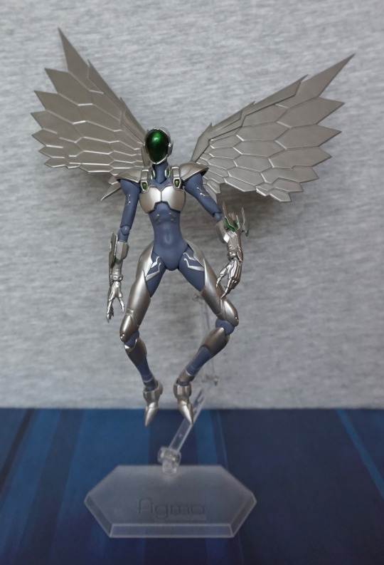
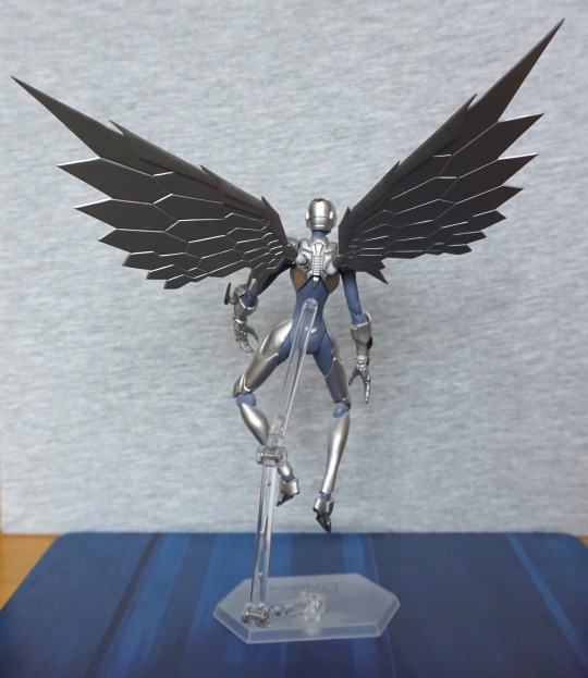
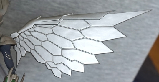
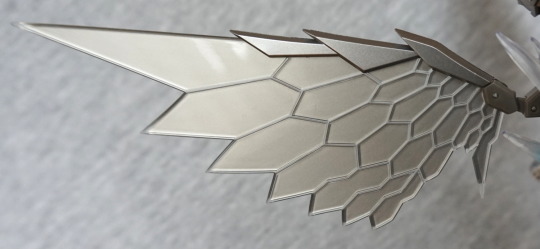
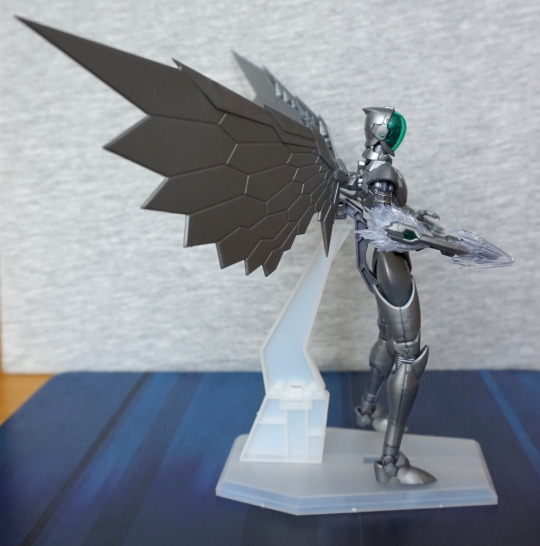
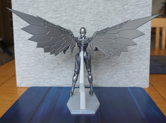
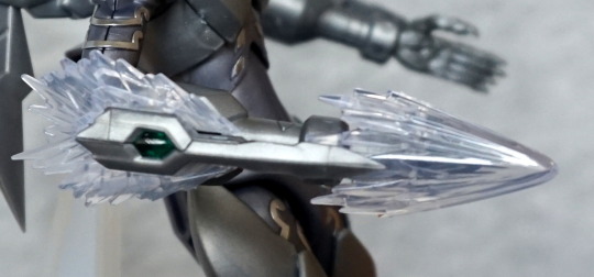
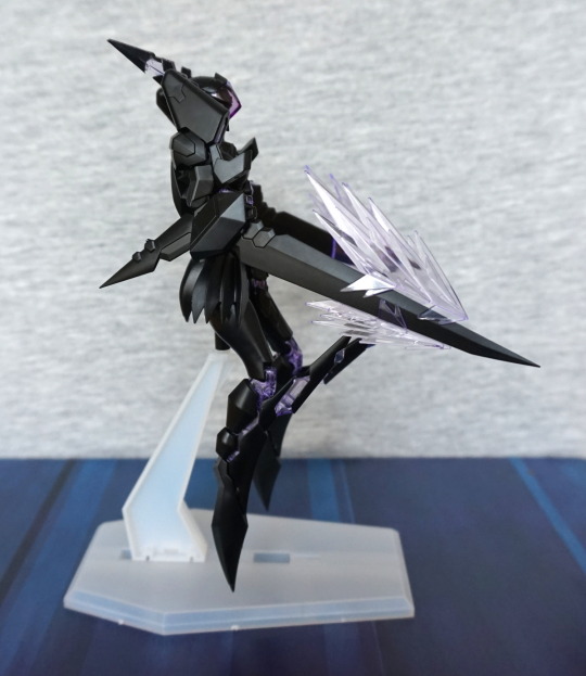
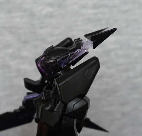
Close-up of the wing:
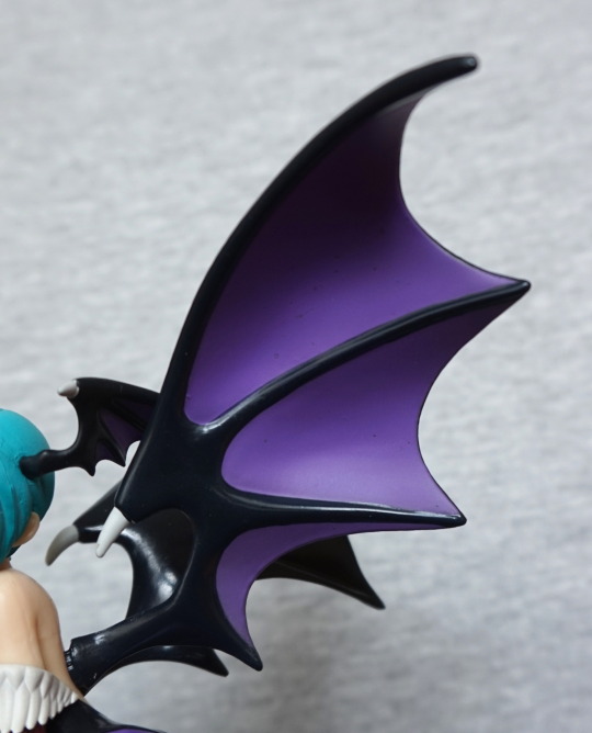
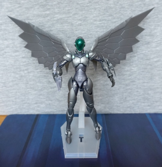
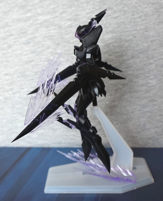
No shading, but I think they still look good and striking. Due to their shape, natural light adds some natural shading :). I like the way they’re posed so they frame her. The tops of her wings aren’t detailed, but I don’t see too much of them.
Overall, I like this figure. It is a simpler figure aimed at a lower price point. If you can pick her up for a good price, I’d recommend her.