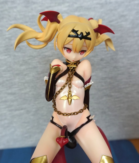
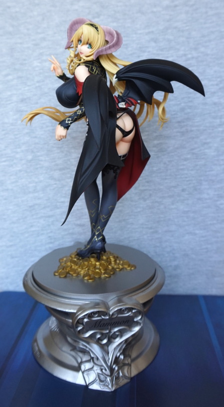
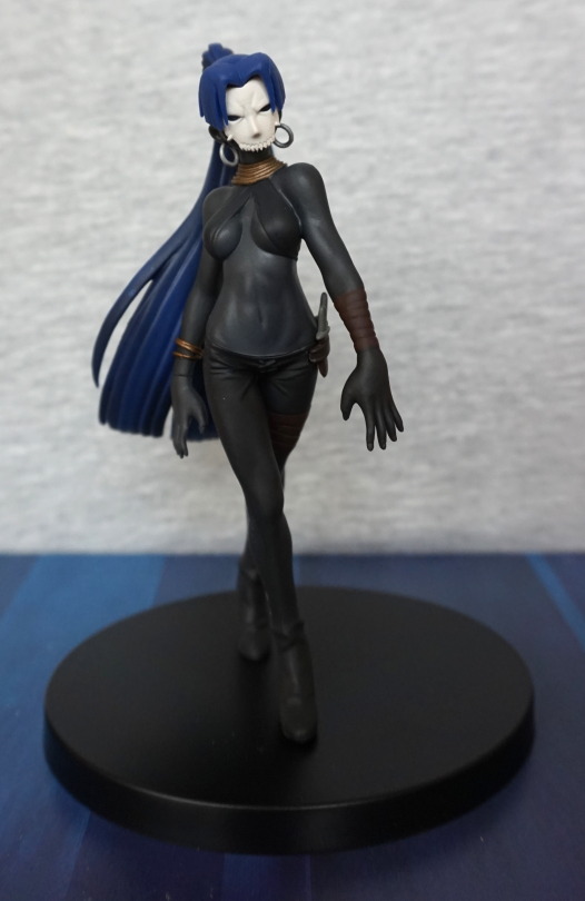
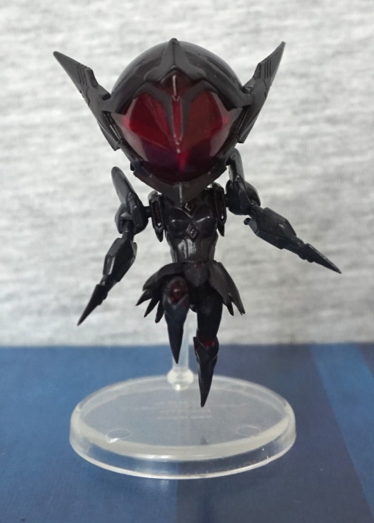
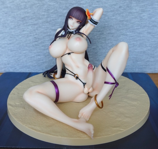
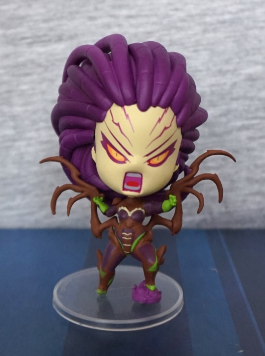
This was a random pickup at a local game collectables store. Been eyeing this one up the last few times I’ve been in (actually… think I eyed her up the first time I went in there…) and finally decided I’d buy her.
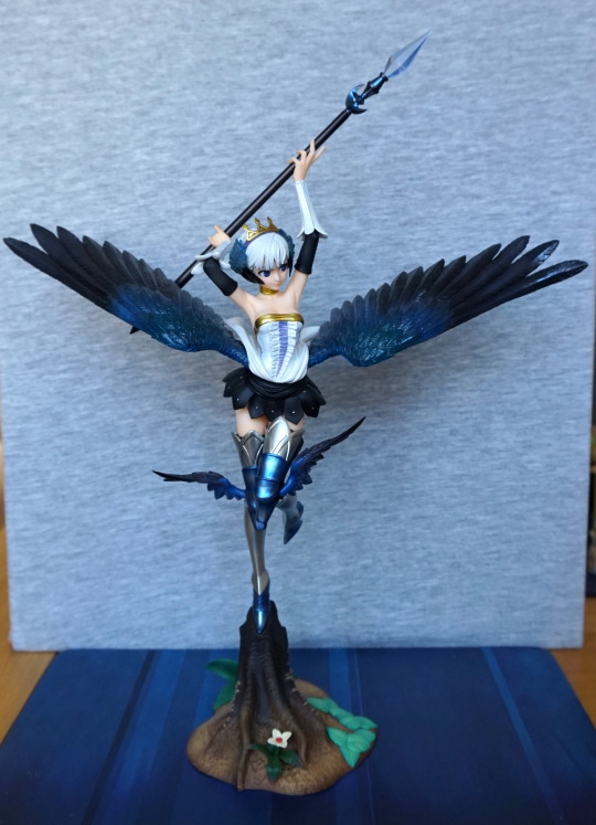
So here she is, finally escaped from her plastic prison:
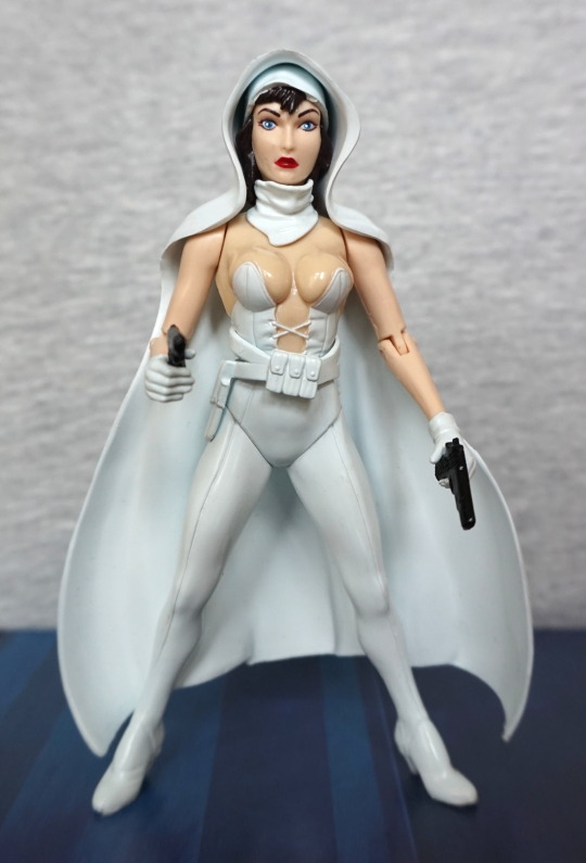
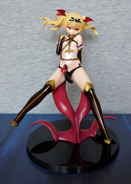
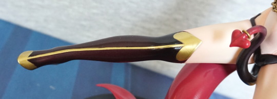
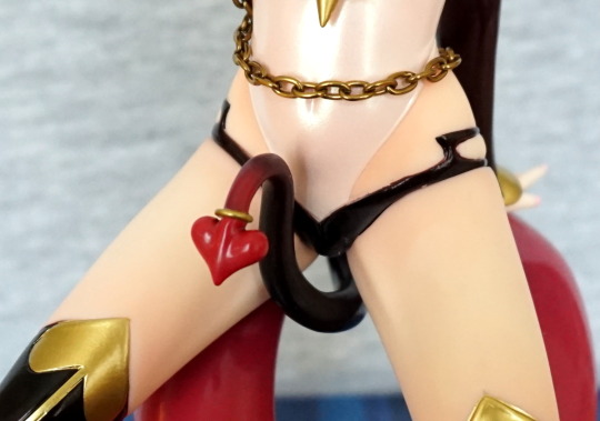
She probably wouldn’t appeal to people used to more modern figures, and definitely seems to lurk in a transitional period between older style and newer style figures. She lacks any kind of leg articulation, and her skin is shiny om her body, which can be seen on her chest. The face aims for more realism, but still seems rooted in an older style. Her belt comes separately, and you clip this around her waist.
You can also take off her cape:
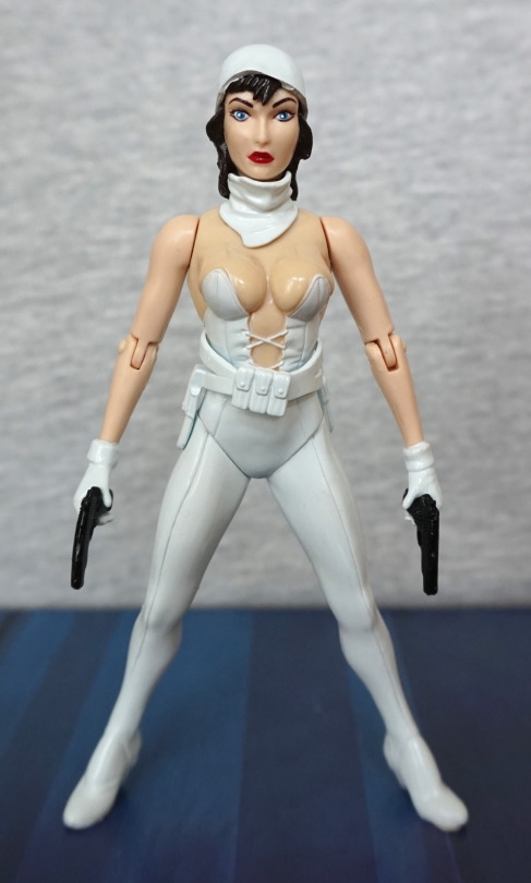
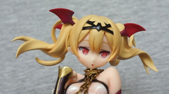
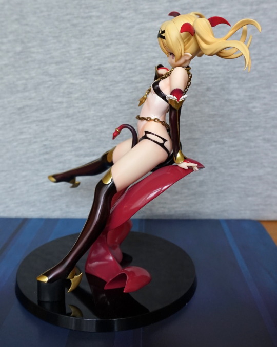
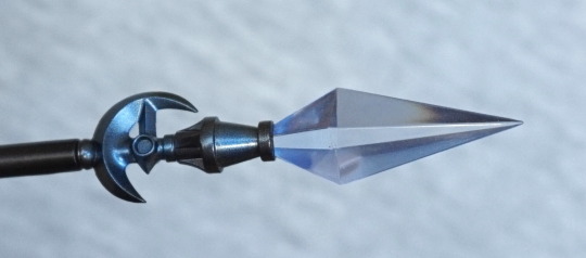
She does look a bit odd like this though. The white cap doesn’t quite work on its own. Doesn’t look like she does in the comic provided. Despite the lack of articulation she’s a bit of a pig to balance too. She holds her guns well though, but doesn’t look right without them.
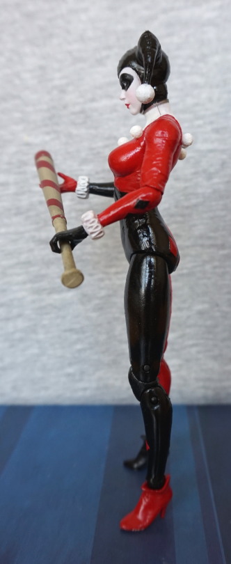
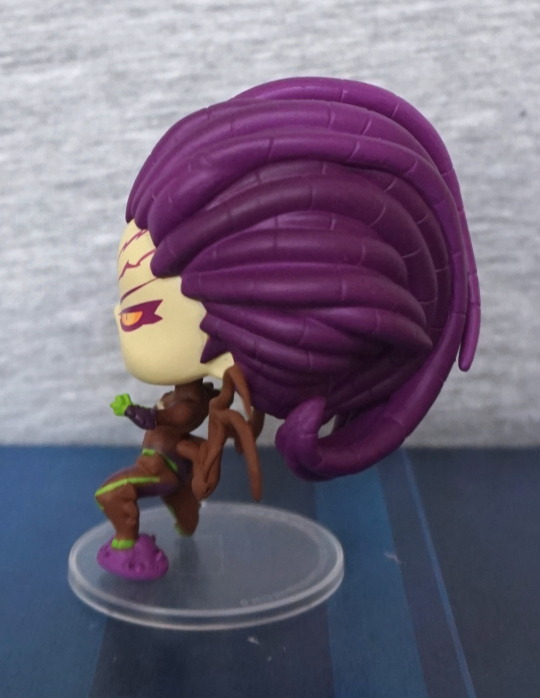
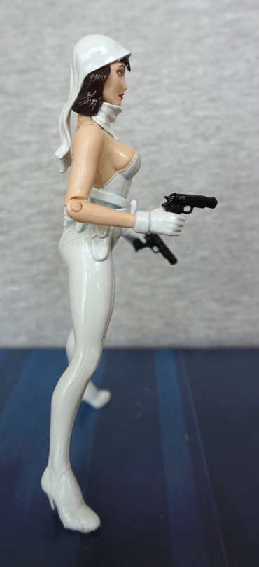
Let’s explore more what she looks like with the cape, by looking at her left side:
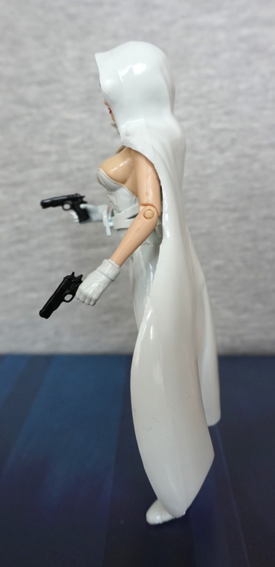
The cape has been somewhat crudely moulded to fit around her arm. Which has a pretty obvious seam line. I do like this white, glossy paint though.
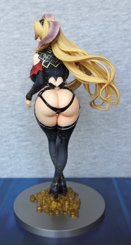
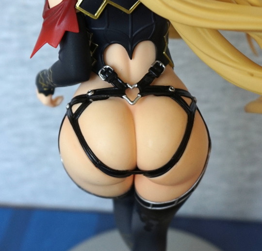
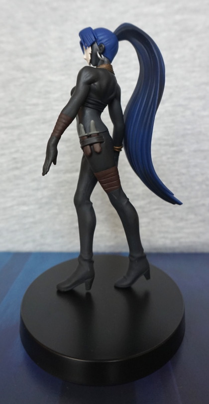
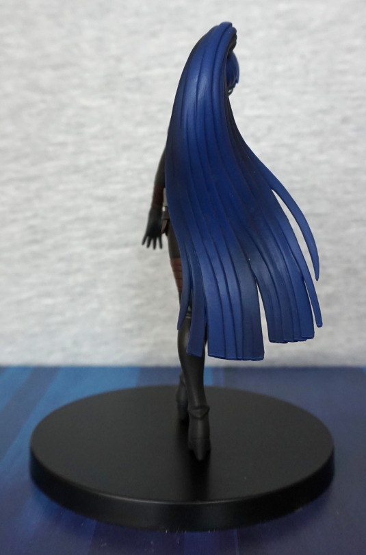
Back:
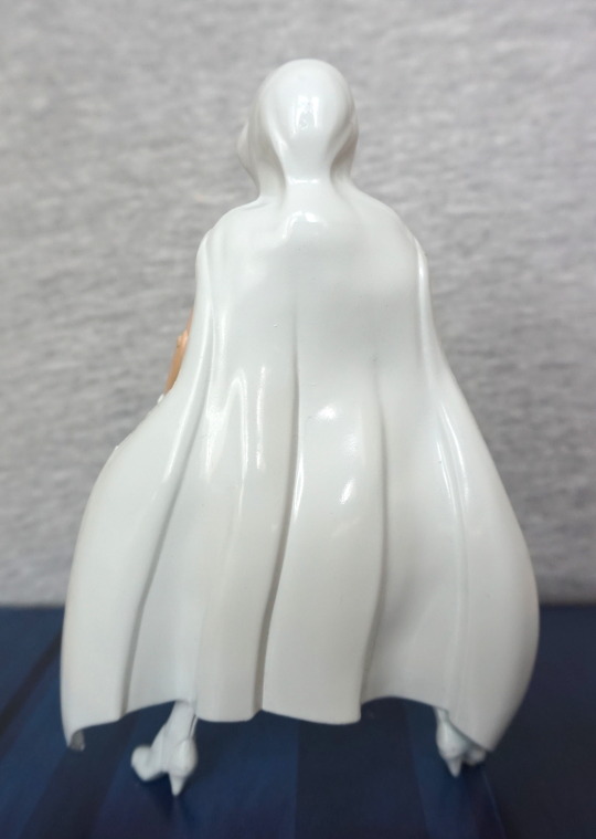
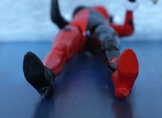
Some creases, but lacks the more lifelike look they’d give a modern figure. She has some nice high-heeled boots, but that’s part of the source of her poor balance.
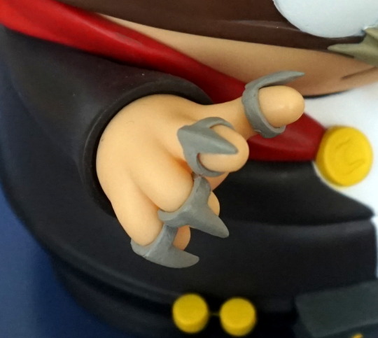
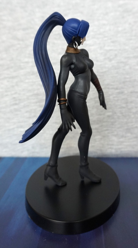
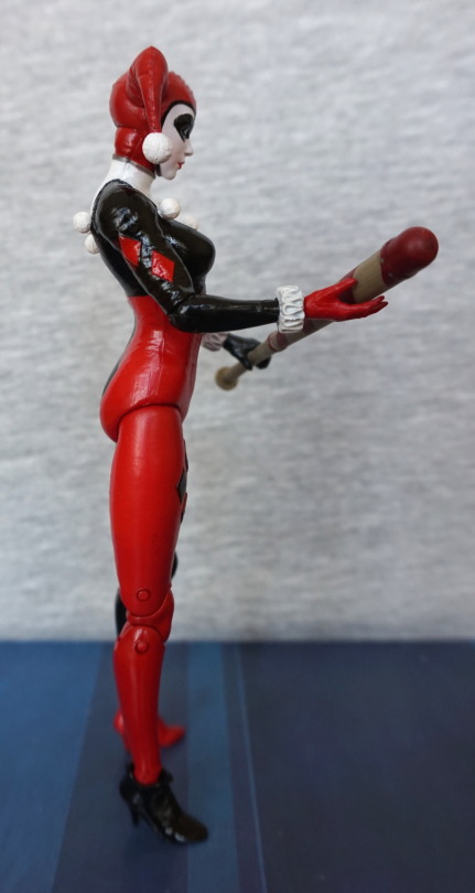
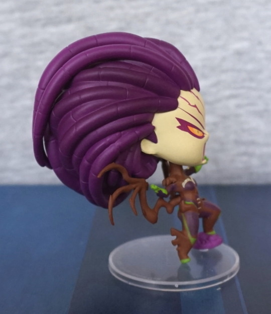
Right, without the cape:
Ignore the mess on her shoe – that’s white tack. Seam a bit less obvious in the arm, and her glove has better painting on this side. Here you can start to see the fabric cap the white bit under the cape is supposed to be.
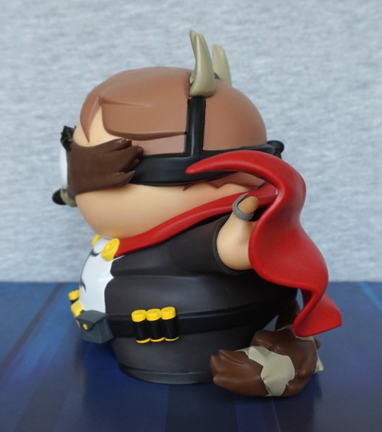
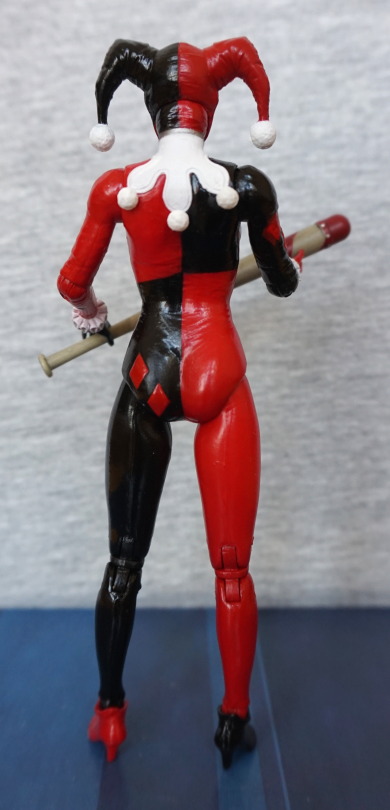
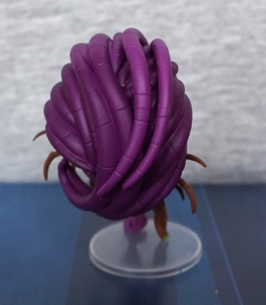
Back:
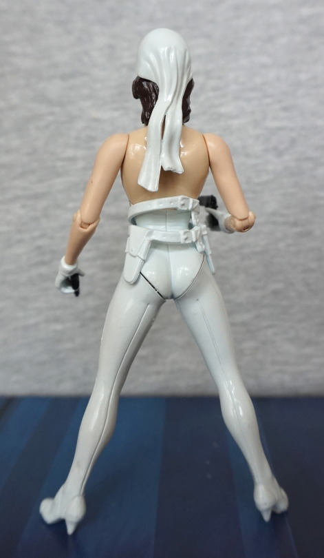
They’ve aimed to make it look like the hair cap is moving around with her movement. This helps it look clothlike form this angle, but it’s just too severe a shape to work without the cape at the front imo.
Overall I think this an OK figure. I paid £10 for her, which I think is fair. I don’t think this figure will particularly appeal to many people, especially as I think she’s not a well-known character. I think she really is a product of her time, and online sources suggest she was manufactured in 1998, which would seem about right for her style. And I’m pretty sure I put her belt on backward for this review… erm. Oops. I think she looks pretty neat with the cape, which is why I bought her. If you don’t mind her half-90s, half-2000s look, I think she’s decent overall.