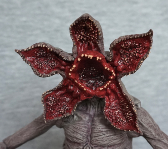
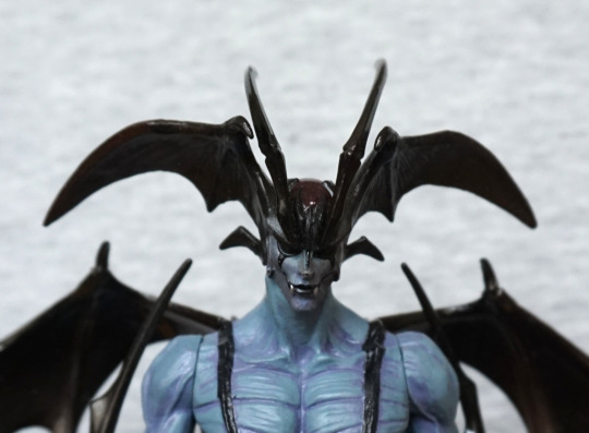
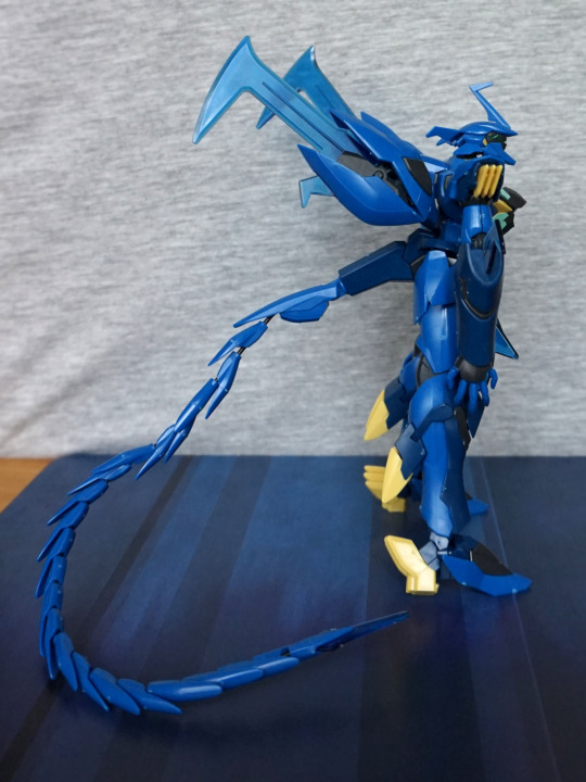
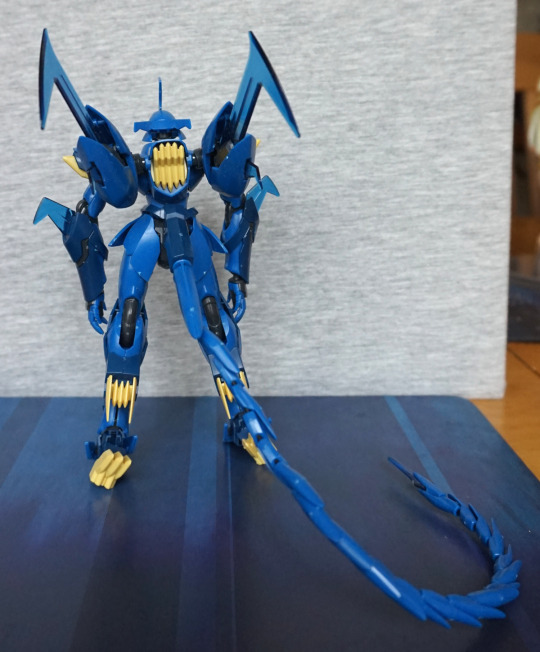
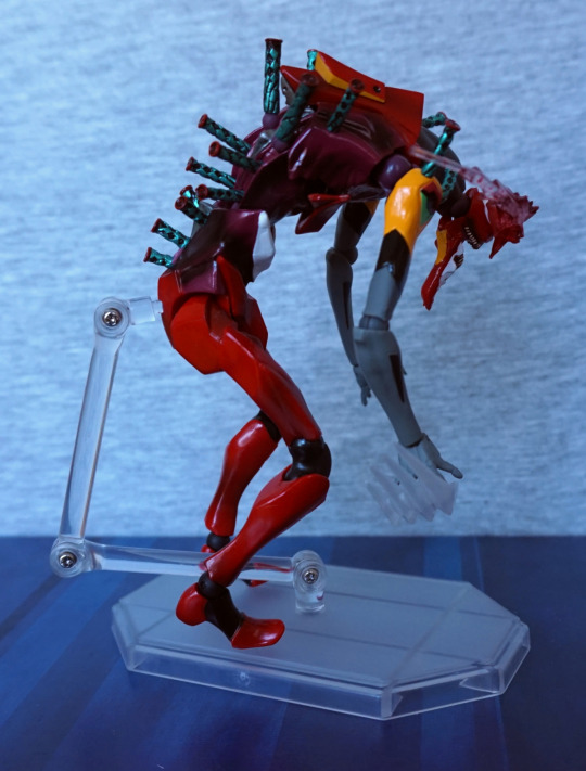
This figure I was on the fence about buying, and decided to go for it, before I lost the opportunity to get it at a reasonable price.
So here he is:
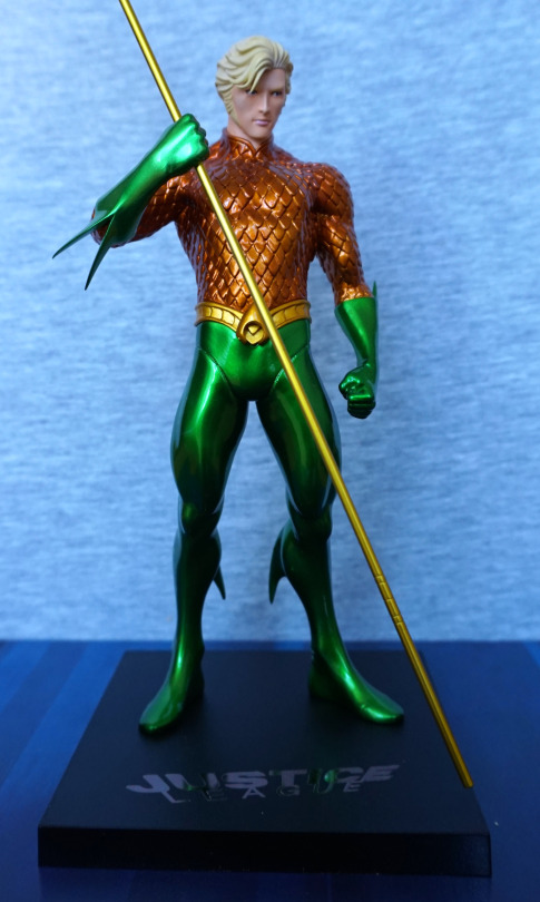
Whilst I’m not much of an Aquaman fan, I like the shininess and the colours of this figure. The copper-green colour scheme is very eye-catching, especially with the metallic effect paint. The belt has also been sculpted well, and complements the figure.
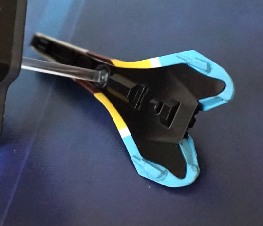
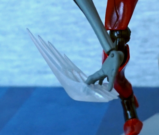
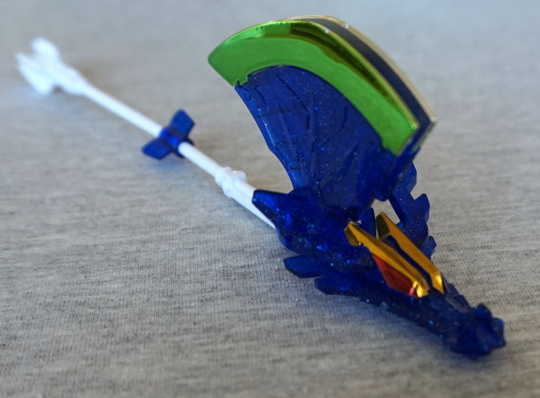
One thing that’s a pain is his trident:
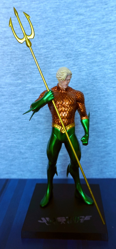
It looks nice, but he doesn’t hold it too well – it’ll easily slip through his hand, which makes it awkward if you’re moving him off the shelf… To remedy this, I’ve used a balled-up Glu Dot on his hand to hold the trident in place. I have him displayed slightly above eye-level, so the Glu Dot isn’t visible, but I don’t think it’s even that noticeable in the above shot.
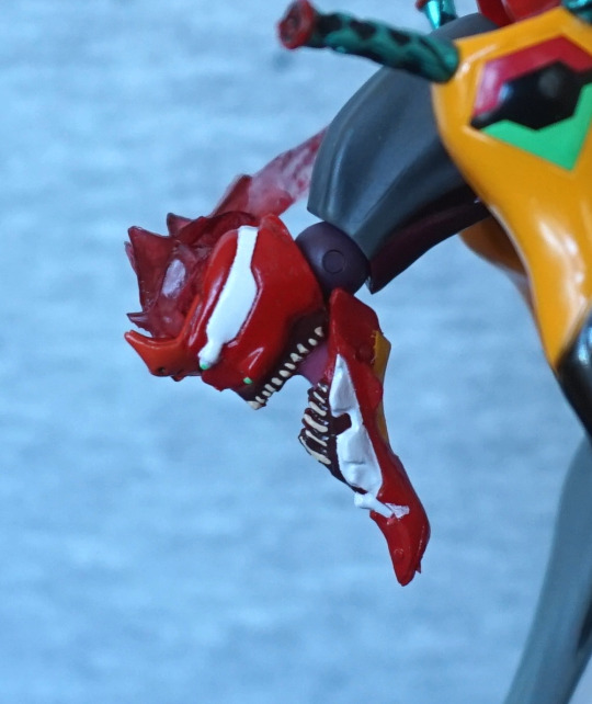
Face:
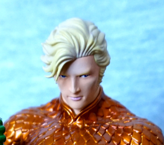
I like his face – not sure what it’s supposed to look like, but I think it has been done well in terms of general sculpt and paint. The hair has a nice sculpt to it too. We can also admire the edging on his collar here too.
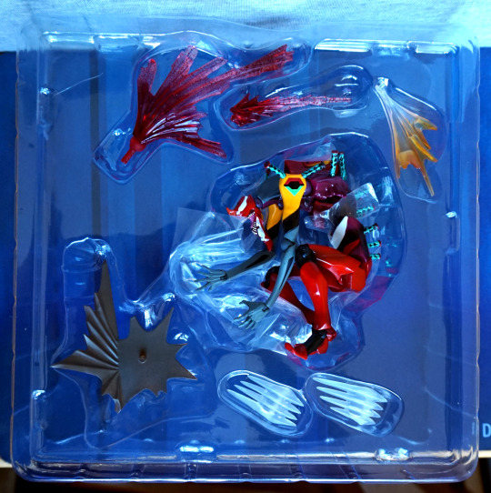
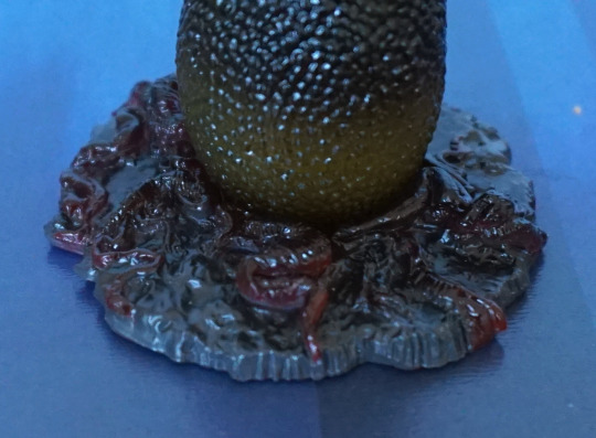
Base:
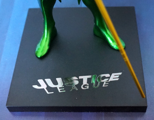
The base is the standard Artfx+ affair, with the Justice League logo, rendered nicely in silver. The base is magnetic, as these figures have magnets in their feet to hold them to the base. For him, the magnets aren’t strong enough to pick up the base, but it does help him stand up for sure.
Left:
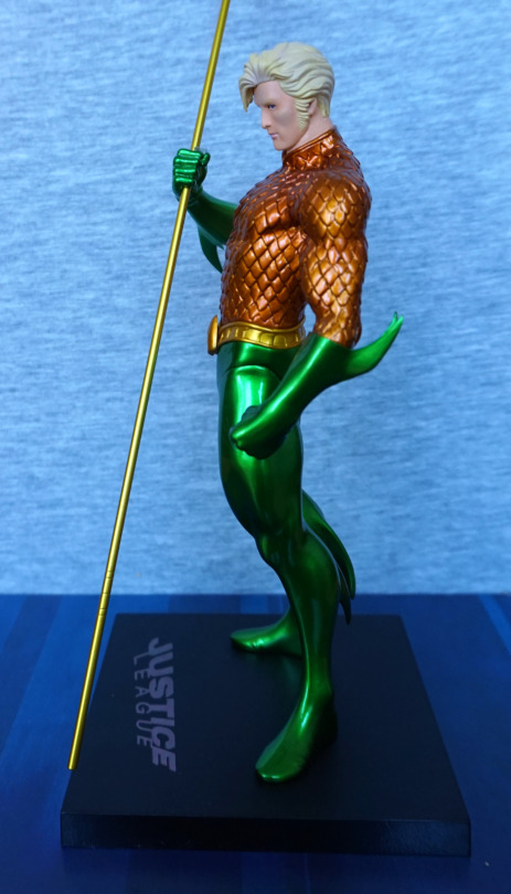
I love the curved parts on his suit, and the glossiness of the green. Almost think his gloves could’ve done with some kind of edging to make them less plain though. They feel like they end prematurely somehow. His sideburn is well done on this side though.
Right:
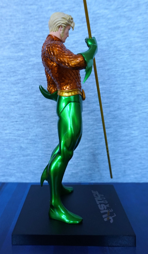
The join on his leg is pretty noticeable from the side. Probably the largest flaw with the figure, outside of his slippery weapon and the fact it’s Aquaman. Still liking the fins on his outfit.
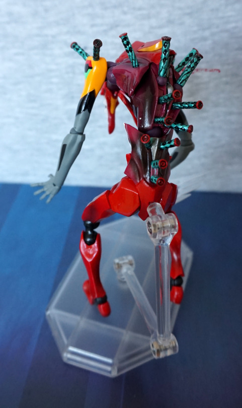
Back:
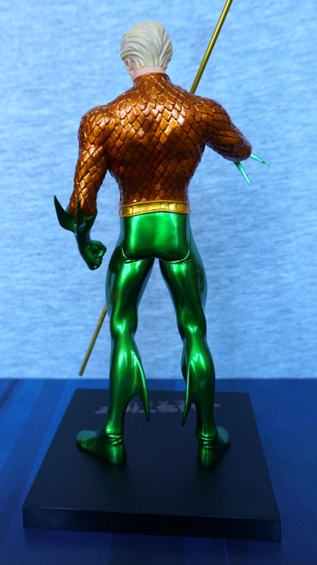
Bit of a square arse… Not sure what’s going on with that. Especially with the creases moulded underneath on his legs, it seems to emphases the odd shape :(. I think the rest of the back of his legs looks OK, though the shiny patterns do make it look a bit like he’s got rubber-legs. For his back, I think it’s better ignore most of him from the waist down, but the suit top texture looks good, and his hair looks decent enough.
Overall, not a bad figure, but not worth RRP. I’ve usually seen him for sale around the £35 mark, which is a fair price. I think with the lack of extra colour and shading that other characters get, maybe he should have been given a lower price point out of the gate.