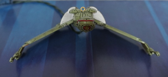
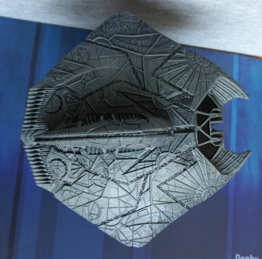
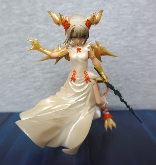
Now for my largest purchase of FACTS! In price, as well as size…
Though I couldn’t use the usual backdrop:
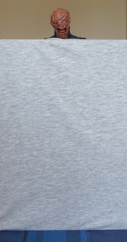
… so I apologise if the photos are a bit meh today.
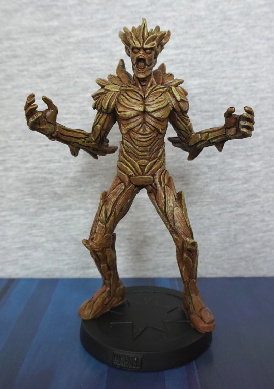
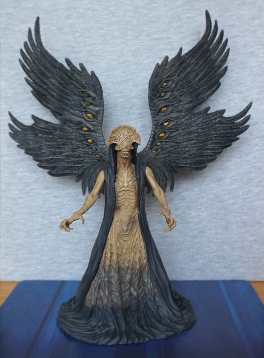
Here he is displayed on a shelf, showing how big he is:
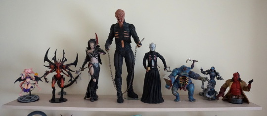
Yeah, this dude towers over everything!
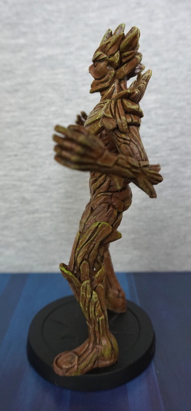
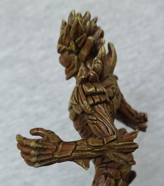
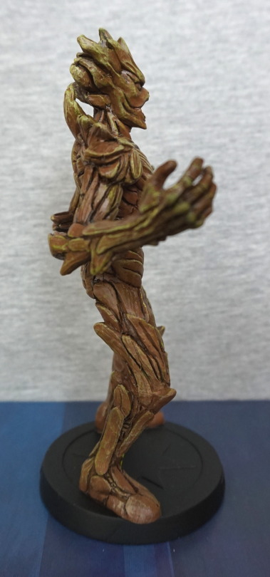
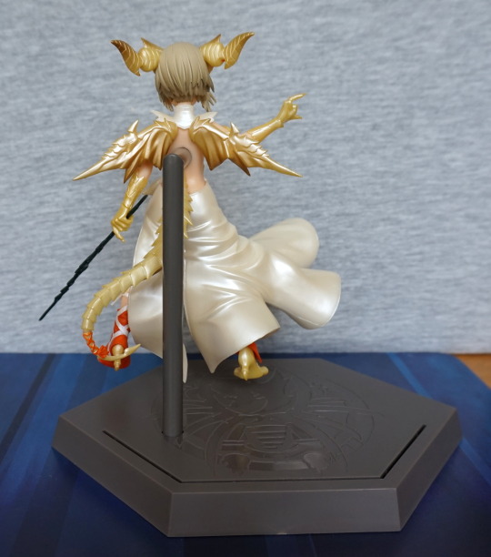
So let’s get a closer look at him:
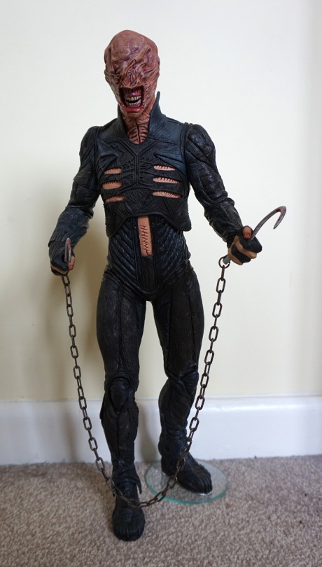
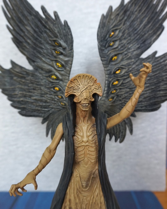
His top is leather, whilst the rest of him is hard plastic. The leather overlay on the top is a really nice touch. I got this figure cheap, as it does have a few flaws – there’s a paint scratch on his lip, and most of his leg joints were glued by a previous owner, as well as being glued to the glass disc. I don’t mind him being attached to the disc – it certainly helps him stand, but the joints being seized is kinda annoying.
Left:
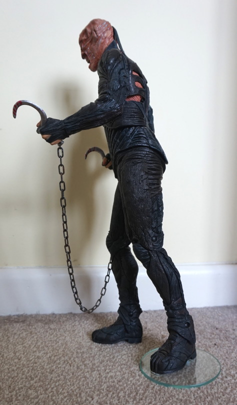
Detailing is nice on the arm, and a bit of a lack on the leg tbh. The halves don’t quite meet up in texture at the top.
Right:
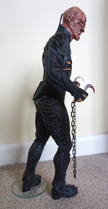
Here we can see better the arms have plenty of creases running round them, and various fake leather pieces making them up. Here the leg issue is better demonstrated – where crease lines don’t run from the back half of his leg to the front. The white dots are glue residue – I may attempt to remove these at some point, but this is from the haphazard efforts to force him into a stable position.
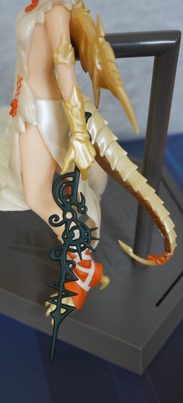
Close-up of one of his hooks:
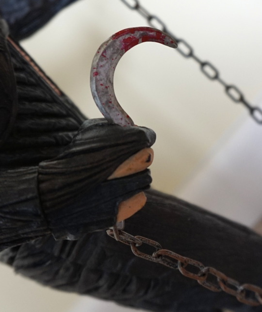
The blood effects are nice, and the chain is plastic, with fake rust. Looks good though. The top half of the hooks slide into his hand, an the bottom of the hook is attached to the chain, and clips into the other half. These fit easily and nicely in his hands, so no issues there. His arms have full mobility, but due to the way the arms have been designed with particular orientations in mind, this limits poseability, if you want things to line up.
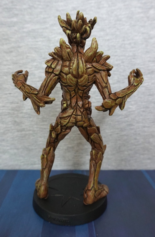
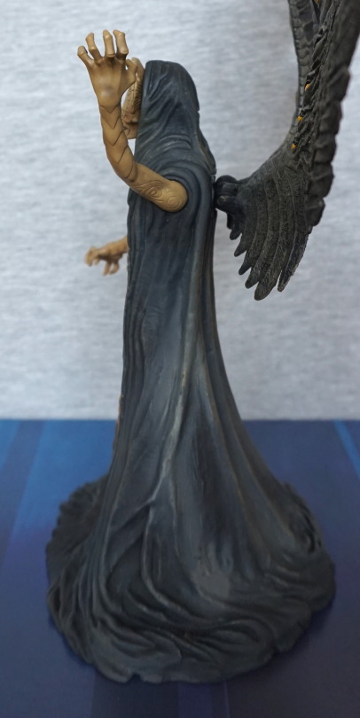
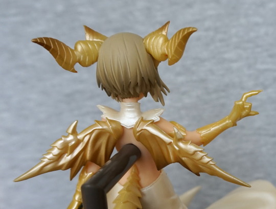
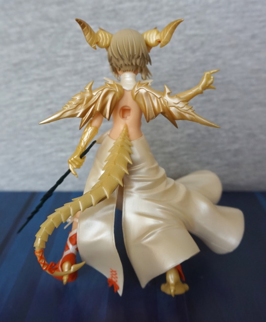
Back:
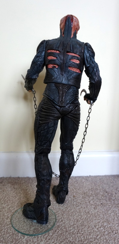
Back looks nice, and the leg hinges aren’t too visible. The screw on his backside is where the batteries live (he has an action feature!) and the switch is there to turn him on and off.
Close-up of his back:
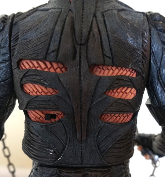
Here we see the switch, which says Off-On above it, and the leather overlaid on his flayed back. Kinda wish more of the figure was covered in material (it’s a rubbery plastic made to resemble leather).
Close-up of his face:
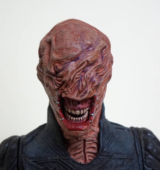
Lovely amount of detail in the face, with the sculpt and the paint. Here you can quite clearly see the paint chip on his lip. I feel a lot of the detail in this figure is in his face.
Side of head:
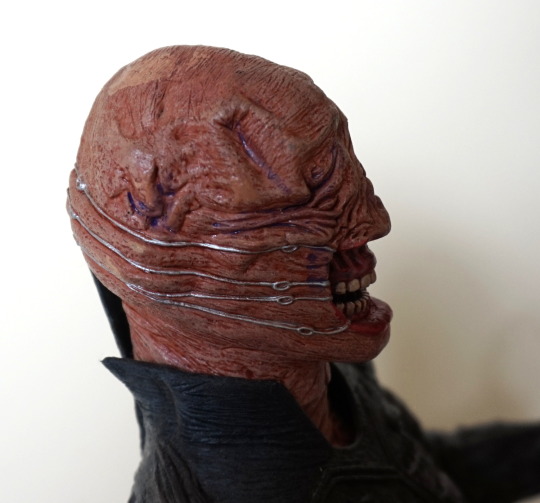
The metal wires have been well-painted, and moulded so they’re digging into his skin.
Back of his head:
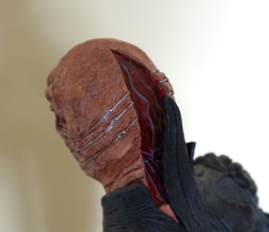
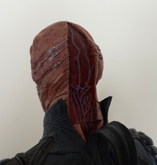
His head is slightly rotated – if you have his head straight, the removed flesh parts line up properly. Love the veins shown in his head. I think they did a good job back here.
So action feature… what would chatterer’s action feature be? Well, he has a motion-activated chat:
Initially, it didn’t work when I put the batteries in, and it turned out that one of the battery terminals were corroded. Currently they’re replaced with a piece of foil, as it was the one bridging the two batteries. Probably won’t bother replacing the foil, but was really glad to find he still chatters, even if the motor is a bit noisy lol.