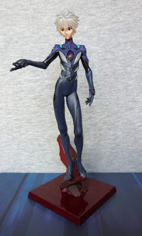
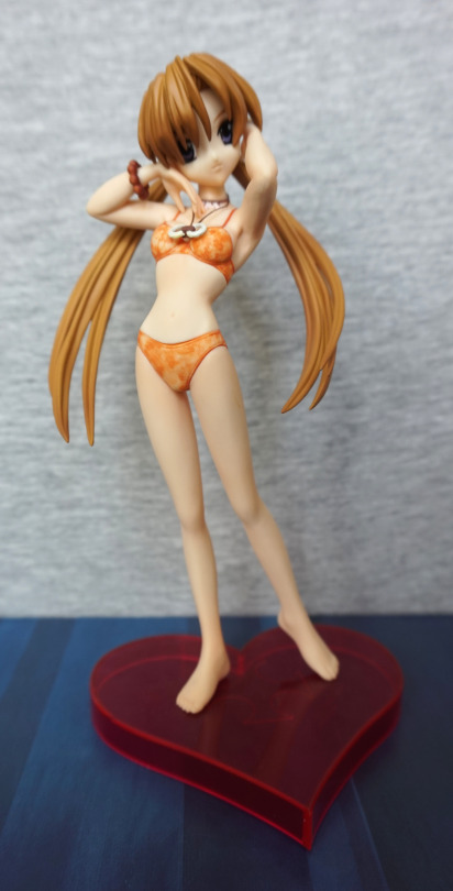
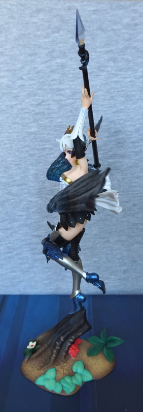
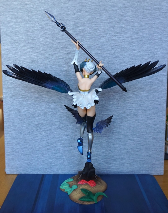
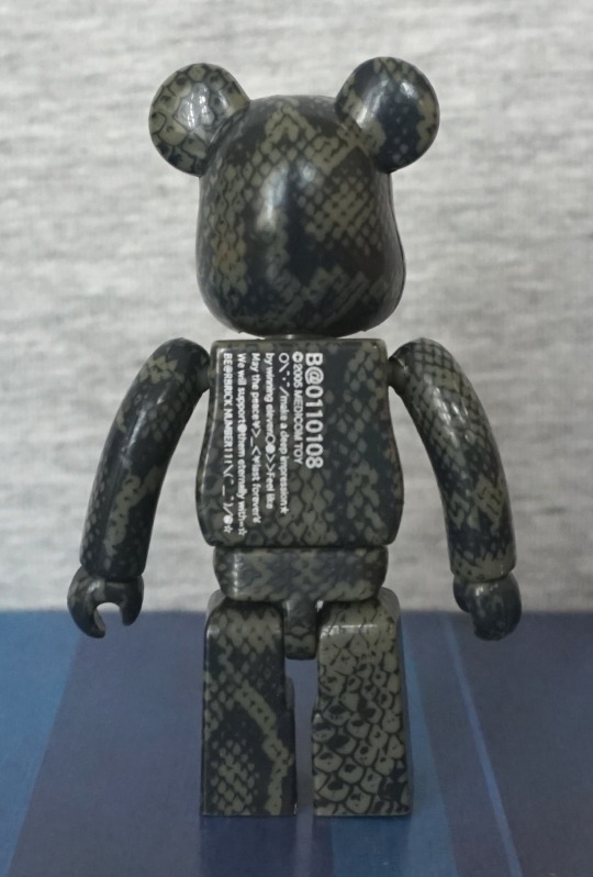
And whaddaya know… more Kaworu! Got this a bit ago, but forgot to blog about ‘im.
But I certainly didn’t forget about him:
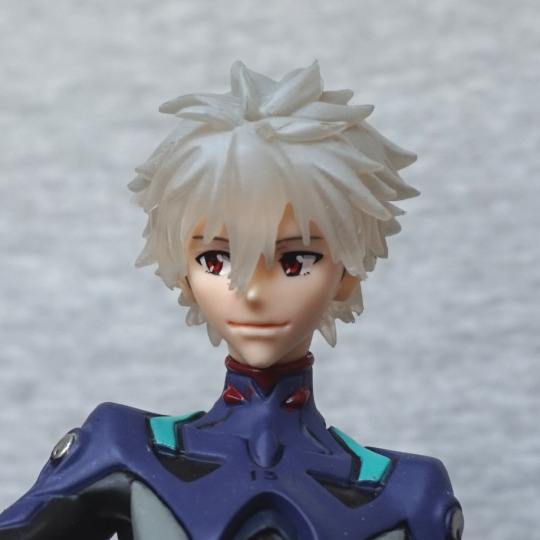
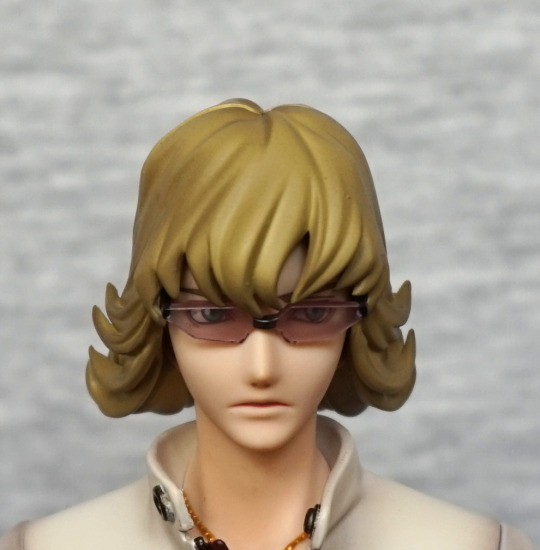
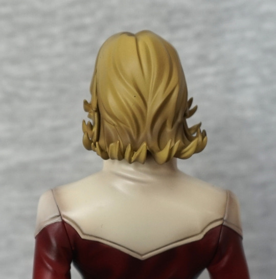
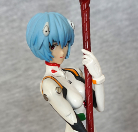
He also has semitransparent hair, but I think I prefer this head o’ hair, though it does look like he has a layer of gel on it or smth. Could do with being a tad lighter.
For his face, it seems very close to the other one, with the darkly shaded mouth. He’s even looking in the same direction, lol.
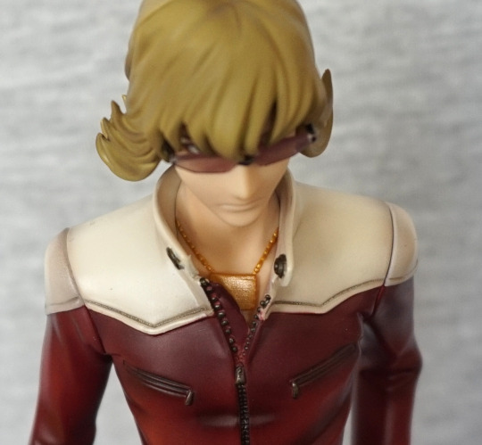
Now onto the main part of this figure – his chest:
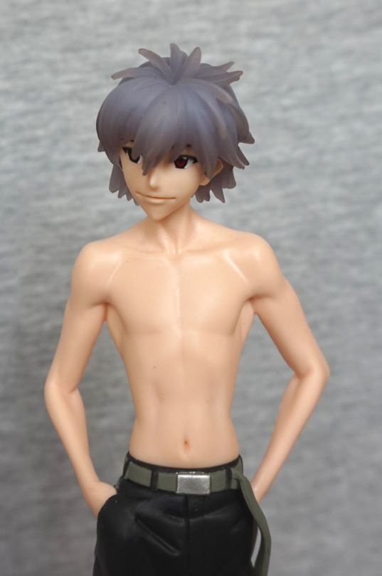
He has good definition on his chest and arm muscles. As he’s a prize figure, he is mildly shiny and lacks shading, but on this figure, the lack of shading isn’t too bad, as the sculpting makes up for it somewhat. And didn’t cost eleventy billion bucks.
His trousers are nicely done, though the finish doesn’t complement them – I think this is where the finish works the least. The creases in his trousers look more like dents in some places, like the one by his pocket in the above picture.
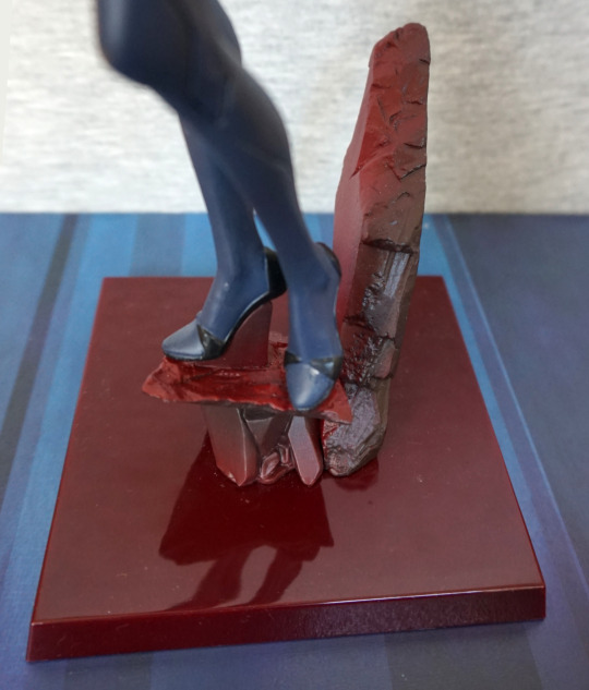
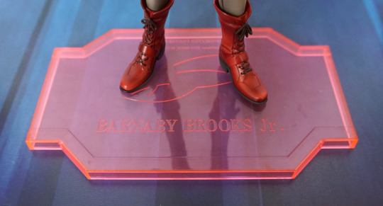
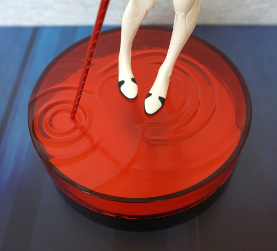
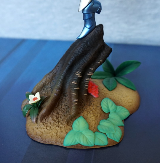
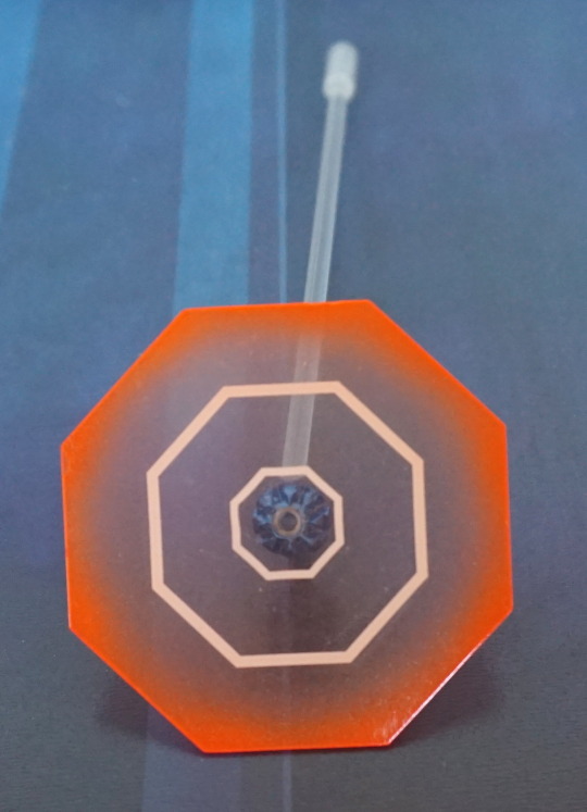
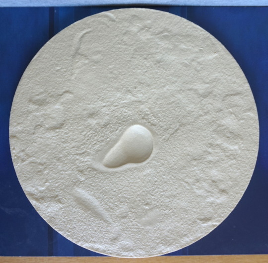
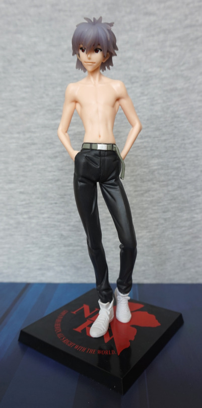
Base:
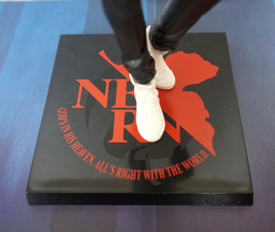
I like these bases, for not being totally plain. Not much to write home about, but works. Could quite well be a tile inside of NERV…
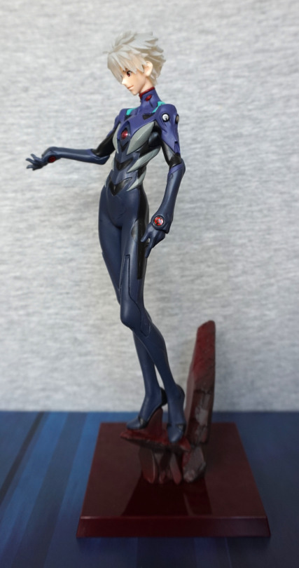
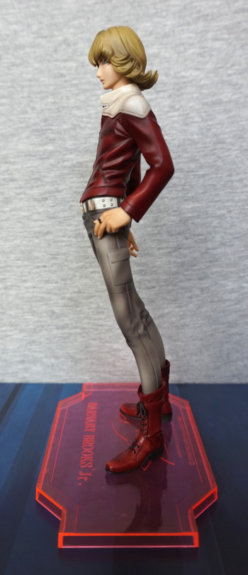
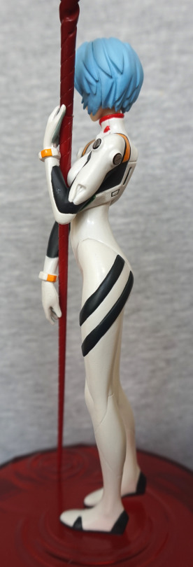
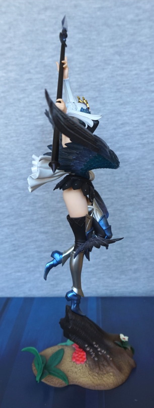
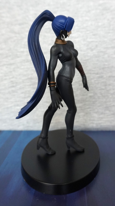
Left:
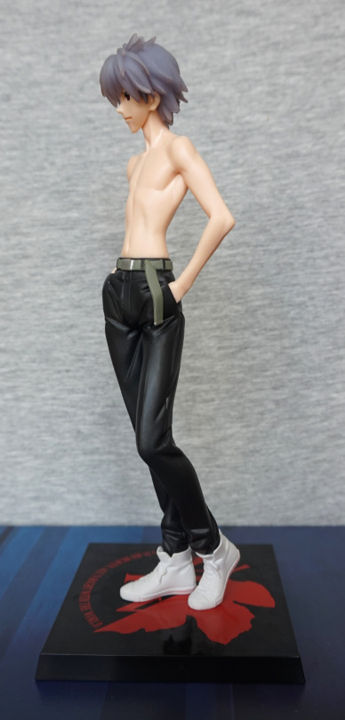
His pose has some depth to it. which makes him look good from the side. Whilst his build is wiry, it’s the kind of wiry that suggests he might actually be strong, which fits with Kaworu.
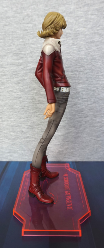
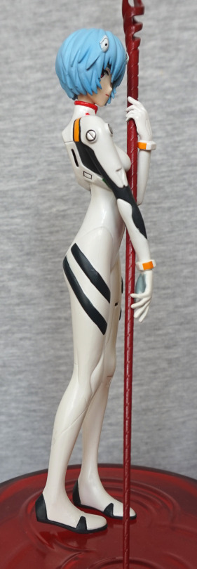
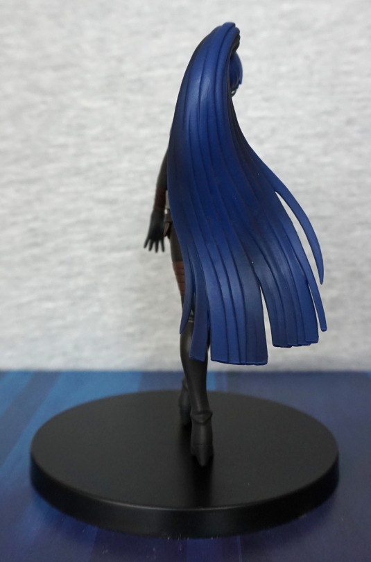
Right:
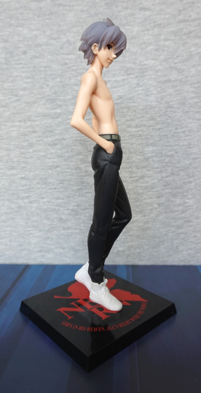
Looks fine from this angle. The lighting worked well in this pic, and has given him a decent amount of definition.
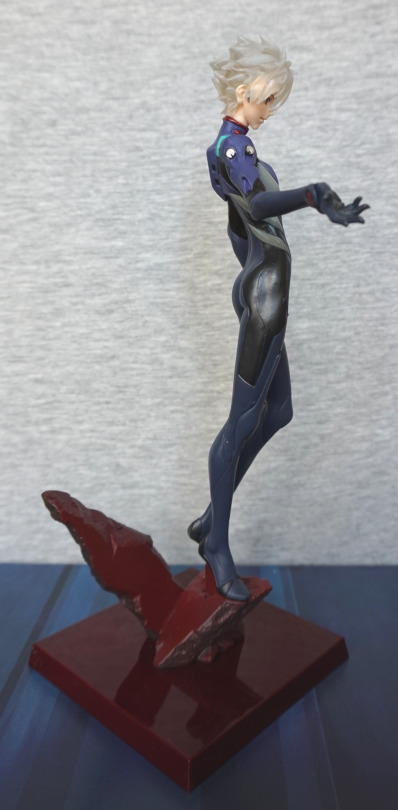
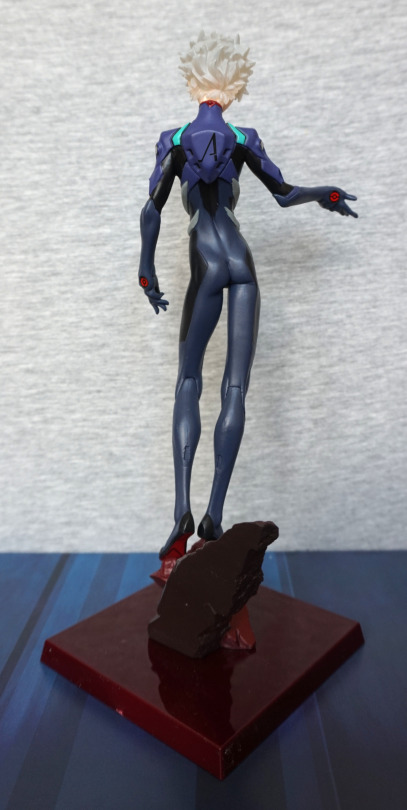
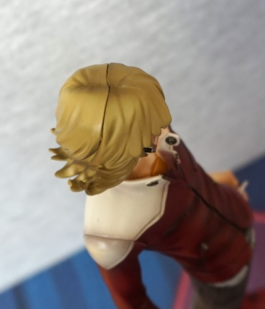
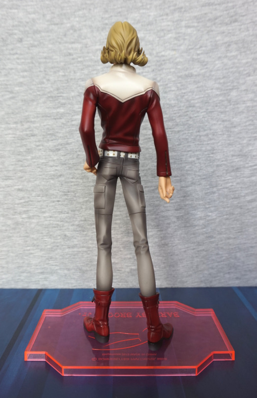
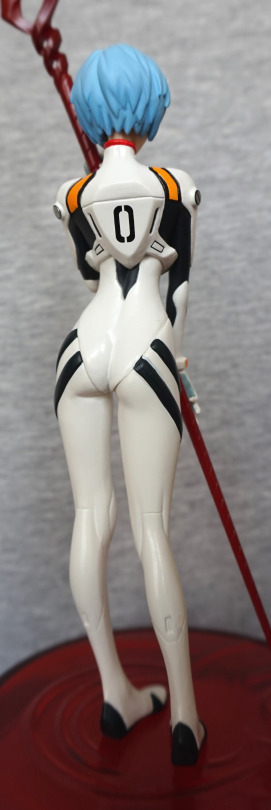
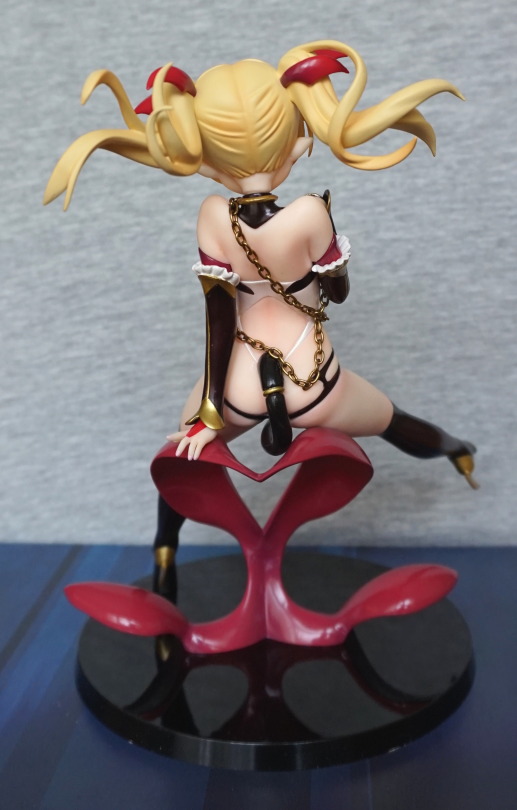
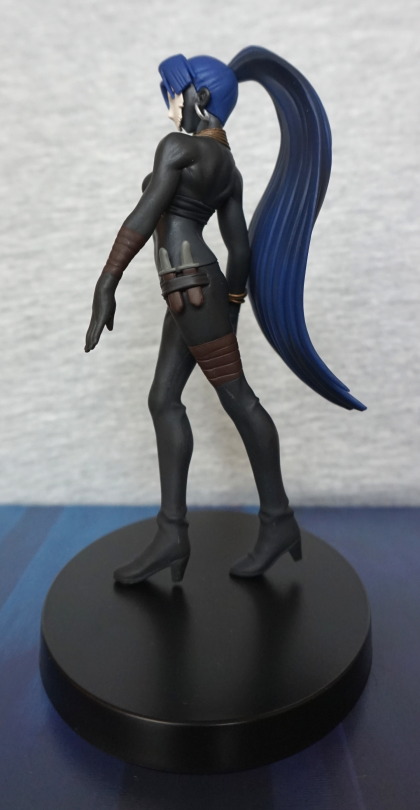
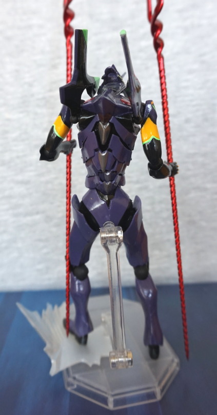
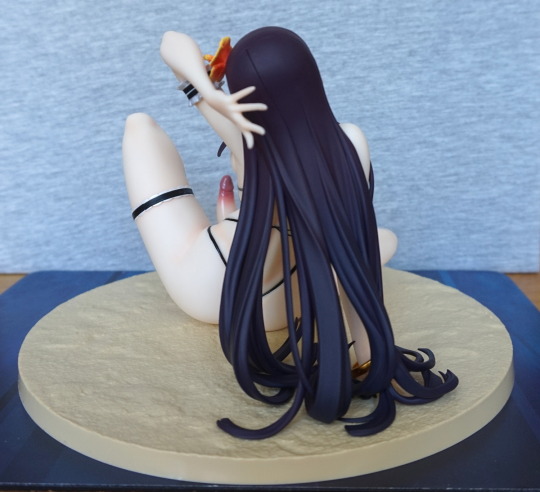
Back:
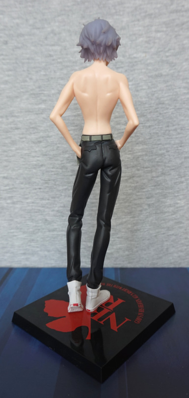
Less of a backside on this Kaworu, but I think that’s mostly due to the style of the trousers. Whilst they aren’t baggy, nothing’s tighter than a plugsuit, lol. Here you can see his shoulderblades and, erm, the dents in his trousers. I like the fact they’ve added some paint detail to the boots, with the red stripes around the back.
Overall, I think this is a very nice prize figure, and would recommend it if you’re a Kaworu fan, and would like him dressed in something that isn’t his plugsuit.