Category: Action figures (articulated)

Lunatic – Tiger & Bunny

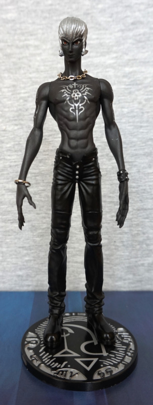
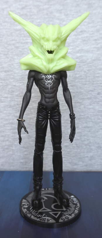
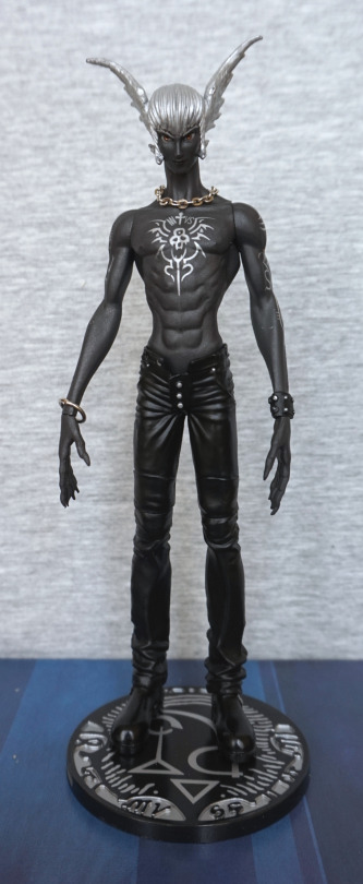
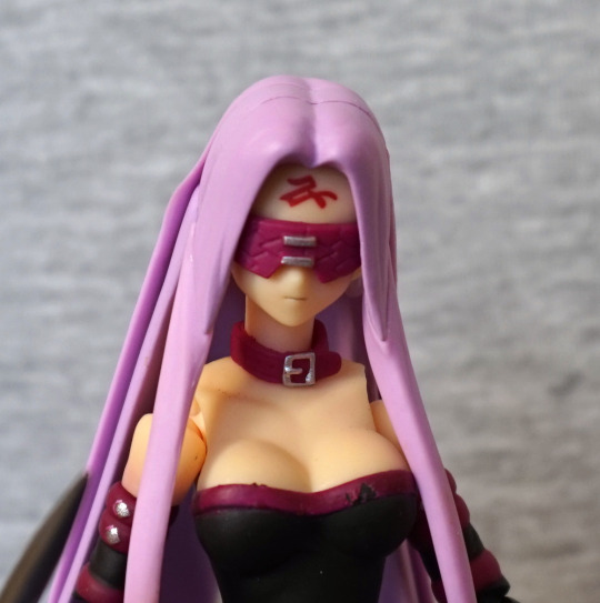
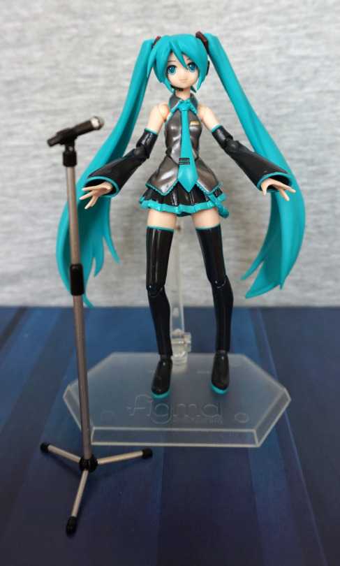
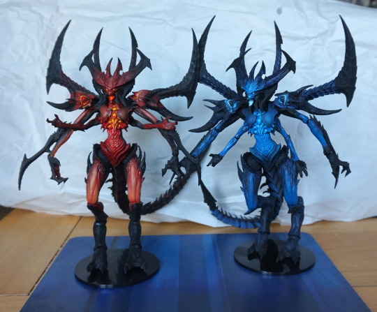
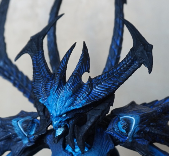
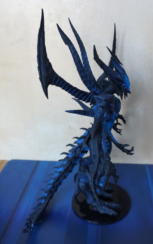
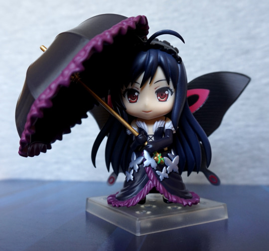
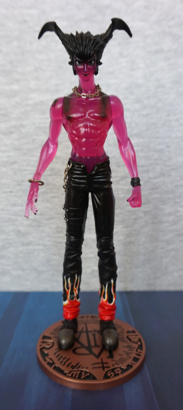
Now for the Big Bad in Tiger & Bunny, Lunatic:

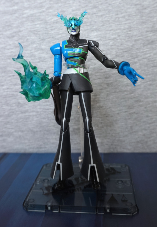
I’m not sure he’s the most compelling of foes, but I do love his bright blue-green colour scheme and snappy sense of dress. For this figure, I’ve “equipped” one of his flaming hands and the flaming head. He also has another head without the flaming eyes, but that just isn’t cool enough for me. 
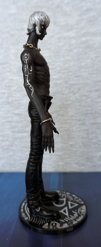
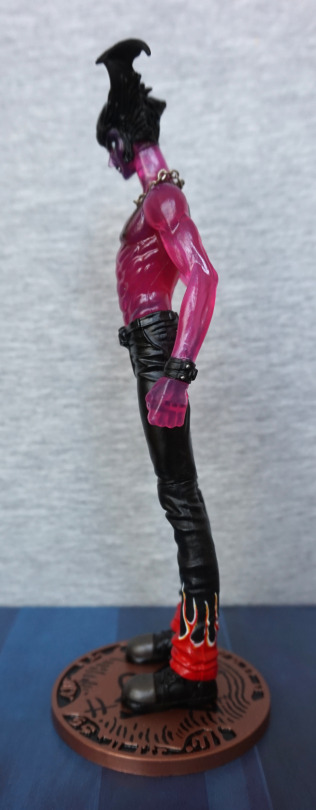
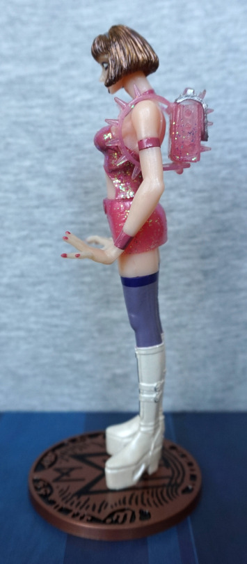
Left:

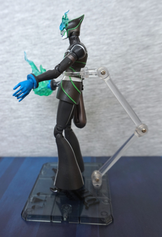
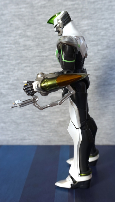
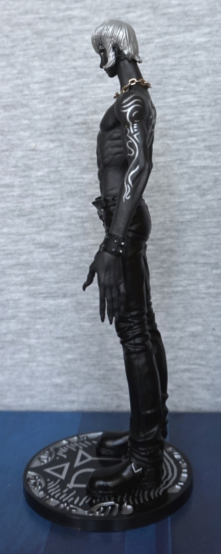
I love the shape of his head from the side, and he’s well-articulated. He also seems to be doing a good line in trying to get flares back into fashion. The paint is nicely done, though I’m seeing one tiny bit of sprue :P. Meh, any model kit I make is way worse. 
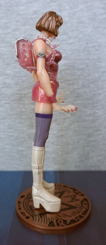
Right:

Here we can see his sheathed crossbow – his flaming weapon of choice. I’ve chosen to use the holstered version, as I wanted to have at least one flaming hand. It clips on decently well to his side. 
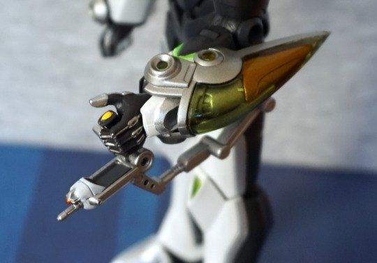
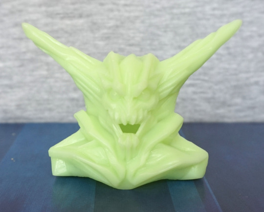
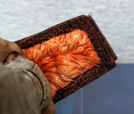
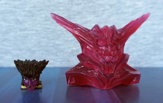
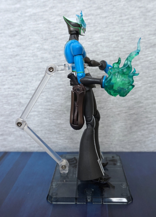
Flame:

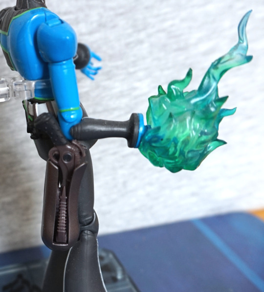
The blues and greens are blended well in the flame parts, and look really nice imo. We can also admire some of the details in the crossbow sculpt as we’re here :). 
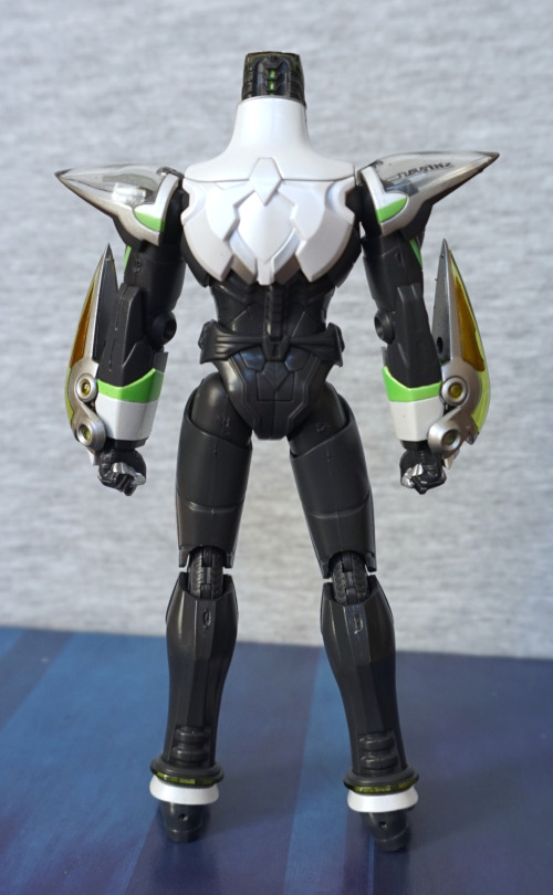
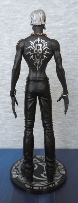
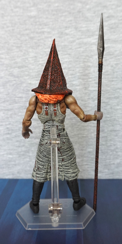
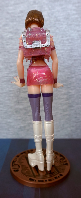
Back:

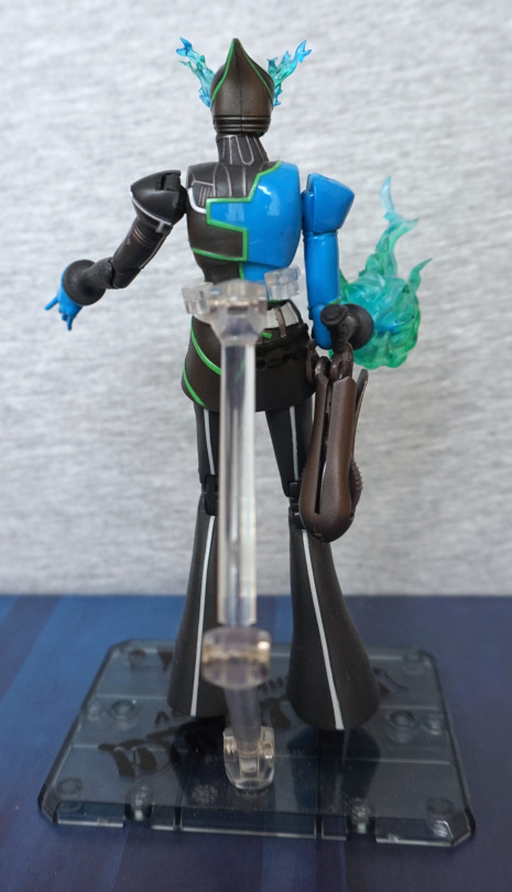
His suit is decently detailed on the back. His shoulders are a bit gappy though. 

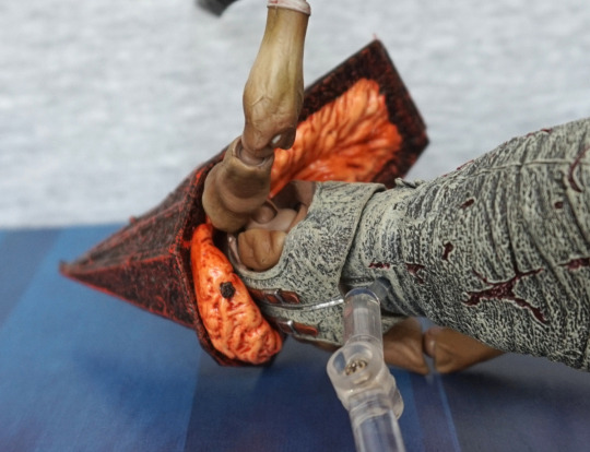
Crossbow and default head:

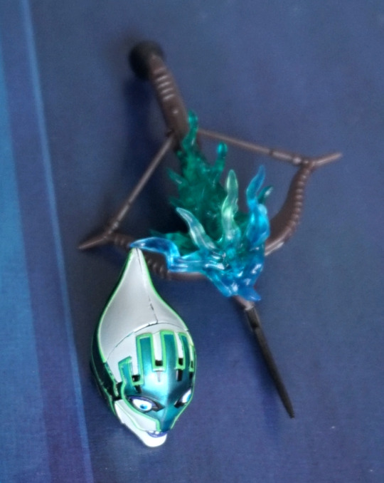
I love the flaming detail on his crossbow. His heads are both nicely painted from the front, though a little gappy on the sides. 

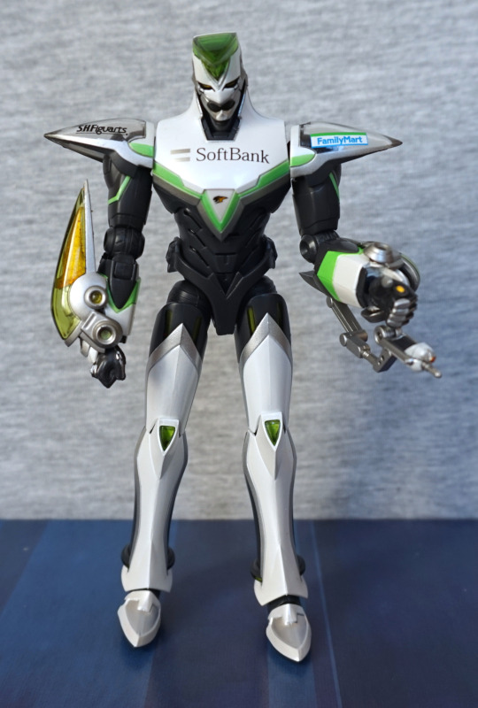
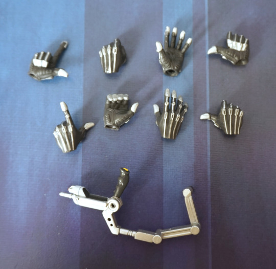
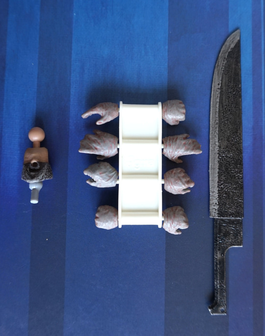
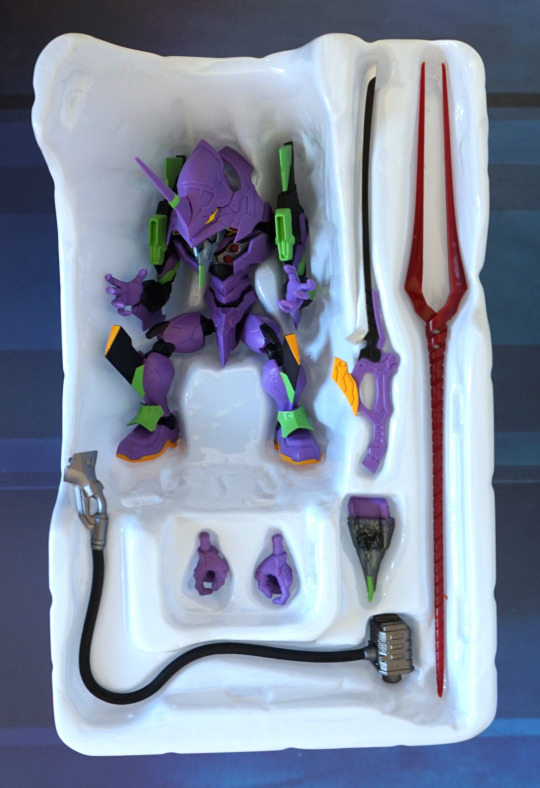
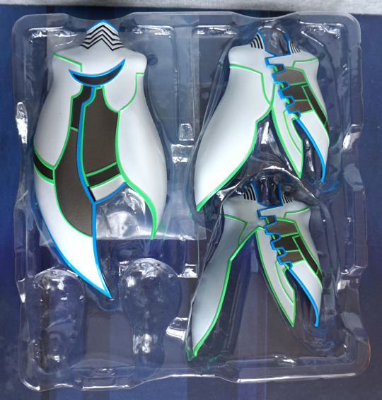
Rest of the small accessories:

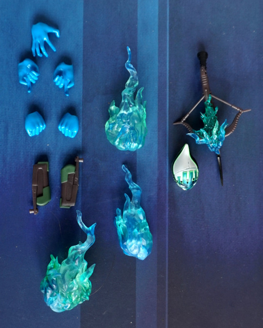
He has a good range of pieces, which I think gives a lot of posing options, which is something really good with this figure.
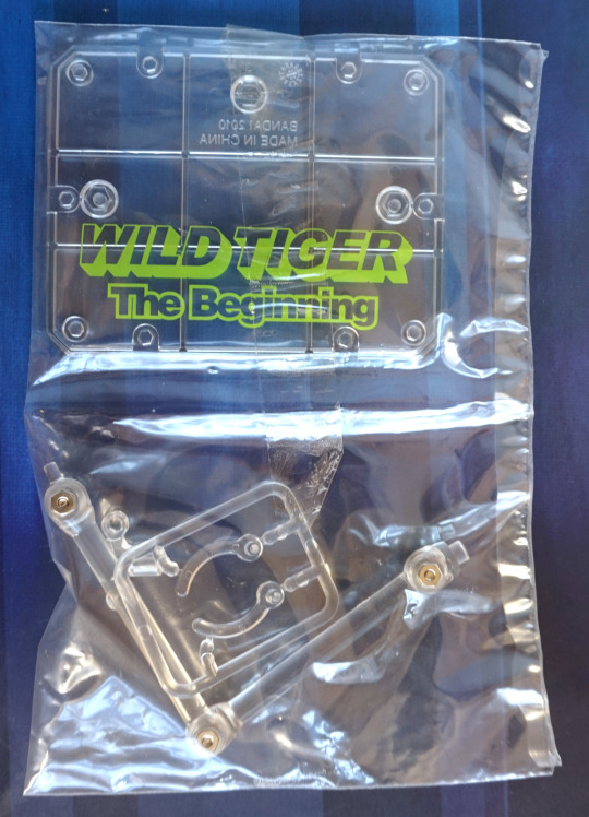
Cloak parts:

Whilst these pieces look really cool, I had massive issues getting them on, and it does somewhat limit your posing options, so I’ve decided to leave them off for now. Maybe I’ll have a go with them some other day in the far future. 

Overall, I think he’s a decent figure, even if he’s probably not a popular character. I’m glad to have him, and if you’re after him, he shouldn’t be too expensive to obtain. 

Trinity – The Matrix – N2 Toys

Another cheap pickup, due to Western figure not popular in Japan:

Always thought about buying one or two of The Matrix figures, but the quality vs price tends to be pretty bad. But hey, this one was cheap. 

Let’s start with her head – the sculpt is nice, but the paint leaves a bit to be desired. For some reason, they’ve done her glasses in a matt finish – this looks odd and makes it look like she’s wearing opaque goggles. A more shiny finish would’ve helped here. though in a modern figure, they may have actually done her glasses with a transparent plastic. Her hair looks a little derpy too. 

In isolation the clothes look nice – the finish is good, and the wrinkles help to add realism and depth. However the paint got a little sloppy at the top, making it look painted on in the upper part. And +1 for the pointless articulation – she only looks good with her arms outstretched, so the arm articulation is… kinda useless. Maybe some point if you’re setting up a specific diorama and need her pointing slightly up/down. Action-wise, you’re not going to get a lot here. Her belt paint is crisp, though.

Left:

Her hair has some good texture to it, making it look good from this angle. I feel she might want to give her clothes a bit of a tug to straighten them out, at least a little bit. Here we can see that with the arms, if you were to point them a bit too far up or down, things are gonna look a little weird. The guns themselves are sculpted nicely, with some small details in there, making them look like guns. She also holds them well, and looks like she’s shooting. 

Right:

Here we can see a nasty seam on her neck. It’s partly visible on the other side, but here, you aren’t missing it. Here we see they’ve sculpted her ears too – much better than Taserface *ahem*. Her belt loops are painted crisply too. Her body pose I feel fits with her arm pose, when aiming. 

Back:

Bit of broken leg syndrome going on there! Her hair abruptly stops, which looks a little odd. Also the paint on her top is a bit of a mess here too, which is a shame. Her ensemble still feels like PVC back here, so that’s good. Arm joints look a little blergh though, and I do feel they maybe should’ve gone all out on the frontwards aiming and forgot about articulating it, when they’ve gone for a specific arm pose. Articulating the arms does mean she can hold them flat in the box, seeing as how assembling your figures was less of a thing in the early 00′s. 

Other accessories:

I feel these are surplus to requirements, and don’t have a way of fitting with the figure. The knife is painted nicely – if she had a sheathe for this, I’d put it on her side. The machine gun, however, feels kind of misshapen, so this one is for the accessory drawer for sure.

All in all, one for the older figure fan. If you can handle pointless joints and a bit of a derp paint job on the top, then maybe this figure will interest you. I’m happy to have a Matrix figure in my collection that manages to be semidecent and look fine at a bit of a distance. 

Tiger – Tiger & Bunny – S. H. Figuarts Movie Edition

Saw this dude cheap in Mandarake, so added him to my pile of stuff:

He’s surprisingly weighty, as he’s part-metal, and feels a good, solid figure. Overall, his design feels clean, and he’s easy to articulate. He does come with a stand, but he stood up just fine on his own, so decided to take pics of him in a neutral stance for this blog. The colours are nice on this figure, and he looks the part. 

Left:

His face has that slightly menacing look from the side. His arms are nicely detailed, and the “cover” part looks good. His leg is nicely finished, with a silver stripe. 

Right:

Very much the same as the left. He’s a symmetrical character, barring the logos, so this was to be expected. 

Back:

Here we can see the small details on the back of his head, and the angular patterns of the armour on his back. However, the whole thing feels… too flat. Especially on the lower part of his back and upper legs. The green detail around his ankles is nice though. 

Accessory time!

He comes with two of these guns, but was only arsed to equip one. They’re nicely detailed, and have a bit of paintwork on them. 

Side:

They peg into the inside of the arm “cover”, and the handle goes into his hand. It’s hinged at the handle join, so you can still pose him when he has it equipped. which I really like. I love the effort that went into this accessory, especially comparing it to the boring one-colour accessories Western figures can frequently come with. 

From the top:

Yep, definitely happy with this one. 

The other pieces:

Due to the peg, the guns have specific sides. And a decent selection of hands, for all your favourite Tiger poses.

And his base:

Will likely assemble this so I can have him in a more action-y pose.

Overall, I think as a figure he is a little on the plain side, but solid. This figure can be picked up cheaply, so would recommend it if you like what you see here. Was a bit worried about what he’d be like out of the box due to the cheap price tag, but I think he’s fine, just mostly because Tiger & Bunny isn’t too popular, and a lot of the figures are pretty samey. 

Ryo Asuka – Devilman – Limited Color ver

It’s time for some more Devilman! This time we’ve got Ryo Asuka:

Here he is, with his normal head. I think the greyscale scheme works well with him. and I love the silver on the black. What I love less, is he has some stray silver paint on his left arm. Also the metal is a little rusty in spots – Japan doesn’t seem particularly friendly to metal parts. 

He certainly has a sculpted body, and I think his trousers might be overly tight :P. I guess fashion wasn’t his first thought when summoning demons… but I doubt he needed clothes for long ¬¬.

Left:

Here we see him with clawed hands, and some wonderful tribal tattoo detail. I like his cuff, and the trouser wrinkles have been sculpted well, to give them the feel of being clothes. 

Right:

On this side we have a metal bracelet instead of a cuff, and a different tattoo. Out of the designs, I prefer the left one to the right one, but both have been painted well. 

Back:

His pants have been pulled tight across his backside, but the rest shows wrinkles, as appropriate. His back tattoo looks good, but I’m seeing some more stray silver on his right shoulder. A bit of a shame the paint has ended up flicked about a bit, as it shows up quite easily against his dark skin. Here we can see the buckles on his cuff, which is a nice added detail. 

Plonk, on goes the mask:

It fits on well, and here you can see one eye staring out :P. This part glows in the dark, but I didn’t take any shots of this. 

Closer look at the mask:

Same mould as the other ones in previous reviews. Lookin’ scary. 

He also has a winged head:

I like this head, and this is the one I think I’m going to display him with, then display the mask separately. 

Side:

I love the wing effect, being more of a bird wing than a skin wing. Gives a difference between him and Fudo. 

Back:

*flap flap flap*. 

Overall I really like this figure and glad I got it. I think he works well with the stark colour scheme, and the subtle differences between him and Fudo in this transitional stage work well as a pair. If I see the normal version of Ryo for a good price, I may also pick that up, as I don’t have a pair to display. 

Nanael – Queen’s Blade – Revoltech

This is a character I decided I wanted a figure of… just because. Ended up coming across her whilst I was in Japan for a reasonable price, so picked her up:

image

Starting with the face shot here, as the front shot features panties. Here she is, being surprised by spilling her milk. Here, the joints do look rather strange, but her face is cute, her hair is OK in the sculpt, but I’m seeing some stray bits of excess paint. And a bit of missing pink on her hair decoration. The neck strap on her dress looks overly industrial – I think this would’ve been improved by being thinner. Her belt is nice though, and the bow on her dress. 

Front:

image

Here we see her uneven wings – at first I wasn’t sure if there was a piece missing, not being overly familiar with the character, and her having a joint where a wing piece could go. Found a pic of her “holding” her sword with her wing, so decided to replicate that. One thing that stands out to me is she does feel a bit overly chunky – her legs seem a bit too wide for her body. She does have a nice pair of panties though :P. Her top is nicely wrinkled, but again, feels a bit too thick of a material. Her milk bottle looks good, and has the equippable splash – you can choose if you have the milk splashing out or not. Though obviously there’s only one choice really. 

Pantsu, seeing as we mentioned them:

image

Enjoy. 

Left:

image

She naturally goes into a bit of a leaning-back pose, which fits with the milk splashing out at her. Silly angel, forgetting her bottle top! The base holds her well, but was a bit fiddly to set up. The writing is nice on the base, but a bit of a pain to get her standing so she wasn’t blocking it. 

Right:

image

Obvious hair seam, as her fringe removes so you can change her face. She looks good from this side imo – everything looks to be painted nicely, and she looks less unnatural in shape. I prefer the hands where she has her fingers sculpted – in these shots, her left hand looks like it’s in a mitten. 

Back:

image

Hair looks overly simple from the back. Wings look OK, but a bit plain on the left wing. 

Base:

image

Here’s the base of the base. Writing looks OK, nothing special, but nice to have something to say what the character is. I like the transparent base effect, but the base itself could’ve done with a bit more weight on the bottom – a common theme with the old Revoltech bases is they easily tip over, as they’re top-heavy  ><. 

Accessories:

image

If you want her more nude, here are the ripped clothing options. Chose not to put them on her, as it looks like it was gonna be a bit of a lengthy process to do so. We also have some hands so she can hold her sword. And a face if you want her post-milking. I think this face has been well done, and I’ll probably switch to it at some point. 

Overall, she’s an OK action figure. I think some better design decisions could’ve been taken, but there are slim-ish pickings as far as

Nanael

goes. Would recommend if you want a Nanael action figure. 

Rider – Fate/Stay Night – Figma

This is a Figma I’ve wanted for awhile, but her aftermarket price is rather potty. Was hoping to see some re-releases of Rider figures due to Heaven’s Feel, but not much announced right now. Some new figures, but nothing that took my fancy.

So here I have the Rider Figma that I picked up in Japan:

… who was a “reasonable” price as she’s a bit damaged, and had no box. Here you can see where the rubbery purple stripe that goes along her top has been scraped off partially – when I display this, I will likely use her hair to cover it. 

Her legs have a weird gap where they join to her boots – looking at someone else’s pic this isn’t unique to mine. The colours are nice though, and look like Rider’s colours. The top has some detail in it, but not a huge amount. She is one of the earlier Figmas though. 

Face:

I like her masked faceplace – always preferred Rider with her blindfold. Her face is painted and sculpted nicely. Must ignore the mess. I like her collar, but the silver isn’t quite in all the places it needs to be – it’s painted on the front, but some silver paint on the top of it would make it look better imo. 

Left:

I like he hair, though her fringe is pretty loose. Not sure if that’s just mine or a common issue. Have to be a bit careful when posing her. Her spike-weapons are nice, and look the part. She also holds them well, and plenty of chain to pose should you wish to!

Right:

Lotsa hair! Her sleeves look OK, but nothing special. 

Back:

Here we can see the hair parts enough for the stand to fit through. The hair is super-flexible, so this isn’t an issue. Screws could do with replacing on this stand though. Or, erm, get another stand.

Weapon close-up:

Yep, lookin’ nice. It doesn’t feel particularly detailed, but I don’t think there’s a huge need for them to be.

Overall, I’m glad to have this figure, but I think it’d be really good if they did a “renewal” version with more detail. Whilst she has a lot of stranded hair, it’s pretty blandly done in execution, which I think would be improved in a newer version. Her legs could do with sorting so the joint shows itself yet, and some shading on her top wouldn’t be amiss. Overall she’s an OK Figma, and I’m glad to have her, but I wouldn’t have wanted to pay the full aftermarket price for her. Maybe with modern improvements, she’d be worth more to what Figma prices are now, but in her current incarnation, I’m less inclined to pay full whack. 

I’d say this one is for the Rider fans.

Red Pyramid Thing- Silent Hill – Figma

This was the figure I bought with Miku – Pyramid Head from Silent Hill. This was one that I was dithering about buying, as it’s not a franchise where I’ve actually played the game, but I’m sort of fascinated by Pyramid Head. 

So I decided to buy him, as I could do so for a reasonable price:

So.. the differences between this one and Miku… Here we can see there’s a lot more detail and texture. He has sculpting and shading on his arms, which I think works well. What doesn’t quite so well is what’s supposed to be his gloves – just sort of looks like his hands are miscoloured somehow. 

The pyramid looks nice though, and his dress looks good with the creases, buckles and rips. Here we also see him with his spear, which I particularly like the paintwork on the pointy end. 

Left:

Here we get to see… some sloppy brains. I think they’ve done some good things at the side to help hid the joint. The shading on his arm helps to give it a fleshy texture. We can also see he has articulated toes, to help pose him. 

Right:

Ouch, that nail in the brain has got to hurt! Shading looks good here too, and a fabric semaline sculpted into the side of his clothing, to add detail. 

Back:

Here we have some leather scraps nicely sculpted & painted. I like the power stance he naturally has, and the shape of his body. Brain has some paint details to emphasise the wrinkles in it. 

Hm, let’s get a closer look at his brain:

Gorey! I like the way they’ve fully painted this. Definitely helps with the horror vibe.

Back part:

Yeah, that guy’s gotta have a headache! 

Accessories:

Here are his other hands, which appear saran-wrapped. This other neck piece, on the left, has a hole where you can put the base part of the spear “through” his neck – I though this was a really cool addition, but I’m probably not going to use it as I like him wielding the spear, and I’ll likely keep knocking it out or it getting in the way if I put him with other figures. The large knife looks good, but I wish the wash followed the curve of the blade. Overall some OK accessories. 

I do really like this Figma. I have a soft spot for horror stuff, and this dude fits the bill. If you can pick him up at a reasonable price, I think fans would be happy with him as an action figure. He seems to lack much competition in the action figure market. Sort of surprised someone like NECA hasn’t picked him up, but hey, we have this one at least 😀

Hatsune Miku – Vocaloid – Figma #14

Saw this figure, and can say this one was an impulse buy. Also partly because buying it allowed me to buy this figure and another tax-free. Gotta save dat tax. 

So here she is:

image

As she didn’t have her box, she was really cheap, but all her accessories were included. Here she is with her microphone.The microphone feels solid, given its thinness, and definitely looks the part. This one I considered buying the bootleg of way back when, just to get an idea of what Figma were like and to see how the bootlegs compared. In the end, I didn’t, and looking back I’m glad I didn’t. 

I was attracted to buying this particular Miku because of the silvery top. and her sleeves. Being the official thing, the green edging is painted neatly, and she articulates well. Her face is also cute and Miku-y. 

Face:

I like this face – it’s nice and cute. Here we can see there’s a tiny scratch in the silver from her being a secondhand figure. Suspect some of the black on the green part of the skirt might be secondhand issues. Some creasing in her clothing, so it isn’t entirely flat. Her tie clips have been painted nicely, and work to break up the large sea of green. The range of finishes is one thing that also attracted me to this figure.

Left:

Here we can see her large, sweeping hair and the aforementioned sleeves. Her black boots have nice green details at either end. The finish is nice, but not super-detailed. Her top has a good bits of detail – the hanging strap, the green border on her skirt and the silver part. The number she has on her arm is tattooed on nicely. 

Close-up of her sleeve:

I like the detailed keyboard on her arm, and this came out well. Here we see the “01″ in more detail too. Arm joint isn’t particularly hidden. Here we can see where the stand has gone a little rusty – guess they’re more prone to doing that in Japan. 

Her hair bands look a little lumpy up close, but fine at a distnace. Her headset has also been done nicely, with some little, coloured details.

Right:

More hair! Not much to differentiate this side – she doesn’t have a strap here, or the tattoo. 

Back:

Looks OK from the back. Some creases in her clothing, hair has sculpting onm the back. I like the fact her hair is articulated too – can be used to give her poses more life. I think this angle emphasises the lack of shading on this figure – she is an older Figma, so this is showing one thing that’s changed – there tends to be more paint detail in newer figures. I still think she’s cute though.

Accessories:

I may give her the leeks at some point. They’re nicely painted and sculpted for what they are, though I’m not particularly attached to Miku, so the accessories don’t hold any special place for me. 

Overall, I think she’s nice for an older Figma. I think it shows how the designs have gotten more detailed over time, whether that justifies their current price tag or not. I’d recommend this one, if you can find it cheap. Don’t think it’s really worth pushing the boat out for, as there’s plenty of other Miku stuff out there to choose from. 

Lara Croft – Tomb Raider

More old Western action figures! This time Lara from Tomb Raider:

That’s one helluva face… Her head is too thin, and that lipstick is way too red. The material shorts were an interesting choice. Looks like one of the legs has come unfurled during this photoshoot, which doesn’t help. Note to self: go fix that. I think with the top not being fabric, this doesn’t work so well, and maybe they would have been better off moulding them, but this was probably the easiest way, without losing leg articulation entirely. 

Left:

… and I didn’t pose this uzi correctly – her finger does fit in the trigger, and sits well in her hand. The holsters do feel super-large to her body, but they were designed to fit the guns she comes with, so you do have the option of holstering them. Her hair looks OK, but isn’t super-detailed. You can rotate her pony tail though. 

Right:

Here we can see where the white paint on her sock/shoe is a mess. Bit of a shame. The black bands on her leg are supposed to be where her holsters attached… but here they’re just um, garters? It might be possible to pull the holsters down so they reach, but it won’t look good. On the fence about them adding these – it is more accurate to her design, but defeats the point if her holsters aren’t attached to the bands. 

Back:

Here the stitching is a bit of a mess on the back, but the rolled short looks nice. Her backpack is pretty decent – not too much detail to it, but does the job. The joints in her arm are very visible, but this is typical of older figures. The stand in these photos is one of the spare bases I have – without a base she doesn’t really balance, so I’d recommend getting one of these plastic disc bases for her. She has a standard sized hole though (these bases work with NECA figures, for an example), so if you have a spare base, it’s worth trying with her. 

Watch out Lara!

The thing that attracted me to this figure other than the fact it was Lara was the fact she comes with a couple of creatures. She comes with this bat, and what’s apparently an Atlantean Guard:

I really like this little guy – he has a fair amount of detail to him too. Possibly more so than Lara! He also has a peg on his tail, but for the life of me I can’t figure out what this pegs to. 

Right:

Vicious lookin’ bugger. Don’t think I want to cross him. The eye is painted really well. 

Back of the guard and bat::

They’re both nicely detailed on the back. These accessories are almost better than the main feature, lol. 

Here are the other two guns she comes with:

You can sling these over her shoulders, if you like. I find that a bit overkill. They’re not hugely detailed, but I like the fact they’ve been included. I may sling one over her shoulder, but not both. 

Overall, I don’t think I could recommend this figure, and it’s one for the more hardcore collector/fan. I have a soft spot for things Lara, so couldn’t resist adding this to my collection, with the low price tag. If you’re in the US, you should be able to pick this up as cheaply as I did, however it could end up pretty costly in other countries. She feels like an experimental figure from the 90s, of ideas that would be later refined, and she has a face that only a mother could love… 

Lady Demon – Chaos

And now for another Moore Collectables figure!

Lady Demon:

Also a sucker for demon figures :). I like her red skin and accessories – here we see her wand. The skull crotch looks good too. Her face and hair are painted well, but I think her horns could do with a bit of work. Also the rings that are part of her loincloth could’ve done with more paint, as they blend far too well into her skin, and can look unpainted from a distance. Her top is sculpted, which gives it needed depth, but the boots are painted and gloves are painted on. 

Left:

Yep, she’s deffo got some boob goin’ on. The sculpting is nice in her hair, but is quite obviously two pieces. She leans a bit on the stand – this is fairly common on Moore figures, as they only have one foot peg. I love her clawed hands. 

Right:

Tiny little skull detail on the side strap for her loincloth :). I wonder what demon magic keeps her boobs that perky…

Wand:

I like this wand – it is nicely detailed, with the claw & horns on the gem, and the bone effect on the handle. Imo, the bone effect came out really well.

Back:

Here we see she has a very full head of hair :). Again, she has a case of copyright-butt. I do like the stands for these Chaos figures, as the Chaos logo makes for a good stand design. The indents are also useful for propping the figure/accessories. 

Sword:

I really like the shiny red this sword is painted. The black wash at the bottom also works well, and we have a small detail of a skull on the base of the handle. I couldn’t get it into her hand so I came up with a different way of displaying it:

Here you can see where I use the base to help the sword stand upright. As long as it doesn’t get jostled, it’ll stay in place, helped by her hand holding it. The arm articulation actually comes in useful here, so you can pose her with the sword. 

Overall, I like this figure. The colours work well, and she has some nice small details. Again, it’s a Moore Collectables, so has that “look” to it. I’d recommend this figure, if you like this style. 

Aspen Matthews – Marine Metallic Ver – Fathom

I was attracted to this figure, thanks to its colour scheme and aquatic theming. And, er, also cheap.

So here she is:

I love the sheen her skin has, and the blue & greens work well, and definitely give the figure an aquatic feel. The blue-green weapon part comes separate, and you clip this to her arm. I like the detail in this piece. Her body is well-defined and she has a decent amount of definition in her harms. Her legs suffer from the “Moore Collectables” plainness though. 

Face:

I like her face, and it feels well-sculpted. The “fabric” part of her outfit feels very flat to her body though, with the aquatic plantlife being raised fully. 

Top of her head:

Some parts have been missed on mine, in some of the deep gaps of her hair. It ends up quite noticeable when looking at her from above, but not so much from the front. 

Left:

Not sure what the muscles are doing on her arm… she might want to get that looked at. She has painted nails, which is a nice touch. Her neck joint shows quite a bit – not sure what the point of the articulations are in these figures – it doesn’t work particularly well, but some articulation is definitely a Western thing, lol. Some of the black background paint is a bit much on her leg – it works well on the lower, denser part, but looks a bit odd higher up.  I love the use of colour on her shoulder. 

Right:

Yeah. should’a retaken this shot… but I like the shapes in the “weapon” part she has. Rest of her on this side looks good.

Back:

Lotta deformation action back here. And the copyrights somewhat spoiling it… I think they’ve given her back too much definition, and it doesn’t quite make sense. And her butt could do with a little more definition. 

Despite the figure’s flaws, I really love this figure. From the colour scheme to the theming, it falls into a few categories of “stuff I like”. If you’re OK with Moore’s style of figure, I could recommend this one. Looks far better than the default colour scheme – I’ve seen this figure being sold in a store before, and the colours make it look very messy. This is definitely the superior one for me. 

Angela – Limited Edition – Spawn

This figure came with a VHS tape, with some Spawn episodes on… but that went straight into storage. So let’s look at the figure instead:

I was attracted to this figure due to its blue colour… and cheap price tag (¥500). I love the colour scheme on this figure – there’s a variety of colours, but they work together. The blue and goldish colour pairs well.

Face:

Here we have her hair and headband. She looks like the wings are part of her head, but if we look up close, we see this is not the case. Whilst the translucent wings are a nice effect, it may’ve been better to keep the headband as the same colour as her armour. The paintwork is average for McFarlane – which is reasonably neat if you don’t look too close :P. The black belt across her midriff terminates a bit early, which looks odd. 

Left:

Her weapon is neat, and she holds it well. The tip can fire out, and does so with some force. I like the armour on her arm, and the purple boot is.. interesting. 

Right:

Here we can see the button that fires the tip. The gold armour on her arm on this side I like quite a bit. I like the spiky shoulderpads too. 

Back:

Here we can see the brightness of her hair – it is quite a bright orange, that contrasts with the rest of her. There’s a decent amount of texture sculpted into it. Paint on her backside is a bit sloppy. I like the sword on her back, which she can also hold, if you prefer it to the staff. 

Overall, I’m really glad I picked this one up. I was trying not not buy all the McFarlane figures, as the quality isn’t the best for these older figures, but certainly worth it for ¥500! She’s grown on me a fair bit since I’ve unpacked her, so she’s staying on display 🙂

Alien Shocktrooper – Independence Day

This was another super-cheap Western figure from Mandarake that I couldn’t not buy. Also… shiny…

Shiny and blue is also a winner with me :P. And tentacles. This figure feels very 90s. And being 90s style, it has to have an action feature:

Not entirely sure if this cardboard dude is supposed to come out or not. He doesn’t easily, so he’s stayin’ in there. Here we can see there is plenty of glitter underneath the sealant. 

Here is the head closed:

The red eyes stand out from the rest of the figure, but aren’t too hash a contrast. The sculpting is good for its age, though the colours chosen are probably somewhat Marmite if you like them or not. 

Left:

Here we see the majesty of this thing. The tentacles take up quite a bit of room, but the upper ones have wires, so they can be posed. The lower two he stands on are solid so they can prop him up. The purple accents on these tentacles are a nice touch. The upper tentacles are pre-attached, but the lower ones are an absolute arse to get in – would recommend warming the figure to ease insertion. 

Close-up of the body:

Still looking shiny and decently detailed. The protruding bit on his upper back is the clip you squeeze to open the head. The head will spring closed. 

Right:

This shot shows the levers and hinge aren’t really that hidden. Does give you a good grip to open it though, which makes sense as a toy aimed at kids. 

Close-up of the lower tentacles:

Decently detailed, and reasonably easy to balance him on these back “legs”. 

Back:

All the tentacle you could need! Haven’t posed them much, but with some fiddling, they’d look good.

Close-up of the tentacle ends:

Here we can see there is more than one tip type, which is a nice detail. I like the way these came out. 

You also get a host dude:

He has a certain amount of flexibility, but isn’t designed to be poseable. The paint colours are nice though. I’ll either find somewhere he can hang onto, or maybe hang him onto a tentacle. He’s a decent little accessory to the figure, but he’s not capable of standing on his own, so that’s a bit of a shame. Would have more display potential if he did. 

Overall, I like this figure, not sure who I’d recommend it to. It also came with a floppy disk, but haven’t been bothered to try and see if it still reads. As of the time of writing, here’s some videos that I found of the mission disks that came with these figures: https://www.youtube.com/user/JTcheatwood/videos They’re all very short minigames (my brother had the Area 51 one as kids, which came with a mini playset, which is why I know the vague content of the disks). 

Zanin – Devilman

Here we have Zanin from Devilman. I did end up getting the fully silver limited edition earlier in the holiday, but I prefer coloured versions, so picked this one up with little hesitation when I saw him:

I love the Devilman designs – they have a good range of colours and detailed designs. I love the shiny blue colour he has, and his wolf-insect head.

Let’s look closer at that head:

OK, I didn’t get the focus quite right…. His chest eyes have coppery irises, and blood vessel details, which make them look good without looking plain. His eyes on his main head are painted nicely too, but there is less to them, lol. The paintwork is nice, with a black wash that fits well.

Side of his head:

Ah, better photo. Here we can see they limited the black wash/painting to is hair, which works really well. His tentacles are nicely sculpted. We can also see his lower eyes also include what almost looks like an eyebrow.

Left:

Despite being articulated, there’s a limit amount of ways you can pose him without falling over. This dude doesn’t have a base. His body is an eye-catching shape, but this has the downside he won’t be cheap to get shipped boxed, as the box is huge, which is why I didn’t buy him prior to going on holiday, and planned to pick him up whilst I was there. Still diggin’ the shiny blue paint.

Right:

The hair texture on his legs is similar to his mane, and looks good. His head doesn’t have the best transtion to his neck. Still lovin’ him though.

Back:

… more eyes! He can see us from here too! The contrasting but complimentary colours look really good. I think they picked well here. Also the veins on his back are sculpted well, and painted in a shade of purple I like. There’s some shading on the green part of his back, to emphasise the ridges, which I think works well.

Overall, I’m really happy with this figure, and was glad I could pick him up. I’d recommend these Fewture figures to fans of Devilman. There is a mildly dated feel about them, but they’re still really good eye-catching figures. Just don’t expect to be able to pose them all that much. And prepare for some of them to be hefty on the postage, when they don’t fit in SAL small packet!

Figure Spotlight: Diablo

I have both the Diablo figures by NECA – one is “normal” Diablo, other is Shadow of Diablo. Here they both are together:

image

The normal Diablo I got as a gift, the Shadow of Diablo I ended up paying a fair bit for, as it got customs’d. Both figures are from the same mould, with different paint jobs. 

The normal Diablo:

image

The paint job on this one is quite striking – the yellow and red contrast nicely. The figures are decently poseable – along with the usual articulation, his shoulder parts move, his back spikes move and his table is bendable. 

Here’s a shot of his side:

image

Not too much to see here, though one thing here is to note he’s not on his stand properly – both of these figures are prone to falling over, and the peg is not long enough to hold him in place at all. This sort of makes the leg articulation useless, as you can’t really pose his legs in many positions without him faceplanting. Usually I have him leaning against the wall to prevent him from attempting to skydive. 

Back view:

image

Nice paint job here too. Tail is poseable, but it’s kinda awkward to move it around – the wire is quite stiff. Now to leave this Diablo munching on the wooden backdrop, and look at Shadow of Diablo:

image

This guy has a reasonably striking appearance from afar, but does not stand up to closer scrutiny. Close-up on his face:

image

 The blue wash appears messy, where it blends into the black parts, and the shoulders don’t look as well blended as the ones on the red version. Whilst the blue paint does feel more sloppy, I’m not sure if the paint itself was partially a factor in the figure’s paint flaws. There’s less colours to play with here, though NECA is known for doing sloppier paint jobs towards the end of figure runs. 

Here is his side:

image

Not much to say here – looks rather like the original version, only blue. 

The back:

image

Here you can see the blue wash being uneven on the two outer back spikes. Also if you look closely near the tip of his tail you can see two dots – this is the wire showing through :/. Pretty sure this was from the figure’s construction, where they haven’t embedded the wire correctly. Fortunately, it doesn’t show as this part is usually facing the wall. 

So if you have a choice of one or the other – definitely go for the “original” version. The blue one just doesn’t have as good of a paint job, and an image search seems to confirm it’s not confined to just mine (as well as some reviews from the time). Getting hold of either at this stage is likely to be an expensive proposition though. I believe the original RRP was £25, but good luck getting them for that now. 

EVA-01 – TV ver. – Evangelion – NXEDGE

This one I ordered just before holiday and was delivered whilst whilst I was away. Well, I say delivered, more like chilled out at the delivery office until I paid the charges… This one sold out online in most places, so when it briefly was in stock again at AmiAmi, I went ahead and grabbed it, as I wasn’t sure if I’d see it in Japan if it was sought after. Turns out I could’ve picked it up, but I would’ve been annoyed if I didn’t see it and didn’t buy it when I could.

So here he is:

D’aww one cute l’il EVA. The articulation is very nice and smooth, and the colours are striking. 

Here he is from a more top-down angle:

The sculpting is really nice, and there’s a good amount of detail on this small model. For this, I feel he’s worth the price. 

Here he is in the box:

And the other bits that weren’t on display:

He comes with a goodly amount of accessories, as well as the stand, which I’m pleased with. The accessories all seem to be of good quality, with moulding and painting. 

Here he is from the front with no weapons:

Not sure if he wants to hug me or strangle me… 

Left:

Here we see his slit eyes, and the sculpting on his head, that not many figures tend to have in such detail. Here we can also see the fuel cable he comes with, which clips on reasonably well, but is still fairly easy to knock out. 

Right:

Yep, looking good from this angle too. Got all the li’l green details. 

Back:

Not much colour to speak of back here. On one of my other models, the “diamond” bits just above the fuel cable are black, but here they’re purple. 

Another back shot:

Certainly a fair amount of sculpting going on here, which makes EVA-01 eye-catching. 

Top:

We even have his EVA-01 logo sculpted into the top of his head. So if he’s drunk and lying in a ditch, you’ll be able to find out where to return him. 

Overall, I really like this small figure. Glad I got it, and I didn’t risk missing out on it, even if it would’ve been cheaper. If you don’t mind paying a fair bit for a small figure, I’d recommend him, and probably this series of figures. 

Kuroyukihime – Accel World – Nendoroid

Normally I don’t buy Nendoroid, but this one is Kuroyukihime so I decided to make an exception based on the subject and the price:

I love this outfit of Kuroyukihime’s and she had her umbrella too, so I couldn’t say no. The figure is painted well, and the shiny butterflies stand out. I also really like the cute, smiling face.

Here she is with Arita in avatar form:

She also has an arm so she can hold Arita in her arms, but I didn’t take a picture of this. I likely won’t display her like that, as she can’t both hold him and her umbrella, and I like the umbrella too much. Arita looks cute and well-painted. I love the fact he is much smaller, as I can imagine him being so in Kuroyukihime’s presence.

Left:

Here we can see her hair, which is less detailed from the side, but this is standard for Nendoroids. It is shaded though, so it doesn’t look bad. I didn’t take a shot of the right, as it’s mostly umbrella, or similar to this if I took it out of her hands.

Back:

Love her wings. The moulding details help them stand out, and the colours chosen are good. Arita has his tail, which is about all you’d expect from this angle.

Umbrella:

The umbrella has some texture to it, which helps show those touches that go into official figures over bootlegs. It helps give it a fabric-y feel. The rim is also painted nicely, which frames it well. The handle for the umbrella is also painted neatly, especially given its small size.

Overall, I really like this Nendoroid and I don’t feel it overdoes the chibi. Some Nendoroids I’m put off by the proportions, but for this one I feel it works. Glad to have another Kuroyukihime in my collection.

Venal Anatomica – Clive Barker’s Tortured Souls

Whilst putting together a Suruga-ya order out of timesale items, I found this dude! And again, I’m buying cheap Western figures from Japan, lol.

So here he is:

One cool-looking dude… if you like this sort of thing. Standard amount of metallic protrusions for a Tortured Soul. I like the metal chains that hang in front of him, and the claws jutting out of his hand. 

Close-up of those claws:

The paint has been done well, so they look like they’re in his flesh, instead of just being kind of stuck there. We can also see one of the chain weapons that hang by his sides. 

Close-up of the ball chain:

Two more brutal weapons on chains. Yeah, don’t get near this guy :P. Also a meathook attached to his wrist, making him dangerous in melee combat. 

The cap on his head can also be taken off so you can see his brain:

The cap is attached by a chain, so it dangles down his back if you take it off. He has a much more skull-like appearance like this. Wonder if he can scratch his head with that shoulder blade. 

Head from another angle:

Gory! Chain for his cap is the one attached to the chain on his right shoulder. 

Left:

Here we can see the bands around his head, that have been nicely done and the detailed boots. Seems to have a chatterer vibe going on. 

Right:

Some more weaponry on his right arm, plus here you can see the nail that “holds” the skull cap on. 

Back:

Here we can see the fabric effect done on the plastic – I think this is pretty effective, especially when looking at it in a photo like this. His upper back is pretty detailed, with the flesh parts poking through the back. 

Overall, I do rather like this figure. I think he’s a bit plainer than other Tortured Souls figures, but the sculpting is good and the paint is really nice. I’d recommend him if you’re a fan of the series, and can find him for sale. 

Akira & Miki Tribal Fusion double-pack – Devilman

Been wanting to buy this for some time, but with it being marked as SAL parcel only, I ended up waiting until I had another SAL parcel item I wanted. This turned out to be Urara, so I added this to my order.

Here they are, out of the box:

image

The table isn’t part of the set – this was bought at a car boot sale, around the same time as this parcel arrived, but it made the perfect place to display the book. Miki does currently lean a bit – these sets are a bit prone to the plastic bending, so it’s not a big surprise that there’s some bending for a set made around 2000. The interesting colours attracted me to this set – Miki’s shiny outfit and Devilman’s translucent red body. 

Let’s take a closer look at Devilman:

image

The translucent body is kind of nostalgic to me – reminds me of old kid’s toys of the late 90s/early 00′s where translucent plastic wasn’t uncommon. However, this I think is far better done that other items of that era – the sculpting is good, and the varying translucency gives it a better look. 

Also the flame pattern on the bottom of his trousers – that’s definitely of another era! 

Left:

image

His muscles are well-sculpted and show well, especially given the translucency. His trousers also have cuffs, showing the detail put into this figure. 

Right:

image

Here we can see the metal accessories have unfortunately gone a bit rusty over time. Isn’t too bad though. Tattoos on his arm and neck look good. Oh, and he’s leaning a bit too. Is a bit of a theme of these Fewture figures. 

Back:

image

Here we have his pants disappearing into his backside… Not sure I’m a fan of that look, but the flames on his trousers are looking rad. Neck does look a little overlong from some angles. 

Now for Miki:

Here she is, bending to her left. Her outfit is very shiny and pink. She also has copper hair to complete the gaudy look. I like the fact her nails are painted, but her hand angles are kind of awkward for posing. 

But what’s that pattern showing through the see-through skirt?

A little skull. Interesting choice of underwear there, Miki! 

Left:

Here we see her backpack, which was separate in the box. It sits OK on her shoulders, but looks  a bit odd from the side. Might be possible to reduce the issue with some heat and careful bending. The book will fit neatly in her backpack. 

Right:

Her boots are nicely painted, but it would’ve been nice to have a bit more accent painting, such as the recess in the sole. Love the little skull detail on her armband. This picture shows off the glitter in her outfit quite well.

Back:

The backpack has a nice silver accent, and has a smooth and solid opening and closing action. Here we can see some creasing in her skirt, but nothing but copyright info on her stockings. 

Alternative head and mask for Devilman:

This head can be used if you wish to equip the mask onto Devilman. 

Book:

For such a small item, this book is very nicely detailed. I do like this addition to the set, and seems a shame to store it in Miki’s backpack. It looks great on the table I bought though! 

Overall I’m happy with this set. I can see this being a polarising set, with the very distinctive look. However, I enjoyed this recolour more than some others I’ve seen, due to the distinctive and nostalgic look. Overall, I’d recommend the Fewture figures to action figure collectors, though be prepared for them to lean forward a bit – they do bend with time, and the stands only have one peg, which doesn’t help with standing the figures up. Also the limited articulation that older figures have – no ankle-rockers here. 

Starfire

When this figure originally came out, I ended up passing on it. But then I recently had the opportunity to buy it at a store, so I decided to go for it:

image

I love Starfire’s hair and purple outfit. With the colour and the shapes, it’s an eye-catching ensemble that compliments her fiery hair. She has a well-sculpted face, though I think the eye shadow is a bit dark. 

Left:

I like the way her hair blends from opaque to transparent. I think they nailed this effect for an action figure. Here you can see she has the typical joints for an action figure, though she doesn’t have ankle-rocking ability. With her shoulder pads being high up, these don’t restrict arm movement. 

Right:

Here we can see where mine is sun damaged…. If you look at her thigh, you will see where it transitions from light to dark… but personally I prefer the lighter colour! She is supposed to be on the orangey side, but personally I’m not a fan of that – it can feel rather overdone to me. If you look closely in the front shot at the top of this blog, you will see where the twisty tie went across her stomach. Hair transition looks smooth on this side. One thing that irks me slightly is her hand positions – she’s not a character that holds any weapons/items, but her right hand is posed almost like she should be holding something. Not quite sure what pose they were planning for you to put her in, but I think a more neutral hand position would make more sense. 

Back:

Here we can see her hair and original skin colour. He hair somewhat limits head poseability. Also she’s not the easiest to get balanced, which isn’t much of a surprise. These days they’d likely give her some ankle-rocking action to make her easier to pose, but she’ll always be back-heavy, thanks to her hair. 

Overall, I think this is a reasonable figure. It’s nothing special, but I feel it has been competently produced. Though… probably best not buying her from a comic shop that likely had her on display for years like I did, lol. However, she seems to be rather hard to get hold of, unless you really want to pay far over the odds for her.