Instructions of how to cast off Konno – instructions under the fold as NSFW.
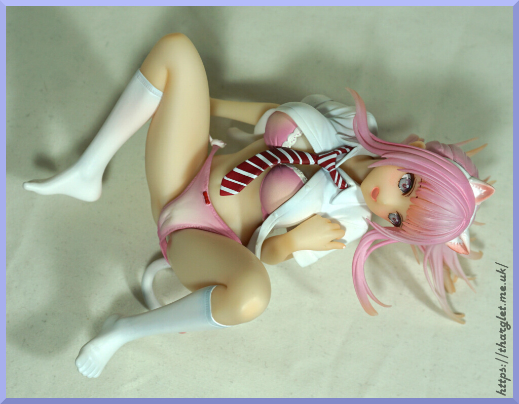
Instructions of how to cast off Konno – instructions under the fold as NSFW.

1. If they haven’t fallen off already, remove right arm and head
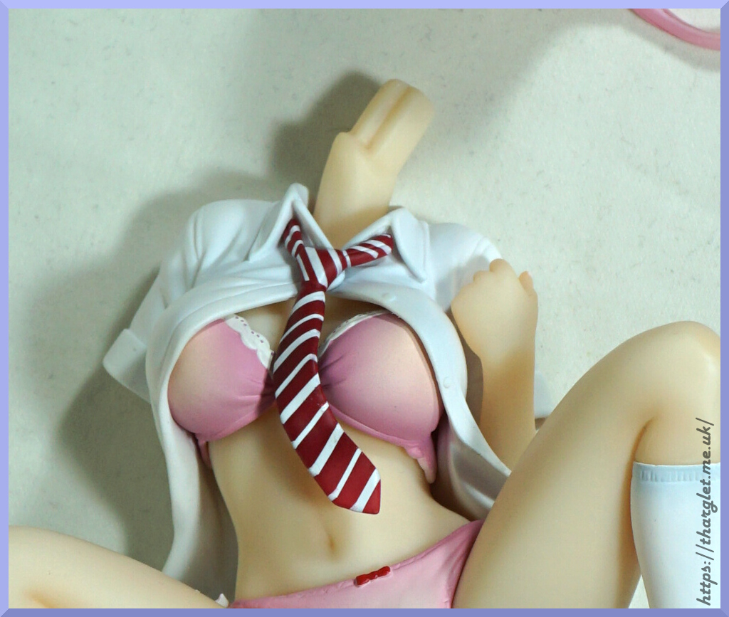
2. Twist around left arm and remove (it is on a round joint to allow you to do this)
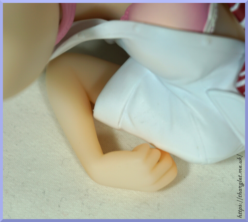
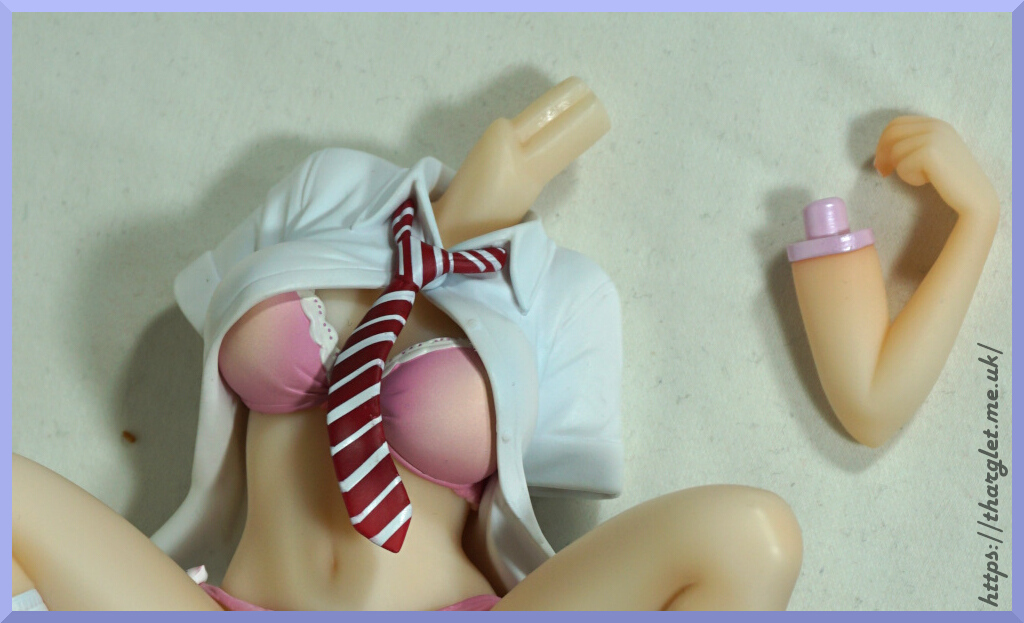
3. Remove her tie – it pops off from the centre of the knot.
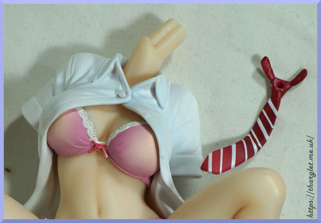
4. Unpeg top where tie was attached
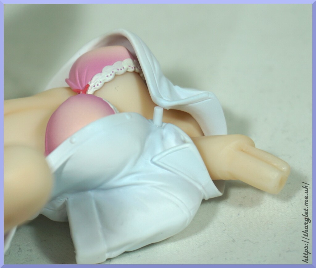
5. Heat up top for a few seconds with a hairdryer.
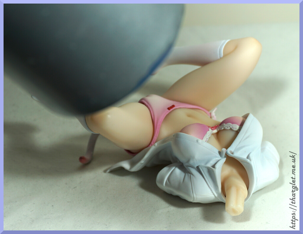
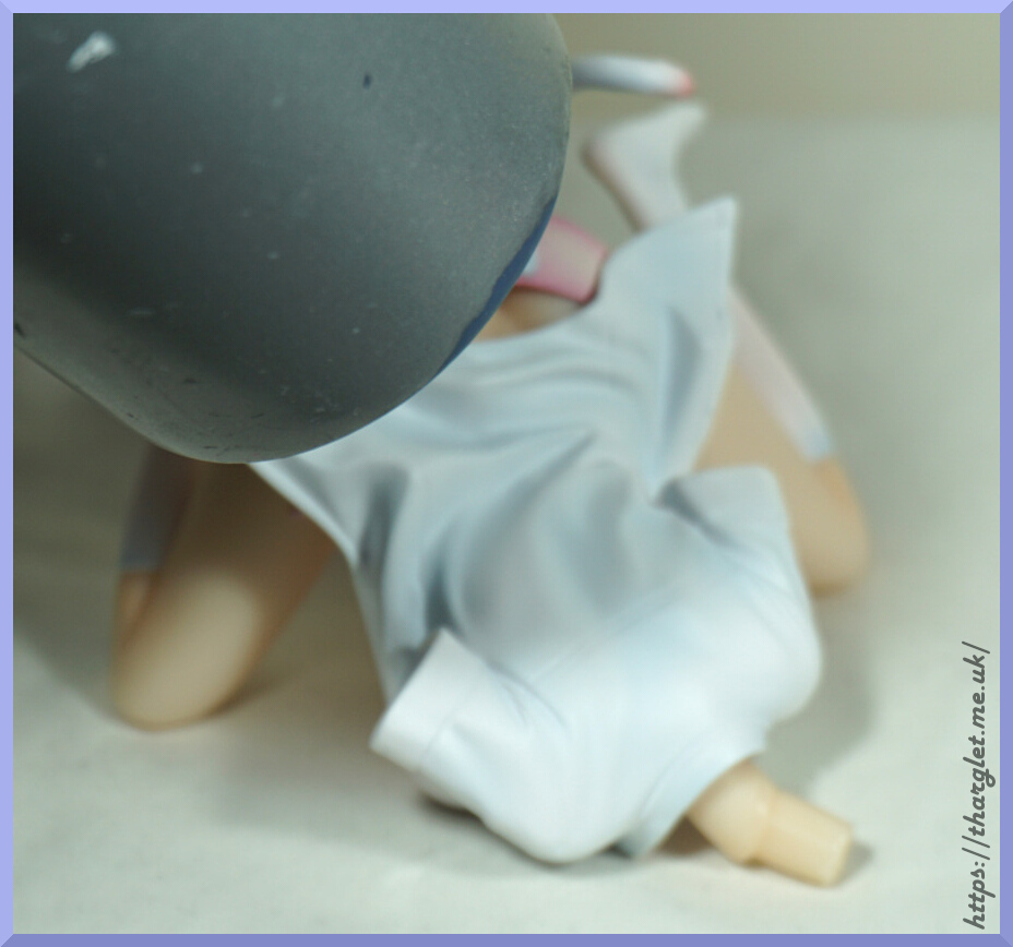
6. Gently pull off top

7. Remove bra
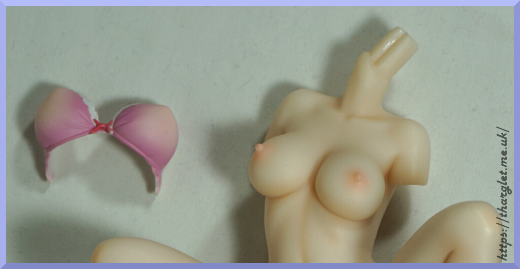
8. Reattach head and arms, and display!
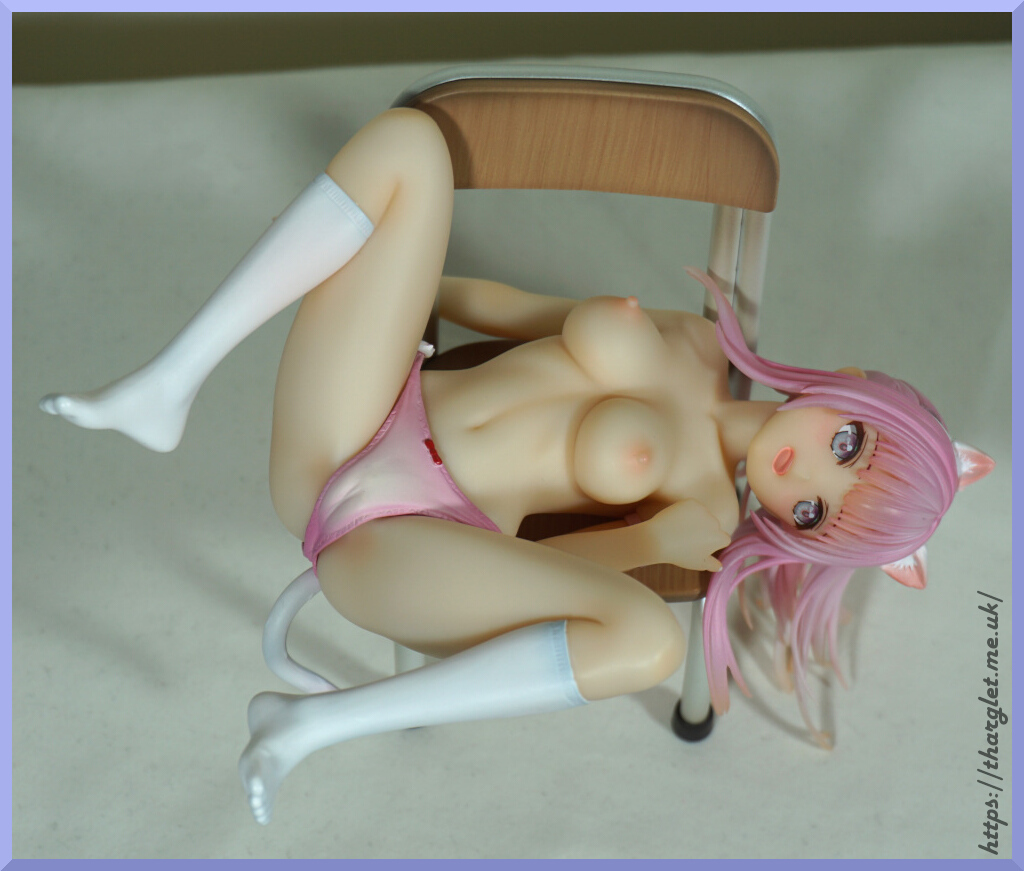
This was a figure I decided I wanted when I saw it. Came across it on Mandarake, where it quickly made its way to my basket.
Here she is:
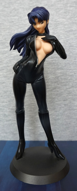
Some of the “free” dust can still be seen on the base. This time it wasn’t my fault it was dusty! The thing that attracted me to this figure was her outfit. I like the cute look of her face, and the skintight outfit has been done nicely for a prize figure.
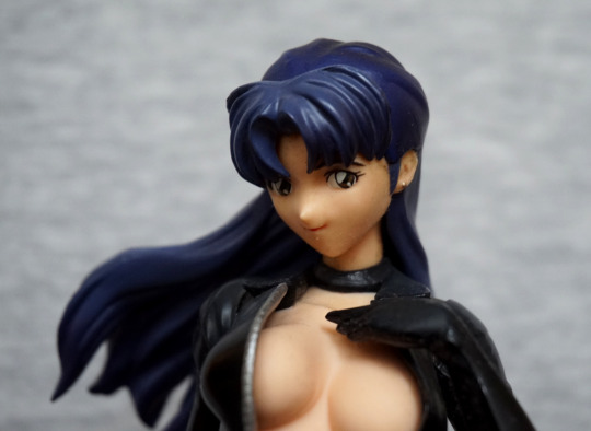
Her face is fairly decent, and I like the expression. Hair is a bit “eh”, but decent enough for a prize figure. I like the choker they’ve added to her neck. Her chest is actually a soft rubber, if you like to poke your figures. An interesting additional feature for a prize figure.
So… let’s see if she has her scar:
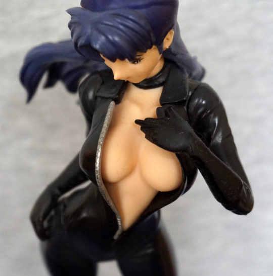
Nope, can’t find it anywhere down there. Due to the rubbery material used for her chest, I’m not surprised it wasn’t included. On her had, the rubber has denatured slightly, but her body seems fine.
The zip on her uniform has been painted neatly. Sculpting is OK for the zip – looks a bit thick close-up but OK with a bit of distance.
Left:
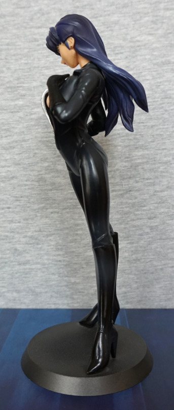
Here she’s leaning forward slightly, and she has a shapely upper body. I like that they’ve included some shading on her suit, instead of leaving it flat-coloured.
Right:
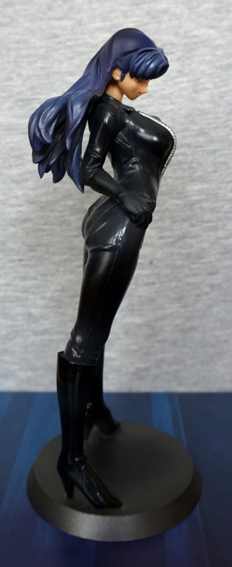
The creasing on her clothing looks good, and the boots have been done well. Her hair I’m not so keen on, but it does the job. Though to me, her hair doesn’t feel quite right – her hair is overly flat in places, which looks odd next to the more sculpted parts.
Back:
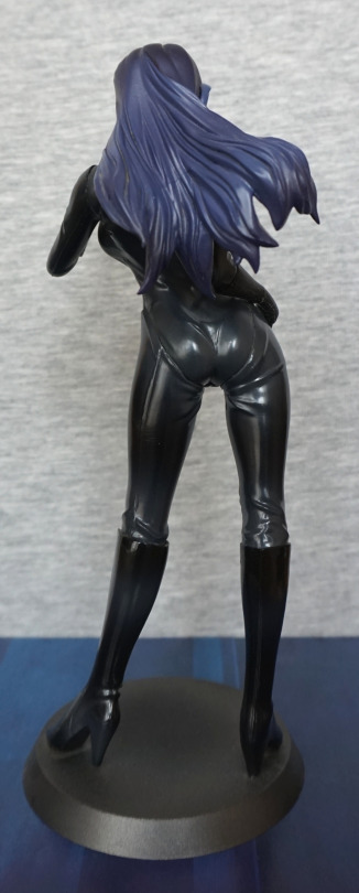
Hair looks good from the back – I do like the way it flows.
Overall, I’m pleased with this figure, though I do wonder how the rubberised bits will age.
Now for another horror-themed figure – Fredd Krueger, but perhaps not as you’ve seen him before!
This figure is part of Kotobukiya’s Bishoujo line, which has a few gender-swapped characters, this being one of them.
So here he, uh, she is:
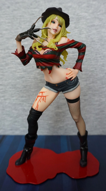
A very sultry-looking Freddy. I love the face and the pose from the front. With the second edition, they slimmed down the base and reshaped it a bit, to make it fit with the figure more. The base does the job, but I don’t have many feelings towards it.
Face:
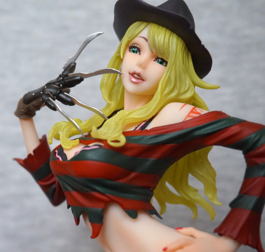
I love the way the lip gloss has been done, and the hair is an interesting effect, but feels a tad green which I find a little off-putting. The glove has been sculpted and painted well. Her top is fairly decent, but doesn’t have a proper ripped effect going on with the edging, which is a minor downside to the figure.
This close-up also shows the issue I have with her body shape – her back looks rather broken at certain angles… especially this one! She’s fine from the front, but some of the side angles aren’t very flattering.
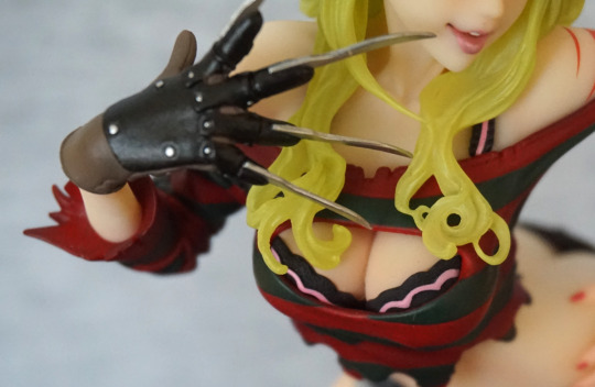
Her cleavage has been done well, and I like the cute bra under the top.
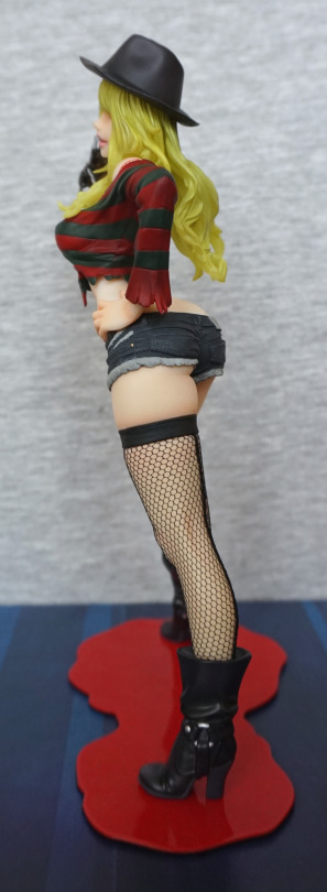
With her arm covering her back, she doesn’t look so broken. Love the dimple in the hat, and the strands in her hair. Her boots are also nicely sculpted, and I think they pulled the ring detail off well.
Stocking close-up:
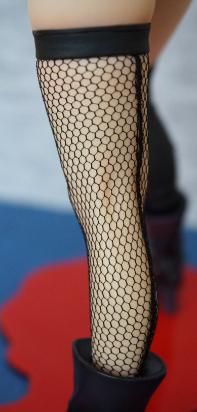
Her stocking looks especially good on this figure, and they’ve even included the stocking seam at the back, which I thought was a nice touch.
Right:
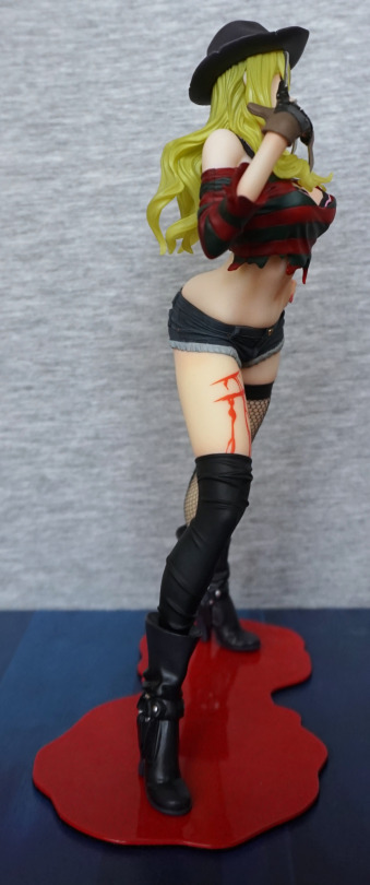
The blood effect isn’t terribly realistic, and could’ve done with a bit more shading to it. The flat red makes it look kinda bad imo. The shape of the paint works, but there’s no depth to the wound. I think a little bit of an edge would have helped.
Back:
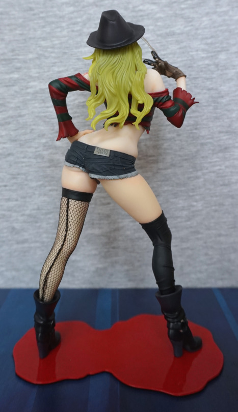
Again, lookin’ kinda bent. However, her back is otherwise sculpted well, and the shorts are really well done. Here the “off” hair shade shows up the most I think, and could’ve done with being a tad more yellow in my opinion. He doesn’t have any hair, so it would’ve been nice to give it a more complimentary shade now he has some.
Shorts close-up:
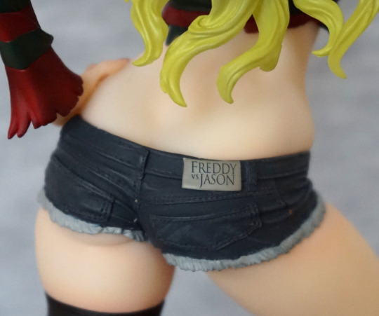
Love the logo on the back of the shorts! The detailing on these is nice, and the frayed jeans effect I think works here. The stitching has been detailed, which really adds to the realistic look.
Overall, I’m happy with this figure, and glad to have finally got around to getting it. I think the hair could’ve been done in a better colour, which is my main gripe. Seeing as I don’t move my figures around too much, I can display her at a favourable angle, so not too bothered about the oddly shaped back. I think it’d bother me more if it wasn’t for the hair though.
Now for the fourth and final Izuruha:
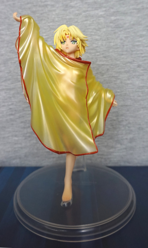
Clothed, her body shows through the clothes, and gives a good silhouette, without showing anything off. I like the more serious expression on this one, contrasting with the smiling one on the other figure.
Left:
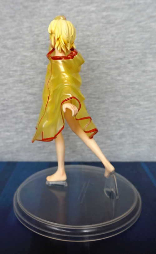
With this figure I had to heat up the legs on the stand – when I first tried to assemble it, the back leg was very far off from the back stand – hence why I’m fairly sure the arm has drooped some on yesterday’s figure.
Right:
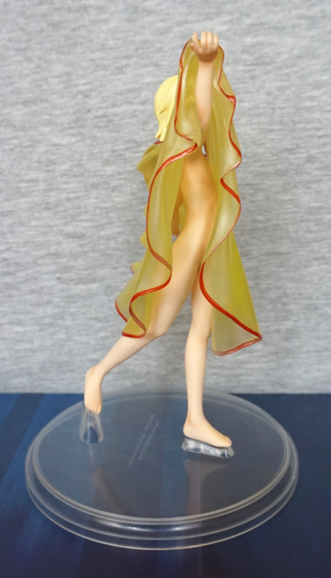
Here you get to see a lot of her body. Sneaky side view :).
Back:
The creases are well done in the clothing, and there is a hood evident too. Hair is also nicely sculpted. Overall, I think she looks good clothed, if this is your preferred option.
She does look somewhat younger than the other version, so I can imagine this not appealing to some people. Again, the body is well-sculpted and painted giving it a lifelike feel.
Left:
Again, the pose is fairly dynamic, giving a unique look to these figures. And look ma, no seams!
Right:
A bit of an interesting line from he leg to her stomach. Not quite sure that’s right, but it doesn’t look bad to me.
Back:
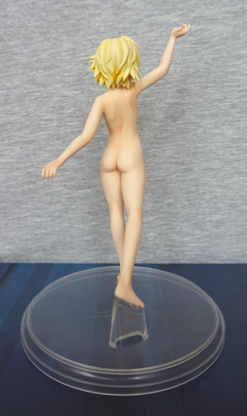
Again, hair is well-sculpted and shaded. She has a more slender frame on this figure, and the backside to match. I like the fact you can see her shoulderblades.
After getting the blue/grey pair, I decided to eventually pick up the golden pair.
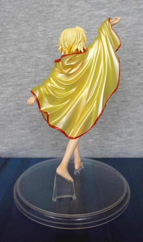
This blog will be about the Golden Diva version:
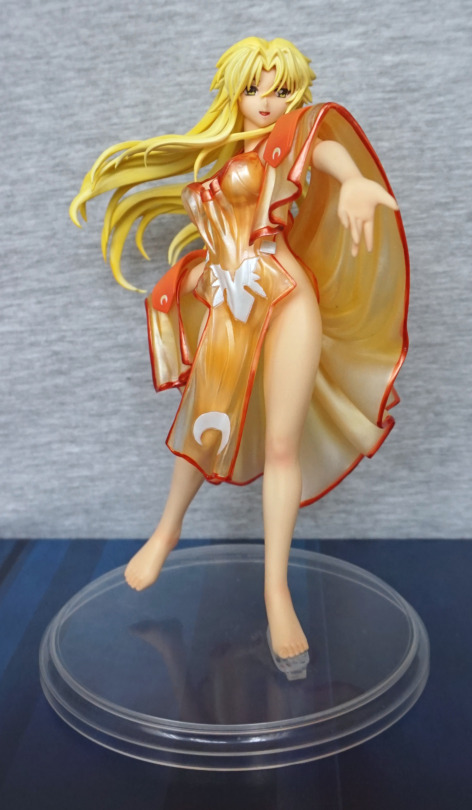
I didn’t quite get her robe back on quite right when taking these pics… The blonde/gold versions are certainly more colourful. The outfit is pretty, and her hair flows well.
Right:
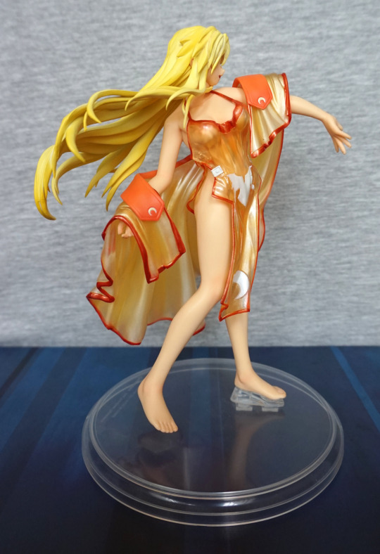
I like the pose of this figure, which is why I ended up getting a second one of her XD.
Back:
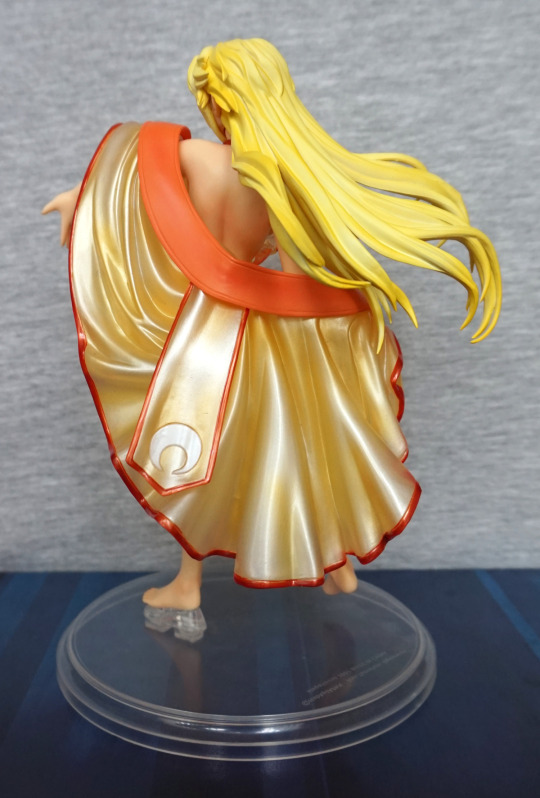
The robe does a good job of covering up the parts you may not want to see, if you prefer clothed figures, but leaves it so you can see her back, which has been sculpted well.
Now for the NSFW pictures.
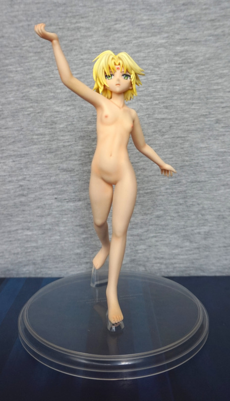
Front:
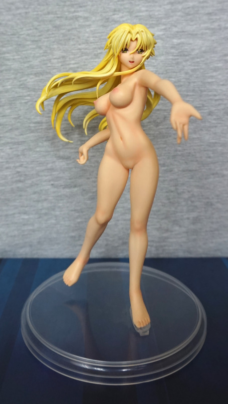
The painting on her body is really good and looks natural. The other nice thing about these figures is the bodies are one piece of PVC, so there are no seams. The head is a separate part, so there is a connection there, but not visible normally, with it being under her chin/hair.
Face/chest close-up:
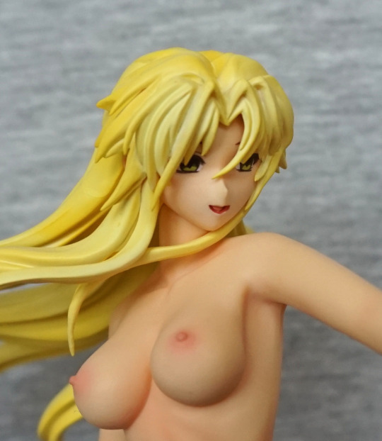
Her face has been painted well, but her nose is a bit pointy. Her chest is painted well, and looks realistic. I like the fact her chest isn’t comical sized.
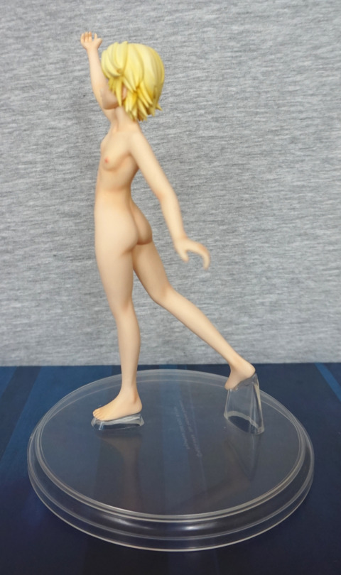
Left:
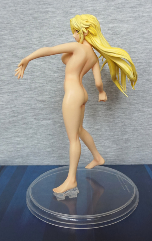
Her body is sculpted well, and the curves look good. The hair also has some nice highlights to it.
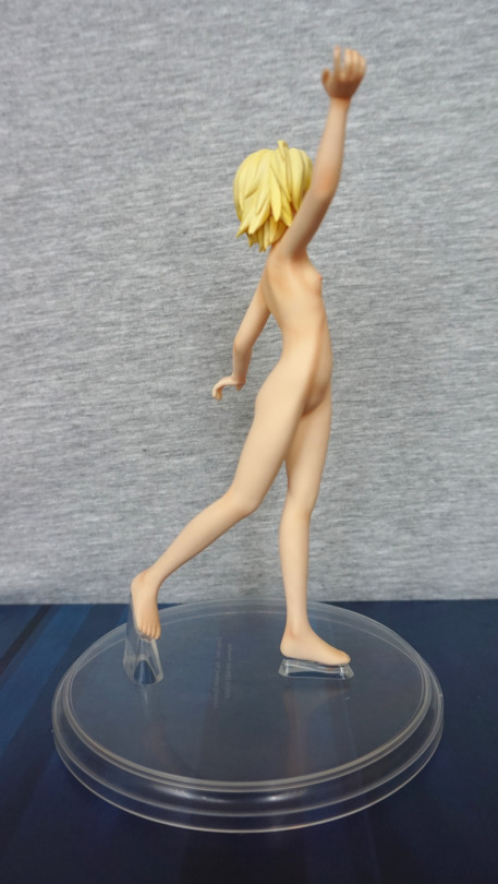
Right:
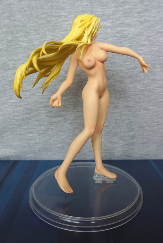
Her chest is probably most visible from this angle. I like the way the light works on this figure. I’m thinking her outstretched arm may have sagged a bit over time, and I may fix this at some point. I know from the next Izuruha figure I’ll be blogging about that these figures do bend a bit over time.
Back:
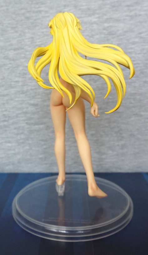
The hair looks nice from the back, and so does her backside. We can see that her ankles have been sculpted well too.
Overall, I really like these Izuruha figures, and this one isn’t an exception. If you like the figure (and not too bothered about source material – doesn’t seem like it’s something that’s particularly accessible outside of Japanese language things),I would recommend it.
Bought this figure from a store that sells gachapon/trading figures loose in small bags. Post tagged NSFW, as Sirene doesn’t know what clothes are.
So enjoy this SFW shot to start with:
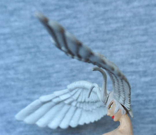
Her face looks OK from the side, but we can see my bugbear with this figure in the first shot… the head wings keep falling off :(. She’s a bit of a fall-to-bits figure, which is not really shown in the photos. At some point I may use some tack or glue to stick her together, if it gets too annoying.
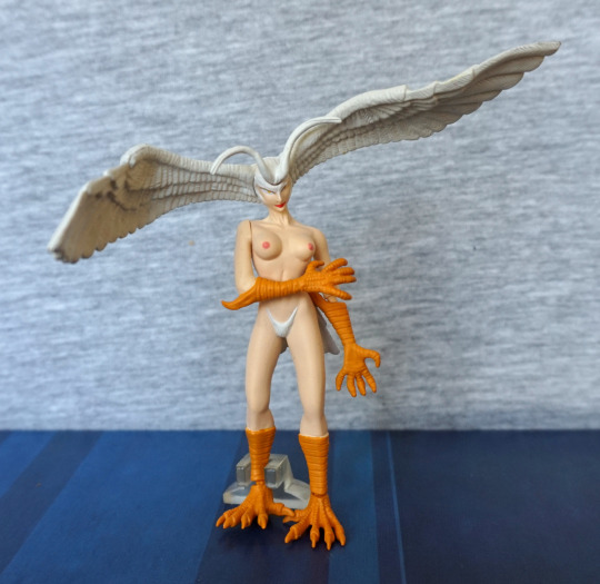
She comes with a little plastic stand to help her stay upright, but it does a mediocre job. The sculpting, however, is really nice – the wings are feathery, we can see her collarbones, and her forearms and shins are detailed. The paintwork is mostly neat, but leaves a bit to be desired in the shading department. Overall, this isn’t too bad as it is a small trading figure.
Face:
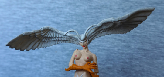
Here we can see the wings are well-textured, and her nipples well-defined. Her right arm can move around a bit, but it’s not meaningful movement – more of an artefact of assembly.
Left:
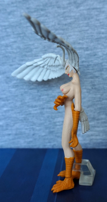
Her boobs are decently shaped, but maybe needed a bit more of an attachment to her body. The side crease seems to go a little high. Here we can see also where her arm has come slightly off from the peg.
Right:
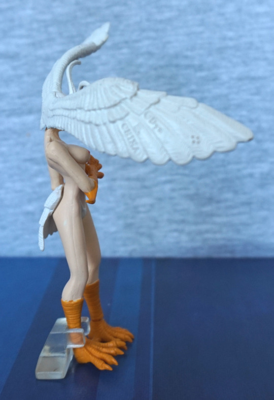
Some copyright notices here… and a seamline up her body. Her body feels a bit oddly shaped from this angle to me. Her feet are nicely sculpted though. Talons could’ve done with being painted black though.
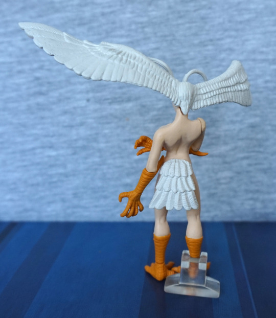
Her hair looks nice from the back, between the wings. Her tail looks odd, but that’s more to do with character design… Her shoulder blades look too flat, on the upper parts, but it’s nice to see some shape to her back.
Overall, it’s a fairly solid trading figure, if you can get it to not fall apart. Its flaws mostly seem to reside in making a small figure to a budget, so I’m happy with it. Might have to heat her legs to sort out her stance, though. And add something to her to stop parts falling off…
This was one figure I was planning to pick up prior to visiting Japan, after seeing it on the Mandarake website.
Here’s her upper half, in her clothed form:
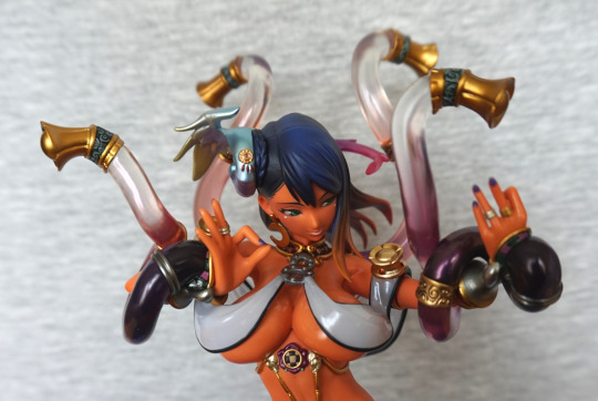
Even clothed, she’s not really that SFW, but we’ll get onto that in a minute. Her top sits nicely, and definitely looks like part of the figure when she’s wearing it, so her clothed option is definitely viable if you’re not so fond of having boobs hangin’ out. I love her four tentacles posed around her head, and her hands posed in a very dancer-ish way. I love the small details here – her rings and nail polish are both well done.
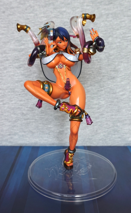
Yep. Nothin’ hanging out here at all. All good. Perfectly fine for the in-laws. Her body is well-sculpted and she has a range of details – from her shoes, to the bells on her thighs, and the gold beading encircling her lower body. Her hair also has a wonderful gradient in it, and the blending looks good.
Back:
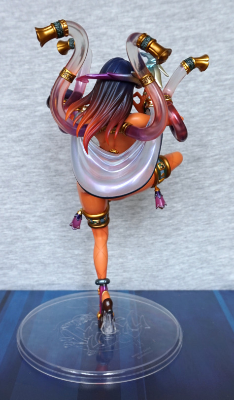
Here we can see where her headpiece reaches around the back of her head and also has a nice range of colour. Her hair gradient feels both subtle and vibrant. With her clothing, it dangles down and hides her bum from view. The clothing has a nice sheen to it, and I like the fact it is translucent. From this side, we can see her tentacles also have metal rings on them, which are nicely sculpted and painted.
Now for some disassembly:
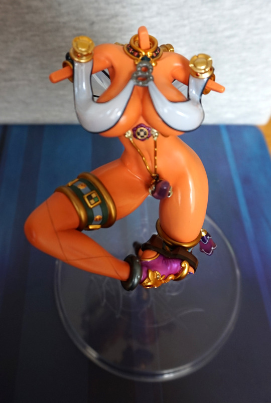
There’s a fair amount to disassemble here – both her arms, and the two tentacles that aren’t wrapper around her arms, plus her head.
After that, we can take her top off and begin reassembling her:
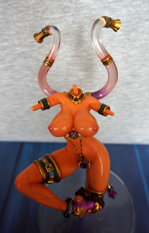
Aww, still looking a bit sad here.
Assembled:
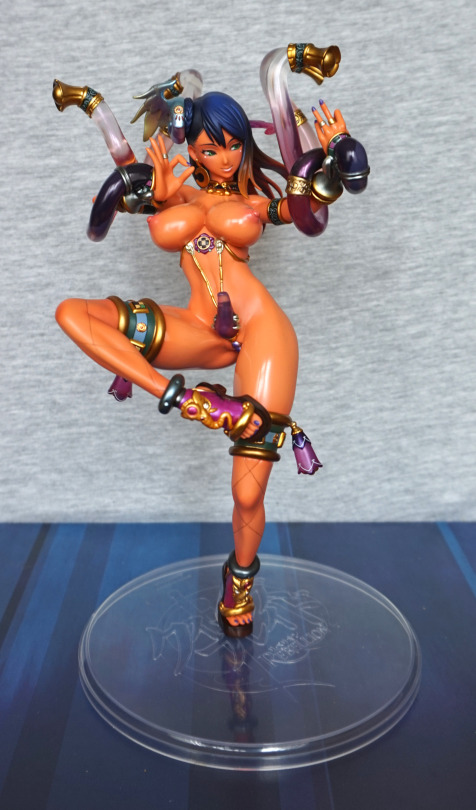
And this feels the way the figure has been designed to be displayed. Her pose somehow feels better like this to me. And the clear base definitely doesn’t do anything to distract the eye.
Face:
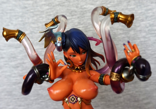
I like the way her nipples don’t have the severe shading a lot of other figures seem to have. This feels much more natural. Here we can also admire the fastener for the beads around her midriff, if you’re not too distracted by boobs.
Photo of her a bit less close:

Here we can see how two of the tentacles jut out from her arms, and are nicely curled around them. And her purple protrusion, that also acts as a clip for her body jewellery. Is it a penis? Is it not? Sources say no, but that doesn’t say it isn’t hangin’ out there like one. Nope, totally wasn’t this feature that attracted me to this figure. Not at all. Nope.
Legs:
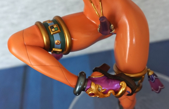
I love the amount of detail put into her shoe – from the vibrant, well-painted colours to the creasing down by the sole. The leg behind her fishnets feels a bit flat though, and some of her skin could do with a bit more shading imo.
Other leg:
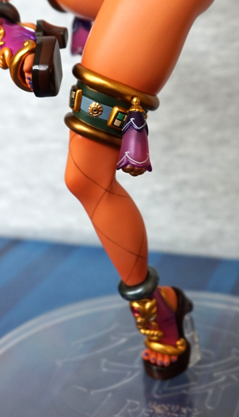
I like these small bells dangling down, and their flowery appearance. The top of her fishnets also is nicely coloured and designed. Some of the green paint didn’t quite reach the edges, but I feel this is a minor gripe.
“Flower”:
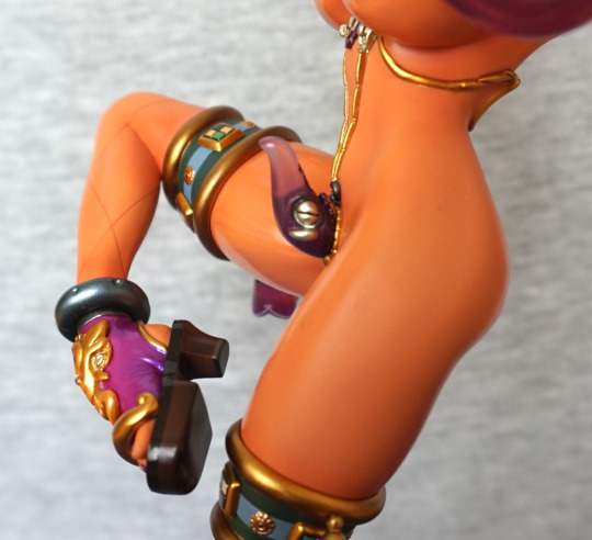
Clearly not a real one, but it definitely seems to be doing its job. The translucent plastic is nicely coloured.
Left:
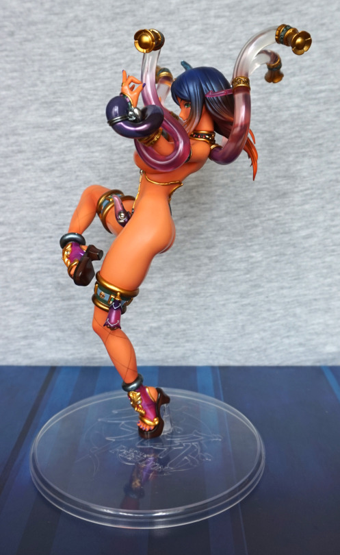
Her pose feels very dynamic from this angle, and she is quite a lithe body type.
Upper half:
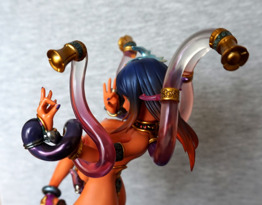
I like her neckpiece from this angle. and her hair’s pretty. The seamlines feel nicely hidden in her hair.
Right:
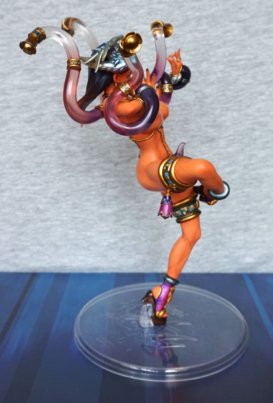
Maybe her leg is bulging a little bit too much here? The bell/flower on her leg dangles well, and feels correct for the pose.
Closeup on the hairpiece:
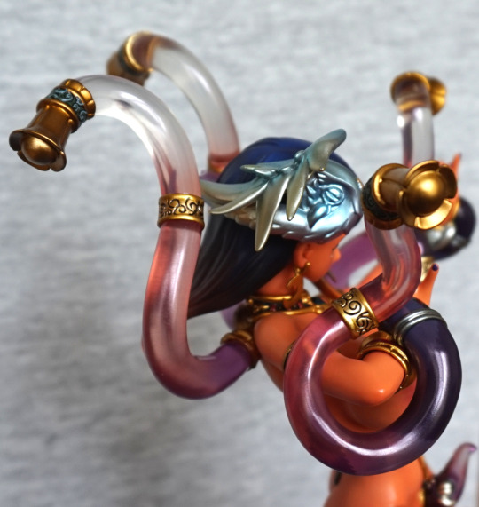
It’s not terribly easy to photo, but I love the greenish colours, and the metallic finish. She’s also got some moon earrings on, one of which can be see at this angle.
Back:
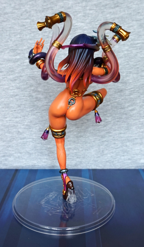
And here we can see her shapely backside. I love the way the jewellery has been don on her back, and finished the model nicely. Her hair is probably the most vibrant from this angle.
This is a character I decided I wanted a figure of… just because. Ended up coming across her whilst I was in Japan for a reasonable price, so picked her up:
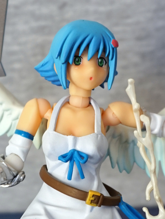
Starting with the face shot here, as the front shot features panties. Here she is, being surprised by spilling her milk. Here, the joints do look rather strange, but her face is cute, her hair is OK in the sculpt, but I’m seeing some stray bits of excess paint. And a bit of missing pink on her hair decoration. The neck strap on her dress looks overly industrial – I think this would’ve been improved by being thinner. Her belt is nice though, and the bow on her dress.
Front:
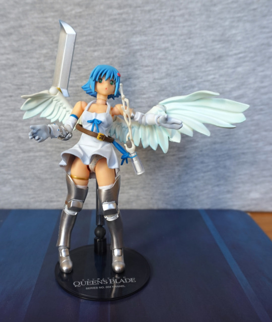
Here we see her uneven wings – at first I wasn’t sure if there was a piece missing, not being overly familiar with the character, and her having a joint where a wing piece could go. Found a pic of her “holding” her sword with her wing, so decided to replicate that. One thing that stands out to me is she does feel a bit overly chunky – her legs seem a bit too wide for her body. She does have a nice pair of panties though :P. Her top is nicely wrinkled, but again, feels a bit too thick of a material. Her milk bottle looks good, and has the equippable splash – you can choose if you have the milk splashing out or not. Though obviously there’s only one choice really.
Pantsu, seeing as we mentioned them:
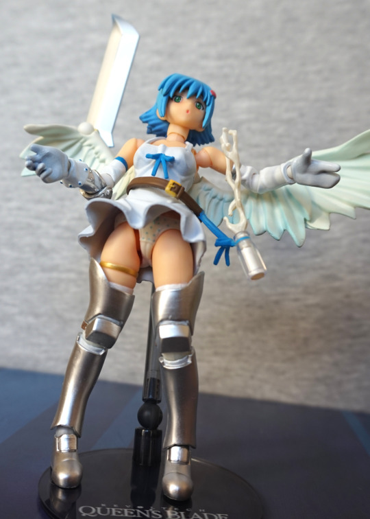
Enjoy.
Left:
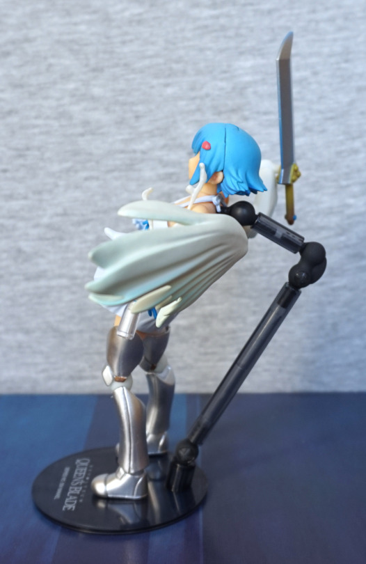
She naturally goes into a bit of a leaning-back pose, which fits with the milk splashing out at her. Silly angel, forgetting her bottle top! The base holds her well, but was a bit fiddly to set up. The writing is nice on the base, but a bit of a pain to get her standing so she wasn’t blocking it.
Right:
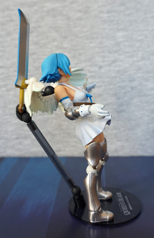
Obvious hair seam, as her fringe removes so you can change her face. She looks good from this side imo – everything looks to be painted nicely, and she looks less unnatural in shape. I prefer the hands where she has her fingers sculpted – in these shots, her left hand looks like it’s in a mitten.
Back:
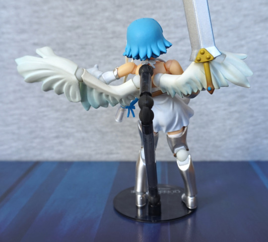
Hair looks overly simple from the back. Wings look OK, but a bit plain on the left wing.
Base:
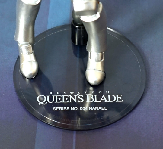
Here’s the base of the base. Writing looks OK, nothing special, but nice to have something to say what the character is. I like the transparent base effect, but the base itself could’ve done with a bit more weight on the bottom – a common theme with the old Revoltech bases is they easily tip over, as they’re top-heavy ><.
Accessories:
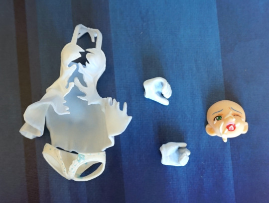
If you want her more nude, here are the ripped clothing options. Chose not to put them on her, as it looks like it was gonna be a bit of a lengthy process to do so. We also have some hands so she can hold her sword. And a face if you want her post-milking. I think this face has been well done, and I’ll probably switch to it at some point.
Overall, she’s an OK action figure. I think some better design decisions could’ve been taken, but there are slim-ish pickings as far as
Nanael
goes. Would recommend if you want a Nanael action figure.
This figure is now my largest scale figure – at 1/3.5 scale. Bit of an interesting choice there, but hey. I bought this figure from someone on MFC.
So here she is:
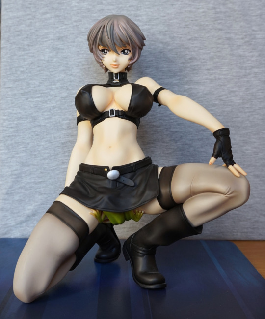
She’s immediately striking from her pose and size. She isn’t too tall as a figure, due to her kneeling pose. There’s no hiding her chest, lol.
Close-up of her face:
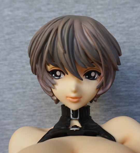
Her face feels a bit doll-like to me, and looks a little odd. Doesn’t help her eyes feel a little flat. She does have painted lips though, and I think her mouth looks good. Her hair is nicely shaded, and the strands sculpted well. The buckles on her collar are also painted and sculpted well.
Left:
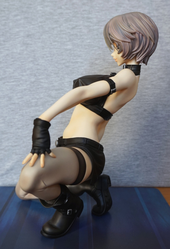
Looking at her from the side reveals she’s leaning backwards somewhat. The arm looks somewhat unnatural from this angle. The colours in her hair show up well from this angle too.
Right:
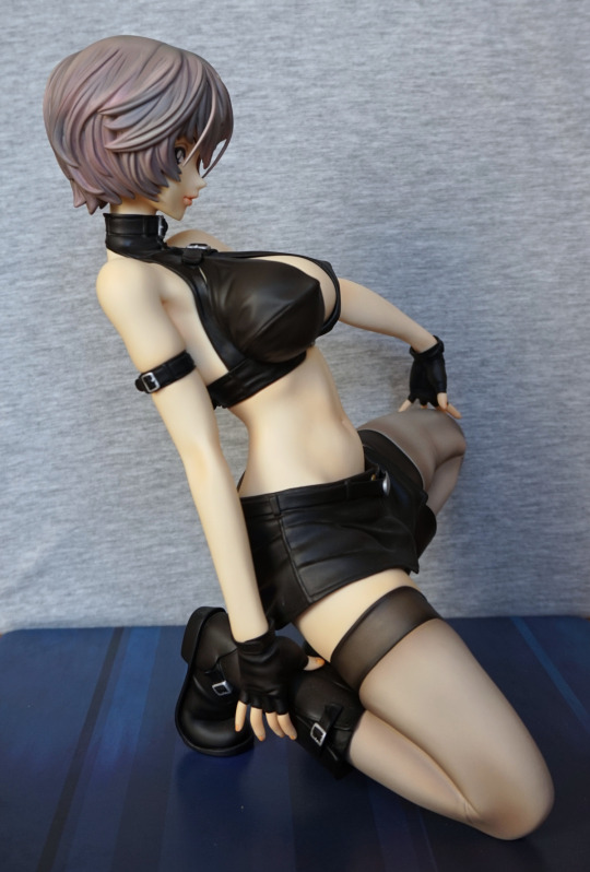
I think she looks more attractive from this side than the other. Her arms look less odd from this side, and we can see her body better. I like the amount of details that have gone into her clothes, especially considering she’s a cast-off. The seam-lines have been done in realistic places, and she has wrinkles in her skirt and top.
Back:
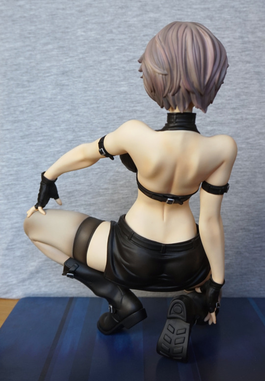
Here we can see the buckle that holds her top on. I like the way her boot is folded over where she is leaning on it. I think her spine crease is a bit severe, but her shoulder bones are sculpted well.
Frog:
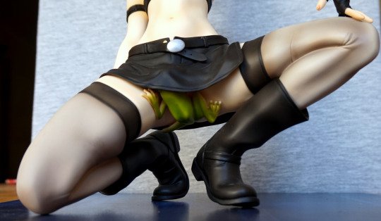
Yep, you read that right. She has this frog keeping things… kind of SFW? This frog doesn’t detach, but if you’re buying this figure, I’d ask why you would even want to, as it’s a highlight of the figure.
The clothed option I’d say is a viable one. Also, once you’ve sussed how to cast her on and off, it is reasonably easy to do.
Here are her clothes:
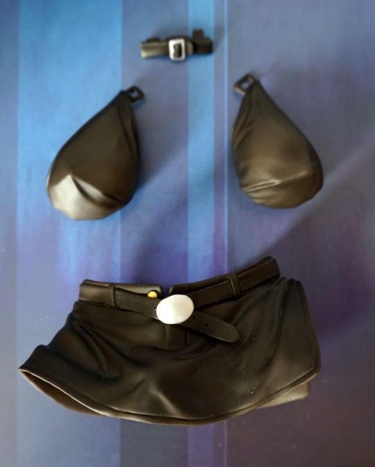
As we can see, they’re reasonably detailed and well-painted, in the small spots that have paint. But they’re rather the dust magnet, for being black.
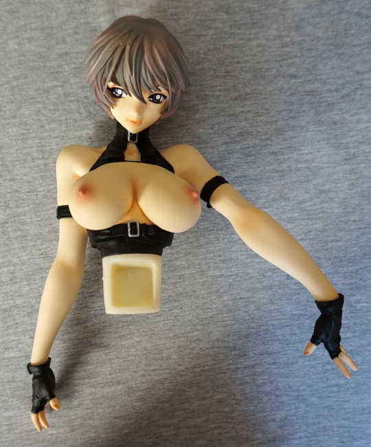
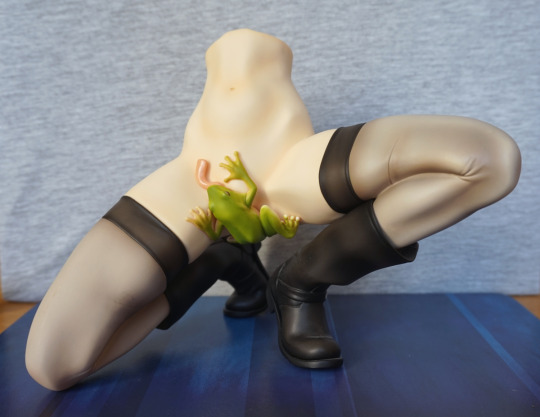
The upper half also has her collar off in the upper picture – this is how her top comes off. This collar can then be placed back on the figure, to mostly hide where her top comes off. The lug between the upper and lower halves is big, giving it a good, solid connection. It fits tightly, but not so tight that you can’t wiggle it out by hand.
So here she is, reassembled:
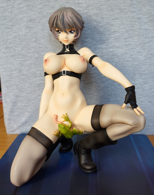
Her pose comes across as powerful and confident. I love the sculpting around her stomach area. Without the chest covering parts, her clothes become a small halter-top and a strap around her midriff. The gap does kind of show where the cups attach into the collar – that isn’t too well hidden.
Close-up of her chest:
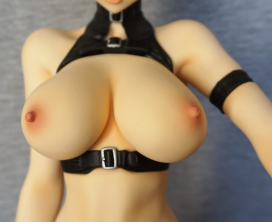
She has a nice pair of nipples. She’s large-chested, but doesn’t feel ridiculous. They’ve managed to keep them to a nice shape, that isn’t reminiscent of balloons.
Frog:
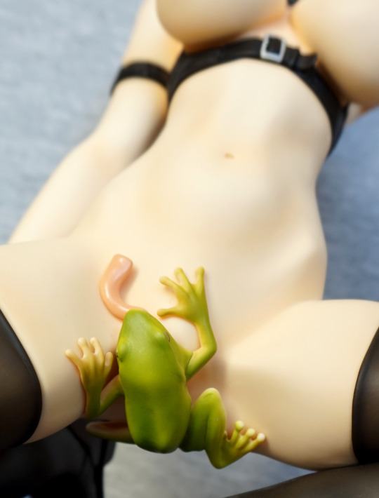
The frog is very nicely painted, and has a good amount of shading. I love the way his tongue is reaching up across her stomach, and he is in a good clinging pose. Some people have detached the frog from this figure, and apparently it isn’t detailed and sculpted underneath – things are pretty much frog-shaped, so I wouldn’t be tempted to do that.
Frog eye:
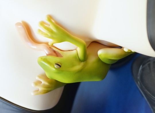
Here you can see the way she’s shaped to the frog. Here we can see the frog is lighter on the bottom than the top, and its eye. Eye isn’t very detailed, but does the job.
Left:
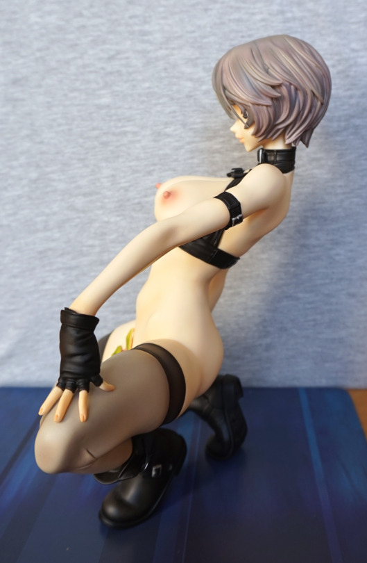
She looks nice from the side, apart from that arm still looks odd 😛
Right:
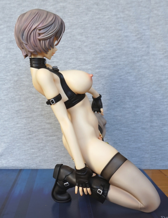
Here you get a good look at the side of her chest, and a bit of her backside. That’s one pointy nipple.
Back:
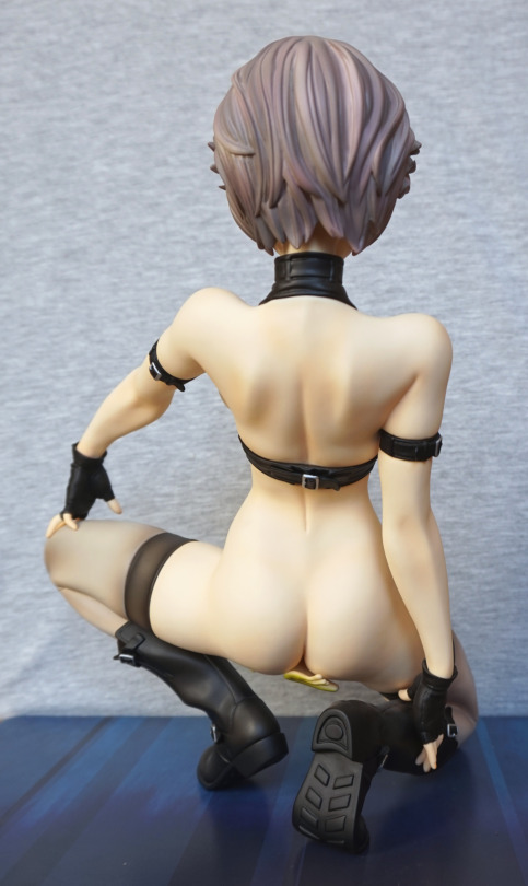
She has a nicely sculpted ass. I think she looks really good from the back, when cast-off.
Close-up of her boots:
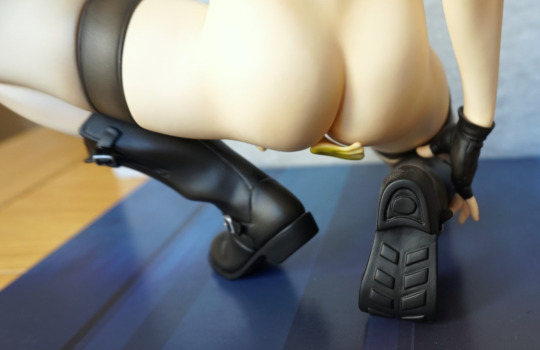
Love the distinct tread in her boots.
Boot side:
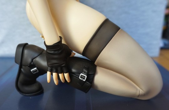
The boots are very nicely detailed – the buckles are really nice, and the boot not being fully tight gives it extra detail
Left glove:
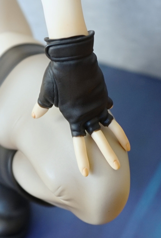
Her gloves are nice too, and look leathery. Plus there are some nice seam-lines on them, adding to the detail. However, looking close you can see where some paint has gone stray. She’s also got delicately painted nails, adding to the detail.
This figure was also waiting for me at home, from my holiday in Japan. Pre-ordered this one some time ago, as the chance of delay is very real with the companies that produce/distribute via GSC. However, amazingly, this one was released on time! And thus got to hang out in the parcel box until I returned home… This figure is of a younger character in a swimsuit, so flagged this as NSFW, though she’s not showing anything.
So let’s first check out the epic base she comes with:
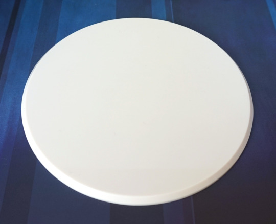
Yeah, uh, thanks Aquamarine.
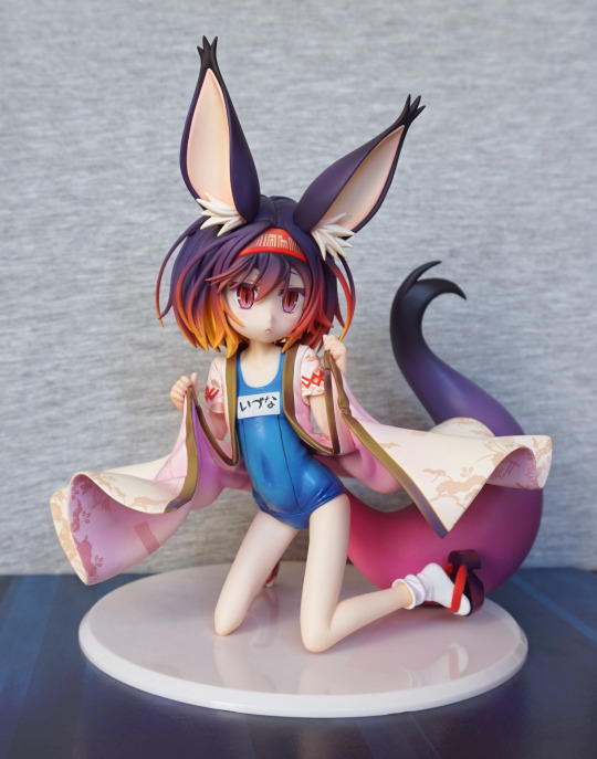
The first thing that stands out are the colours – they’re very vibrant, and do the anime justice. I’m very happy her hair came out vibrant, which is essential for a NGNL figure. The swimsuit is also slightly shiny, and that works really well too imo.
Close-up of her face:
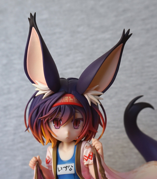
Her earls look really good, and her hairband has come out well. The hair paint blending stands up to close scrutiny too. Not a big fan of her expression, but it has been done well. I’d prefer it if she at least looked a little happy and not under duress.
Swimsuit:
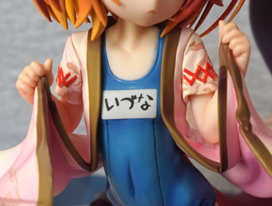
The details are really nice, as well as the contrasting finish, though the finish doesn’t show so much in this photo. The red details are painted as they’re moulded, but they do sort of suddenly end… which I find a little odd, but not a dealbreaker for me. Do think it would look better if they appeared to carry on underneath her arms.
Left:
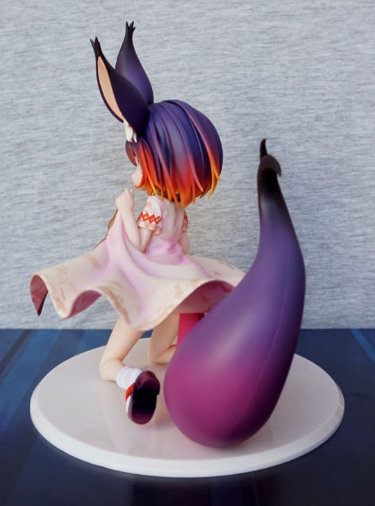
Here we can see her HUGE tail, which is very nicely painted, but does have a whacking great big seam mark down the middle of it. Would prefer it if that wasn’t there, but it doesn’t show from the front, thankfully.
Leg close-up:
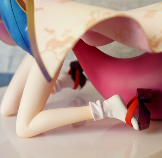
Her shoes are nicely done, as with the wrinkles in her socks. The base of her shoes is also done with a shiny finish, which gives them a look of quality.
Robe pattern:
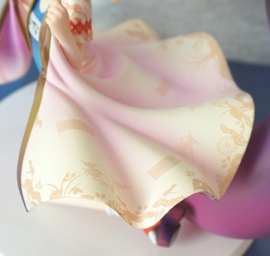
She has this detailed pattern on the top and the bottom of her robe. It looks really good, and helps this figure stand out from less expensive figures. The shading here is also lovely, and really helps to add depth.
Close-up of the shiny swimsuit:
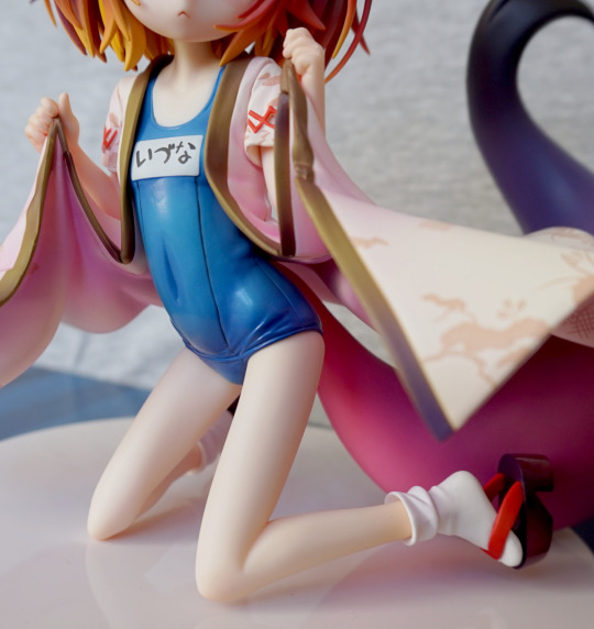
Here you can see where the light is being reflected off it, and the wrinkles that have been sculpted and shaded. I think the belly button is a bit overdone though, but this style seems pretty common on Japanese figures.
Right:
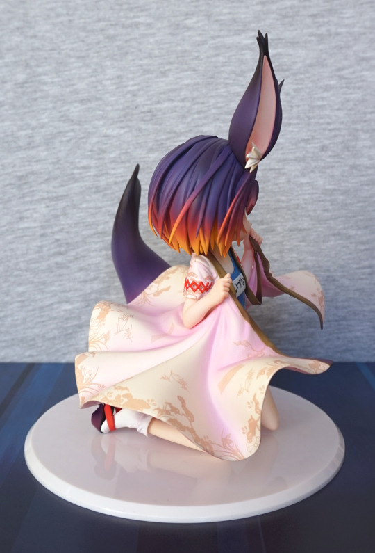
Hair still looking vibrant :). And more of the robe pattern. The red detail on her sleeves looks better like this, as you can’t see the odd termination.
Back:
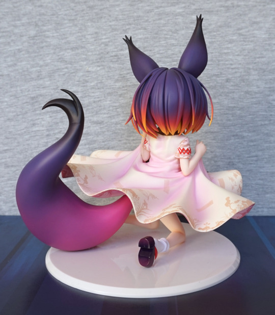
The shading from her hair and tail are both really visible here, and look great. You can also see shading on the base of her shoe and on the back of her ears. I love the way it’s all so smoothly blended.
Close-up of the tail tip:
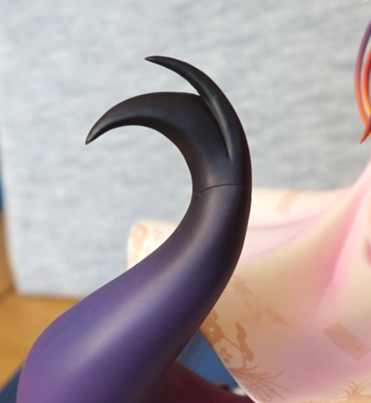
Yeah, this was the first seam mark I noticed. Really rather visible. Would’ve been nice if they could’ve done something about this to make it show up a bit less, but again, not visible from the front.
Back of her head:
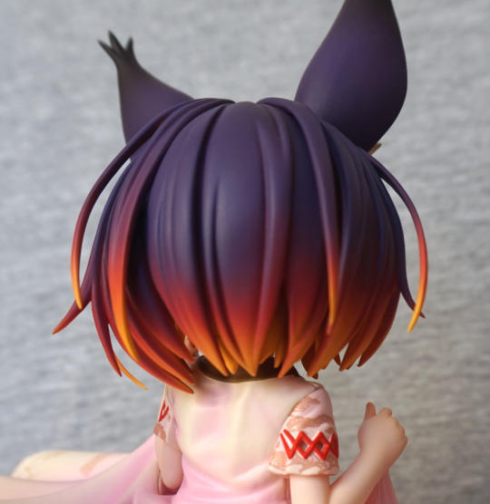
Just love the sunset colours.
Detail of the dress from underneath:
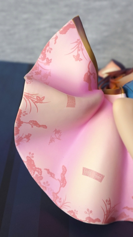
The edging is done really nicely in gold, plus this pattern printed throughout. Also the dress is shaded under here too, to emphasise the peaks and valleys in the fabric.
Seams in the robe:
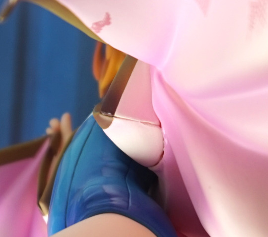
These are very visible if viewing the figure from beneath, as they’re pretty gappy. Kinda almost wants some filler in there… Again, it is a hidden seam, so you only really see it when you’re looking for it, but you do really see it if you look from the bottom imo.
So that limited edition I mentioned… it was still for sale at the retailer I found it at. So I decided to get that one too:
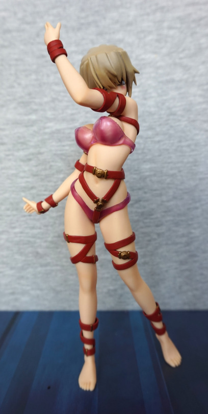
The translucent clothing on this one does more to hide her intimate areas. But still, doesn’t leave much to the imagination… The hair on this one also has the weird shape to hold the habit.
Face:
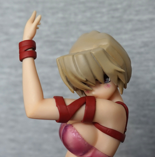
Again, her face is largely obscured by hair and her arm. However, she’s also got some blush on her cheek, which is a nice touch. The hair paint seems a little less messy on this one too.
Left:
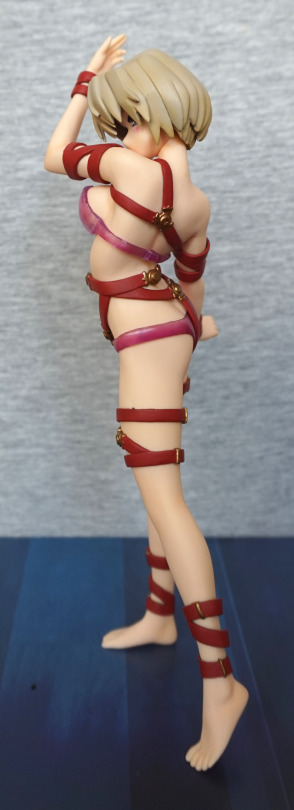
Yep, looks nice like the other one. Might not be too many words on this blog, as this one is a clone of the other. Her censoring clothing doesn’t match as well to her straps as the other one.
Right:
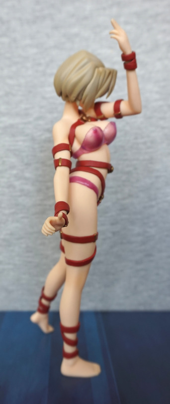
Back:
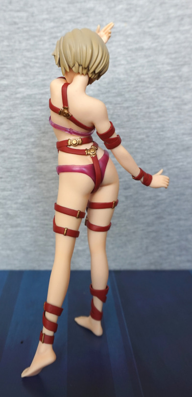
I think the gold and red works as well as the gold and black. I did wonder if it’d feel like it blended in too much or wouldn’t quite match, but I don’t feel that looking at the figure.
Base:
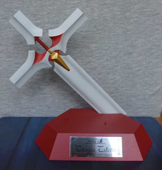
Here’s her base, which differs in the plaque saying “Theresa Tilette” and being red.
The other angles of the base are pretty much the same:
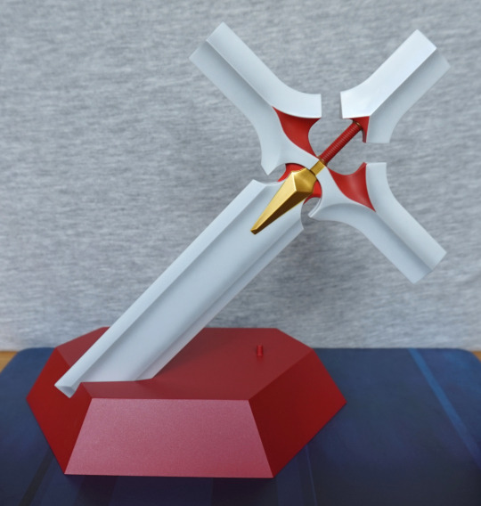
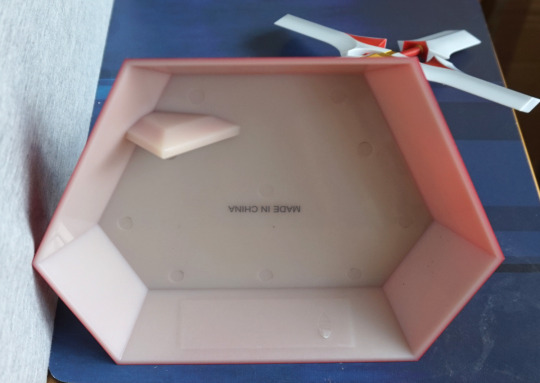
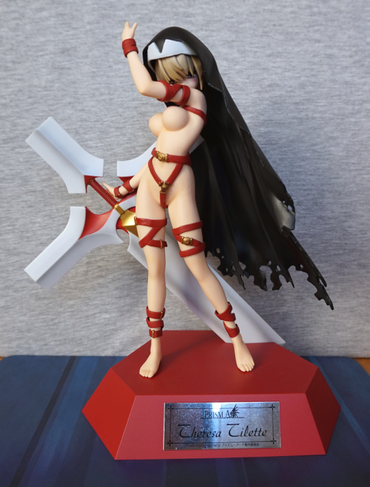
Looking impressive as the other one. The habit has the same flaws as the other one, and is identical. This one has more colour contrast, with having a red “outfit” rather than black.
Left:
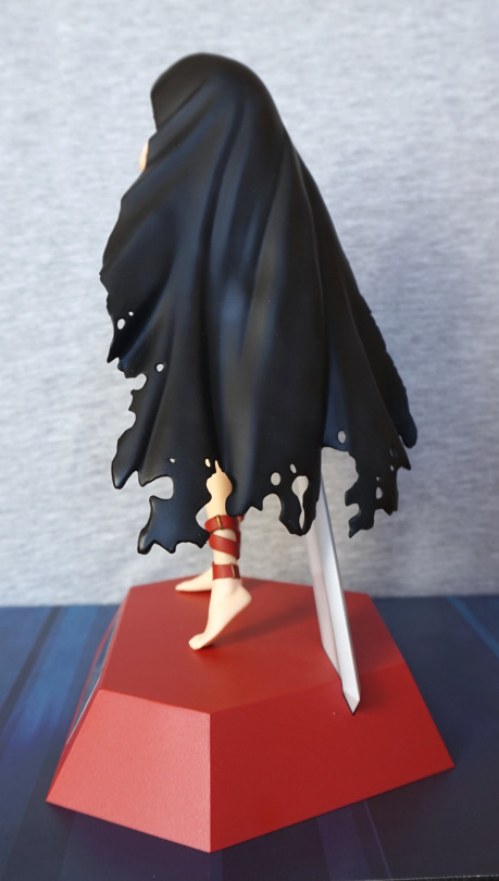
Mmm, bad habit…
Right:
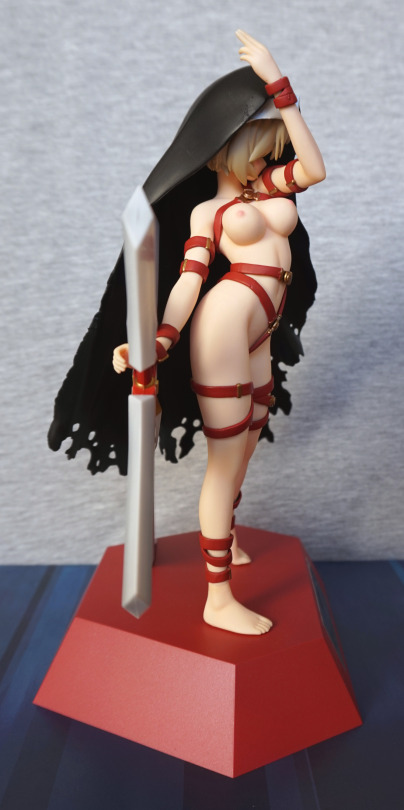
Yep, still rockin’ that nice body. Hand didn’t naturally go on quite as well as the other one, but isn’t really visible from the front. Could use some heat to move it, if I felt it needed moving.
Back:
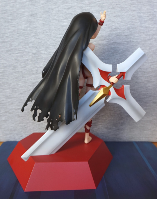
Again, same as the other one, but with more red.
I first saw the limited edition of this figure, but didn’t go for it. Then I came across this one for sale from someone I’ve traded with before on MFC, and decided to buy:
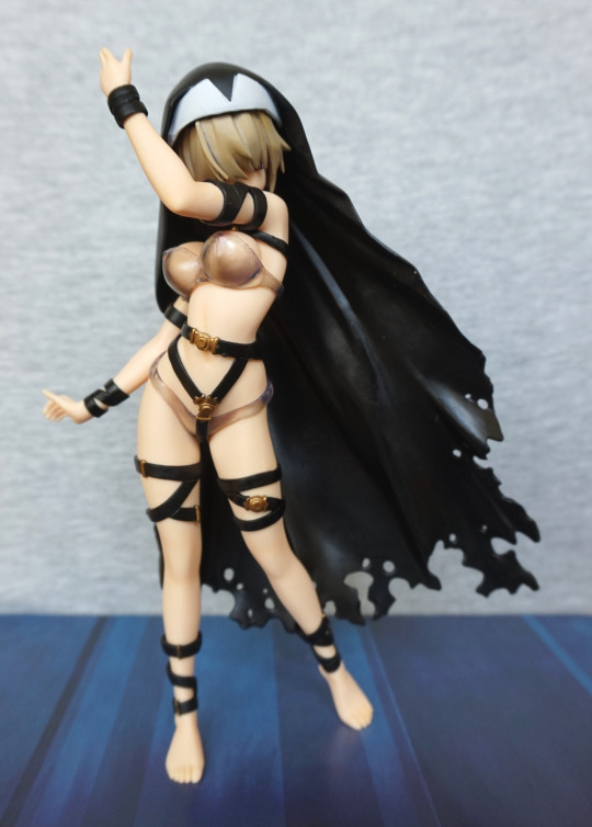
This is the figure with her ‘censors’ on, and her habit. Not sure that the ‘censoring’ clothing does much to hide anything though… She also comes with a stand, which will be shown later in this review. For the next few pictures, I’ll show her without her habit, so you can see the figure fully.
Here’s the same angle, without the habit:
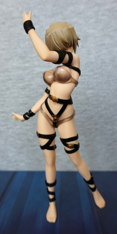
Without the habit, her hair looks strange, as it’s shaped to hold it on her head. The rest of her body looks nice though, with the straps adding much-needed detail.
Face:
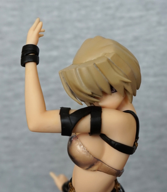
Her face is really hidden. Not too much of a fan of this design decision. We can also see where the hair wasn’t detailed, as when assembled it is hidden by the habit. I think it would’ve been nice if they did more with her hair so she could be displayed with or without the habit and still look good.
Left:
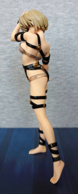
Here we can see she is posed quite well. I like the fact she balances well, even without the stand. I like the way she is twisting her body.
One seam is visible where her neck joins to her head, but the others can be hidden with the straps she is wearing. Here we can see the join on her left ankle, but move the strap slightly up and this would be concealed.
Right:
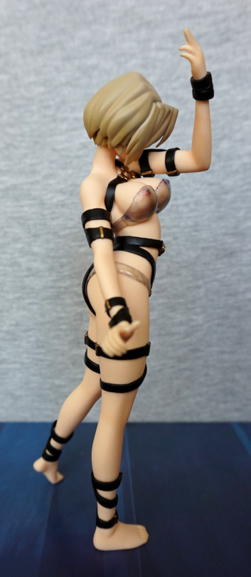
Not too much different to see on this side. Apart from the bra doesn’t do much to hide her nipples. Erm. I do love the straps that go around her body, and the gold clasps that compliment them.
Back:
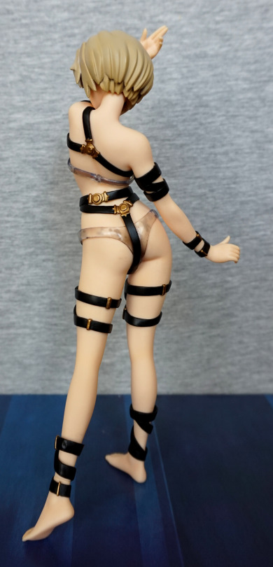
And the reason for taking these pictures without her habit. When it is on, you can’t see her back, however the back is finished nicely, with the clasps on her bands. Her hair looks less derpy like this too.
Back with the habit:
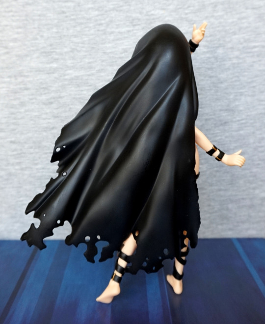
Here we can see what it covers. This piece is somewhat disappointing as it feels cheaper than the rest of the figure but it is pretty much a required part.
Let’s have a quick look at the stand before we assembled her and take off her censoring clothing:
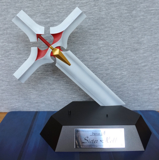
Ended up with a bit too much shine on the plaque there. That’s what I get for not having a proper setup 😄. The plaque is nice though. She has two pegs to solidly hold her on the base, and a large cross to hold. Her hand does go over the red handle part, but doesn’t clip on tightly, which probably does help with assembly. All in all, a very nice base. The cross-sword is painted well, with a good amount of shading.
Stand back:
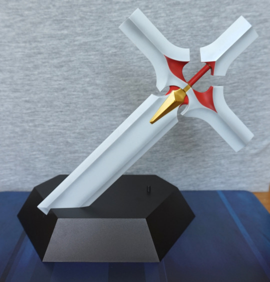
Looks good from this angle too.
Base of the base:
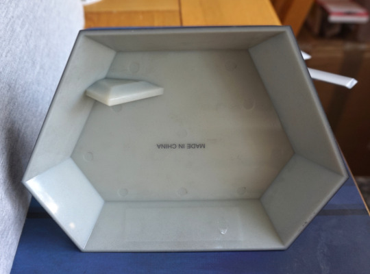
Not too much to see here. Just thr fact it was made in China and where the cross attaches into the base. I like the fact that there is goodly amount of corner here, as it means the cross on the stand is sturdily attached.
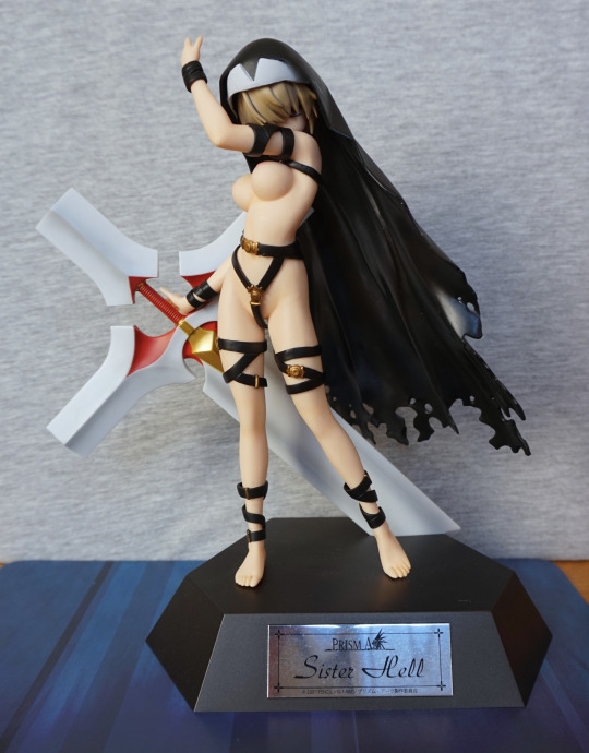
She’s a very striking figure imo. As these pictures were done on a different day, we can also see the plaque better here 😀. I feel her chest does defy gravity a bit, but not to the point it is bothersome. We can also see how she loosely holds the cross.
Casting her off is awkward – over time the plasticiser has come out of the transparent parts, so be prepared for that if you get this figure. The bra you may need a tool to poke out the ‘peg’ due to this. The knickers will need a good amount of heating so they can flex enough to come down over her legs. The bands around her waist have pegs, so can be taken off easily, to allow her knickers to slide off.
Once cast off, you will likely need to wash off the plasticiser – water may be sufficient, if not a bit of washing-up liquid should do the trick.
I don’t think she is designed to be reversibly cast-off, but it can be done, if you take the parts off carefully.
Face:
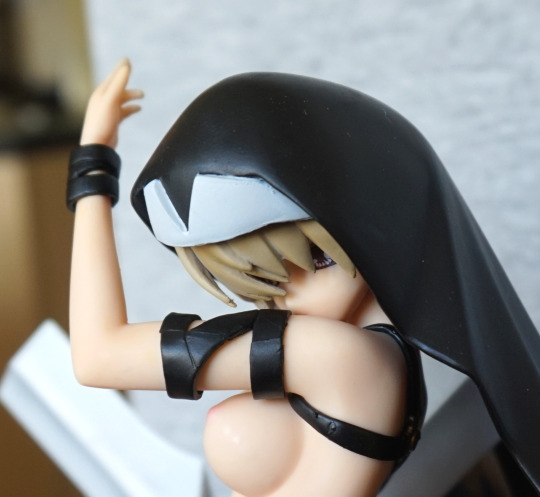
Here we get a better look at the front of the habit – sadly the white area is rather blobby, and doesn’t look cut well. Hair seems to suffer a little of this too. The habit is probably the most disappointing thing about this figure. If a bit of time and effort was put into the habit, I think it’d be a noticeable improvement.
Left:
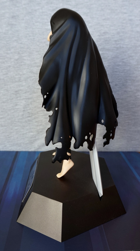
Her habit covers her up from this angle, so not much to see.
Right:
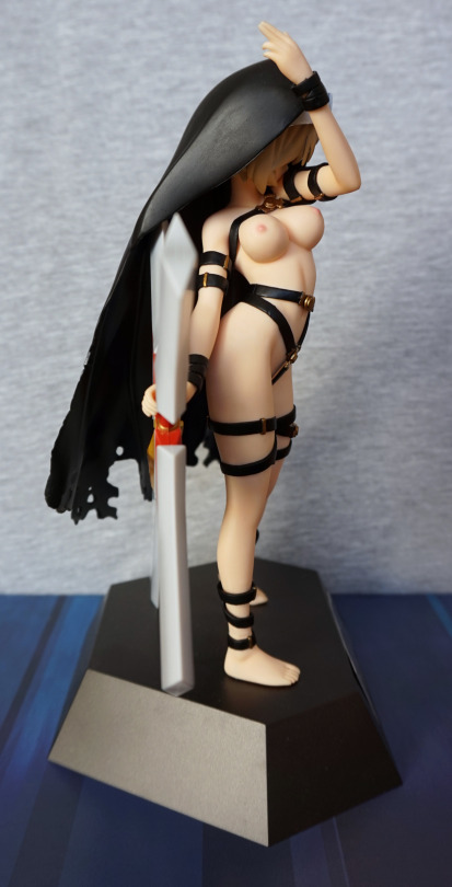
Here we can see her chest and stomach quite well. I like the way her nipples have been done – they stand out but aren’t over the top, as with a fair number of figures. They’re a pretty perky pair though. I like the way they have a ‘crease’ above her stomach, to give her body some definition.
Back:
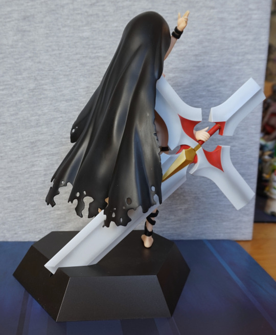
Does what it needs to do – the cross stops the figure from being totally plain at the back.
Overall, I really like this figure and glad I got it. However, the habit quality is an annoyance for me – wish she looked OK without it, or a bit more time and effort was put into making it look as nice as the rest of the figure. If you want to, you can leave the lower bands off of her body, but to me, she looks better aesthetically with them on. She does have sculpted genitals, which you can see if you look closely at the front shot with her cast off. Personally, I like what the bands add to her, so I’m unlikely to cast her off that far.
It’s hard to recommend this figure for a premium price, but if you can pick it up cheap, I think it’s a solid figure. Kinda wish she was easier to cast off, and more scope for putting her clothes back on, should one wish to.
This figure I purchased from Mandarake. Prior to purchasing, I was on and off considering buying her. I preferred the colour of the green one, so this was the one I chose to buy:
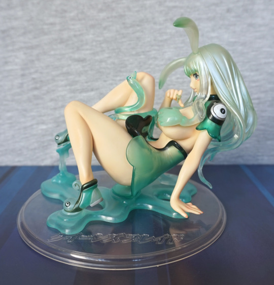
I like the shades in her hair and the green slime base. The clear disc is not attached to any part of the figure, so I don’t intend to use this to display her. It’s nice if you want a consistent round base to match with other figures, but personally I prefer her without.
Right:
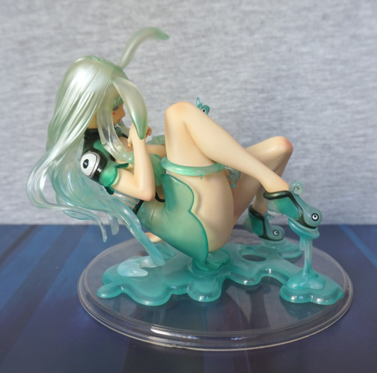
This side isn’t much of a viewing angle, as if hasn’t been designed to be so. We can see her cute slime slippers here, which I think look good and do a decent job of holding her to the slime stand.
Now for the reason I didn’t lead with the front shot:
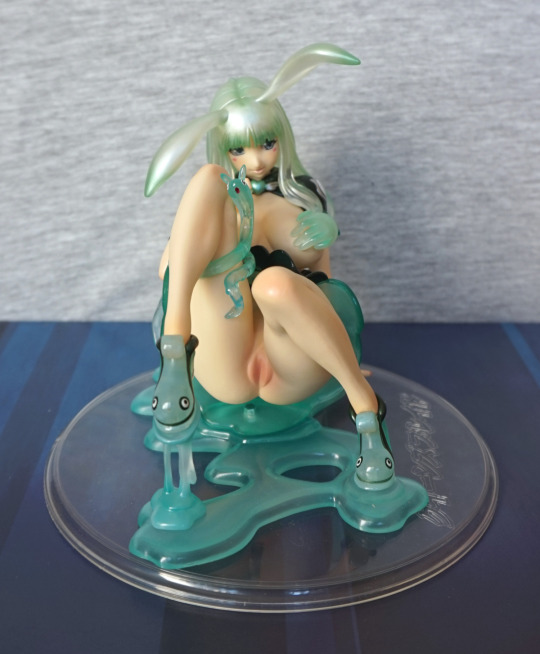
She does have a skirt part that covers her genitals, but it sort of pins in place so it was a bit awkward to reassemble, so I didn’t.
I think her face looks cute from this angle, and is one of the two main angles she looks good at.
Back:
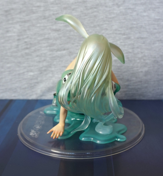
Here we can see the lovely gradient in her hair – I love this effect. She doesn’t quite rest on the stand, but later we’ll see how I get her to rest on there properly.
Upwards angle showing the back of the skirt:
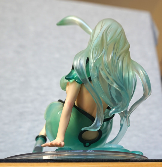
The skirt in of itself is quite pretty, but has design flaws. I like the way it looks from the back, with the hole.
The main skirt flaw:
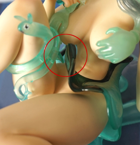
The skirt doesn’t fasten up well at all. These pegs give the feel that the skirt isn’t really much of a display option unless you don’t cast off your cast-off figures. I gave it a good go to fasten it again, but no dice. It is very hard to get into the gap to apply pressure.
Skirt separated:
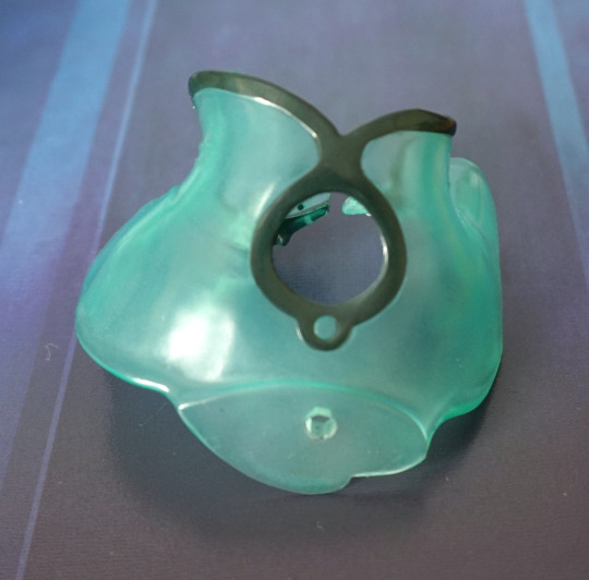
Here we can see where it attaches to the stand and gives her more support, which made it feel like a mandatory part. However, without it, she can place her hand in the dimple on the slime puddle, so this skirt can be an optional part. Am on the fence if it is supposed to be a mandatory part.
Melona cast off:
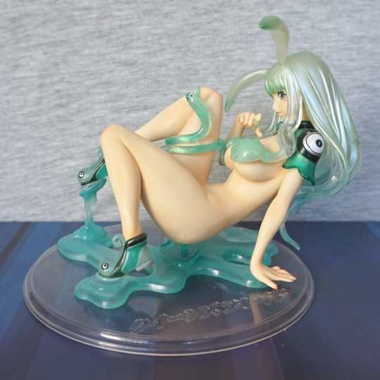
She looks nice from this angle, showing some skin. There is some shading detail on her skin, but it doesn’t feel like much. Having the peg in the slime puddle is a bit of an eyesore though. Would’ve been nice to be given a plastic piece to fit in there, though if you are looking at her from above, it isn’t visible really.
Slime close-up:
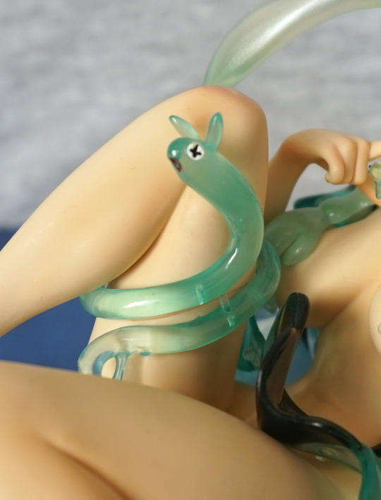
I like all these tiny slimes dotted around her body as different things. And this guy is cute, even if he isn’t functional. The green plastic does give off a slime ‘feel’.
Right:
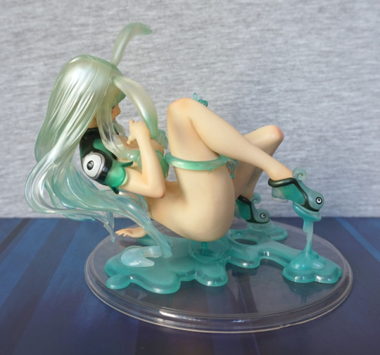
Not too much to see here still, though you now have the curve of her butt.
Back:
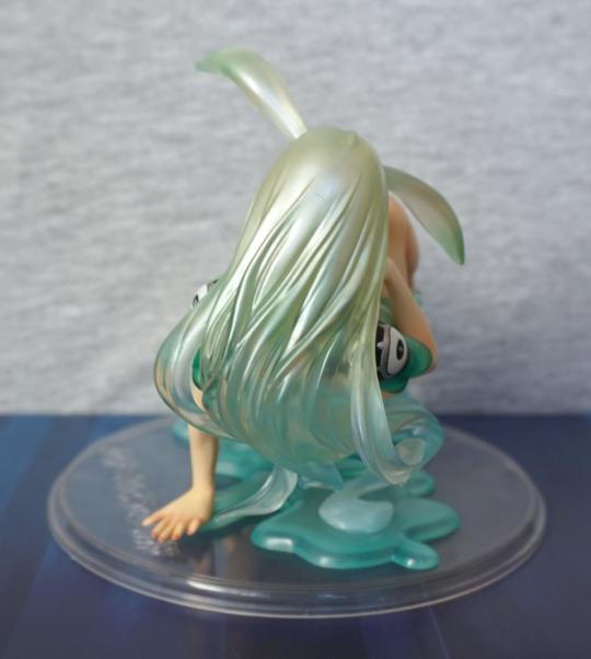
Yeah, barely me difference here, but now she rests her hand in the slime pool, which does look better.
Now the shot you may’ve been waiting for:
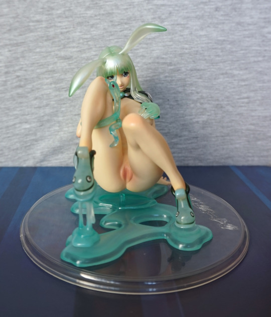
Melona without anythin’ on. Her genitals I find a bit on the strange side, but hey, she is a slime in humanoid form. Here is where most of the darker paint went on her body, though she does have some shading on her knees. And her cute smiling face shows above her legs.
You can reveal her breasts:
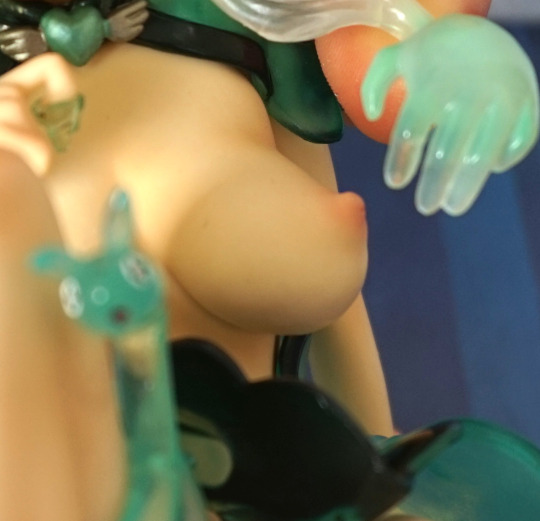
And to my surprise they were painted decently well, especially given they aren’t really designed to show. Her ‘hair’ isn’t removable, so the only way of seeing her chest is to bend her slime arms out of the way. They won’t stay there naturally, but I should imagine with heat you can get them to stay in a different position.
Overall I do rather like this figure, and think it met my expectations. This is an older figure, like the Rin Tohsaka figure I recently blogged about, and does show its age. I’d recommend this figure, if you like the look of her, though she may be hard to obtain.
Saw this in a collectables store, and simply had to buy it, seeing as it’s become topical again:
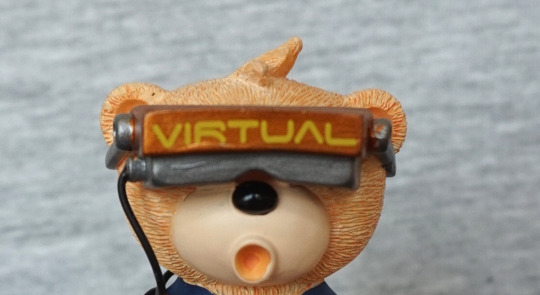
So what’s he surprised about, with his VR? Is it Skyrim?
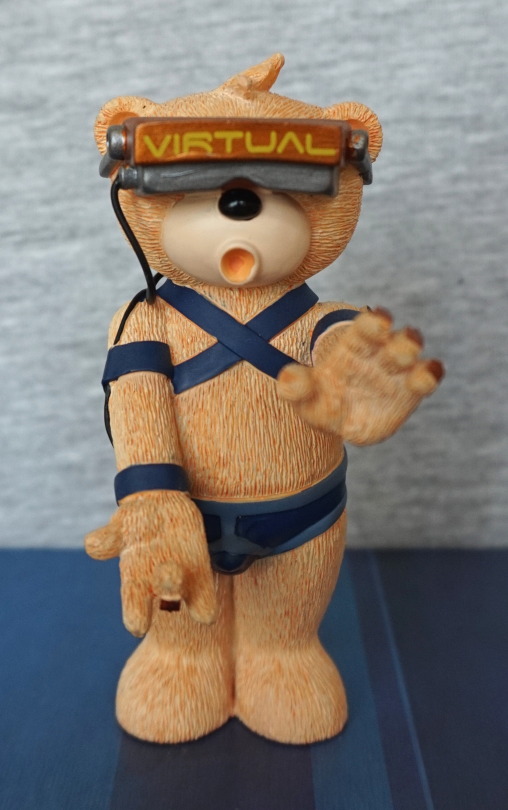
Ah, probably not Skyrim…. maybe Witcher?
Left:
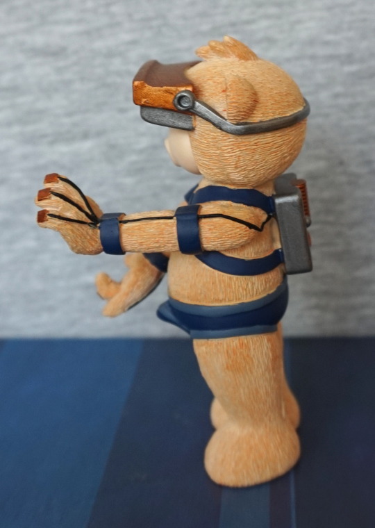
Here we see the haptic feedback system. We’re not here yet, but hopefully we won’t need to wear a large “backpack” when we do get there… However, it looks like it works well, judging by a certain part of the sculpt. Some bits of stray paint, but nothing too significant.
Right:
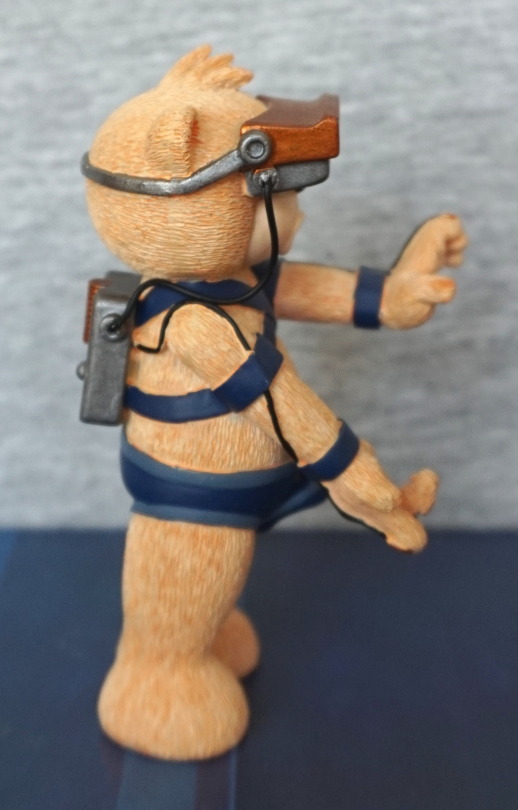
Pretty much the same story as the left, but there’s a bit more of the black wires that haven’t been painted properly. It doesn’t show too much, but it’s pretty obvious if you’re looking closely at it. Having one of the wires as a real wire is a nice touch though.
Back:
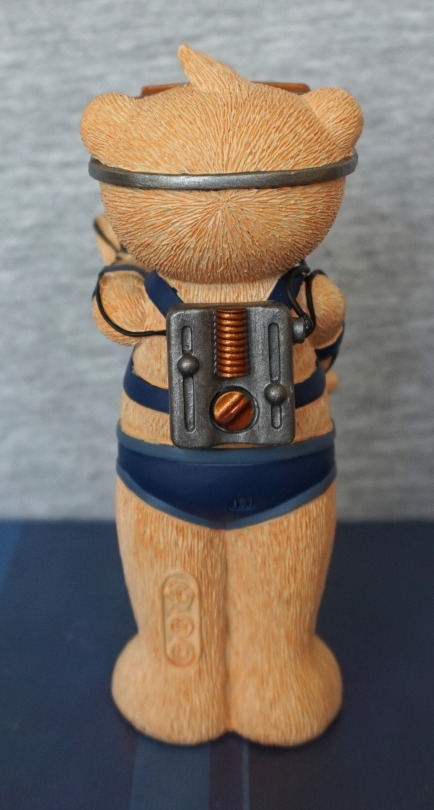
Ah, VR as imagined in the early 2000s. Such an industrial-looking box. Should imagine these days, it’d be a sleek black box. Maybe even teadrop-shaped.
Top:
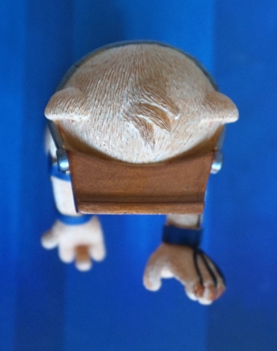
At first, I thought this was way too fat, but on reflect, I think it’s fairly comparable to a Rift/Vive.
Overall, I like this bear. The sculpting is good, and the subject is amusing. However, the painting is a bit lacking in a couple of places, which brings it down a bit. Now to see what the actual future brings for VR!
This figure I got super-cheap as the owner no longer had her box, and has glued her to the base, due to the fact she had a wobbling issue. This figure is cast-off, which will be shown in this blog, hence the NSFW tag.
She displays just fine, so the issues aren’t an issue for me:
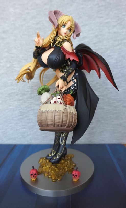
The rest of the photos won’t feature the basket, as it’s pretty easy to knock out of her hand (… and I forgot to bring it downstairs for the first few pics I took…).
Here’s the veggies up close:
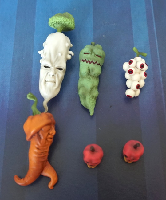
Tis a mean-looking set of veggies! I don’t think I will eat these…
Mammon with her full base:
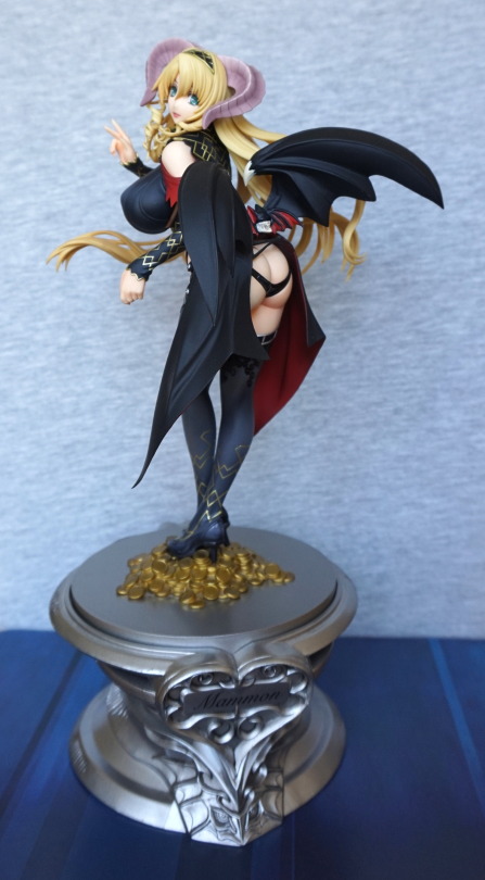
This base allows her to stand at the back of a shelf and remain visible :). But you can display her as per the first pic, if she has too much height.
Close-up of the “Mammon” side of the base:
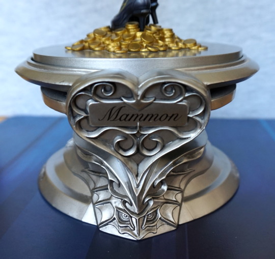
And the other side, which tells you what sin she is:
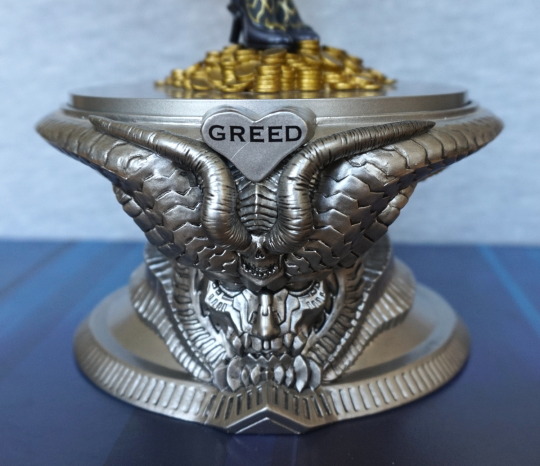
Bit of a scratch on the base on the “GREED” heart, but it isn’t too bad. Love the horned demon o this side of the base.
Base from the top:
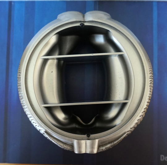
Is a large thing, the two dark dots top and bottom are pegs that go into the upper base. As these are evenly spaced, you can pick which side of this base is facing forward (Greed or Mammon).
Close-up of the part of the base she stands on:
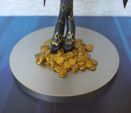
Coins being the perfect companion to greed. The gold lines on her legs are really nicely done and sharp.
Front:
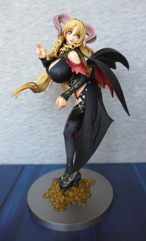
She has a very nicely sculpted and painted face, nicely framed by her horns. I love the way her hair curls at the front, though the complexity of her hair does make her assembly a bit awkward when casting her off. The gold lines on her clothing offer a good amount of contrast and give a more sophisticated feel to the figure. The black print on her stockings is also crisp and stands out well.
Left:
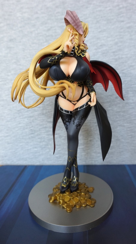
Left… or is it front? Because here you have a lot of front! Here you can see the black print better, and the shading in her stockings. They’ve also put a heart in her thong, which is a nice attention to detail. Her cast-off clothes look really good imo – some cast-off figures have the issue that the clothes look a little iffy. but here they are shaded and have hidden connectors.
Right:
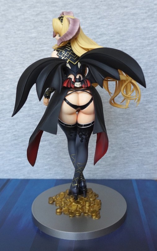
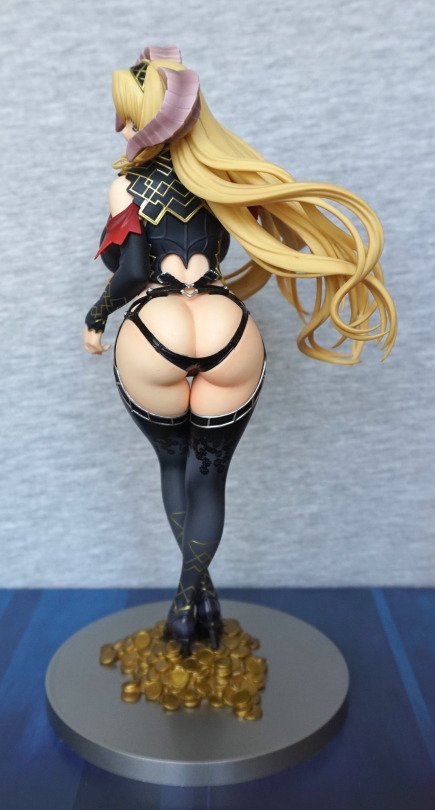
Love the little bat above her backside :). She has the wings every succubus should have, though these are detachable. Her cape nicely frames her shapely backside.
Back:
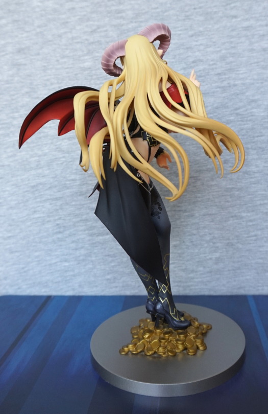
Here you can see the sheer amount of hair she has. They’ve gone to a fair amount of trouble to sculpt all these strands, and I think it has paid off. We can see some of the underside colouring of her wing too, which is a reasonably vibrant red. Her horns are also shaded, which is evident here.
Underside of the wings and cape:
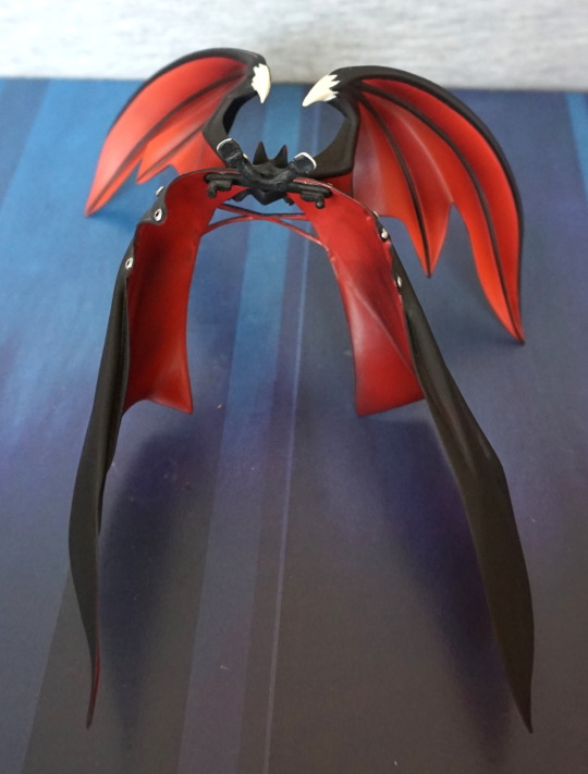
Love the red and black contrast under here.
Close-up of the bat:
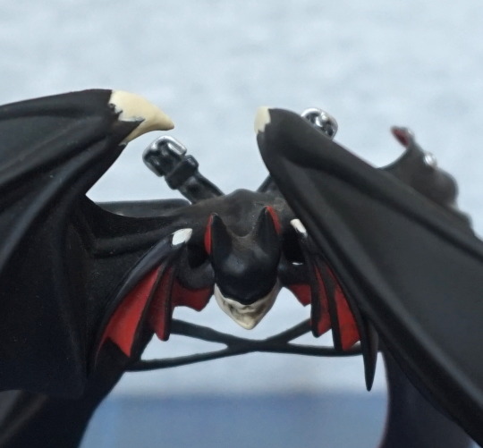
Some of the paint has gone a bit walkies on this part – little bit evident on the claw and I think the bat face a bit. Still love this little detail.
She also comes with the strap part shown above, if you want a clearer view of her backside, or just don’t like your women winged. This strap forms a heart with the top of her dress, ad has a little heart-shaped ring to join the straps together.
Close-up of the straps:
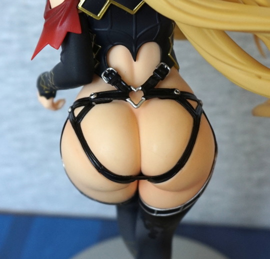
All the small details here were well thought out.
Now for some less-dressed shots.
Casting her off:
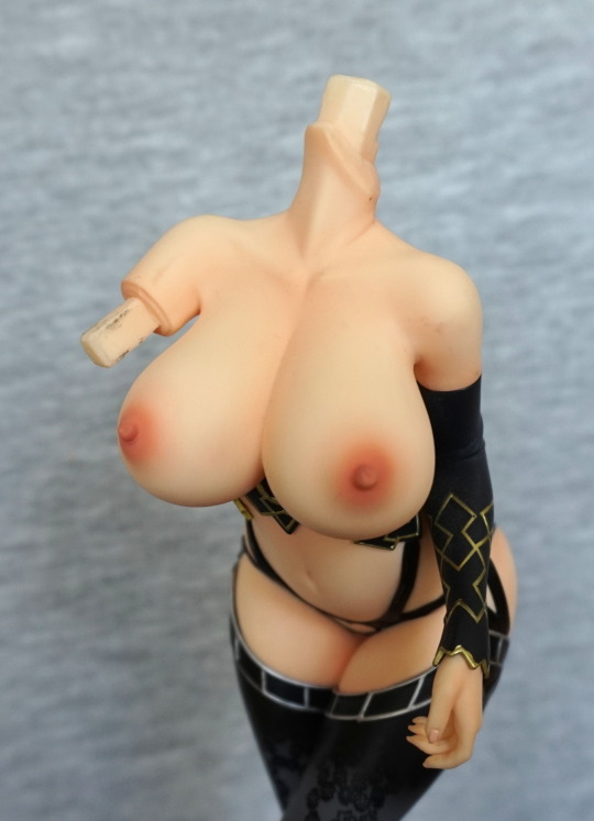
Her head and right arm come off, which allows you to remove the clothing on her shoulders, and her top. The top is three pieces which fasten together – the two boob cups, and a part which clips to her neck.
As her shoulder clothing piece comes off, you have a few choices in terms of dress level:
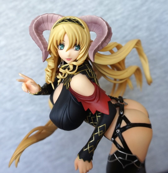
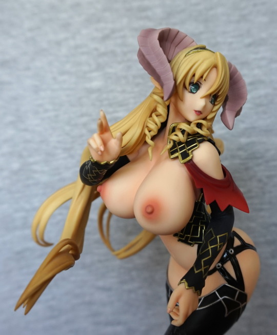
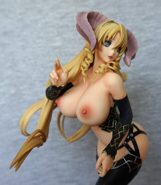
I personally think she looks best with her top off, but her shoulder piece on, which is the middle of these three shots.
Cast-off, no wings:
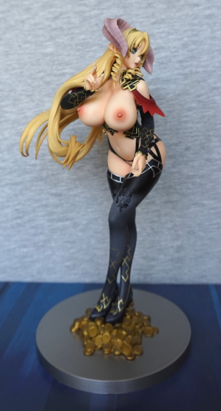
If you want a view of all the assets. I think the colour is a little too strong on the nipples, but it works.
My preferred level of cast-off:
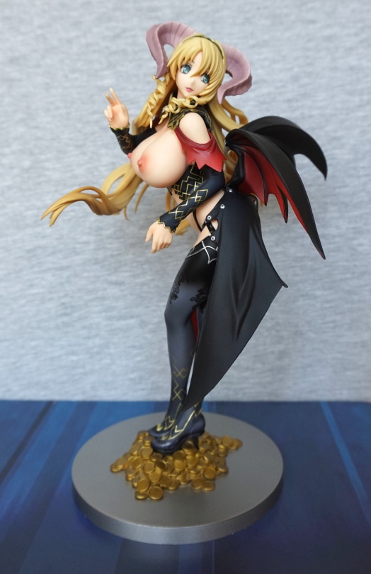
Yeah, gotta have the wings!
This figure is a futanari figure, so this is definitely a NSFW blog.
So let’s start with a SFW pic:
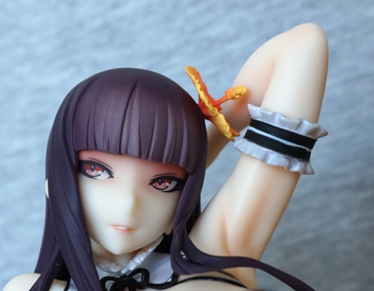
She has a very cute face, that has been well-painted. Love the shading underneath her fringe, and the slight smile.
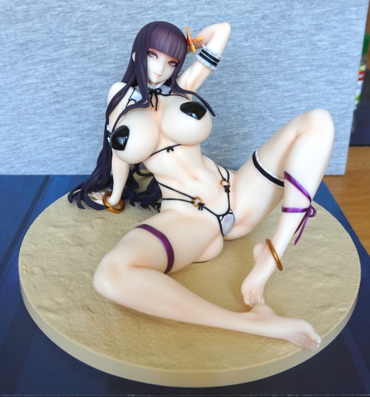
The pasties covering her nipples are made out of metal, and she has magnets in her boobs. This makes them stay put, yet be easy to take off and put on. I like this! This figure benefits from strong lighting – her skin is quite plain, as far as paint jobs go, but in the light, it adds a fair amount of natural shadow, as seein in the pic. I love the shiny purple of her ribbons, and the methods used to hide the figure’s seamlines.
Dva’s base:
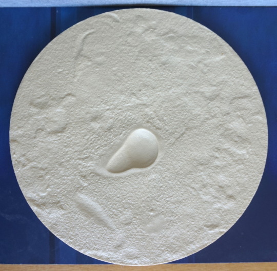
This thing is big. Takes up most of a shelf of a detolf cabinet… The texture’s nice, and the butt divot does help keep her in place, but there’s no shading in the paint. Fortunately Dva mostly covers it, so it isn’t too much of an eyesore. And she certainly is a distraction, lol.
Close-up of her with the pasties:
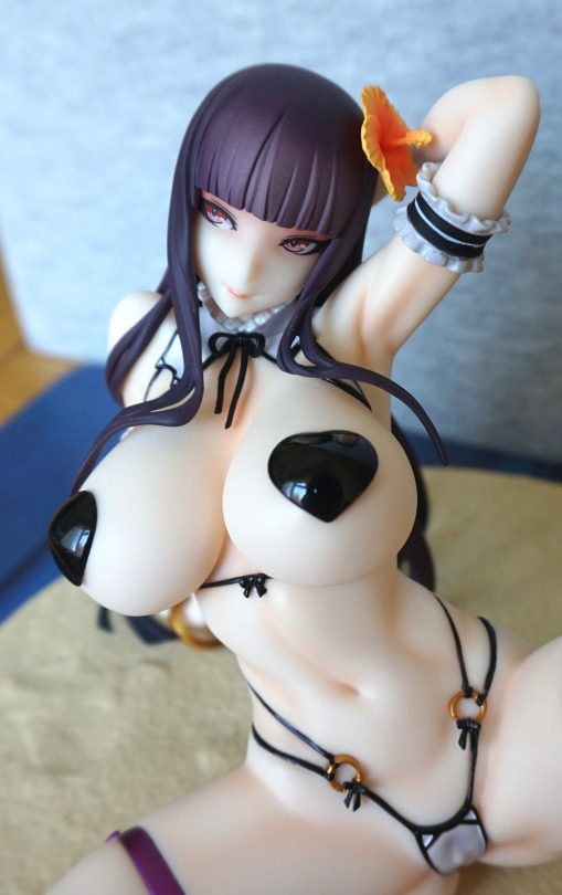
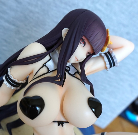
The paint appears to be thickly applied, and is a good, solid layer. Also shiny, which makes them nice, if you’d like to display her with them.
Here she is without her pasties:
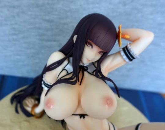
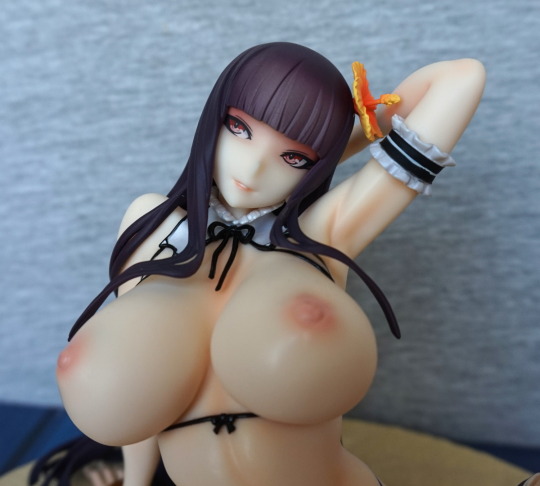
Yep, those look like a pair of nipples on a couple o’ melons. They’re big, but somehow don’t look ridiculous like some anime figures can do.
Close-up on the flower in her hair:
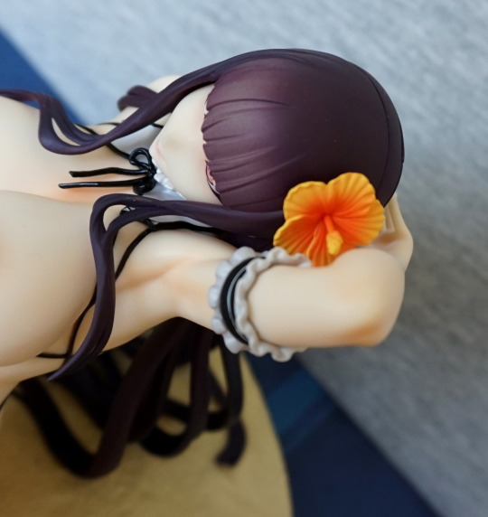
Nice, vibrant colours, that contrast well with her hair.
Let’s look at her different downstairs options, before looking at the rest of her in detail.
First up, if you want to keep her 100% woman:
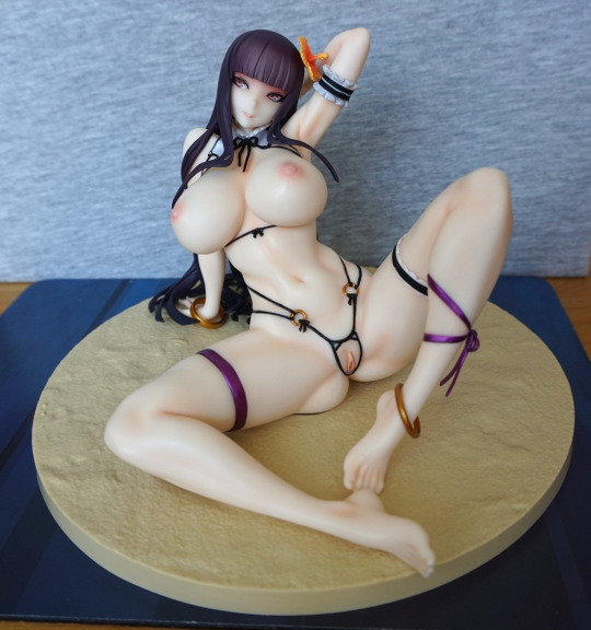
Just the string, with some well-sculpted inner female parts. Not sure if she has a labia majora?
If you want her to be futanari but not have everything on show:
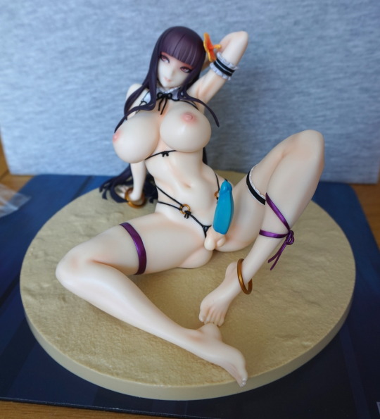
You get this option, where she has a bright blue condom. The condom has a moulded ridge at the bottom, so it doesn’t appear painted on, which I thought was a nice touch.
And for the full futanari effect:
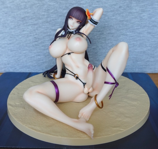
One member please! It does have a particularly dark tip to it, which is a bit odd, but I honestly don’t mind it. Is a bit of an odd choice, but hey. Does ensure it contrasts strongly with her body and doesn’t blend in with it, from a front-on view.
With this part, there is a labia minora visible underneath:
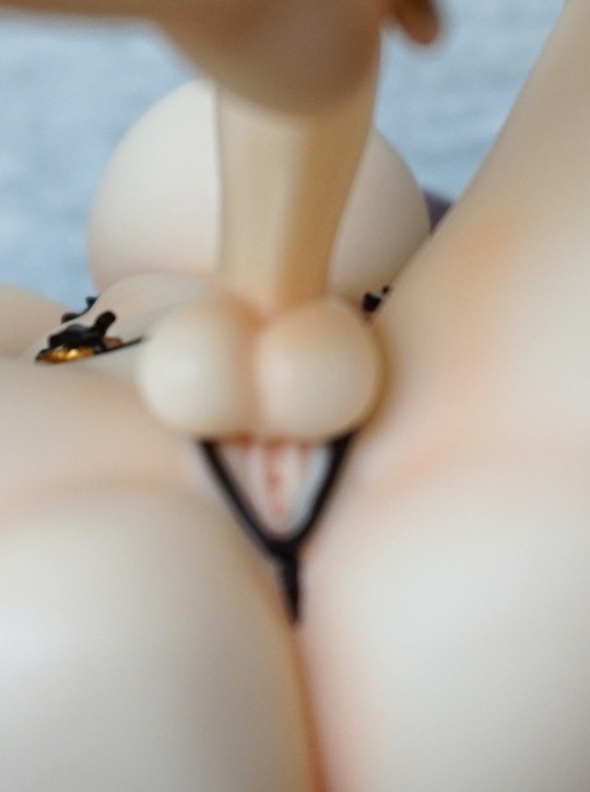
S’cuse the blurry shot. Was trying to hold her and focus the camera at the same time… maybe I should’ve taken the part off first. But I think this shot gets across what’s there, though it really isn’t visible when she’s on display.
Close-up of her left leg:
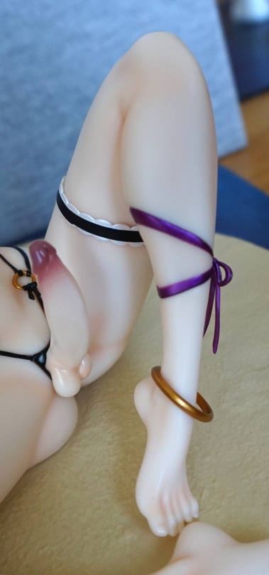
I love the purple bows – the shiny purple is a lovely colour. The bottom part of her leg detaches, so you can slip the golden ring onto her ankle. The golden rings are packed separately in the box, so no need to worry about paint transfer.
Right leg:
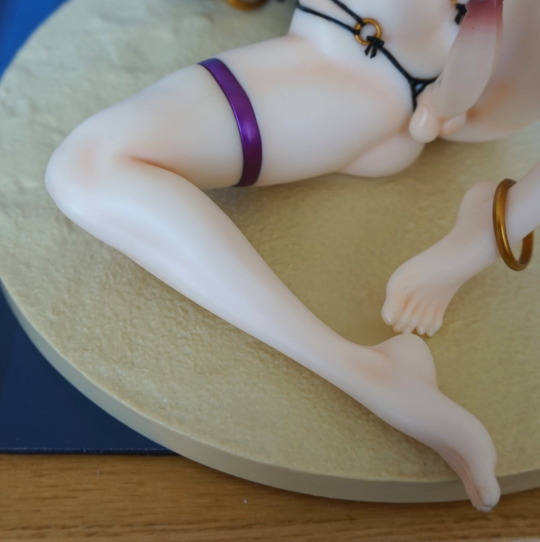
One nicely sculpted leg. Not much to say about this one. Some suggestions of shading in the paint, but not a lot.
Midsection:
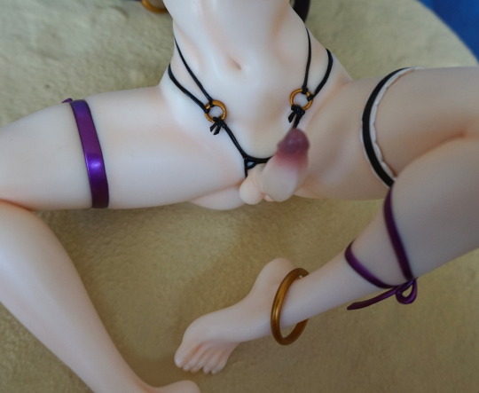
Yeah, this shot for your work PC wallpaper :P. The strings are nicely moulded, and slightly dig into her flesh. Hate it when they overdo it with the tightness, but I think this is a nice balance. The gold rings are also painted well, without stray paint.
Left:
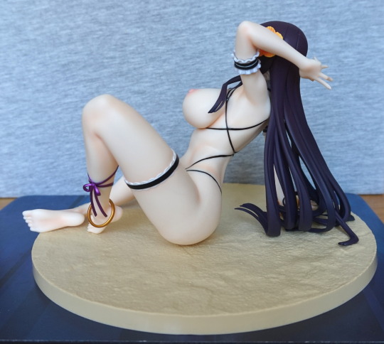
Here we can see she is arching her back slightly. Nothing too strenuous. The ribbon on her leg hangs down nicely.
Close-up of her side:
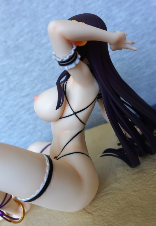
The black strings are neatly painted.
Right:
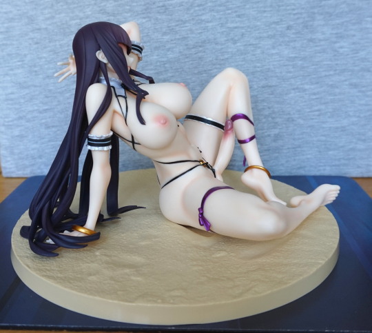
Here we can see where she’s resting her hand behind her, and the subtle shading in her hair.
Close-up of her arm:
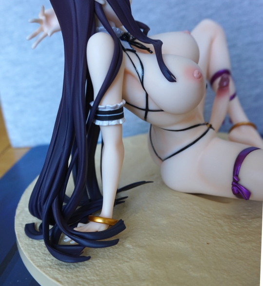
The band is nicely placed on her arm, and here is the other bangle you can place on her, if you’d like. Her lower arm detaches, so you can slip this on easily. Some people have complained her hand doesn’t lean on the base, but for mine, it does to some extent, and looks fine from the front.
Close-up of the bangle:
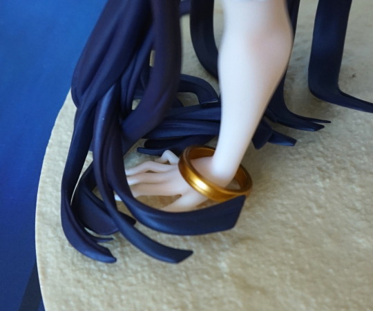
Shiny 🙂 Here you can see where her hand does touch a bit to one side, but not so much in the middle.
Back:
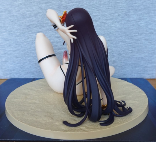
Yeah, bit of a seam visible here, but I love the gradient in her hair. And a nice shot of the penis :P.
Lastly, here’s a shot of one of the penises not attached:
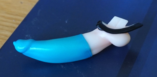
This peg simply plugs into the front of her, and the pieces stay there snugly. The penises are easy to remove, but the female parts are a bit of a pain to get out. Was able to do it with a fingernail from the bottom point. Once you’ve loosened them a bit, they’re easy to pull out. With the snug fit though, it does make the thong/genitalia parts look seamless though, which is good.
This isn’t a series I’m familiar with, I saw the figure, and liked it, so decided to bid on it. Not sure why I didn’t check the Mandarake store, but I could’ve got it for the same price, sealed. Oops. Ah well, the manga in the box wouldn’t have been any use to me anyways… so no loss there.
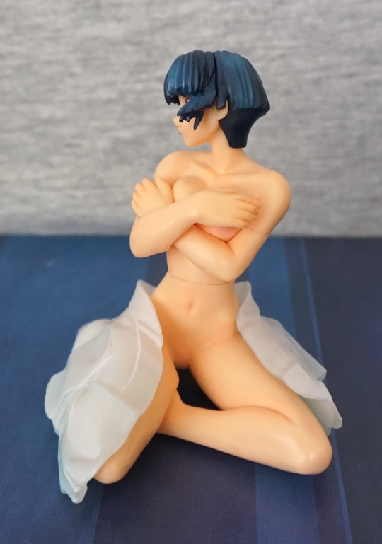
So here she is:
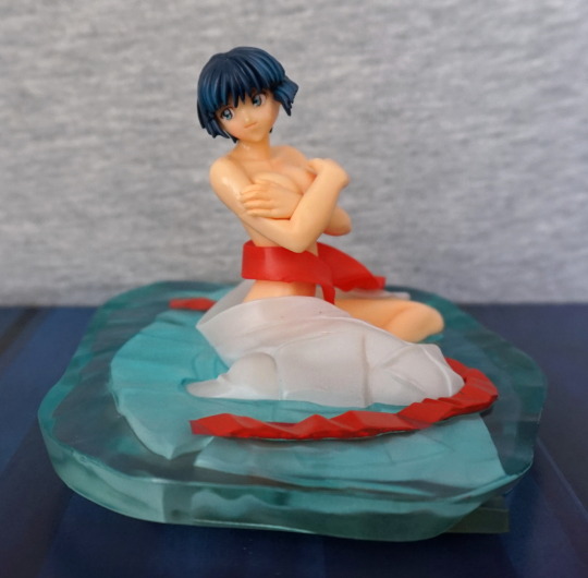
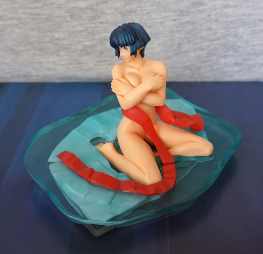
Sitting in a puddle, with her kimono about her. A cute, little figure. This is probably the intended display angle.
The front of her body:
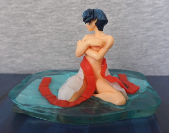
A noticeable midriff seam. Anything lewd is covered up.
Her left:
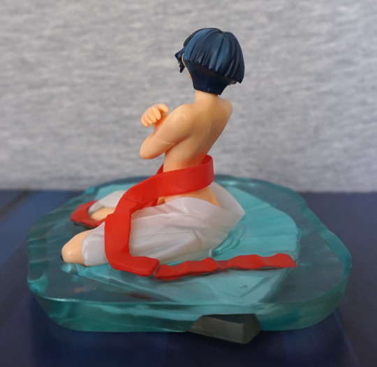
One of the strips wasn’t fully pushed down when I was taking these photos. Her hair has some nice shading, but there is a noticeable seam on her arm.
Her back:
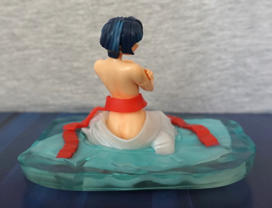
The ribbon wraps nicely around her back, and the kimono sits around her backside.
Above shot:
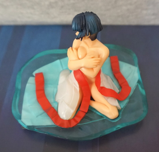
I find it an interesting pose, but the water is a bit like a block of ice. Probably was the easiest way of setting the resin/plastic block, but does look slightly odd.
From the back you can see down her ass-crack:
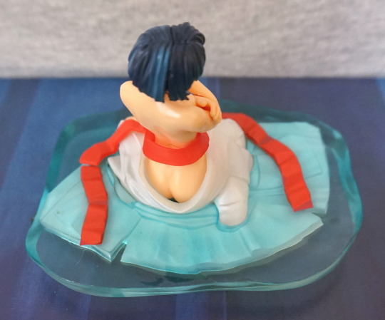
Definite case of bulider’s bum there. Hair seam is visible, but not that bad imo.
With one part of the kimono block sticking out, it got me thinking… can I take this apart? Here’s the bottom, where you can see where the pegs are:
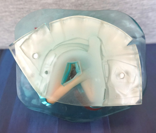
And moments later:
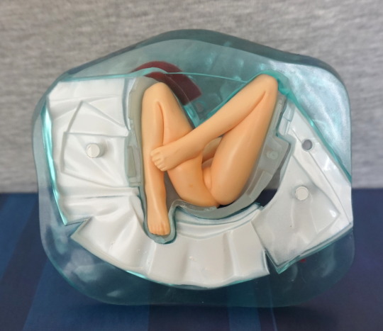
Aha! Here you can see they’ve sculpted her feet and legs, so they’ve intended for her to be removable. With a bit of fiddling, I worked out to remove her fully from the base:
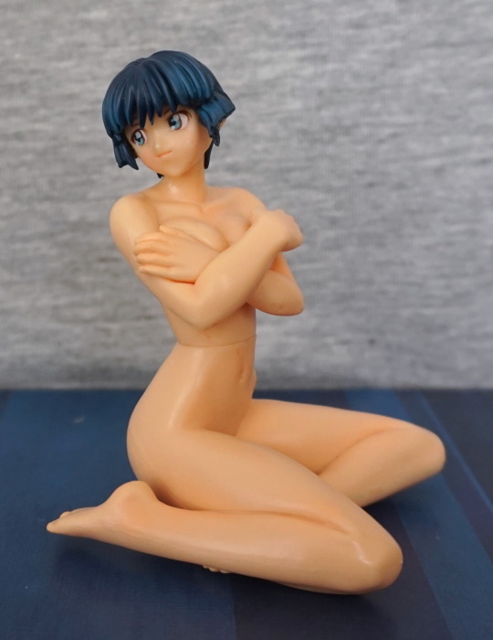
Though like this, her middle seam is more visible. She doesn’t quite stay standing up, so you’ll see a small piece of tissue in some shots, which I was using to prevent her from rolling over.
Her front:
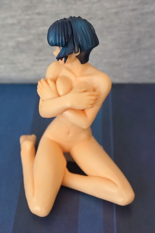
Other side:
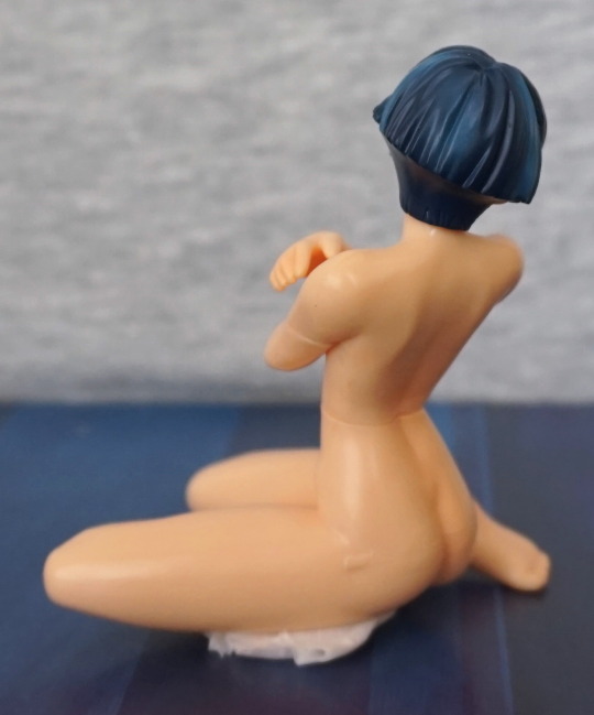
Here you can see the tissue I’m using to prop her up, and a little mould mark on her hip/backside.
Back:
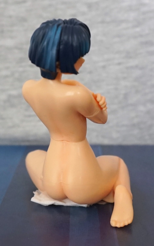
Seams are pretty obvious, but her foes are moulded.
If you just wanted her as a small figure to display on her own, you could do this. I did some experimentation of displaying her with various parts of the stand.
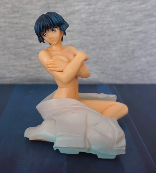
First, with just her upper part of the kimono:
Works for this angle, and also props her up… however:
You can see the parts that attach it to the lower half. So let’s try that:
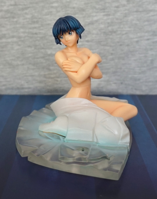
Yeah, this kinda works, but:
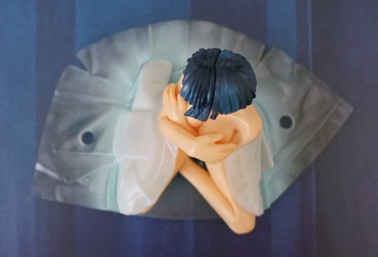
You do get to see the holes where the water plugs into the kimono.
I know, let’s just sit her on the water:
It… kind of works. Needs the lower part, to hold her in place.
Here are the parts separated:
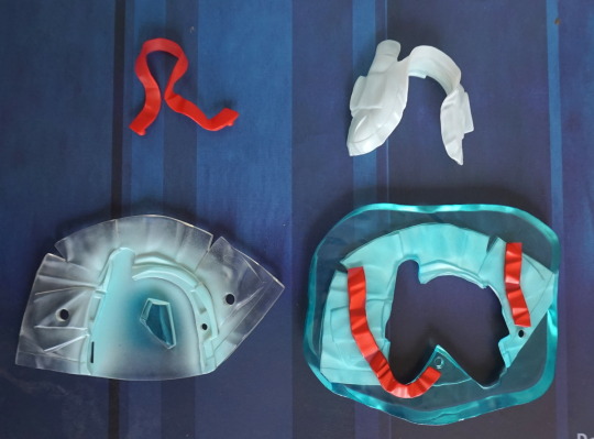
So you could have the ribbon around her, to partly hide the mould markings, but it does have the two pegs on it to hold it to the base. So probably best displaying her whole or singly. Or you could have just a kimono-in-water, but the inside would look odd XD. And, um, why would you want that..?
She’s OK for an extra to a manga, or as a cheap figure. Don’t think I could recommend her, unless you really want her.
… so where did P-Body get that, uh, enrichment equipment?

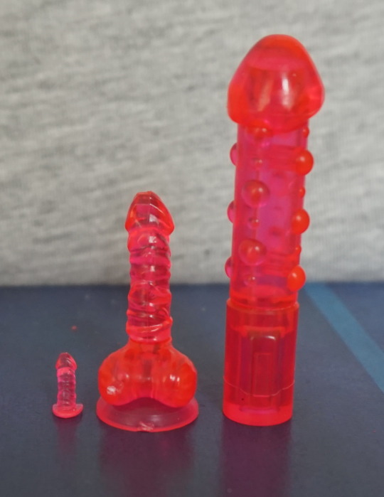
These sex toys come on a sprue, and you need to assemble them yourself. The toys themselves are for various scales. Clipping them out of the sprue was easy, and most of the assembly was fine… but the rings for the handcuffs… argh. I got there in the end, with various pliers!
Here are the toys in vol 1:
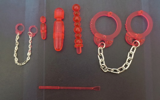
A nice selection of items, for a selection of scales.
Volume 2:
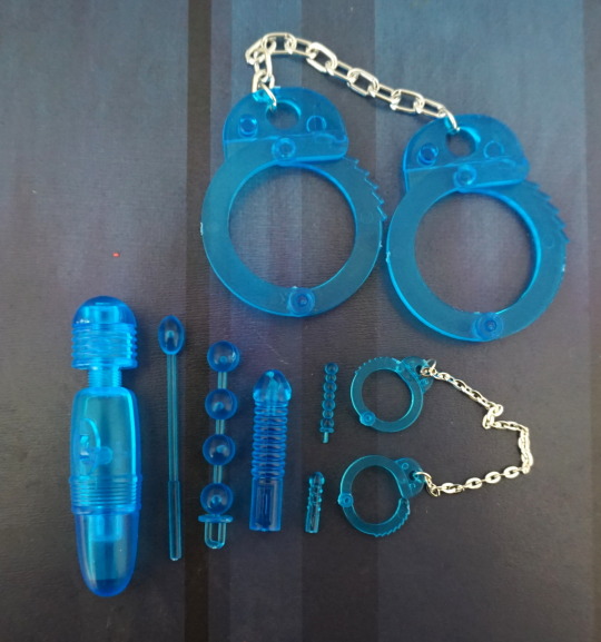
Feels a bit less of a variety, but still a good selection.
The Queen of Pain was straight into the toy selection:
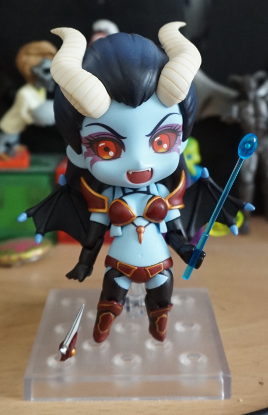
Yeah, not sure what is scarier…
This one fit well with Nitta:
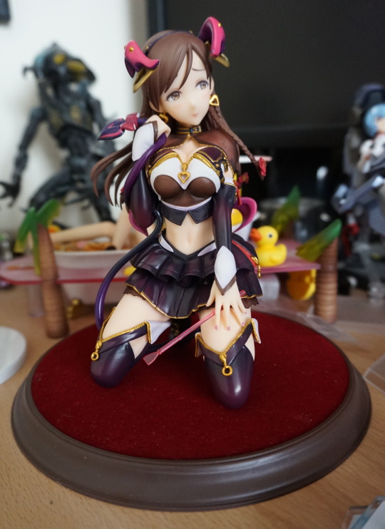
And lastly, this figure’s probably one of the few who can make use of the ¼ scale accessory:
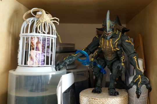
Oh, you silly, that’s not how you’re supposed to use them, they’re supposed to be used on your arms.
Um, I guess that’s better!
Currently most of the toys aren’t in use across my collection right now, but I’ll be setting a new cabinet soon, so they may get some more features soon.
As promised by yesterday’s blog – more Izuruha! This one appears to be an older version of her, with longer hair:
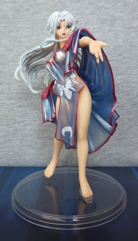
Here she is, fully dressed. She has a more detailed costume than the other one. She also has more display options due to this – her outfit is two pieces.
From the left:
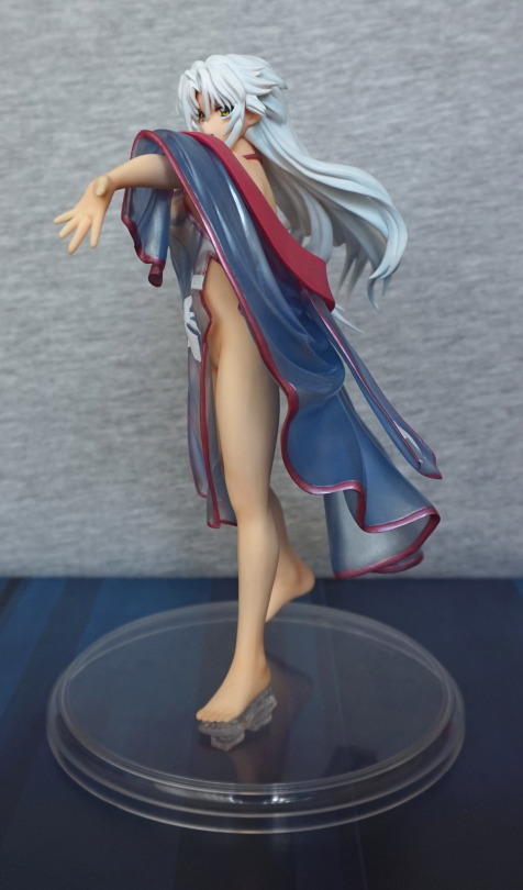
You get a good look at her leg from this side, and you can see her outstretched arm.
Right side:
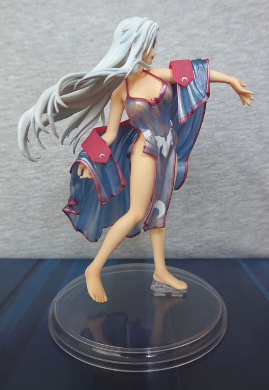
Here, her body is almost front-on, and it looks like I’ve nudged her cloak. Oops. Also her foot is floating – would be nice if they included another foot stand, like the other figure, to ensure she’s stable. With some fiddling, she may have her toes down on the stand though.
Back:
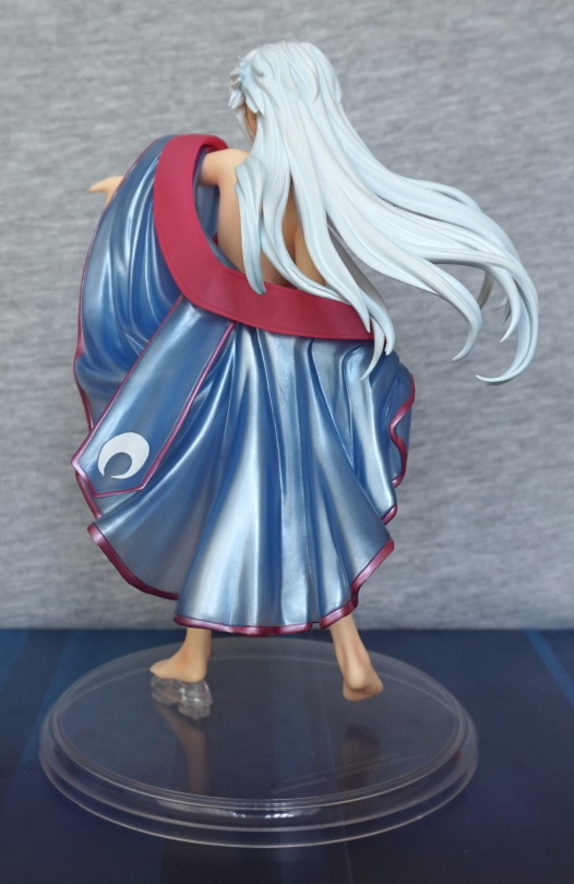
The light shines well off the back of her cloak/robe. She also has the nice detail on the back of it, flowing with her movement. Her hair also adds to her sense of movement.
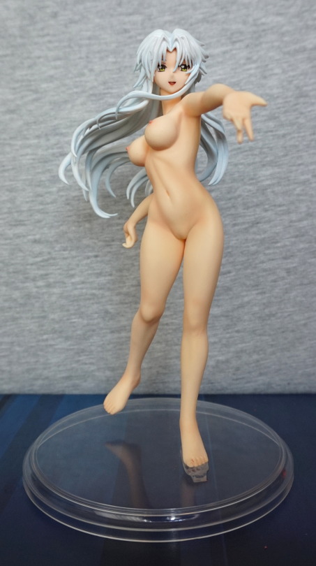
She has a noticeably larger chest than the other one, and her skin has a fair amount of detail on it. Her pose really works with her cast off.
Left side:
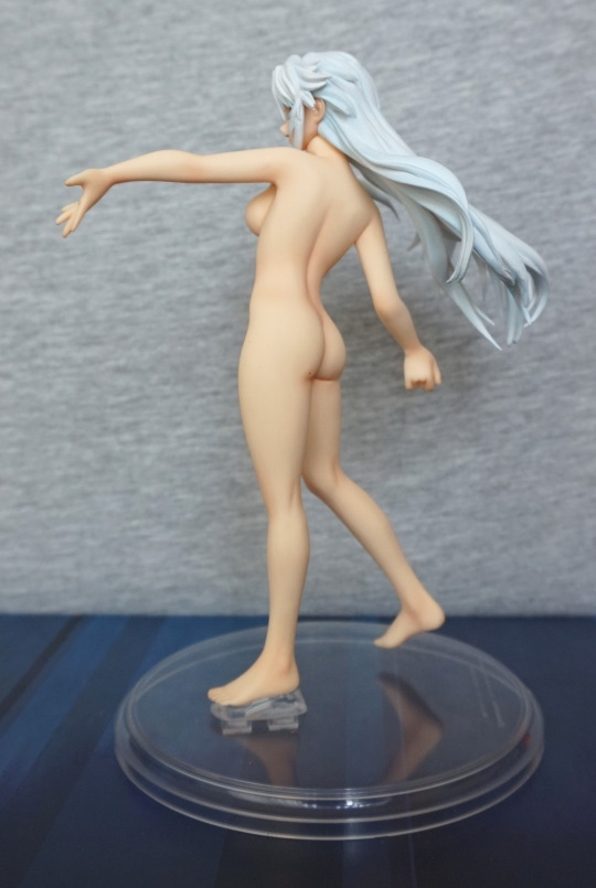
A nice view of her backside :). There is a stray dot on there, which i did start off trying to remove, but it looks like a mole to me, so decided to leave it XD. Give her a little bit more detail!
Right side:
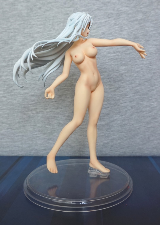
This angle gives you the best view of her fromt. Her nipples have been painted well, and I love the way her muscles show.
Back:

Her nice, flowing hair, and some more admiring of her backside.
Izuruha with her outer robe on:
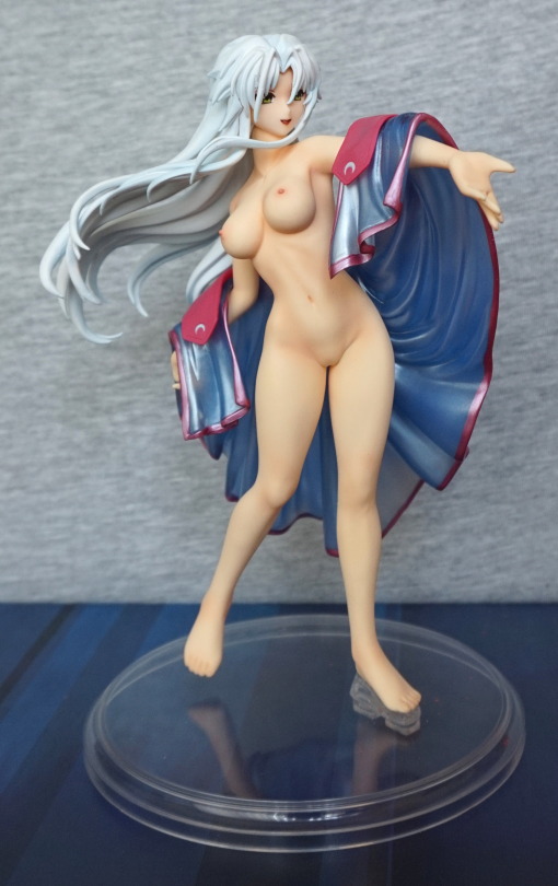
I feel as if this frames her quite nicely. She will also work with just her tunic on, but didn’t take any photos with her tunic and no robe.
Semi-cast-off, from the back:
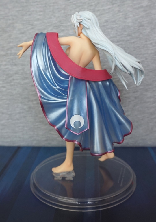
You get a bit of side-boob when she doesn’t have her tunic on.
The next two blogs will be two figures of Izuruha. I saw someone selling these figures on MFC, and wanted them… came back to seeing them again, and this time actually messaged the seller! After agreeing their price, they were soon on their way to me. These figures are cast-off, so there will be female nudity.
As for Ru/Li/Lu/Ra, I can’t really find out much about it on the internet, so these figures are just because I like them :).
Enough waffle, now for some figure:
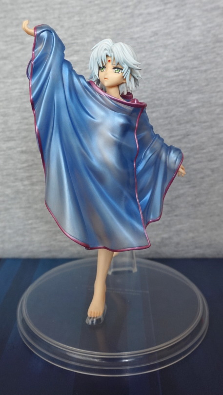
The clothing is very nice in its own regard – I love the way you can see her body through the clothing, but only partially. Also it’s blue and purple… and that’s a winner for me :P. I’ll probably display her cast-off though.
Left side:
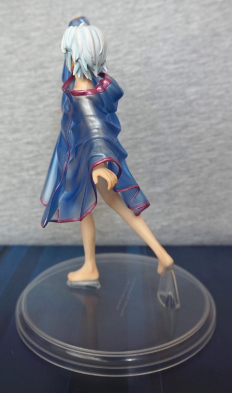
Not too much to say about this angle. Hair looks OK, stand supports her well.
Right side:
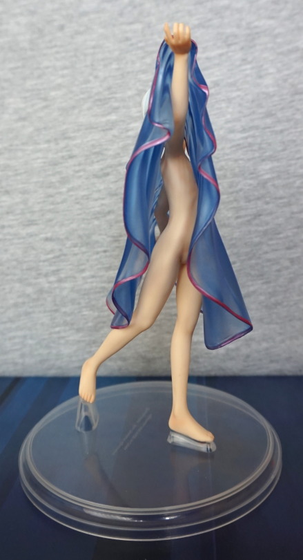
You get a good preview of her body from this side:P I like the way they have her holding her top upwards, and not just for the view :P. It can sit quite nicely on her hand, which makes it flow well. It’s a hard piece, but it can take a little bit to get it settled in the right place to display.
Back view:
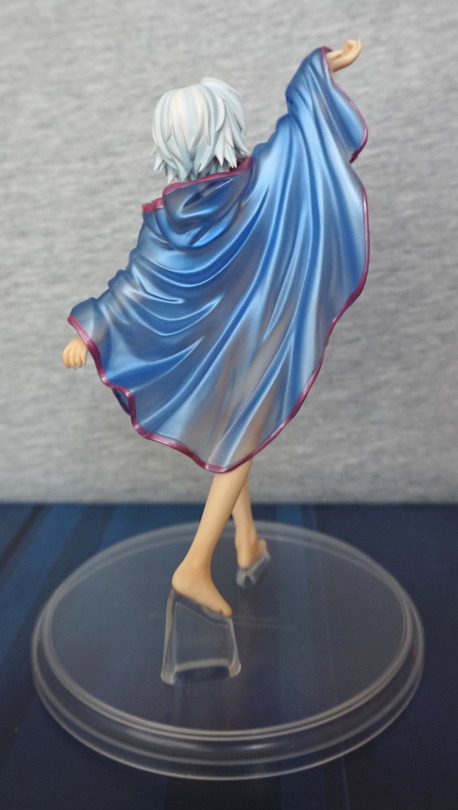
Her robe has a hood, which is a nice touch. The top also catches the light nicely.
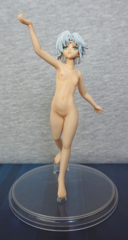
This version of her has small breasts, compared to the other one, to go with the short hair. Her nipples and skin are very nicely painted, though she’s not really sculpted down below. She has a very nice-looking skin texture.
From the sides:
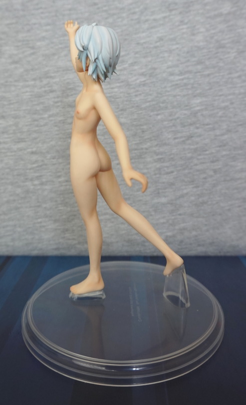
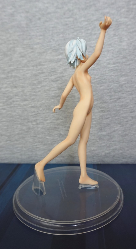
Her body is very well shaped imo, and the dynamic pose shows it off well.
From the back:
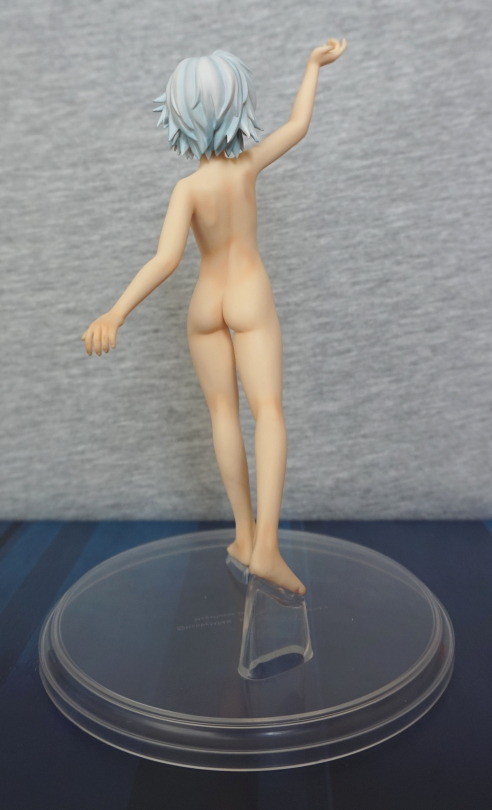
And a very nice backside too.
Tomorrow, more Izuruha!
