Month: June 2018

Sakuya – Sister Princess

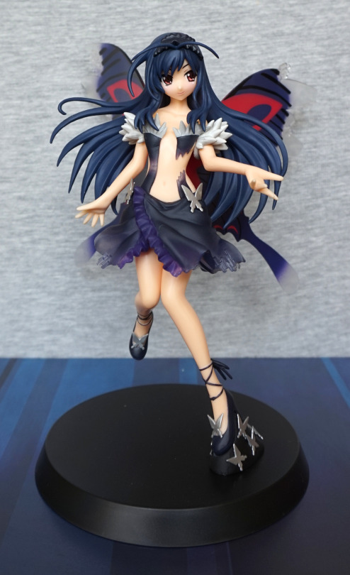
Another “bargain” purchase from the same retailer as Barnaby. This one I tried to find pics of online… but came up blank. So decided to go for it anyway. 

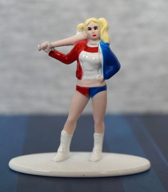
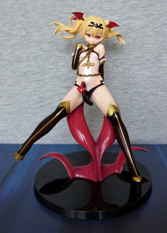
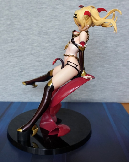
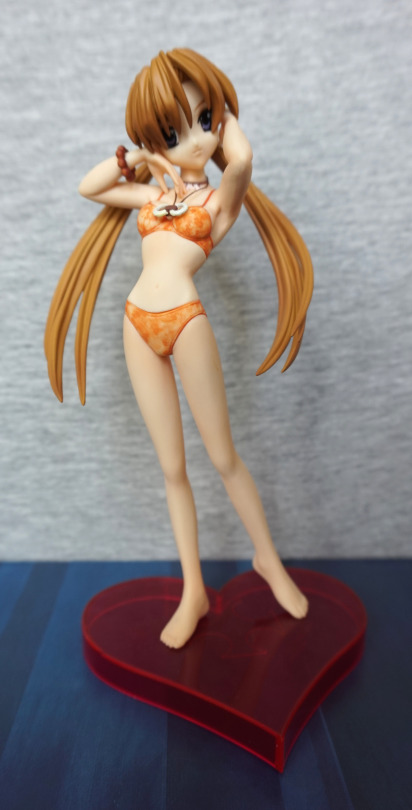
So let’s see what she looks like:

image

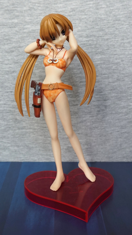
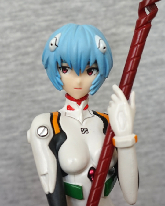
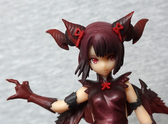
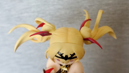
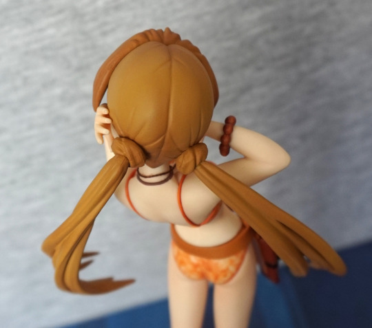
Her swimsuit is a nice marbled orange colour. From the prototype pics I couldn’t work out if it would have a shiny effect – turns out not, and I think it works fine as-is. The fabric necklace was a nice surprise – I like mixed media touches like this. What is disappointing about this figure for me, however is her hair – it dangles very significantly over her face, and you don’t really see much of her face. In the prototypes they’ve lit her in an unnatural way so there isn’t as much shadow. Displaying this figure, you’re likely to get a decent amount of shadow over her eyes. What compounds this lighting issue is the dark colouring of her eyes – when strongly lit from one angle, this causes her face to look overly plain as it overemphasises the light areas. You can also get the same effect from viewing her from above, where you can’t see anything but face. 

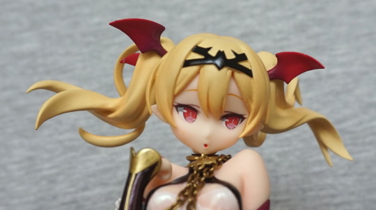
Let’s have a close-up of her face before we move on from it:

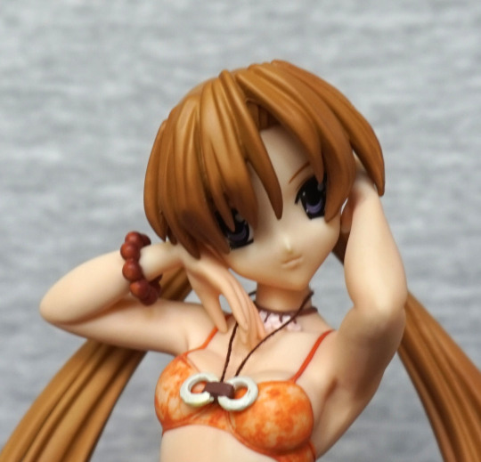
It’s not a bad face when viewed close. Just something doesn’t quite work between face and hair. She’s quite cute when viewed from below. 

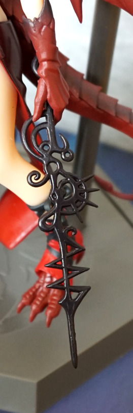
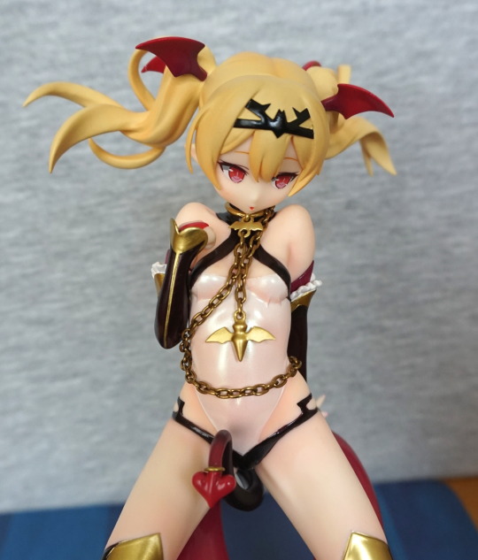
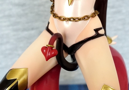
A closer look at the necklace:

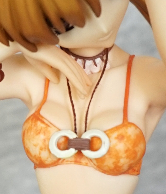
… and the chest. There’s some lifting going on with that swimsuit, despite what those bra straps are saying :P. It does give her body more definition, so I think the curvy boobs are needed. OK, back to the necklace… she has one painted onto her – here the paint does look messy on it, but this really isn’t visible when looking at the figure normally. Here we can see the binding is painted on, and the string simply inserts into this part. Had me fooled until I looked at this photo, lol. And I’m thinking the marbled paint on her outfit is the best feature of this figure. 

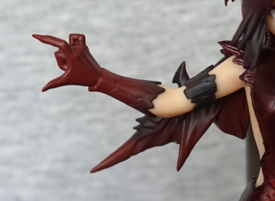
In terms of painting, this figure does lack in the body shading department:

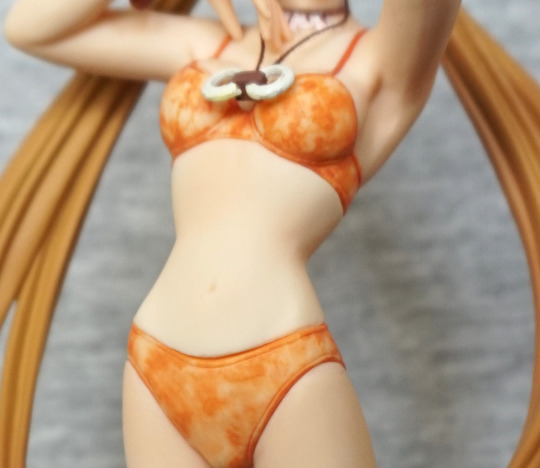
This isn’t just my photo-editing whiting things out – as far as I can tell, there isn’t any paint shading on her body, or what’s there is incredibly subtle. She does have some sculptwork that’s gone missing in the editing of this photo, but it is pretty subtle. Imo her stomach could’ve done with a small amount of shading to bring out the curves in her body. 
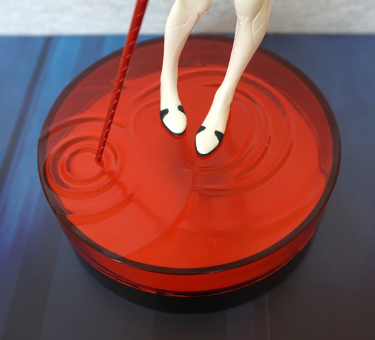
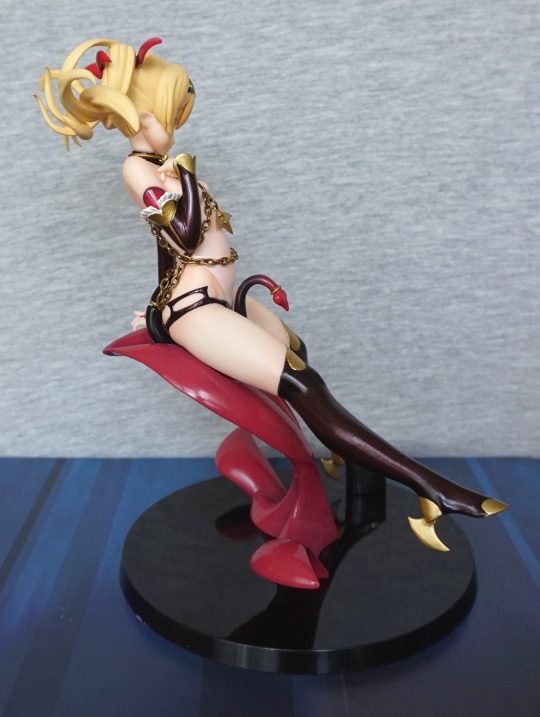
Base:

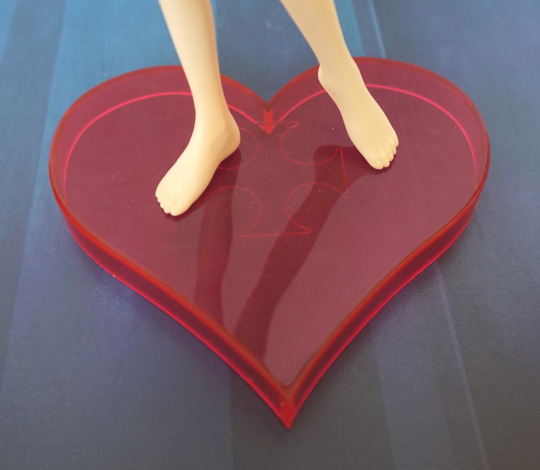
A fairly simple base, but I love the heart shape. Contrast got upped a bit too much here, and it’s more of a “red red”. I think the colour complements the figure. 

Left:

Here we see the sculpting carrying the figure. Her pigtails are mostly the same colour, barring the tips. She has nails sculpted, but I think they’re the same colour as her skin. Her toes are definitely not painted in a different colour. 

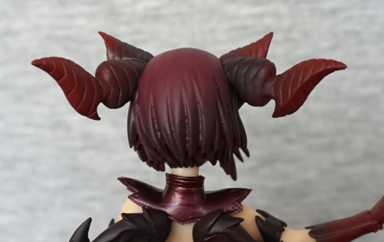
Some more of her hair:

There is some shading up here, but it’s pretty subtle. Could’ve done with some darker paint all the way down her crown. 

Right:

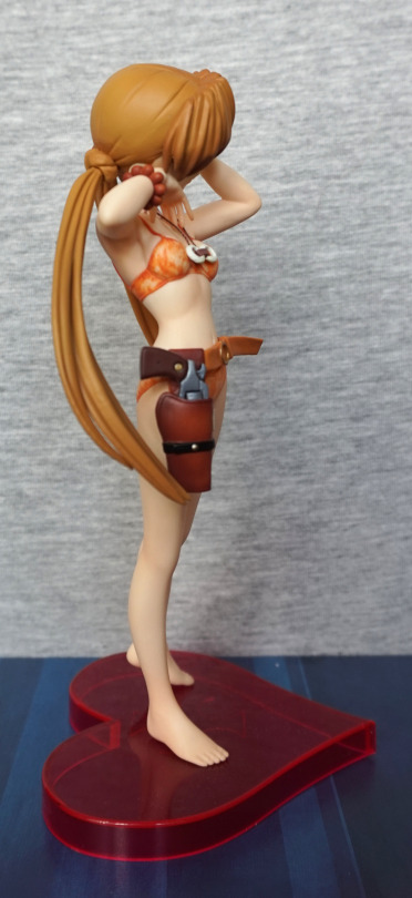
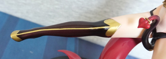
The gun and gun holster are painted nicely! We have some shading here! And I’m pretty sure she’s knotted her hair to get it into pigtails. Not sure how she managed that, can’t imagine it’s too practical!
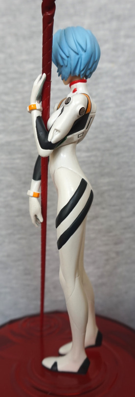
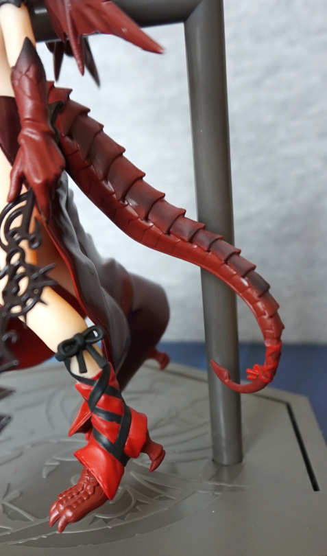
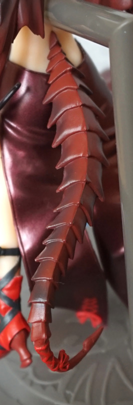
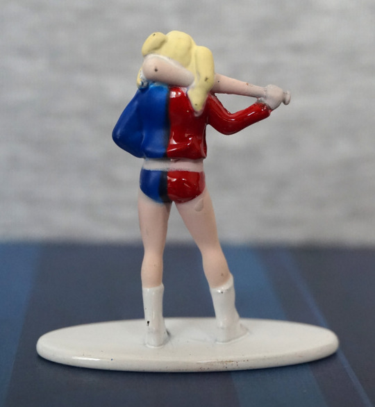
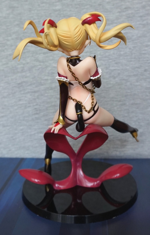
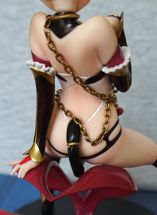
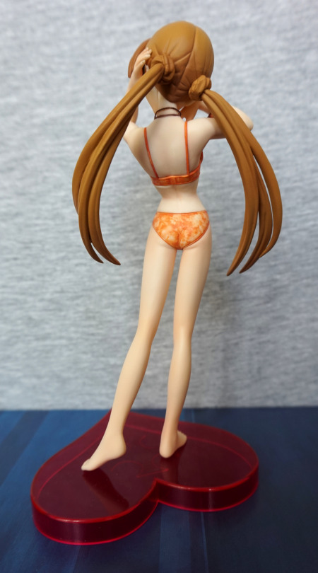
Back:

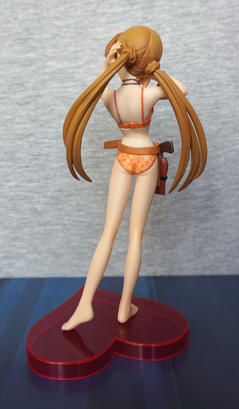
Some distinct join going on under her top. Looks a bit too, erm, linear to be the top pressing into her imo. Backside is sculpted well though. Again, no shading in the paint on her back or legs. 
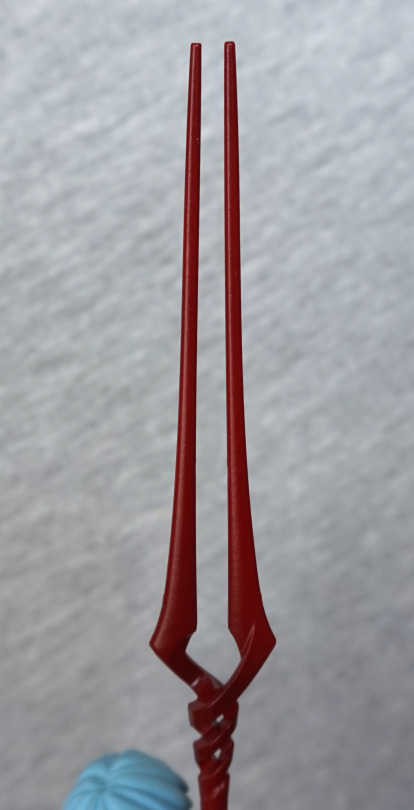
Time for a break:

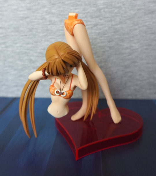
Bwah! This is how she comes apart, so you can put her holster on her .

With mine I think I need to have the holster on her:

Due to her leaning back pose, the upper half of her leans back a slight amount, giving a bit of a gap. Fortunately I prefer her with the gun. 

Back, without the gun:

Here the joint is OK. Not sure how prevalent this issue is, as I only have one, and well… there’s a lack of pics of her on the internet. But I’d be prepared to mod her joint to get her upper half to sit fully upright. 

Overall, I wouldn’t recommend spending a lot on this figure. I paid £18, and I think I got my money’s worth. She’s a bit above a prize figure – she doesn’t have the shiny plastic that plagues prize figures and the paint that is there is well-applied without flaws, but equally well she has a lot of areas where the paintwork could’ve done with more detail. Also she’s a short figure, as she’s a fairly short character – she measures just under 18cm without the stand. If you like her simple, clean look, then maybe consider her, but I don’t think I could give a strong recommendation for her. Maybe if you have to have all the Sakuya figures?

Barnaby Brooks Jr – Tiger & Bunny

This figure is the G.E.M figure of Barnaby Brooks Jr, by Megahouse. Got this cheap from a retailer in the UK. One that garnered a poor reputation, but seems to be now just concentrating on liquidating their stock, so I grabbed a few good deals, including this one. 

So let’s have a look at him:

Certainly plenty of shading on him, and the sculpting is really nice on him imo. You can imagine him settling into this pose, and he has an appropriately serious expression, which fits Barnaby. Plenty of detail has been put into the clothing, which I like, as there was the large potential to leave it bland. 

Close-up of his face:

His eyes are painted nicely, and his lips have been well done, without too much colouring. 

You can also exchange the front of his hair:

And have him wearing his glasses. Both options are equally viable, and I think come down to personal preference. On initially purchasing the figure, I thought I’d only want to go for this look, but on experimenting, it left me indecisive. 

Both of the hairpieces have been shaded well, so no issues there. 

Necklace:

Tucked into his jacket, you will see his signature necklace. Was particularly pleased this was included. Here we can also see his jacket has a “lived in” feel, which is rare in a figure. 

Hairline:

This is what the hairline looks like with his glasses hairpiece. A bit more visible than other figures, but this is not surprising given you can exchange his hair. 

Boots & stand:

Love the red leather of his boots, and they’re painted neatly. The base has his logo and name. In isolation, the stand is nice, but I’m not entirely sure it fits the style of the figure. I don’t find it really detracts from it, though. 

Left:

Here we can see how much work they’ve put into the creases in his outfit. Gives all of his clothes a lifelike feel. Some of the trouser shading feels a bit randomly placed, but it doesn’t detract for me. Here we also see his hand with his ring on. 

If you prefer him ringless, he also comes with this hand:

Which is identical to the other hand, barring the ring. Switching the hand in and out is easy enough, but probably want to go careful, to avoid scratching the hand or his trousers. With the connection under his jacket cuff, it doesn’t look like a replaceable part when on display. 

Right:

He is thrusting forward, which feels more evident on this side, as his arm & hand doesn’t obscure it. He has a slender build, which feels true to the anime. Paint application looks good here too. 

Back:

His backside looks rather small from this angle! Ok, maybe they overdid the slenderness? Definitely doesn’t feel like there was any slacking off here when it came to the sculpting and the painting. All looks good, if you’re happy with his build. 

Close-up of his head & shoulders:

Join on the left doesn’t look quite aligned, but I think I can let it off for that. Hair is nicely shaded, and the off-white of the top of the jacket looks good. I think they nailed the colour for this. 

Overall, I’m really happy with this figure, and can recommend it, if you’re a Barnaby fan. Some day I might get the Kotetsu that goes with him, but I do have other Kotetsu figures, so not rushing out to buy it, unless I come across a good deal. 

Rei Ayanami – 20th Anniversary

This was a prize figure for the 20th anniversary of Evangelion. Decided to order this as I had a coupon code, and you can never have too much Rei:

In terms of a figure, she’s not that big, but with the base and the Lance of Longinus she takes up quite a bit of height. She comes attached to the stand, but you need to put the lance in her arms, which was a slightly awkward operation. 

Close-up of Rei’s face:

I think they were aiming for a blank expression, but she seems somewhat miffed to me. The paint is in the lines, and of the right colours (to me). The sculptwork is nice too, plus the lines on the lance are nice and even. 

Top of the lance:

Looks the part, and I think has some subtle shading. 

Base:

Here we see the pool that Rei seems to be standing in. There’s also a ripple for the lance, but I find it doesn’t quite land in the middle. Some fiddling may get it to do so though. It doesn’t bother me too much. 

Left:

Lines are clean, and the hair seam is fairly well hidden. She has some movement in her pose, making her look natural. 

Right:

Here we see where I haven’t quite got the lance into her hand. Paint lines are also clean on this side. 

Close-up of the side of her face:

She seems more serious than miffed from this angle. Comparing the shaft of the lance at the top of the image to the bottom, you can see there’s some shading there, which seems rare with her lance in figures. It’s not always needed imo, but it does help this figure. And we can take a moment to admire the silver parts on her suit arms. 

Back:

A little bit of a booty wiggle :). Most of the paint is fine back here, but I can see a bit of a flaw on one of the stripes on her backside. Otherwise it’s clean, and nicely done, which is always a nice thing to find on a prize figure. 

Overall, I really like this Rei, and was glad to have one with her lance at last. Though I’ve acquired two more since XD. Not sure why this one hasn’t done as well as the Asuka of this prize set – Rei was the “A” and Asuka was the “B”, but I think the Asuka is probably more unique than this one. I’m happy with just the Rei though, unless I find Asuka at a too-good price to pass up. 

Kuroyukihime – Sega PM Figure

Found this randomly on MFC, and decided I ‘needed’ it. So went and found it on Mandarake and ordered it:

image

I love the pose of this figure, and the partially transparent clothes. Not a big fan of the split in her dress on her left side – would’ve preferred this to be whole. Her hair isn’t as dark as it should be imo, but it still looks pretty, if not really accurate. 

Close-up of her face:

She has a cute face, nothing special. Her frills don’t seem to be white, but I think this is for the best as they’d clash with Kuroyukihime’s clothes too much. 

Dress close-up:

The fading is really nice, but the plastic does give off prize figure vibes. 

Shoes:

Love these cute heels and the ribbons around her ankle. They’ve put some of the butterflies on the base, which give it an accent. 

Left:

Here we can see her wings – I think they were a nice idea, but didn’t quite work in execution. The contrast between the colours doesn’t make them blend well and don’t match with the style of the figure, which I think is a bit of a shame. There’s a nod to matching with the fading, but it’s much sharper than the clothing, which doesn’t help it match. A smoother fade would’ve helped them look nicer too imo. 

Close-up of the wings:

Here you can see the fade better – towards the bottom is decent, but not a fan of the upper wing portions. Looking at the lines like this, I much prefer the lower part, where the lines are much thinner and closer to each other, than the scribbled business going on at the top. 

Close-up of her skirt:

Here we can see the clothing break, which doesn’t look realistic, and I rather they didn’t do this. Fade on the back part of her dress probably is best admired without close scrutiny. 

Foot:

Here we get a closer look at the butterflies on the base – simple but effective. Her foot is glued to this part of the base, and this slots into the round disc. 

Right:

Her arms are posed well, and give a good sense of motion. Here we have some derpy black lines at the top of the upper wing. I think Kuroyukihime would’ve spent more time designing her wings to get them looking good than the artist did here. Bottom wing is more Kuroyukihime. 

Back:

The wings are quite striking from this angle. I like the use of colour, but I think the pattern could’ve been neater. 

Close-up of the wing joints:

No real blending here, as they slot into her back as four separate pieces. They were a bit of a pain to get in – you have to be careful to not knock other ones out whilst doing it. Also, don’t be surprised if you have to heat her back up to get them in. Once in, they haven’t fallen out though. 

Overall, I think she’s a striking display piece, who isn’t necessarily character-accurate, but a fun interpretation of Kuroyukihime, that isn’t similar to other versions of her (not including the repaint version). I think this one is more of one to admire at a distance, as close-up scrutiny is likely to reveal paint flaws and little oddities. 

Flamebound Myr – Puzzle & Dragons

Decided to complete my set of Myrs by buying the Flamebound version. So here she is:

image

This time I remembered to take a pic with her backdrop :P. So now you can see how she is pointing at the clock in the background. 

Here she is without the backdrop:

image

I love the shiny burgundy colour of her dress, the shading in her hair and horns. 

Close-up of her face:

Her face is nice, and I love the red eyes. I do wish the bows had more contrast to the rest of her – they kind of blend in too much for me.

Arm close-up:

The sculptwork is nice in her hand/arm, and a bit of subtle shading on where her arm transitions to skin. 

Staff close-up:

Same design as the other one, but this time the staff was in her hand out of the box, instead of wrapped up separately. 

Tail side close-up:

Tail looking nice, but here you can see where the black paint is a bit off on the “boot” ribbon. 

Left:

She looks very nice from this angle. Love the way the dress flows, and the detail on her upper arm. The straps around her “boots” is tied nicely.  Her tail is nice, and you can see a small ribbon she has at the end of her tail.

Right:

Looks OK on this side, but the seam in her dress is pretty obvious. Not a big fan of that. 

Close-up of her dress:

Yeah, that seam… isn’t great. Because it runs across the ripples of her dress, and her dress being a plain and shiny colour makes it stand out. 

Back:

Has the same downside as the other, with the huge base hole in her back. Kinda wish they provided a plug for this or made it smaller, but this is a prize figure. Does mean she doesn’t wobble about much, with such a large pole though. Her skin and the red colours contrast well imo. 

Close-up of the back of her head:

Ah, hmmm… some blobby paint back here in her hair. Bit of a shame. Her collar is nice though, along with her horns. 

Close-up of the tail from the back:

Some lovely shading and sculpting here. I do rather like her tail. 

Overall, I like this figure, but isn’t my favourite of the three. It is a repaint of the Illusionless version, which does partially detract from it. I do love the shiny burgundy, but the rest of her outfit doesn’t really contrast or compliment this well for me. Also the blobby hair. I don’t think this is a bad figure, just less attractive than the other two for me. Unless you want both colours of this one, I’d recommend picking whichever colour scheme appeals and go with that one. 

Kin – McFarlane

Here we have Kin from the Spawn universe:

You can choose to display him with or without the pig mask, and the arm he carries is a separate part. The demon on his back is attached via a wire, and cannot be removed, but can be moved to sit in various places on his back. 

Close-up of the demon: 

Love the paint job on this figure – a fair amount of detail, and I particularly like the detail on the demon’s face. Having some articulation in the demon is nice too – allows some customisation of how you sit him on top of Kincaid. 

Without the pig mask:

Didn’t focus on his face in this shot, but  here you can see he’s fully detailed, if you don’t like the pig mask. The placing and sizing of the holes that hold on the mask are such that they don’t really show when you have his mask off, which is a nice touch, if people don’t want the mask. 

Left:

Here we can see the length of the mask – is pretty long! The hair effect on Kin’s arms is good, and I really like the stippled blood effect on the demon’s back. One of the better recreations of blood that I’ve seen on a figure. Often bloodied bits look rather fake, but this one doesn’t. 

Close-up of the axe:

Yeah, I think this axe comes with a side of tetanus. Some lovely paint details on his boots too. 

Right:

And that’s one putrescent arm! I love how they’ve mailed most of the textures o this figure. Only one I’m not a fan of is the trousers – they look a bit wooden rather than cloth due to the paintwork. 

Back:

Even from the back, there’s a lot to be seen in the moulding and the painting. The way the demon is climbing onto Kin’s back gives a sense of motion to me. Love the way they’ve given the trousers a bunch of highlights to help add to them, though the paint does leave them looking kind of woody instead of hessian sack. 

Kin’s jacket:

They didn’t skimp on the detail, despite the fact it is likely to be covered up by the demon. The paint has been neatly done, which shows of the details in the jacket. Almost a shame the demon is permanently connected to Kin – would’ve been nice if there was a connector on the wire. However, I do have a McFarlane figure with detachable wires and they do fall out pretty easily, so maybe this was the best solution. 

Overall, I can strongly recommend this figure if you like the looks of it. It’s not very poseable, but if you’re OK with that, this is a solid figure. 

Minecraft Chest Series Blind Boxes

Found these at Poundland, so I picked up the 6 that they had.

The first two, zombie, and zombie on fire:

image

Originally these retailed for £3. You only get one of these per box, so I think £3 is a LOT to pay for such a tiny figure (they’re around 2cm in height). £1 is still…. kind of a bit. At least they’re painted OK. 

Sides:

image
image

Fire zombie has more to look at, by virtue of the fire. Sleeves aren’t painted too straight on him though. The normal zombie has pretty blobby paint. though the textured areas are nice. 

Back:

image

Hm. Yeah. Distinctly average. 

Alex and Steve:

image

These two are more interesting than the zombies, but you can see the seeming cheapness of the plastic, with the patterns on Steve’s armour. There is a bit of overpaint here and there, but no too noticeable.

Sides:

image
image

I like the design of Steve’s shield, but it is poorly painted. Alex seems to have had a hard life, and there’s a number of paint scratches in her hair. Pickaxe has a number of paint flaws, but at least they’ve done the head in a proper gold. 

Back:

image

Here you can see where the plastic was poured into the mould. Not much hiding Paint on Alex is much neater back here. /sigh. 

And finally, Blaze and Snow Golem:

image

Brown paint missed on the Golem. Blaze paint is also a bit messy. The transparent bit on the Blaze is kind of a nice touch. 

Sides:

image
image

Snow Golem looks fine, but the red paint on the Blaze is a bit of a mess. The paint is mostly where it should be, but with the groove going all away around the edge of the Blaze, it makes it look like the paint didn’t quite come up to the edge it should do. 

Back:

image

Again, clear mould marks from where the moulds were filled. Paint is neat back here though. 

Even at £1, I wouldn’t particularly recommend these. Definitely not for £3! Would’ve liked to see some of the more interesting picks from this collection, but overall, the quality and size doesn’t justify a premium price for these figures. Unless you’re hardcore into Minecraft and really want these, I wouldn’t particularly recommend them.

Whilst I was at Poundland, I also bought this minecart:

The print quality of these vary, so I’d recommend inspecting it in the packet, if you care. Some of them are not printed straight at all. I’ve decided to leave this one in the packet, so not sure of the quality of the wheels etc. 

If we look at the back:

… we can see that they’ve released the same minecart, in various different packaging. Collect them all? Nah, think I’ll pass on that. I don’t think I really need more than one of these tbh…

Joker, Harley, Cyborg & Mr Freeze – Metal Nanofigs

Ended up getting some more Nanofigs from Asda. Not sure quite why I keep doing this… oh yeah – they’re cheap… 

So first up, Joker:

Well-painted, for such a small figure. He has purple boots though… and the shiny jacket might be an acquired taste, 

Left:

A little bit of an ear going on, and a very red smile. Hair has some shape to it. 

Right:

Bit more definition in the green hair paint on this side. And a sea of shiny purple. Good thing I like shiny purple.

Back:

Some details in the sculpt back here. Am happy with this nanofig. 

Next up, how did his ‘partner’ Harley go?

Ah. Hm. Yeah, she didn’t fare so well. Missed paint on her hair, by the bat and the lines aren’t too crisp on the jacket. Not sure what’s going on with the bat, being flesh-coloured… that doesn’t quite work. She has a full face though, unlike some of the nanofigs, which is a nice change. 

Left:

Yeah, definitely evidence of some painty mess here.

Right:

Seems to be some mess going on with her hip, and her foot seems poorly moulded. Or maybe overpainted. 

Back:

Faaail. A number of black marks, and not much attention paid to paint edges. You can’t see the back of the figures, and this one shows it. 

Cyborg:

Recognisably Cyborg, but he does have some mutant growths on his shoulders. There isn’t a large amount of detail in the paintwork, but what’s there has largely been done neatly. 

Left:

A sea of silver. Think some definition has been lost in the legs from the thick paint apps, but probably better this than seeing through the paint. 

Right:

Head paint has been done well, rest of it is what it is, lol.

Back:

Yeah, looking decent back here, no real complaints. 

Overall, he’s pretty decent, but does suffer from the lack of paint details these figures have. 

Lastly, Mr Freeze:

Mr Melty Face! His head looks distinctly mutant, like they couldn’t decide if it was his helmet or his head. I think it would’ve looked far better if they shortened his skull, so he didn’t have his helmet on. Paint on his left arm looks like a “yeah, that’s about right” job. Rest of the paint, such as it is, looks like it has gone where it was supposed to. 

Left:

Not much definition here. Looks OK. 

Right:

His glove and boot lack detail in the moulding imo, and look overly plain. 

Back:

One large paint gouge here, at his mid-back :(. His left glove looks really good from this angle, with the gun… looks better here than on the front!

Overall, Mr Freeze looks OK, barring that stupid head. Argh. Goggles could’ve done with more work too. 

My favourite out of these is the Joker. Harley is probably the weakest out of this set. For less than £2 each, they’re pretty decent, and better than what you can get out of some pricier blind bags. And you can pick the ones you want! Wouldn’t recommend ordering these off the internet (unless you’ve got good pics of the ones you’re buying) as the paint jobs can vary massively. Did try to pick the better looking ones, where I could. I remember there only being one Mr Freeze though. 

Kyoshinhei – Figma SP-043

This Figma I was looking at on and off, for ordering. I ended up getting a promotional code from Solaris Japan, so I decided to use it on this fellah:

This review’s been a long time in coming, due to the fact the stand was missing in the one I was sent :(. Contacted Solaris, who sent a replacement straight out, so all worked out in the end :D. This dude doesn’t have the ability to stand without it, so yeah. Wasn’t gonna settle for no stand! 

Love his big wings – these don’t feel too delicate, which is nice. The texture on his body is well done, and detailed.

Side with the wings:

They have some depth to them, which helps them stand out. He has a butt spike stand and a claw stand part. I’m happy with him standing, so went with spiking him in the butt. Certain poses probably work better with the claw stand, but I like the butt spike, as they’re good at holding Figma in place. 

Back:

Yeah, he’s another dude that exceeds the size of my backdrop… The contrast between the spines on his wings and the wings themselves is nice. Does give him a really striking appearance. 

Here he is with his ‘weapon’:

He comes with two sets of hands – ones in the first photo and these to hold the spike, which looks disturbingly like frozen pee. It can be a bit awkward to move him around once it is in his hands though – the spike is pretty thin, so I wouldn’t try to stress it too much – if you’re playing around with him, I’d recommend detaching the spike halves, then connecting them when ready. 

Above, with the pee spike:

This thing is pretty big! Here we can also see the multitude of spikes he has on his body, without the wings. The back spikes are the wing replacement parts. I think both configurations look really good. When I bought him, I planned to display him with wings, no questions, but upon getting him out of the box, I then debated, prior to setting on yes, wings. 

Close-up of his front, and alternate head:

Here we have him chomping on… something. Or maybe spitting? Here I’m showing my ignorance of the source material ¬¬. Love the sculpt and paint on his body though. Lovely amount of texture and detail, and enough soft parts to keep him poseable. 

Right side:

He’s quite a lithe chap, some visibility of joints on his arm. Most of them are pretty well hidden, worst offender is the elbows. 

Back:

The spikes are well-blended into his back, and really look a part of him. The separate parts that cover up the places where the wings go blend in well, and don’t look out of place. I live the amount of detailing with all the dimples back here. Gives him a strong, gnarled monster vibe. 

Close-up on the spikes:

The orange really compliments his look, and it’s transparency without looking naff. So that’s a strong positive to me :). 

Overall, I love this figure and glad I got him. It’s fiddly doing the wing switch, as you need to pull out his joints, so it’s not something you’d want to do regularly. I love his looks, as I’m a sucker for monstery things, especially those with wings, so this one definitely ticks the boxes. Definitely wouldn’t want to meet him on a dark night! Would recommend him, but not at a high premium, as he doesn’t come with too many extras for a Figma, but he certainly looks good imo, and poses well. 

Harley Quinn – Arkham Knight – DC Collectables

This one I bought at Hawkins Bazaar, who had a few characters on clearance. But some of them are being sold at B&M for cheaper, so if you see figures there, check if they’re in B&M or TK Maxx first. 

Here is Harley Quinn, based on her appearance in Arkham Knight (not played the game, but does she appear in both of her outfits?):

Most of the paintwork is well done, but there are a few dodgy bits here and there. The paint quality varied between figures, so I picked the best one. Some of them, the white paint was encroached upon by the black/red paint. 

This figure is very shiny. Not sure if I’m a fan of the look or not. Wish the black line on her left side was a bit straighter. The diamonds on her leggings are painted nicely though. 

Close-up of her face:

I like the rouge on her face, the lipstick and eyes are painted very well. Not too much of a fan of the “blow-up” hat look. The hat has been given seams like it’s an inflatable, not sure if this is intentional detail, but not really a fan. The creases are nicely realised. Some of the white n her collar does seem to let some of the undercoat show through, but not too badly on mine. 

Left:

Here you get to see the extent of the shiny. Does make it look like she’s wearing some plastic-y fetish suit. The colours are very vibrant though. 

Right:

Looks fine from this angle, other than some previously made points. 

Back:

Quite a bit of creasing detail throughout her body and hat. The pom-pom balls are nice. Her neck looks odd from this angle though, from the way they’ve done the joint. 

And now for some notes about posing her:

Why, DC, why?! No hopes in her feet to add a stand, so you’ll either have to go for no stand or a claw stand. Without a stand, she’s a bit finnicky to stand up. You can get her to stand, but she will be prone to falling over. Also getting her to hold her bat can be troublesome, though looks good once you get her to hold it properly. 

Overall, I can see why this figure was reduced. She’s a bit of a pain to pose, and I think the shiny look would be polarising between collectors. She articulates well, but this is let down by the lack of stand. If you see this for around a tenner, and you like the look of her (and prepared to throw in a stand if you can’t prop her up), I’d recommend her. But I’d recommend also leafing through the stock to ensure you get one with a minimal amount of paint flaws. 

Manic – Scary Fairy

Bought this at a comic shop that was selling it off for £5:

One scary fairy, as the box promised! From a distance, this figure looks good. It’s also weighty, made out of some kind of resin. 

If you look closely at the hair and the logo on his T-shirt especially, you can see the sloppiness in the paint. 

Hair close-up:

Here you can see where the black doesn’t quite go into the gaps at the front, and some places where it’s escaping onto the white paint

Left:

Not too much to see. Though having the trouser base colour the same as the skin colour makes it look odd from the side. Paint isn’t too bad this side.

Right:

Couple of little bits of stray paint, and some little white marks in the hair. Not too much different from the other side.

Back:

Wing attachment could’ve done with some more hiding. But I do like the wings -they’re made out of a clear plastic, and are mostly painted neatly. However, would’ve been nice if they added to the central connector so it’d appear more “in keeping” with the wings. 

Overall, I wouldn’t recommend paying a lot for these figures, but it is a nice, fun figure, that’s a bit unusual. Due to the weight, they’re probably not economical to be shipped internationally, so I’d recommend looking for them domestically where possible. 

Batman – Q-Fig

I’ve been holding off buying this particular Q-Fig, as it looks like kid Batman. But then B&M reduced them to £3 so I went… why not? 

The paint job is decent, but the sculpt…. Batboy! Not entirely sure what they were aiming for when they did this, especially as subsequent Q-Figs didn’t have this young-age style. The stone effect on the eagle is nice though. And the whiteboard speech bubble is a nice touch (I used the supplied whiteboard marker to write on the speech bubble). 

Right:

Here we can see his very basically sculpted body, which adds to it being “kid Batman” rather than some kind of chibi Batman. One mould line visible on his fingers. 

Back:

Not much to look at back here. 

Overall, it’s a well-painted figure, but the sculpt really lets it down. It’s not sold as “kid Batman”, and it fails at being chibi-Batman. I can see why many of these got to the “final discount” stage at B&M. A few more details in the sculpt could’ve added some age to him, which would’ve made for a better overall figure. I can see people being rather disappointed with this, when it was included in Loot Crate. If you’re OK with it being kid Batman, it’s an OK figure though. And you have the added feature of the whiteboard, 

Sinclair – Bad Taste Bears

Saw this in a collectables store, and simply had to buy it, seeing as it’s become topical again:

image

So what’s he surprised about, with his VR? Is it Skyrim?

image

Ah, probably not Skyrim…. maybe Witcher? 

Left:

image

Here we see the haptic feedback system. We’re not here yet, but hopefully we won’t need to wear a large “backpack” when we do get there… However, it looks like it works well, judging by a certain part of the sculpt. Some bits of stray paint, but nothing too significant. 

Right:

Pretty much the same story as the left, but there’s a bit more of the black wires that haven’t been painted properly. It doesn’t show too much, but it’s pretty obvious if you’re looking closely at it. Having one of the wires as a real wire is a nice touch though. 

Back:

Ah, VR as imagined in the early 2000s. Such an industrial-looking box. Should imagine these days, it’d be a sleek black box. Maybe even teadrop-shaped. 

Top:

At first,  I thought this was way too fat, but on reflect, I think it’s fairly comparable to a Rift/Vive. 

Overall, I like this bear. The sculpting is good, and the subject is amusing. However, the painting is a bit lacking in a couple of places, which brings it down a bit. Now to see what the actual future brings for VR!

Hal Jordan – Test Pilot – Mattel

Saw this figure loose at a collectable figure store. Wasn’t sure who it was, until I did a bunch of research. 

Turns out it’s Hal Jordan as a test pilot:

image

The figure isn’t in pristine condition, but he was cheap, and I liked his spacesuit outfit. The helmet “glass” is a neat-looking shimmering blue. 

Left:

image

His clothes are moulded well for a cheap figure, and the paint is surprisingly not messy. Here you can also see the translucency of his helmet. The colouring is basic, but I think that was a good choice, to avoid colouring mistakes.

Back:

image

Backpack looks OK, but it might’ve been nice to have it not in a block colour. It’s not really a collectable figure, so it’ll do. Sculpt works fine imo. 

Without the helmet:

Not much detail in the face – quite reminiscent of much older figures. I don’t think there’s enough detail there to match it up with any particular drawing/actor. With him without his helmet on, it’s clear his crotch is the colour of his top half. Would’ve been nice if his crotch was made to match his pants, not his top. 

Back:

Some creasing on his jacket, which is nice to see. Stops him from being totally plain back here, when they could’ve easily gone for a flat sculpt, what with the backpack accessory. Hair also has a good patterning to it. 

Overall, I like this figure. In some places it’s pretty basic, but his clothes have had a decent amount of attention put into the sculpt. His hands have been curled in a way which makes him look like he should have an accessory – and the pictures that I found on the internet seem to imply he didn’t come with one. Would’ve been nice to have a tiny lantern, or a more neutral hand pose. Overall, I’m happy with this random pickup. 

Ghost – Dark Horse Comics

This was a random pickup at a local game collectables store. Been eyeing this one up the last few times I’ve been in (actually… think I eyed her up the first time I went in there…) and finally decided I’d buy her. 

So here she is, finally escaped from her plastic prison:

She probably wouldn’t appeal to people used to more modern figures, and definitely seems to lurk in a transitional period between older style and newer style figures. She lacks any kind of leg articulation, and her skin is shiny om her body, which can be seen on her chest. The face aims for more realism, but still seems rooted in an older style. Her belt comes separately, and you clip this around her waist. 

You can also take off her cape:

She does look a bit odd like this though. The white cap doesn’t quite work on its own. Doesn’t  look like she does in the comic provided. Despite the lack of articulation she’s a bit of a pig to balance too. She holds her guns well though, but doesn’t look right without them.

Let’s explore more what she looks like with the cape, by looking at her left side:

The cape has been somewhat crudely moulded to fit around her arm. Which has a pretty obvious seam line. I do like this white, glossy paint though. 

Back:

Some creases, but lacks the more lifelike look they’d give a modern figure. She has some nice high-heeled boots, but that’s part of the source of her poor balance. 

Right, without the cape:

Ignore the mess on her shoe – that’s white tack. Seam a bit less obvious in the arm, and her glove has better painting on this side. Here you can start to see the fabric cap the white bit under the cape is supposed to be. 

Back:

They’ve aimed to make it look like the hair cap is moving around with her movement. This helps it look clothlike form this angle, but it’s just too severe a shape to work without the cape at the front imo. 

Overall I think this an OK figure. I paid £10 for her, which I think is fair. I don’t think this figure will particularly appeal to many people, especially as I think she’s not a well-known character. I think she really is a product of her time, and online sources suggest she was manufactured in 1998, which would seem about right for her style. And I’m pretty sure I put her belt on backward for this review… erm. Oops. I think she looks pretty neat with the cape, which is why I bought her. If you don’t mind her half-90s, half-2000s look, I think she’s decent overall.  

Nomad – Mass Effect 3

Wasn’t originally interested in this, but GAME was selling ‘em off for £3, so hey, why not. Not actually played the 3rd in the series, but I’ve had enough quality time with the Mako to pretend I’ve actually driven this one. 

It’s a decent little die-cast car. Not really surprised these have ended up significantly reduced from their original £10 price tag. It feels more substantial than a Hot Wheels car, but not so much I’d pay a big premium for it. 

Back:

The sculpt and paint job seem to be good on it – the lines seem nice and crisp. 

Top:

Looks nice and neat from the top.

Side:

Cuts a nice profile. Some silver details nestling in there. 

Bottom:

Sculpted and painted here too. So you do get something decent for your money, but I debate if this more “grown up” Hot Wheels affair is really worth the RRP. Which is probably why every GAME seemed to have a few they were flogging off at the time I bought this one, and there’s probably a number of them still floating around. 

If you want a small ND1, then this does the job. Not sure how many people really want a little Nomad, but the manufacturer clearly overestimated, though if you want one, I don’t think this one will disappoint. 

Alexa Bliss – WWE Elite Series

Normally I wouldn’t consider buying a wrestling figure, but upon seeing this one, and it being on sale, I decided to get it:

At first, I thought it was a cross-dressing bloke. On further research, she’s female, and they did a bit of a poor job with the head sculpt. Sorry Alexa :(. So that was probably why she’s on sale, oops. Her head is squarer than it should be, which was the source of my confusion. I was mostly attracted to this figure, due to the bright colours, though. 

Another thing my research dug up is the belt and the bits on her hands should be shiny – I find it odd they didn’t use silver paint on these, especially as they’ve used silver elsewhere on the figure. 

Also the sculpt – it seems they went for customising the body and the face, but the arms and legs are probably generic sculpts. 

I love the hair, outfit and boots on this figure, but the arms seem kind of generic and don’t really fit. They’ve done her makeup, so that’s a nice touch. 

Left:

One pink pom-pom comin’ up! Here we can see the blend of the dye in her hair – the blend job is so-so. Some of a seam showing on her hip.

Right:

Rather disappointed they didn’t put her hand jewellery in silver. Think it would’ve looked much better, but it’s not very delicate, so not true-to-life. And a blue pom-pom! Dye blend in her hair seems better on this side. 

Back:

Here you can see how the paint in the hair differs on the two sides. Her top straps are nice and shiny – this is definitely one of the selling pints of this figure. Here you can see that the top of her boots is a separate part – this helps with articulation. The poofy bits on her back aren’t terribly accurate to real life, but OK for a cheap figure. Not really finding this “elite” series to really be elite, which is likely why they’ve hit the bargain bin. 

And one last thing on articulation:

Her waist has plenty of it! 

I think this figure is a fine one as a cheap one for the kids, if you get it cheap. It’s not hugely accurate to her real look imo, so I don’t see her much as a collector’s item. I paid £10 for her, so she was definitely on the cheaper side of things, though I think the regular price was £20 or something, which is just too much imo. She did come with a base, but it is a cheap piece of rubbish and I wouldn’t recommend it. 

If a quality articulated figure manufacturer made her, I’d definitely buy it though – love this outfit, and I don’t think the figure does it justice. But it’s OK for a tenner and not knowing who she was prior…

Coon – South Park: Fractured But Whole

Saw the collector’s edition being sold off in GAME, and I didn’t own the game, so I went for it. £25 isn’t bad for a game and a figure. I haven’t played much of the game yet – seems to have a slow start, but I have photographed the figure it came with. So let’s have a look at that:

This is Cartman as Coon, the main character in the game. This figure is pretty large. Love the bold colours, and the paint’s been kept within the lines, which helps the figure “pop”. Gotta hand it to Ubisoft, they’re cranking out some nice collectables currently. 

Close-up on that claw:

Vicious. Don’t want to be clawed with those. 

Left:

Looking the part from this side. I think they’ve transferred Cartman into three dimensions well – doesn’t feel too fat, yet fat enough. Bit of dodgy paint on this side, with the black strap heading to his ear. Ah well. 

Right:

Not much to see here tbh. 

Back:

Some well-done folds in his cape, and the coon logo. And his coon tail. They’ve even replicated the knot that holds his ear band on. On close inspection, he does have stray brown paint on the back of his right here. Hm, sloppy. 

Bottom:

Ooh, two years ago. Guess it was about time the game went on clearance :P. The base of his tail is flat, so he sits well, and is very stable. 

Overall, I think this is a decent collectable and glad I got it. As long as the game doesn’t suck, I reckon I got a good deal. 

Succubus – Chara-Ani

This figure I’ve been considering on and off, as I have a liking for succubi. Finally decided to pull the trigger and buy her. Weirdly, in the two listings Solaris Japan had, one could be shipped by small parcel, and the other… could not. Thankfully the cheaper listing allowed small packet shipping. She did fill up nearly all of the shipping box, but she survived fine. 

So here she is:

The chain is a loose part that hooks to her necklace, and you wrap around her body, in whichever way is pleasing to you. I love the pearlescent finish on her top, but I wish there was more contrast between her top and her body. I bought the normal edition, so don’t have the limited edition hand and tail. Would’ve liked those parts, but not prepared to pay a few k yen for them. 

Close-up of her face:

A wonderful cheek “o” expression. Love the colour of her eyes. Her tiara feels kind of flat though, and not quite painted to the corners, making it feel not-quite-there. 

Close-up of the chains:

I do really like the chain that comes with the figure, and is probably my favourite part. 

Close-up of her right leg:

Love the glossy shininess, and the gold colouring, but the gold paint is a bit off in places, which doesn’t give this figure a very premium feel. 

Tail end:

The shading is very nice on the tail, and the little golden ring. Here you can see a bit of sloppy paint around her panties. Not sure if things are particularly well-sculpted around here, the sides of the panties look a little on the odd side to me. And large black panties over a leotard? The black framing works well, but up close it’s a bit… hmm. 

Left:

She’s posed well, and here you can see the odd design they went for the panties… or whatever they are. I guess she’s Supergirl gone bad :P. I do like the gold blade parts on the back of her boots. 

She’s pegged to the base by the black lump under her shoe – this part is permanently attached to her shoe, and the base peg goes into this. The upside of this is she sits on the base very organically. 

Right:

I like the way she has one figure poking out – gives a more natural pose feel. Again, that gravity-defying loop on her panties though. Her hair looks good from this angle – love the messy look they’ve gone for. 

Back:

Here you can see a good chunk of the heart-shaped base they’ve gone for. Props for the non-boring base. Here you can see where I haven’t neatened up the chain :P. Her leotard is shown to be more of a different elasticated top, and I do like they’ve done this, so it shows more skin. Her hair is sculpted well back here. 

Top of her head:

Pretty decent seamline, and she’s got 4 head wings. Flapflapflapflap. 

Close-up of her back:

The tail has a bit of a gap. Not really tried to fix this, as she’s displayed where it doesn’t show. Here we see a nicely posed hand, with pink nail polish. I do like her back overall. 

With this figure, it has a good amount of strong points, and I’m glad I got her. But there’s just some bits lacking in the paint job, which hold the figure back and doesn’t make it worth full price for me. If you can pick her up cheaply, and prepared for a few minorish paint flaws, then maybe this is the figure for you. 

Minecraft Diorama – Mining Mountain

I saw these mini-dioramas online, complete with poor reviews thanks to size. Especially for the original price, I wasn’t ever going to get one of these. 

Saw one at TK Maxx for a bit cheaper, and decided that was the best deal I was gonna get to judge it for myself. So let’s see!

Here it is out of the box:

Even with the small box, half of it is padding. So if you see the box for one of these, it’s roughly half the height of the box. I’d regard this thing as palm-sized – I can hold it comfortably in one hand. The grey piece underneath it is a connector you can use to connect multiple of these dioramas together, if you get more than one. 

Close-up of Steve’s back:

Yeah, these scratches were fresh out of the box. Can also see the crummy paint job on his pants. Not quality. He’s also leaking shirt onto his left arm. 

Left:

Kinda wish this cobweb was moveable. That would make for more of a feature. Either that, or have the holes in it like it should. This cobweb is made out of a rubbery material. 

Right:

The upper grass block is actually quite nicely done. Not so much for the one “hiding” the action feature. 

Back:

/yawn. Can’t we even get a spider decal back here…?

So… the action feature! Will it redeem this? Upon pushing Steve down, let’s see what happens:

We get some coal. Hm. Let’s try again:

Gold. Now we’re getting somewhere…

Third time’s the charm?:

Diamond! Yay! 

I think the action feature is pretty neat, but doesn’t redeem this overall. I paid £10 for this, and well… it’s not great. It could’ve really done with some spare bits – maybe some tools for Steve and/or a couple of critters to play with. A spider and a creeper would’ve been well-received. A chest would’ve been a nifty addition for that cavelike feel. Overall, I think this thing is worth a fiver at best. It’s too small to make a good toy, without much interactivity. It could’ve been like a Minecraft Polly Pocket, but without a couple of other mini-figures, it lacks that value. If you already have some of the blind box micro figures, this set would combo well with those though… but then that’s adding to the cost just to make it fun… 

Overall wouldn’t recommend unless you can get one cheap in good condition. Or you just have to have everything Minecraft.