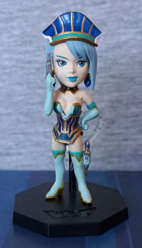
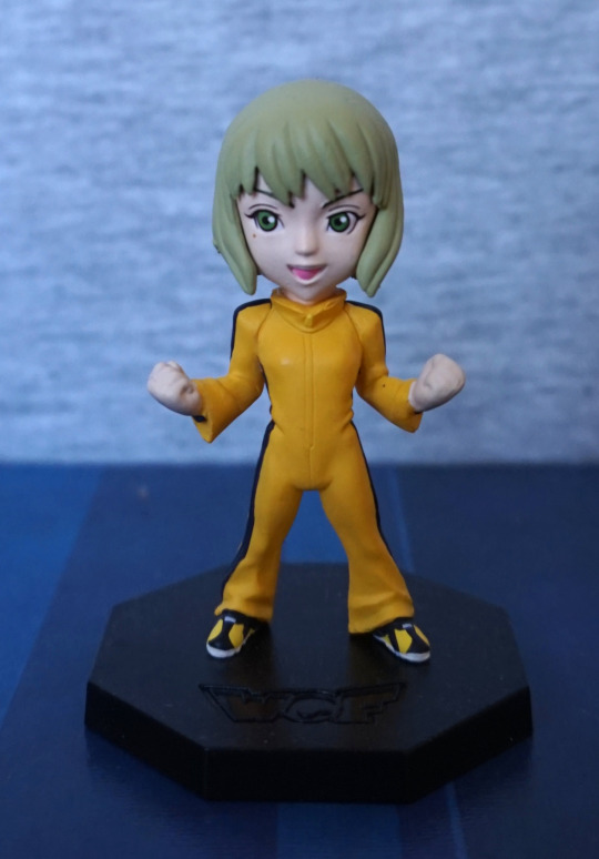
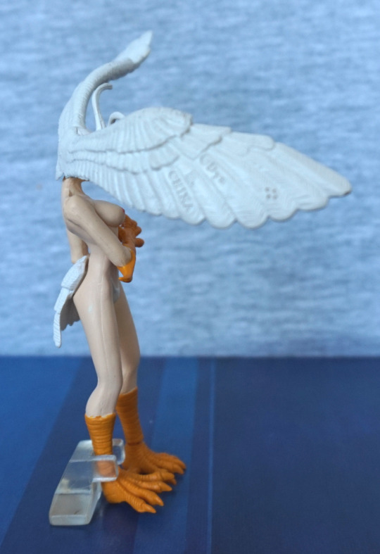
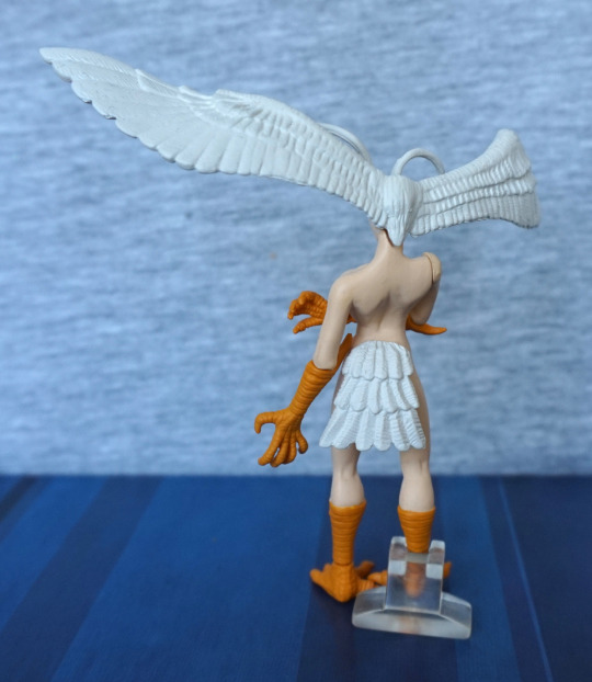
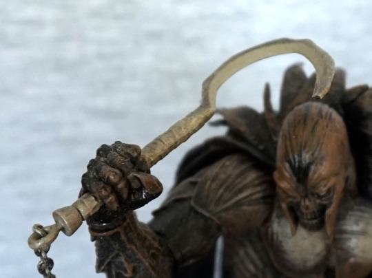
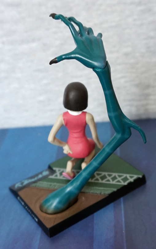
And finally, the side characters!
First is Ben Jackson, the taxi driver for Wild Tiger:
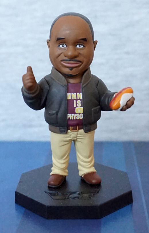
Here we see him as his positive self, with the obligatory hot dog. The painting is really nice on the front of this figure, and the sculpting is good too – his face looks really good, and the creasing in his trousers gives this figure a more realistic feel.
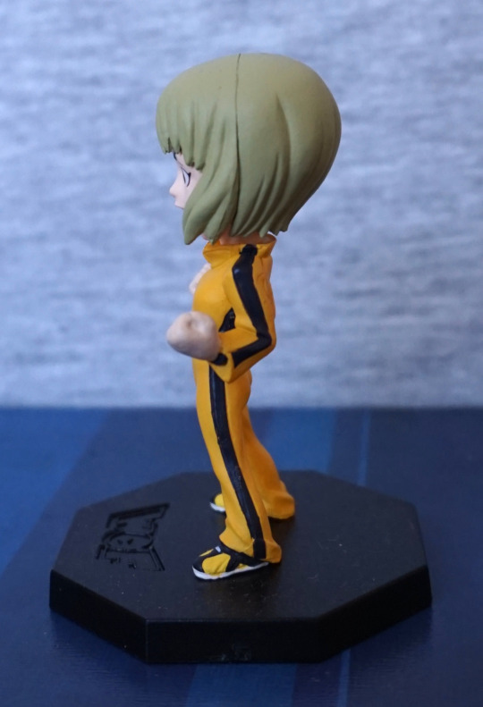
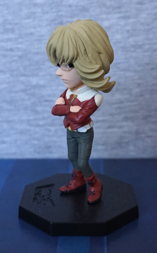
Left:
His hair is definitely smooth…. could’ve probably done with some kind of knobbly texture. Rest of him looks fine though.
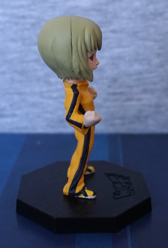
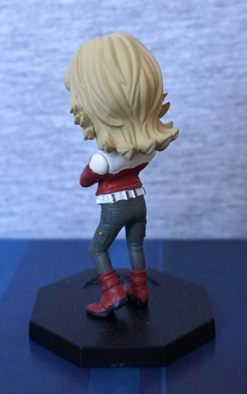
Right:
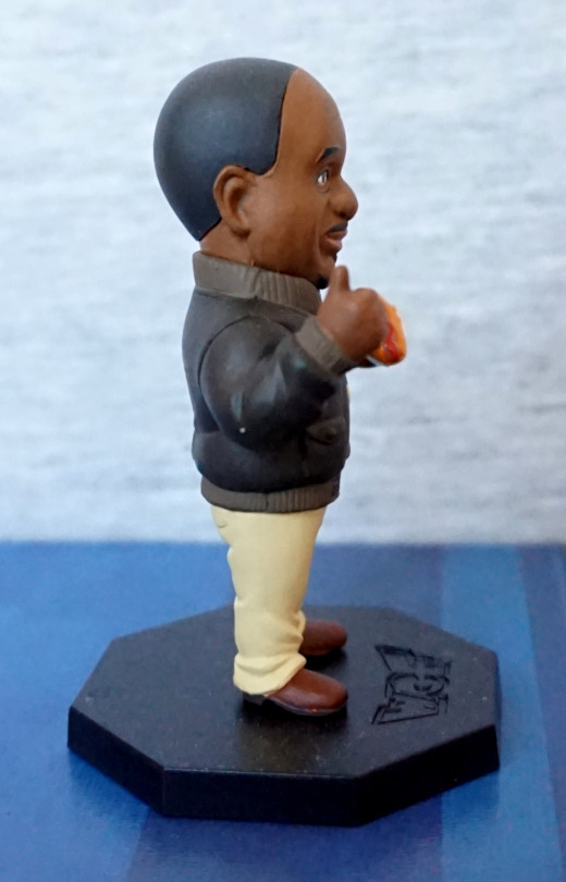
Go Tigher! Yeah, that hair is deffo lookin’ odd…
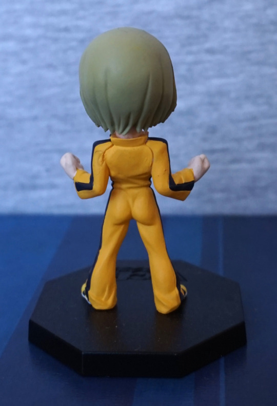
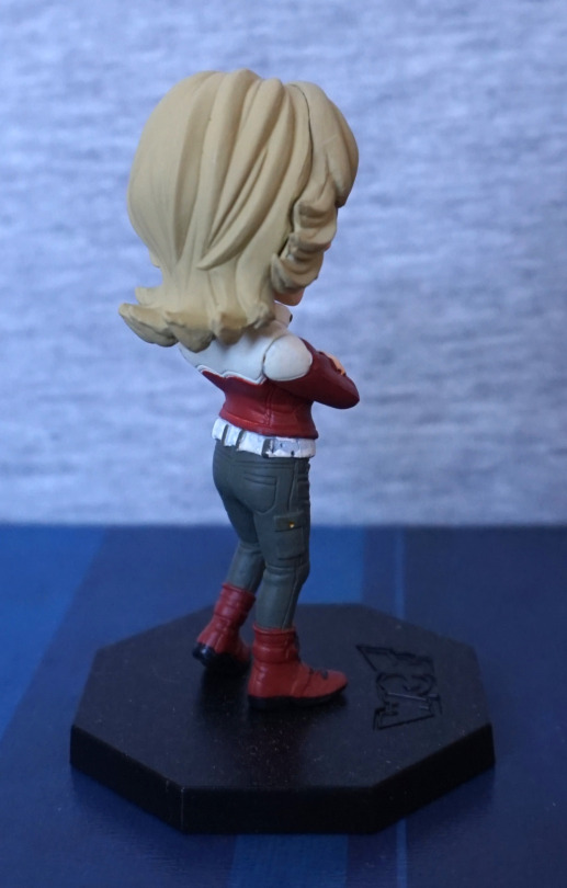
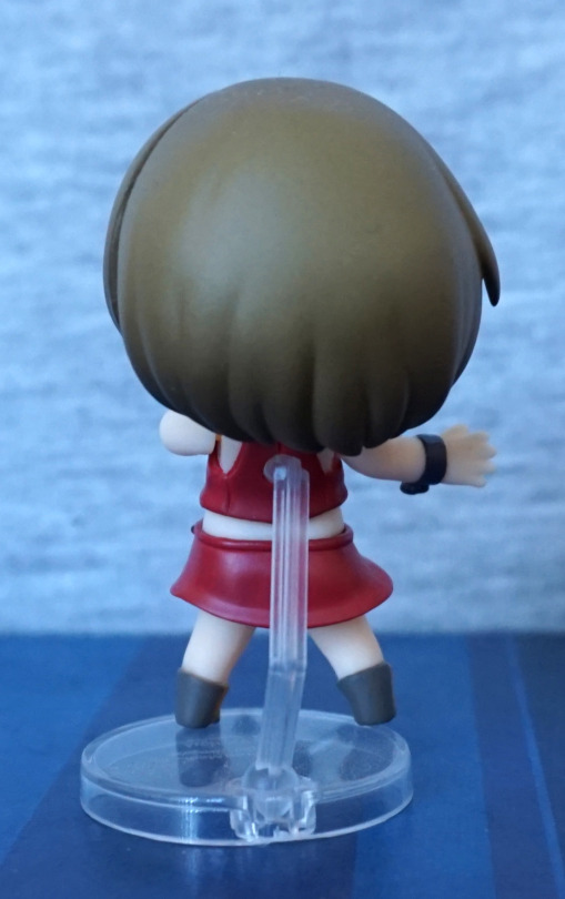
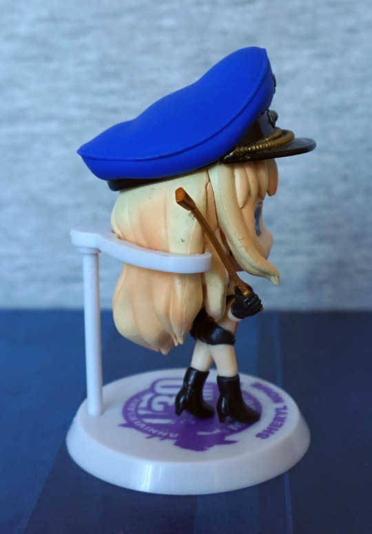
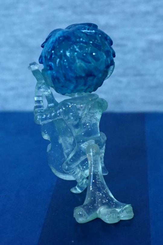
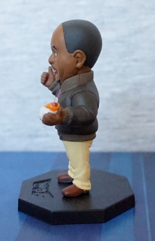
Back:
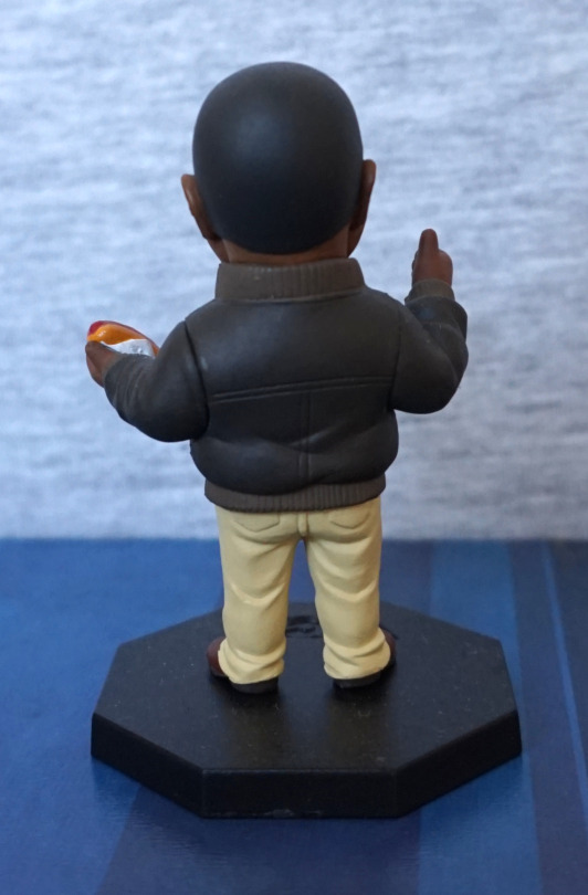
The arm seams actually look good on this figure, and match with the coat style. They’ve added creasing to the clothing at the back, so he also looks good from the back.
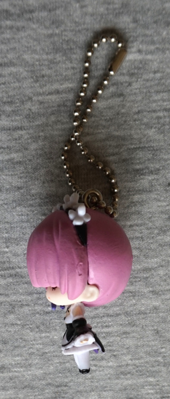
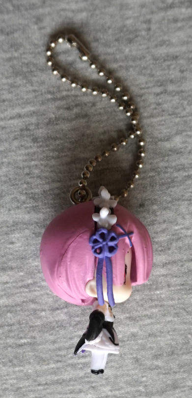
Most of this figure is really good imo – just the hair could’ve done with more detail so he looks less like a brown bowling ball.
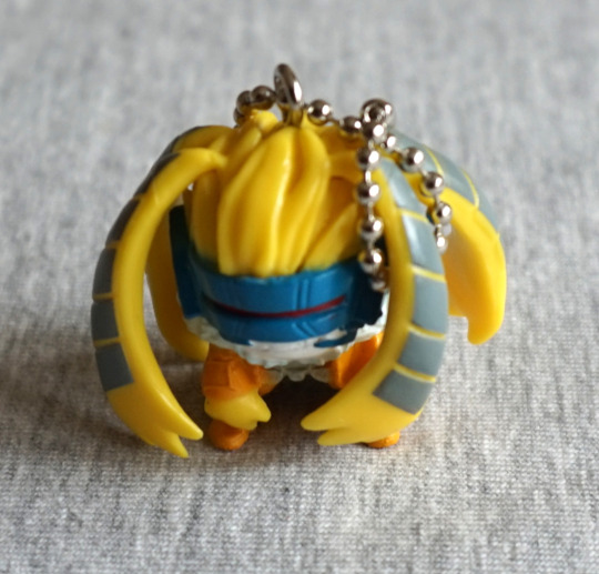
Now for Saito the Scientist:
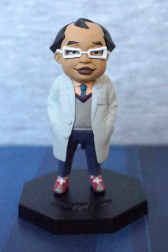
The paint is neat, and looks good. Though with his badge not painted, that part does look odd – more like he’s got it underneath his labcoat, and it is showing through…
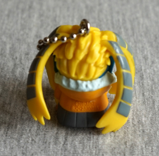
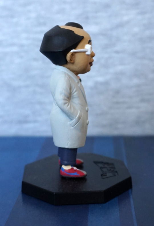
Left:
Paint for his glasses got a bit escapey, and not quite enough on his hair. His shoes and coat look good though.
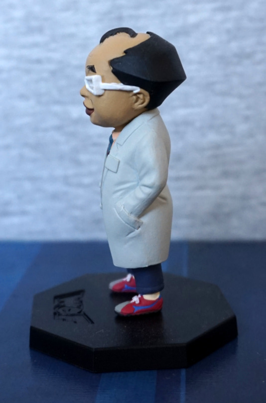
Right:
Glasses a bit better pained on this side, but looking odd. Hair is of an interesting geometric shape…
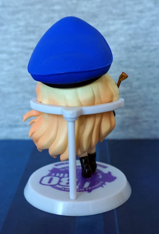
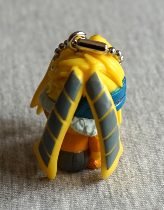
Back:
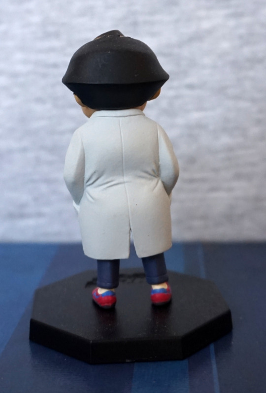
Back doesn’t do the hair any favours either, but the coat looks good, plust the other clothes we can see here.
Overall a decent figure with a couple of oddities.