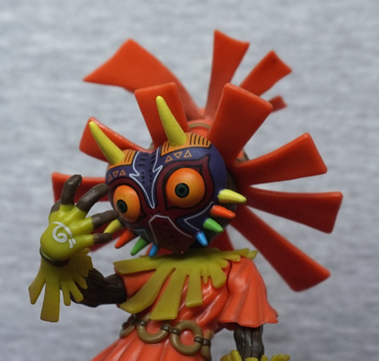
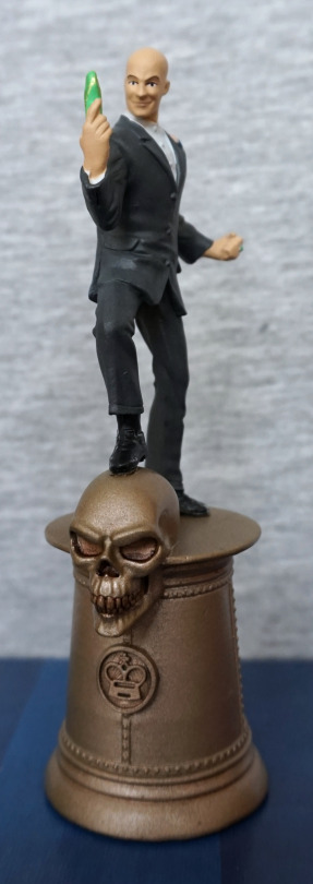
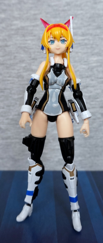
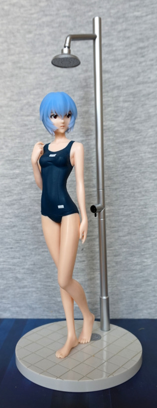
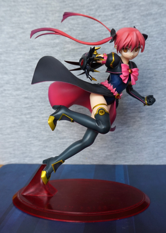
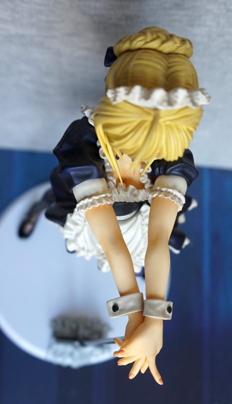
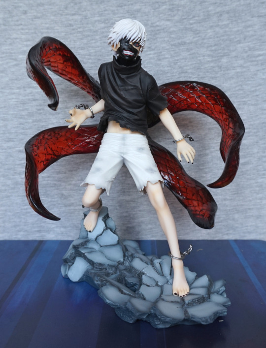
After getting the incorrect version last time, I managed to order the right one this time!
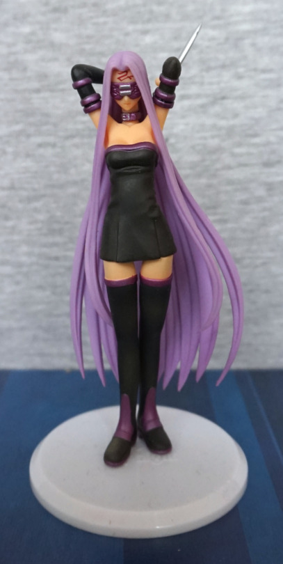
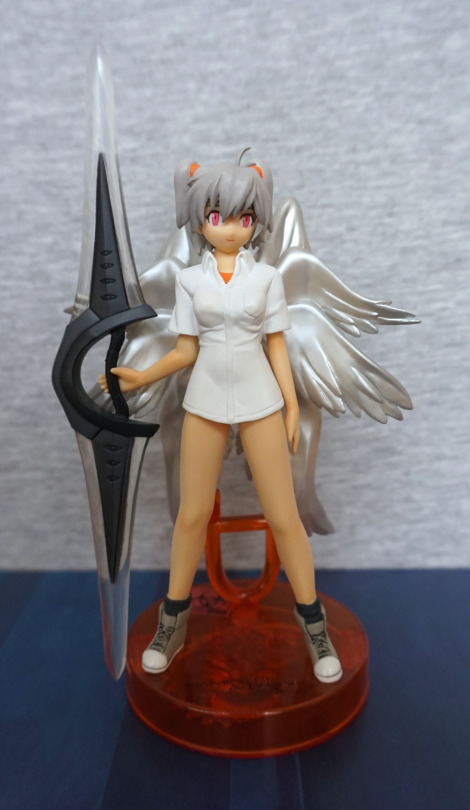
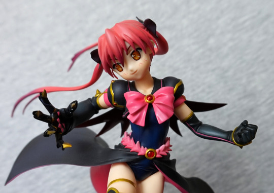
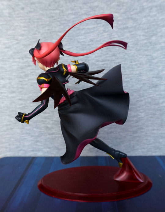
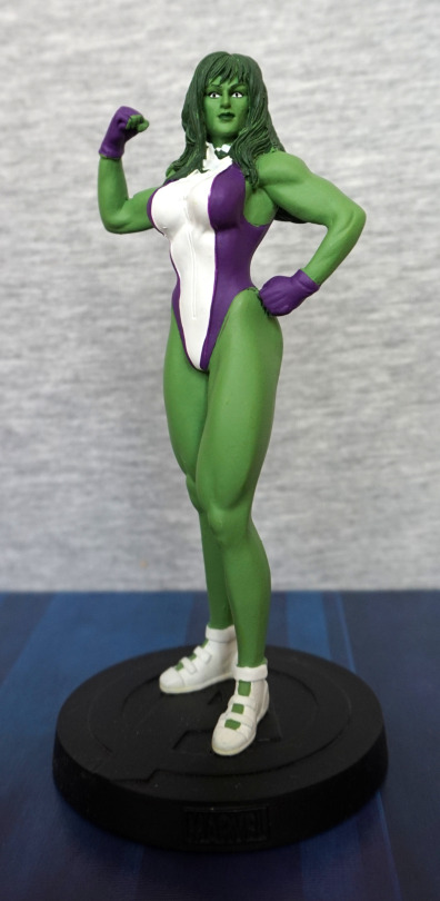
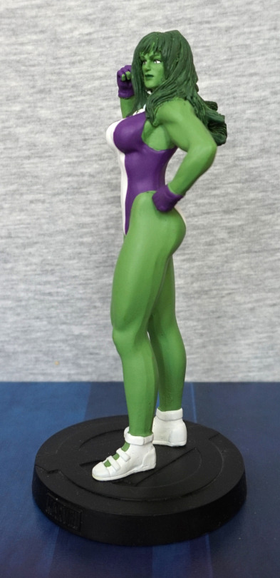
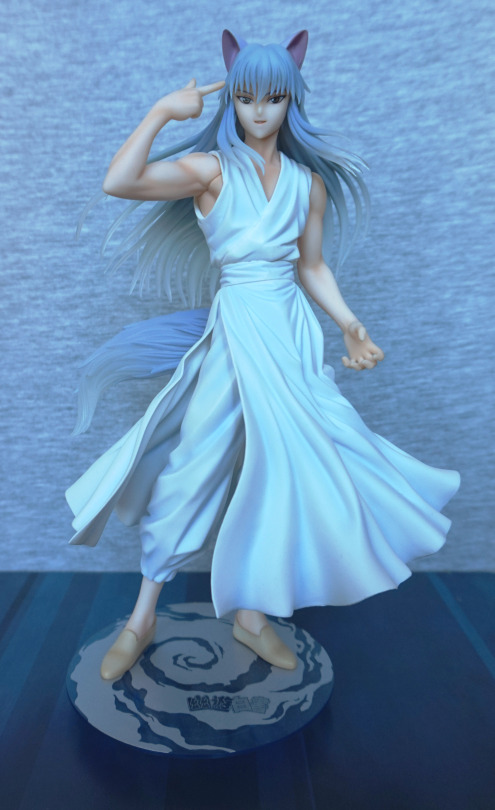
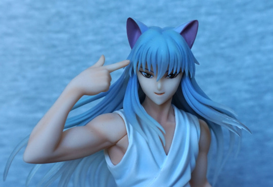
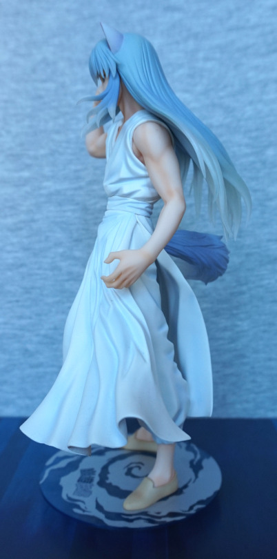
Aha! The Rider trading figure I wanted! And this one is in better condition too – bonus. She’s in a very similar pose, only she has her blindfold on, which for me, makes Rider feel more complete. The sculptwork is good, and the paint is neatly done – not overly fancy, but it feels like the correct colours.
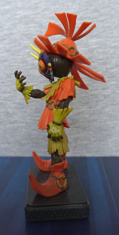
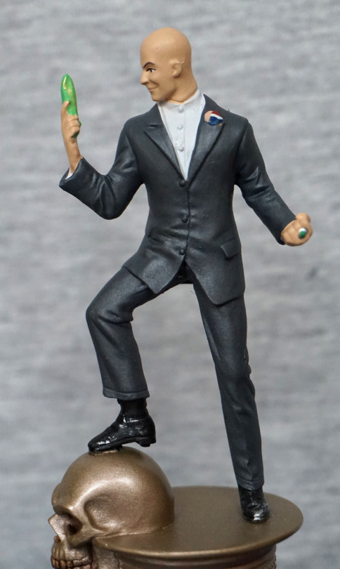
Left:
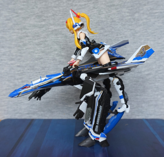
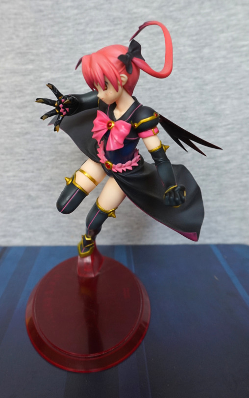
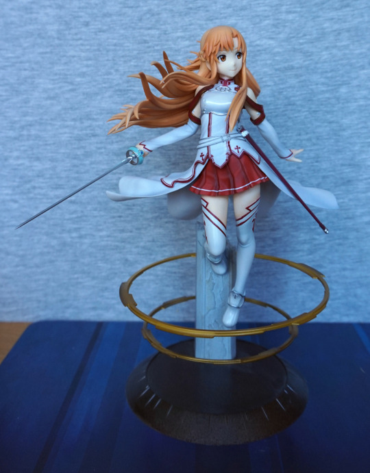
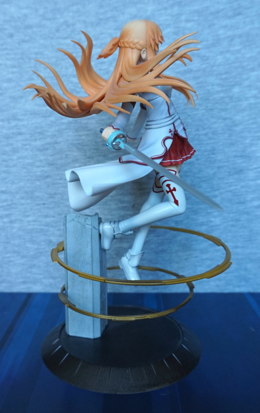
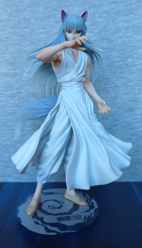
Standing with her back arched, she feels ready to pounce with her blade. I like this slightly unusual pose.
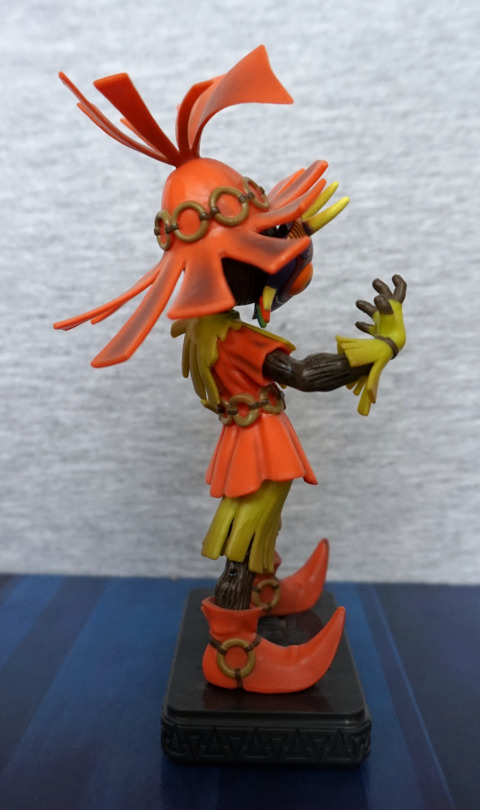
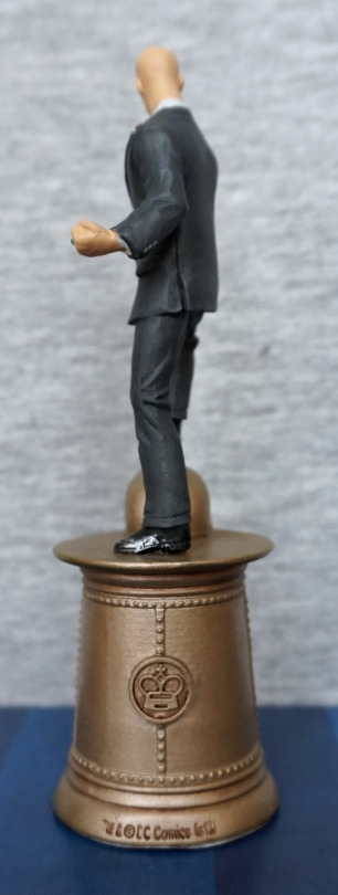
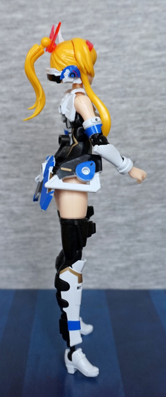
Right:
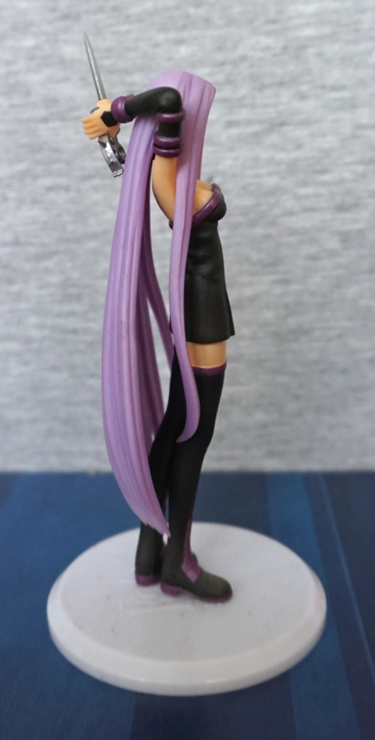
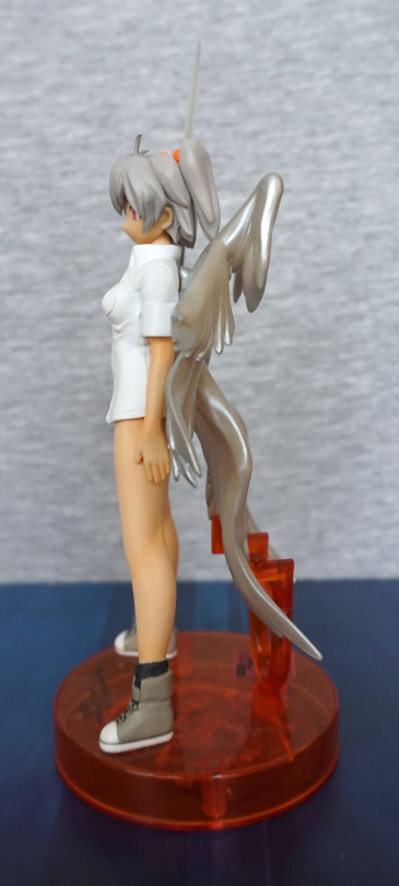
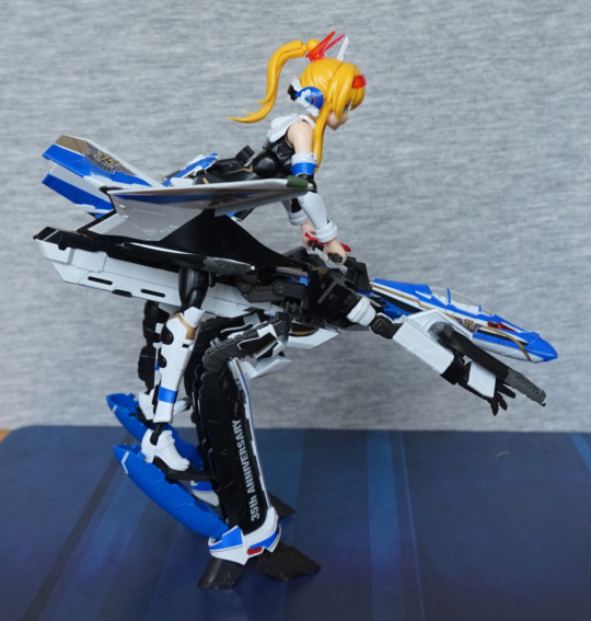
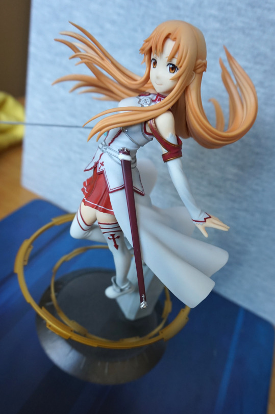
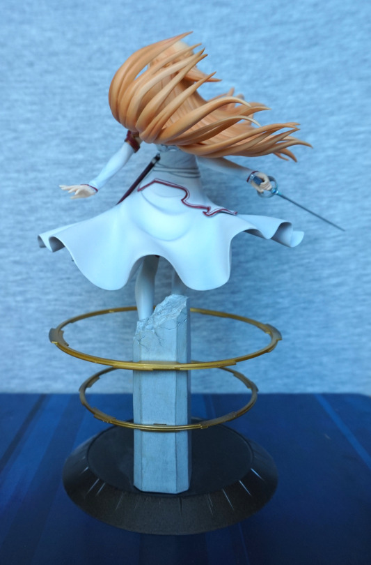
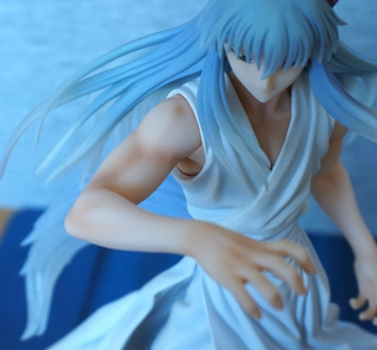
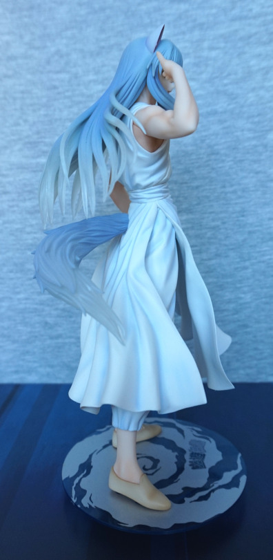
The hair has been made to flow nicely around her arms, which I like.
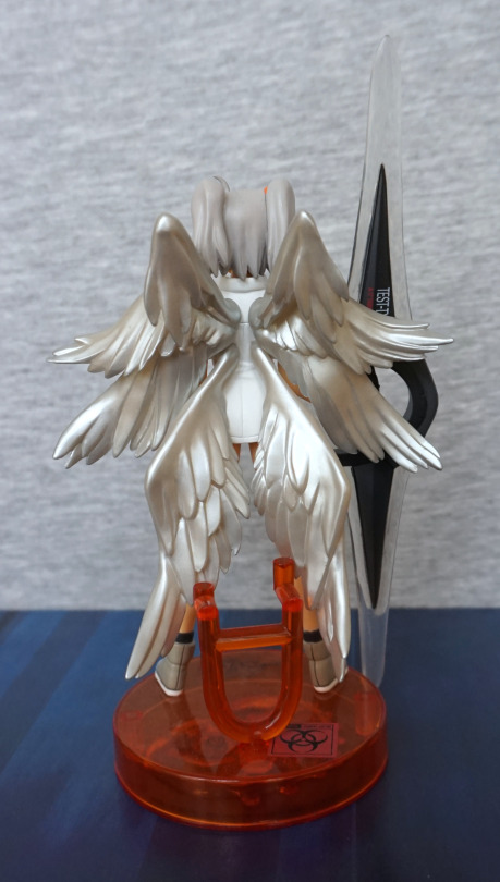
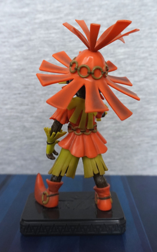
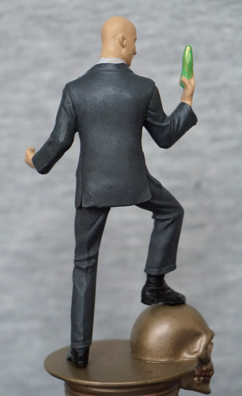
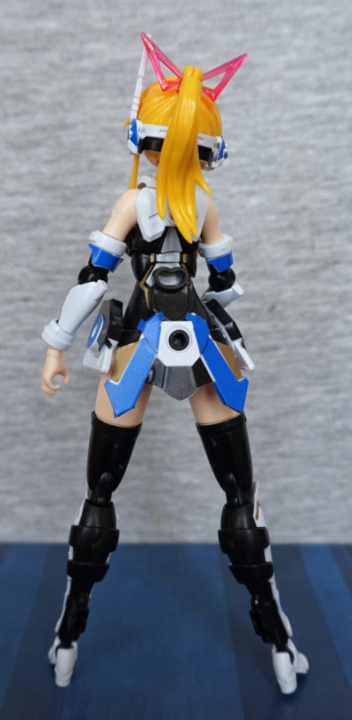
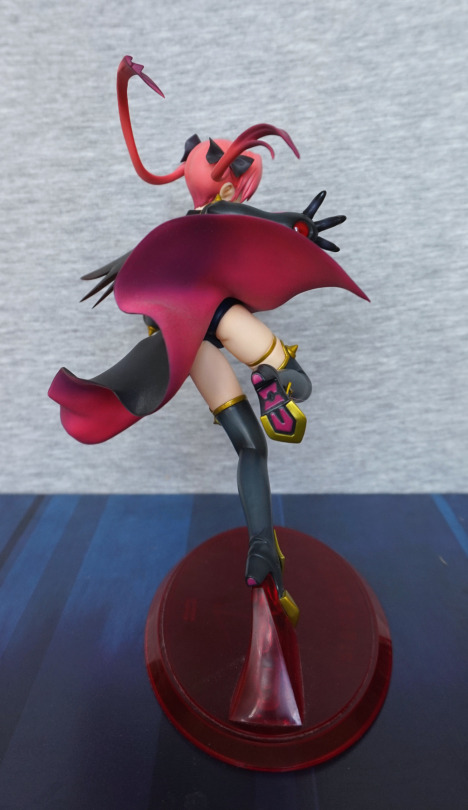
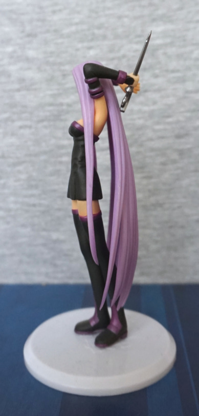
Back:
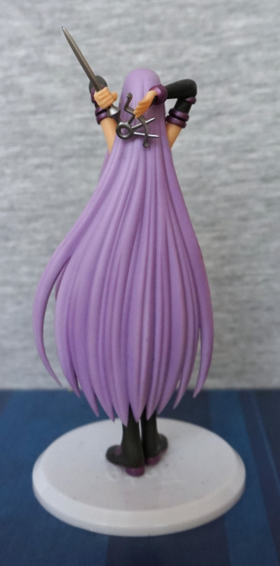
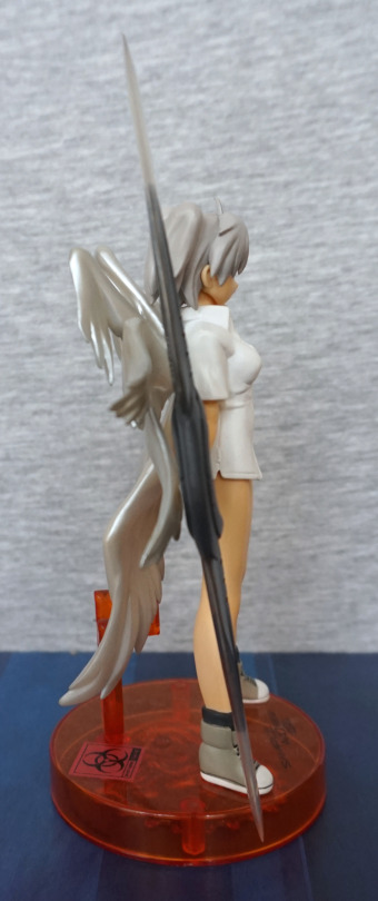
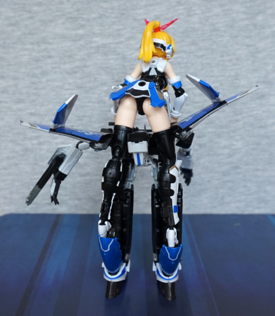
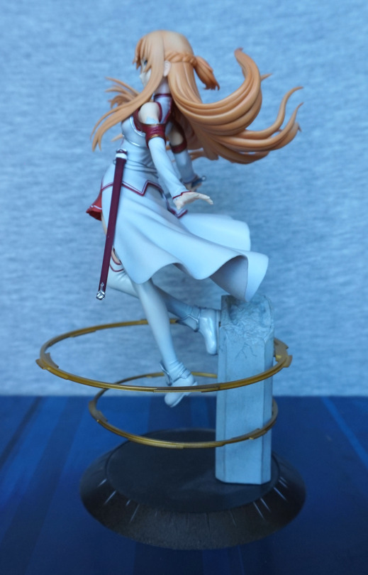
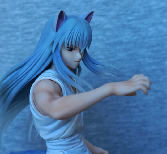
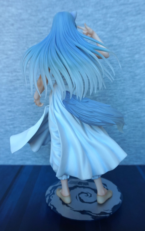
Her hair has some shading, which helps to give it depth. It’s sculpted well, and works for Rider. She can hold her blade either way up, but I felt this worked best.
This trading figure is a nice one, and definitely a higher quality than a lot of small figures, though it’ll likely a bit pricier due to this fact. Does feel in keeping with GSC’s quality, and am glad to have finally found and got around to buying it.