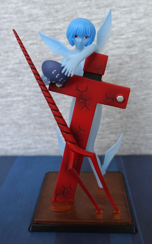
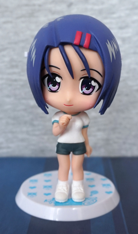
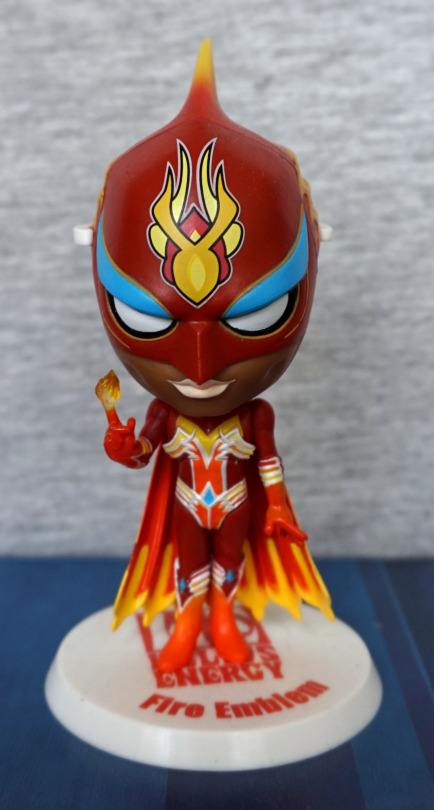
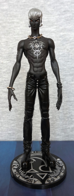
Just a small figure today, Rei on the beach:
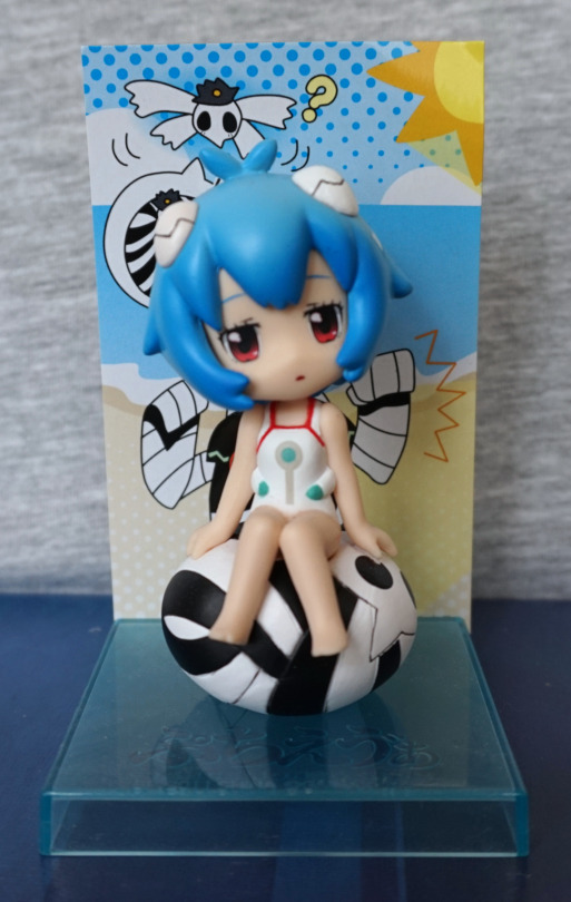
I have a couple of this series of figures already, so I was excited to see the Rei from this set. These figures aren’t overly complex in their design, but they’re nicely painted. The base is a rather straightforward affair – clear blue plastic, with Eva@School on it, with a slot for the background. The background is nice, and complements the figure. I like the angel that’s been included in the backdrop.
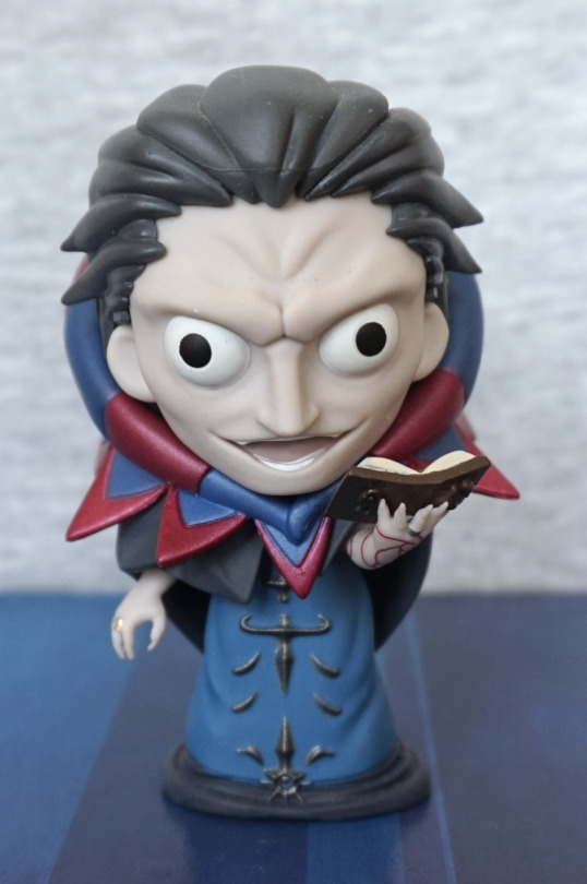
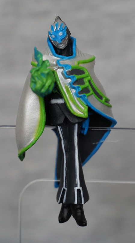
I like her expression – I feel it captures her detachment. The ball she’s sat on also includes an angel symbol – a nice inclusion of the theme. The swimsuit also captures the essence of Rei’s plugsuit, but I do think the grey almost-penises look a bit odd. The hair has a subtle gradient, preventing it from being bland and flat.
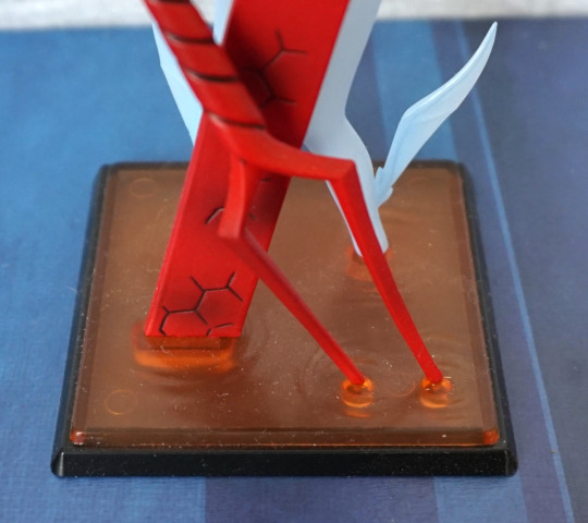
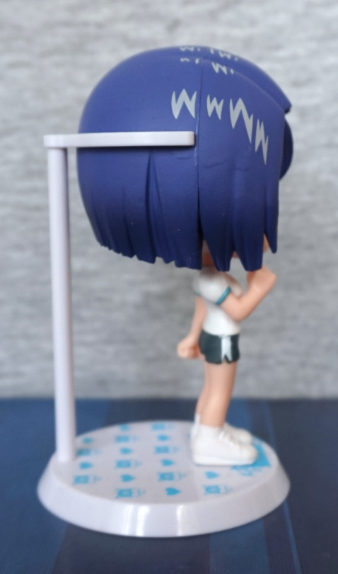
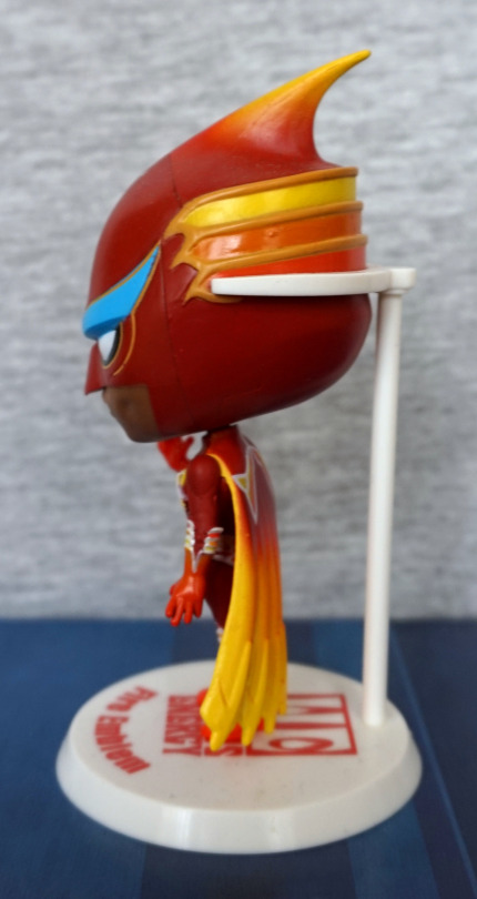
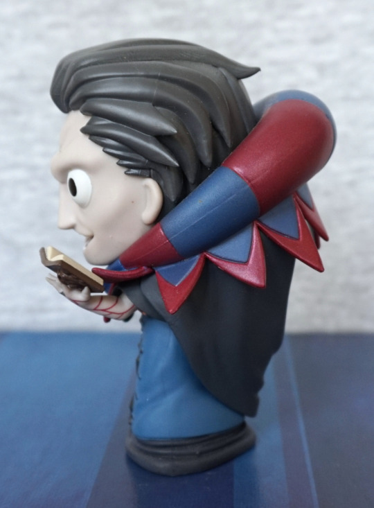
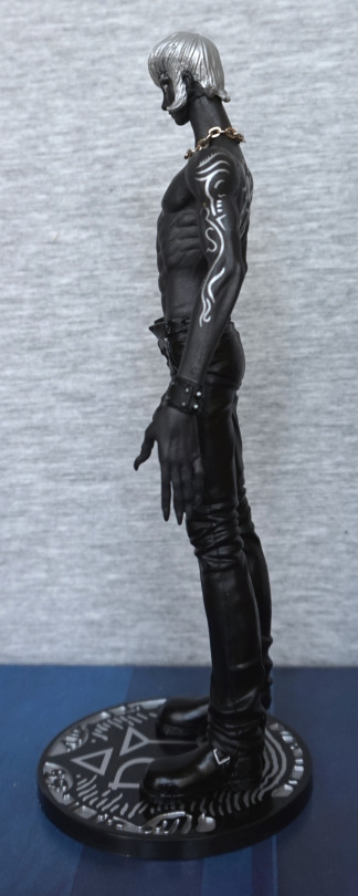
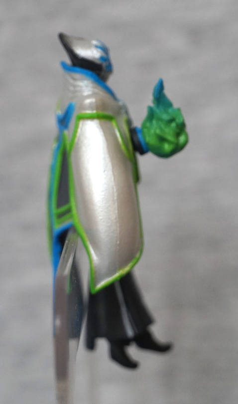
Left:
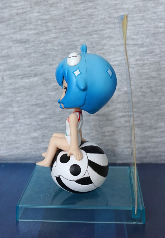
Here we can see the angel-on-the-beachball clearer. Edging on it is a bit unclean, but it’s easily recognisable and does the job. Here we see some overemphasised highlight marks on her hair – not sure if I’m a fan of this style of highlight. Hairclip looks good too.
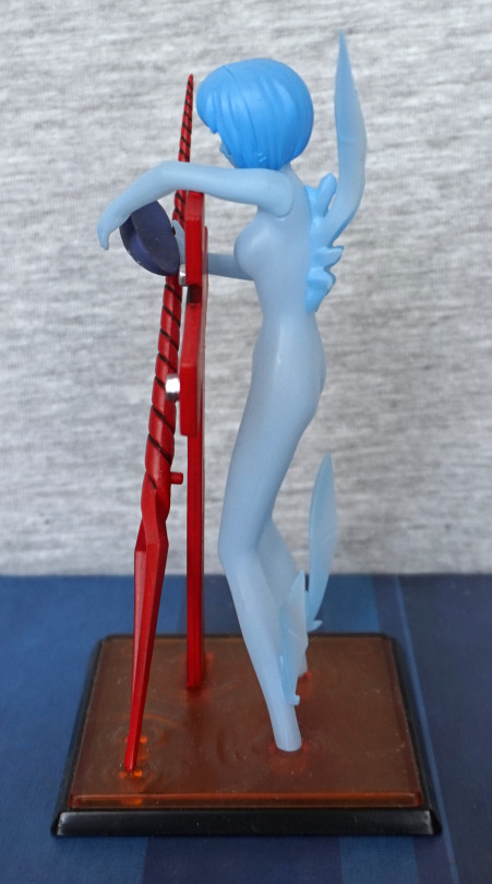
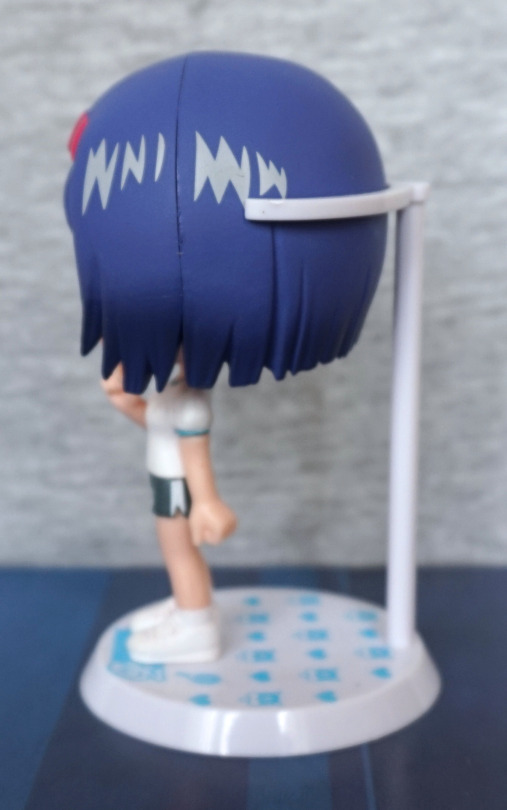
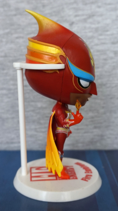
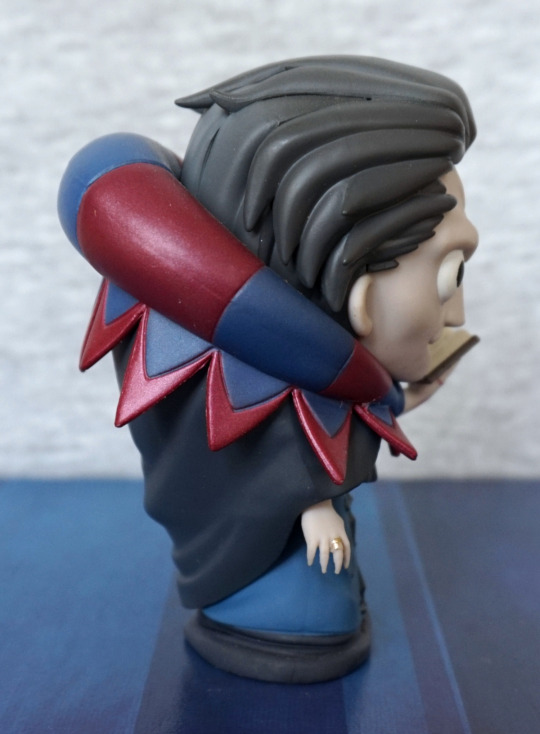
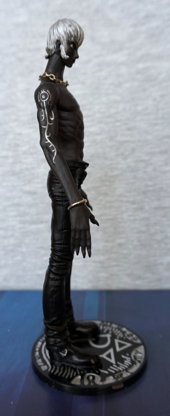
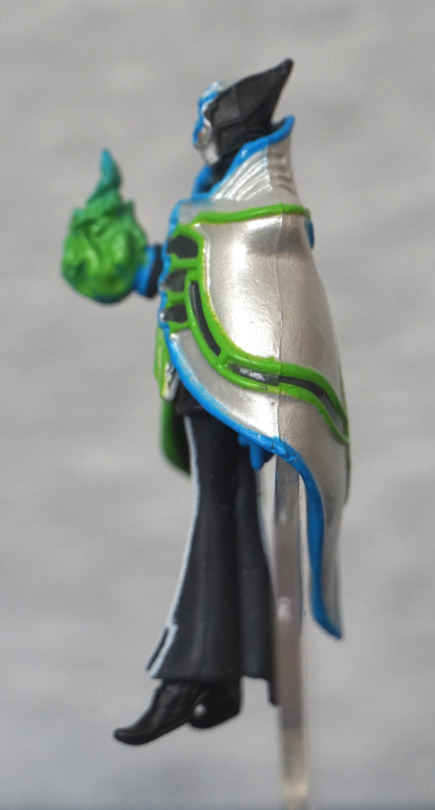
Right:
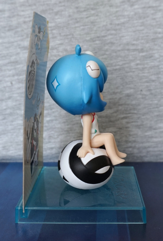
Seam isn’t overly bad in the hair. Beachball looks good from this side, and we can see where her hair sticks out a bit on the front half.
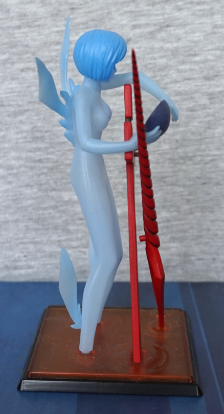
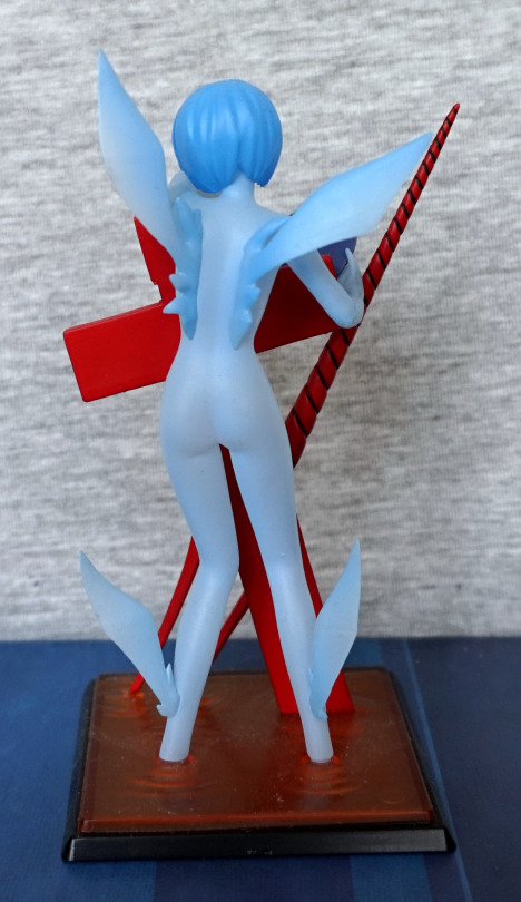
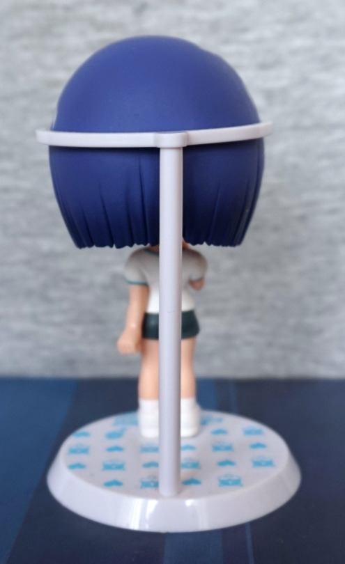
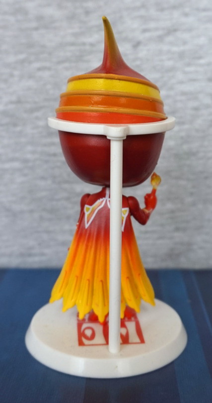
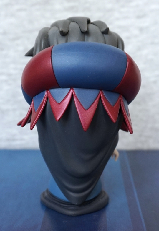
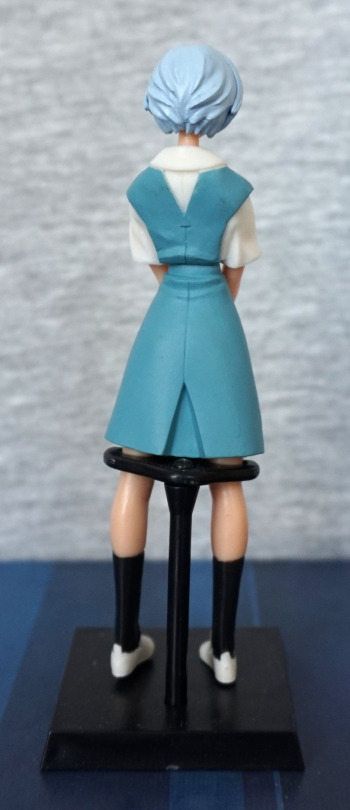
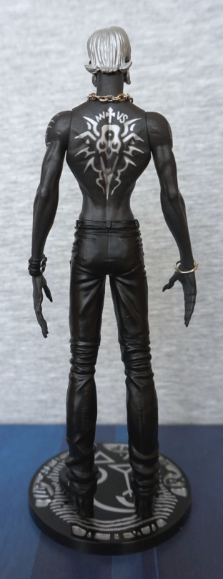
Back:
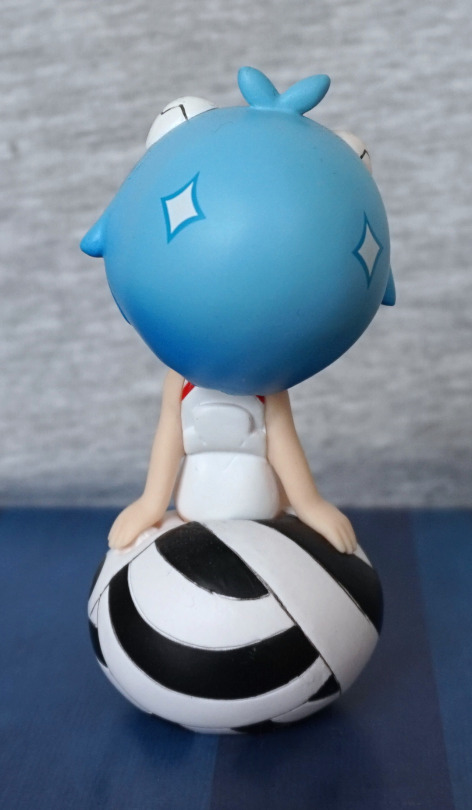
Bit of a paint mess on the ball. Hair is neatly painted on the back. They’ve reduced some of the plainness with the shine marks, but I don’t think you’ll really be looking at this side much, especially with her backdrop. They’ve given her some of a backpack, but I think this looks kind of odd, and a flat swimsuit would’ve worked better, though an actual backpack could’ve worked for a beach trip? Gotta have something to carry the beach supplies!
Overall, it’s a decent small fig, if you don’t expect too much from it. I got it for a reasonable price, so for me she was worth it.