Time to get back to a Japanese figure, and what better than Evangelion?
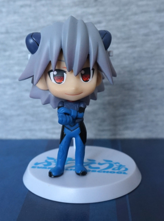
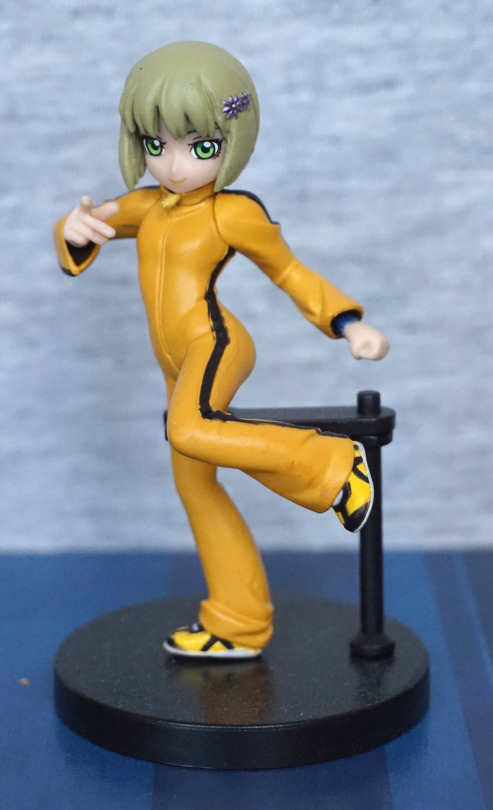
Here we have Kaworu Nagisa, in prize figure form:
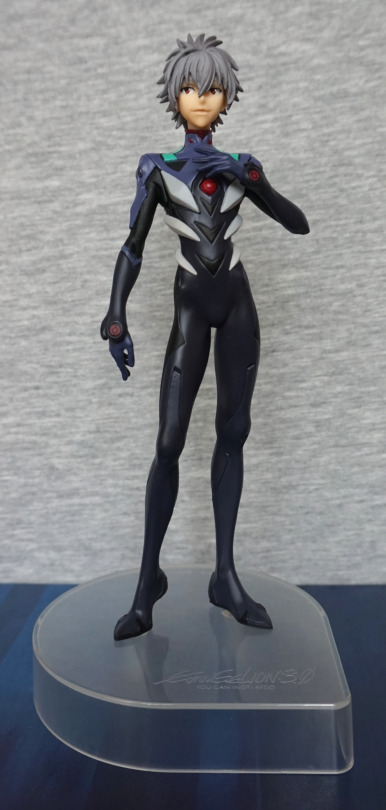
Lookin’ tall as Kaworu does. I like his pose, and feel it suits him well. I also like his plugsuit, as they’ve given it a good amount of depth. With the way this figure has been designed, the parts of the figure have nice, crisp lines. I like the clear base for its neutralness.
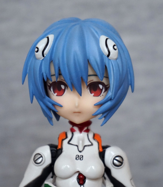
Face:
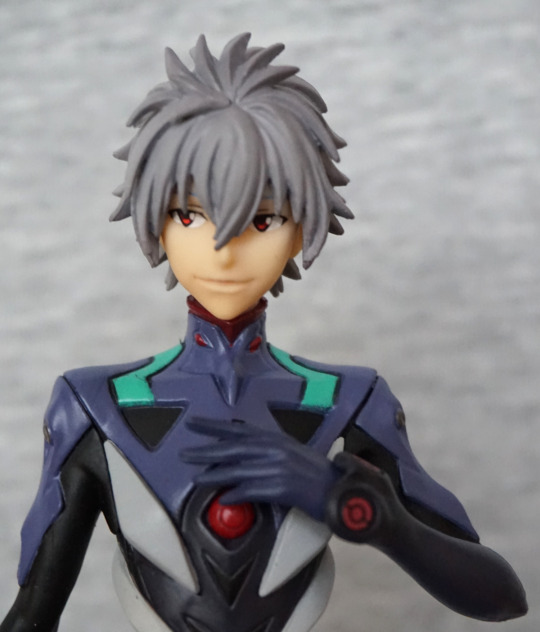
The hair is well-sculpted and his face is decent.
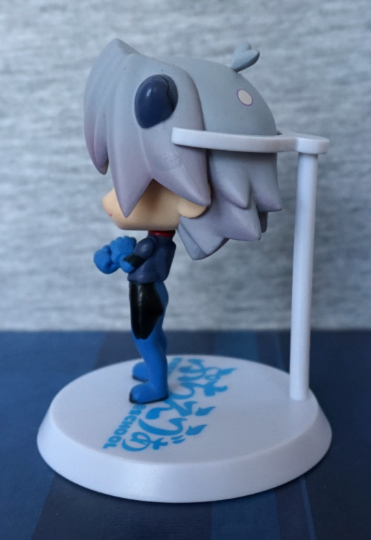
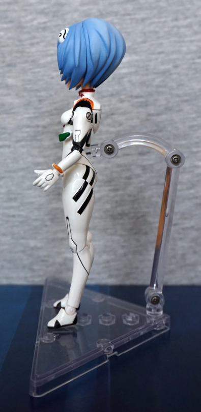
Left:
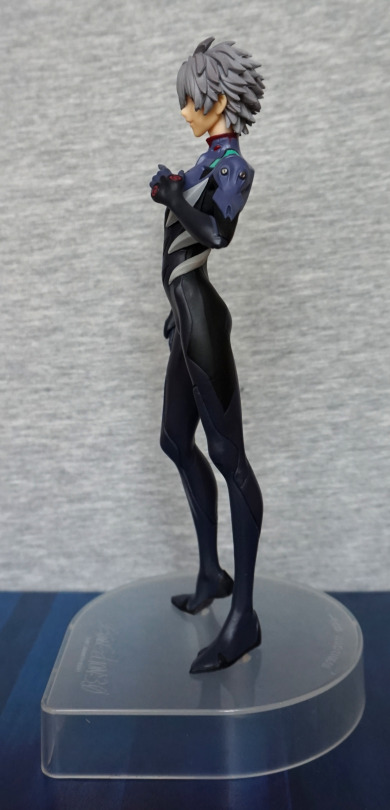
He’s leaning forward slightly, which adds to his pose. I love the slender body shape, and the hair looks decently detailed from this side too.
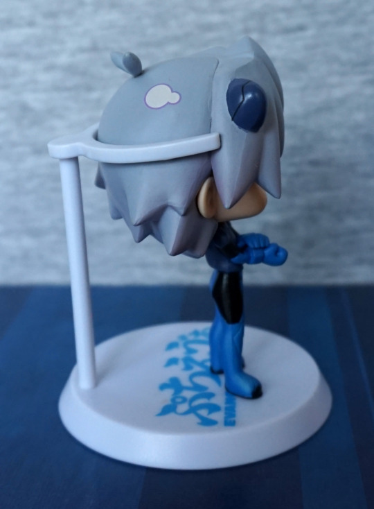
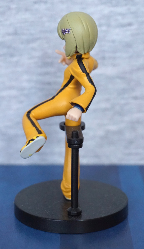
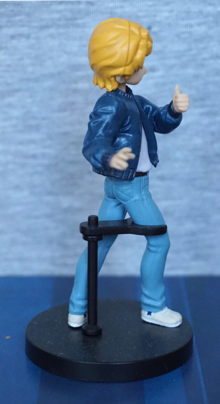
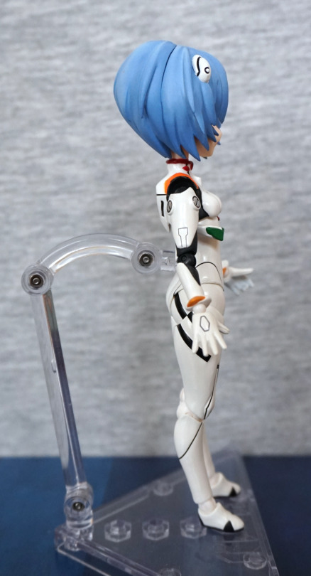
Right:
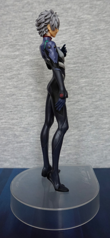
There’s some good detailing on his arm – the upper light-blue part has some good sculpting details to it, along with the grey parts. His backside has a nice shape to it from this side too.
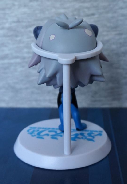
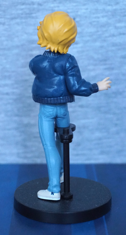
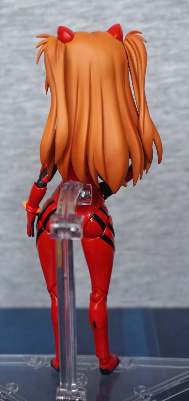
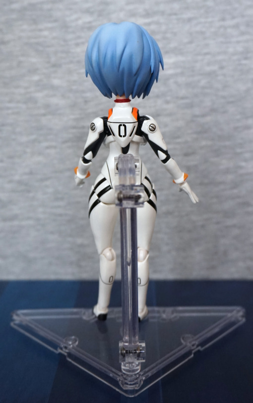
Back:
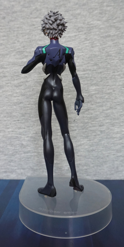
Hair also looks good from the back, and his backpack looks the part, and the print is well done here. His body feels slender, without being overly so, with some shape to his backside… very form fitting suit :P. Love the finish on the darker parts of the suit.
Base:
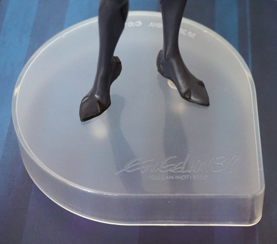
The base features a logo to say it reflects his 3.0 design. The shape of the base is mildly eye-catching, being a bit different than usual. For me, I’d prefer the base to be a little less tall, as he’s a fairly tall figure as-is.
Overall, I’m happy with this figure, and am happy to add him to my army of Kaworus. Looking up close, you can see some of the hallmarks of a prize figure, but overall I think he’s a decent quality and would recommend.