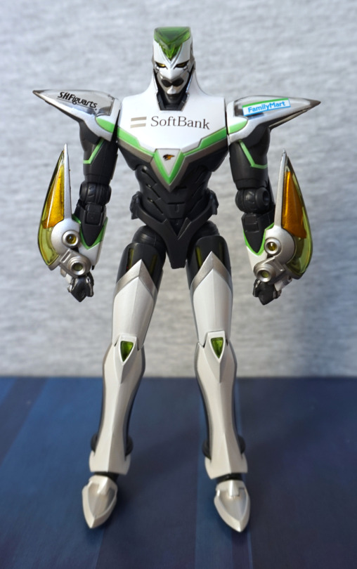
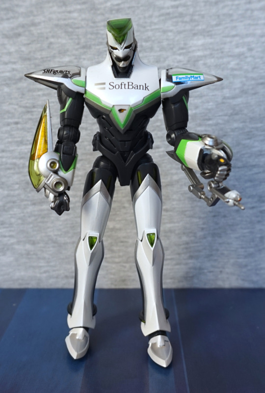
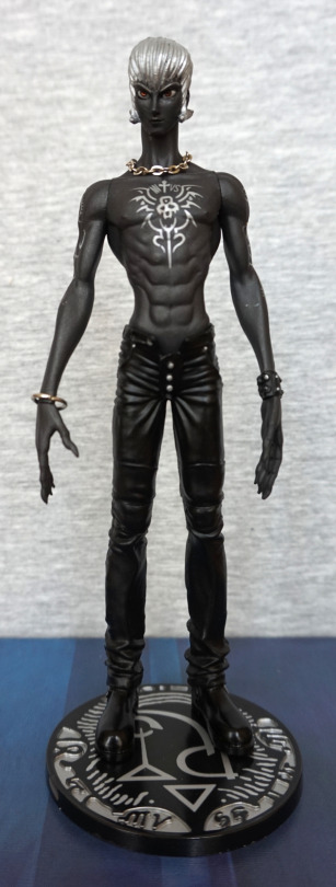
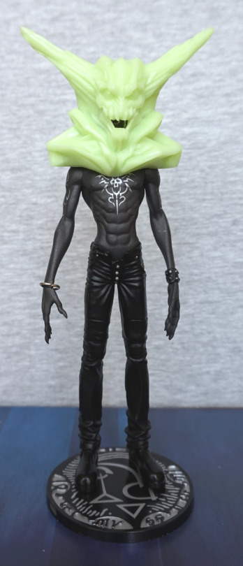
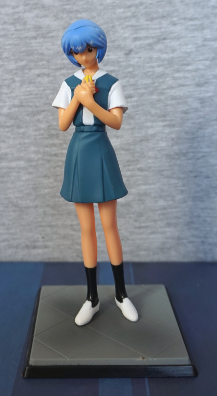
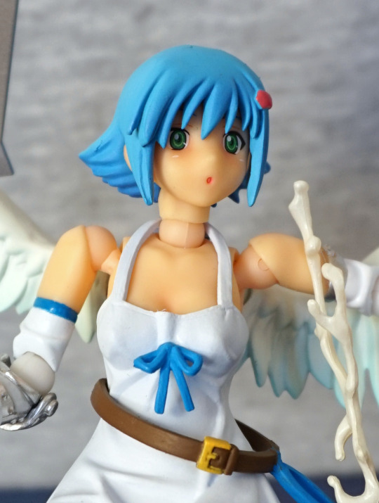
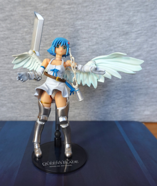
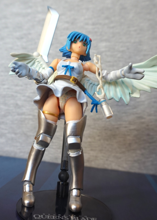
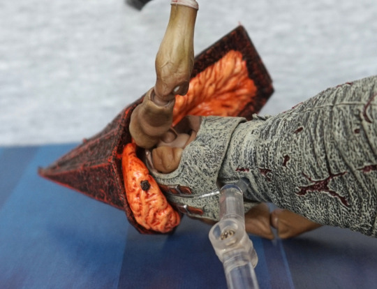
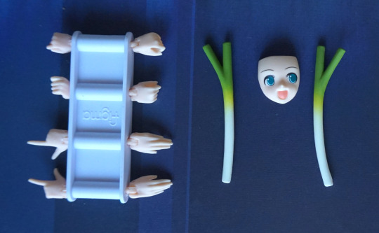
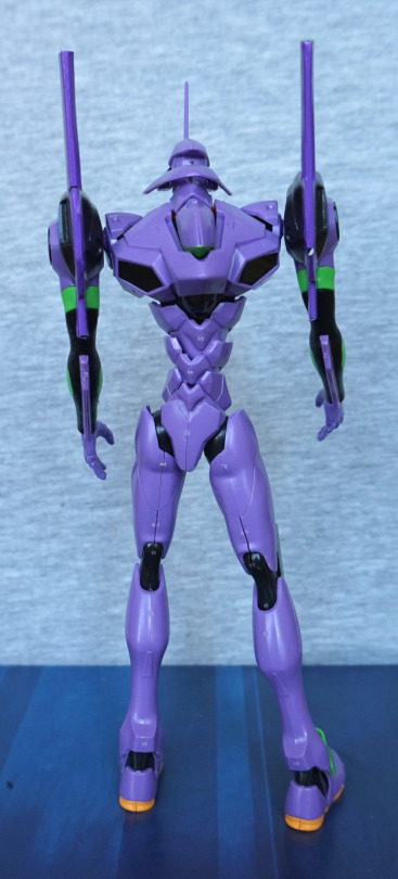
I couldn’t escape Japan without getting at least one model kit. So here’s EVA-01:
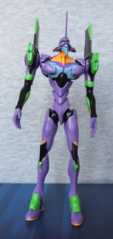
This one was a fiddly mess to build, and made me appreciate more modern model kits. The waterslide transfers were… a fair bit more tricky than I thought they’d be. From the front, he looks OK, but definitely a kit that could benefit from paint. Some of the areas are large and bland, and the blue plate could’ve done with some black dot stickers.
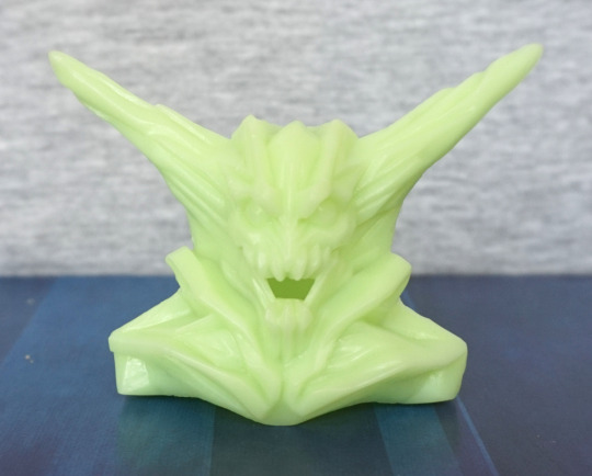
Head:
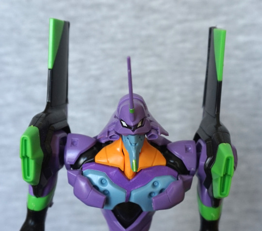
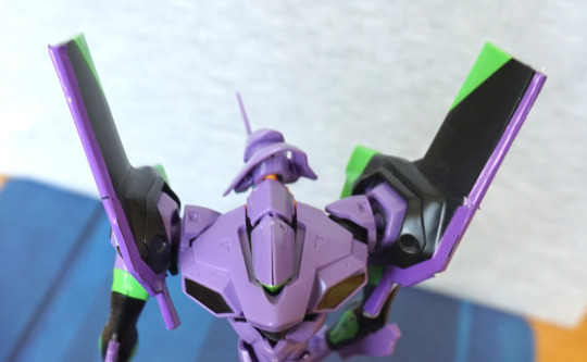
Rawr. He’s lookin’ at you. Face looks pretty good from the front, wish there were some black insets or stickers to go on the front green parts. Head itself articulates well.
Knees:
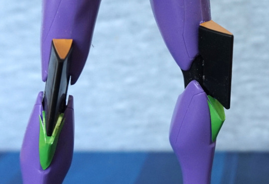
Just about got these stickers on OK :P. Here you can see the green stickers like to escape a bit. I like the use of colour here, and looks good from a distance.
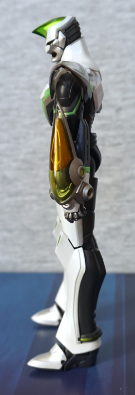
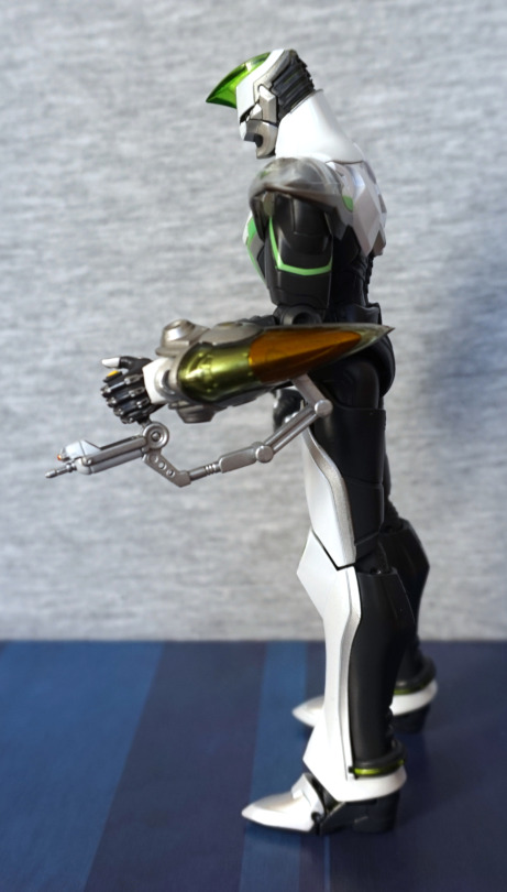
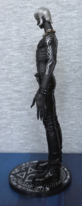
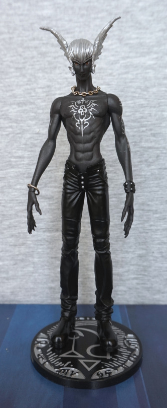
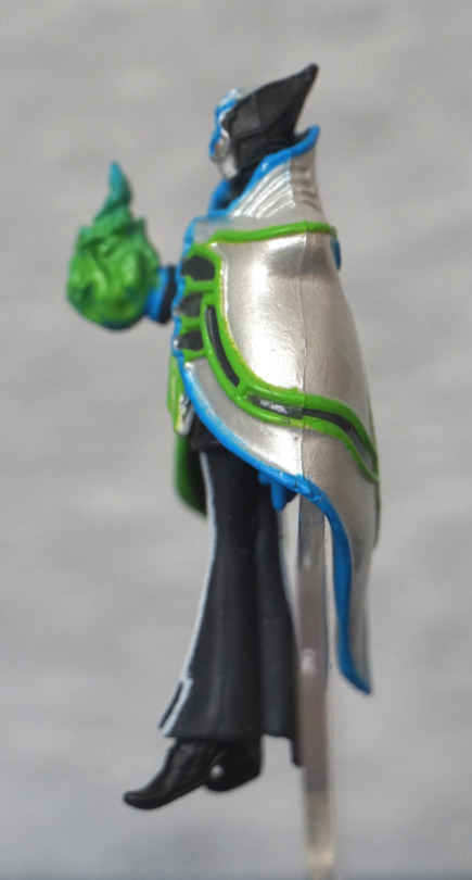
Left:
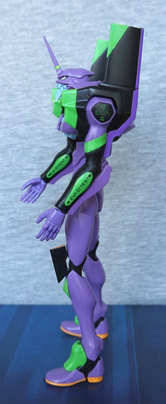
The purple stickers on the fins went OK. Here you can see the green decal didn’t go on too well, but the black ones were OK. From the left he looks pretty decent, and the colours work well. Here you can see some of the fluff stuck on the black parts of his arm already – this is a rubbery part. Not entirely sure why, but it’s kind of annoying due to being a dust magnet.
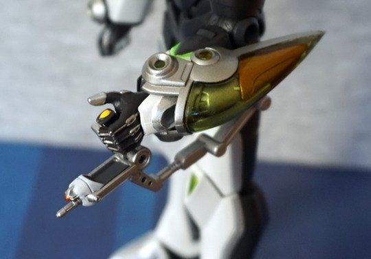
Head:
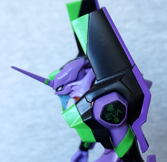
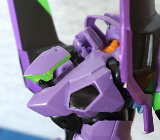
The triangular corners could’ve done with fitting on better. I like the green part on the lower arm though. His head looks good, though doing the stickers on his eyes was a pain. The head spike sticker works well though. The black parts on his arms articulate, which helps with posing.
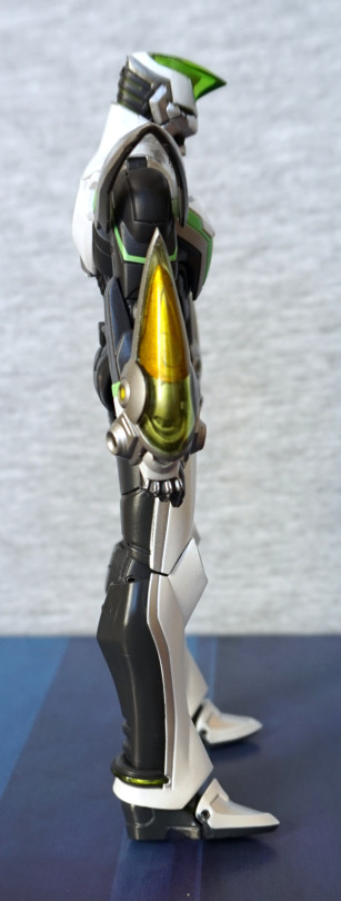
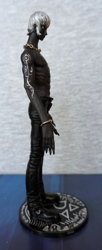
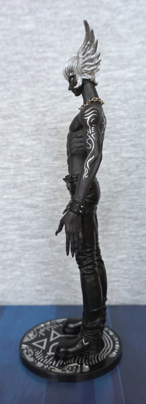
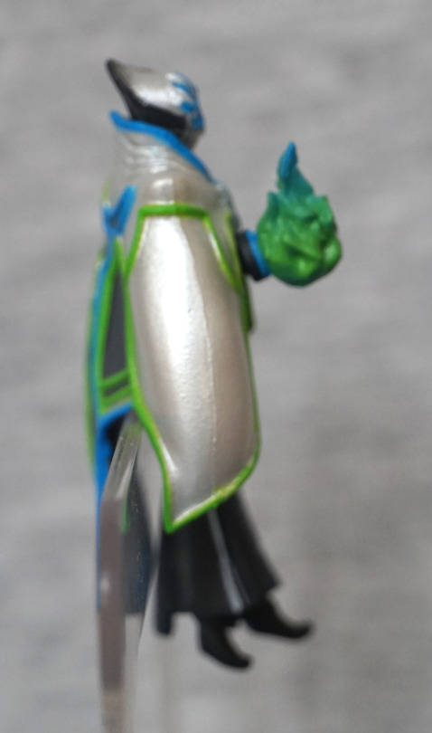
Right:
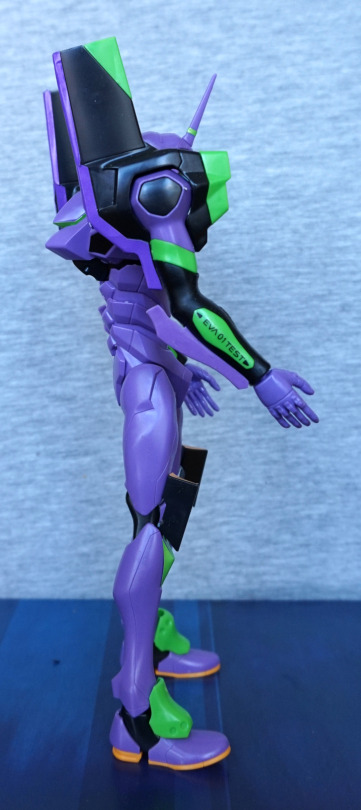
So… no 1 sticker on this side? Yeahhhh… it didn’t go well and ended up breaking up into three pieces, then one folded over, making it impossible to apply. Shame, because it was on OK, but then I accidentally nudged it with a finger :(. Though the green part at the top fits better on this side. The ribbing that forms his back looks good from the side too.
Close-up of the transfer that made it:
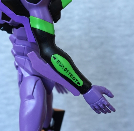
These ones worked well, once I worked out what I was doing. Still weren’t fun to do, but at least these look great once completed.
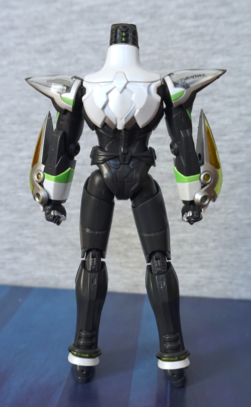
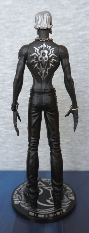
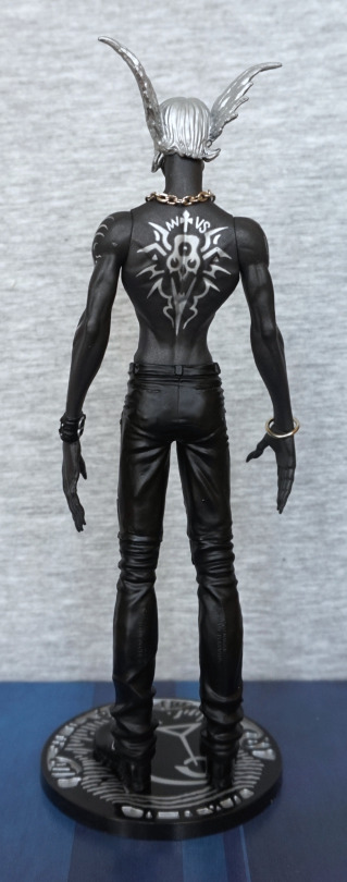
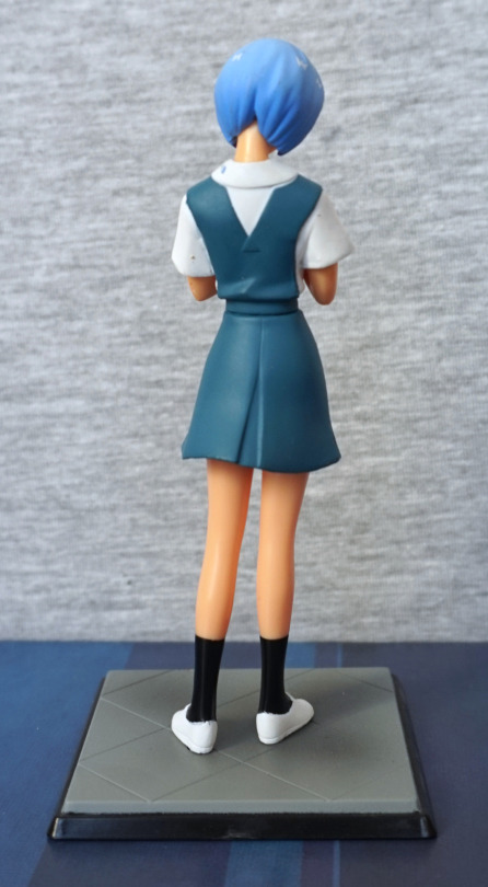
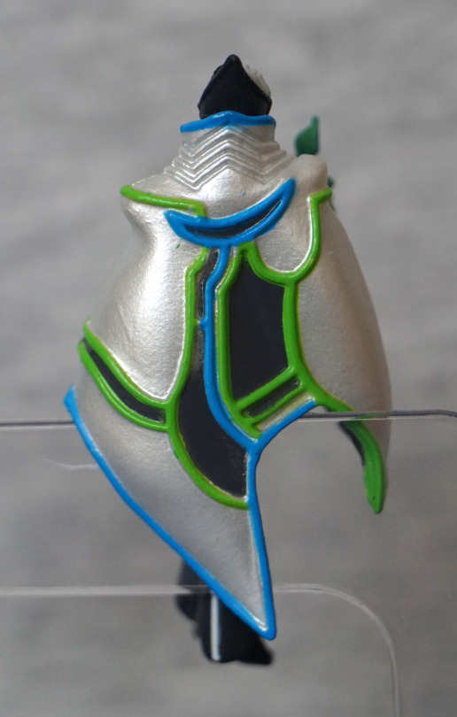
Back:
I like the shapes on the back. Here we have some black inset stickers – much-needed for the back, otherwise it’d look too flat. And we can see a bunch of mould edges – this kit was rather prone to them and I’m too lazy to sand ‘em all off.
Top of the head:
Here we can see some rather special pieces…
*Ptcffff*:
Here we can eject the entry plug! I like this little feature. And, um, I need to poke that sticker back on… The mechanism is a fun thing, but the little part that goes over the entry plug does have a nasty habit of popping off, and it’s a pain to get back on :/. The fact it has a few moving parts is nice, but could really do with having better ways of connecting!
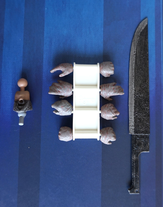
He also came with an oversized Shinji (well, a figure to fit that entry plug ain’t happening), which you could paint, but that got chucked in a drawer. It’s beige, doesn’t stand up on its own and looks rather meh.
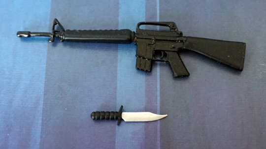
Overall, I wouldn’t recommend this kit. The result is OK, but not really worth the effort imo. He did come with some other accessories I didn’t photograph, which could make for good posing opportunities, but they’re nothing particularly special. There’s a big gun, but it can have a habit of falling apart and is plain grey unless you paint it. I don’t have any other EVA model kits to compare him to, though. Maybe get this one if you plan on painting it, as it would be a fairly decent base for that.