Category: Trading & Small figures

Klan Klang – midi figures – Macross Frontier

Today there shall be not just one figure, but two! You lucky blog reader, you. 

Both these figures are by Bandai – one blind box, one just boxed. 

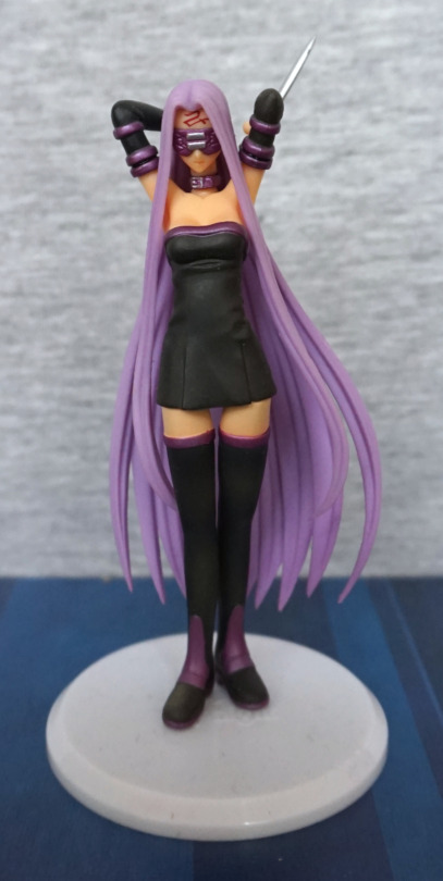
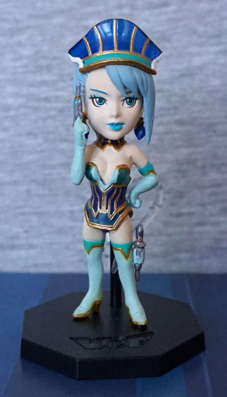
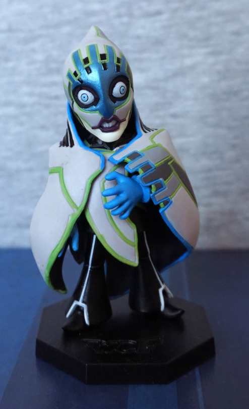
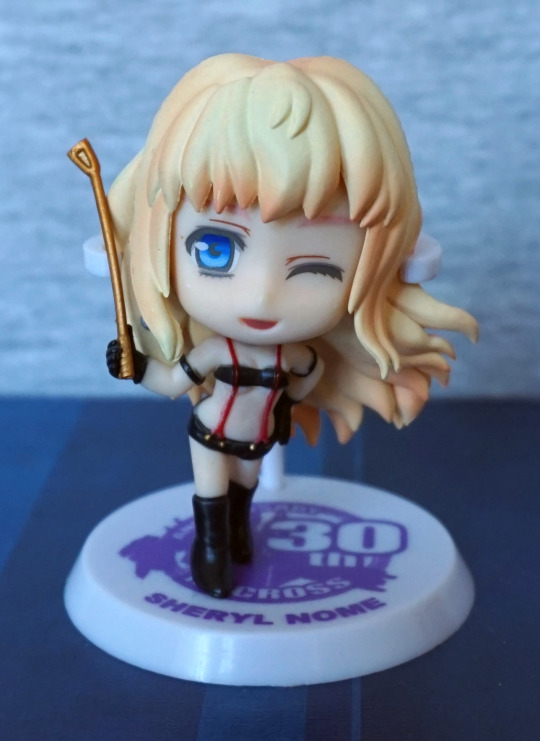
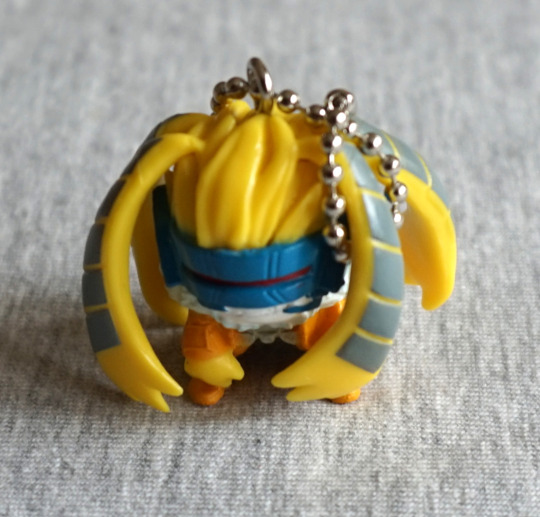
First up, Klan Klang in a casual uniform:

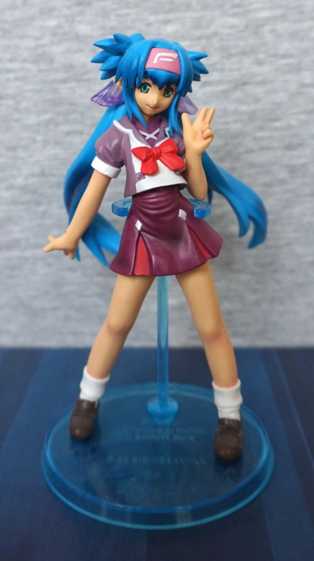
Quite a cute figure, and I like the translucent blue base. The colours work well with this figure. There’s a small amount of shading, but nothing to write home about – the dark bit on the skirt looks a bit like a grease stain imo, but the hair is nice. 

Face close-up:

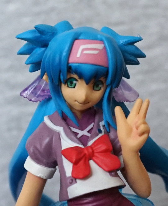
Not too much to the face, but looks OK. Here we can see some of the smaller flaws with the paint, but overall, pretty decent. 
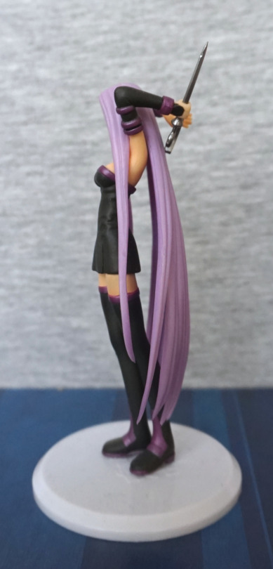
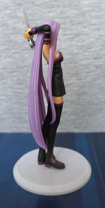
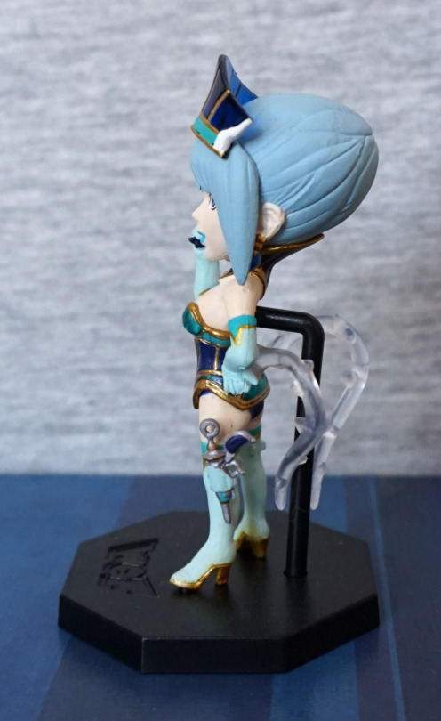
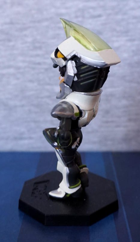
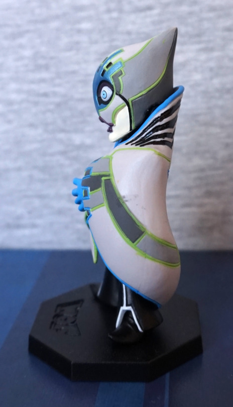
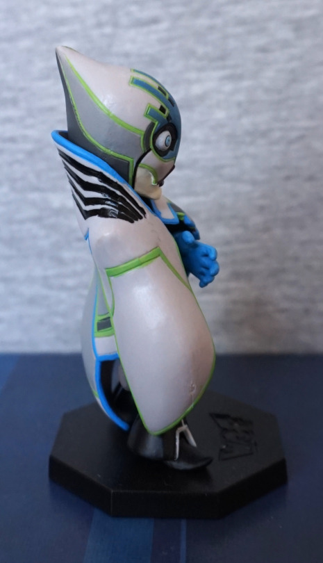
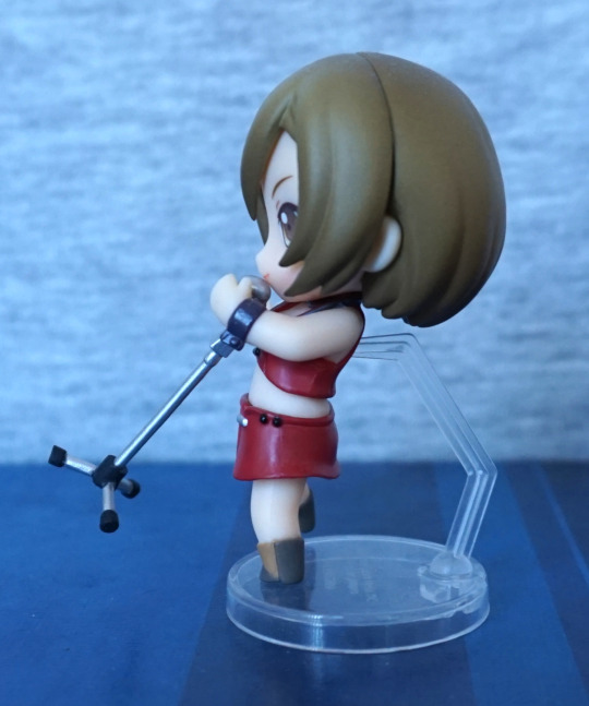
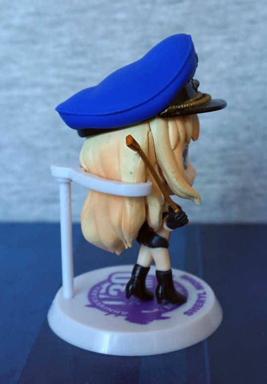
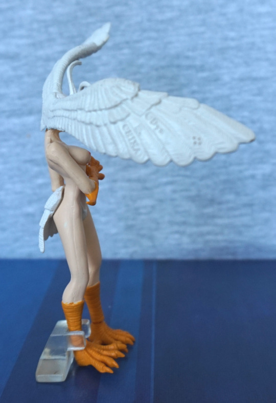
Sides:

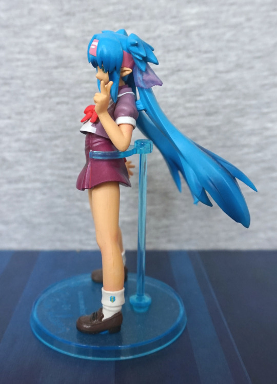
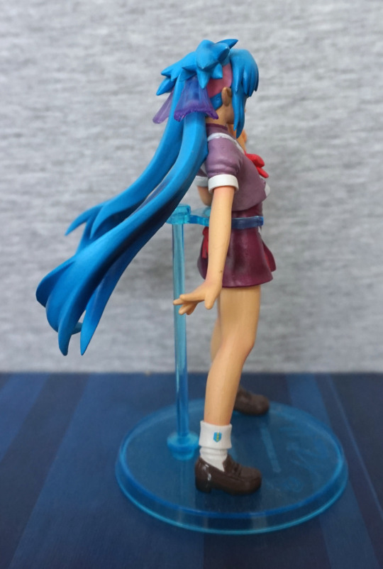
Her hair is positioned so that it doesn’t foul with the stand, which was nice for assembly. The shaded ends of her hair show up well here, which is one of the things I like about this figure. I also like the little logo on her socks. Her shoes are also nicely detailed and painted neatly. 
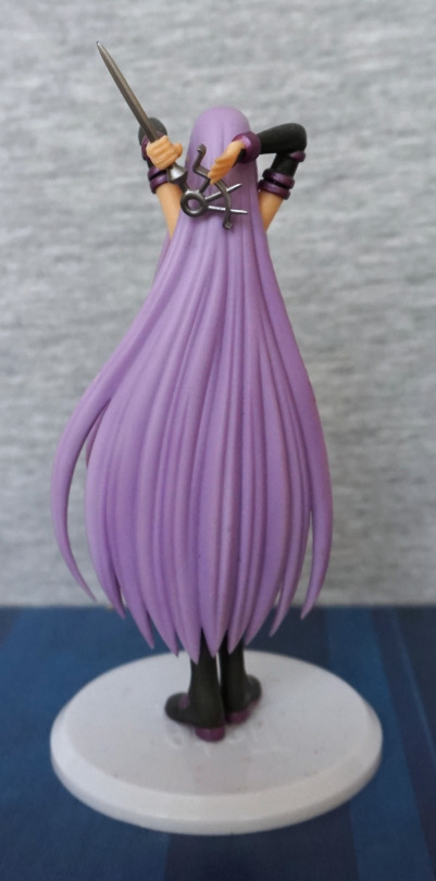
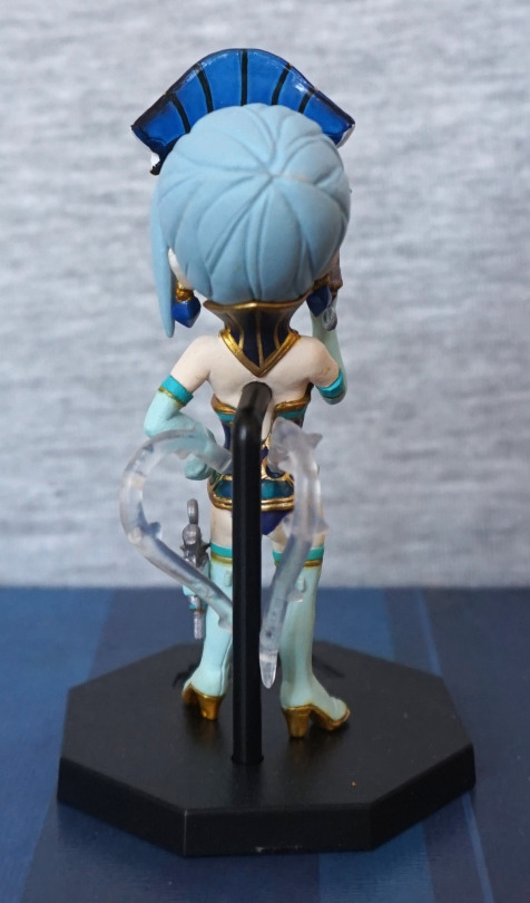
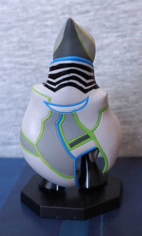
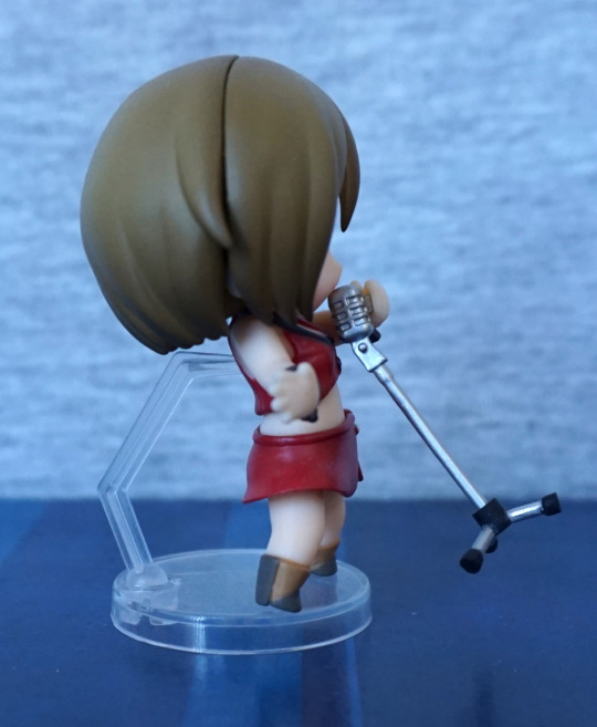
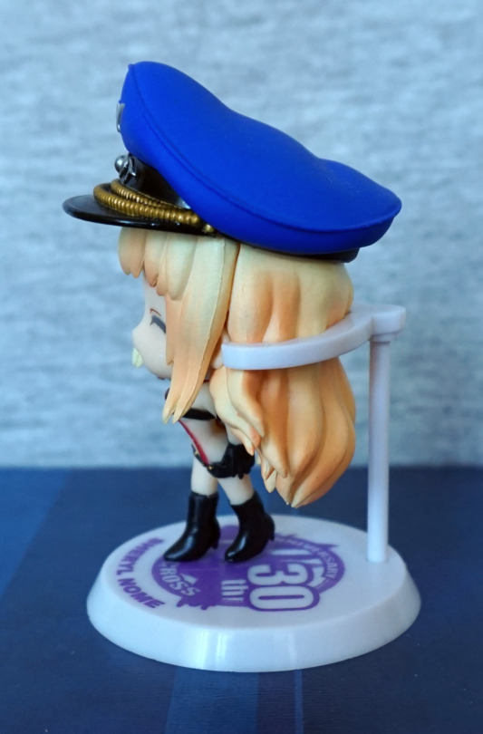
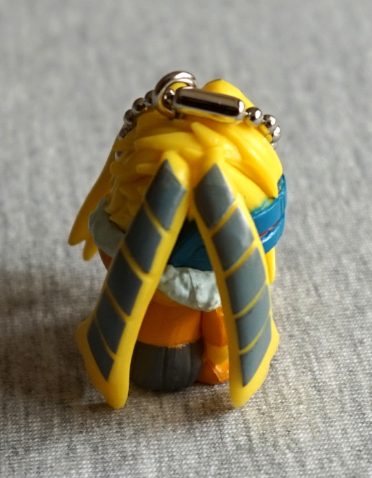
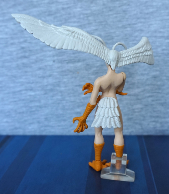
Back:

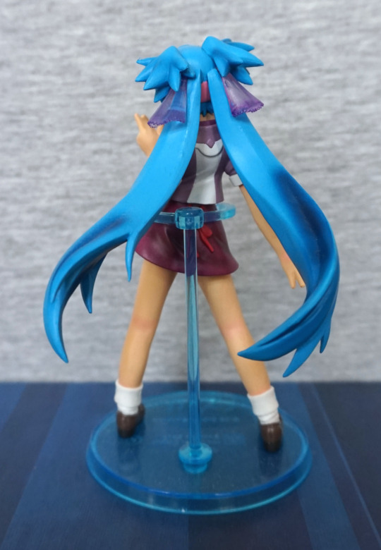
Hair shading looks overly severe here – would’ve been nice to see more blending. Back of her clothes looks good though.
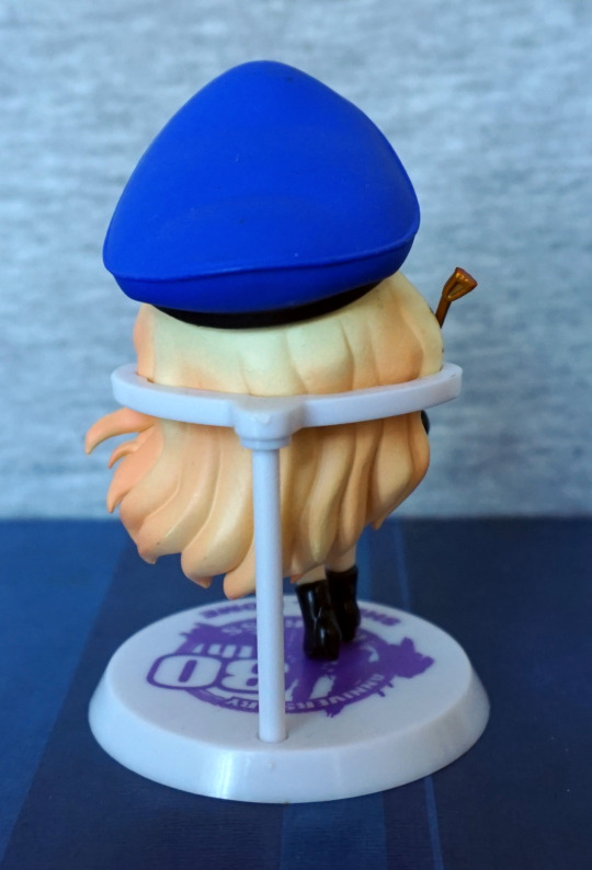
Top of her hair:

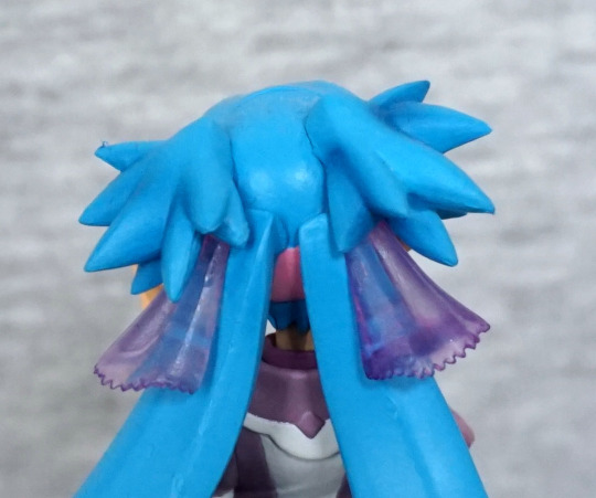
Some mould-blobbyness, but not too bad. The hair ties are translucent, which is nice to see. 

Overall, a nice-looking figure, competently painted, but could do with a bit more blending of colours in places.

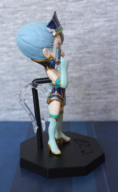
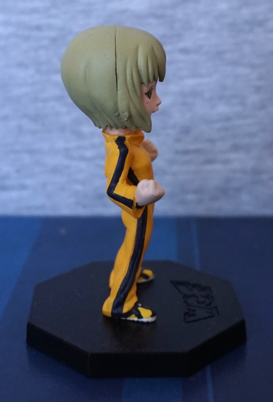
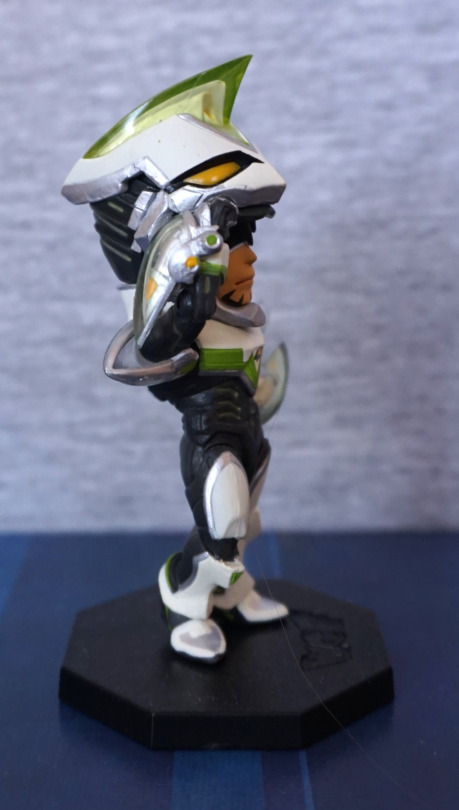
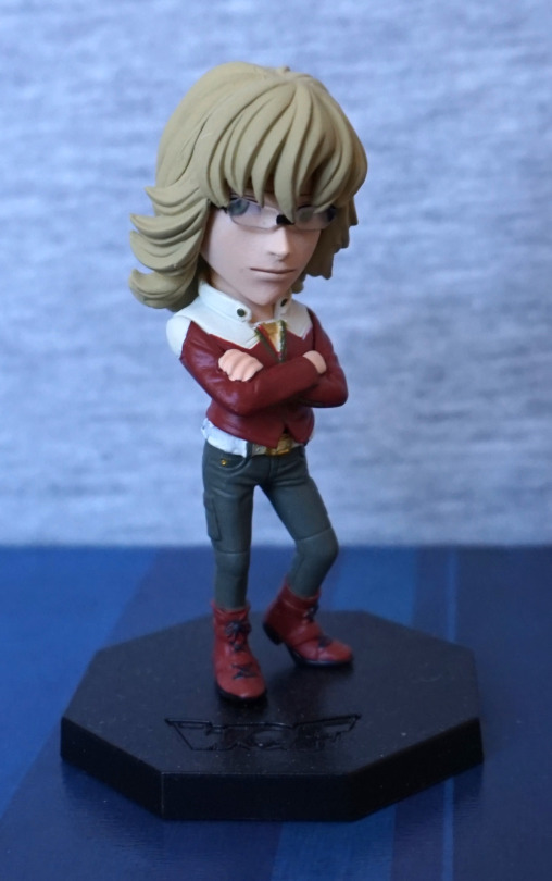
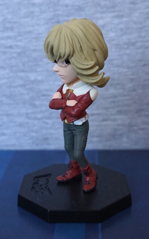
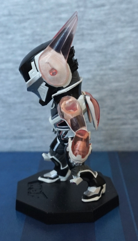
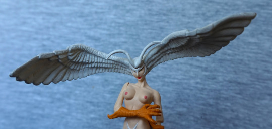
Next up, half-age Klan Klang:

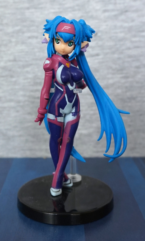
I accidentally ended up with two of these, so here’s just the one of them. She’s wearing her suit that she wears when she’s macronized in this figure, which is a mildly interesting choice. I like her in her suit though, so fine by me. On both of these figures, the paint is noticeably dodgy in places – here you can definitely see some paint errors on her legs. Again, she’s posed so you can see some of her long hair form the front. They have included some small details, like the SMS logo, but it’d be nicer if the paint job wasn’t quite so sloppy. 
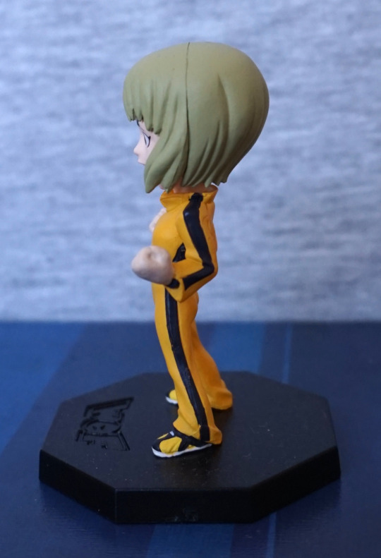
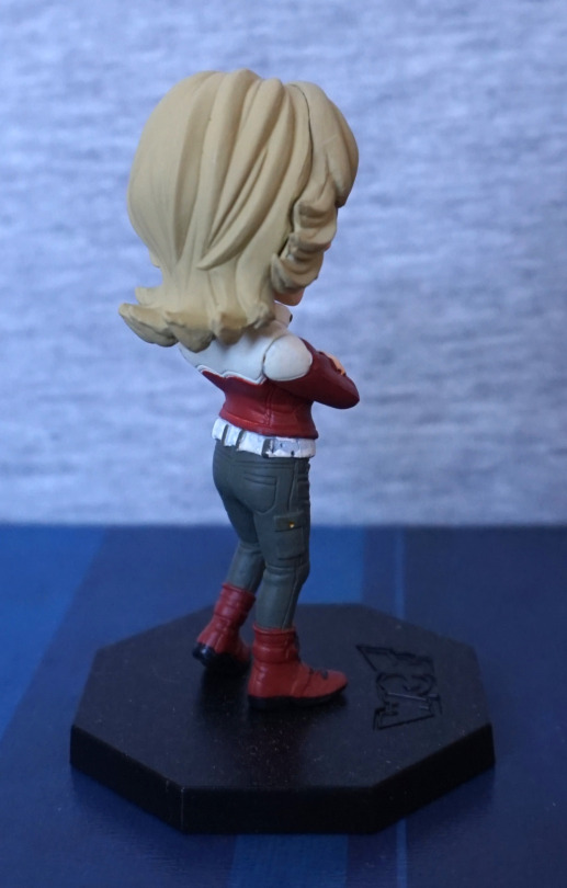
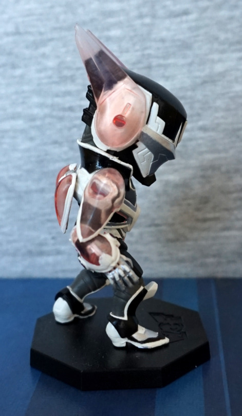
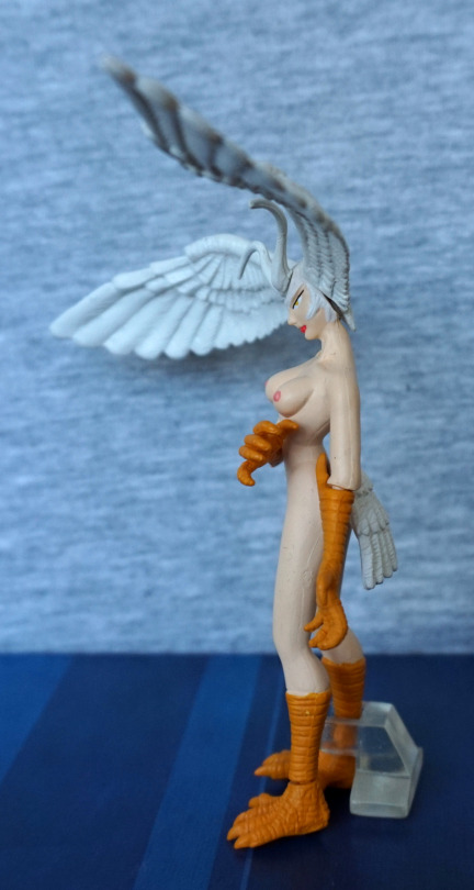
Sides:

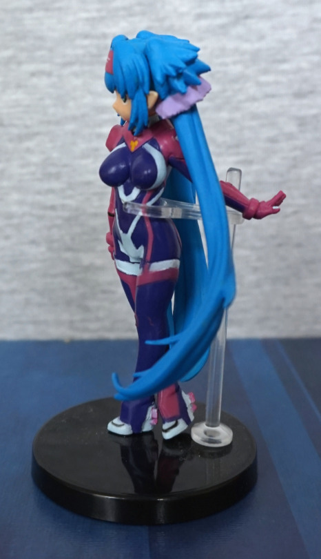
Again, some derpy paint, but the sculpting and pose hold up. 
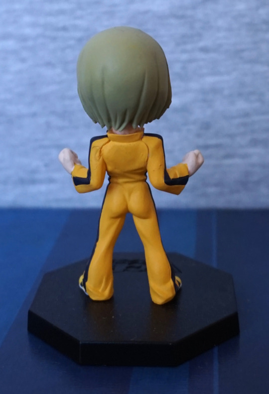
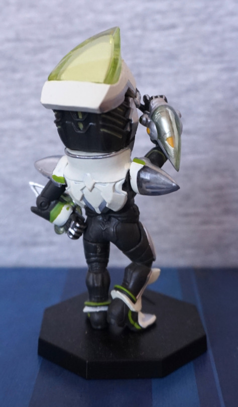
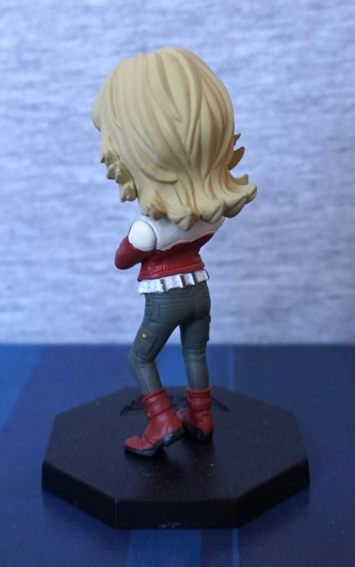
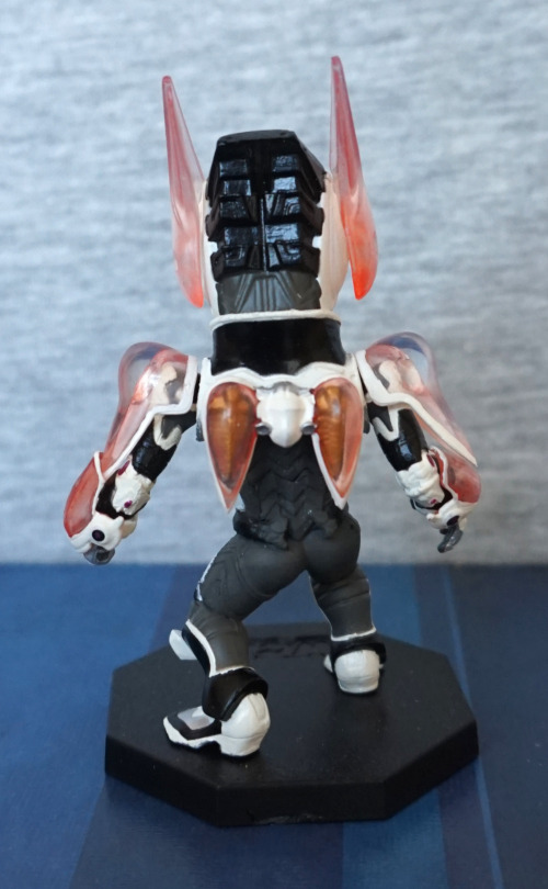
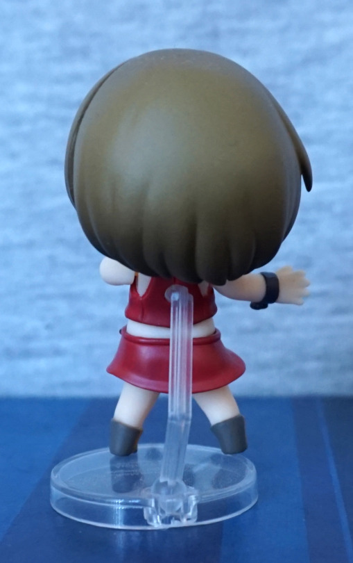
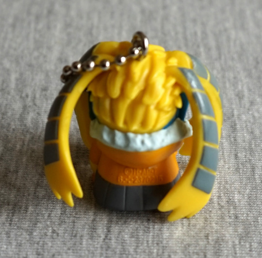
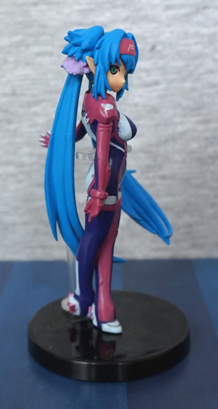
Back:

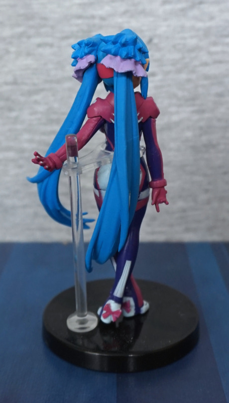
Her back is fairly obscured, so not much to see here like this. The main details are there though, but we’ll just have to admire the bows on her shoes. She was a tad fiddly to pose initially, but she’s fine once done. The clear stand holds her well, without being too distracting from the figure. Her hair ties are not translucent though :P. 

I think the first one is the clear winner, in terms of overall quality. I like the idea of the half-age figures, but their execution leaves something to be desired. I do like seeing Klan Klang in her suit, but the paint issues let the figure down as a whole. 

VF-1 – Macross

This one was added to a small order. 

And it is small:

This is a gachapon toy of the VF-1 from Macross. Or Robotech if you prefer. It’s decently detailed for a gachapon figure, but does have a habit of falling apart. 

Right:

Logo on the gun is rendered well, and I like the little details in the sculpt. The paintwork is neat, but doesn’t have much detail to it. 

Front:

Vrrooom. 

Back:

Engines are sculpted here, and you can see the VF-1′s feet. for when it is gerwalk mode. 

Top:

Here you can see the way it is twisting from not wanting to stay assembled. I like the little logo on the wing.

Bottom:

Here you can see a hole for the stand. There are two holes here, for an extra accessory you get with one of the other gachapon figures. I like the fact they’ve done the plating on the wings… even if it is obscured by copyright info… 

Overall, an OK little figure, but does have the disadvantage of liking to fall apart. Kinda wish Kinder Eggs had things like this, but this wouldn’t fit in a Kinder Egg. Hm. 

Rider – Fate/Stay Night – Blindfolded ver

After getting the incorrect version last time, I managed to order the right one this time!

image

Aha! The Rider trading figure I wanted! And this one is in better condition too – bonus. She’s in a very similar pose, only she has her blindfold on, which for me, makes Rider feel more complete. The sculptwork is good, and the paint is neatly done – not overly fancy, but it feels like the correct colours.

Left:

image

Standing with her back arched, she feels ready to pounce with her blade. I like this slightly unusual pose. 

Right:

image

The hair has been made to flow nicely around her arms, which I like. 

Back:

image

Her hair has some shading, which helps to give it depth. It’s sculpted well, and works for Rider. She can hold her blade either way up, but I felt this worked best. 

This trading figure is a nice one, and definitely a higher quality than a lot of small figures, though it’ll likely a bit pricier due to this fact. Does feel in keeping with GSC’s quality, and am glad to have finally found and got around to buying it. 

Skull Kid – Majora’s Mask

This was a promo item from Nintendo, but I bought it at a collectable figures retailer. 

Here he is, all bright and shiny:

I love the colours on this figure, which is what attracted me to buying it. And the fact I’ll totally get around to playing some of the Zelda games I haven’t yet, which includes Majora’s Mask. This figure also came with a free layer of dust, which I’ve now mostly removed… Still some visible in the logo on the base cough. 

Mask close-up:

I love the bright colours, and they’ve been rendered well on this figure. THe entire figure is neatly painted, which stands out mostly on the mask. The symbol on his hand is also nice and crisp. 

Left:

Love those shoes, thought I can’t imagine they’re too practical! All the pieces are neatly painted.

Right:

I’m in two minds about the weathering effects on the orange parts, but it does add needed detail to the figure, otherwise it’d look overly plasticky. I also like the Aztec-y design on the sides of the base.

Back:

Love all the splayed out spikey bits. Back doesn’t have too much to see, but what’s there is good.

Overall, I’m happy with this figure, and glad I was able to get it. 

Red Skull – Marvel

And finally, Red Skull:

Yep, he’s definitely got a red skull alright! The paint on his head is really good, and features all the details you’d expect a skull to have. However, not much are seems to have been taken when painting his sash, so that’s a bit blobby and weird. I like his screaming pose, but I don’t think they got his hand positions quite right – he looks more derped than angry because of it imo. 

Left:

Again, the head looks really nice. They’ve attempted painting a buckle on his belt, but the paint hasn’t gone on thick enough, and it looks like a smear. The pistol he’s holding does give off a German vibe, which matches what it is supposed to be. 

Right:

Sculpt looks nice, buttons could’ve done with a bit better paint job. I like the belt though. 

Back:

Paint doesn’t seem to have gone on quite right, and there’s a bit of brushmarks at the bottom. Sculptwork is passable, but his guns seem a little bent. Not sure what happened there. 

Overall, I think this is an OK figure. Again, some small paint tweaks could’ve elevated this figure into a better one, but my main complaint is with the guns – I think a little better posing could’ve gone a long way. 

Mephisto – Marvel

For the other two figures that I got with Lex, I picked characters that I think look cool, but probably should learn more about.

First pick was Mephisto:

An interesting pose, but one that’s not likely to all be in focus in one photo. The sculpt on this dude is nice, but not sure if he’s had a hard life prior to me buying him, or the paint wasn’t so good on his loincloth to begin with. Due to his red nature, the paint job is on the simpler side.

Left:

Here we can see he’s stretching out, though it is unclear where glove begins and arm starts – would be nice to get some more paint definition here for his glove, as it does look like it has mutated into being part of his arm. Or he’s wearing some kind of skin-coloured suit… 

Right:

Again, the sculpt failed to capture where glove starts and body ends. I like the fact they’ve sculpted his hand as doing something though. The side of body sculpt looks good, though, again, his boots could’ve done with a different shade of paint to differentiate them from his body. Hair looks nice though.

Back:

Cape does the job, and there’s some paint shading back here, which looks nice. Collar part of the cape looks a bit overly starched, compared with the rest of it though. 

Overall, he’s an OK figure. Could be much more if they painted his clothes properly. Wouldn’t recommend paying a premium price for this one. 

Lex Luthor – Chess Piece – DC

This figure I bought at an antiques store, that also has a few sellers that sell more modern collectables.There was a 3 figures for one price deal, and this one was my first choice:

image

And here we have Lex Luthor brandishing some kryptonite. I love the way he is posed, making the most of the stand. The paint is also really good for the most part – not too much paint creeping out of the lines. I love the skull on hte base, and there’s also a “king” symbol to show which piece this is – a fitting role for Lex Luthor.

Side:

image

Here we see he’s on his presidential campaign, to get as close to “king” as he can. I love the sculpt on the clothes, and the colour of his suit, but some of the sculpt lines are a bit strange- his heel on his right shoe seems to have an extra bit, and an odd like on his neck. Also not too sure about the ring – I don’t think it came out too well. 

Back:

image

I like the way the seamlines on this figure follow the seams that a suit would have. The finish on his suit gives it a premium suit feel to me, and the creases in his clothes are sculpted well. Though it does look like that kryptonite is melting his hand… not sure if he should be handling it like that… 

Back of the chess piece:

image

Here there’s also a marking to show it’s a king piece. I love the riveted metal effect on the base, and it really works to finish off the figure. 

Overall, I’m really glad to have him, even though I don’t intend to collect the rest of the set. For a small figure, it’s painted well and Lex doesn’t have too many good figures to choose from imo. Glad to have this in my collection, without having to buy the rest. 

She-Hulk – Marvel

I bought this at the same time as the Crash Bandicoot, And I managed to squeeze both into my luggage. And some DVDs. And some Minecraft papercraft…. This one is a fair bit smaller than Crash though. 

Front:

The sculpt is nice, but the paint feels a bit flat, and slightly squiffy in places. The face and hair are painted nicely, along with the shoes at this angle, but the purple paint is a bit missing in spots around the edges of her leotard, and a bit of lumpiness in the white paint. With this lighting, she doesn’t look too flat, but the green paint is all one colour, so it can feel a lot flatter in certain lighting conditions.

Left:

Here you can see some of the missed purple paint. Also some weird lines on the back of her legs.I think her hair looks like it’s in need of a wash…

Right:

Again, there’s some strange lines on her leg, on the lower half this time. White paint went a bit squiffy at the top of her right shoe. Hair and paint edges on her leotard are better on this side though. 

Back:

Hair looks good, but the paint edges look odd in a few places. And again, one of those strange lines running down her leg. 

Overall, it’s an OK figure for what I paid. I think some extra QC wouldn’t have been amiss on this one. Not sure I could recommend this figure though. 

Power Armor – Fallout 4

So… I actually bought a Dorb again…

And it’s this cute looking dude here:

Personally, I think this is one of the better looking Dorbz, and I’m still thinking that when he’s out of the box. The head has been done well – the finish on the helpet is good, and there is a decent amount of detail to be seen here. 

Left:

The paint is neat, there is a seamline, but that would be hard to hide on a flat surface like this. Shiny! 

Right:

I can see one stray brush mark on his helmet, but other than that, paint look good, Like the gun thing he’s holding, but this is that part where I admit to not playing Fallout 4 and subsequently not knowing anything about it. 

Back:

Nice bit of detailing back here on the helmet, and the body looks decent for its stylised fashion.

Top:

Definitely got that Dorb-y shape to him. Seams are a bit of a mess though. Well, he was put together on the wastelands, so we can’t be too hard on him :P. Would be better of the seam wasn’t so rough-hewn and misaligned though.

Overall, I think he’s good for the money I paid. I got him for £3 at B&M. I think it’d be a hard sell at over a fiver tbh. Still think he’s a decent-looking Dorbz, so would recommend if you like the style. 

AG-SYS – Wipeout

And this was the one I was waiting for, before I bought the other, as they’re 2 for £20 at GAME. 

Managed to snag this one prior to the official release date (per GAME’s site). Was just there, chillin’ on the shelf, so I wasn’t leaving without it… and gladly they had the Feisar there too :D.

So here it is:

This ship ha a more interesting design than the other, what with having two distinct “halves”. The paintwork is nicely done, and it also has the weathering effect like the other.

Right:

This one has asymmetric paintwork, which is a nice attention to detail. Paintwork looks neat and crisp.

Top:

Love the overall shape of this one – a fair bit different from a bog-standard ship design. Also has its designation nicely painted down the middle. I also like the fact they’ve done the windows in transparent plastic, adding to the realism of the figure. 

Back:

Some nice detailing in the engine area here.

Underside:

They’ve actually painted down here on this one, which seems to be a step up from the previous one. Looks like they’ve learned from the last one.

And here are the pair together:

They look great together, and I’d definitely get more Wipeout ships, if they chose to release them. Even if this pair cost me £20… I’m not entirely sure they’re worth that much, but hey, captive audience unfortunately. They know how to pick their franchises! 

Feisar FX350 – Wipeout

This is the first of two Totaku based on ships from the game Wipeout. 

Right:

I like the dirty/weathered effect they’ve added, and the details and decals look good for the most part. However, that ladder looks kinda derpy for being painted on. Maybe they should’ve taken the time to mould that a bit at least… 

Left:

Ladder on this side actually looks less derpy in this shot, as it seems to have a bit more detailing and not be just black lines… hm… This side is pretty much a clone of the other, and looks good imo.

Front:

Hullo. Not much to see here!

Top:

Love the shape of these craft, lovely sleek design. 

Back:

The vroomy bits! Don’t look very vroomy though. 

Bottom:

Looks a bit like a bike seat! Not too much detail down here, but some at least. 

Overall, I like this figure. The detailing and paintwork is good, and I like the fact it sits on a ball joint, so you can position it at any angle you like. They’re fairly small figures though, and kind of expensive here, at £10 each. I don’t mind too much for these ones, as there isn’t really much Wipeout loot out there, and this one is done decently well. 

Ben Jackson & Doc Saito – Tiger & Bunny World Collectable Figures Vol. 3

And finally, the side characters! 

First is Ben Jackson, the taxi driver for Wild Tiger:

Here we see him as his positive self, with the obligatory hot dog. The painting is really nice on the front of this figure, and the sculpting is good too – his face looks really good, and the creasing in his trousers gives this figure a more realistic feel. 

Left:

His hair is definitely smooth…. could’ve probably done with some kind of knobbly texture. Rest of him looks fine though. 

Right:

Go Tigher! Yeah, that hair is deffo lookin’ odd…

Back:

The arm seams actually look good on this figure, and match with the coat style. They’ve added creasing to the clothing at the back, so he also looks good from the back.

Most of this figure is really good imo – just the hair could’ve done with more detail so he looks less like a brown bowling ball. 

Now for Saito the Scientist:

The paint is neat, and looks good. Though with his badge not painted, that part does look odd – more like he’s got it underneath his labcoat, and it is showing through…

Left:

Paint for his glasses got a bit escapey, and not quite enough on his hair. His shoes and coat look good though. 

Right:

Glasses a bit better pained on this side, but looking odd. Hair is of an interesting geometric shape…

Back:

Back doesn’t do the hair any favours either, but the coat looks good, plust the other clothes we can see here.

Overall a decent figure with a couple of oddities.

Blue Rose & Huang Pao-Lin – Tiger & Bunny World Collectable Figures Vol. 3

Now for some of the other heroes! 

First up, Blue Rose:

This figure was one of the reasons I went for Vol 3 – as I really like Blue Rose’s design. Aaandd… with my luck, she was broken in the box! I ended up ordering this replacement from Mandarake. And I’m glad I did – the paintwork is mostly pretty solid with this figure, and the colours are really nice. Unfortunately assembling her is not fun, and it was hard to get her ice tentacles in, as well as attached to the stand ><. You will want to warm this figure to assemble it. 

Left:

Her head feels overly egg-shaped. Her hair should stick back some, but this feels… kind of unnatural. Otherwise, she looks fine from the side.

Right:

Hm, that vine isn’t quite in her side… yeah, she’s a pain to assemble. Bit of mould mess on the side of he head, and could do with a few more lines to make it more hairlike. Her earring is nicely done though, and the ice gun looks good. 

Back:

Despite the pain to assemble, the ice tentacles look good. The paint on her collar looks really good too. 

Overall, I really like this figure, and glad I ordered a replacement. With the broken one, her tiara split. I did try to repair it, but really with the wrong glue, so the glued part shows quite badly. 

Now for Huang Pao-Lin, aka Dragon Kid:

I like her in her casual outfit, so was glad to have this one in the set. The paint is very nice on this one, and there’s been some detail put into her clothing, with the creasing. Her hands aren’t very well moulded though, and look kinda blobby. 

Left:

The black linework is mostly OK, can see some flaws if you look close, but not as bad as other figures in this set. 

Right:

Bit messier on this side, plus some mess on the hair. 

Back:

Not sure what’s going on with her back up top – looks a little overly flat, and teh seams/creases by her arms look odd. I guess the sculptor was distracted by her backside…

Overall, a decent figure, but not anything special. 

Tiger & Lunatic – Tiger & Bunny World Collectable Figures Vol. 3

Today’s two figures will be Tiger in his suit and Lunatic. 

Here we have Wild Tiger:

In this figure we get to see his face and his suit, which is a rarity with his figures. I like the fact he’s wearing his eye mask under the suit… like he needs it. The paint on his is really nice, but a little less neat on the suit, The clear pieces of his suit are nice – on his should, arm and helmet. Though, like the Bunny figure, the tint is too pale on the green parts. 

Left:

Not too much to see here. 

Right:

Paint is fairly neat, and I think he’s posed well.

Back:

His pose also works well from he back. He has a few small details painted too, which makes the figure look good – his boots, bit on his back, and the green parts on the back of his helmet. 

Overall I like this figure – and he’s a welcome addition to my collection for the different pose. 

Now for the villain of the piece, Lunatic:

His head is painted well, and his hand, but the green paint feels rather rushed on his right of his cape. The white lines on his trousers have come out well, though. 

Left:

His head is painted well, but again, paint on the cape looks rushed, and there’s a bit of a transfer mark in the middle. Think he needs to give his cape a wash!

Right:

Ditto the remarks for his left-hand side.

Back:

The green and blue paint seem a fair bit neater back here than the sides, but still has some slop and misses. Black paint didn’t feel like going within the lines on his collar. 

I’m really impressed with his head, and the sculpt overall, but the paint on his cape is rather the letdown. One to display at a distance… which fits Lunatic. But it would’ve been nicer if the painter paid a bit more time to his cape. 

Bunny – Tiger & Bunny World Collectable Figures Vol. 3

I will be doing these trading figures in pairs, as there are 8 of them, and a week of blogs dedicated to these guys feels a bit much.

So, today’s pair is… Bunny & Bunny. 

Barnaby in his casual outfit:

The sculpting on this duded is pretty nice, and the paint is mostly neat. I especially like his hair, and the amount of details that went into his jeans – the stud, the belt and the linework. 

Left:

Here we can see some of the red of his jacket escaping int the white, and some dodgy texturing on the hair, which is a lot less apparent from the front. Jeans and shoes loog good though.  The cream part on his shoulder doesn’t match the white on the main part of his jacket, which makes it look a little odd to me.

Right:

Hair has a nicer finish on this side, seam is fairly well hidden imo. 

Back:

Hair sculpt is good, jeans look good from all the angles imo, as well as the boots, belt paint is a bit suspect back here though. 

Overall, I think this is a good trading figure and has a good likeness to Barnaby Brooks Jr. 

Bunny, darkness edition:

From a first glance, this figure looks pretty good, but does have its flaws – the one that isn’t so apparent from the photos is the side fins on his head do fall off rather easily. They do stay, so long as he isn’t nudged, though. This figure does have a fair number of fine lines, which I think does show the limits of painting on small trading figures – it does feel a bit uneven in places. 

Left:

I think the fins on the sides of his head could’ve done with a bit more dye, so that his head didn’t show so clearly through these parts. Lower arm guard colour looks about right. I do like this use of transparent parts.

Right:

Mostly more of the same. I like this pose though – “ready for action”. Paint on his collar looks a little dinged up. 

Back:

The backpack parts are nicely shaped, but appear to be a different colour to the rest of the pinkish parts. Would’ve been nice if the pinkish parts coordinated more. I think the proportions have gone a little odd due to the chibification though – I feel as if the backpack is a bit too wide, and doesn’t sit how it should. 

Overall, a decent likeness, but best not looked at form the back. 

Meiko & Sheryl Nome – Vocaloid & Macross Frontier

So theme of these two is…. gacha that aren’t usually gacha. 

First up is a Nendoroid Petit – I found a Goodsmile Company vending machine in Japan, and it vends Nendoroid Petits. There were 3 series to pick from, can’t remember what my choices were, but I went for the Vocaloid ones, as I’m familiar with some Vocaloids. So ofc, it gave me one of the ones I didn’t know, Meiko:

I remember this one costing a bit more than your average gacha, but being a Nendo Petit, this makes sense. From even a quick glance, it’s fairly obvious these are a fair bit higher quality than a gacha. 

My main issue with the figure is the mic – it is a bit of a pain to get into her hand, then it very easily falls out. The mic is attached by a peg, but the hole isn’t quite tight enough to hold it well. 

Other views:

Overall, I think she’s a decent Nendoroid Petit, but don’t have any personal attachment to her. The clothes are sculpted well, and she has some nice shading on her hair. Just wish she’d stay in one piece once assembled.

Next up, Sheryl Nome:

Originally, this was an Ichiban Kuji prize, but one of the shops in Japan had a gacha machine vending stuff from Evangelion and Macross respectively. Blog about the Evangelion items here. So this was the one I got from the Macross gacha. I like Sheryl’s outfit in this figure, plus the shading in her hair. 

Without hat:

I really like her hat, but displaying her without it is a viable option, if you prefer to see her hair. It’s fully sculpted, so she doesn’t look like she’s missing anything without it. 

Other views:

I really like the piping around her hat, and her outfit looks good from all the angles. She does have some fairly noticeable seamlines in her hair though, so she’s best viewed from the front. 

Overall, really happy I have this figure. I didn’t know it existed, and is the kind of figure I’d want the moment I knew it existed… and even better, I already owned it on knowing it existed 😀

Devil & Butt-head gachapon

So… going to classify today’s blog items as “misbehaving”. Because why not. 

First up, Butthead from Beavis and Butt-head:

image

Had to get a gacha from this machine, seeing as I felt it was a very random thing to be producing gacha for in this day and age… The hair is nicely shaded and sculpted, and the face looks good. Rest of him… does the job. He’s on half a sofa, as Beavis comes with the other half, but I didn’t feel like buying any others of this set. 

Other angles:

image
image
image

Looks decent from the other angles imo. With the side of the couch painted, it doesn’t look too distracting for being one half.

Next up, a devil:

image

This one I got from a gacha shop rather than a machine. They were selling him for his RRP, so hey, that’s good with me. I like the overall design, though it would’ve been nice if his wing claws were black, Even for a gacha, this guy was cheap though, lol. His main design flaw is he’s hard to stand up – has a habit of rolling over, despite having his loincloth designed to help him stand. As he ain’t standing on his feet. 

Side:

Here we can see how he sits on his loincloth. After bending it a bit, he did stand up a bit easier. Neck looks a bit too thick from this angle.

Back:

He has some texture moulded into his wings, so isn’t entirely plain here. Overall, an OK gacha, but nothing special.

Mediamon & “Sorry” – Digimon & Bekkon Robotonics

So… time for some gachas! 

This first item I got from a ¥100 random item gacha – no idea what I was going to get.

And I got Mediamon:

Overall, a decent gacha item, but not one I’m particularly interested in. I think he may have gone into my Drawer of Purgatory already (every house has one of those… right?). The quality seems decent, but I have no familiarity with the source material, so can’t pass too much comment about him. 

This gacha I wasn’t sure what it was supposed to be, so I decided to grab an item out of it anyway:

Apparently this is some kind of mascot for Bekkon Robotonics, and this particular gacha item was entitled “Sorry”. Here we seem to have two cats with masks walking along… interesting mascot action!

Some more pics:

Well, now I have something for a “loljapanese” display. This one is also likely to live in the Drawer of Purgatory, unless I have room for a random display. Maybe I could squeeze these into an ita bag of some sort? 

So yeah. That was two random gachas I ended up with. Because I like shoving money into gacha machines. 

Sirene – Devilman

Bought this figure from a store that sells gachapon/trading figures loose in small bags. Post tagged NSFW, as Sirene doesn’t know what clothes are. 

So enjoy this SFW shot to start with:

image

Her face looks OK from the side, but we can see my bugbear with this figure in the first shot… the head wings keep falling off :(. She’s a bit of a fall-to-bits figure, which is not really shown in the photos. At some point I may use some tack or glue to stick her together, if it gets too annoying. 


Front:

image

She comes with a little plastic stand to help her stay upright, but it does a mediocre job. The sculpting, however, is really nice – the wings are feathery, we can see her collarbones, and her forearms and shins are detailed. The paintwork is mostly neat, but leaves a bit to be desired in the shading department. Overall, this isn’t too bad as it is a small trading figure. 

Face:

image

Here we can see the wings are well-textured, and her nipples well-defined. Her right arm can move around a bit, but it’s not meaningful movement – more of an artefact of assembly. 

Left:

image

Her boobs are decently shaped, but maybe needed a bit more of an attachment to her body. The side crease seems to go a little high. Here we can see also where her arm has come slightly off from the peg. 

Right:

image

Some copyright notices here… and a seamline up her body. Her body feels a bit oddly shaped from this angle to me. Her feet are nicely sculpted though. Talons could’ve done with being painted black though. 


Back:

image

Her hair looks nice from the back, between the wings. Her tail looks odd, but that’s more to do with character design… Her shoulder blades look too flat, on the upper parts, but it’s nice to see some shape to her back.

Overall, it’s a fairly solid trading figure, if you can get it to not fall apart. Its flaws mostly seem to reside in making a small figure to a budget, so I’m happy with it. Might have to heat her legs to sort out her stance, though. And add something to her to stop parts falling off…

Smile Slimes! – Dragon Quest

Here are a couple of Smile Slime items. I’ve not played Dragon Quest, but I have a soft spot for these squishy fellows.

First up, a magnet set:

Their cute faces have been done well, and I love the translucent effect.

Back:

These flat backs stick to surfaces well. Have had them stuck to various radiators in the house, plus they just about fit on the Detolf handles. My favourite one is a tie between the purple one (on account of being purple) or the blue one, as the colours fit well together… and it’s the traditional colours. 

I also had a go at a Dragon Quest gacha and got this fellow:

He’s made of a soft, smooth rubber, and is air-filled. Was quite strange picking him up for the first time! Not quite what I expected. 

Back:

Nothin’ much to see here. Not sure what you’d expect, really. 

Overall, an OK gacha. Still undecided if I like the fact he’s air-filled or not – at least if he does burst, he won’t make a mess. 

So keep smilin’ and slimin’ out there!