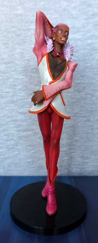
These pair of creatures I picked up cheap at a Hobby Off, without boxes. I was impressed with the prices in the Hobby Offs I visited, even if they didn’t do tax-free shopping.
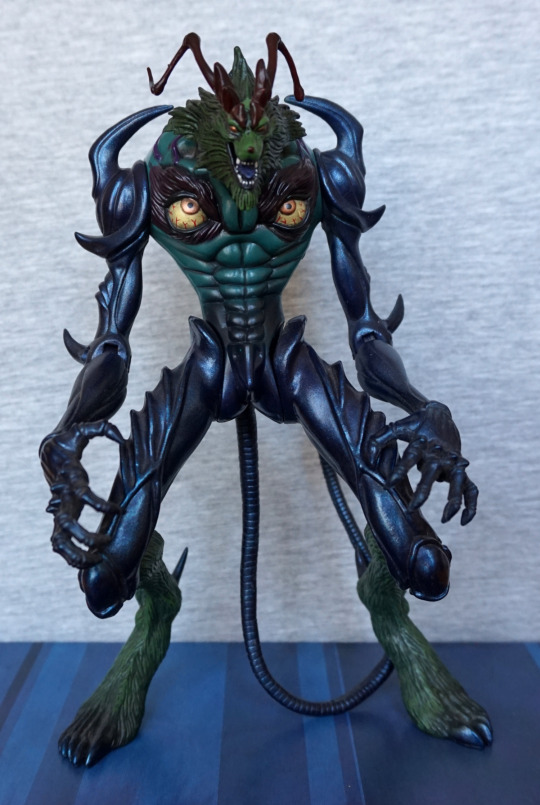
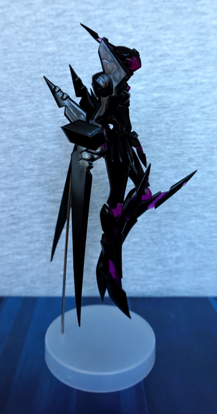
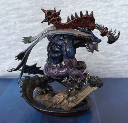
Firstly, let’s have a look at the Behemoth King:
Looking at these creatures close-up, there are many small details to be seen, such as the stitches on his sleeve, and the metal edging on his shoulder… ribbons? His tail curls around him nicely, and for this figure the “front” isn’t the best viewing angle, but you do get to see his face.
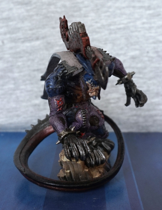
Left:
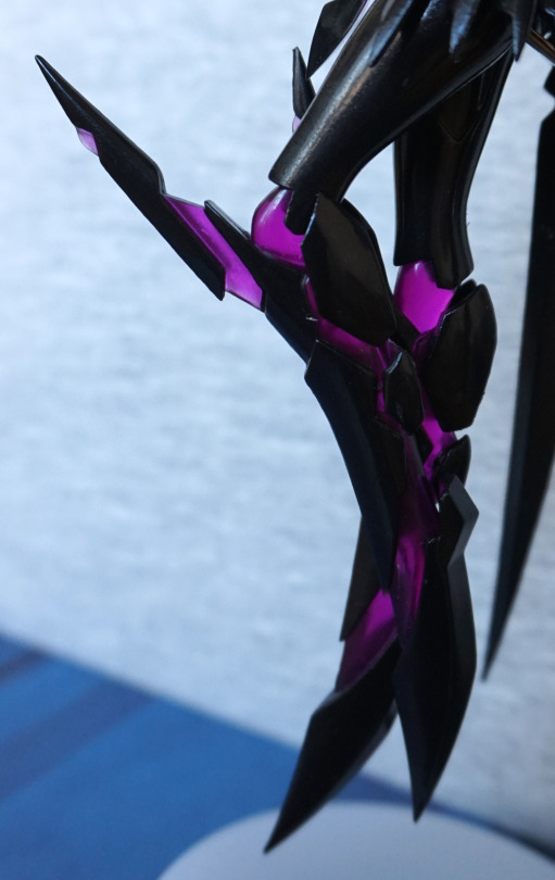
This I would regard as his viewing angle, as you can see mos of his pose. Here we see his tail has a heavy metal end that I’d definitely not want to tangle with! The muted blue and purple colour scheme works well, and definitely counteracts blandness in colour design for a creature, without going full-on fantasy. I also wouldn’t want to tangle with the clawed gloves he seems to be wearing on all his limbs. The weapon on his back is also nicely sculpted and painted.
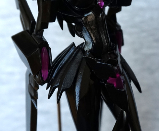
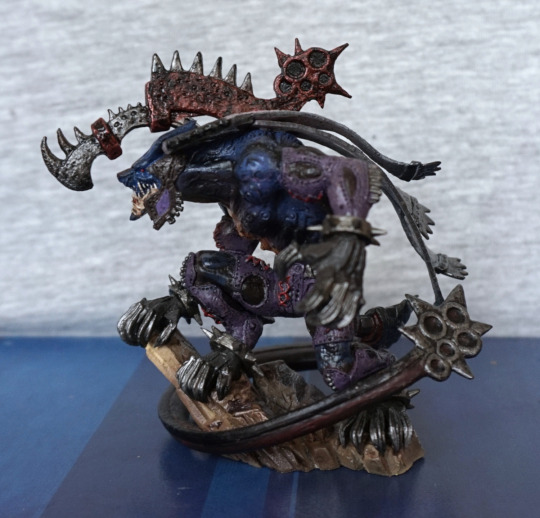
Right:
Here we can see he has a good amount of shading in his back paint. The rock “stand” is largely visible from here, and the textures and colours on it are nice and feel like stone. The ribbons on his shoulder look like they are blowing in the wind, which is a nice touch.
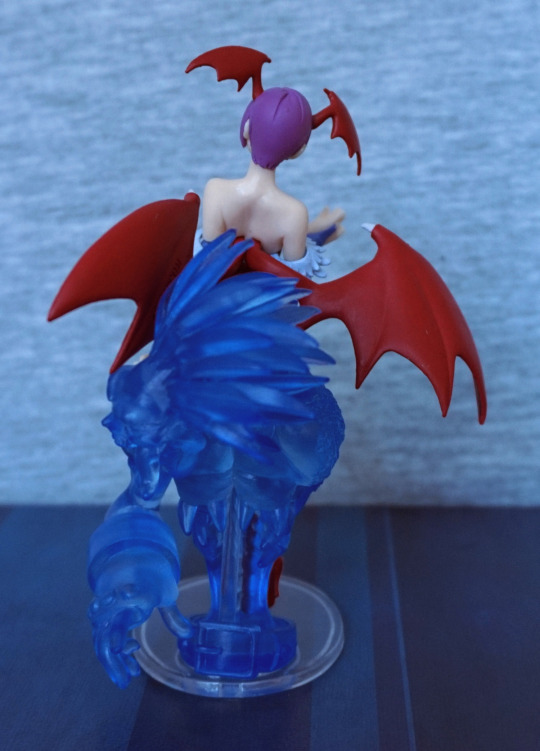
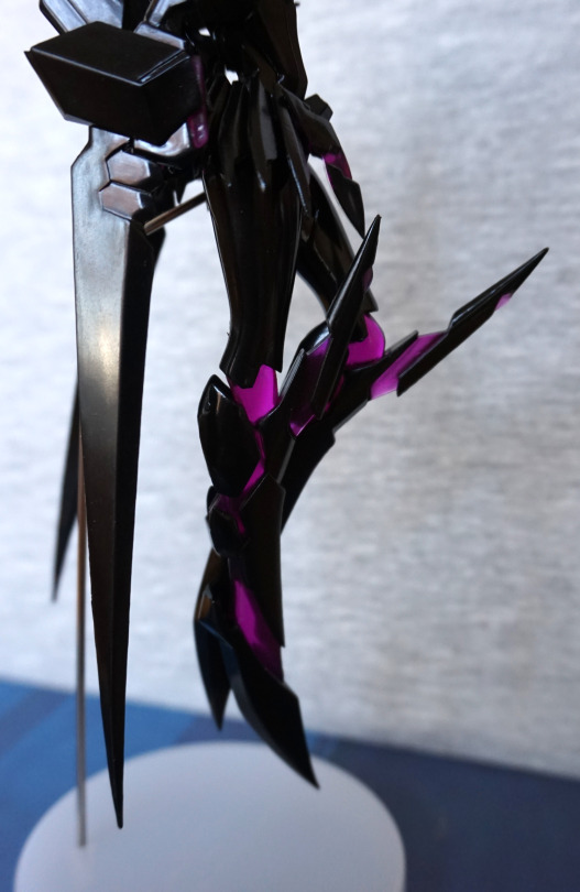
Back:
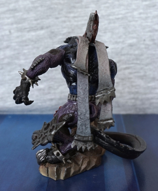
Here we can see the ribbons (as I’m calling them…) are textured nicely and are shaded down their length. Also liking the spiky collars on his wrists/ankles.
Overall, I’m impressed with the quality of the sculpt and the paint for this figure, plus I love his overall design.
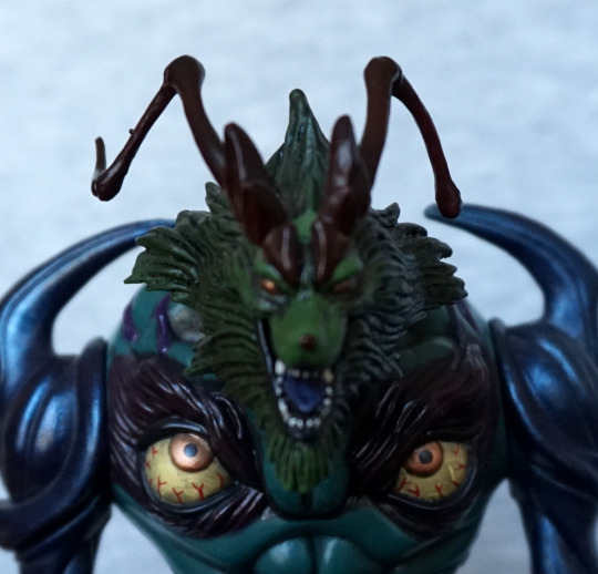
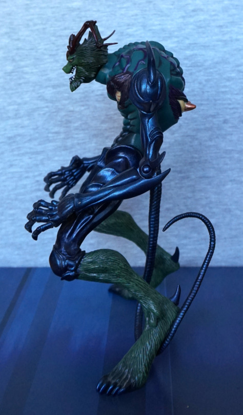
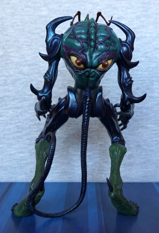
Now for Marlboro:
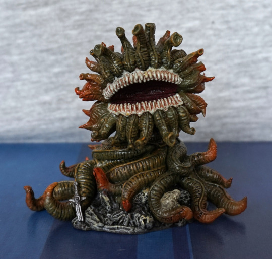
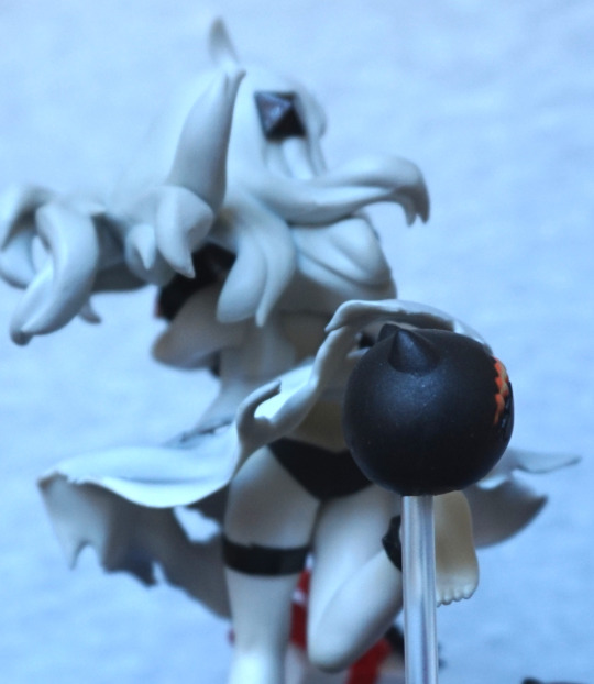
My research revealed, that yes, his name is a reference to the cigarettes, as he kills you with his stink. I love the detail of this creature’s design, and the muted colour scheme. He also feels kinda cute to me, by monster standards. Here we see him looking like he’s wrapped himself over a dead adventurer, who still had his sword. I love his big, gaping mouth, with all its teeth. The paintwork is quite detailed around here.
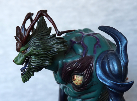
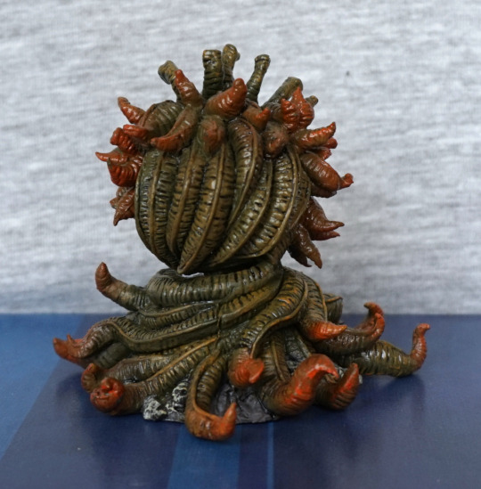
Left:
Here we see His Plantiness has orange tips on all his extremities. I like this touch in his design, and the paint seems blended well with the green, so there isn’t a harsh transition.
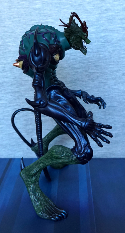
Right:
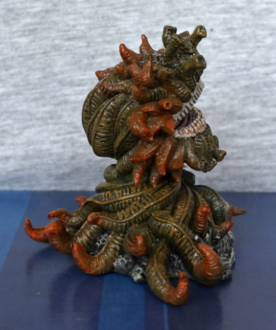
Again, more orange-ended tentacles, plus some skulls beneath him. Yeah, don’t think I want to tussle with those teeth.
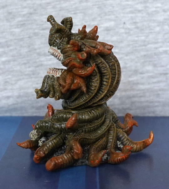
Back:
Here we see an obvious join about halfway up his back – this is the only noticeable flaw imo. Here he also has some yellow accents on his vines, which adds some depth and detail to him. I think a decent amount of detail has been put into his sculpt, and definitely gives him a plantlike appearance.
Overall, I’m really happy with this figure too. On a personal level, I think Marlboro is my favourite of the two, but that’s down to creature design rather than quality. I could recommend these figures, who would like some more creaturey small figures in their collection.