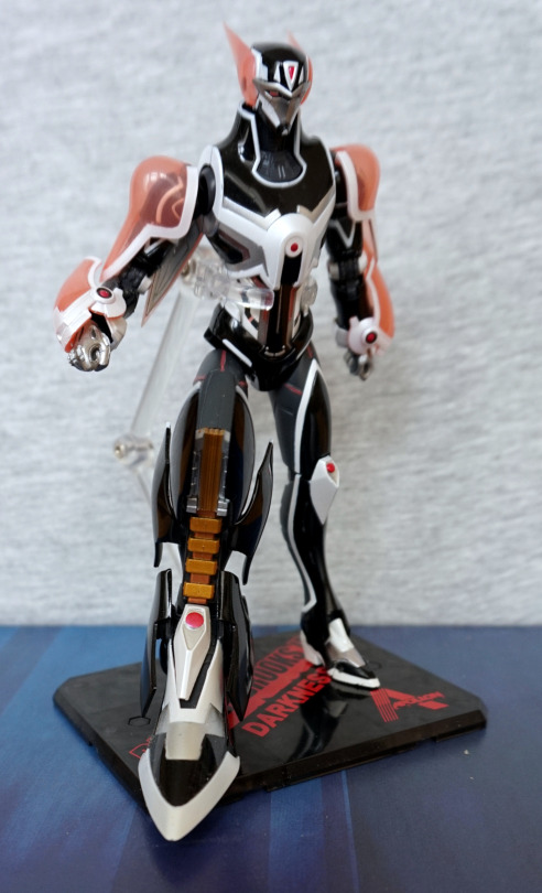
So… this thing seems to be from the Japanese equivalent of the 80s toys that had cartoons made for them. Initially, this was a toy series that had its own backstory, which eventually got a manga and a TV series… in a similar style to some other toy lines in the West. Also part of this toyline was the inspiration and basis for Transformers!
This part of the series, the toys were marketed as being 1:1 size and were masquerading as action figures on their visit to Earth… Old toy lines, amirite?
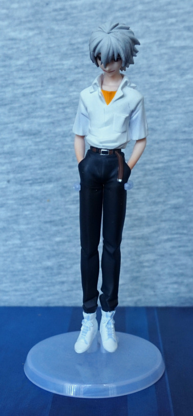
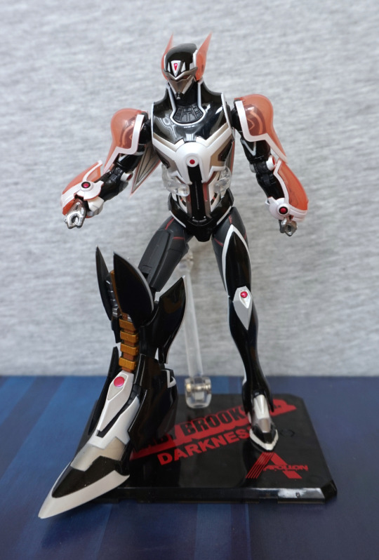
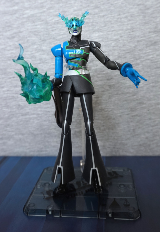
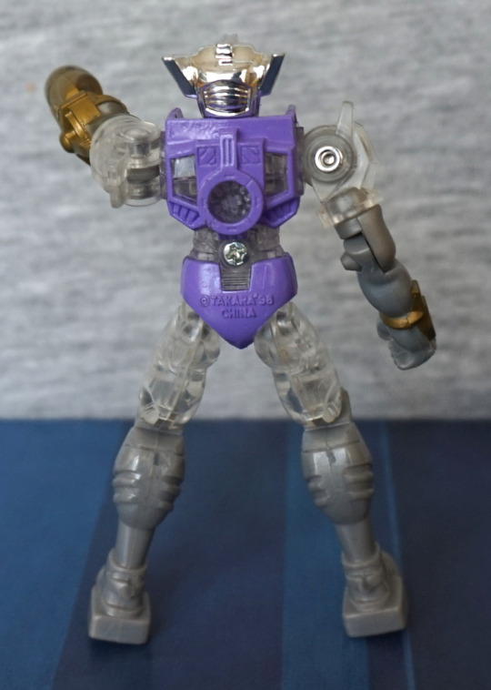
So this one is called Izamu:
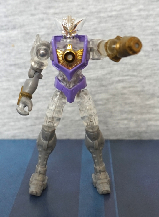
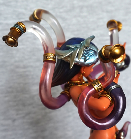
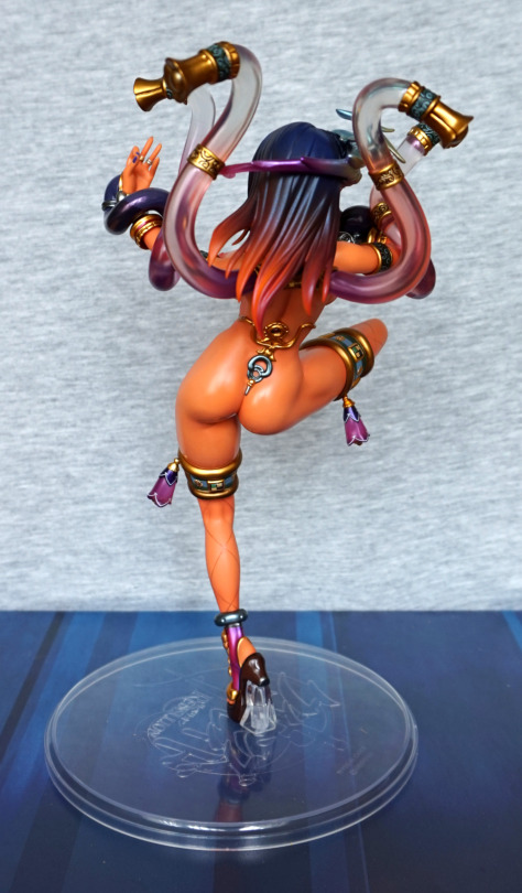
I bought him, as he was one of the cheaper ones, and I liked the gold-purple colour scheme. Some of them were pretty pricey for what they were, and I guess those were the popular characters, lol.
Standing straight:
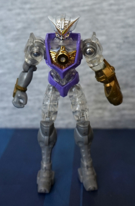
He does have a fair amount of retro toy feel going on about him, though his hinges have been incorporated well into the design, so they don’t look bad. He’s decently articulated, and has the ability to stand (which is easier, given his small size). I like the shapes of his armour pieces, making his look interesting and detailed.
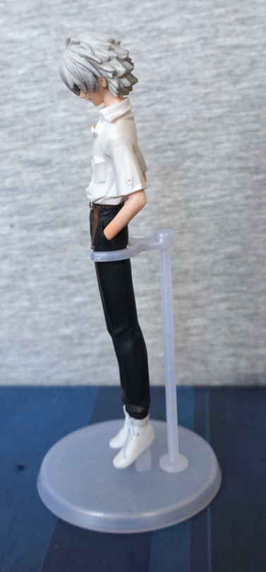
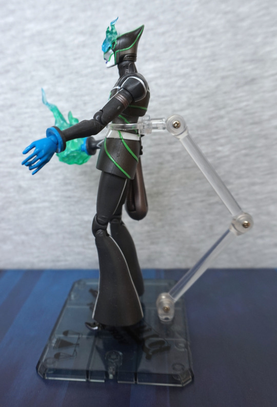
Left:
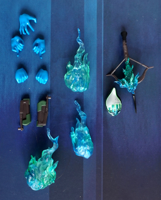
Here we have his arm cannon, which has a decent amount of moulding detail. The clear parts of this figure manage to look good,without overwhelming the “look” of the figure. The silver plastic isn’t the best, but hey, cheap small action figure. The sculpt detail helps make up for the lack of any detail paint, not that you’d expect a paint job on this kind of figure.
Closeup of the gun:
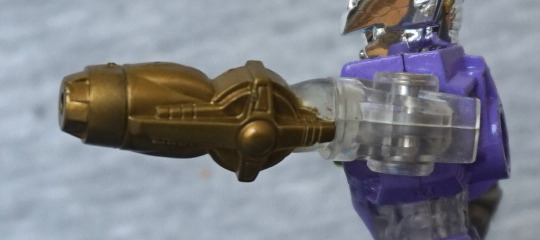
I like this cross design, and the different levels used in the design to make it stand out.
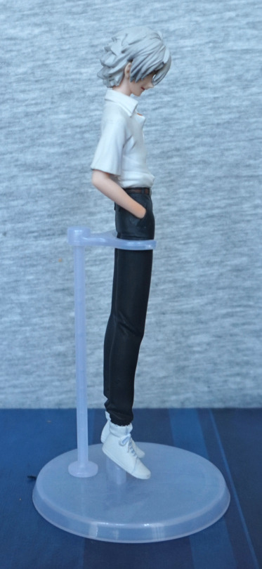
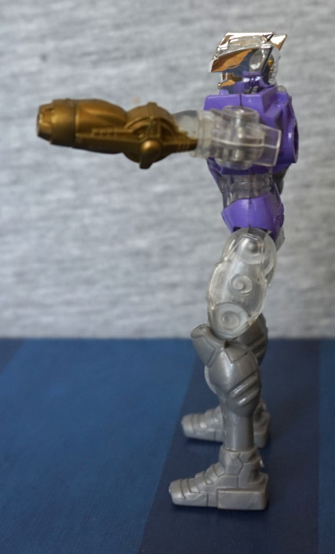
Right:
I like the way they’ve added a gold detail to his right arm, so it doesn’t look overly plain. Here we can see how the cannon isn’t his actual left arm, but rather attached to it (though it is a part of the figure and doesn’t remove). Here we can also see how his head being silver gives it more definition, and does look better than if it was transparent.
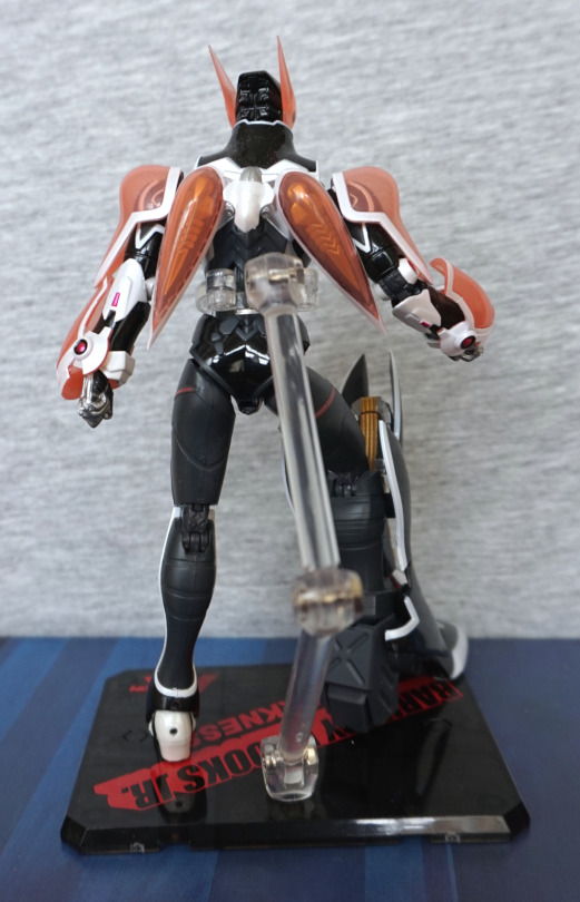
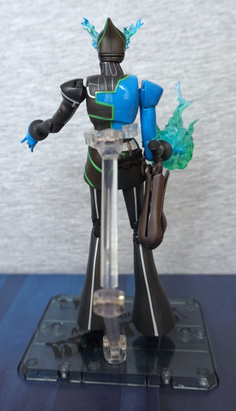
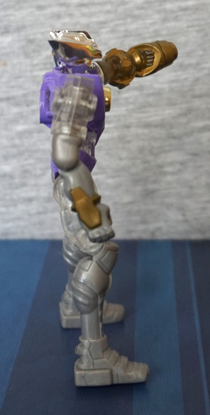
Back:
We can see he’s fully committed to the masquerading-as-a-toy bit by the Takara stamped on his backside P. One screwhead back here – almost feels as if they missed a trick by putting it below the circular part, instead of inside. The sculptwork does go around it though, so it doesn’t look super out-of-place. Here you can see how older toys without ankle articulation are harder to balance :P. The details on the purple part of his back are really nice, and shows they thought about the back of the figure too.
Overall, I’d recommend this line, if you’re a fan of the designs and into this retro aesthetic. The articulation is decent, and you can get a good range of poses with him imo. Better than some modern equivalents, but not the super-articulated ones (though some of the latter do suffer from being too dainty, and being awkward to pose as a result…).